Search the Community
Showing results for 'wildlife birds nature' in content posted in Share your work.
-
I think desaturating the back ground color will remove the false nature of the color. Objects in a distance are always a softer/ less saturated color. The value seems too high for the blues because our eyes want the back ground colors to have a lower saturation value.
-

affinity photo Third Week learning Photography & Affinity Photo
firstdefence replied to I'm Ant's topic in Share your work
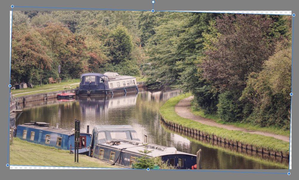
That's better re the house, I can hear the birds tweeting now and the cows mooing lol! The river scene needs levelling up. still water doesn't slope, see your image below for the difference. (Rotated -1.7º)
-

affinity designer Boolean Games - Newbie Designer
snuffleberries replied to Boolean Games's topic in Share your work
Hi, I'm glad you are having fun with Affinity Designer. Its a great product. Something I find improves drawings a lot is having gradients rather than just solid colours. Using the gradient tool (key G) you can easily draw a line on your object and set the colours of the two end points. The gradient tool is far more advanced than just that, but its an easy way to start. I had a little play with your picture and came up with the following. I didn't want to change it too much from the original. For the clouds I find that stretching the single cloud object doesn't look very good, I find it better to overlay several non stretched copies over the area. I used firstdefence's idea for the birds too :-) I've included the .afdesign file incase that is helpful. Kids Drawing exercise.afdesign
-

affinity designer Boolean Games - Newbie Designer
Alfred replied to Boolean Games's topic in Share your work
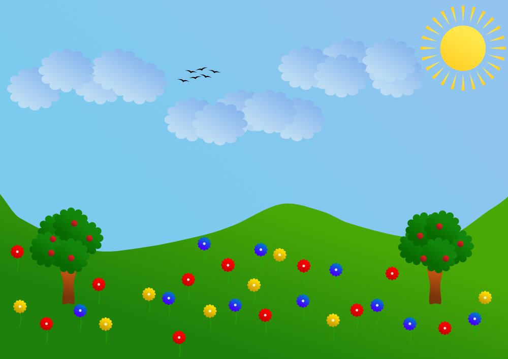
It’s OK for some kinds of foliage but too dark for apple trees, and it could do with being squashed down a bit. I think the grass is too light, especially against that pale blue sky. The black things would look less like giant flies and more like birds if those fat tear shapes were replaces by thin curves. -
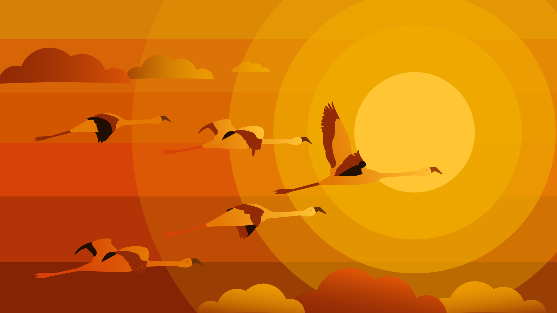
Hello Affinity fans Today I drawn flamingos, interesting long-legged birds. I have made not use of textures, patterns, pixel layers or brushes, I just wanted a very simple illustration, just shapes, pen and gradients. Give a look at the illustration, drawn in Affinity Designer and tell me what do you think, leave your feed backs, write positive and negative The full project here on behance
- 11 replies
-
- 9
-

-
- flamingos
- illustration
- (and 7 more)
-
Seahorses are among nature's most successful designs of which you created a nice digital tribute.
-
They come in sizes but the most common around here seem a bit smaller than your picture. That could be an illusion too having to do with the angle of the shot. I am in Florida in the US and the old local name is "cow birds" The follow the cows around and whenever one "drops a load" they are on it I had a couple of shots of them nesting in the branches of a fallen, dead tree for the evening Your shot really captures the morning glow just before the day really opens for business Thanks again
-
Hey, I tried to create some nature scenery this time. It's not entirely my idea/design because I used something I found online as inspiration but it was a good practice. Turned out those trees are not as easy as they seem. I am glad for any feedback!
-
Welcome to the club! Wildlife photography offers lots of such moments… one has to appreciate luck! Great take and cool rendition!
-
I love seeing wildlife pictures, to be brutally sincere, I don't care a bit even if they have not even been saved or edited with Affinity's, as I'm not from Affinity's staff or a forum moderator... I just like the pics... :D I bet a lot think like me.... (hence the huge amount of views -yet no posts: When I admire a landscape, I usually don't talk, just look and enjoy... ;) - in Kodiak's posts ...)
-
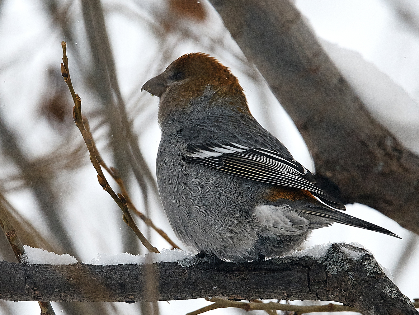
This is my first Pine Grosbeak taken using a new Jobu gimbal with my Nikon D800e + Sigma 150-600 S combo. The gimbal makes it a joy to shoot fast moving wildlife.
-

affinity designer Flamingos illustration / wallpaper
GarryP replied to Francky's topic in Share your work
I agree with Kasper-V. The colours, composition and level of detail are great. It's also very nice that you have taken the time to make all of the birds different, rather than just making copies. The only thing I would add is that it might be better if the clouds tapered to a point at the bottom of one side to make it look like they are being pushed along by the wind, rather than just being static. I think that would add a little more "movement" to the image. As an extra added detail, you could try and find out whether flamingos would - or would not - fly into the wind as that could tell you which side of the clouds to taper (tapering the side into the wind). All-in-all though, nice work.- 11 replies
-
- 1
-
-
- flamingos
- illustration
- (and 7 more)
-

affinity designer Pouting Lips (AD)
VectorVonDoom replied to VectorVonDoom's topic in Share your work
Yes I know, I can't think when I wouldn't want it checked. If I scale the artwork I want my blurs scaled too or it changes the look. I don't really use any other effect. But it does sort of become second nature to check the box before setting anything. Perhaps when scripting comes along we can just do a little script to go through everything with an effect and set it checked in code. I think I read a while back (can't remember where, not here) that it was planned for this year but that doesn't seem likely now even in beta. -
Hi Stuart, Thanks so much for the tips. I'll definitely try them. I try to use translucency of black and a darker version of the main colour I am using, just as I see in nature. I'm not sure if this is the right thing to do though. Hahaha I have been using the effects panel a lot lately to experiment so that's a great tip. Oh, rubs hands in glee, vector brush ftw. I do have a tablet which I bought a long time ago but never used. I will search for it in the garage and try it. How exciting. Thanks so much for your help Stuart. I'm so excited about my new world of discovering art.
- 9 replies
-
- 1
-
-
- vector
- illustration
- (and 1 more)
-

affinity photo AP • Long Lens Mentoring Class
GMPhotography replied to Kodiak's topic in Share your work
Not sure if this is open for others to post photo's or not, the description is kind of vague. But thought, "Hey, why not show a landscape taken with a long lens" Seeing as long lenses are usually used for wildlife or for portraits that require that extra punch. Anyway, this was taken at 300mm using a tripod. DTRPano by Greg Murray, on Flickr -
affinity photo No AP "2" • Birds in First Snow! —picture heavy!
Kodiak replied to Kodiak's topic in Share your work
• Thanks RamaBot! It is 1221 as of this morning… groovy! This observation was brought to me before, maybe even in a other thread and I addressed that saying: "As a photographer —and on this forum more a wildlife photographer— I use AP's inpainting, healing, and clone brushes to remove debris or anything that is not contribu- ting positively to the final rendition of a picture. Most of my post-production is done in Capture One (great RAW con- verter but not a pixel editor). For pixel editing, since I do not use ANY adobe products anymore, my chosen app is Affinity Photo… very pleased with the results so far! ;) As SrPx wisely put it: —"To each his own, but 819 views is already a deep reverence to your work.... :) Take it as silent, deep compliment... Words do not always say everything... Glad you like them! -
affinity photo AP • Dabbler duck : Mandarin female
Kodiak replied to Kodiak's topic in Share your work
• Thanks for your comment Aeros4 Here are some important points… Take good care to capture your subject, recording properly all its data within the DR of your sensor. Read the RAW file to fully restitute the recorded data with fist correct DRL, and then WB. These two steps should reveal most of the quality of your cap- ture… and are the base of my cooking. Now, the tricky part! One has to restore and render an organic image recor- ded by a mineral sensor. This is the seasoning part of the "cooking" where tasteful tweaks will do their magic… like micro contrast and micro saturation, mid-tones ta- ming and others. My workflow, for studio sessions, location works and wildlife, aims at the "closest to reality" look of the capture. I hope that helps! DR = Dynamic Range DRL = Dynamic Range Levels = black and white points setting. WB = White Balance -
affinity photo AP • Dabbler duck : Mandarin female
Kodiak replied to Kodiak's topic in Share your work
Thanks and welcome for that! …the drake, yes! Males have, generally, more spectacular plumage bird wise. Still using Capture One v10 as RAW converter for all my PP and Affinity Photo as pixel editor. I render to the strict quality that was seen. I would never manipulate a wildlife shot but I do use AP to clean debris that do not contribute to the visual quality of a take. -
affinity photo AP • Wild Coots in Natural Theatrical Light Setup.
Aeros4 replied to Kodiak's topic in Share your work
I presume, Aeros4, that you have experience in wildlife photography with such a comment! Yes Kodiak, but my first love is representational painting of animal and human subjects. Increasing my skills in photography, also helped me better understand the dynamics of light, (this is what I see in your work, like Mathis, you paint the light) so it was a symbiotic path forward, I am very excited with the release of the Windows version of AP. I especially like the inpainting feature. This is a major event, a company like Serif has long been needed to provide healthy competition and has changed the landscape for everyone in photography and all forms of image making. I wish them all the success their business model deserves. I look forward to seeing more of your very inspiring work. Bon chance Monsieur. Flickr......https://www.flickr.com/photos/aeros4/sets -
affinity photo AP • Wild Coots in Natural Theatrical Light Setup.
Kodiak replied to Kodiak's topic in Share your work
• I presume, Aeros4, that you have experience in wildlife photography with such a comment! :) Thanks for your appreciation! -
I knew of shooters trying their best to make their own life miserable but I never heard it could go so far! :( The T-stop is a measure of the light that is reaching the sensor, used in video production. The ƒ-stop, used by photographers, is a relative mea- sure of the light going through and is lens dependant. Most of the bird/wildlife shooters I have met don't even bother with that stuff as the subject and the light condi- sions have all our attention. On the other hand, I am just a photographer with no tag like birder or else… just trying to do everything the only way I know: the best I can! —"…a user-related thing"? May well and legitimately be but in my case, nothing is worth more than the ultimate rendition of the RAW data and Capture One Pro is the converter closest to what I was looking for since I work in the hight end of publishing/printing. Maybe someone someday will outperform my actual set of tools but Affinity RAW is not yet there I think … too close to the lightroom approach! So I understand you perfectly!
-
Most of the bird/wildlife shooters I have met here are 'scoping' (using an iPhone mount on a scope) and claim it is mostly because of the difference in T-stops. A scope, they say, just lets in that much more light. Is that something you have tried; any opinion? ... Admittedly, I sometimes still compare the RAW conversion from Aperture with that of AP and often prefer that of Aperture; but this could be a user-related thing.
-
I love drawing wildlife and have found Affinity for Windows Beta fantastic for doing this type of work. I am so impressed. I have done a lot of drawings but only now plucked up the courage to put one up here.
-

affinity designer Illustraion - After I Quit 996
Don Lee replied to Don Lee's topic in Share your work
It's a bush effect. you can buy it on Affinity Store, Frankentoon - Concept Master (Nature B - 260). -
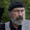
Good morning folkies! A new eejit is here just for you (just you!) Meet eejitus sunflooweris - a creature who is friends with nature and all creatures great and small. Like a ray o’ sunshine However, wrong him or it’s friends and you’ll see it’s not-so-sunny side!! George P.S. Forgive the selfless self promotion, but I would LOVE to have you visit the eejits Patreon page. I upload loads o’ exclusive sketches and posts. Plus there are some FANTASTIC rewards posted out to members each and every month. Gee it a look over at www.patreon.com/eejits