All Activity
- Past hour
-

When can we finally expect RTL support?
AliMu replied to -TR-'s topic in Feedback for the Affinity V2 Suite of Products
This is not a valid statement if there is a system in place where an official or semi-official response notifies you that your request is on the roadmap, or if they can't fulfill it due to certain limitations. The point some people are missing is that such a system doesn't exist :). -

Affinity Publisher loopt steeds vast
Alfred replied to AvdB's topic in Affinity on Desktop Questions (macOS and Windows)
Google Translate: Google Translate: -

The 72 DPI thing
antoniomcluis replied to antoniomcluis's topic in Affinity on Desktop Questions (macOS and Windows)
Thanks markw, the nikon d7500 - 5600x3728; the Fuji - 6246x4170. I know I can change this in the document menu!? (I only use affinity for photography), but the workflow is hampered as I have to repeat this process for all the photos that come from the Fuji. I really don't understand how one camera is interpreted one way and the other another. -

When can we finally expect RTL support?
-TR- replied to -TR-'s topic in Feedback for the Affinity V2 Suite of Products
Just my 2c. I should note that I disagree with that statement. It's like saying that if the people are demonstrating against their government in one city, they shouldn't demonstrate in any other city. If something is sufficiently important for people, they should make their voice heard and noticed. Adding to the same ancient and winding thread, which may be already overloaded and overbloated, may not be the right choice for everyone. But I absolutely agree that the opinions on this do vary. -

App crashes when using the PLACE command
Hangman replied to Eric1701's topic in V2 Bugs found on Windows
Hi @Eric1701, Thanks for confirming... I'm still looking into your file as I would like to figure out the cause of the problem so I will update the thread if anything does eventually come to light... -
 Hangman reacted to a post in a topic:
App crashes when using the PLACE command
Hangman reacted to a post in a topic:
App crashes when using the PLACE command
-
PaoloT reacted to a post in a topic:
Multiple page sized in a book
-
 When placing or moving elements (text boxes, pictures, etc.) beside the work surface, they should still be visible. Hiding these should then be possible preview mode. I usually move objects aside so I can work better on my working surface. It’s annoying to have to guess for the right ones in the hidden side area 🤦♂️
-
Where is bleed option after document is created?
Alfred replied to Calis's topic in Affinity on iPad Questions
Whether on special offer or not, the ‘Affinity Collection’ in-app upgrade gets you all three apps for the price of two. The current sale ends on August 15. -
 Max3 joined the community
 -
Alfred reacted to a post in a topic:
Where is bleed option after document is created?
-

Affinity Publisher loopt steeds vast
Pšenda replied to AvdB's topic in Affinity on Desktop Questions (macOS and Windows)
Možná by bylo vhodné poskytnout "padající" soubor, aby se dalo posoudit, jestli je příčina v souboru (nějaká specifická funkce nebo jejich kombinace), nebo jde o nějaký problém u vás (kombinace PC a instalace aplikace). Jinak vám těžko někdo poskytne nějakou radu, než klasické - zkusil jste vypnout HW Akceleraci v nastaveni aplikace? -
Printing in Photo 2
Alfred replied to fotofinn's topic in Affinity on Desktop Questions (macOS and Windows)
-
 NotMyFault reacted to a post in a topic:
Just for fun - Just a smoke
NotMyFault reacted to a post in a topic:
Just for fun - Just a smoke
-
Hi StuartRc, I love 'Poison II'. It is so beautiful! The red sky filled with the dark foliage of the background shrubbery and the orange toadstools is very evocative. Your work has evolved since I saw your earlier work (which must have been archived in Affinity Designer v1 because I can't find it now). It's really interesting to see the development in your graphic design style and artwork, which is really creative and quite exquisite. And the fact that you have uploaded your colour palettes for other Affinity Designer users is really kind of you. Keep creating... 🙂 DelN
-
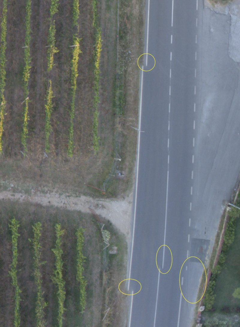
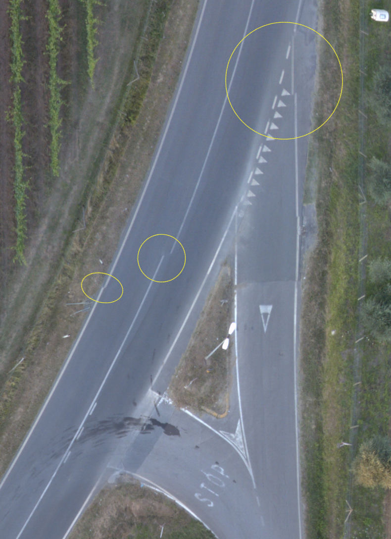
 Hello, I've recently started creating, or at least gathering the data and images for orthographic imaging from my drone. I have used to the Affinity photo app panoramic stitching within the app with some decent results. What I am finding is a lack of editing ability (or atl least the ability to see and understand the overlaps and adjust them effectively. As an example I am finding that there are very basic alignment issues that end up being a bit complicated to adjust. It is a 24 image ortho with about 70% overlap. I would like to use Affinity to generate these images. Thanks! David
- Today
-
 Westerwälder reacted to a post in a topic:
Cannot edit ESP or JPEG files downloaded from Shutterstock
Westerwälder reacted to a post in a topic:
Cannot edit ESP or JPEG files downloaded from Shutterstock
-
 Help. Bij het werken aan een nieuw bestand loopt mijn Affinity Publisher steeds vast. Wat is hier aan de hand. Ik werk op een ASUS Vivobook met Windows 11. Vanmorgen heb ik een nieuw Word-bestand ingelezen in Publisher. Bij het nalopen van de tekst, loopt hij nu steeds vast. Uw reactie wordt zeer op prijs gesteld.
 -
 T.KIck joined the community
 -
 Watch the paint dry… watch_the_paint_drying.mp4 It is hard to educate an opinionated mind. But once again: I do not think that there is anything wrong with the EPS part of an Illustrator EPS file (it has never failed us during the decades we have been in this business, nor has the EPS format created by CorelDRAW); for any practical purposes we have had, it appears to be as standard as can get and in practice we still always export vectors we create ourselves as Illustrator or Corel EPS to be imported in page layout. An EPS file may be complex and beyond another (non-professional) app’s capability of rendering or even passing it through correctly, or converting it competently to app’s own native format, and it may have low quality parts because it has been created with sub-standard settings, e.g., using too low rasterization PPI if there are transparencies and they are chosen to be flattened using rasterization instead of applying vectors. As always, Adobe apps allow the user to define how the document is flattened, whether fonts are converted to outlines, etc., and this may be beyond comprehension and skills of some users… But it is not a fault of the format itself. Any app that produces “true” EPS would need to do similar things, but not all apps allow selective flattening and doing transparency (incl. blend modes) flattening retaining vectors (e.g., Affinity apps always just rasterize transparencies, and much else that by definition does not require it, but could be retained as vectors). Similarly as certain kinds of PDFs, EPS files need to have non-compatible features processed in a way that makes them printable, and this can be done poorly or well, but your posts seem to imply that an Illustrator EPS file with its EPS content is itself somehow “not true EPS” in coding, and requires knowledge about proprietary AI file format to be processed as vectors in the first place, and the file content is otherwise available only as raster images. This is just nonsense. Perhaps a TIFF file with custom extensions is not a “true” TIFF file, either, or a PDF file preserving Illustrator editing capabilities, a “true” PDF file, either? These file formats are created in a way that allow extra features (when not intentionally or by specific standard stripped); the parts that are extraneous and proprietary are simply just ignored by apps that have no use for them, but they do not interfere the interpretation of standard parts. You would probably not suggest (as a first aid) that when a user cannot have a supposedly vector format drawing in editable format when they open a PDF file that they might have opened a PDF that has Illustrator editing capabilities preserved in it (and therefore a proprietary PDF, not a “true” PDF)? My boring video clip tries to prove this by comparing opening of the same EPS file in Inkscape, CorelDRAW and Publisher. All three apps basically interpret the file correctly, but Publisher just makes one error which renders the whole document useless. This is basically not a problem because the file has its EPS part in editable vectors, but it is clear that this kind of file, when included encapsulated in a PDF production file (a thing that is often done for EPS files, similarly as PDFs that are placed to be passed through), would be disastrous, so whoever purchases such an EPS file would need to have a vector editor to be able to fix the issue. Placing this same file in an app that allows passing through an EPS file within a production PDF (e.g. in InDesign), without interpretation, would not cause any issues. If this does not convince you, you are welcome to stay out, since what I mention can be reproduced with any Illustrator EPS file. Go get one from a well-known vector stock site and see. You probably won't experience rendering issues because they are pretty rare also when using Affinity apps (if you do not count EPS features that Affinity apps just do not support). If there are rasterized parts, they are ones that the contributor has chosen to make EPS compatible that way (rather than preferring 100% vector format), or because Affinity app has rasterized them when interpreting the file; they are not rasterized because of "non-standard" EPS format.
 -

Performance issues with V2 Photo
cgidesign replied to jlpollard's topic in Affinity on Desktop Questions (macOS and Windows)
That's a pity, it helped another user some time ago. Two other things come to my mind: - Reduce the RAM usage to about 16 GB (I assume your system has 24GB) - in some cases users reported that setting the RAM usage below the value of installed ram helped with performance issues. - If you have installed the MSIX variant of the Affinity apps, uninstall them and use the MSI/EXE variant instead. Uninstalling of the MSIX can be done via Windows settings -> apps. The default download is offering the MSIX installer. MSIX installs apps as a container that is separated from the OS (this is called "sandboxed"). This can cause issues with user rights, file system access etc. (google for it to read about advantages and disadvantages of MSIX). -
 How can I add affinity apps to GeForce experience for optimization? When i click "Scan for games and apps" programs do not appear in the list My laptop: ASUS VivoBook Pro 15 OLED K6500ZC-MA228W Core i5-12500H | 15,6"-2,8k | 16GB | 512GB | W11H | RTX3050 |
 -
 well, it depends on the quality you need, but one of the best vectorizers I have seen is the online vectorizer “Vectorizer.ai” here the Link https://vectorizer.ai/
 -
Fun Art Sam reacted to a post in a topic:
Selecting locked layers
-

Complex Shapes in Designer
Josh H replied to Josh H's topic in Affinity on Desktop Questions (macOS and Windows)
He mentioned a stroke width tool, but I guess that affinity has one now. When he was doing the Olympic rings that overlap, he had a special tool that allowed him to remove those strokes easily. He used quite often the “expand” tool, which made everything editable (maybe that’s Affinity’s concert to curves). A lot of tools allowed him to have a very efficient workflow. I’m hoping that I can have a similar workflow experience in Affinity. -

Printing in Photo 2
fotofinn replied to fotofinn's topic in Affinity on Desktop Questions (macOS and Windows)
Thanks -
 syyong joined the community
 -

Complex Shapes in Designer
carl123 replied to Josh H's topic in Affinity on Desktop Questions (macOS and Windows)
Logo number 7 (Toyota) requires use of the Stoke Width Tool which Affinity now has Logo number 9 (Woolmark) uses the Blend Tool in the video which Affinity does not have (as yet) but it should still be doable using Designer without this specific tool -
LKINNEY reacted to a post in a topic:
Create New Layer 'Below?'
-

Performance issues with V2 Photo
jlpollard replied to jlpollard's topic in Affinity on Desktop Questions (macOS and Windows)
They're not. I actually started a completely different stack and it acted up on the first stretch in levels. -

App crashes when using the PLACE command
Eric1701 replied to Eric1701's topic in V2 Bugs found on Windows
When I start a new book I create a completely new file, set up some basic layout options and then create new styles as needed during writing. All the editing is done in that file, though of course the revision number changes throughout the process. The process you give me above is actually something I have never done and I feel can be quite helpful in the future, so thanks for THAT! I appreciate you looking in to this. Next time I run in to this issue I will give the above a try and see what happens. Thanks so much for your time in looking at this! Eric -

Complex Shapes in Designer
DonC123 replied to Josh H's topic in Affinity on Desktop Questions (macOS and Windows)
In the video, the fellow is using illustrator, not InDesign. Affinity Designer is the equivalent, software-wise. I flipped through the video and didn't see anything that could not be done using similar techniques in Affinity Designer. The shape builder tool addition in the latest builds ensure that this is the case. Since they are different programs, things will not always be approached quite the same, but that is no different than say using TurboCAD as opposed to AutoCAD, or other such comparisons. Try them all in Affinity Designer. If you get stuck, someone here will show or explain the different method required.
-
To reproduce: On Windows 11, copy an image to the clipboard Start Affinity Photo 2.5.3 and go to "File > New from clipboard" The app crashes immediately.
-
How do I do that?