PaoloT
-
Posts
1,538 -
Joined
-
Last visited
Recent Profile Visitors
17,808 profile views


-
 Snapseed reacted to a post in a topic:
Too quiet …
Snapseed reacted to a post in a topic:
Too quiet …
-
PaoloT reacted to a post in a topic:
Too quiet …
-
PaoloT reacted to a post in a topic:
Too quiet …
-
PaoloT reacted to a post in a topic:
Epub suport export
-

Exporting into IDML please?
PaoloT replied to StrixCZ's topic in Feedback for the Affinity V2 Suite of Products
The most typical case that would be comfortably solved by having IDML export in Publisher. 1. Export the page layout document as an IDML file. 2. Create a new project in the CAT software. 3. Load the IDML file, and let the CAT software segment it. 4. If you have the translation of a previous, similar project, align it with the imported and segmented IDML file. 5. Be happy translating the missing or slightly different segments, correctly aligned sentence by sentence. 6. Compile the translation as an IDML file. 7. Open the translated document in the page layout program, with everything in the right place. The alternative: 1. Extract the text from a PDF file. 2. Translate it without support of translation memories. 3. Apply the styles again. 4. Load it into the page layout program. 5. Rebuild the original document by reimporting the images, creating the links again, adding any variable. 6. Ask an exorbitant price for the work, that took an uncountable number of hours more; or 7. Be competitive, and ask a price that will not cover the time you spent on that work. Paolo -
PaoloT reacted to a post in a topic:
Exporting into IDML please?
-
Exporting into IDML please?
PaoloT replied to StrixCZ's topic in Feedback for the Affinity V2 Suite of Products
They are a bit more than text, since they also contain text styles, links, images, variables. DOCX is an interchange format for complex documents, that can be interpreted by several different programs. That's why it is so important, and it allows interoperability between different programs, not at the exclusive advantage of Microsoft. Paolo -
Exporting into IDML please?
PaoloT replied to StrixCZ's topic in Feedback for the Affinity V2 Suite of Products
I'm not totally sure that someone receiving my documents made in Word would be too happy to open them in Google Docs as a PDF instead of a DOCX file… -
Exporting into IDML please?
PaoloT replied to StrixCZ's topic in Feedback for the Affinity V2 Suite of Products
Over 60% of wordprocessor users are now using online tools. Google Docs makes nearly three times the traffic of Microsoft Word. Among the remaining 40% of users, still preferring a desktop app, Word still gets over 50% of the market. Percentages vary depending on the country (LibreOffice, for example, has a larger use in Europe than in North America). I've never found complete, factual statistics, but everything seems to led to an ongoing change in the market. Paolo -
SDLeary reacted to a post in a topic:
Add Markdown file support
-
SDLeary reacted to a post in a topic:
Add Markdown file support
-
PaoloT reacted to a post in a topic:
PLEASE FIX Affinity exporting quality image results
-
PaoloT reacted to a post in a topic:
Cross-references not imported from IDML files
-
New document bug. Formats are missing A2, A1 and A0.
PaoloT replied to Designer1's topic in V2 Bugs found on Windows
That's a very strange omission, considering how much Affinity is promoted among the architects. Paolo -
Oufti reacted to a post in a topic:
Cross-references not imported from IDML files
-
PaoloT reacted to a post in a topic:
Affinity for Professionals - what is needed
-
Hi, When loading IDML files to Publisher, cross-references are replaced by – nothing. It would be ideal to have them translated into the Publisher's equivalent. If not immediately possible, it would be desirable to at least insert a placeholder, to prevent having the missing link going lost. Paolo
-
 Ldina reacted to a post in a topic:
Feature Request: Fully customizable toolbar
Ldina reacted to a post in a topic:
Feature Request: Fully customizable toolbar
-
 ItsMeAlex reacted to a post in a topic:
Feature Request: Fully customizable toolbar
ItsMeAlex reacted to a post in a topic:
Feature Request: Fully customizable toolbar
-
ItsMeAlex reacted to a post in a topic:
Feature Request: Fully customizable toolbar
-
PaoloT reacted to a post in a topic:
[feature request] Export same format at multiple sizes in batch
-
Alfred reacted to a post in a topic:
Feature Request: Fully customizable toolbar
-
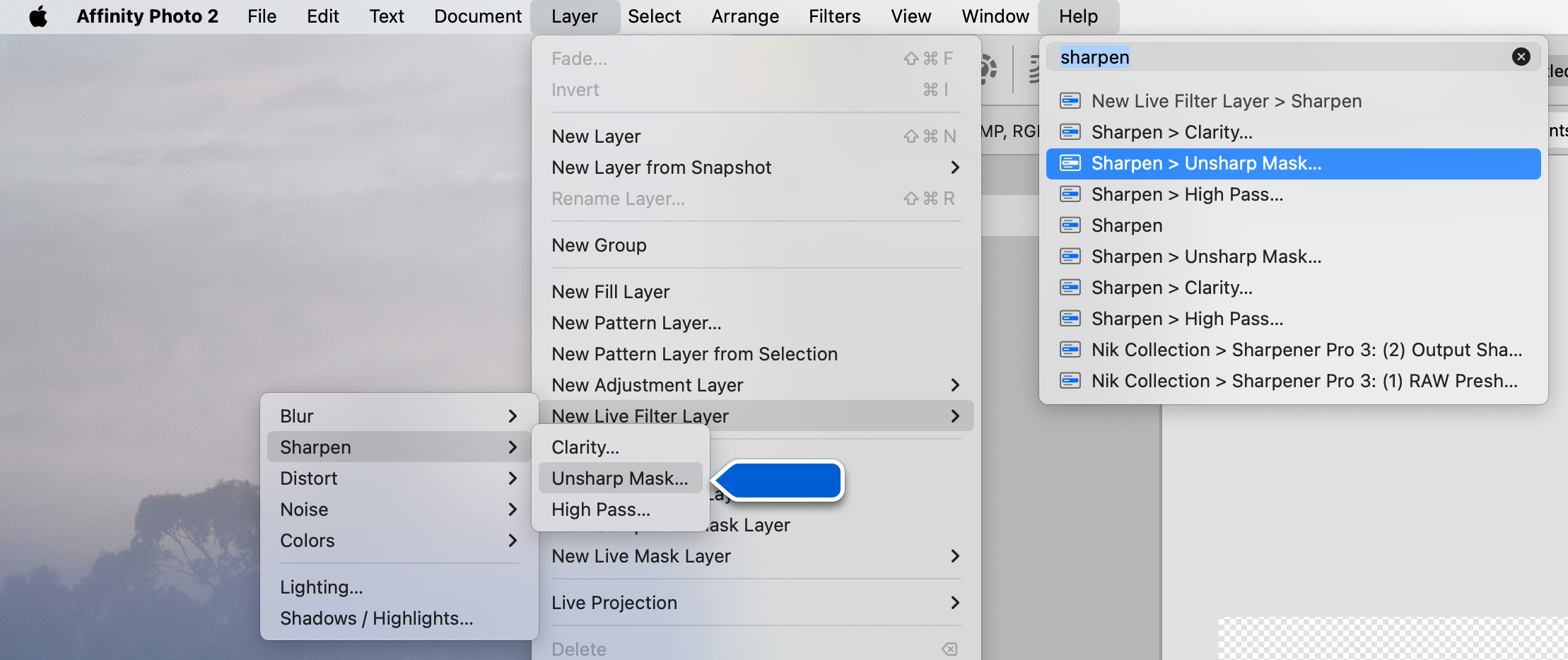
It's a different thing. This feature on the Mac is not just showing you an help page, but it is choosing the command for you. For example: Since I'm one who sometimes forgets where I parked my car, I like this thing a lot… Paolo

-
Yes, I guess it is a system-level feature on the Mac. Paolo
-
Video Editor...?
PaoloT replied to leec2024's topic in Feedback for the Affinity V2 Suite of Products
I'm extremely happy with iMovie. In the past I had Final Cut Express, then Premiere; I have DaVinci Resolve installed; but nothing lets me create some quick videos as fast as iMovie. Love it. Paolo -
On the Mac, one of my preferred features is the Search field in the Help menu. Type the name of a command, and it will appear highlighted and ready to be chosen by pressing Return. Paolo
-
PaoloT reacted to a post in a topic:
Too quiet …
-
Ian Sayers reacted to a post in a topic:
Too quiet …
-
Welcome Ian. I hope we will see Spotlight shine again! Paolo
-
PaoloT reacted to a post in a topic:
Too quiet …
-
SrPx reacted to a post in a topic:
Too quiet …
-
The aforementioned director's report of December 2023 directly alludes to integration of the staffs. It would be surprising if they wouldn't share knowledge and technologies. Machine learning being the most evident of them.
-
The only official statement I saw is that the staff was not reduced. At the same time, the merger has given Affinity a lot more personnel from Canva. I guess the new subject and object selection is technology inherited from the new labs. Paolo
-
We are live, and thank you!!!
PaoloT replied to Ash's topic in [ARCHIVE] 2.5, 2.4, 2.3, 2.2 & 2.1 Features and Improvements
From the company report: "The biggest risk is ensuring the integration of the two companies is successful. We are already over the most challenging initial period of integrating systems, people and working practices which has gone very well. This is not something we are taking for granted […]" I guess the main issue, in integrating the staff members, has something to do with the language… -
Since the acquisition, we have only seen minor things, like native Windows Arm64 support, variable fonts, QR codes, AI selection, multi-page spreads, preliminary work for ePub export, improvements in pencil and stroke drawing… Development is clearly dead!