Oufti
-
Posts
1,584 -
Joined
-
Last visited
Recent Profile Visitors
11,301 profile views


-
 Oufti reacted to a post in a topic:
Table of contents out of order, incorrect numbering, and my hopeful formatting goal
Oufti reacted to a post in a topic:
Table of contents out of order, incorrect numbering, and my hopeful formatting goal
-
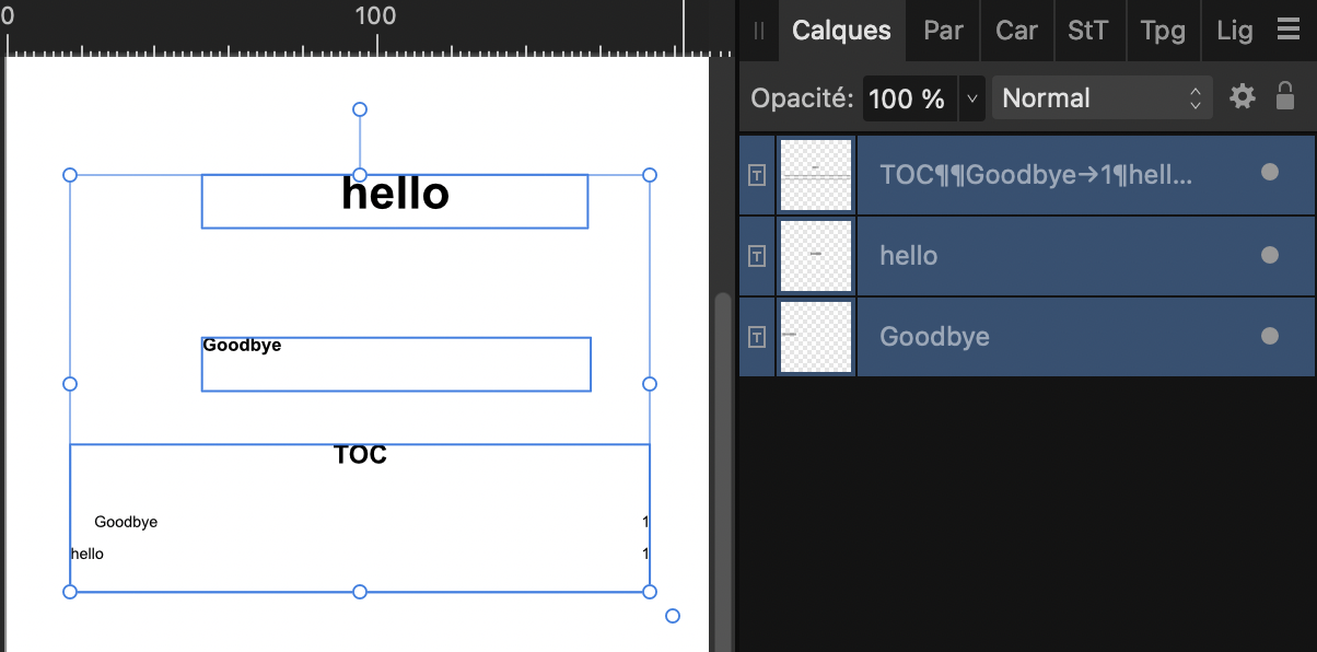
I guess this is probably because Headings 1 and 2 are in two different text frames and H2 is below H1 in the Layers panel. TOC doesn't understand H1 and H2 nor their respective place on the page layout but relies on the respective place of the frames in the Layers/Calques panel (menu Window), reading from bottom to top. Changing this order in the Layers panel (in the Master Page if you use them) will correct this. For the rest, I don't have immediately an idea where it comes from…

-
 Oufti reacted to a post in a topic:
Problems printing processed photos
Oufti reacted to a post in a topic:
Problems printing processed photos
-
Urgent Export Issue in Publisher with Onboarding Packet on iPad Pro
Oufti replied to kbyers's topic in iPad Questions
I have tried to export your file from my Mac. After a very long time, it seemed to be stalled, so I tried to locate the difficult part by halving successively the export: export of pages 1-7 was very long (more than 20 minutes) but succeeded. Export of pages 7-14 resulted twice in a crash after a similar time. It could be interesting to try again reducing the attempt to pages 7-10 and 10-14 but I don't have more time for this now. Crash log is joined. Crash Log.rtf -
Oufti reacted to a post in a topic:
Convert to Curves not working properly + Undo "Convert to Curves" not taking effect
-
Oufti reacted to a post in a topic:
"Convert to curves" on multiple objects breaks/scatters objects, breaks undo functionality, and leads to crash
-
I have no explanation for this but instead of cmd-Z, you can also go back in the History panel (menu Window). Sometimes, it helps to better see where we are in the succession of actions…
-
Marathon1908 reacted to a post in a topic:
File created in Mac opens significantly differently on PC
-
It depends on how you structured your Text styles. If they are based in cascade on other styles, it's easy to change the base style(s) and have your other styles modified the same way. https://affinity.help/publisher2/en-US.lproj/pages/Text/textStyles_create.html https://medium.com/@ElaineGiles/looking-to-save-time-in-affinity-publisher-theres-a-stylish-secret-to-that-9903d9fb51ee
-
Oufti reacted to a post in a topic:
Wave Pattern without using the Pen Tool - Affinity Designer
-
Oufti reacted to a post in a topic:
Wave Pattern without using the Pen Tool - Affinity Designer
-
iwans reacted to a post in a topic:
Corrupted .afpub file — urgent client project (Mac, Affinity Publisher)
-
Oufti reacted to a post in a topic:
bug publisher le texte s'efface quand on applique un style
-
Before trying to solve this, I would evidently make a copy of the file and work on it. Just in case of… It could also be helpful to post here a screenshot of the whole window with the Layers panel open and unfolded. Please activate also Show Text Flow in the View menu. The problem is possibly that you have multiple Master Pages applied on the same page.
-
Oufti reacted to a post in a topic:
Limited and inadequate meta data editing for Affinity Photo
-
Oufti reacted to a post in a topic:
Affinity PHOTO export to .bmp *HELP*
-
 Oufti reacted to a post in a topic:
Make the Status bar hints scrollable (for small screen usability)
Oufti reacted to a post in a topic:
Make the Status bar hints scrollable (for small screen usability)
-
R C-R reacted to a post in a topic:
Blurry text on screen while creating image
-
R C-R reacted to a post in a topic:
Affinity PHOTO export to .bmp *HELP*
-
I see that this problem has been tagged AFD-6178 in a topic for iPad:
-
Old Bruce reacted to a post in a topic:
Blurry text on screen while creating image
-
Blurry text on screen while creating image
Oufti replied to creativeguru's topic in Desktop Questions (macOS and Windows)
Worth to note that if the text appears blurred in Affinity Photo, it's saved as vector and is crisp when viewed in Designer or Publisher or when it's exported in formats that support it (like PDF). -
HCl reacted to a post in a topic:
Affinity PHOTO export to .bmp *HELP*
-
Affinity PHOTO export to .bmp *HELP*
Oufti replied to Max Mitty's topic in Desktop Questions (macOS and Windows)
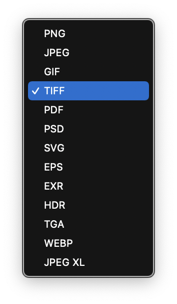
EMF, as WMF and BMP are formats from Microsoft and don't exist on Mac. Here are the Export formats for Affinity on Mac: For the conversion, I would personally use Graphic Converter. Initially dedicated to this task, it's now known as a Swiss army knife for image treatment. It's a shareware that you can test for free but I think it's worth its reasonable price.
-
Snapseed reacted to a post in a topic:
extremelly beginner-unfriendly software
-
amoraleite reacted to a post in a topic:
Color Vector and Bitmap to print CMYK.
-
Layer Panels| Scroll Bar Hides Layers' Color Codes
Oufti replied to Gotchi's topic in Desktop Questions (macOS and Windows)
Yesterday evening I left a navigator tab open on this old topic, wondering if it was worth to bump it with a link to this one or post a feature request (probably not a bug report?) about this small problem. Given your experience on these forums, I would be interested to have your advice, given that the problem was sort of acknowledged by a staff member. -
matisso reacted to a post in a topic:
Corrupted .afpub file — urgent client project (Mac, Affinity Publisher)
-
Alfred reacted to a post in a topic:
text tools suddenly disappeared or grayed out (designer)
-
@Louise Cloutier This help page will help you to learn the names commonly used for various parts of the user interface: https://affinity.help/designer2/en-US.lproj/pages/Workspace/interface.html And this one is a very good starting point for the rest: https://affinity.serif.com/learn/designer/desktop/quickstart/ (I hope it will match your language… I've had to tweak its URL, otherwise it was in French). You can also retrieve this page through the Help menu in Designer > "Quick Start Guide"..
-
Drag and drop it where you want it. (It's a bit capricious… You'll probably have to circle around near the place you want until it gets blue or the place "opens", then drop it.) If you want to move only one tab, drag it by its label. If you want to move the whole group, fetch the || .
-
You must have a dropdown menu named Gray [in fact it's called Greyness in English] where you can choose RGB instead…
-
They are there in your screenshot. Just look at the edges & midpoints of the blue bounding box.
-
Making a screenshot and posting it here is really fast and easy. If you're using a Mac: Press Control+Command+Shift+3 and paste in the forum answer dialog. For Windows, I think there is a keyboard button Print Screen but I don't know more…
-
Have you tried to click on one of the buttons I indicated? It could bring back your familiar environment. If not, click back on the presently highlighted button…