Ldina
-
Posts
1,772 -
Joined
-
Last visited
6 Followers


Recent Profile Visitors


-

Colour Difference Bug - Procreate to Affinity Designer
Ldina replied to Elisheba's topic in V2 Bugs found on macOS
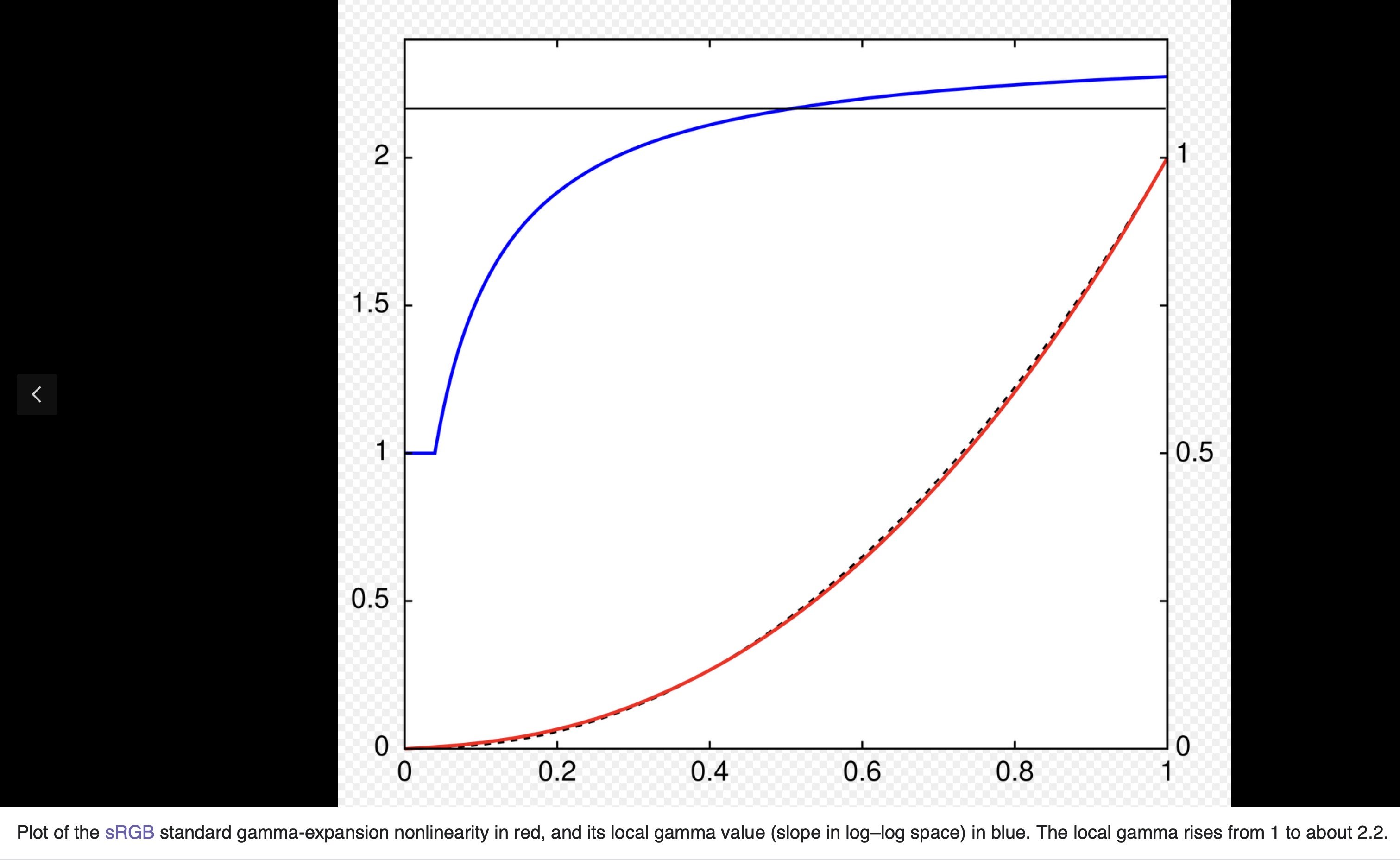
Maybe so...I'm always open to learning something new. Most of what I've read says sRGB closely approximates gamma 2.2, but since it doesn't follow the power curve exactly, it's an approximation over most of its range. "The sRGB color space standard used with most cameras, PCs, and printers does not use a simple power-law nonlinearity as above, but has a decoding gamma value near 2.2 over much of its range, as shown in the plot to the right/above. Below a compressed value of 0.04045 or a linear intensity of 0.00313, the curve is linear (encoded value proportional to intensity), so γ = 1. The dashed black curve behind the red curve is a standard γ = 2.2 power-law curve, for comparison."
-
Colour Difference Bug - Procreate to Affinity Designer
Ldina replied to Elisheba's topic in V2 Bugs found on macOS
Thanks...I know that the earliest versions of sRGB used a modified 2.4 gamma, but from what I've read, it is now 2.2 gamma, with a linear portion at the black end. Maybe I'm misreading it. Below is a link on the subject from w3.org. Also, a PDF from the ICC (color.org). https://www.w3.org/Graphics/Color/sRGB.html sRGB.pdf -
 Hangman reacted to a post in a topic:
Colour Difference Bug - Procreate to Affinity Designer
Hangman reacted to a post in a topic:
Colour Difference Bug - Procreate to Affinity Designer
-
Colour Difference Bug - Procreate to Affinity Designer
Ldina replied to Elisheba's topic in V2 Bugs found on macOS
Thanks for the feedback. I don't own or use Procreate. I'd be curious to play with a few files exported from Procreate. If you are interested, perhaps you can upload couple of PNG files from Procreate, one exported as sRGB and one as P3 (ideally the same file). You'd need to put them in a ZIP file to keep the forum software from stripping the profiles. I'd be glad to play around with them to see if I can find a method that retains the proper color numbers. If not, no problem. It's worth noting that 2.2 gamma is not identical with the sRGB tone curve. sRGB is 2.2 gamma, except at the dark end, where it was modified somewhat, I guess to mimic a CRT monitor's typical tone curve. But, 2.2 is a pretty good approximation for sRGB. Other color spaces (P3, Adobe RGB, etc) are 2.2 gamma by definition. -
Colour Difference Bug - Procreate to Affinity Designer
Ldina replied to Elisheba's topic in V2 Bugs found on macOS
I suspect something else is at play then. All that procedural texture filter does is convert a Linear file to 2.2 gamma. -
Ldina reacted to a post in a topic:
Colour Difference Bug - Procreate to Affinity Designer
-
Elisheba reacted to a post in a topic:
Colour Difference Bug - Procreate to Affinity Designer
-
 Morphy reacted to a post in a topic:
V2 is it a good alternative to PS?
Morphy reacted to a post in a topic:
V2 is it a good alternative to PS?
-
Hangman reacted to a post in a topic:
Colour Difference Bug - Procreate to Affinity Designer
-
Ldina reacted to a post in a topic:
Level 2: The Clariculus
-
V2 is it a good alternative to PS?
Ldina replied to Morphy's topic in Customer Service, Accounts and Purchasing
Thanks for the explanation. There are numerous tools in Affinity (different, of course) that I use when working to soften and even out skin. 'Negative' Clarity, Healing and Inpainting Brush, various blur filters, diffuse glow, Overlay or Soft Light layers, etc, and they can all be applied non-destructively, which I like. I can revisit and tweak them at any time, or even delete them if desired. You can save many such "edits" as a macro, then apply that macro to other images, with all your macro layers intact, allowing you to vary opacity, settings, etc. A one time Affinity purchase can be paid for in a few months of Adobe subscription, and the license is forever, so if you don't need to upgrade when version 3 is released, there's no need to rebuy it for features you don't need. You'll be eligible for all v2 upgrades for free. I think you have a 2 week money-back guarantee, but that's not a lot of time to get comfortable with a new interface and tools. Still, it's pretty inexpensive. If you're getting paid for professional work, it's a bigger decision whether to switch or not, especially if you need to collaborate with other designers who use the "Big A". I'm now retired, so there's no way I'm paying Adobe US$70/mo ($840/year) to use their software on an ongoing basis. Affinity suits me just fine. Let us know how things work out, and feel free to ask questions. There are a lot of helpful people on this forum. -
Ldina reacted to a post in a topic:
Images washed out on export to png/jpg (Designer iPad)
-
V2 is it a good alternative to PS?
Ldina replied to Morphy's topic in Customer Service, Accounts and Purchasing
I'm not sure what the "neutral filters" do, how they work, or how you use them, so I can't comment on that. There is probably a way to achieve the same effect, but I'd need to know more in order to comment. Others may already know what neutral filters are and do. I also work on a single monitor, but AP should work with dual monitors. Again, others will need to comment on that. I have done a lot of portrait work myself, and AfPhoto works fine for me...all the tools I need are there. When I used PS, I saved PSD files too because that was Adobe's "native" (and proprietary) file format and supported all PS features. In AfPhoto, I save to afphoto file format, which is Affinity's native file format and supports all Affinity features. I almost never save to PSD file format when using Affinity. Not all PSD features are supported or transfer to Affinity, and the opposite is also true...not all afphoto features are supported or transfer to Photoshop. So, when using Affinity I save to their native afphoto file format, then export to PNG, JPG, TIFF or whatever format I choose for sharing or other uses. It's worth noting that AfPhoto is a "one-at-a-time" photo editor, unlike a product like LightRoom, which is a database driven Digital Asset Manager. LR is good at synchronizing RAW development settings and banging out a bunch of proofs quickly. Affinity isn't a DAM and doesn't do that. You can utilize Batch Processes to do some of that, but it's not as easy or fast. Switching from PS to AP will probably require you to change some of of your workflows, and most people prefer to continue doing what they're already used to doing, using the tools they like and are familiar with. That's just the nature of things when you change software products. After a while, the new way is just as fast, and sometimes preferable. Sorry I can't answer all of your questions. -
V2 is it a good alternative to PS?
Ldina replied to Morphy's topic in Customer Service, Accounts and Purchasing
@Morphy It depends on the work you do. I have to work somewhat differently in AfPhoto than I did in PS, but all the tools I need are available and work fine. But, that's for the work I do. Some people have other needs, which may or may not be supported. For example, you can't currently export to BMP, AVIF, HEIC directly from AP...you'd need to use another app (many free ones available). It all depends on your workflow and needs. It works perfectly for mine. If you can describe what you do, others may be able to provide suitable feedback. Or, as Alfred suggested, try it out yourself, and if need be, get a refund. -
Colour Difference Bug - Procreate to Affinity Designer
Ldina replied to Elisheba's topic in V2 Bugs found on macOS
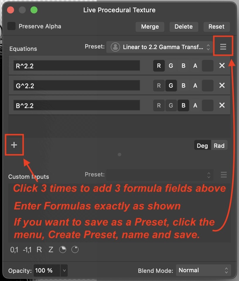
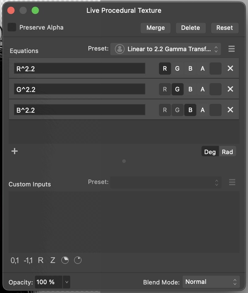
@Elisheba It's early here 'across the pond'. You sound like you have a workable solution, but I will try to give you a step by step using a Procedural Texture Filter, since you asked. Once created, you can save the filter as a Preset to quickly apply it to any other PNG files that are mistakenly opened as 32 bit linear files. One advantage is that you can do everything in Affinity Photo instead of opening the file in a separate App. The solutions offered by @Hangman should work great and may be preferable to you. To create and apply a Live Procedural Texture Filter (to correct Linear to 2.2 gamma)... 1. Open the PNG in Affinity Photo 2. If it opens as 32 bit Linear and looks washed out, go to step 3. 3. In the Layers Panel, click on the "Live Filters" icon (looks like an Hourglass) at the Bottom of the Layers panel, and select Procedural Texture. Alternatively, you can use the Main Menu...Layer > New Live Filter Layer > Colors > Procedural Texture. Either method opens the same exact dialog window. 4. When the Live Procedural Texture Dialog window opens, follow directions in Red below. 5. Once saved as a Preset, you can apply it quickly without having to retype the formulas, by opening the Live Procedural Texture Filter (Step 3), select the Preset from the Preset Dropdown (I named mine Linear to 2.2. Gamma Transform). Then click on the red dot in the upper left of the window to close the dialog window. This will add a Procedural Texture Live Filter Layer above your image, which will convert your file from Linear to 2.2 Gamma, and should correct the tonal rendering. You can then Export to TIFF or whatever file format you wish. TIFF export will retain transparency, whether you choose RGB or CMYK when exporting.
-
Elisheba reacted to a post in a topic:
Colour Difference Bug - Procreate to Affinity Designer
-
Colour Difference Bug - Procreate to Affinity Designer
Ldina replied to Elisheba's topic in V2 Bugs found on macOS
@Elisheba If Procreate cannot export a transparent TIFF, then export your file (with transparent portions) from Procreate in PNG format. Open PNG in Affinity Photo. If it opens up looking washed out (i.e., misinterpreted as 32 bit linear), then create a Procedural Texture filter with the following formulas, which should correct that problem. This converts Linear gamma to 2.2.gamma. Then after correcting the gamma problem, Export from AP to TIFF format. As long as your image contains some fully or partially transparent areas, they will be retained when exporting to Tiff file format. You can choose to export to RGB or CMYK. You will then have a TIFF file, with transparency, in your desired color mode.
-
Ldina reacted to a post in a topic:
I am outraged by Affinity behavior
-
 Komatös reacted to a post in a topic:
Erm. . .Just Follow the Instructions
Komatös reacted to a post in a topic:
Erm. . .Just Follow the Instructions
-
markw reacted to a post in a topic:
Erm. . .Just Follow the Instructions
-
StuartRc reacted to a post in a topic:
Erm. . .Just Follow the Instructions
-
Alfred reacted to a post in a topic:
Erm. . .Just Follow the Instructions
-
Ldina reacted to a post in a topic:
Erm. . .Just Follow the Instructions
-
AffinityJules reacted to a post in a topic:
Erm. . .Just Follow the Instructions
-
affinity photo Erm. . .Just Follow the Instructions
Ldina replied to AffinityJules's topic in Share your work
Nice…(what exactly are you smoking?? 😁) -
Ldina reacted to a post in a topic:
Erm. . .Just Follow the Instructions
-
Ldina reacted to a post in a topic:
Made some Texture assets (4k)
-
In version 2, it’s Window > Library.
-
Ldina reacted to a post in a topic:
A Lesson in Light Frequencies and Wavelengths
-
Ldina reacted to a post in a topic:
Why is some text black and some grey
-
Agreed!
-
Ldina reacted to a post in a topic:
end of affinity
-
Aren't they both important? A skilled professional can usually make do with a variety of tools, whereas someone less skilled will struggle even with the best tools in the world. Most professionals will avail themselves of the best tool(s) for the job, or at least one that doesn't completely limit their ability or vision. Some of that depends on the task at hand. One size doesn't necessarily fit all.
-
Thank you...maybe this will help provide a starting point. Designer is good for illustrations like this because it natively mixes vector and pixel elements. I typically start by outlining major elements in the Designer Persona (individual wings, bodies, antennae, background, etc). I'll put each major element in its own Container Layer. I typically use vectors quite a bit, especially early on, to help me outline those areas I want to work on, incorporating blurs, gradient and transparency tools, layer blend modes, etc., where needed. Where I have a lot of "mottled" areas, I sometimes use textured vector brushes, and I often use bitmap texture overlays or procedural texture filters to add some texture and variation, varying the layer blend mode, opacity, etc, for the desired effect (which often involves trial and error to find the right combination). When needed, I duplicate a vector layer/Group/Layer and rasterize it (converting it to a single pixel layer, retaining my vector elements as a backup), switch to the Pixel Persona (or Edit in Photo) to access other tools, such as Pixel Brushes, Smudge/Blur Tools, Filters, Procedural Textures, Masks, etc. The Smudge Tool is very helpful for softening hard edges or even adding tiny 'hairs' to wing edges by dragging with a small diameter brush (just a few pixels in width). The process varies somewhat for each image and evolves as I'm working, depending on what is needed. The process is time consuming and requires attention to detail.
- 21 replies
-
- 3
-
-
-
- affinity designer
- butterflies
- (and 2 more)
-
.PSD not moving to Affinity Photo 2 Well
Ldina replied to JaimeS193's topic in Desktop Questions (macOS and Windows)
@JaimeS193 PSD and AfPhoto are both proprietary file formats. Not all PSD features import into AfPhoto perfectly, and some PSD features may not be supported in Affinity at all. Certain things (gradients, masks, or whatever) are handled in different ways natively. In your first file upload, I checked not only the colored rectangles you created, but also the colors in your design, and they matched in both PS and AP. Another possible difference is that Adobe wrote their own printing module, whereas Affinity uses the Apple Print Engine (on Mac). I don't know how that is handled in Windows. A valid printing test is to open your Photoshop-created PSD into AfPhoto, and make NO CHANGES to the file. Then print. If that doesn't print properly, you'll want to inspect the file in AP and make sure all elements have transferred correctly from PS, i.e., adjustment layers, brightness/contrast, HSL, etc, and match what you have in PS. And they need to be toggled on (or off) in both apps. If the composite color numbers match, they should print the same. Your original file appeared identical to me (at least the same color numbers). I didn't check your last file upload. Did you make any changes to the PSD file after opening in AP? Adding adjustment layers to "match appearance" wouldn't be a valid print test. I can't help with printing from a PC (I'm Mac only). I have read some things about the latest Windows O/S update which 'may' impact color management, but Windows users will be better able to help. Incorrect print output could be print settings in Affinity, your printer driver, different printer profiles, or possibly settings in your OS. If the files have the same color space, color profile and color numbers, they should print the same. Sorry I can't help much when it come to printing from Windows.