Ldina
-
Posts
343 -
Joined
-
Last visited
Everything posted by Ldina
-
Thick stroke convert to outlines results in wonky chopped edges
Ldina replied to dantaylr's topic in V2 Bugs found on iPad
@dantaylr I don't think you do need those extra Nodes. I was able to create those angles by setting the "Join" value in the Stroke Panel to a bevel per the attached screenshot. Try this for the beveled edges, and if necessary, adjust the miter value. I also wondered about the scale being so small. Glad that worked for you, but the above may also work and be a simpler, more elegant solution (assuming the angles and sizes work for you).
-
Thick stroke convert to outlines results in wonky chopped edges
Ldina replied to dantaylr's topic in V2 Bugs found on iPad
@NotMyFault Good catch! I didn't zoom in close enough and didn't see those extra Nodes before expanding. 👍 -
Thick stroke convert to outlines results in wonky chopped edges
Ldina replied to dantaylr's topic in V2 Bugs found on iPad
@dantaylr I don't see a way to solve that either. Perhaps someone else does. I played with different stroke properties, miters, etc, but they all bombed when expanding the stroke. There are two possible workarounds I can think of (perhaps other, better ones exist)... 1. When you expand the stroke, it creates a lot of extra Nodes, which you can see when you select the expanded stroke with the Node tool. In the letter "S" in the attached screenshot, I removed the extra nodes in the upper left corner. It's those extra nodes in the beveled angles that seem to be causing your Palm Tree effect. 2. The other approach is to create your letters, as you have already done and use them as a template. On a new layer, use the Pen Tool to create a path, which you can fill with your desired color. Then delete your original fattened stroke. With either approach, once you have each letter completed, you can save them as Assets, in a resource file, and recycle them as needed. There may be better methods I haven't thought of.
-
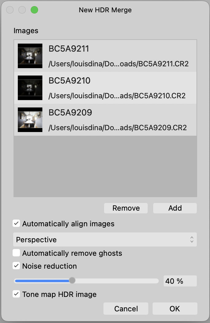
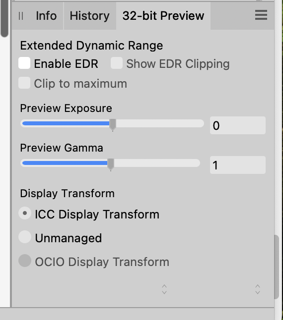
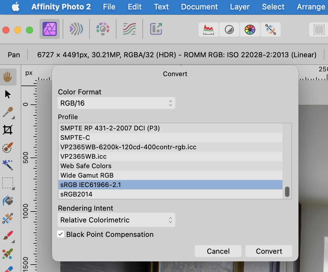
@Max89 OK...first, what is your final delivered file format going to be? Standard JPG, PNG, TIFF, 8 bit, sRGB, etc? If your final format will be, for example, an 8 bit, sRGB JPG, here's one workflow... Create a new HDR image, add files, and leave it per the attached screenshot, then click OK. This will import, align, noise reduce your RAW images and send your file directly to the Tone Mapping Persona. In the lower righthand Studio, you will see the 32 bit Preview panel. If your end product is a standard JPG (which only supports standard dynamic range, i.e., 0–1 values), make sure you have the same settings as shown below. Next, make whatever adjustments you wish to make in the Tone Mapping Persona to sculpt tonal range, color, saturation, etc. When you are happy with your adjustments, click Apply. This will deliver a 32 bit, linear gamma (1.0 gamma) file to Affinity Photo in your chosen color space (sRGB, Adobe RGB, etc...whatever you chose initially). This will be a single, flattened pixel layer. In the screenshot below, you can see that the Tone Mapping persona delivered a RGBA.32 bit HDR file in ROMM RGB to Photo. I'd immediately convert the file to 8 or 16 bit (both of which are 2.2 gamma and limited to 0-1 standard dynamic range). I'd also chose your final color space. sRGB is probably the best overall choice if you plan on posting images online. Document > Convert Format / ICC Profile. Below, I chose RGB/16 and sRGB. Now that you are in a file space compatible with JPG, PNG, TIFF, etc, feel free to "edit away", adding adjustment layers, live filters, or whatever. The appearance should be preserved when saving and exporting. Export to JPG, sRGB, etc. That should do the trick. Your final JPG will be 8-bit, sRGB and should match what you see in AFPhoto.
-
It confused me too at first. 32 bit HDR is a different thing and takes some getting used to. There are a few things that can trip you up, so it takes some experimenting and experience. But...it works.
-
32 bit always works in a 1.0 gamma space (scene referenced data). 8 and 16 bit are usually 2.2 gamma, which is display referenced and tried to mimic the way human vision compresses tones, which is far from linear (sRGB is fairly close to 2.2 gamma, but is modified). Like I mentioned, I don't do a lot with HDR and stick mostly to standard dynamic range...others on this forum are more knowledgeable than I am on the subject. The reason I converted to 16 bit immediately after doing the tone mapping was to enter a 2.2 gamma editing space. Then, all my adjustments, layers, etc, would behave themselves. A while back, I scanned some images with Apple Image Capture. It delivered TIFF files with a 1.8 gamma profile. I edited this in AfPhoto leaving it in 1.8 gamma. I added adjustment layers, etc. When I converted to 2.2 gamma, the image changed (this happens in Photoshop too). All those adjustment layers, filters, etc, apply ONLY to the gamma of the editing space you are in when applying them. So, when you convert the file with those layers still intact, the look different. I think the gamma change applies ONLY to pixel layers, not to adjustment layers, which are pure alpha. Anyway, I learned my lesson from that. If I know I will save to a 2.2 gamma, 8 or 16 bit format, I convert from 32 bit, 1.0 gamma, or 16 bit 1.8 gamma before adding adjustment layers. James Ritson knows this better than I do and probably explains it much better. Hope this helps (and I hope everything I said was accurate).
-
Haha..no surprise there! 😵💫 It's all fixable, which is the important thing, and you know what it looked like in person. James Ritson has some good tutorials for v2 (also legacy v1 tutorials, which cover some things not in his v2 tutorials) on working with HDR, Tone Mapping, etc. On this forum, navigate to Browse > Forums > Tutorials > Affinity Photo (or something like that) to view them.
-
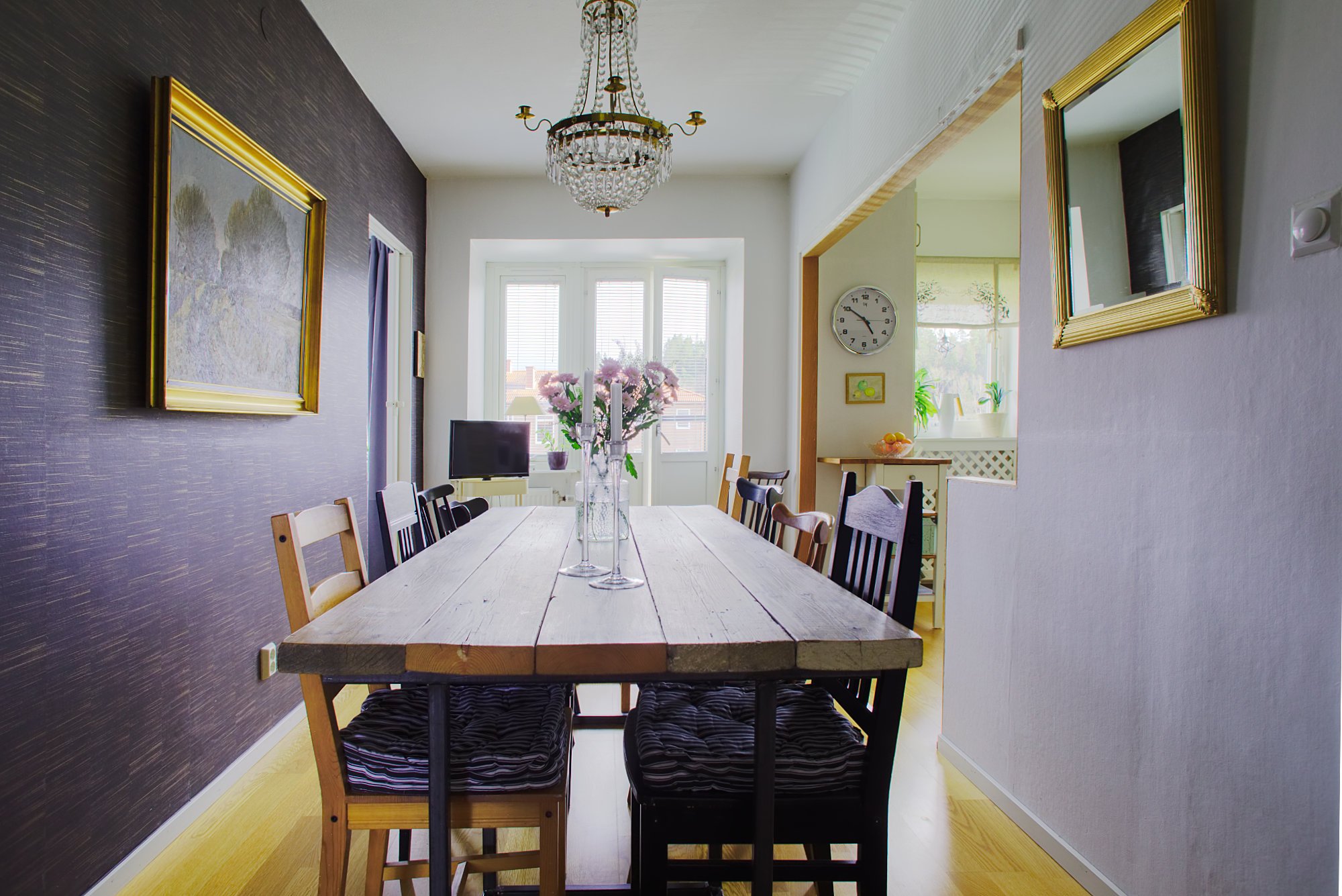
I forgot to attach a reduced-size JPG for viewing on the forum. The exported JPG is sRGB and I reduced the long side to 2000 pixels at 85% JPG Quality. You'll probably notice that I did some "perspective correction", which crops the image a bit.
-
@Max89 Max, Welcome to the Affinity Forums. I don't do a lot with HDR, but I gave your images a shot. After doing a standard HDR Merge, I went into the Tone Mapping Persona and tweaked a few settings (your choices may be very different). When applied, this remapped all the tones to Standard Dynamic Range (0-1). I had EDR (Mac terminology for Extended Dynamic Range) turned off in the 32 bit panel, which limits you to the standard 0-1 range (0-255 in 8 bit RGB terms). I assumed, perhaps incorrectly, that your final image would be a standard dynamic range PNG, TIFF or JPG, so I immediately converted the file to RGB/16 and used my standard RGB profile, which is Display P3 (sRGB is probably the safest for the internet). I added some adjustment layers and left them intact in the attached AfPhoto file. I don't know what the colors looked like in real life, so again, your choices may vary considerably, but HDR definitely works. The attached file is large because it is 16 bit and has multiple layers. HDR Merge.afphoto
-
Editing Skin Tones in Affinity Photo
Ldina replied to Ldina's topic in Tutorials (Staff and Customer Created Tutorials)
@wim you are welcome to print and share it. Thanks for asking. -
Attached is a Tutorial on Editing Skin Tones in Affinity Photo. The original document was created in Affinity Publisher and exported to PDF. The emphasis is on getting accurate, natural looking skin tones, assisted by the numbers...Vectorscope, HSL and CMYK samplers in the Info Panel... to help the user stay on track and defeat "eye adaptation". Our eyes acclimate to our monitor, and the longer we stare at our monitors, the "better" our colors appear (even if they are way off). I hope you find the tutorial clear and helpful. Editing Skin Tones in Affinity Photo.pdf
-
@SteveFogel Steve, I'll add a few thoughts about using CMYK for skin as well. This applies to skin "Midtones", not to bright highlights or shadows. A good general rule is that Cyan should be approximately one third (¼ to ½) of Magenta and Yellow, with yellow equal to magenta, or slightly higher (but not excessively so). For example, for Caucasians, a good starting point is about 10C, 30M, and about 30-35Y or so. Again, this is for well lit skin MIDTONES. Highlights and Shadows will vary quite a bit. (RGB is generally useless for assessing skintones). Redheads, young children, etc, will tend to have yellow and magenta close to equal, but yellow will rarely be less than magenta (except for rouge makeup or cold wintery cheeks). Someone with pale, light skin might have values of 5C, 18M, 18-20Y or thereabouts. Dark races may have more yellow (Asians, Latinos, Africans, Middle Easterners, etc), but sometimes they have more red. If you have too much Yellow combined with higher Cyan values found in darker skin, faces tend to skew toward green (never too attractive, unless you're a Martian). Due to their darker skin, they may also have a Black (K) component. Shadows and highlights tend to vary, but it's good to guard against too much saturation in shadow tones. Anyway, I like seeing both HSL and CMYK readouts when working on portraits. Each offers a different perspective. Sometimes HSL tells me what I am missing, but sometimes CMYK does. For example, it's easy to end up with a value like 0C, 30M, 32Y, which is definitely RED. It's too saturated and needs some Cyan for balance. That's where I like looking at CMYK. Together, they keep me on track. FWIW..
-
@SteveFogel Steve, I'm not sure if you can enlarge the actual vector scope graphic. If so, I haven't found a way. One thing I often do when skin tones are an important element of the photo is to switch from RGB to HSL samplers in the Info Panel. That "I" line (i.e., skin tone line) in the vector scope corresponds to a Hue value of about "18" (red, with some added yellow). Skin tones vary from person to person, and even in the same person in the same photo, so a Hue of 18, plus or minus about 5 points either way, is a good general starting point. Relying on a single sample point doesn't always work well, so I prefer to run my cursor over nicely lit skin midtones. Highlights and shadow often skew away from that "I-line" more than midtones. Redheads and young pale children often lean a bit toward the red side of 18 (13-18), and people with a rich tan tend to be more yellow (18-25). Those are just ballpark numbers. Saturation and Lightness make a big difference too, but this is a good starting point. I do use the vector scope, but I often rely even more on HSL readouts in the Info panel. I also like CMYK readouts for skintones, and when dealing with portraits, I often set both HSL and CMYK samplers in the Info Panel. I suspect you know this already, being an experienced videographer and longtime photographer, but I figured others may read this and find it helpful.
-
Can't open a PDF password protected file with Affinity Designer;
Ldina replied to pisksix's topic in V2 Bugs found on macOS
@pisksix I'm on a Mac running Ventura. I opened an unprotected, 8-page PDF Brochure I previously designed using Acrobat Pro, added PW protection (in Acrobat Pro) and saved it as a PDF with a new name. I then opened this PW protected PDF in Affinity Designer, entered the PW and it opened perfectly. I wanted to be sure Designer was protecting properly, so I exported this file to PDF with a new name and generated a different PW when saving. Just to be sure it worked, I then opened this file in Designer and it opened with the new password just fine. So, I am able to do what you said you wanted to do. Perhaps I am doing something different. In both Acrobat and Designer, I set PW protection for changing, printing and copying data. I did not require a PW to open. FWIW. -
@colorsHaveChangedAgain It may not work, but try unchecking that one box, per the attached screenshot. Perhaps that causes a conversion. It shouldn't, but who knows. Worth a try.
-
@AffinityJules Ha...you may be exactly right! Clarification would help.
-
@Lead Welcome to the Affinity Forums. If you can upload a few of these photos, perhaps someone here will show you some steps using them. Try to be as clear as possible in your explanation, so we understand what you want to do (Use Google Translate or another online translator if necessary.) If I understand you correctly, this is usually done with Masking. You can use the Selection Brush Tool to isolate a person and remove the background. That person will be on one single layer. Repeat the procedure for each person, so each person is on their own individual layer. Those layers can then be resized, repositioned, even recolored as needed. You will probably want a background image behind all of them, or perhaps a plain background. To make it look real and natural, you may need to add some drop shadows, so they don't look like they are "floating in the air". Upload a few images you wish to work with and try your best to be clear about what you want.
-
.AFPHOTO File
Ldina replied to HerrBill's topic in Affinity on Desktop Questions (macOS and Windows)
@HerrBill You're welcome. This is probably more info than you want, but here is the PSD file format spec by Adobe. They mention that PSD is a proprietary format, and the spec doesn't cover how information in the file is interpreted (on purpose...they keep this secret), so anyone without a paid license from Adobe ($$$) would have to reverse engineer much of what's inside a PSD file, and hope it works properly. That can be hit and miss, especially if Adobe adds new features or changes things in the format over time. The first few paragraphs of the spec are all I wanted to read, but they make it pretty clear. https://www.adobe.com/devnet-apps/photoshop/fileformatashtml/ Companies do this for a few reasons. First, they need a file format that fully understands ALL the features their software is capable of encoding. Second, they want to keep it secret so you are forced to use their software to access all the features and edit the PSD file. If they're too restrictive, the file format will not gain wide acceptance. If it's fully disclosed, people will not buy their software, especially if they can find a less expensive alternative that works well with their file format. Since Adobe's been around SO long and have been involved in the graphic arts and printing industry since the beginning, PSD is in very wide usage. AfPhoto file format is designed to understand Affinity Photo's code and support all its features. Photoshop is not capable of reading or properly handling all of the features that Affinity can encode, so it works both ways. Fortunately, there are standardized file formats available that are fully specified and available to all, otherwise interchange of information would be a real nightmare. -
Incredible! Your attention to detail is amazing.
-
free resources FREE – Seamless Canvas textures for Affinity Designer
Ldina replied to The Artifex Forge's topic in Resources
Thank you! 😀 -
.AFPHOTO File
Ldina replied to HerrBill's topic in Affinity on Desktop Questions (macOS and Windows)
@HerrBill Many native file formats are proprietary and not shared openly. Even Photoshop PSD file format is proprietary to Adobe and many native features of PSD are not fully disclosed. Many file formats are open source...JPG, PNG, TIFF, etc, but many are not. AfPhoto has its own internal structure to support all the capabilities of Affinity Photo. The same is true of Adobe...PSD files are designed to handle all of Photoshops capabilities. It's been many years since I used FastRawViewer, and I didn't use it a lot, so I forget most of what I knew about it. An AfPhoto file is NOT a RAW file format. It can contain a link to a RAW file, or embed a RAW file, (if these features are enabled during Development using Serif's RAW engine in the Develop Persona), but the AfPhoto file format is not essentially a RAW file. Perhaps this may be why FastRawViewer doesn't work? I'm not sure. -
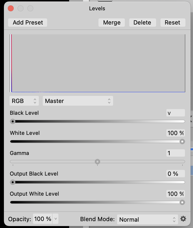
@afdojo You can display clipped (out of gamut) highlights, shadows, and tones, in the Photo Persona using a Live Procedural Textures filter. The following discussion provides Procedural Texture formulas you can load into Affinity Photo for that purpose. This provides similar display of clipping to the Develop Persona. Procedural Texture are a bit confusing, especially if you are new to Affinity Photo. I've tried them and they work. I'm not sure if this is the sort of thing you are looking for. Another approach you can use to identify clipped tones is a Levels Adjustment Layer. While that adjustment layer is open, you can move the White Level and Black Level sliders back and forth while holding down the Opt/Alt Key and it will highlight areas that are clipped...
-
Macro recording
Ldina replied to HerrBill's topic in Affinity on Desktop Questions (macOS and Windows)
@HerrBill Glad it was helpful. The real "thanks" go to @Old Bruce, who shared his knowledge and the procedure with us. I just put it into a "step-by-step" format. Credit where credit is due!! -
Macro recording
Ldina replied to HerrBill's topic in Affinity on Desktop Questions (macOS and Windows)
@walt.farrell Thanks, Walt. Perhaps Windows won't record Macros if clicking on the Develop Persona, but either method works on my Mac. I can select the Move tool and click Develop Image, or just click on the Develop Persona. Just tried it again to make sure. -
Macro recording
Ldina replied to HerrBill's topic in Affinity on Desktop Questions (macOS and Windows)
@HerrBill HerrBill...I was busy earlier, so I just provided the link in my previous post. I know you didn't ask about Batch Processing, so you can ignore that portion of that discussion, but I think the answer to your questions should be in there. I am able to record a Macro and make a round trip to the Develop Persona and back again. I'm on aa MacBook Pro. Hope this solves your issue.