
massive.art
-
Posts
47 -
Joined
-
Last visited
-
Not to my knowledge, A windows update went through this week but the update did not seem to affect the program until yesterday. I deleted all the app data i could think of to try a fresh instal and went through the uninstal on windows. All 3 affinity 2 programs still will not load in. affinity 1 seems ok, but my current project is mad in affinity 2 -- I was working in the program all week and it sudeenly crashed and will not come back
-
As of yesterday, Friday July 19 2024, my affinity programs now seize while opening. I have uninstalled and reinstalled designer 2 (3)three times but the error keeps happening. The program gets to the loading data sequence and freezes and windows forces me to close window.
-
 KRYoung reacted to a post in a topic:
Logo design for Atlanta DJ
KRYoung reacted to a post in a topic:
Logo design for Atlanta DJ
-
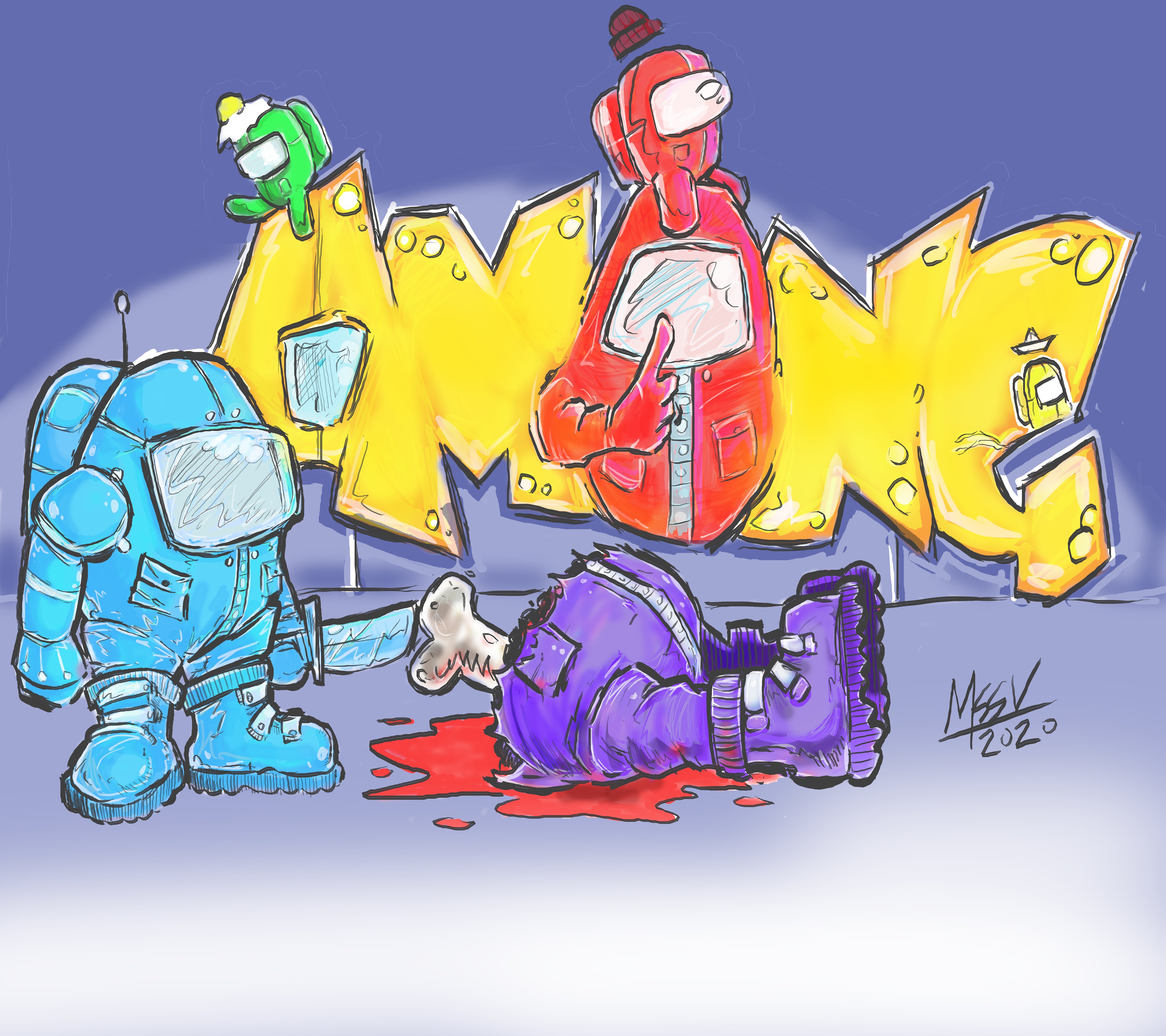
iuli reacted to a post in a topic:
Among Us art
-
Markio reacted to a post in a topic:
Among Us art
-
j3rry reacted to a post in a topic:
A stack of new illustrations
-
j3rry reacted to a post in a topic:
A stack of new illustrations
-
dannyg9 reacted to a post in a topic:
A stack of new illustrations
-
PeterRex reacted to a post in a topic:
A stack of new illustrations
-
PeterRex reacted to a post in a topic:
A stack of new illustrations
-
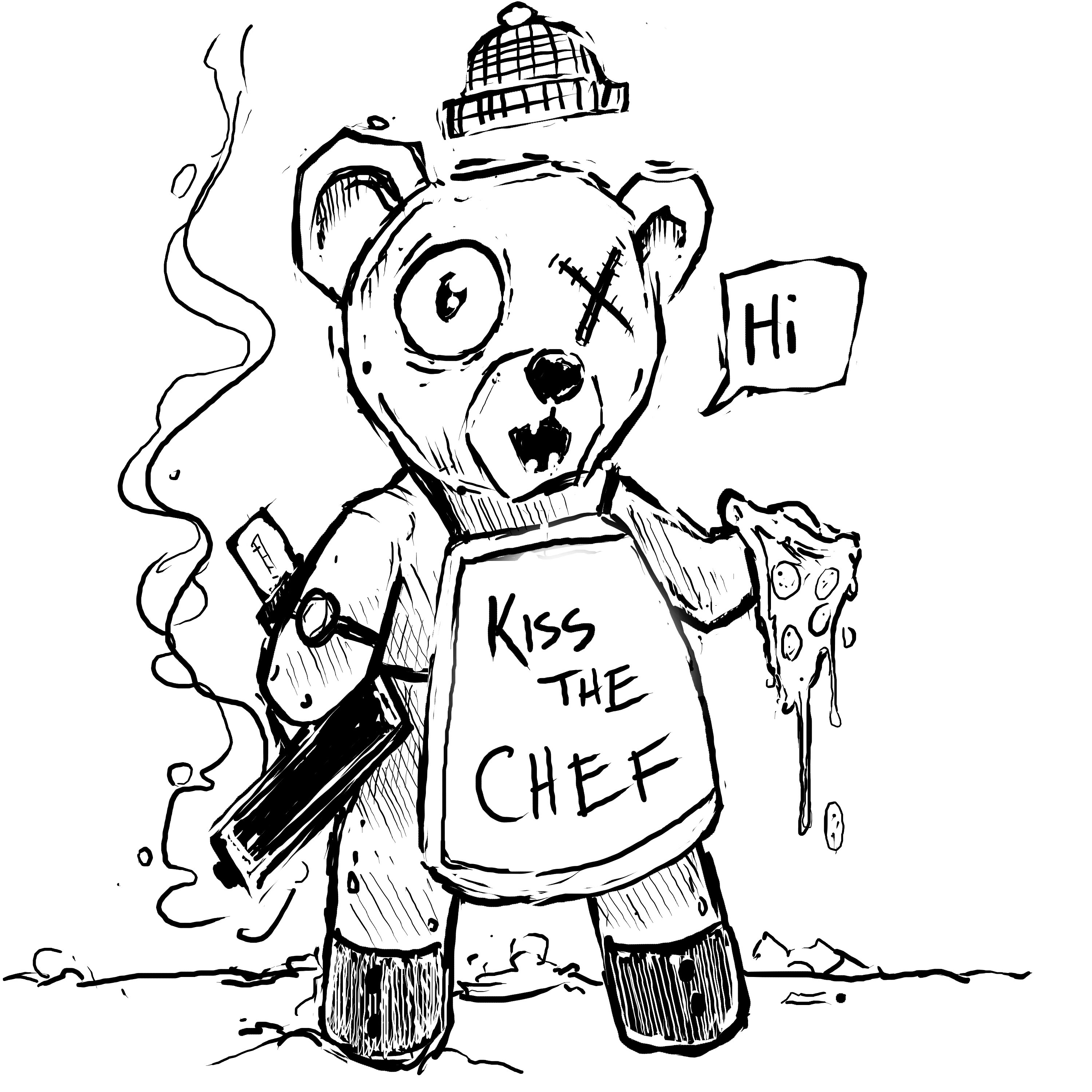
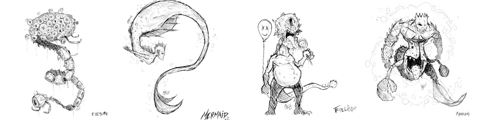
affinity photo A stack of new illustrations
massive.art replied to massive.art's topic in Share your work

-
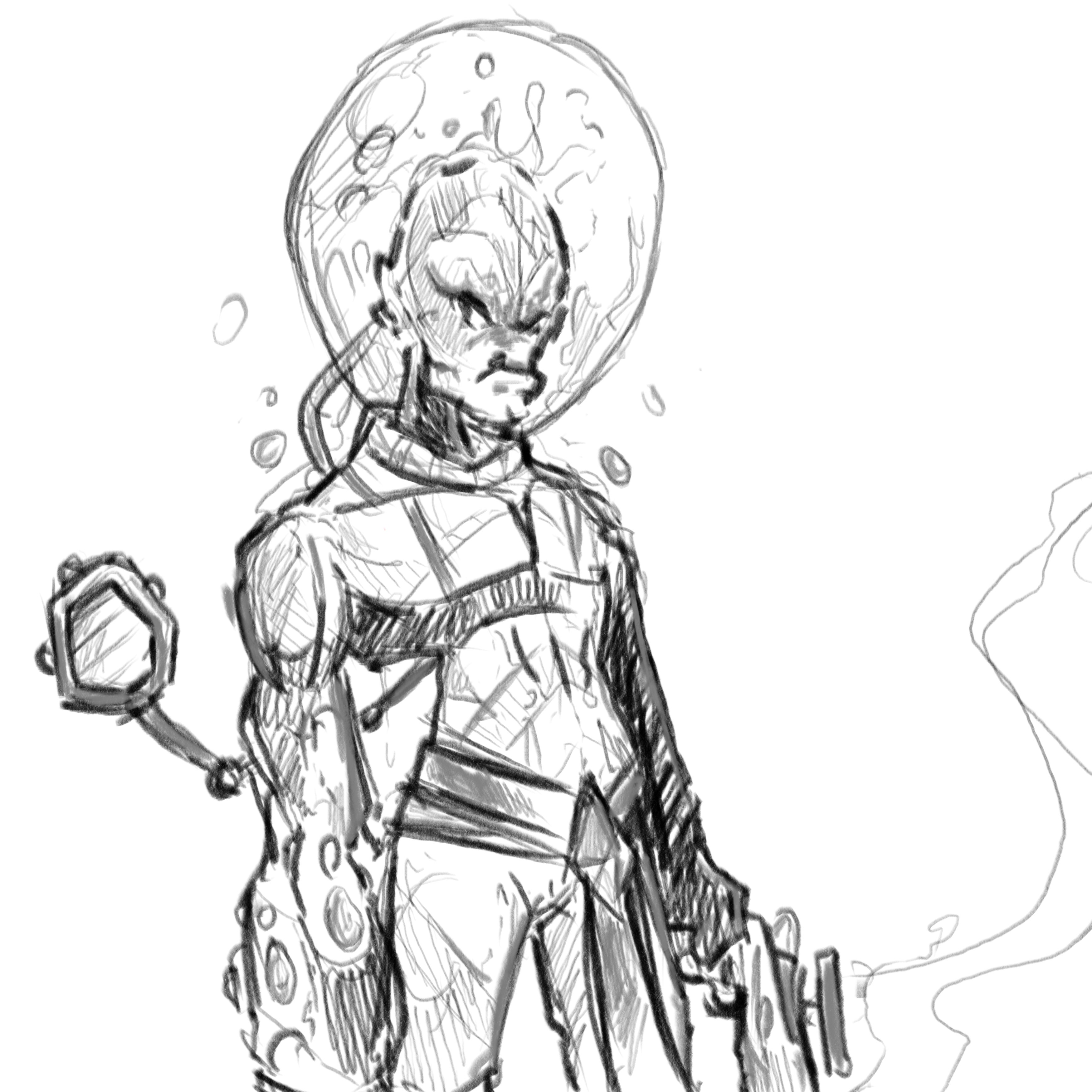
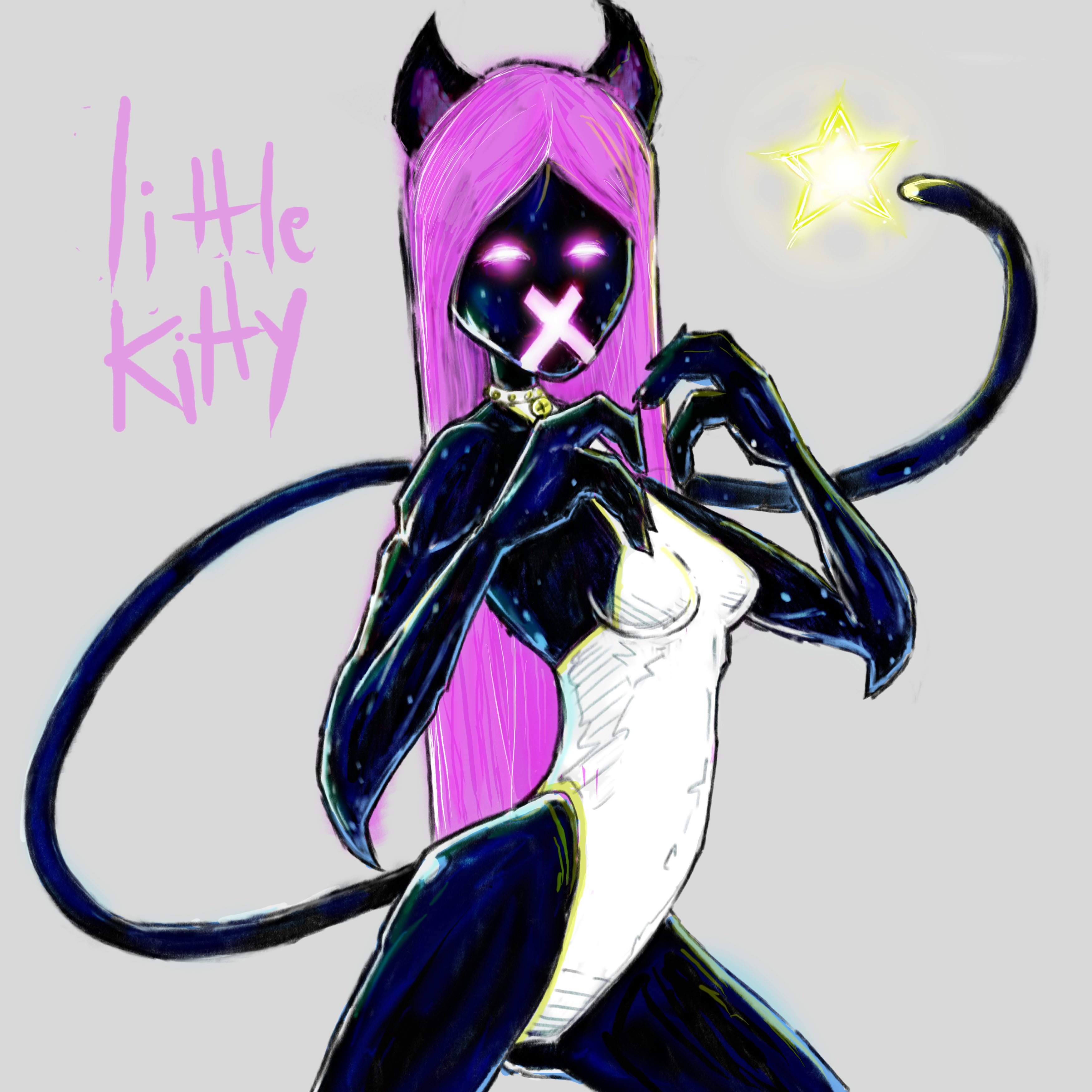
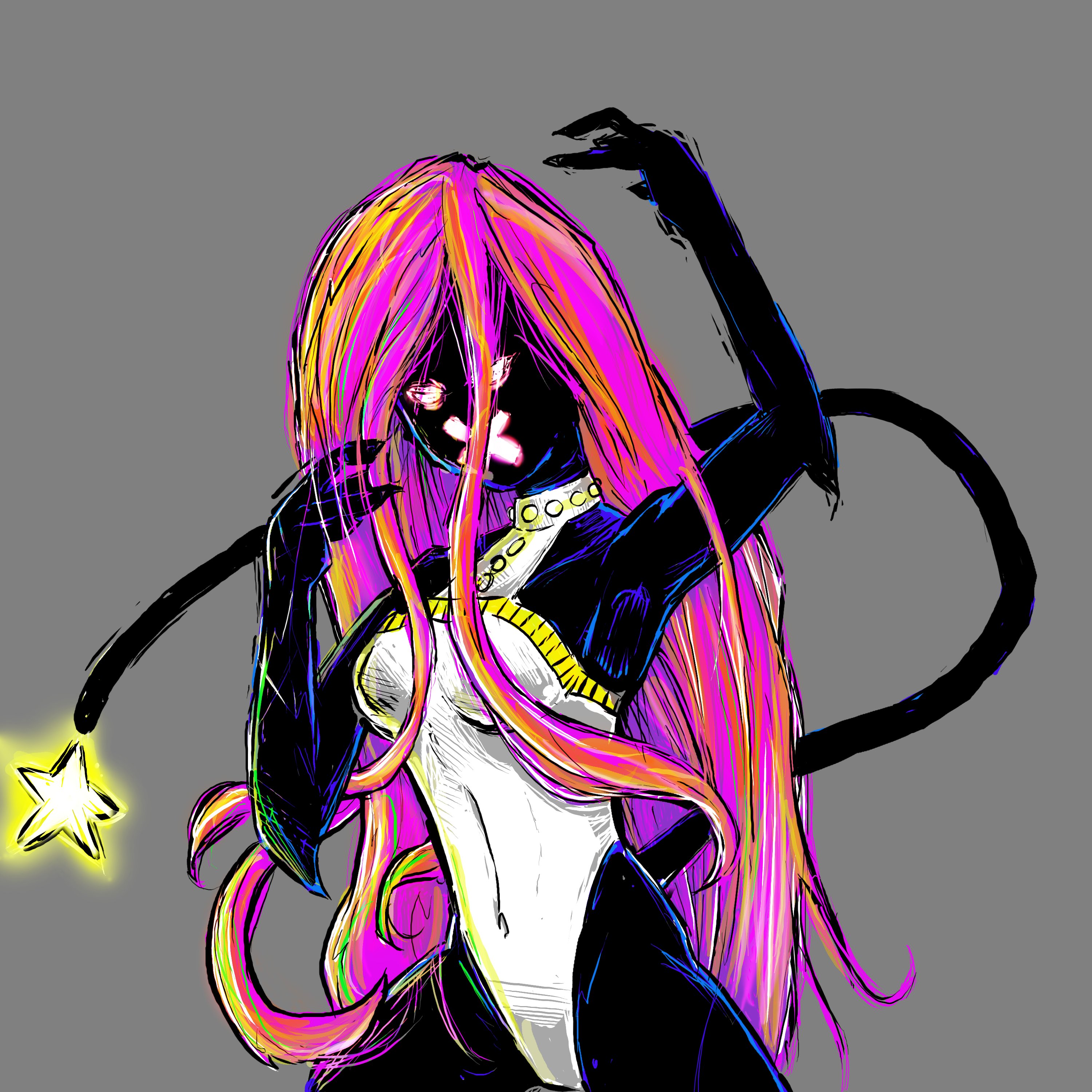
All drawn on a Huion Tablet in Affnity Photo. I am experimenting with the layer composite effects (hard light, overlay, and soft light)
-
Loïc MIAME reacted to a post in a topic:
Another Logo
-
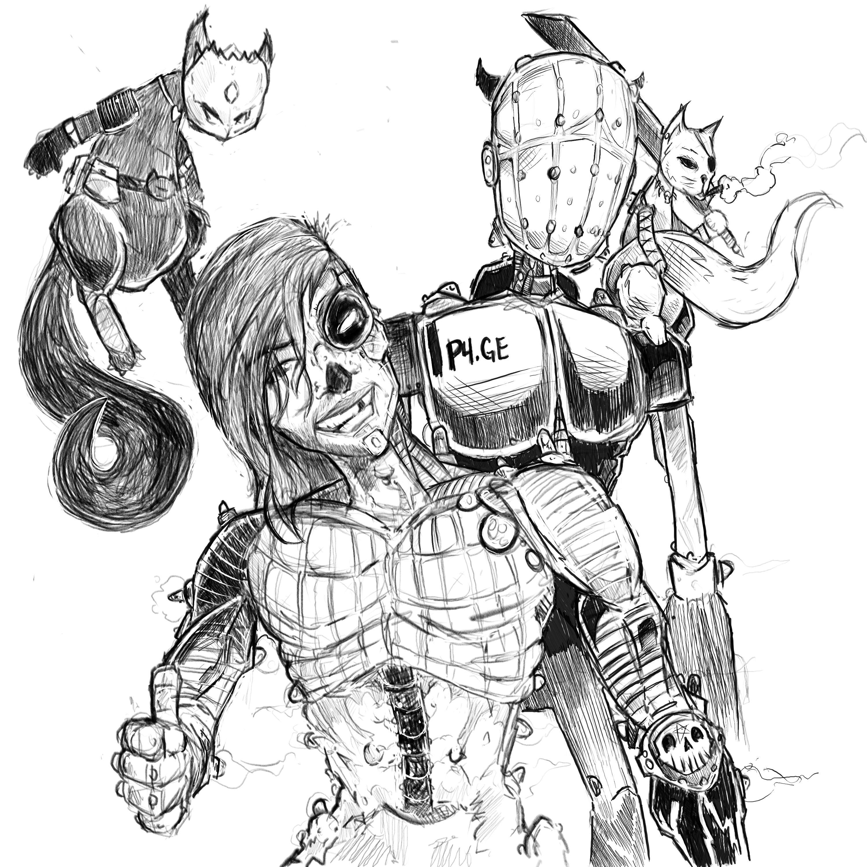
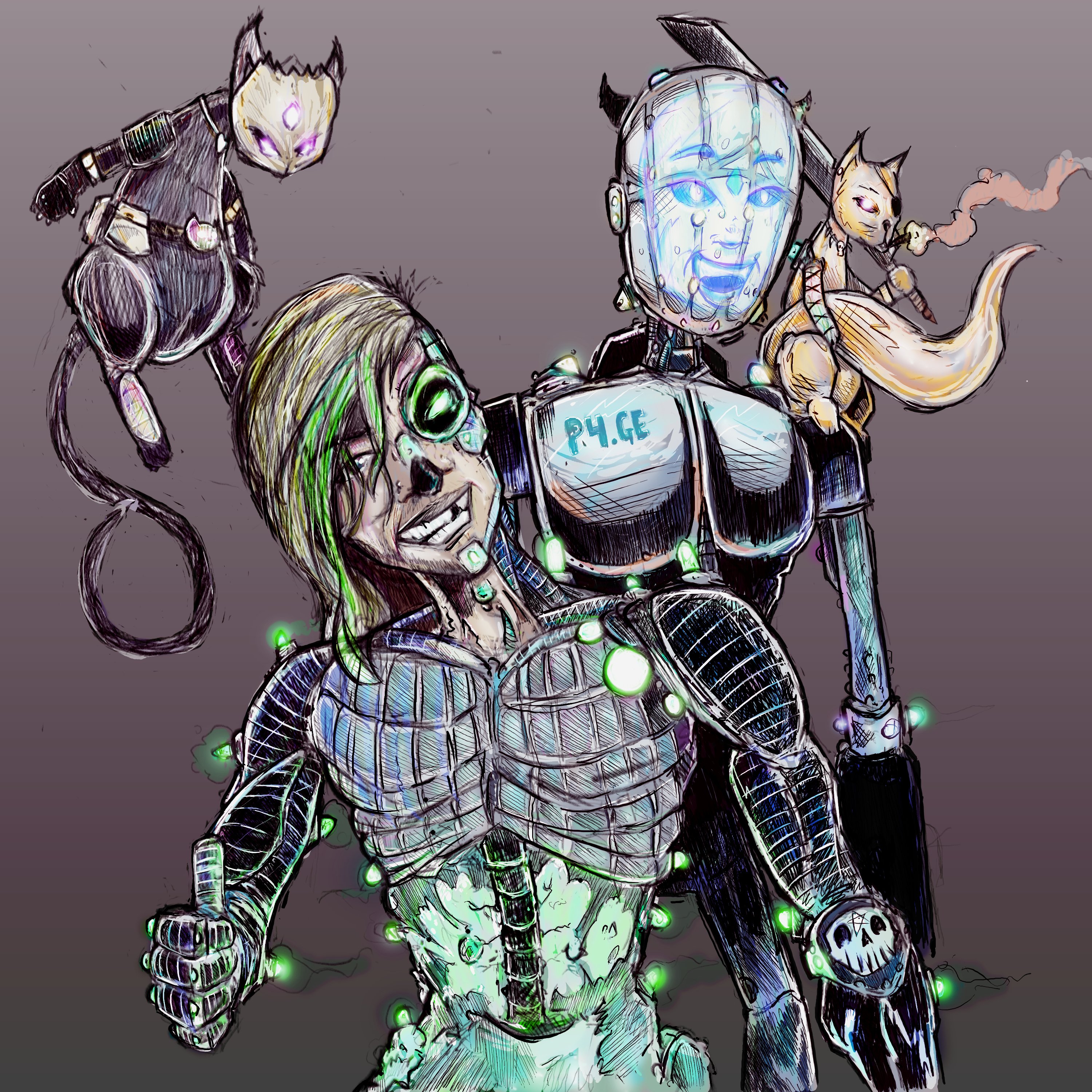
Dan C reacted to a post in a topic:
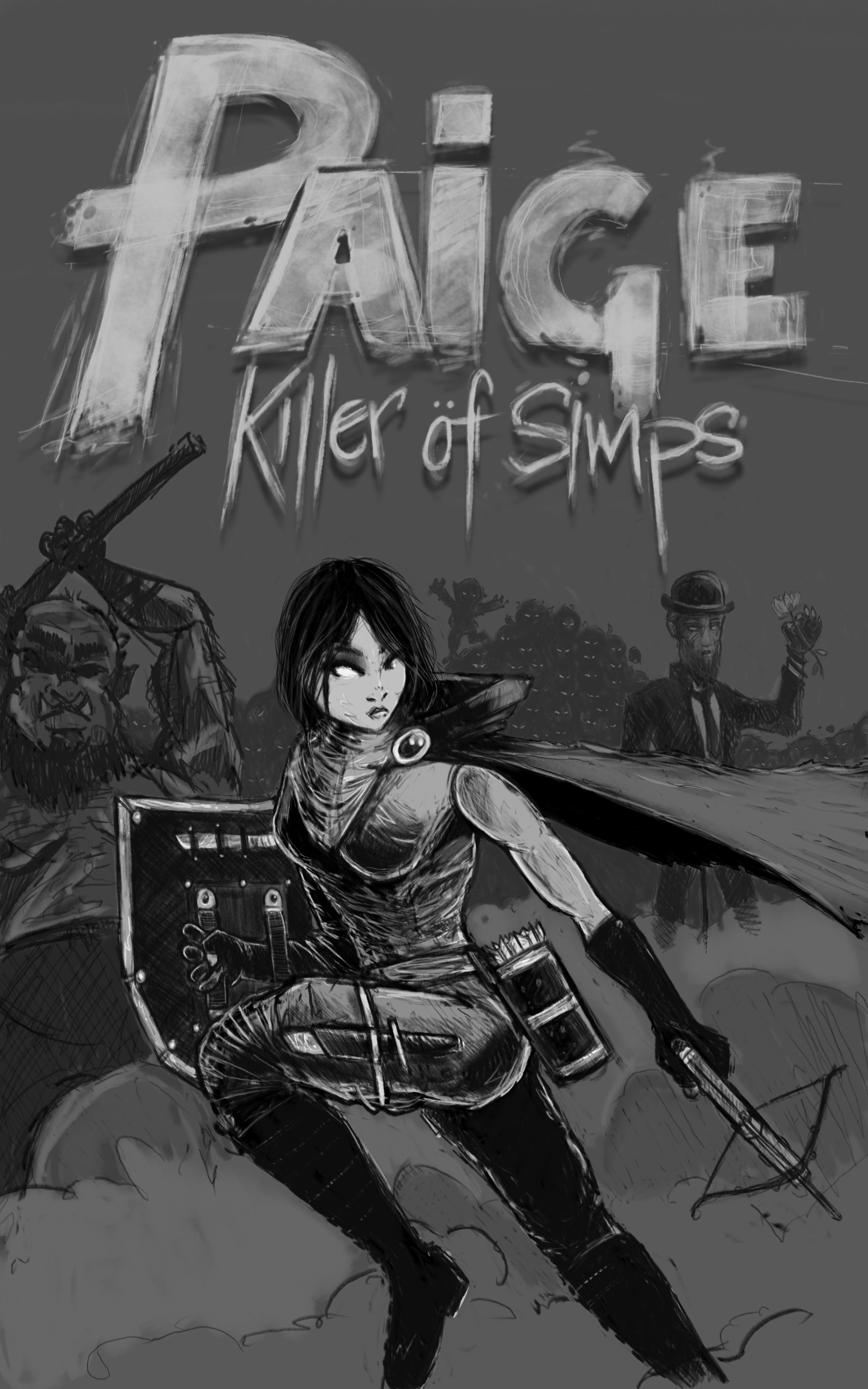
Paige, Killer of Simps
-
Would you like a tutorial?
-
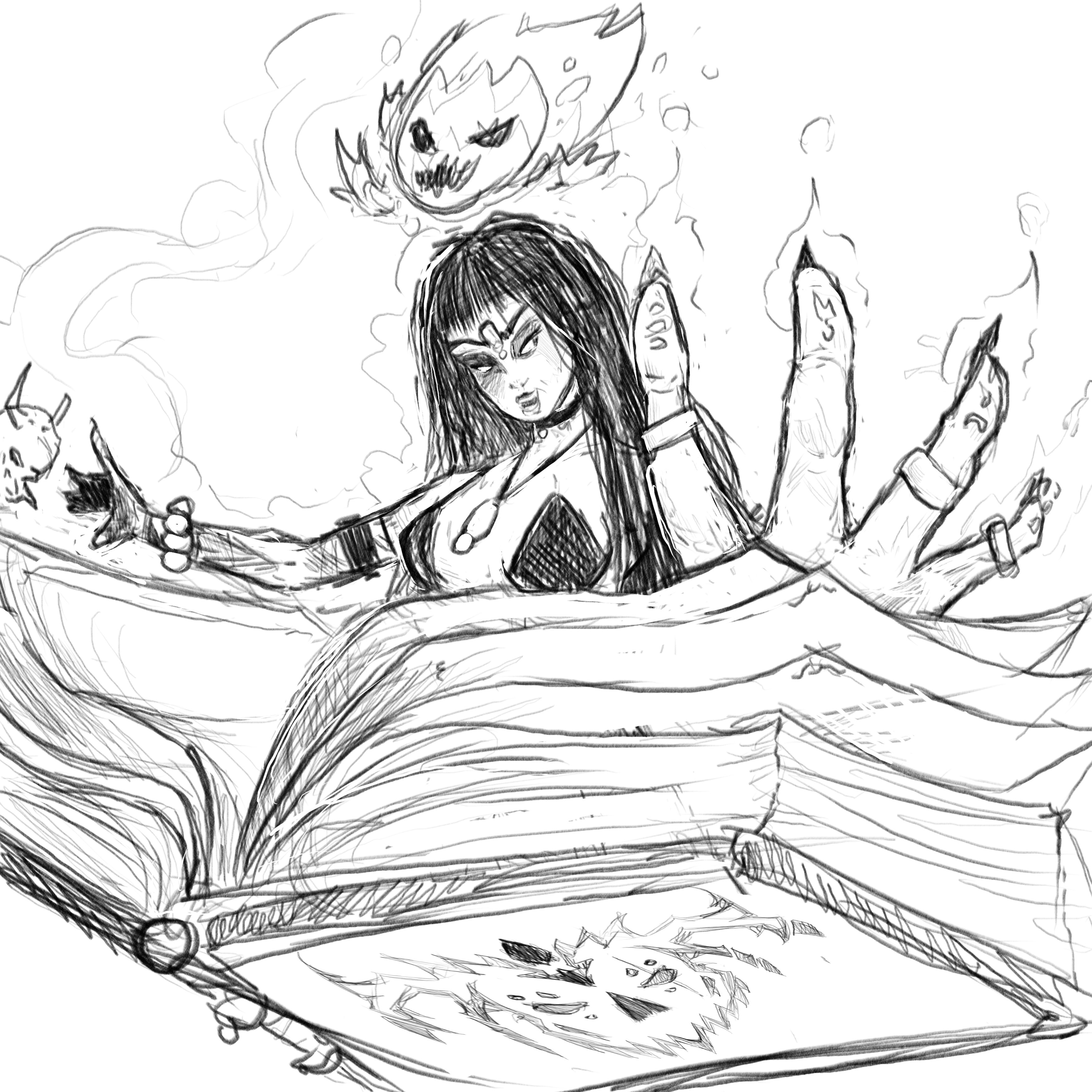
This started out as a conversation about the general experience girls have in the online gaming realm. I took and ran with it as a comic book cover.
-
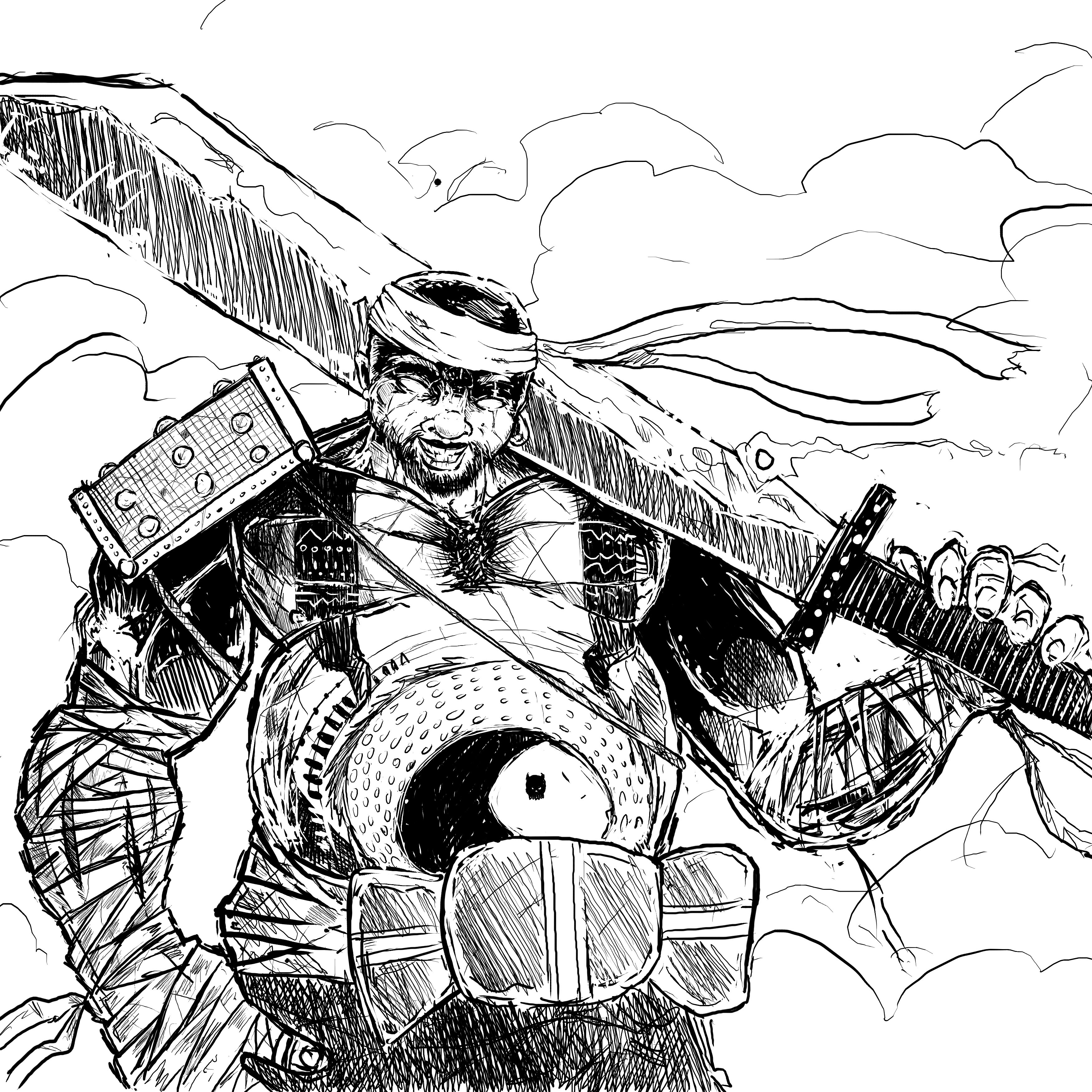
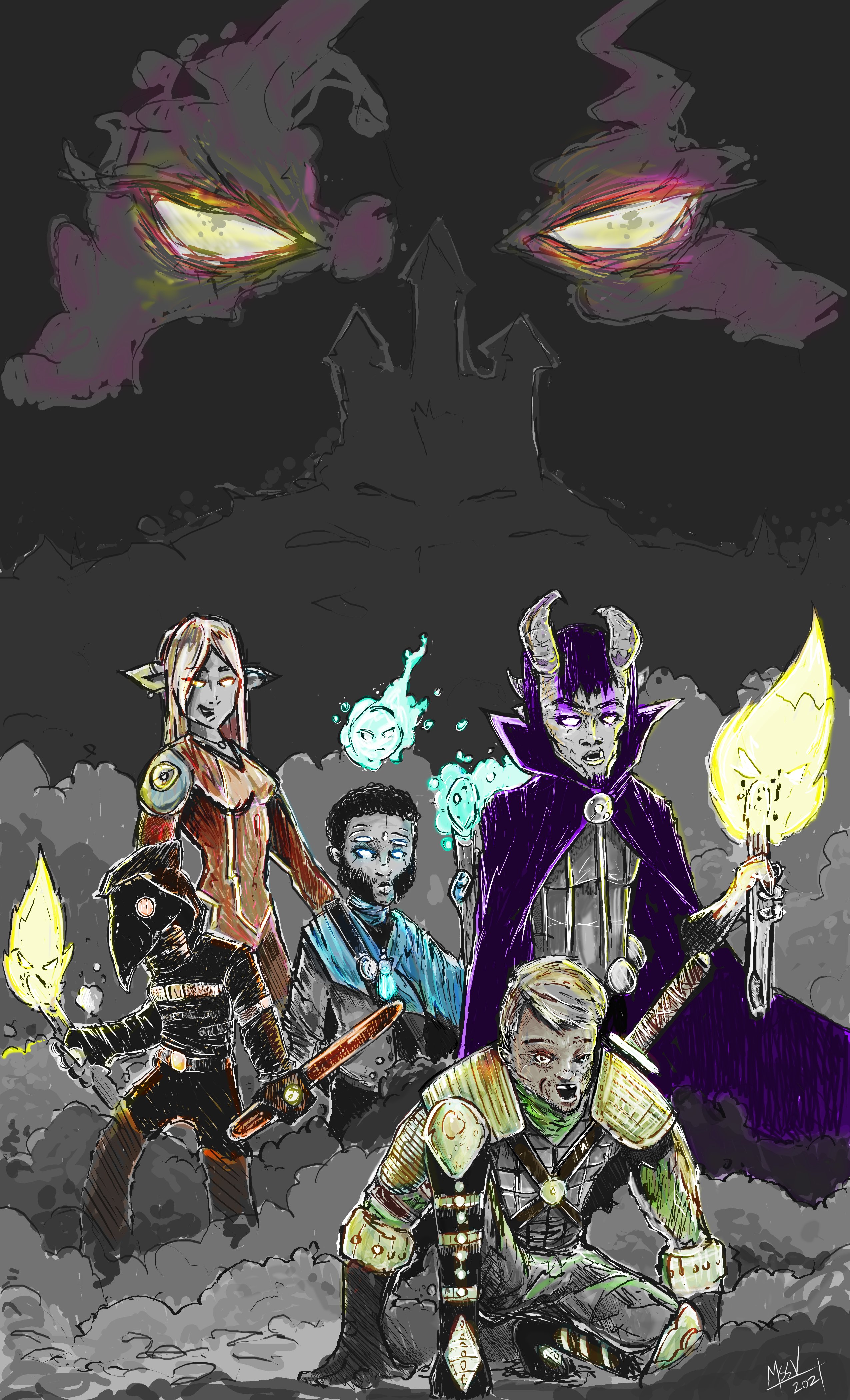
A 5 person DnD group wanted a illustration of their party. This was fun to work on using character descriptions.
-
Random shoot with a couple taking shots on an iphone in a random parking lot last night. I just guessed at setting to get a strong exposure to produce some silhouettes with detail. I noodled with levels and contrast and used some color filters to boost the colors in the sky and experiment a little. Canon 7D shutter 1/40 f 4 or 5.6 ISO 800
-
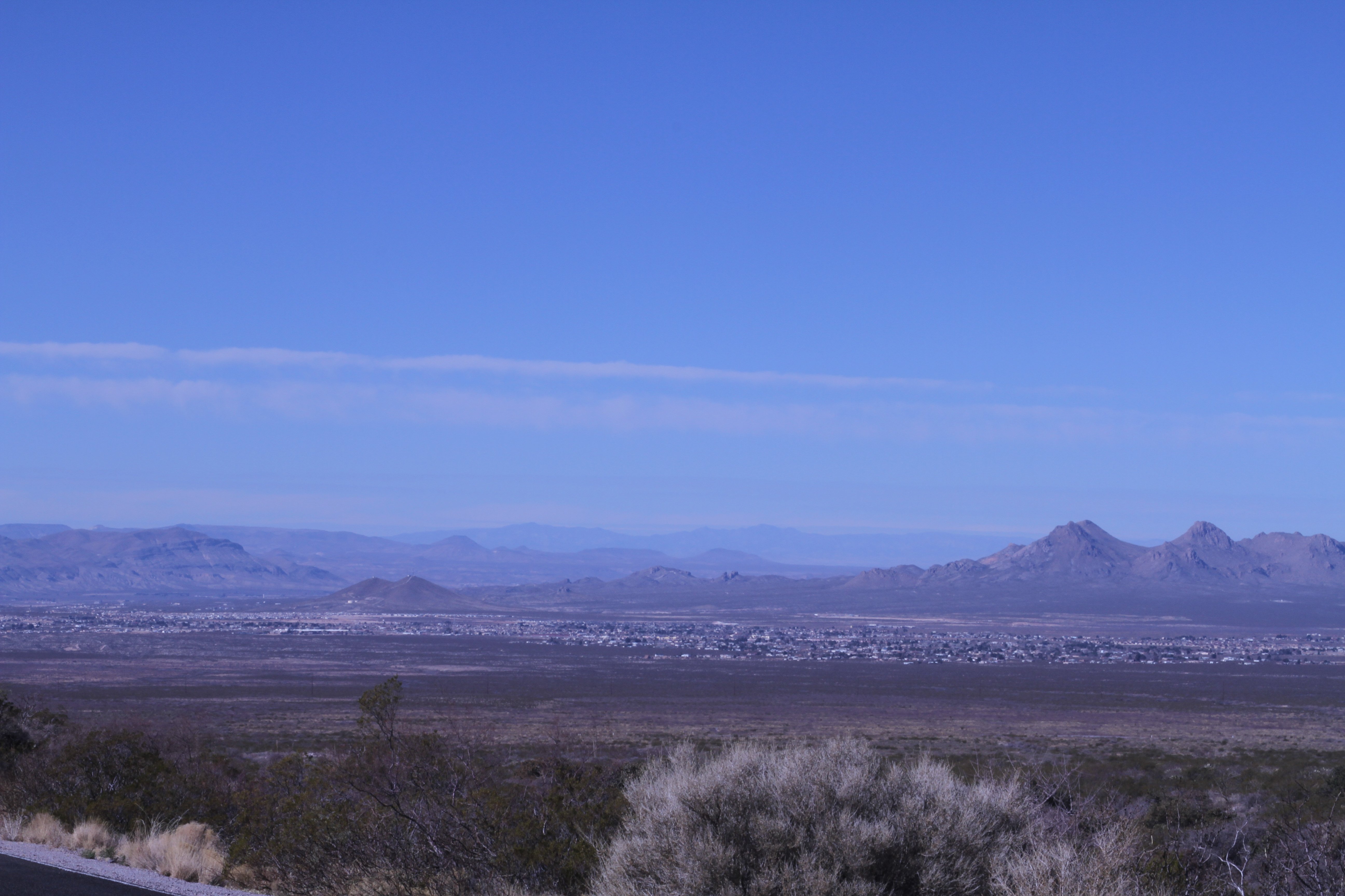
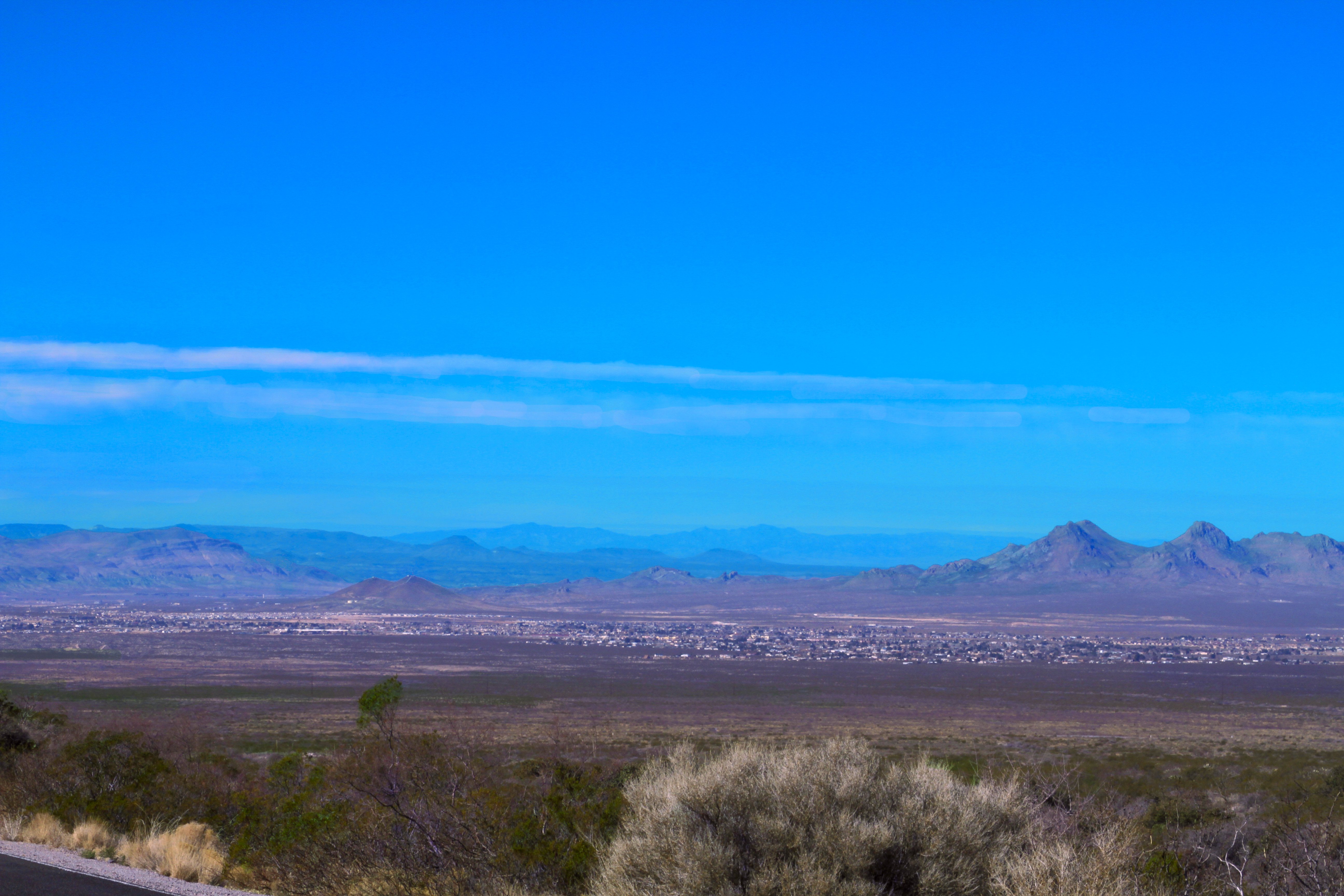
Landscape from above LAs Cruces NM. Canon 7D Camera Settings: f/20, 1/50s, ISO-100, 70mm Canon 28-135 USM Lens First image was as shot and second is edited to ad a little more color vibrance. All edited in affinity photo. The image was too dry and I wanted to push the colors up a little
-
So, this guy is a young twitch streamer I have played siege with for a while and he wanted a new logo for his channel. He really liked Shrouds S logo icon and wanted a similar effect with a G. I think i came pretty close with this iteration and as always enjoy your feedback. Red was the requested color and I solved it by using negative space with a red outline because the inverse "looks like a muppet" according to people around me. Twitch: gilleyg edit: I redrew the icon G 8 times in case anyone is curious. This is my 8th iteration.
-
massive.art reacted to a post in a topic:
Alien Express
-
massive.art reacted to a post in a topic:
Another Logo
-
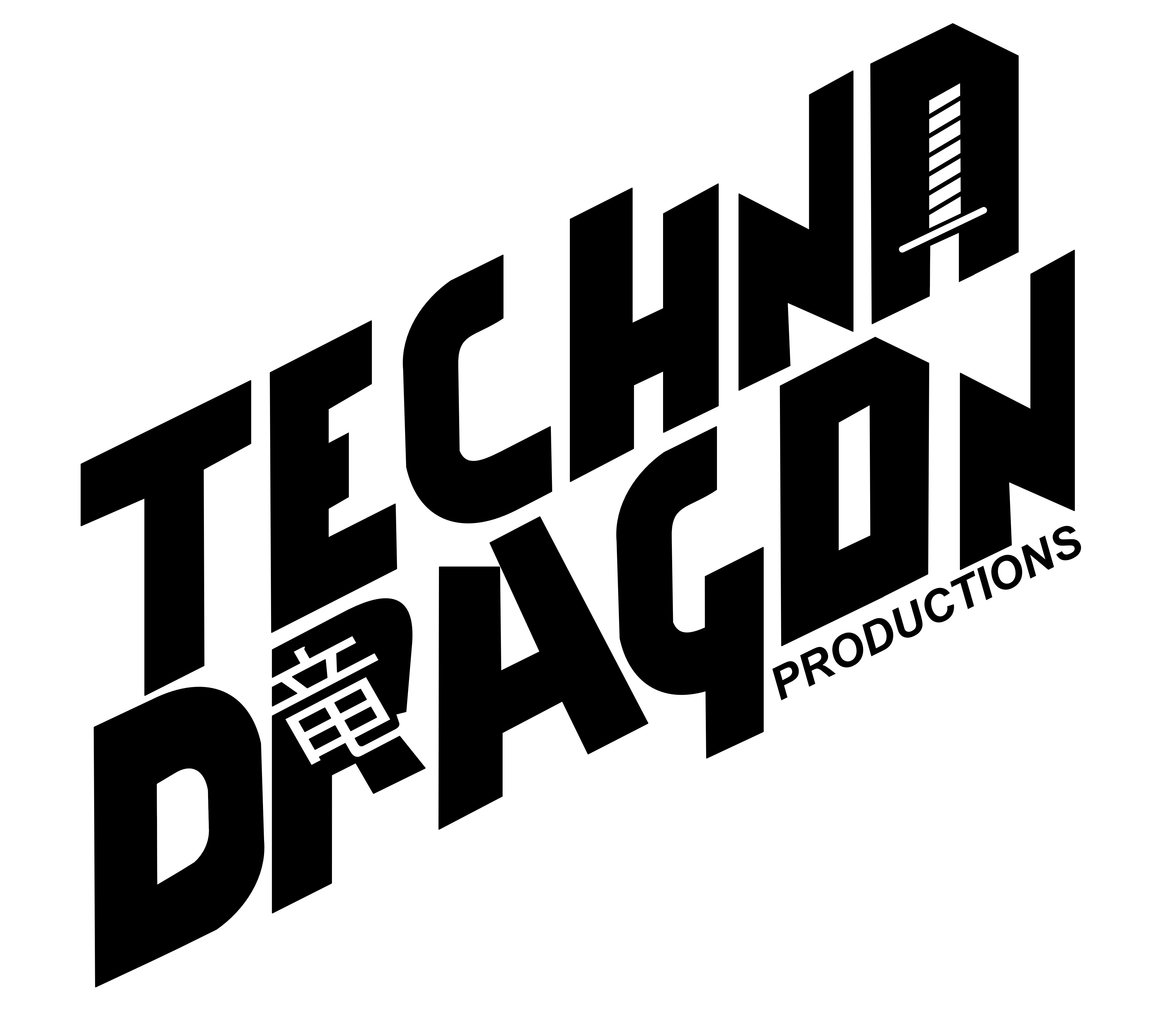
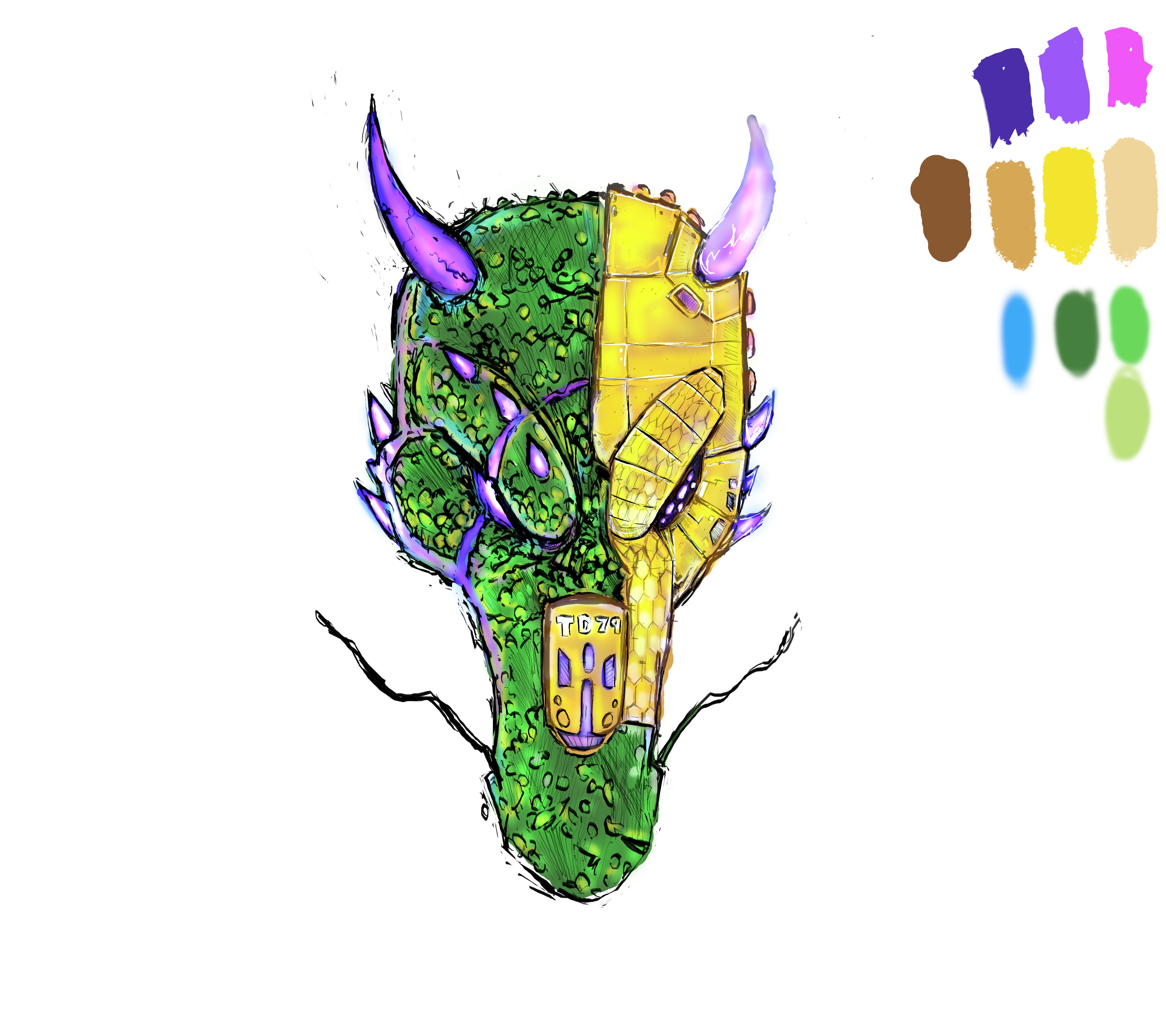
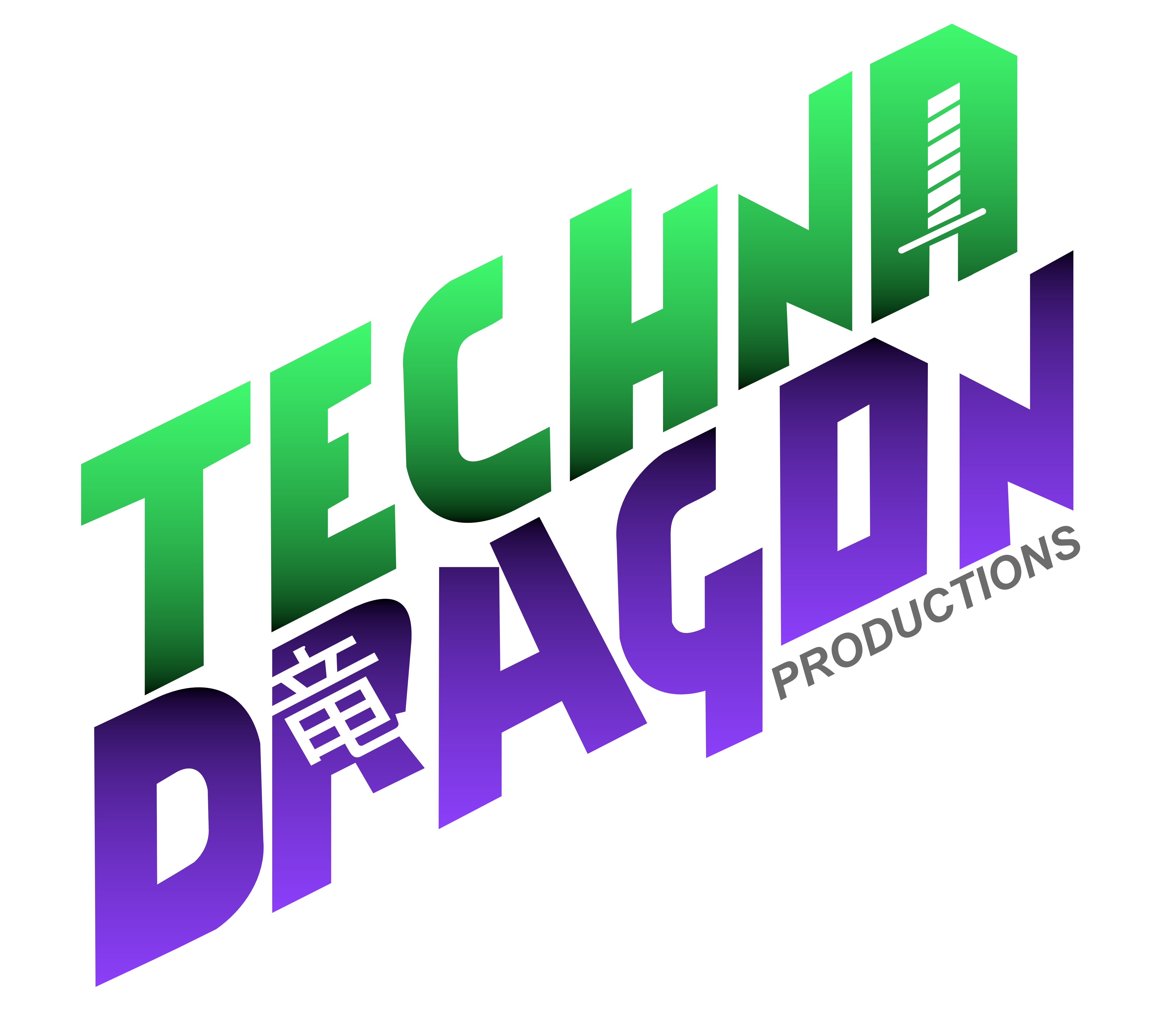
I am slowly finding tools I had in Illustrator and using those in Affinity, This has been a fun experience. This is a logo for a company in GA. The kanji is the simple symbol for dragon and the client wanted a sword in the design. The sword took me while to incorporate but once I saw it I think it worked out. I also made a dragon illustration for the design -- Logo is vector and dragon sketch is pixel.
-
fried egg, available in game too I believe
-
massive.art reacted to a post in a topic:
Among Us art
-
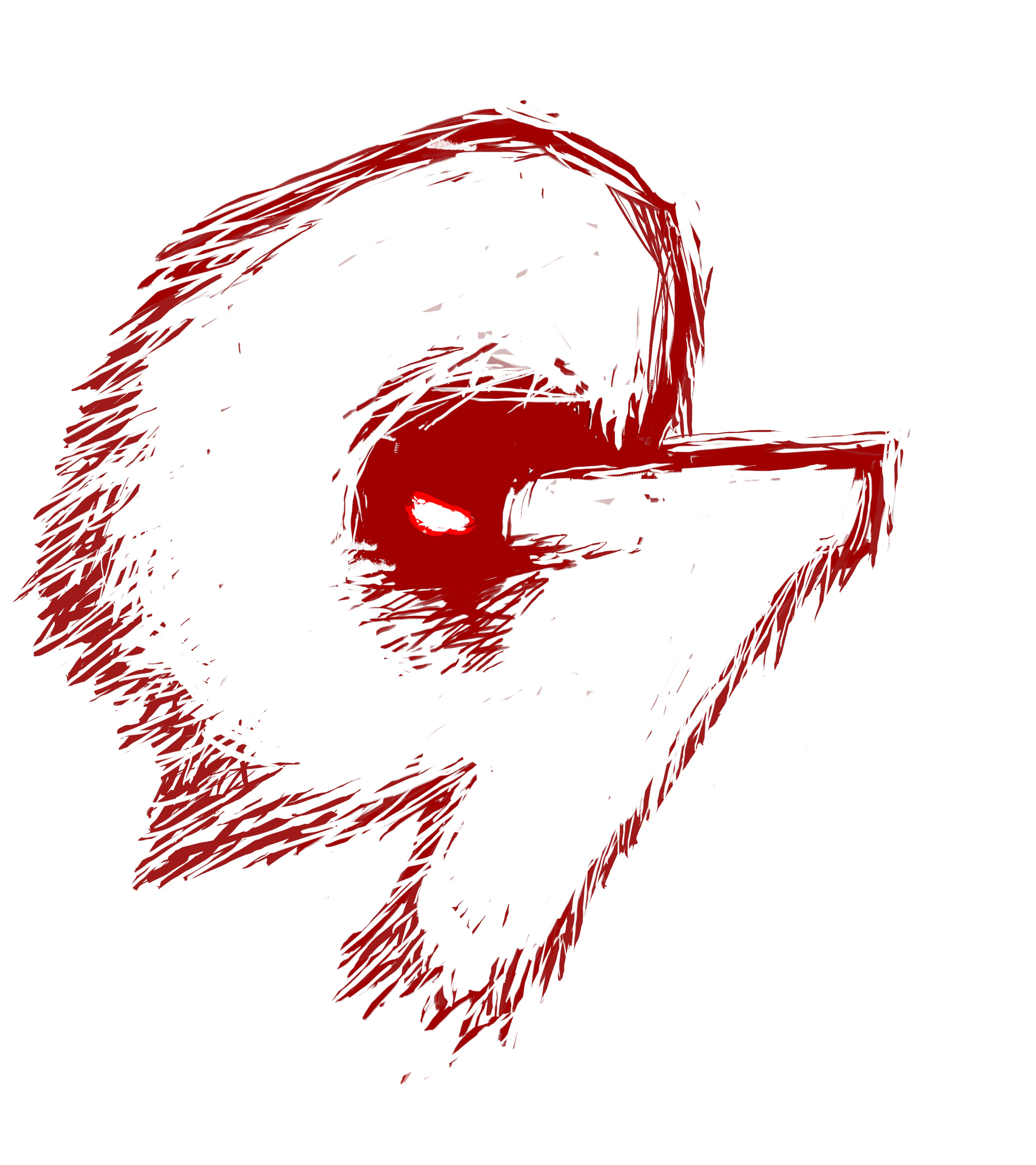
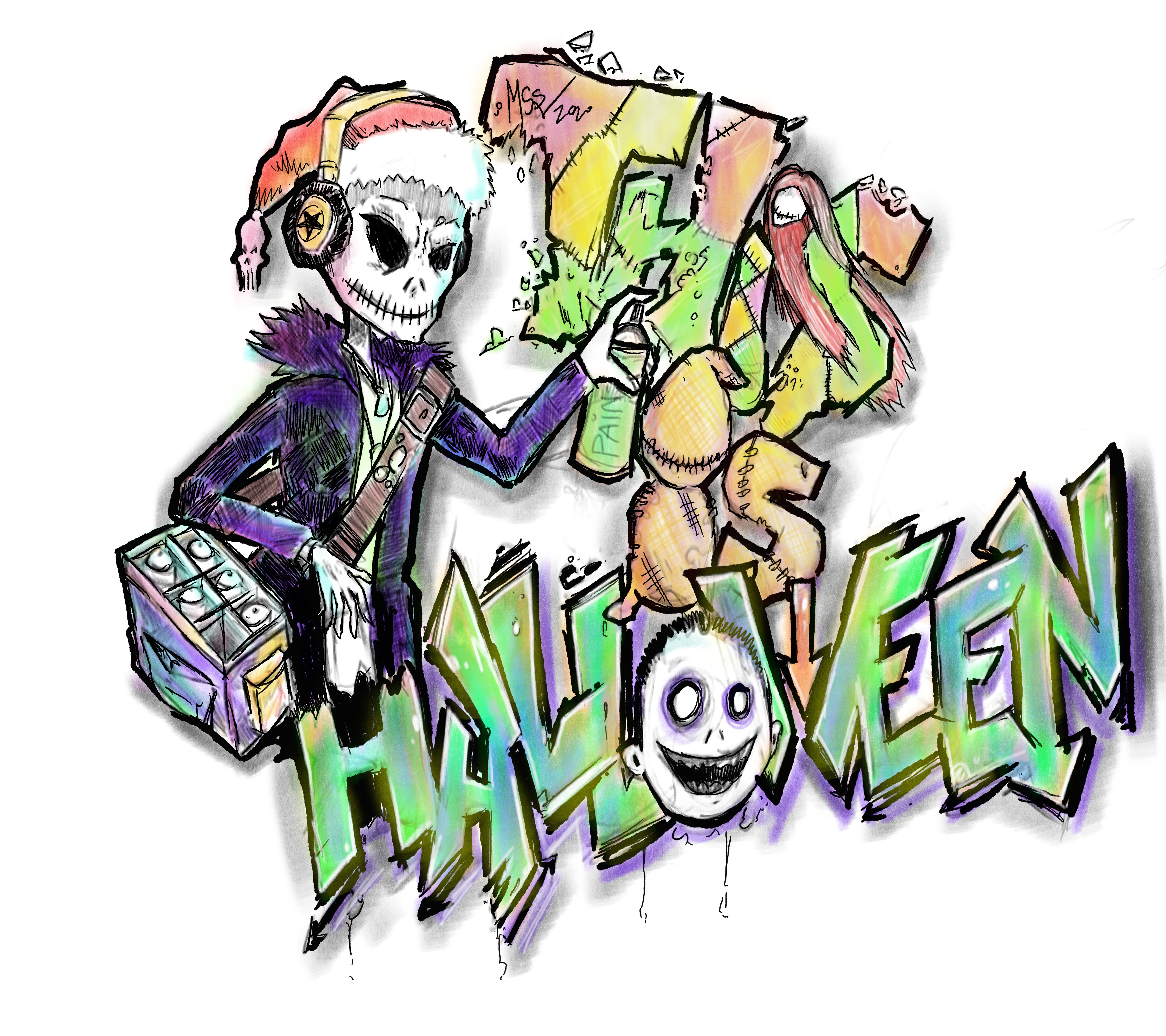
affinity designer Skellington the Painter
massive.art replied to massive.art's topic in Share your work
too many egg shapes? -
Halloween or Pumpkin Spice season is upon us