firstdefence
-
Posts
11,461 -
Joined
-
Last visited


Recent Profile Visitors
10,441 profile views


-
 LOinessZD reacted to a post in a topic:
Applying texture Proplem
LOinessZD reacted to a post in a topic:
Applying texture Proplem
-
firstdefence reacted to a post in a topic:
Pictures not looking as clear as in other programmes
-
 I've just inserted an image into Affinity Publisher v2 and it looks the same as in Affinity Photo v2. Can you show your layers panel with the layers expanded.
 -
Applying texture Proplem
firstdefence replied to LOinessZD's topic in Affinity on Desktop Questions (macOS and Windows)
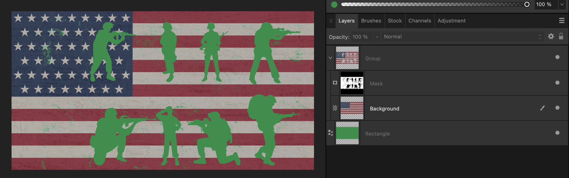
You need to put the flag and the mask into a group else the mask will mask every layer below it, placing them in a group; effectively making the mask a child of the group, prevents the mask from masking a higher status layer (Parent) like so.
-
LOinessZD reacted to a post in a topic:
Applying texture Proplem
-
Applying texture Proplem
firstdefence replied to LOinessZD's topic in Affinity on Desktop Questions (macOS and Windows)
Welcome to the forum @LOinessZD I'm confused, are you trying to apply a texture as a mask or apply a texture as an overlay? As it is, it sounds like you are masking the flag. Show your layers panel with the layers expanded so that we can see any masks or nested layers. -
You have selected a text box so the fill for that is on the Text Frame Panel
-
luminance mask
firstdefence replied to beertje53's topic in Affinity on Desktop Questions (macOS and Windows)
Another Affinity luminosity mask tutorial is done by Robin Whalley: -
You're welcome.
-
Callum reacted to a post in a topic:
Corrupt Files since last Update in Affinity Designer 2
-
Hi Judy, the Text frame is likely to be on one of the master pages. You can either delete it from the master page; which will delete it from all other pages that are associated with that master page or go to Layer > Master Page > Edit Detached, after doing this you can delete it if you want to. bear in mind that any pages created afterwards would still have that text frame because the text frame still exists on the master page, all you did using the edit detached is delete an instance of the text frame on the master page.
-
Affinity doesn't like playing with online storage, it's better to save offline and upload a copy to an external or cloud based drive.
-
firstdefence reacted to a post in a topic:
rectified photography
-
Here is a preview... Select the node tool (A) and the warp layer to edit the vector warp. Select the Move tool (V) and the text layer to edit the font/typography.
-
firstdefence reacted to a post in a topic:
Text / vector text and perspective? Affinity Photo
-
You might be able to change the font in this afdesign file from within Affinity photo: Aureon.afdesign
-
If you had Affinity Designer v2 it has vector warp, so applying a warp won't rasterise the text like it does when you apply a warp in Affinity Photo.
-
Lines in SVG, how to remove
firstdefence replied to Pokepoke's topic in Affinity on Desktop Questions (macOS and Windows)
This is from Illustrator and you will find the red grid will match how your eps file shows up in Affinity.
-
Lines in SVG, how to remove
firstdefence replied to Pokepoke's topic in Affinity on Desktop Questions (macOS and Windows)
The lines are a consequence of using gradient meshes most likely in Illustrator. Affinity, cannot interpret them because Affinity doesn't have gradient meshes so rasterises them into images. I opened the eps file in illustrator and exported it to png for you.
-
Martin511 reacted to a post in a topic:
Change light source/shadow direction on all objects
-
Wouldn't it be simple to add an option in the brush settings, you already have rotation, surely flip horizontally and vertically could be added? In the meantime, a workaround would be to create a flipped brush using New brush from selection... Select brush of choice Stamp an instance of said brush Flip stamped brush Go to the brushes panel click on the burger menu icon and select New brush from selection... You now have a flipped brush. Bear in mind this method doesn't work with the vector/raster hybrid brushes in Affinity Designer.
-
PSD compatibility is a gimmick
firstdefence replied to DGee's topic in Affinity on Desktop Questions (macOS and Windows)
Re the hoodie mockup, I can't see anything wrong with it at all in Affinity Designer, it works just as if it's in Photoshop, Layer structure is the same too. In Affinity Photo you have to nest the colours to get the same effect. Forgot to do the hoodie design too, nest that.