DGee
-
Posts
138 -
Joined
-
Last visited
-
 R0bw reacted to a post in a topic:
I have Deleted V2 and Gone Back to V1
R0bw reacted to a post in a topic:
I have Deleted V2 and Gone Back to V1
-
BBG3 reacted to a post in a topic:
PSD compatibility is a gimmick
-
 BBG3 reacted to a post in a topic:
PSD compatibility is a gimmick
BBG3 reacted to a post in a topic:
PSD compatibility is a gimmick
-
 BBG3 reacted to a post in a topic:
PSD compatibility is a gimmick
BBG3 reacted to a post in a topic:
PSD compatibility is a gimmick
-
PSD compatibility is a gimmick
DGee replied to DGee's topic in Desktop Questions (macOS and Windows)
Much appreciated Nathan. Cheers -
DGee reacted to a post in a topic:
PSD compatibility is a gimmick
-
PSD compatibility is a gimmick
DGee replied to DGee's topic in Desktop Questions (macOS and Windows)
Maybe Canva should also buy Photopea 🙂 -
PSD compatibility is a gimmick
DGee replied to DGee's topic in Desktop Questions (macOS and Windows)
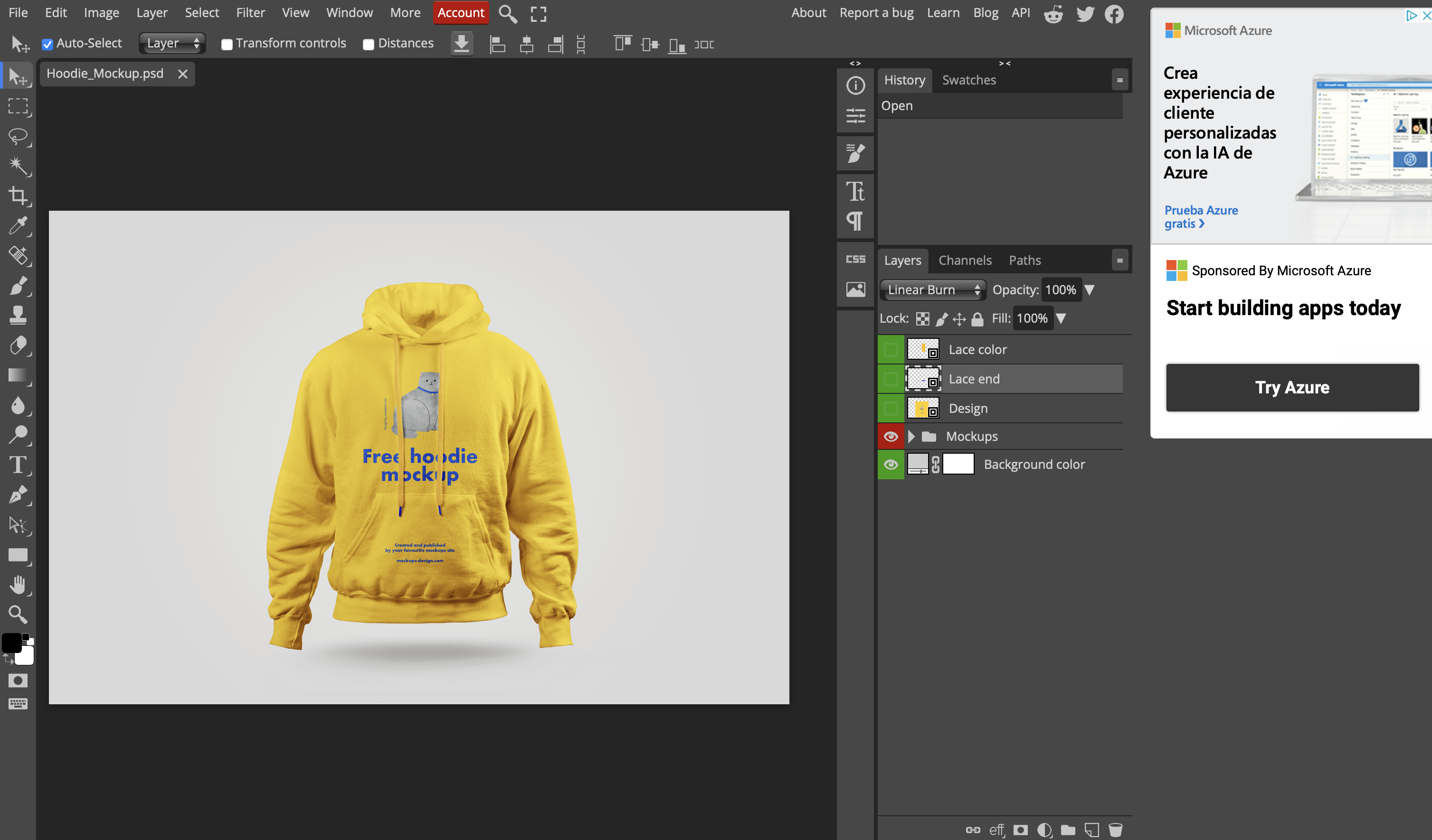
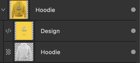
https://mockups-design.com/free-hoodie-mockup/ hey thanks, yes I know how to fix that particular PSD file but the file metadata does not translate correctly, masks need to be redone. It should not need any work otherwise there is a problem. As I said before, Photopea, which is a free online editing tool is able to read the psd and render it as it should.
-
DGee reacted to a post in a topic:
Downscaling discrepancy between resize document and export dialog
-
Downscaling discrepancy between resize document and export dialog
DGee replied to DGee's topic in V2 Bugs found on macOS
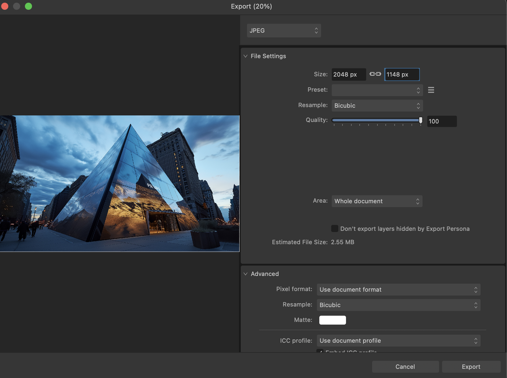
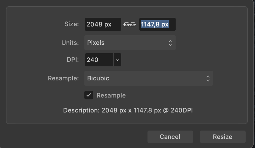
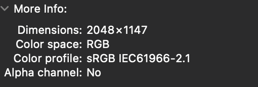
If you go to Document/ resize document as you can see in the images attached below, it shows a decimal. If I resize there and then export without resizing the output jpeg gets rounded up to a full pixel value. But If I use the export dialog that you can see here to downscale the image it shows a full pixel value of 1148, I then export the jpeg and the jpeg itself has 1147 pixels. not 1148 as displayed in the export dialog box. Hopefully you can see what I mean now. Thanks
-
Downscaling discrepancy between resize document and export dialog
DGee replied to DGee's topic in V2 Bugs found on macOS
Hi, I'm not sure I expressed myself clearly but I don't meant that. yes I know you can have decimals in size in Affinity photo, when you export it rounds it up. When you use the resize tool in the export dialog box though, it rounds decimals down... that is where the problem is. -
walt.farrell reacted to a post in a topic:
PSD compatibility is a gimmick
-
If I manually downscale an image ( using the resize document dialog ) that results in decimal values before exporting to jpeg, the final output gets rounded up to the nearest pixel. the image is question is 1007,8 so the exported jpeg has 1008px However if I downscale using the export dialog box it rounds down to the lower pixel: 1007px This is bad and hopefully can be fixed in the next update.
-
If I manually downscale an image before exporting to jpeg the output gets rounded up to the nearest pixel. However if the I downscale using the export dialog box it rounds down to the lower pixel. This is bad and hopefully can be fixed in the next update.
-
PSD compatibility is a gimmick
DGee replied to DGee's topic in Desktop Questions (macOS and Windows)
Right, I'm, not sure I could do that because it's a psd mockup that I don't own the rights to. but here is the link to the file https://mockups-design.com/free-hoodie-mockup/ -
I'm running some tests in order to try to exactly match the sharpening applied by photoshop when downscaling an image, so that I can have the exact same results when using photo. What I noticed is Photoshop rounds up the pixels and Affinity uses decimals. How can I have Affinity Photo use full pixels when downscaling? I believe what's actually happening is upon export Affinity photo is rounding down the value instead of up. My image is 1007,8 pixels tall and Photoshop is correctly rounding up to 1008 and affinity is rounding down to 1007 which is far less desirable and accurate. Thanks D
-
PSD compatibility is a gimmick
DGee replied to DGee's topic in Desktop Questions (macOS and Windows)
I may be able to share the psd with you as it's a free mockup, how can I send to you? -
Matt Lewin reacted to a post in a topic:
Affinity Photo 2 for macOS - (2.4.2)
-
simoncox reacted to a post in a topic:
Affinity Photo 2 for macOS - (2.4.2)
-
edwin404 reacted to a post in a topic:
Affinity Photo 2 for macOS - (2.4.2)
-
why is it always so complicated to check the release notes.... it makes no sense
-
Martin511 reacted to a post in a topic:
PSD compatibility is a gimmick
-
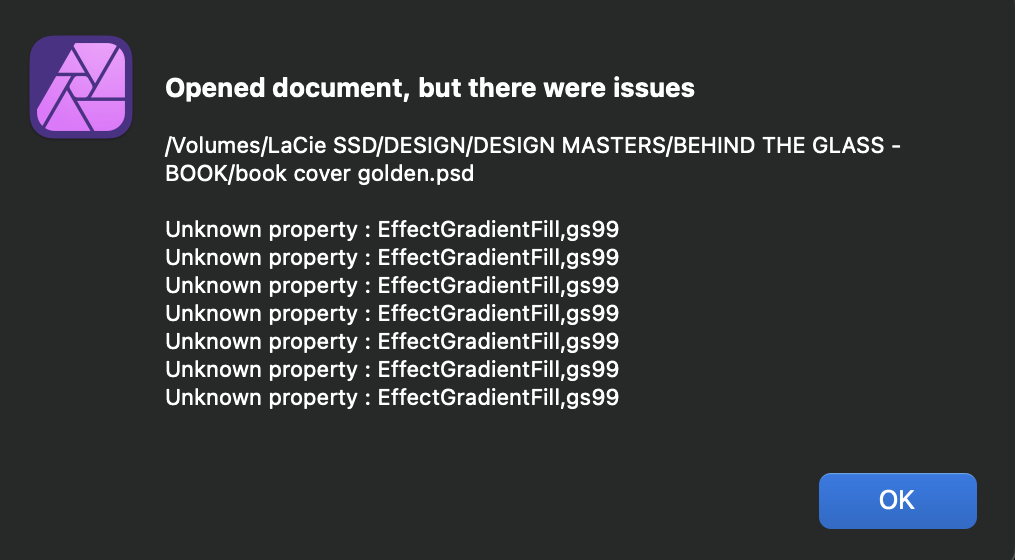
I'm trying to leave the Adobe ship but it's a very difficult task. I can get over the many features missing in Affinity but the fact that PSD mockups open broken or look different in Affinity is a deal breaker. Hopefully I'm missing something and that´s the reason for this post... BTW I have the import PSD smart objects option checked in preferences. The main issues I'm encountering are: 1. In many cases layer masks won't import and I have to manually mask those in Affinity Photo 2. Gradient Fills won't translate even if those are not mesh gradients 3. Sometimes layer styles won't translate accurately. Even if I uncheck the import psd smart objects there are clear visible differences. This a serious problem. Every mockup out there is made for Photoshop so if Affinity apps cannot properly open and render PSDs , they are not usable as a replacement for Photoshop in any professional workflow. This is a problem that has not been solved since Affinity Suite came out and to this day it has not been fixed, while there are free apps like Photopea.com that are able to open any PSD file and render it without issues... it's frustrating...
-
_Th reacted to a post in a topic:
Affinity Publisher's swatches make it difficult to work with professionally
-
DGee reacted to a post in a topic:
Optical Kerning
-
DGee reacted to a post in a topic:
Optical Kerning
-
DGee reacted to a post in a topic:
Negative feedback on Affinity V2 after 2 months of use
-
This is probably my last post here as I've just paid for a whole year of Adobe Creative Cloud. I really hate Adobe's subscription model and that's why I tried to build a professional workflow around Affinity apps at all costs over the past two years or so. In the process I've spent / wasted countless extra hours dealing with the lack of basic tools such as optical kerning, warp effects (which is now a welcome addition in v2 though it still lacks behind Adobe's in many aspects) text view options (like hide cursor, hide text boxes, text edges that really slows you down), mesh / freeform gradients, lack of image tracing, lack of vector integration with after effects or apple motion, unreliable integration with Photoshop (unexpected changes in appearance that makes it unreliable in any professional workflow, good luck trying to edit a photoshop mock-ups) lack of 3rd party plugins, mockup incompatibility just to name a few. In hindsight it was not worthy at all for me. I honestly cannot understand why Serif has not implemented basic stuff as variable font support, optical kerning or text view options when you have here people who has been asking for those basic features for many many years. It feels as if you don't care at all. When I use these apps, despite they all have amazing features, pack incredible technology under the hood, and have a lot of potential, it's a real struggle on many fronts. For me the final deal breaker was the lack of competitive text editing tools and the lack of optical kerning in particular. When you have to kern many texts daily it just makes zero sense. Maybe you should listen to your customers and probably get a top notch design consultant to guide you in building a truly competitive workflow for designers. You've probably build that workflow for illustrators, IDK as I'm not one but I'm afraid not for designers. Good luck with everything, I'll check back in a year in hope that I can go back to using these apps. I would honestly love to see Designer evolve and become a true Illustrator killer.
-
- 1
-
-
DGee reacted to a post in a topic:
Optical Kerning
-
DGee reacted to a post in a topic:
Optical Kerning
-
DGee reacted to a post in a topic:
optical alignment
-
DGee reacted to a post in a topic:
optical alignment
-
DGee reacted to a post in a topic:
optical alignment
-
If I open a PSD in Designer containing optically kerned text in Photoshop the text looks totally messed up in Designer. I was exploring this as an option to deal with Designer’s lack of optical kerning which btw drives me insane. There’s also another issue here: either the guides I set in Photoshop don’t match those in Designer or the text changes in size in Designer. I used guides for each character in photoshop to use them as a reference and be able to track changes in the psd in Designer. However no matter how I adjust the characters in Designer there is always a slight deviation from the guides I brought in from PS. Meaning no matter how I readjust the kerning to match the guides in Designer, the characters won’t perfectly fit within the guides i set in PS.
-
affinity photo Automatic colorize an black and white picture…
DGee replied to AffinityMakesMeWonder's topic in Share your work
this is amazing man