Search the Community
Showing results for 'group text size'.
-

pdf export problems
lacerto replied to Lanalang's topic in Affinity on Desktop Questions (macOS and Windows)
Here is a simplified version that would allow exporting the warp groups as non-distorted curves. The output size will be big because the raster images are pretty large and they are not compressed much with the default 98% quality setting, so there might be point in optimizing them in Photo. A PDF optimizer can easily drop the size of the export file to somewhere around 10MB, as in the attached PDF where the original size before optimization was around 50MB. As for text warp groups, I converted them to curves, then merged the separate curve objects to one curves object and only after that clipped in the image fills into them. I additionally placed the middle text on top so that the top text group does not cause clipping to it. You had some effects (FX), like 3D, inner glow, gaussian blur etc. applied to some text warp groups. These will cause rasterization of these groups so I removed them. They might well also have been the cause for warp groups failing to export properly. If such effects are wanted to be applied on warp groups, it is probably just best to export to flattened (rasterized) PDF at high enough resolution., or export directly to an image format. The resulting file size would not necessarily be any larger. All in all, when creating these kinds of designs where large image textures are used as fills or as background, it might be a good idea to just export to high-resolution image format so that warp groups can be kept as native and editable objects (rather than converted to curves). I chose to convert them to curves simply to see what it takes to keep them non-rasterized. Note that exporting to PDF also needs to be done in format that retains transparencies, since otherwise some of the text warp groups will be rasterized when exporting. adventskalender-gran_simplified.afdesign adventskalender-gran_simplified_optimized.pdf -
 I have created a one page doc made up of QS's and text boxes ( its a flow chart) that is just a bit too large for an A4 sheet of paper. I want to save the file in n A4 format. I thought I could group all the text boxes and QS's and simply transform them down but this doesn't happen and is a mess! How can I do this without having to increase the doc size to accommodate all the information and be still able to edit?
 -

Cross References
MikeTO replied to Ash's topic in [ARCHIVE] 2.4, 2.3, 2.2 & 2.1 Features and Improvements
Again thank you for cross references, I needed this. Use Index Marks as targets: One feature ID lacks is Target Type = Index Mark. For some books everything you might ever want to cross reference will have an accompanying index mark so being able to target an index mark would save time and be a nice feature. For example, in a book of biographies you might write "See John Doe on page 123" and John Doe would be in your index. In a cookbook you might write "See the recipe for Lemon Icing on page 123" and Lemon Icing would be in your index. Anchor generation: Using a paragraph as the target generates an anchor at the start of the paragraph which makes sense but its name is a truncated version of the first words of the paragraph with an appended number for duplicate names, which leads to an anchor list full of things like "Less than", "Less than 2", "Four of", "Their son", "Robert's", and "William". Perhaps the dialog could offer an optional field to name the anchors to save a step? Target Type = Target Chapter: I think it should list the chapters as names and not as numbers. Most books have front matter so what Publisher considers to be chapter 2 will almost always be chapter 1. Books and chapters: While Section Name is offered, Chapter Name isn't so I'm unsure how we'd generate "See Apples in <Chapter 7>". Minor stuff: Deleting cross references: Shouldn't there be a Delete option in the panel? I know you can delete one by selecting it with the Text tool and pressing Delete but similar panels have Delete icons. Filter Text and Style: Shouldn't these be disabled when Target Type = Anchor? Panel size and position: The panel's default height and position could use some improvement. Maybe default to docking at the bottom of the left studio? Name column in panel: You can't click a name to edit it inline as you can with similar panel lists. Display As > Above Below: Will these be localized in a future beta? Yes with Settings Chapters: The "Ch." column should be named Chapter and as with the dialog the values should be names instead of numbers. Control alignment: The controls at the top and bottom of the panel aren't vertically aligned in their spaces. [added more] Paragraphs: The list of paragraphs shouldn't include index or TOC text or else people might accidentally create cross references to text that will soon be replaced, losing the anchors. End characters list: It looks like there's a separator at the top of the list, as if there was supposed to be another option above it. Menu grouping: Cross references and Anchors fit together just as well as Anchors and Hyperlinks fit together, but Anchors are grouped with Hyperlinks. I don't use Hyperlinks but I will use Cross References so I will now also be using Anchors. Perhaps group all three together in the menu? Display As > Anchor Name: There's no way to insert an anchor's name as the Display As format which isn't that important for print documents but is for interactive PDFs. e.g., if I've named an anchor "Boiling the Ocean" then I could use that name when I insert a cross reference to it. e.g, "See Boiling the Ocean" Settings > Cross References: Is Settings the right place for this? The values shown in the fields are the current document's defaults and nothing else in Settings shows document defaults. Perhaps this should be in a standalone dialog accessible from Text > Cross References or from the panel's menu? Changing any English language option except for "English" (US) will change all English language options except for "English" (US). Changing English (US) will change only it. Is this intentional? I had one crash while editing a cross reference but I couldn't duplicate it so this likely isn't useful. I'll keep an eye on this but the steps were roughly delete the generated anchor, edit CR, target=paragraph, pick a new paragraph, click OK and then it crashed. Affinity Publisher 2 Beta-2023-03-01-132035.ips- 66 replies
-
- 3
-

-
- rmap-27
- cross references
- (and 1 more)
-
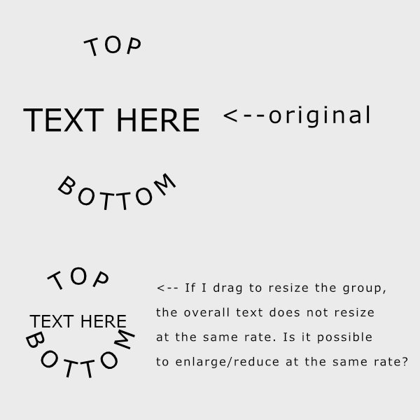
 I'm using Affinity Designer. I have artistic text on a circular path and basic text in the center. I grouped all text together, but when I resize the group, the aspect ratio of the text changes. If I expand the group, the center text gets larger and the text on the path gets smaller. And vice versa. But, I'd like to maintain the ratio so that all text expands/decreases at the same rate. Is that possible? Is there a "scale with object" option for this? I will attach my file. text_path_resize.afdesign
-
We are pleased to announce an update for the Windows release of Affinity Designer 2, version 2.0.3 The changes in Affinity Designer 2 for Windows 2.0.3 (those made since the last release Affinity Designer 2 for Windows 2.0.0) are as follows: We plan to also release this build as a MSI/EXE installer. Please follow this FAQ thread for notification of it's release. Fixes & Improvements: (since the last release 2.0.0) New Document: Custom Document Preset order is not retained between app sessions Current DPI of selected layer does not show in V2 Shape Builder Tool now has an additional option to delete open curves that were inside a newly created area, plus you can now hold Alt to delete areas while still in Add mode - more to come... Warp Group editing now supports the Shift modifier to lock node edits to an 8-axis grid. Also can be used with off-curve nodes to maintain their angle while dragging them Modifying Global Colour swatch fails to update document until you click out of the Colour Selector Sliders for Warp Group are broken Using the Select object/ transparency object selects all objects Symbols - Delinked nodes get forgotten when swapping out nodes from synchronised instances Shape Builder Tool: Alt to delete on rotated shapes fails Shape Builder Tool: sometimes drags out a selection marquee Shape Builder Tool: functional improvements on some shapes Placed documents with bleed fail to render the top and left side correctly Quotes can be incorrectly put on newlines and cause text to render differently compared to V1 Straightening in the Develop Persona offsets the image from the canvas entirely, until developed or crashes Transform Panel- Differences in panel size when switching between Curve strokes and expanded objects Cmd+Z / Ctrl+Z isn't working in V2 apps for adjustments Outline Layer Effect is making the anti-aliased edges transparent, rather than blending with the shapes colour Quick Access to Node Tool no longer allows you to insert node Fixed spurious "future version" error under certain circumstances Improvements with PDF Import and Layers Fixes for RTF import - font name discrepancies, fields in footnotes Update for HEIF importer DWG Import scaling improvements DWG file takes a long time to open then shows incorrectly (file specific). Colour Panel now remembers user preference for CMYK documents Export Panel UI fixes Fixed some tool drawing issues relating to selections across spreads etc Pen tool tweaks and fixes Fixed hang that could occur composing vertical centre aligned text OpenType handling does not respect lookup flags such as IgnoreMarks Hit box of scaled text could be incorrect Gradients on text strokes don't render unless the fill also has a gradient Fixes for line breaking in some odd cases with punctuation Resource Manager updates Light UI Improvements Many and various Layers Panel updates and fixes Clipboard: 32 bit DIB support added Auto Flow Place: Added an option to auto-flow place to replace the content of already populated picture frames More attributes are retained when replacing images in frames Ensure global colour edits update live Select Same Name should only select objects with user supplied names New clearer icons for stroke properties (cap, join, align) Help & localisation improvements. Licensing and Registration improvements and new help links UPDATING TO THIS VERSION (Free for existing customers) The software version can be seen on the splash screen and the About dialog (in Help > About Affinity Designer ). If you’ve purchased from the Affinity Store — each time you start the Affinity Store software it will check for updates and offer any available update. The latest update will install over the top of any earlier version, with no need to uninstall. You can download the latest installer by logging into the affinity store here and find the order in your account and use the "Download" button in there. Alternatively, this new release (and previous versions of Affinity Publisher for Windows) can be downloaded from this link. (those installers are NOT for Windows Store purchases). If you’ve purchased from the Microsoft Store — Microsoft Store updates are done automatically by the operating system (each time you start the application). If this does not happen for you, open the Windows Store app and click the three dots in the top right corner of the app and then go to Downloads and Updates. Click Get Updates. This should hopefully force the update to show.
- 20 replies
-
- 10
-

-
-
 I would use the "Reset formatting" for when making a new style. I would leave Base as it is. Yes, there is A LOT listed in the Base style settings. My reasoning for cleaning that section with the "Reset formatting" button is because I cannot tell what the style is for with all of that there. I am overwhelmed from step 1! haha . So, I clean out the Style settings to start fresh. I want to be able to glance in that box and see what settings the style is overwriting. If you have a style and press "Reset formatting" so that the Style Settings window is blank, I assume Affinity sets all settings to some default settings. These are just assumptions, but my thinking is there has to be default font, font size, line height, text color, etc, etc for every one of the dozens of settings. Base might be exactly those default settings, but I have no idea if that is true. So, Base with all of those settings and Base with "Reset formatting" pressed might be functionally identical. Maybe someone can chime in and give some insight! Yes, Base is a Group Style. Group Styles [I think] are unique to Affinity. They are there as a way to help organize your styles. If you have "Show Hierarchical" checked under the hamburger, your group styles are collapsible. You can also choose style settings for the Group style that all styles under it will inherit. For example, if you decide on 2 fonts for your document: a San Serif for headers and a serif for body type. You can create 2 Groups Styles, place all of your headers in 1 Group Style and all of the body type styles in the other. Now, if you want to change the font you use for headers, you only have to change it in one place. Group Sans-Serif (Font) - [ P ] Header 1 (Font Size) - [ P ] Header 2 (Font Size) - [ P ] Header 3 (Font Size) Group Serif (Font, Font Size) - [ P ] Body 1 (No Change) - [ P ] Bullets (Bullets) Sorry, I should have proof read my post a bit better. You are correct. Group Styles do not have anything in front of them in the Text Styles panel. Base is a Group Style. The reason I used [ s ] is because to create a Group Style, you press the +s at the bottom left of the Text Styles panel. As an aside. I'm pretty sure there are a lot of Affinity users that don't even use Group Styles. The most important style is the Paragraph Style. Group Styles should be thought of as just a way to organize your styles when you have "Show Hierarchical" checked. Yes, my approach is to start fresh. For example, I might make only a body style first that will style almost everything. When I get to a point that I need a header, I create a header style. When I get to a point that I need an unordered list, I create a bullet style. My logic for that is the Text Styles panel is too overwhelming from the start. I want to explicitly write the styles that I need.
 -

Photo Captions
Old Bruce replied to lgoodwin's topic in Pre-V2 Archive of Affinity on Desktop Questions (macOS and Windows)
What I do is make a Picture Frame of the proper size I then make a Frame Text text frame (not an Art Text text frame) I arrange them and group them. If necessary I will pin them in the best location in the text with appropriate offsets so they will flow with the text. The pinning of art in a text flow is fraught with complications, some times the pinning location will mean the image has to move to another frame/page/spread when text is added or deleted earlier in the flow. This then leaves a void in the original location and the text flows back into it, dragging the pinned art with it. -
 Status: Beta Purpose: Fixes and Updates Requirements: Licensed Affinity Designer 2 (registered to an Affinity ID account) Windows Store: Not Submitted Download: MSIX Download Auto-update: Not Available --- We are pleased to announce that the first Affinity Designer 2 Customer Beta 2.0.3.1670 is now available as a download from the link above. Please note: We are working on an equivalent MSI/EXE installer to ALSO be available before the time this 2.0.3.x beta cycle finishes, and becomes a public release. This beta is an update to the 2.0.0 version recently released to all customers and will form the basis of our first patch for 2.0.0. We recommend that you use this beta in preference to the release version if you are affected by any of the issues listed below. If this is your first time using a customer beta of an Affinity app, it’s worth noting that the beta will install as a separate app - alongside your store version. They will not interfere with each other at all and you can continue to use the store version for critical work without worry. --- New Document: Custom Document Preset order is not retained between app sessions Current DPI of selected layer does not show in V2 Shape Builder Tool now has an additional option to delete open curves that were inside a newly created area, plus you can now hold Alt to delete areas while still in Add mode - more to come... Warp Group editing now supports the Shift modifier to lock node edits to an 8-axis grid. Also can be used with off-curve nodes to maintain their angle while dragging them Modifying Global Colour swatch fails to update document until you click out of the Colour Selector Sliders for Warp Group are broken Using the Select object/ transparency object selects all objects Symbols - Delinked nodes get forgotten when swapping out nodes from synchronised instances Shape Builder Tool: Alt to delete on rotated shapes fails Shape Builder Tool: sometimes drags out a selection marquee Shape Builder Tool: functional improvements on some shapes Placed documents with bleed fail to render the top and left side correctly Quotes can be incorrectly put on newlines and cause text to render differently compared to V1 Straightening in the Develop Persona offsets the image from the canvas entirely, until developed or crashes Transform Panel- Differences in panel size when switching between Curve strokes and expanded objects Cmd+Z / Ctrl+Z isn't working in V2 apps for adjustments Outline Layer Effect is making the anti-aliased edges transparent, rather than blending with the shapes colour Quick Access to Node Tool no longer allows you to insert node Fixed spurious "future version" error under certain circumstances Improvements with PDF Import and Layers Fixes for RTF import - font name discrepancies, fields in footnotes Update for HEIF importer DWG Import scaling improvements DWG file takes a long time to open then shows incorrectly (file specific). Export Panel UI fixes Fixed some tool drawing issues relating to selections across spreads etc Pen tool tweaks and fixes Fixed hang that could occur composing vertical centre aligned text OpenType handling does not respect lookup flags such as IgnoreMarks Hit box of scaled text could be incorrect Gradients on text strokes don't render unless the fill also has a gradient Fixes for line breaking in some odd cases with punctuation Resource Manager updates Light UI Improvements Many and various Layers Panel updates and fixes Clipboard: 32 bit DIB support added Auto Flow Place: Added an option to auto-flow place to replace the content of already populated picture frames More attributes are retained when replacing images in frames Ensure global colour edits update live Select Same Name should only select objects with user supplied names New clearer icons for stroke properties (cap, join, align) Localisation updates --- To be notified about all future Windows beta updates, please follow this notification thread To be notified when this Designer update comes out of beta and is fully released to all Designer customers, please follow this release announcement thread
- 4 replies
-
- 15
-
-
-

White outline around every pixel
Wosven replied to manfred11's topic in Pre-V2 Archive of Affinity on iPad Questions
Original file: face.svg The first trick, is: to group the squares, duplicate the group, add a blur effect on the group, add a new Rectangle, drop the group with effect in this rectangle to avoid blur out of the area Result, a code with lot of extra group: face_blured_2.svg The second trick, is: to group the squares, duplicate the group, add a blur effect on the group (for example 2px), add a new Layer at the bottom, drop the group with effect in this Layer, clip a rectangle to this Layer to avoid blur out of the area Result, a cleaner SVG code (no extra groups): face_blured_3.svg The third trick, is: opening the SVG in a text editor (and use regular expressions in the text editor or in APub once the text is pasted in a new document), Replace the Style to have a style with fill and stroke using the same color Example for TextPad Replace: style="fill:(#[a-f0-9]+);" By: style="stroke:\1;stroke-width:0.5px;fill:\1;" Example for Notepad/APub Replace: style="fill:(#[a-f0-9]+);" By: style="stroke:$1;stroke-width:0.5px;fill:$1;" Example, this: <rect x="-0" y="0" width="200" height="200" style="fill:#32516e;"/> <rect x="200" y="0" width="200" height="200" style="fill:#365677;"/> <rect x="400" y="0" width="200" height="200" style="fill:#3a5b7e;"/> <rect x="600" y="0" width="200" height="200" style="fill:#3d6186;"/> Should become: <rect x="-0" y="0" width="200" height="200" style="stroke:#32516e;stroke-width:0.5px;fill:#32516e;"/> <rect x="200" y="0" width="200" height="200" style="stroke:#365677;stroke-width:0.5px;fill:#365677;"/> <rect x="400" y="0" width="200" height="200" style="stroke:#3a5b7e;stroke-width:0.5px;fill:#3a5b7e;"/> <rect x="600" y="0" width="200" height="200" style="stroke:#3d6186;stroke-width:0.5px;fill:#3d6186;"/> 0.5px or 1px, 2px, etc. depending of the size of the drawing. face_stroke_1px.svg face_stroke_2px.svg And the AD file: face.afdesign
-
 I don’t think you can change the size if the text if you have a group selected. You can change the size of the text the way I mentioned above if all of your text is of the same size but you can’t do it if the text is formatted to different sizes. I don’t know if this is by design. However, you can change the size of many selected text layers – when each text layer has a different font size – via the Horizontal Scale and Vertical Scale fields of the Character Panel. I don’t know if this will cause problems with other things later. Note: As iconoclast mentioned above, when you mention that you are working with text, it’s better to say whether you are using Artistic Text, Frame Text, or a mix of the two, as some functionalities differ between the two.
 -
 I have a group of objects (Text boxes and outline images) that I wish to scale uniformally by a fixed percentage – say 50%. I've never found a way to do this in any of the Affinity apps. The only way is to drag the group and 'guess the percentage amount. This obviously is not accurate. If I select all that I need to scale and then enter the percentage in the Transform panel – say Width 50%, then it does this but destroys all the relationship of the grouped elements. So Text in a text box stays at its original size but the Text Box reduces. Is there a way to solve this without converting text to outlines etc?
 -
Use the flow options in the Paragraph Panel for this, Start on: Next Odd Page Do Not use blank paragraphs to space the text, use Space Before and / or Space After in the Paragraph Text Style. You also use Frame or Page Breaks in some places. I am guessing this is to create spaces for the images. Use the Pinning panel and the Text Wrap to make the space, as you are already doing. You tend to override Paragraph Styles for no discernible reason. On Pages 20 and 21 you have overridden the Body Text paragraph style as well as the Body First Paragraph style for the three illustrations (1, 2, and 3). I would have made a Paragraph Style for these paragraphs, as there are many of them. Here is a basic setup of the Master/Parent pages and a couple of Paragraph Styles to start with. Also note that I have the Page numbers applied to the other two Master/Parent pages. Anthology bruce edit 04.afpub Note the use of the 2 Group Styles; Base and Headings. I use these to base other styles which are quite similar, this way I only have to change indents or first line indents in new Paragraph Style to get a Quote or a First Paragraph paragraph style. The vast bulk of my Paragraph Styles' properties are set in the Group Styles. This way I only need to change the Font Family or Font size once and have it change automatically in two or three or seven related styles.
-

Text Box background V2
walt.farrell replied to Marti4x4's topic in Affinity on Desktop Questions (macOS and Windows)
Thanks. You have a few choices in Designer (more in Publisher). Designer: Art Text: Set a background color in the Character Panel. Frame Text: The approach for Art Text can also be used with Frame Text, but if you want the entire frame to have the white background create a Rentangle of the same size as the Text Frame, fill it with white, and group them together. If you were in Publisher, you could use the Text Frame panel to set the fill of the frame. -
Publisher Features I use all the time: Master Pages Text Frames Text Styles, Paragraph and Character Styles. Master pages should hold things (graphics or text) that you want/need on every page or a set of pages. Sometimes you'll want an actual photograph on each page, most likely you'll just want a Picture Frame on each page so each page can have a different photo on it but in the same location. Text Frames are what hold the text in your ezine or newsletter. I put most of them in Master Pages but that is for the way I work. Text frames are in two flavours, Art Text and Frame Text. Learn about the differences. Frame Text text frames can have a background colour and a border, they can have offsets for the text on the top the bottom the left and the right. They can have a Baseline Grid so the text can be neatly aligned. Text Styles are great, you can set them up so the text size for all your text can be increased or decreased very easily. You can change the font from a Serif to a Sans Serif font with a simple click. Bolded text can be made more bold through the entire document by changing one setting in the Character Style. Paragraphs can be changed from a bulleted list to a numbered list quite easily. All you need is to use the Paragraph and Character and Group styles. If you are going to be using a lot of images, photographs or digital artwork drawings then read up on what the Picture Frame can do.
-
 I'm trying to resize a group that contains frame text, but I noticed that the frame text's font size doesn't rescale in proportion. Regular text is scaling properly. Oddly enough, this problem does not occur when modifying skew. How do I get the frame text to scale together with the group?
 -
 I have a logo that has text on a circle. When I scale the circle with the text on it (part of a large group of nested circles) the text does not scale and it makes a large mess. I have to size the text on the circle to the target size first before I can resize the circle. This is very frustrating as the new logo is a large group of nested circles and other text that I want to be able to resize at will to whatever size my needs are. What am I missing? Or, is this the expected behaviour. My recollection of Illustrator is that this was not a problem and the text would resize with the circle.
 -
Fortunately, I have versioning in my blood, so I do have some "good" document versions of the project I'm working on. I started with a good one yesterday. 1st document - older - stable-ish, also versioned. This is a completed 12" x 12" document. 2nd document - the newer one that is crashing after being edited awhile. This is an 8" x 10" format. I am copying page-by-page from the 1st to the 2nd document. In order to do that I do the following things to the 2nd document. a. add pages a spread at a time, usually, or maybe 6 pages. b. Copy (always copying from the 1st document) the background image in a picture frame (full page or full spread) then paste to the 2nd document. Arrange it "Send to Back". I noted that even though the source picture frame is arranged "to back" the copy is NOT arranged to back - so that must be done manually just after pasting it. c. Copy all elements on a page (text boxes, picture frames, usually) then paste to the 2nd document. d. rearrange the elements just pasted (as a group) grab lower right inner drag handle while holding the Shift key down. Drag the group to fit (smaller) into the page. Then center the group on the page. Then click outside page to remove selections. e. work with each item. Text boxes shrink, font sizes do not. So text boxes need to be resized and re-centered as captions for images. In some cases, I select all the text in each or a group of text boxes and make the font smaller. Also checking the Paragraph Leading to be sure it's value matches the font size. Adjust the text boxes to fit the text and place as a picture caption. f. Work with each image. Some are not set to "Max fit" in the 1st document so they tend to slide away from the picture frame and are not made smaller by the group of elements that are shrunk down. Center the picture frame where it needs to be, align to other frames if called for. This means clicking some other frames just so you can get a line-guide to show up with the picture frame I'm moving. May have to use "frame fit to picture" and followed by "Max Fit" and then grab corner with Shift key and shrink/fit the picture frame to the area it needs to go into. In some cases I have to double-click the image handle (center of image) so that it will fit into the frame properly. g. Select all elements on that page - center them vertically (guide lines) and horizontally. h. Move on to next page and repeat process. Here are some other possibilities. I noted that the text styles that are brought over from the 1st document (while copying them) are added to the Styles list with new, sequential numbers. I missed this little detail when I started the project. I have hundreds of duplicate styles because of this. An example is a "box" based on the default box that comes with the styles. I made one new one in the 1st document - Box Blue 1. Now there are maybe 40 of those (duplicated) with sequential numbers. This is also happening with other text styles. One of the "clean-up" efforts I was doing is to select a group of text/box and change them from the sequential box styles to Box Blue 1 or another standard Style I was using. This changes the text size (my new Box Blue 1 in the 2nd document has a smaller font and Leading size). It may be coincidence, but it was after these changes that the "good" document started acting up and crashing. But it could have been any number of steps listed above where I'm copy/pasting and re-editing a lot. Another difference between the documents is - just around the same area where the document is "good" and then it goes "bad" again. I have been changing how text flows between text boxes. The 1st document does not use this feature - just two to four boxes with fixed text representing one transcription of a written letter. In the 2nd document, I have been linking the text boxes and then copy/paste the actual text into the new boxes - where it all flows. This is a new difference that I have been using. I have about 12 letters that are transcribed. The good document (2nd one that does not crash) has just the two text boxes on one page. What I've been doing is to continue to add pages and text boxes (with links to flow the text) and saving test versions as I go. I use the Text Frame panel to set the background colors (12 different colors for the 12 letters) and use a Style "Letters Home" and make sure that is applied to the text. There are also the text frames that are styled as "boxes" and making that Style change to the standard (non-sequential) box Style I now use. I got to about the 10th letter home when the document started acting up and it would just crash when I tried to continue the process. That's about 10-12 spreads added to the "good" version. Do keep in mind the earlier "fix" you did for me - apparently something to do with the Indexing/Index marks, and "See Also" types of references. Those index marks are also coming into the 2nd document from the 1st document as I paste the text in. One probability is that an earlier index mark (in the sequence of pages) that has a "see also" reference, references an index mark that HAS NOT yet been added to the document. I do have lots of memory in the "very fast" machine 64 GB 2667 MHz DDR4; 2.4 GHz 8-core Intel Core i9; available disk storage 2.81 TB; Catalina 10.15.3 and using AFPUB 1.8.3 currently. Thanks for helping out - hope what I've written might help to narrow down what is going on.
-
 @euronesia, a couple of observations... firstly, the makeup of the graphic elements in your file use a mix of RGB, HSL and CMYK colour specs as shown below... while this isn't the cause of the issue, all the elements should ideally use an RGB colour space... It looks to me as though there is a bug here with the rendering of shadows that have Gaussian Blur applied to them. According to the Affinity Designer Guide... Allow advanced features When selected, all design features supported by the PDF file format are exported as vectors. If this option is off, depending on the nature of these features, they are rasterised or converted to curves on export. These features include: Artistic text which has been horizontally or vertically stretched. Text which has an applied stroke. Linear and radial gradients. Non-solid transparencies. By Default, when selecting either PDF Digital (high - quality), PDF Digital (small - size) or PDF (for export), Allow Advanced Features is off by Default, so by Affinity's definition this means the Gaussian Blur Shadows are rasterised. When you take a look at the exported PDF files using either of these export options, the 'shadow' layers are indeed, as expected, rasterised, however, when you check Allow Advanced Features for any of these three default PDF export options, you notice that the rasterised shadow elements are nested in their own Group layer, separate from the overlying Gradient Layer as shown below... Allow Advanced Features Off - Left | Allow Advanced Features On - Right So, as a quick test, in the original source Affinity Publisher file, I simply grouped all the Shadow layers to mirror the layer structure shown on the right above, including the Shadow layer on Master A and then exported the file using the default PDF Digital (high - quality), PDF Digital (small - size) and PDF (for export) settings and lo and behold they export correctly. So it looks like a bug relating to how linear and radial gradients are rasterised when Allow Advanced Features is off, which it is by default for these three PDF Export settings...
-
 Hi! I have a document with many different text layers in Designer — the text layers are grouped in various groups, some of them are not. I want to select all the text layers and change the type size for all of them, but wherever the text is grouped, it doesn't seem to resize it or change it at all the only way I can make it work is to select the actual text layers — and not the group. Any way this could be remedied (aside from styles which I'm aware of) Thanks!
 -
 Group-transform the size of all selected text (no matter what fonts, sizes, etc). A parameter in the Character window to increase or decrease size of all this text by the same amount - just as if I was to scale the selected text with a bounding box.
- 1 reply
-
- 1
-
-
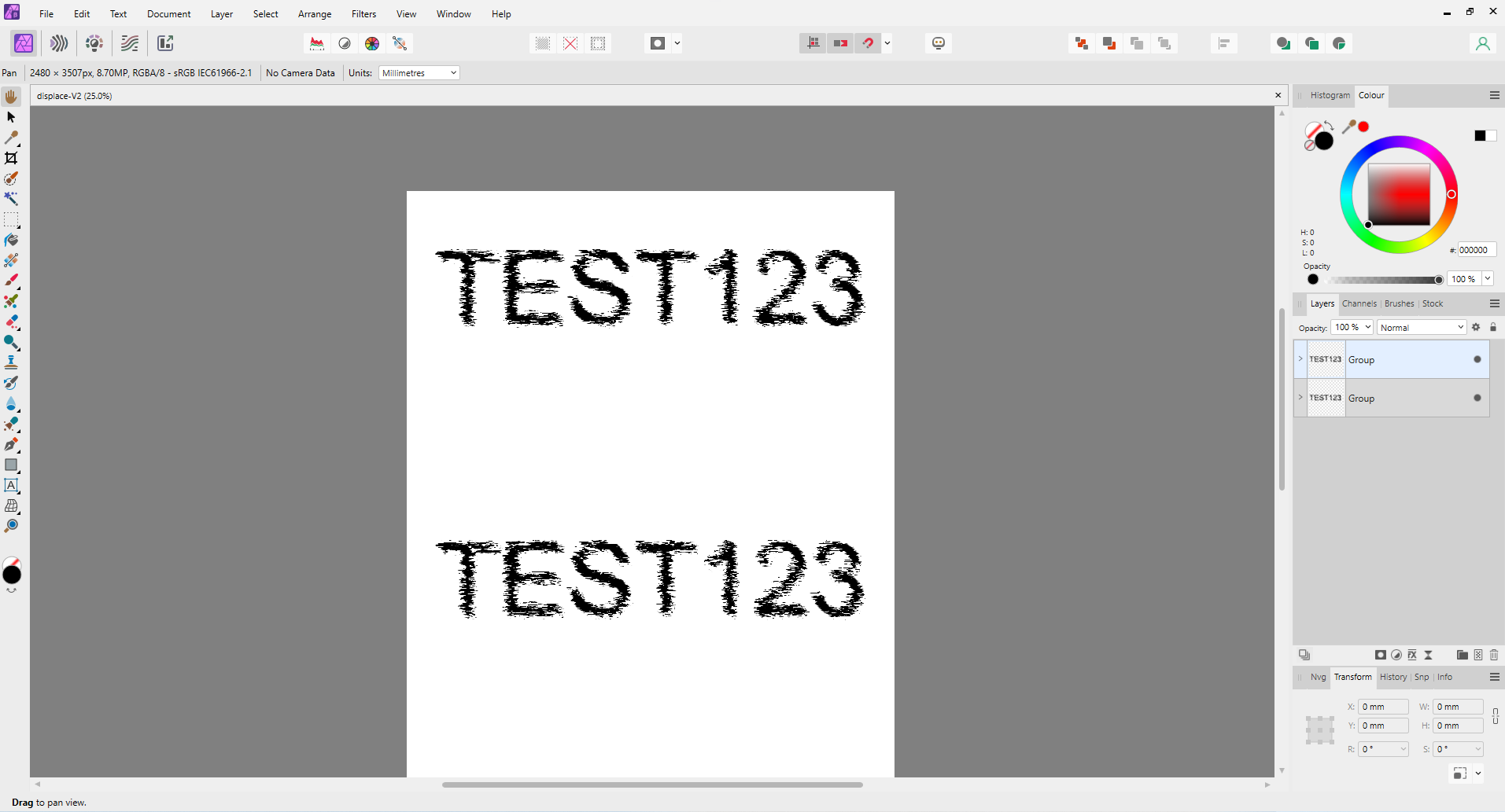
 It can be done but a lot of fluffing around Use an image the same size of the text layer Placed it under the text Select Load map from Layers beneath for the Displace Layer & Adjust effect Group the above Duplicate Group Drag down to new position Delete this one's Displace layer Readd the Display layer with same settings as before You can now hide (switch off) both image layers If you need to move any of the groups again, you need to delete and readd the Displace filter There may be other easier ways to do this but who knows AfPhoto file attached displace-V2.afphoto
-
Designer Version: 1.10.1142 OS Windows 10 home version 20H2 build 19042.1237 Hardware acceleration on (makes no difference either way) Designer shows pop up with message: "Failed to save document... Save failed due to an internal error. This should be reported to the development team." Can I reproduce the fault - yes but only so far with the one document attached. A new document does not provide the same error. For this test document I created a new file, added a rectangle to this. Some text over the rectangle then using the layers panel moved the text "within" the rectangle. Grouped the text and rectangle and then promoted the group to a layer. Saving this out produces no save error. The error with the attached document is created by doing the following: Select a group then use the layer menu > promote group to layer Now attempt to save the file using CTRL S Error will be generated on save attempt. Interestingly I tried to SAVE As which appeared to save the file out however, attempting to reload the new file gives an unknown file type error upon trying to reload the file. The save error is generated whether I try to promote either the page border group or drawing info group (at bottom of layers panel). I have tried this with three different groups within this file and each one generates the error after promotion to layer. For what its worth I have save history with document turned on which for such a simple drawing (yes I know) is making the file huge but may be of help... when drawing finished this can be turned off to reduce file size. Any ideas? Cheers, Adam. VTE 01 - FoH Domestic Main A3.afdesign
-
hey folks, thank you for checking this out. first, i'm a noob trying to break free of adobe after 35 years. managed to do so with a.designer & a.publisher but a.photo is another thing. i go off on that below. i'm always the guy that finds out what's wrong with something. if i worked in QA, i'd be king of the world but... yeech. i'm enough of an angry old man already, thank you. anyway, thanks again for your validation. i'm not looking for answers as much as hoping my troubles translate into something good for many others. peace out! ________ AFFINITY PHOTO: first thing i do is move the tools and tool windows from the big monitor to the macbook. but once pulled out from their position docked at the right, they're impossibly long. trying to shorten them was a very time consuming and problematic act. one that should take a second or two takes minutes as i struggled to hook into the fraction-of-a-pixel-magic-spot where the up & down arrow exists to shorten the tool window. the entire time i have a hand-shaped cursor which wants to move the file around and NEVER lets me change the size of the damned tool window. i later figured out one must try a CORNER and then it's far easier to grab, but why not the first and logical choice from the bottom? why is one way easy and the other rather impossible? can we make the ability to customize tool box sizes more intuitive and far less of a pain in the ass? thank you. ________ is there a way to tap into one's v2 settings (studio, brushes, etc.) instead of having to re-install and set up for an hour? is this what users will experience when v2.1 is ready to download? if so, it's not cool. forgive me if i should know this from v1 updates but i never used v1 to know. i'm a noob using all the affinity v2 progs for only two months. thank you. ________ why can't i simply right-click to "unchain" and move brush categories into customized groups? it's easy to create & name a new group but getting actual brushes into it is far from intuitive. i have yet to figure out how to actually move entire brush categories into it. i can only move one brush at a time. i have a couple thousand. this is so lame it's wearing a cape. it's an issue i have with a lot of affinity workflow; click hold click click scroll click click click repeat 1000 times and then click/scroll just one more time. jesus. when i was a UI designer, clicks were bad. we were to make the fewest clicks possible to get a user where they wanted to go. what happened to that? how does one unlock the folders? there is no menu option on the burger in the brush window. is there a way to move entire brush folders into other folders that i'm unable to find? and again, why is this so lacking in intuitiveness? why must a noob struggle to do simple operations like categorizing brushes? thank you. ________ you know what would be more cool than a naked supermodel at your door sporting a bleached mullet? the ability to import .pat and .atn files to gain patterns and to use as action/macros in affinity progs. the supermodel says "HELL YEAH DUDE!" that would surely require a far more robust "macros" capability than i've seen so far. one would think with v2 something like this, which many have commented on over the years, would've been addressed. if affinity could boost this aspect of their programs, it would be the most important thing which keeps many from coming over. it's why i never did until $99 for all three. adobe creative cloud is obviously still making it and probably always will, but i've moved away from indesign and illustrator to fully use publisher & designer. photo is another thing, though. if i could do with affinity photo what i do in photoshop, all i'd need is $5/mo incopy subscription to be able to use their fonts. but i find so many things lacking, #1 being the "actions," that i cannot fully commit to photo. and that's a darned shame because it does a lot of nifty stuff. so i open in photo, do a few tricks, save as a psd and finish in p-shop. now the supermodel is crying. good job. ________ once a tool window attaches to the side or top or bottom of another, how does one free it? ________ i cannot state more emphatically my frustration at the lack of intuitiveness with photo. the other two a progs were a cinch to get a hang of. at this moment i create a circular path. i click on the bottom inside to add text. i paste my text and it changes the paragraph to "justified all" when i had "center align" chosen. so i re-choose center align and. . . . nothing. meanwhile, a short sentence is wildly spaced on both sides of the circle and nothing will make it change. back to photoshop i go for the night. i struggled to do ANYTHING in a.photo and spent two hours importing brushes and swatches, organizing my studio (all which should've been auto created off my v2) and writing these notes. i hope this changes things for the better because i can't spend so much time to get nothing done again. thank you.
-

Creating Collage (Shapes / Text)
v_kyr replied to mattnico's topic in Affinity on Desktop Questions (macOS and Windows)
Hello and welcome! You didn't said in which Affinity app you want to do it, or which apps you have therefor? However, here's a rough sketch for you of a common procedure in the steps to perform therefor ... Use the Artistic Text Tool and type in a huge font size of your choice the text (name of the daughter), or as above shown a "1" for first tryouts. Select the text (or "1") and "convert it to curves", so you have vectors of the letters now. Place on every vector letter separetely, several white equally width sized rectangles (use copy/paste for duplicating rects), use the move tool and place, rotate ... place them as you want, or as shown in your above image. Now select the vector letter and all rects arranged on that in the layers panel and perform a geometric subtract operation (this splits the letter into pieces, like shown in your image). - Alternatively on ADe v2 you can use the Knife tool to cut a vector letter into pieces. After the geom. subtract you should have now several pieces of a letter, group those together as they all belong to one letter. Now load in images and clip those underneath each of the letter pieces you want it to appear. -

Editing Photo Booth Template
firstdefence replied to Roman K's topic in Affinity on Desktop Questions (macOS and Windows)
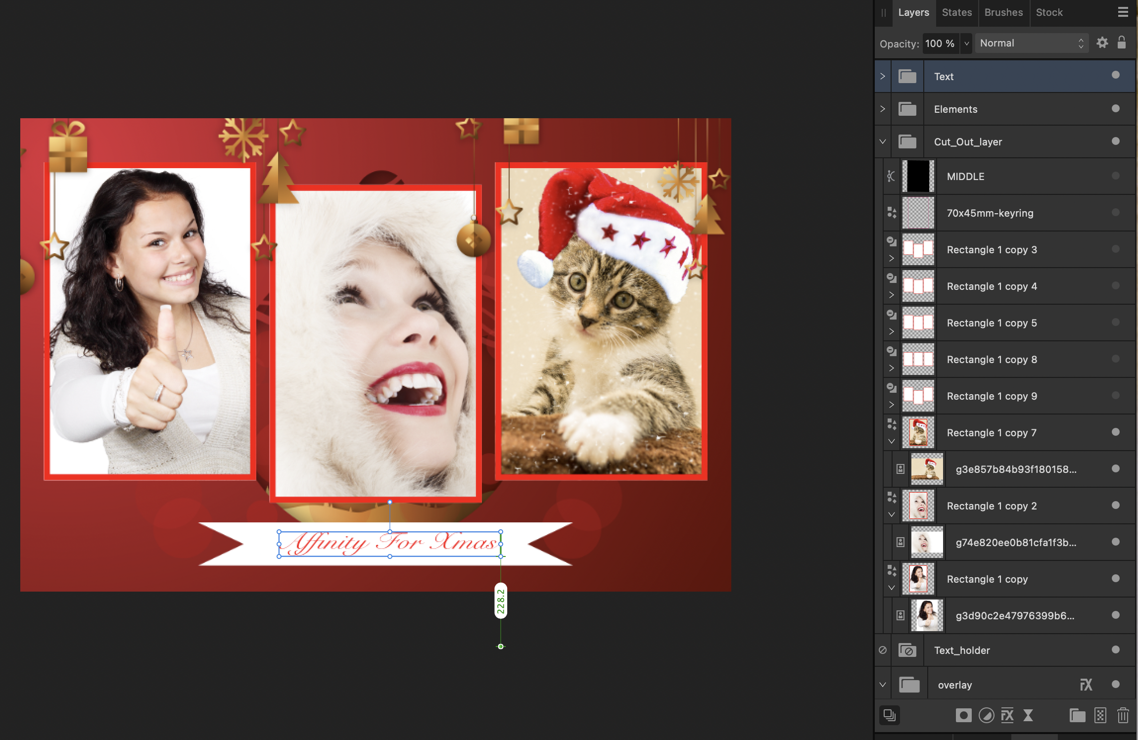
Ok, I think I've worked it all out, so... In the Cut_Out layer group hide everything but Rectangle 1 copy, Rectangle 1 copy 2 and Rectangle 1 copy 7 see example screenshot below. In the Overlay group, turn the mask off, you can forget about that, it isn't necessary but keep everything else active, see example below, I've also turned off the text_holder, text, elements and people groups to simplify the display. but these can be turned on later. Now go back to Rectangle 1 copy, Rectangle 1 copy 2 and Rectangle 1 copy 7 and move them to where you want them to be. You can place images as child layers to the rectangles Final setup can be seen here, click on the image to see it full size to see the layer arrangement better.