Search the Community
Showing results for 'variable fonts'.
-
 I disagree, mapping outlines to multiple Unicode codepoints is a smart and efficient way to build fonts. If you open Arial or another Windows system font, you will find a ton of double mappings. (Such fonts do not have glyph names, just a list of Unicodes mapping to glyph indexes.) In an effort to reduce fonts size, I built a multi-script font and gave the letter A three codepoints, for Latin A, Greek A and Cyrillic A. This applies to many shapes. Substantially smaller file, smaller kerning, all nice. In MS-Word, this font works perfectly, copying pasting text, spell check etc. Word has an "Insert Character" dialog that only shows code-points. In the backward Adobe universe, this font is a total disaster. In Affinity V1 it was handled already much better, all codepoints shown. Haven't tested since then. The problem is that Adobe can't handle multiple mappings, their software has yet to learn the difference between a glyph (slot with outline) and a character (code point). Their Glyphs window can only show Glyphs, not all Unicodes of a font, now that is truly stupid 🙂
 -

Designer | Kerning is wrong with some fonts
kenmcd replied to GenewalDesign's topic in V2 Bugs found on Windows
Different issue. In the image below, your doc opened in Designer 2.4.1 on Windows 10. Looks fine here. Do you also have the variable fonts installed? If you do, un-install them. Cannot have statics and variables from GF installed at the same time.
-
Nope. The only fonts available from the cloud fonts are the basic RIBBI v1.05. Not even the Medium. And certainly not all of the 16 styles in the variable. The cloud fonts are kind of a mess. When I started doing a detailed inventory awhile back I found stuff missing, old fonts, misnamed fonts, etc., etc. Definitely a WIP. The lack of the Medium for the old static version is probably an oversight. But the lack of all the styles from the variable is likely a decision. Probably not what you wanted to hear. But variable font support is coming to your favorite Affinity app soon....
-
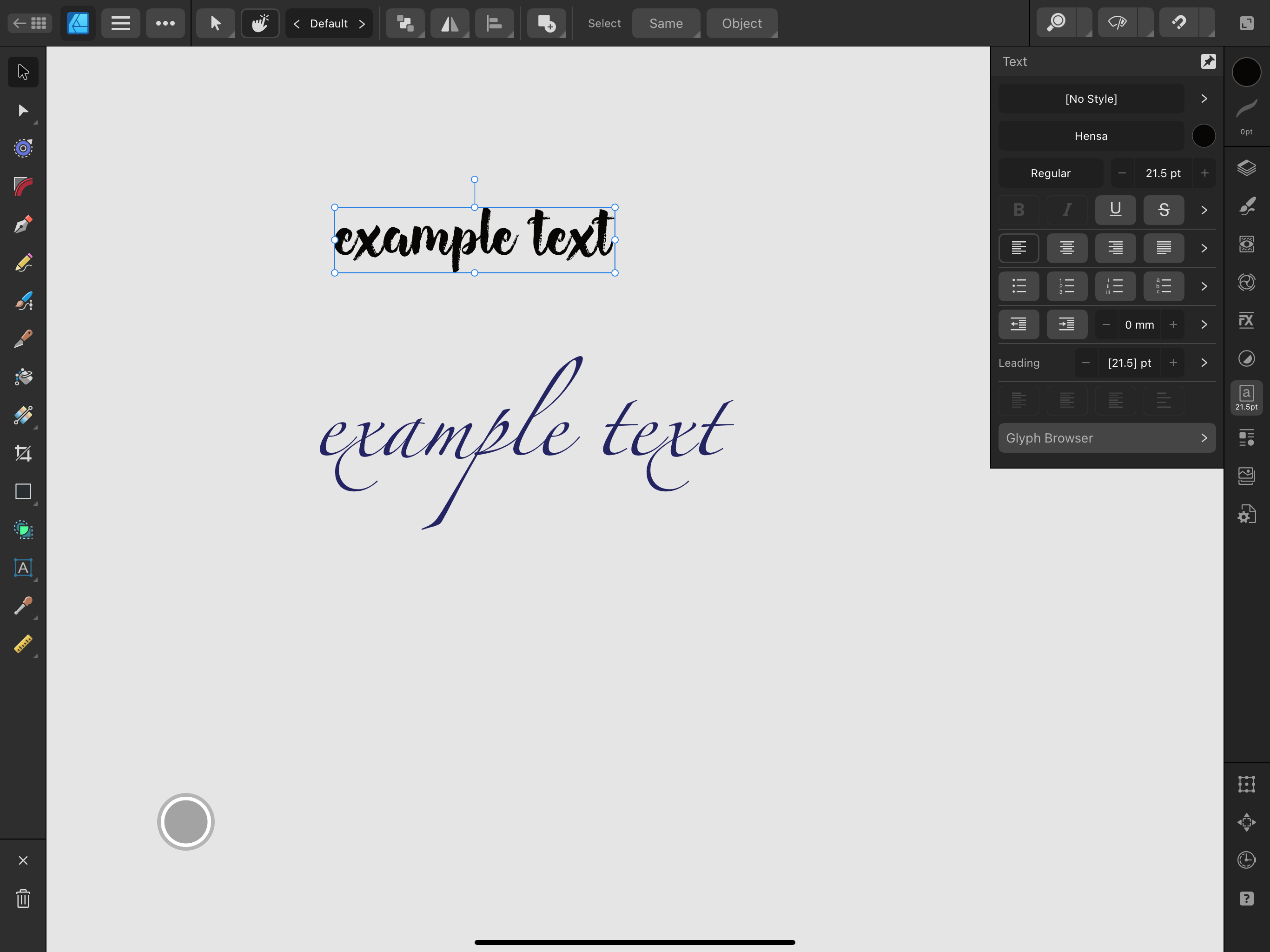
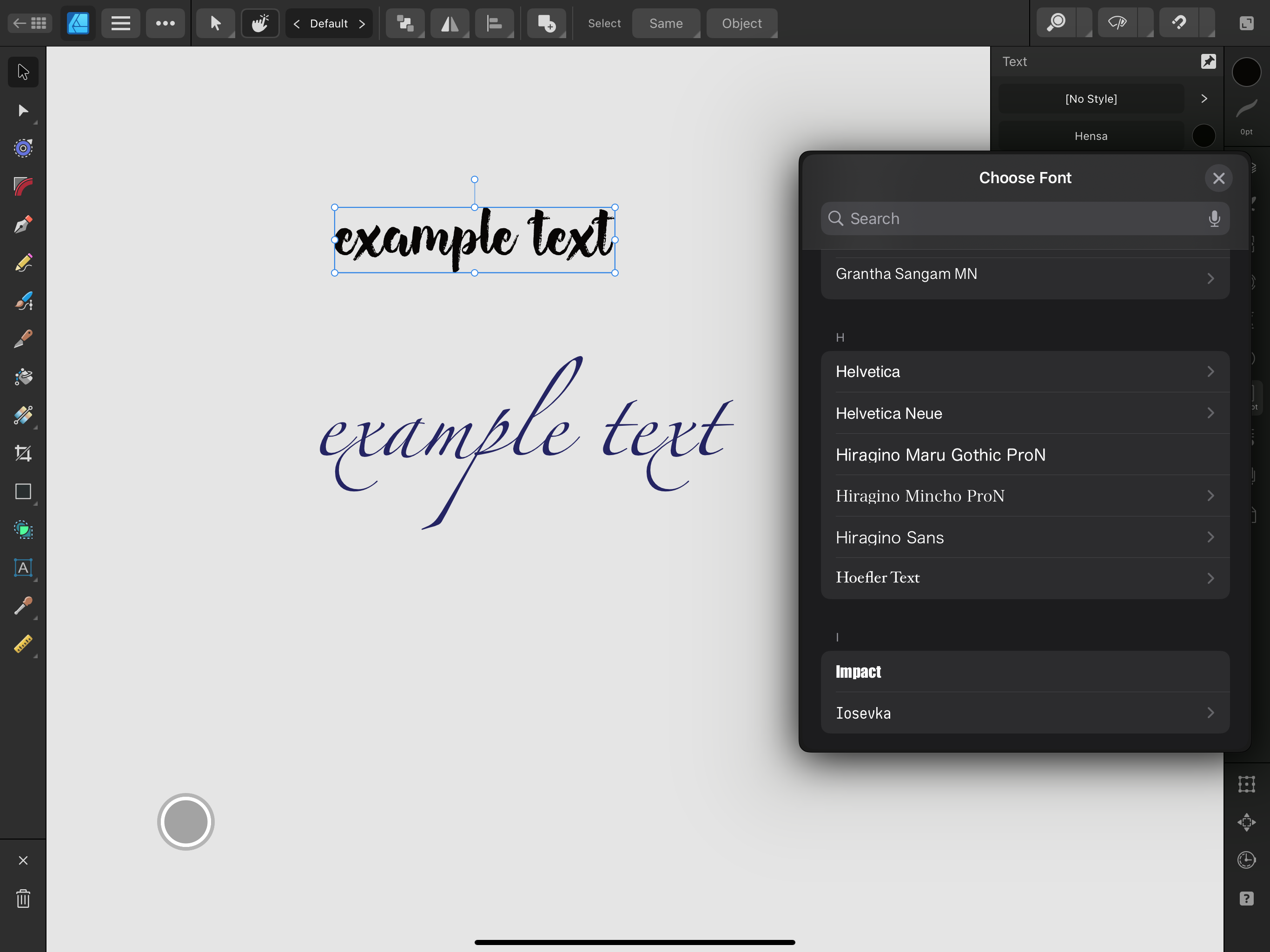
I find myself a little confused in having Cormorant (eg) with 'Light' twice in the drop down menu when both forms are installed - only by selecting can I see if a particular Light is actually the variable one, when the 'v' button lights up. Could Affinity perhaps put Light* in the menu (or just * ) to avoid this confusion? I am not a heavyweight professional user but I make leaflets for politics, festivals and so on and don't want to cause them grief! Edit : for advice..... I notice also that some fonts that occur in both forms ( Google Cinzel for instance ) have naming that makes it impossible to have both forms under Windows - installing either asks if the regular form is to be overwritten on install. Is this 'just how it is' and everyone has to live with it? I don't really want to update FontCreator just to change names as designing variable fonts is out of my league.
-

Designer Beta 2.5.0.2415 won't start
Sean P replied to Cooperphile's topic in Other New Bugs and Issues in the Betas
Thank you very much for the crash reports and the fonts. Whilst I still cannot replicate it with those fonts installed, the crash reports do seem to be working this time. I've passed these onto development, so fingers crossed these shine a light on what is happening! -

Variable Font Support
Affinity Info Bot replied to Ash's topic in 2.5 Beta New Features and Improvements
The issue "Variable Fonts - Geologica Font not responding to Cursive axis" (REF: AF-2893) has been fixed by the developers in internal build "2.5.0.2437". This fix should soon be available as a customer beta and is planned for inclusion in the next customer release. Customer beta builds are announced here and you can participate by following these instructions. If you still experience this problem once you are using that build version (or later) please reply to this thread including @Affinity Info Bot to notify us. -
FWIW I had some weirdness in Affinity where I had one document I had opened that used a static version of a font, while I then created a new document that used the variable version (but only having the static or variable version of a font active at one time). I ended up Affinity picking up the 'correct' font, but there were visual glitches in terms of tracking, kerning, metrics, etc. Even copying between Affinity documents was creating some confusion. I'm not entirely sure if this problem is down to only some variable fonts, or if it's potentially a larger problem in the way that Affinity handles these fonts in general. I'll do some more testing later, and try to come up with a solid reproducible test case.
-
 Viktor, I can't speak for Affinity, but developers don't measure key press times. The operating system has events such as keyDown, keyUp, keyPress which applications 'listen' for. When you press and release a key, the app gets a keyPress event which it can act on. The app doesn't know how long you held down the key. The operating system determines whether you have pressed and released the key or whether it is being held down. You can modify the variable in macOS System Settings.
 -
Variable Font Support Discussion (split)
kenmcd replied to fde101's topic in Beta Software Program Members Area
The Roboto Condensed static fonts still have the overlaps. Most of the time font developers will remove the overlaps when the static fonts are created. But some of the GF tools do not remove overlaps by default. Developers using their tools can switch-on "remove-overlaps" and usually do. But since being able to properly handle overlaps is required when using GF variable fonts, GF will often leave-in the overlaps. If you are on a Mac, Core Text did/does have a rasterizing issue when two lines are on top of each other - it shows a bit of a halo where the overlap is. Do not know if this has been fixed or not (probably not). But the big jaggies you are seeing are an Affinity issue with the overlaps. They are going to have to solve dealing with the overlaps to support variable fonts. Variable fonts are never going to remove the overlaps. Note: As a work-around for now, you can remove the overlaps from the Roboto Condensed static fonts yourself. -
 iPadOS 17 affinity 2.2 official version (2005), iPad pro 2012 M1 processor, the response is very slow when selecting fonts. I don’t know when this problem will be solved. RPReplay_Final1695223328.mp4
 -
 As long as you have a subscription with Adobe that allows you to use those fonts, it doesn't matter which software those fonts are used in. Since fonts synchronized with Adobe Fonts are recognized by the OS, they can be used in applications other than Adobe. --- Zolang je een abonnement hebt bij Adobe waarmee je die lettertypes kunt gebruiken, maakt het niet uit in welke software die lettertypes worden gebruikt. Omdat lettertypes die zijn gesynchroniseerd met Adobe Fonts worden herkend door het OS, kunnen ze worden gebruikt in andere toepassingen dan Adobe.
 -
Missing variable fonts are not requested on macOS
kenmcd replied to Floor's topic in Other New Bugs and Issues in the Betas
Thanks. They have been requiring a unique nameID 25 PostScript Name Prefix be present in variable fonts. All the Source font families are an example. So I am wondering exactly why and how they are using that. The Google Fonts folks think it (that non-standard requirement) is basically a bug. And they have reservations about requiring it. But I have seen font developers including it for ID compatibility. So just wondering if it has any bearing in Affinity variable support. Thanks again. -
I am on macOS 14.3.1, and I just tested with Roboto Serif and I see the same thing problem what you reported here: What I am seeing is that it seems to jump from italic to non-italic several times, not just the minimum and maximum. I presume it is going to italic when I pass over a named instance. It may be relevant that I am using Typeface as my font manager, and I currently have both static and variable versions of that font active. I tried deactivating all of the static versions in Typeface. That seemed to work, but then when I restarted Publisher beta with only the variable versions of the font active, I experienced the same problem.
-

Curated list of Free for Commercial Use Fonts
Affinityconfusesme replied to Mithferion's topic in Resources
@Mithferion will this list be updated with variable fonts now that it is beta? -
 Official Affinity Publisher Desktop Tutorials The Affinity Publisher video tutorials are available here: https://affinity.serif.com/tutorials/publisher/desktop/ In case you didn't know, the above tutorials are also accessible directly from Publisher's Welcome screen. We've really tried to go the extra yards with this tutorial set - all shot in 4K, picture-in-picture, subtitling and packed full of tips and tricks. If you have any requests or feedback, please let us know by replying to this topic. The videos listed at the above link are hosted on Vimeo. Alternatively, please find a list below with YouTube links: Basic Operations: UI overview New Document dialog with templates Open and import IDML import Pan and zoom Selecting Moving, resizing and rotating Studio Presets Page Layout: Pages Master pages Smart master pages Sections Page numbers Rulers, ruler guides and column guides Column rules Baseline grids Picture frame tools Place and Scale Images and Documents with PDF Passthrough XLSX import Linking and embedding Pinning Assets Panel Shape tools Convert pixel layer to image node Configurable bleed and margin guide colours Clear Picture Frame Background on Populate Text Tools: Simple text Frame Text Tool Linked text frames Text styles Text wrapping Text on a path Artistic Text Tool Find and Replace Initial Text Baseline Advance Typography: Characters: Fonts and font attributes Characters: Kerning and tracking Characters: Optical alignment Characters: Special characters Characters: Advanced typography Paragraphs: Alignment, leading and inter-paragraph spacing Paragraphs: Text Ruler for indents and tabs Paragraphs: Bullets, numbers and initial words Advanced: Tables Table of contents Indexing Hyperlinks Merge documents Collect resources Data Merge Publishing: Preflight checking StudioLink - interworking with Designer and Photo: Designer Persona: Vector Brush and Pencil Tool Designer Persona: Multi-stroke/multi-fill effects Photo Persona: Paint Brush Tool Photo Persona: Removing image areas Photo Persona: Applying creative live filters Publishing and Sharing: Spot PANTONE colours Desktop printing PDF publishing for web PDF publishing for pro print PDF Bookmarks Packaging
- 60 replies
-
- 12
-

-

-
There has been a similar issue with some variable fonts from GF in InDesign. (you see this in the various issue trackers) That one is related to some non-standard stuff Adobe wants in the fonts. Specifically in the name table. I hope this is not the same thing - meaning Affinity is following the same path. Because that is a direct collision course with GF. Anyway, I'm off to rummage around... EDIT: correction "name" table And: Or this just could be normal Beta stuff.
-

Optical alignment
lacerto replied to Tony Pritchard's topic in Affinity on Desktop Questions (macOS and Windows)
I do not think that there is a way to compensate effects of optical alignment setting for the text flow and wrapping, so I suppose the only way to try to correct this is decreasing one percent by one the "Left" adjustment and only to the point where the change does not result in rewrapping (or at least not in every place). The "Right" adjustment would occur only if capital A, T, W or Y appeared as the rightmost character in a row, so not probable if your text is not in all uppercase, and even then, increasing the "Right" setting (which could theoretically compensate the decrease of the "Left" setting), it is unlikely that the changes in optical alignment would happen so that you would have identical optically aligned characters both at the start and end of each affected text line). Btw, I agree that the default (20%) for these letters is too much. I am not sure how "optical" is defined, and whether it is something that gets analyzed real-time based on font metrics (or even rendered appearance???) but in Affinity apps e.g. non-serif fonts like Arial get basically similarly optically aligned, as fonts with serifs (e.g. Adobe Caslon which I tested). In InDesign, optical alignment is basically recommended to be set according to leading, and the effect is much more subtle there, and grotesque (non-serif) fonts get differently aligned than fonts with serifs. Typically only the tips of serifs get aligned off the text frame, and as alignment happens automatically (not by user-defined characters and percentages), there is obviously less control, but generally the effects of the feature are more balanced and "intelligent". In InDesign optical alignment related to frame edges is probably somehow connected to the app's capability to apply optical kerning, that is: it happens somehow dynamically, analyzing the shapes of glyphs, either "optically", or using metrics. -
That makes me realize that the new iconography that we just got in this beta (which we are glad to see) does not seem exactly aligned with the actual facts. The new icons would suggest TrueType, OpenType, and OpenType Variable. But actually, it seems most of the variables are actually TrueType Variables. Related to that, the very old Postscript Type 1 fonts are also given the “TT” icon, and they are included when the list is filtered by TrueType. That latter point particularly ought to be addressed. Postscript Type 1 fonts still work, and I still use them for the very old documents when I am not willing to make a redesign, but I do not want to accidentally select one for new work, thinking it is TrueType.
-
Changes in this week's 2.5.0.2430 build (and a hint for next week's) - Fixed several UI glitches with Variation Axis controls (All Platforms) - Fixed crash if .affont files installed (Windows) - Fonts installed via Creative Cloud cannot be found (Windows) - Localised font names not showing when desired (e.g. Chinese) (Windows) - Addition of font type identification icons on the fonts list (Desktop) - New font filters for Opentype TrueType and Variable (Desktop) Change which is still being ironed out, but will be available soon - The 'rvrn' Required Variation Alternates feature handled better (All Platforms)
-
Embedded font support for PDF editing would be very welcome, of course, but that is wildly off topic for a thread about variable fonts.
-
While adding variable font support is awesome, would embedded font support for editing coming? This is big downside of Affinity as a PDF editor. Adobe can handle embedded fonts for editing, which makes PDF handling easier.
-
So, I use Affinity 2.4.1.2334 (all three apps) on an iPad Pro 12.9" 2018 iOS 17.4.1 and just recently noticed a very obnoxious bug. Whenever I install a new font, it does not appear in any of the Affinity app and you guys know that as a designer this is very troublesome. I’ve seen on the forums that this is an unresolved issue for any iOS 17, however, I didn’t have this problem in February, for example. Normally I use the same fonts that I had already installed before, so that’s why I’m seeing it now. The new fonts appear in Procreate, as well as Pages, but not in any Affinity app. I tried installing them through settings in Affinity - no result. I tried copy-pasting the text from someplace else - sure, it works, but then I’m limited to the text box where I pasted the text and if I delete this text, the style does not remain.
-
In Windows 11 in Publisher, the variable font icon in the top bar is moved down by 1 pixel compared to the other font icons, i.e. B, I, U, and the V icon in the button is blurred and darker than the letters B, I, U. Please correct it. And the variable font icon in the Character panel (the letter V) is very small (it does not match the other font icons at all). Please correct that too.
-
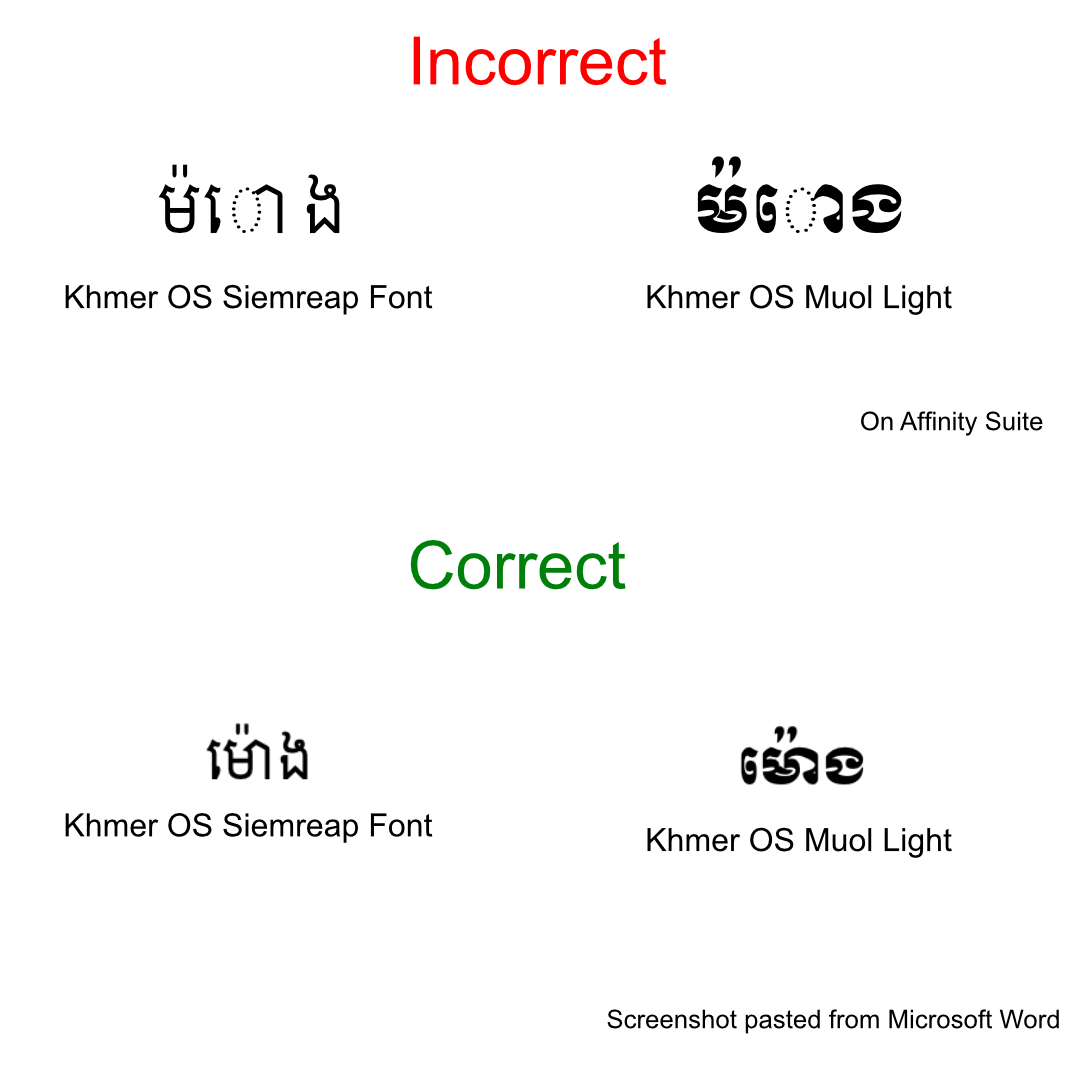
 Hi, i'm a user from Cambodia. I have been a long time user of affinity suite. Bought the V1 version and now the V2 version of it. Been using it on windows and macOS for years. Currently, as the screenshot shows and from many users before. There seems to still be a huge part more or less support for proper Khmer Font. As opposed to say Microsoft Word as a an example of a set standard of what i'm sure Khmer Users are looking for when trying to use those exact sort of fonts for design software to show. I hope the devs will consider making this a sort of a quick high priority to have resolved in the next update as that will be much very appreciated from me.
-
This is where I'm a little confused... Yes, e.g., on Google Fonts (other variable font websites are available) differing numbers of axes for variable fonts are marketed/promoted but I'm slightly unsure how one determines which axes the font designer has actually specified should be hidden... Why does Roboto Flex advertise 13 variables but only choose to make five available? I'm sure I'm likely missing the obvious but interested to know...