kenmcd
-
Posts
2,160 -
Joined
-
Last visited
6 Followers


Recent Profile Visitors
12,126 profile views
.thumb.jpg.10f2b563a70eeebe55f0490f73fde1fc.jpg)


-
 PaoloT reacted to a post in a topic:
Obsolete font substitution on Mac
PaoloT reacted to a post in a topic:
Obsolete font substitution on Mac
-
Komatös reacted to a post in a topic:
Obsolete font substitution on Mac
-
kenmcd reacted to a post in a topic:
Feature request - key bindings for semibold, bold italic, etc.
-

Obsolete font substitution on Mac
kenmcd replied to PaoloT's topic in Feedback for the Affinity V2 Suite of Products
Affinity does not support these "document-support" fonts. And the only way to get macOS to not block them is to rename the fonts. They specifically key on the PostScript Name (nameID 6). But these old macOS fonts are usually Apple AAT fonts, not OpenType. So all the features are going to be missing, and this often includes the kerning. With a fixed width font like Courier the features may be an issue, but not kerning. But with the Times font - everything is gone. So you may better off replacing them with the similar old fonts which are not AAT. That old Courier was made by Bitstream, and there are similar old alternatives. Courier 10 BT is the same visual weight, but the width is slightly larger (602 vs. 600). Courier Std from AFF11 is the same 600 width, but slightly less weight, but no reflow. And if you need no features at all you can change the name of the existing font. Times is not going to work on Affinity at all. No kerning. No features. It was an old Linotype (LT) font, and they (LT) made other versions. Times LT Std from AFF11 is a perfect replacement, with kerning, with features. Times LT Pro also is going to fit perfectly, more kerning, and more features. So replacing those old fonts with these old fonts should eliminate the issues. -
PaoloT reacted to a post in a topic:
Feature request - key bindings for semibold, bold italic, etc.
-
This could go wrong in too many ways. Right now the Bold button does not always work correctly. Just make a character style and assign a keyboard shortcut.
-
Oufti reacted to a post in a topic:
soft hyphen appearing on pdf.
-
soft hyphen appearing on pdf.
kenmcd replied to TracyKK's topic in Affinity on Desktop Questions (macOS and Windows)
Exported your doc to PDF and then looked at the actual character codes. There is an actual hyphen-minus (U+002D) in the PDF. Appears you have two soft hyphens (U+00AD) in the APub text. I searched for "sweet crackers" like in your image above. Then highlighted from the "m" in "from" to the "M" in "Marsilias" and then pressed Alt+U to show the Unicode code points. There were two U+00AD in the text. I deleted one of them, and then exported the PDF again. And the visible hyphen is gone. I suppose you could do a search and replace to fix them all at once.- 9 replies
-
- 1
-
-
- hyphen
- soft hyphen
- (and 1 more)
-
 Old Bruce reacted to a post in a topic:
soft hyphen appearing on pdf.
Old Bruce reacted to a post in a topic:
soft hyphen appearing on pdf.
-
Alfred reacted to a post in a topic:
soft hyphen appearing on pdf.
-
soft hyphen appearing on pdf.
kenmcd replied to TracyKK's topic in Affinity on Desktop Questions (macOS and Windows)
The text looks a bit loose...
- 9 replies
-
- 2
-
-
- hyphen
- soft hyphen
- (and 1 more)
-
soft hyphen appearing on pdf.
kenmcd replied to TracyKK's topic in Affinity on Desktop Questions (macOS and Windows)
What font are you using? Could be the font has a soft hyphen character with a glyph in it (not good). Could be some other feature is messing with the line breaking - and that is a actual hyphen. It would be helpful to see the document and the PDF. Just a single page like your example above would probably be sufficient. -
kenmcd reacted to a post in a topic:
We are in desperate need of Affinity version of Acrobat Pro
-
drik reacted to a post in a topic:
Write a how-to book for Affinity product/s
-
R C-R reacted to a post in a topic:
Write a how-to book for Affinity product/s
-
Yes. No. Regarding the trademarks - just look at the disclosures in other books regarding trademarks which appear in the books. You do not need any permissions or need to seek any blessings. Unless you are selling graphic design software you do not need to worry about it. That is what the trademark applies to. Nobody has to ask permission to write a news article, a software review, a tutorial, or a book - or to create videos - which include names related to trademarks. This is specifically allowed in trademark law. Just don't say or imply that this is an official "Affinity" publication. Again, look at how this is handled in the front matter of books published by major publishers.
-
Alfred reacted to a post in a topic:
Publisher 2 Crashes When Any Text is Edited
-
kenmcd reacted to a post in a topic:
Publisher 2 Crashes When Any Text is Edited
-
An Affinity support person previously suggested this: So give that a try. If you can share the document it would be helpful for us to see and test the doc. It may work on another system or OS, and be fixed.
-
Those antique Type 1 fonts were converted to OTF in 1999. Since they have been around for about 25 years they are fairly easy to find. Sent you a test link via PM. If it works, your problem is the font. Those old initial Type 1 conversions are very minimal fonts. A minimal character set, and a bit of legacy kerning, and that is it. There are many newer versions which are much better. Full character sets. Lots of OpenType features. Full OpenType kerning. And made in this century. Note: Adobe Font Folio 11 has the sort of next generation of the OpenType versions. Includes Frutiger LT Std family (which is a step up from minimal conversions).
-
Just tested and I can download the zip. You might be restricted because you are a new forum member. So I sent the zip to you via PM. Have fun!
-
kenmcd reacted to a post in a topic:
Missing Characters
-
Alfred reacted to a post in a topic:
Missing Characters
-
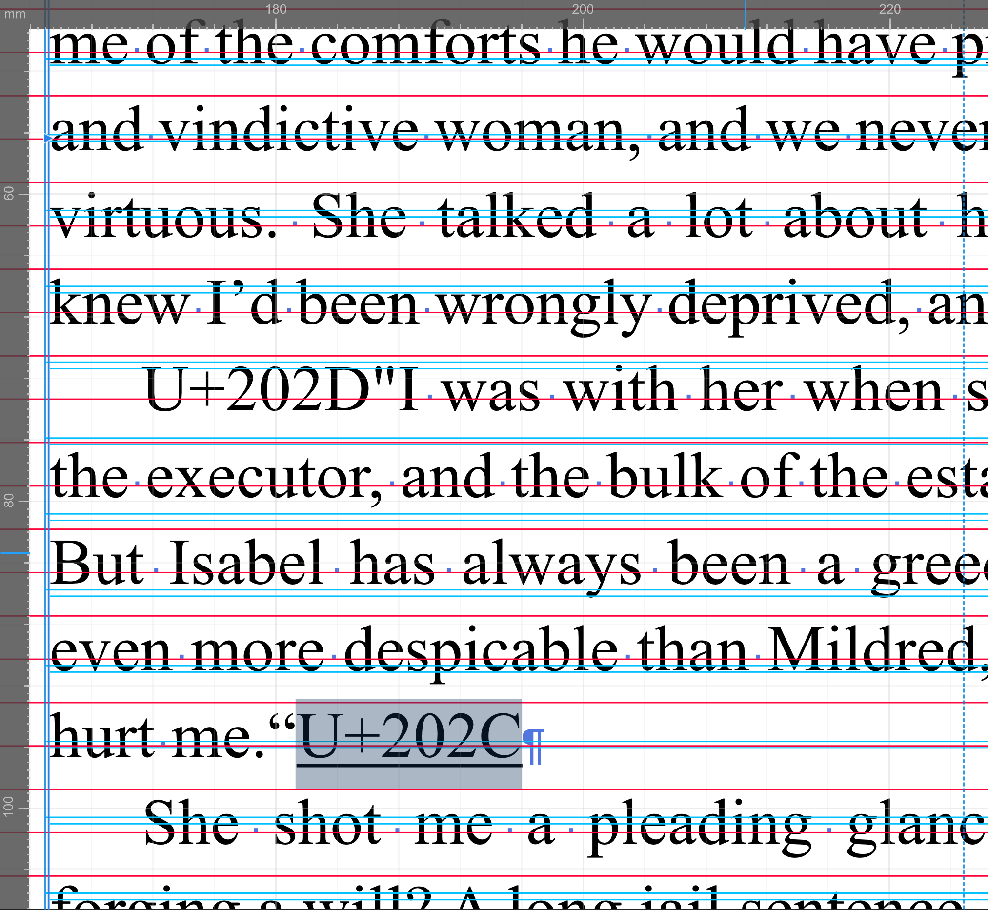
Missing Characters
kenmcd replied to RainbowsC's topic in Affinity on Desktop Questions (macOS and Windows)
I zoomed-in and looked at some odd characters. Highlighted them and toggled to Unicode. 202D LEFT-TO-RIGHT OVERRIDE 202C POP DIRECTIONAL FORMATTING Note: Baskerville on macOS is an Apple AAT font, not OpenType. (Palatino too) So it will not work as expected. I changed the font to Baskerville Pro - and it still had the missing characters. That is when I went looking and found the above. Looks like junk coming over from the word processor perhaps.
- 14 replies
-
- 2
-
-
- font manager
- preflight errors
- (and 1 more)
-
Sometimes issues with the font glyph outlines can cause artifacts such as these in applied stroke outlines. The same artifacts in the two e and two s outlines may point to this. What font is that? And where did you get it? And please attach your test document.
-
kenmcd changed their profile photo
-
kenmcd reacted to a post in a topic:
Ligatures not working properly (Publisher, Designer on Windows)
-
kenmcd reacted to a post in a topic:
Ligatures not working properly (Publisher, Designer on Windows)
-
That MyFonts demo features dialog includes a bunch of features that are not in the fonts. Check the Tech Specs tab for the correct features info. OT Features: kern liga salt ss01 ss02 @alrine The ligature works in my tests (in a font editor and online test tools). Please post your test document so we can see what is happening. I can test in APub tomorrow. The ligatures do have code points assigned up in the PUA (which is not common). APub could be doing something dumb with that.
-
kenmcd reacted to a post in a topic:
Variable Fonts with custom axes, no longer work in Affinty 2.6.0
-
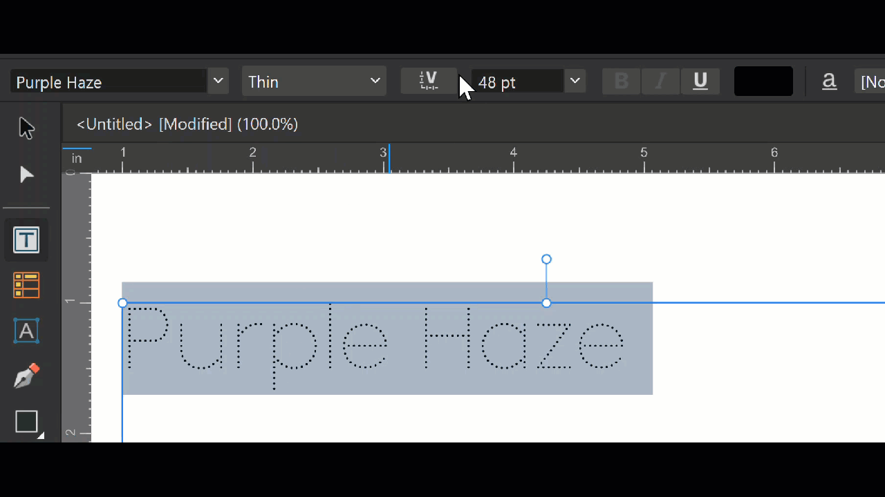
Interesting. I am not seeing that on APub v2.6.0 on Windows 10. It jumps from increment to increment, not instances. I think it should not jump at all. Should be smooth when using axis sliders.
-
Turn-Off the Stylistic Alternates. That just affects the E. Turn-On Standard Ligatures. The LEG in their LEGEND sample text is a Standard Ligature.
-
kenmcd reacted to a post in a topic:
Non-Unicode font fails to render
-
I did not say "20 units increments". The range is divided by 20 to get the increments. 900‐100=800÷20=40 increment. So you see it jump 40 each time. 100, 140, 180, 220, 260, 300, 340, 380, 420, 460. etc. Where do you see the named instances indicated on the axis slider? Or while moving the slider. Show me a slow moving video which shows this while slowly moving the slider. I am looking at Purple Haze v0.5 and see 9 instances for the Weight Spaced axis and they are in increments of 100. And the slider moves in increments of 40.