Search the Community
Showing results for 'logo' in content posted in Share your work.
-

affinity designer [Designer] Seamless Looping 2D Wing Plane Animation
MmmMaarten replied to MmmMaarten's topic in Share your work
@jmwellborn Haha, thanks! 😅 Yeah, this was a real fun short one to make. BTW the pilot is not a duck... it's the guy from my logo 😀 -->
-
IMO, save this thread's info (probably not any of my posts' info! ), specially from "pixels to print" ;) , as his info is golden. You will very much need to follow -at least to an extent, like everything is food for thought and integration with your personal way of doing things !- He is basically telling you all the main lines to build the necessary skills, the technical margins to do great logo designs (and other elements). Which BTW, is far from being an easy discipline to master. I'd say.. would be specially good if as well you purchased and have handy on the shelf or even near the bed (is a good reading stuff to get asleep, haha) , books about design theory, color theory, composition, aesthetics and design tendencies. Maybe start with 3 or four books about it, read 'em lightly, meaning, if get stuck in a concept, jump to another book or chapter (then back to the hard ones as u keep evolving), as the main purpose could be to get more into the general knowledge about it. Probably the ones you would enjoy more now though, would be more practical ones about design, but reading some of the very basics (ie, color theory and composition) could be extremely positive. But also, one of my fav points of pxls2prnt is that rules are made to be broken. Don't follow any rule super rigidly or you wont be able to create a single icon. Or do folow these rules first, to get to know why those are an advantage, then you can integrate them as you see best ...if you'd be to keep to rigid with the said rules, you probably wont end up enjoying it too much. The best thing of knowing well those principles is to have later on the freedom of following them or fully breaking them as you see fit. To be able to not use them, IMO, is needed to know what are these things for, in which situations could be not necessary, for certain reasons. Not just going wild... Sometimes am asked for a logo that is actually a realistic illustration, and very detailed ! And I do it, with no hesitation... the client is the king. :) (and that I love doing illustrations, lol... ) About the sketching matter, yep, is true... And actually, if I think about it a bit, specially late years, while I use my wacom in "pencil" mode or the like, and/or I always do large ink brush shapes as well, blocking fast and dirty, erasing very fast with big brushes, etc, as all am looking is for a shape, and yep, usually in black, even those times I start with another tone. (which is perfectly doable, too, of course). You don't want a logo that its shape is not saying a lot of the product by itself already, or at least, that has a very recognizable shape, so that should be a first focus. Not just for this next solely reason, but for example, when you see a logo from very far, ie, at the top of a building, or in a tiny print of a shirt's pocket, you know how much interested is the company in the logo shape being recognized immediately as that logo's brand. Also, helps a lot to remember it in the brain... For a solid impact, an easy image to perceive and remember, the super multi color thing or over-complex shape, or non good contour/shape, are obstacles for getting that impact and to stay in people's memory, help in fast "read". Gradients, reflections, and even less, drop shadows, are a thing that is best to avoid... Even while in the 2.0 times it was almost a contagious bad habit, that every boss and his/her dog would force you to add to the logo... A gradient is the less wrong one to use, but as pxls2prnt, gives probs in replicating in some media. Or even the mere thing of passing the specs to a partner company... a ton of things. Still, there's a bazillion company logos with gradient, some very important ones. Also, is sth more usual in web- focused companies. But a lot of logos created so find their issues when is the time for printing. In that case, I've seen many times how a designer arrived at a company, and even forced a new version, more flat, and better in general... (easy to notice when suddenly they publish a press kit where they include the corporate image guidelines... ;) ). Might sound weird, but I have seen companies that in the press kit zip had just a low resolution gif...and just that.... :S A lot of courses, or even at the college, are not teaching design well... Is not that uncommon. Also, there is a huge difference in a simple 30 hours course, and a degree, or a serious, good master. A pair of things also that I think are key are simplicity and the design accomplishing the function of representing the brand or product. About what you say of changes...yeaahhh... clients often ask for changes in a very demanding way, asking for things that are no good at all for a logo (or whatever other graphical element).... I was once in a company where a lot of these matters were not considered and the designer's criteria counted for literally nothing -if I'd tell you some anecdote, you'd understand till what point was it so...- I made a bit of a veery dirty thing..not recommending you to do the same, but might help to have a global view, maybe...... I used to make like 6 versions (or more), being the two latest my favorite ones. Often I would do those 2 the first ones...they would spend the morning in eternal internal fights about the first 4 logos, released timely, one after another, not at a time.... giving not a freaking single solid reason (with some very rare exceptions) based on design principles or even basic human perception, for going one way or another. Once they have wasted all their fighting bullets, ruined the productivity and time of the company, and feeling more compelled to get to common points of view, then I played the role of making two ones, with "a fresh start" , and even if those had some no-no "things" for one of the fighting parties (is very bad to have several bosses which are fighting among them for reasons ("territory") never related to the graphic work...) they would see the logos WONDERFUL. The pity is sometimes the "place holder" logos had ended better than my more worked out ones, lol... xD. It was really hard to work in that kind of thing back there... So happy of being a freelancer now...In the first years there, I always played dumb showing my first tries first... xD. That said, with normal customers this is a bad path. You'd better do your best, and show them those first. they might revisit it later, even. But just told this as you will find all sorts of people out there for these tasks... My advice though, is adapt to the client's requirements, but always add suggestions or your own takes. You never know, and very often get approved your versions, as initially, the customer doesn't know , in many cases, and consider they are wanting you to do it because they have -usually- no knowledge about the matter. I have also a portion of my work, my duty, - be it when I am doing graphic design, illustration, 3D or pixel art- , that wouldn't call it "educating" the client, as I've heard sometime, as that sounds arrogant to me, but just the same when a mechanic needs to explain me a bit -lightly- what was going wrong with my car, and so for me to understand why has he changed a piece, you should probably explain some things to the customer as well. But don't get her/him bored... ! ;D In any case, as said at the beginning, follow pxls2prnt advices, they're very solid. ( I am more a bit of a big mouth chit chatter that never shuts up, you know me ;D )
-

affinity designer Smarty Studio : Our Project (made with Affinity)
Wosven replied to Uncle Mez's topic in Share your work
But there's a comment Ok, I'll explain instead of summarize it. At first, the logo is not at the center but follow the curves of the amp and the leaves: it's strange, but ok since we look at it more. At second, I thought we had a triangle, sending the eyes below the banner, but it's ok too since that's where is the text to be read… (follow amp, ^, logo's leaves, crown, wheat leaf near the "i"). The only annoying point is the background "croissance & expansion". Perhaps the background's pic should be a little darker, and the eyes won't run from c&e strokes to background and back… (interferences! when too much (usually) white dots or specks drive the eyes away from the main subject or text to read, or when some forefront and background colors are too similar, it's like focusing on the background and on the foreground and on the background… endlessly => less readability). Or perhaps more transparency for c&e will be enough. It'll be perfect when we'll notice c&e and stay focused on the central part (logo & text): we read the whole image, and step by step: background image, c&e, logo c&e with leaves, logo (at least, that's how I process the banner). But the colors are fines, the logos "sympas" (nice)… I don't always want to tweak a design! (but the apps we use and the way we use layers and all as pieces we can move around or modify easily give us wishes to see or test what it would be moving this +1mm here, 2% more yellow there, etc.) Perhaps sometimes we want to be as annoying as clients can be…- 103 replies
-
- 1
-

-
- graphic design
- projects
- (and 7 more)
-
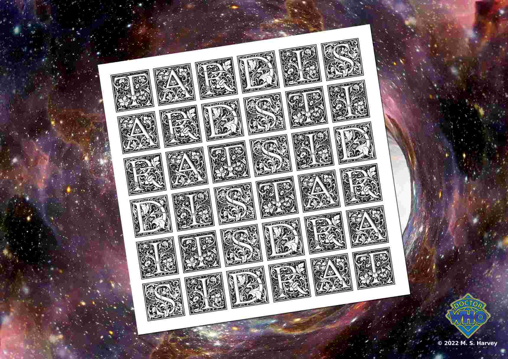
 A version with the Doctor Who diamond logo ...
-
Thanks to the help received from members of the forum I think I have now got to grips with the Logo creation. Stuck some on a few simple 3d models I made in order to test... and they appear to be just what I wanted. Cheers, Raymond.
-

affinity publisher Sharing my publisher newsletter
dannyg9 replied to pcdlibrary's topic in Share your work
Nice work. Simple and clean. A few comments. On the TOC page, you can make the text a little larger and increase the leading to fill out the space a bit, OR maybe add an image on the bottom (Large American Flag, or the Legion Logo from the cover). Maybe make the color and size of the frames on the photos on pages 1-3 uniform. Simple 1 point strokes on the photos throughout with the key blue or red color. -
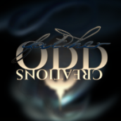
affinity designer Holy SKITXO's World (80s Theme)
Father ODD Creations replied to Father ODD Creations's topic in Share your work
@GarryP Thanks for the critique, yes he is going for a more calmed down energy with his future productions. the first one I created also so thanks for the compliment. As far as the smoke goes, its to bring depth and a dark mysterious vibe as hes and fantasy/scifi/horror fan. The smoke is a symbol for fog over graveyards, ghost, and for symbolizing mysteriousness. I tried just a plain black background at first but it was just boring on the eyes, as you can see I've purposely left out the Tron grid (since most logos referring to the 80s usually have it their art...trying to make it a little different i guess). Thats a great point on the length of the logo, and its safe to say that I actually have it covered, as when I created this logo, 'though it looks as one,' there is actually 3 versions of it in this set (I probably shouldve uploaded all 3 lol): The full version (Holy, Skitxo, and the Crucifix) The secondary version (Holy, Skitxo w/o the crucifix) Third Version (Skitxo, and the Crucifix): as the the crucifix on average universally stands for Holy and then skitxo across the crucifix. and the smoke in the background is only for this display, he will have the logo itself alone with future projects or however he decides to add it to his future projects. Im a really a huge fan of symbols, so I try to go for more logos that are memorable versus being politically correct. For instance the "Novant Health" logo, most people dont realize its negative space that creates the N and H but when explained, people finally understand (including myself, i didn't understand it at first until i stared at it LOL. I really appreciate the feedback mate. Thank you -
No, I was sub contacted by another designer to create the illustrated section that she then used in her logo design... all above board 🙂
-
Wait, another designer stole your art for their logo? Digital cannibalism. That sucks........
-
Bike innit.... drawn to then be incorporated into a logo design for another designer... I think she uses Illustrator!! Spit!!
-
Logo design in Designer...
-
Logo design...
-
I like that treatment...as long as it was a conscious decision to swap the colors between the logo and text. I always ask that question. Many/most companies simply want a logo because "everyone else has one," which isn't true, of course. Think of FedEx, for which the logo type serves both purposes (and hides an element in the negative space. Quite brilliant, really). Anyway, it is a question that every company should ask itself.
-
What about something like: btw, I'm super interested in the first line ion your reply: "Do you need a logo?" Its that not a thing? to have a logo. I don't know why, I just instinctively had the idea in mind that I wanted to have a logo... do I need it? good question, I still think I do but I just can't objectively justify it... I'm puzzled now... =)
-
affinity designer My logo, which one do you prefer?
garetmckinley replied to Nic727's topic in Share your work
My personal recommendation is something along these lines. Note: this logo was literally made in under 5 minutes haha, do not use this logo. It's merely so I can communicate a concept to you. If it were for one of my clients, I would probably add a "folded ribbon" look to this logo. Make it look like it's one constant ribbon that is being folded at each of the bends. It works in a logo like this, because you could make this logo in the physical world using a single strip of fabric. To be clear, this is the style I'm referring to. Again, not telling you to do this or that it is best. I'm just communicating what I would do if I were building this for a client. Good luck
-
About a month ago I launched a website for my games, and I want to share it with y'all. All of the layout elements were created in Affinity Designer, as well as the logo. https://mnemonicrpg.com/setting.html Things I'm proud of here that I created with Affinity Designer: The woodgrain background of the site, which is the exact same asset as the top menu bar, with some clever filters applied The book cover in the table of contents The parchment texture for the page's main content The logo It's gonna look different between mobile and desktop, but everything but the table of contents should be visible on both. Lemme know what you think!
-
So, this guy is a young twitch streamer I have played siege with for a while and he wanted a new logo for his channel. He really liked Shrouds S logo icon and wanted a similar effect with a G. I think i came pretty close with this iteration and as always enjoy your feedback. Red was the requested color and I solved it by using negative space with a red outline because the inverse "looks like a muppet" according to people around me. Twitch: gilleyg edit: I redrew the icon G 8 times in case anyone is curious. This is my 8th iteration.
-

affinity designer Ohhh My Strawberry Monkey
My Strawberry Monkey replied to My Strawberry Monkey's topic in Share your work
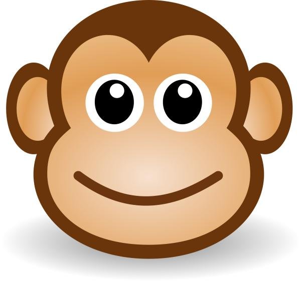
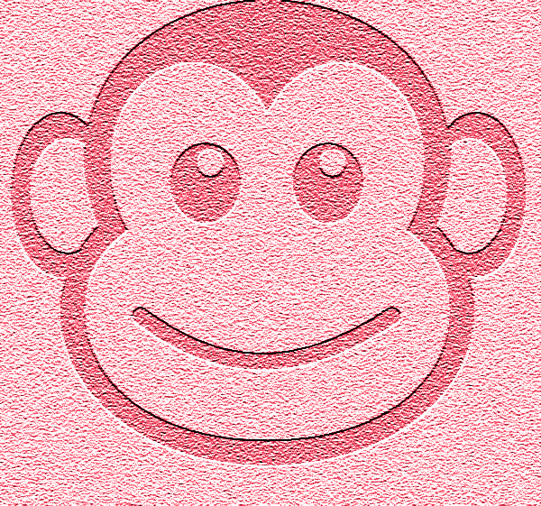
So, I've decided to share where My Strawberry Monkey all started over the next few posts. Hopefully it will inspire and encourage you to keep going at what you're doing. Looking back at these images, clearly I was blind and didn't have a clue at what I was doing, still feel the same way, well, just a little bit. My Strawberry Monkey originally was the name for my freelance company back in 2014 ish, I was working on some motion graphics and video editing at the time. Before that I was called Saffire14 Media but I really wasn't happy with the name and was inspired to change by a company I came across called Fox & Velvet, my name just felt so boring in comparison. When I did change (I will share how I came up with the name in a future post) I needed a logo. I was just learning how to use Photoshop at the time and had no skills besides video editing & motion graphics. So I used my best friend, Google and found the image attached, I worked out how to apply a couple of filters to make him look pink and the second image was the result. This was before Affinity came into my life and yes downloading an image and using as my logo wasn't the best or right thing to do, I just really wanted to get going with an Idea and I never intended to keep this logo and as I said, I really didn't know what I was doing in Photoshop, it was so daunting and complicated to use. Let me be clear, at this point in my life I had no intention to make a children's picture book and preschool website or even a clue of what to do.
-
 Possibly next week or the other next week, I will be starting another project for logo design. As I continue doing what I am doing, I am finding a lot more interest into going back to logo design, since I can utilize that in other possible crafts such as concept art, illustration, personal logo or even create a logo for another person. But I will commence with it as soon as I am done with Spacetronauts probably 2 or 3 days after. The project its basically going to be either 2 hour constraint or 1 hour constraint. I am not looking for perfection, but quantifiable work where I can learn something new each day. Maybe that is the arc of a letter or how to make "W" lettering into a logo and so on. So yeah. Probably next week. Finishing with Spacetronauts around this Friday, and I also have like an appointment Wednesday for sign design and stuff, and if all goes well will start working. Which I will have to adjust my time.
 -
It can be difficult to give good constructive criticism of a logo when we do not know what it is for or how it will be used. Can you give us some idea of what the logo is for (what sort of organisation or project) and how (and where) it will be used?
-
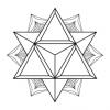
I would remove the internal wheel spokes... too much detail for a logo, and a pain when printing... They aren't needed, it is understood visually... For a logo, I like the first flat version better. Of course, for a version over black/dark backgrounds, some variance would be needed... (or just loose the background, as u did in some others) But I like it.
-

affinity designer Holy SKITXO's World (80s Theme)
GarryP replied to Father ODD Creations's topic in Share your work
The old version of the logo was incredibly 80's but that might have been a good thing, depending on what sort of music they make. I like the new version but I have some concerns: * I don't know what the 'smoke' is for - it's a nice effect but I'm not sure why it's there; * The full logo is very tall which might make it difficult to scale for inclusion in landscape-oriented images, such as page banners; * The "SKITXO" text is difficult to read - at first glance it looks something like "SKITY" with a little blob after it (the old logo was similarly difficult to read as it looked like "Sloitixio"). All-in-all it's a nice image, I'm just concerned that it might not be easy to use in lots of different circumstances. -
affinity designer My logo idea for container warehouse
GarryP replied to Daviddesign's topic in Share your work
I agree with Wosven, the first one has better reproducibility at different sizes and the typeface gives an impression of 'solidity'. The second one is too detailed and the typeface doesn't look right to me. Nice graphics, just not right for a logo. The third one is nice but isn't great at smaller sizes. One small issue I have with the first one is that it looks like the containers have fallen over, maybe there was bad weather at sea. That may not be the image the company wants to give out. Also, on a related note, have you thought about a black and white or grey-scale version of the logo? What does it look like when the colour has been removed? Does the logo still 'work' when there's no colour? All-in-all though, some nice ideas there.- 2 replies
-
- 1
-

-
- illustrator
- work
- (and 1 more)
-
The other day I suddenly thought I ought to make something to commemorate the 75th anniversary of VE Day, remembering the Allies' victory in Europe in the Second World War. Unusually for me, the design came into my head in almost finished form, illustrating lines from the chorus of Vera Lynn's famous song, (There'll Be Bluebirds Over) The White Cliffs of Dover. I thought I'd share it here before I post it on social media. I Googled a few photos for guidance as I'm not brilliant at drawing completely from scratch, and made up some vector illustrations almost entirely with the Pen tool (rather than starting with shapes, my usual method), switching between Designer and Photo and back as I went along. The wavy text I made by rasterising Artistic Text and applying the Mesh Warp tool: turning on the grid made sure I applied the distortion evenly. The leaves and clouds are simply Cloud shapes, while the flowers I did with a pixel brush on layers clipped to their vector layers. Finally, the VE Day 75 logo is easy to find online, but only in pixel format, so I downloaded one and made up a vector version. The letters are Arial Black, but the numerals aren't: I couldn't find a close enough match in the fonts I have, so I made them as vectors too. (BTW, I'm not forgetting the war against Japan. I'll see what appears.) This was originally A2 in size, but I've reduced it for posting ... VE-DAY-LOGO.afdesign
-
A smaller version of the roundel/logo could then be added to the above. I’d probably chose the bottom right corner.