Search the Community
Showing results for 'logo' in content posted in Share your work.
-
Versión Man of Steel Designer (vector) and Photo (effects). I love this software.
- 8 replies
-
- 10
-

-
- affinity designer
- logo
- (and 4 more)
-
Playing with a more fun logo this afternoon. The top "slashes" in the Flokk wording echo the slices in the bird and the goo...well that creative juice of course (see below)
-
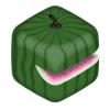
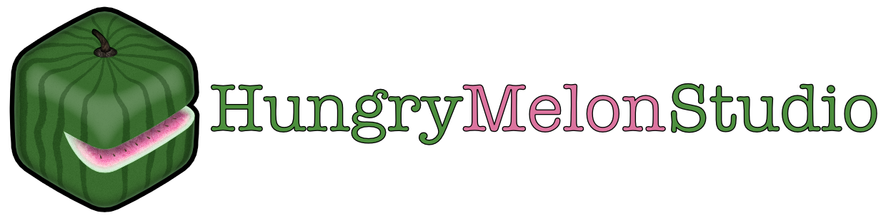
Even tho I came up in Industrial & Graphic Design, I currently do software design and development (mostly Mac & iOS). Here's the logo for my consulting company (and self-tutorial to learn AD), Hungry Melon Studio, LLC. I definitely got carried away with the texture layering ;) Thoughts, Comments, Critiques?

-
Hey, I made a logo design for a designer called "the Arktiker"(Arktik is Arctic in German :D). My idea was to make the letter a but combine it a little bit with the look of an iceberg (is it really iceberg in english? :D) Do you like it and which version do you like most? (Left side is one version and right side is one version, and to the bottom the colors vary)
-
 A while ago I went to a portfolio show to get advice from some leading graphic designers in the area. When I showed one designer this logo that I did for a women’s group he said to me that at first didn’t realize that they were people due to their heads not being very visible in front of their arms. He also thought that the curves of the dress made it appear like they were rubber gloves. He suggested that I move the arms further apart so the head would be more visible and to straighten the dress out more. The image on the left is the redesign I did after listening to his advice. There many other type choices I have been experimenting with that I might try as well. I would love to hear what other people think!
-
 Hi All, Thanks to all the amazing videos, I was able to create my company's revamped logo with ease. Any feedback is welcome. Also any idea on how to improve it is also welcome. I wanted to keep it clean and simple :)
-
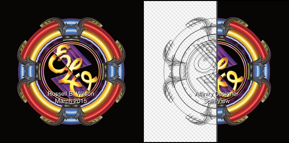
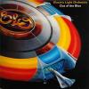 I found Affinity Designer after deciding not to continue with Adobe Illustrator's monthly subscripton fees (after using it for several years). To learn the interface and tools, I decided to hand trace the classic Electric Light Orchestra logo from the 1976 "A New World Record" album cover. I love using AD, and looking forward to more features that will make it even better than Illustrator :)
-
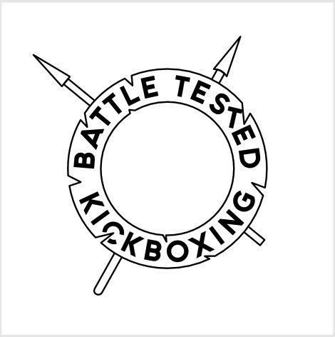
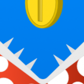
I have a few comments/questions/observations on the logo if you're interested... 1. Where do you see the logo being used? I ask this as the 'distressing' on the roundel might not be something that's easily replicated on all formats, e.g. embroidered badges etc. 2. Are the spears important? I have no experience of kick-boxing - or martial arts in general - but I didn't think they used spears. If you, or your friend, wants them then that's absolutely fine but they look a little out-of-place to me. You could try making them non-symmetrical so that they are at different angles and, perhaps, make one longer than the other. And maybe try making the spears thinner and trying rounded or slightly jagged ends, easy enough to experiment in Designer. 3. Some of the strokes aren't the same width as the others, e.g. roundel curves vs. nicks, spear-head 'base'. Not super-important but it might be worth checking to see if that's what you want. Sometimes you do but sometimes it's better if they're all the same, it just depends on what you want and, sometimes, how the logo will be reproduced. 4. The typeface used for the lettering doesn't seem to fit the rest of the design. This is a totally personal thing but I don't think the lettering style fits with the artistic style of the fighter. I would have expected something less 'fancy' but that's just me. Something with a bold/black look - maybe outlined - might go well. 5. The letters aren't properly centred within the roundel. If you look at, for example, the first "T" in "TESTED" and the "G" in "...BOXING", there's a big difference in their distances from the edges. Sometimes you might want this, it can give a 'hand-made' look to something, but often it's a bit off-putting. 6. It might be good to make some of the nicks in the roundel cut into some of the letters. If the nicks are where chunks of the logo have been knocked off then it's a bit suspicious that none of them have hit any of the lettering. 7. The belt looks strange. At first I thought it was a stool and couldn't think why there was a stool in the image. Maybe shorten one of the ends so it's not as symmetrical. Or maybe remove the belt altogether and make the fighter a bit larger perhaps? 8. Could the glove nearest to the viewer somehow overlap part of the roundel? I might make more 'impact' if the glove was to 'come out of the logo' somehow. Anyway, while going though some of my ideas I thought I'd give it a try for myself. I've attached my quickly-made version (without the fighter) for you to have a look at. (Note where the "T" and "C" have had to be 'stuck back on' quite crudely.) Feel free to ignore any or all of my comments. It's your logo so do it your way.
-
Affinity designer is my first AI type program Ive used (as AI is too expensive) - heres a quick logo mockup for a design competition - they're an electronics company... Still wondering when they're or if they already have put a save as png option? z-icon.afdesign
-
A work for my website, maybe you like it?
-
I've made two variations of the same logo using only my first and last initial. I'm looking for some feedback on which catches the eye better. P.S. Can someone tell me how to make a perfect equilateral triangle?
-
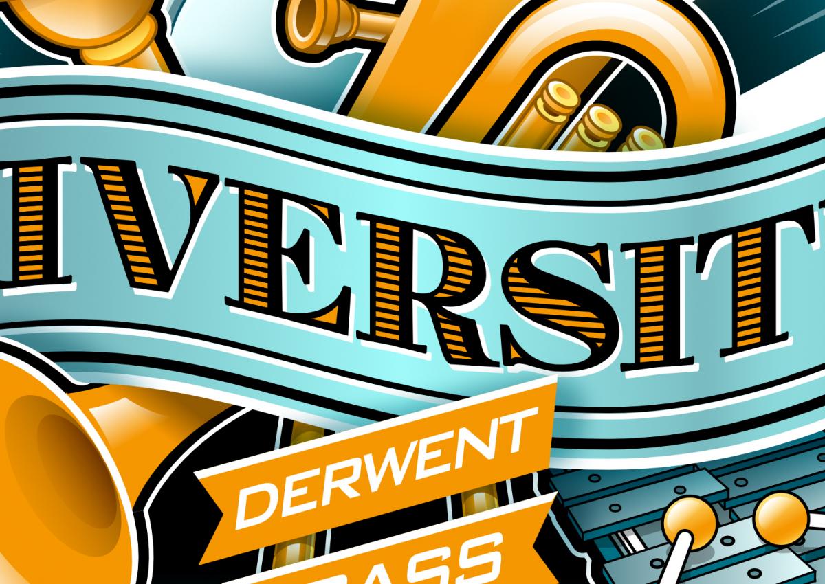
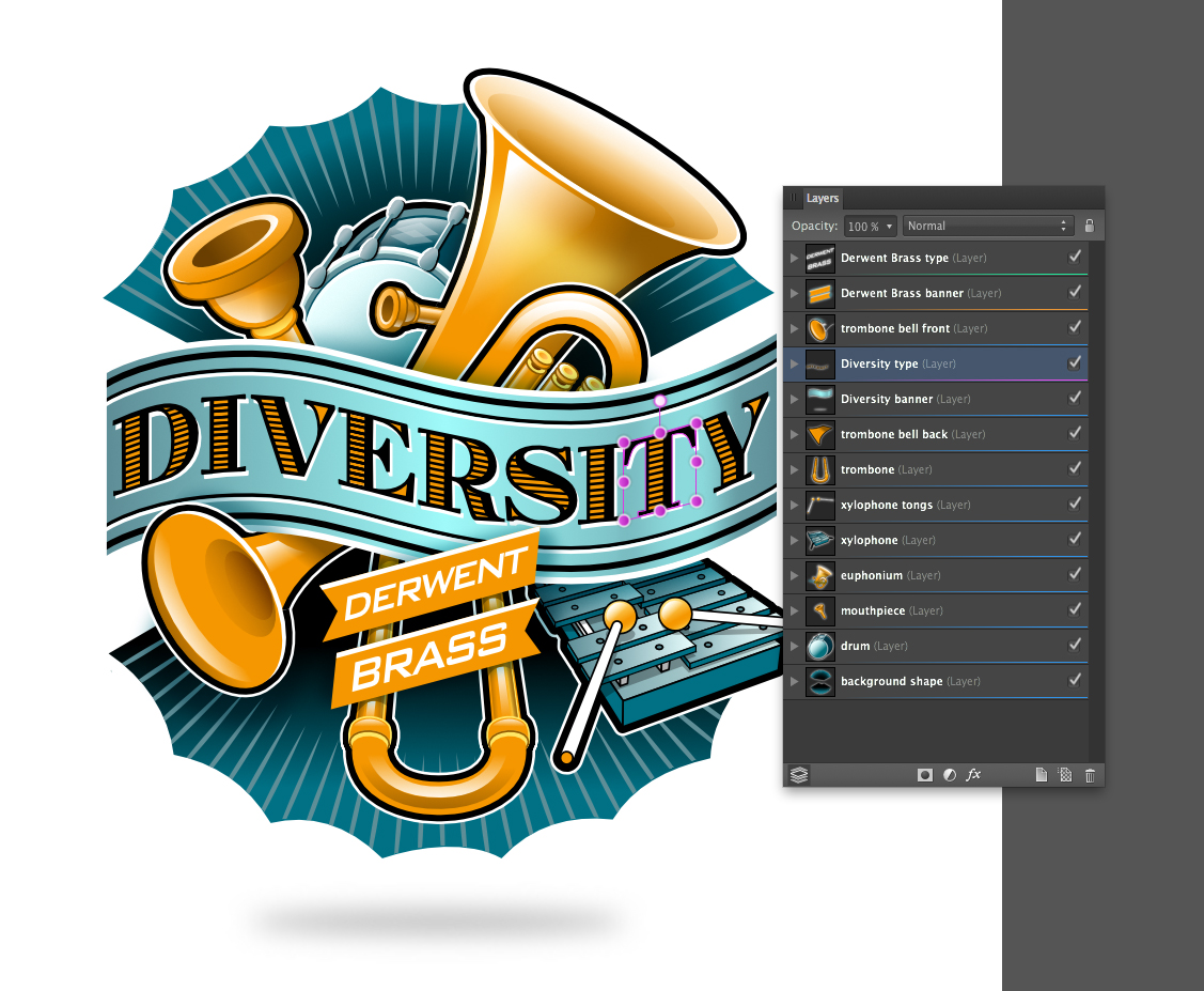
 Hi all, here is a recent client project and my first logo/illustration piece done in Designer. It's for the CD cover of the Derwent Brass, a brass band in the UK. The title of the disc is "Diversity" The idea here was to try to suggest or display some of the many instruments in a stylistic way that are included in the band as a grouping that forms the backdrop for the CD's title banner. My usual process was adhered to here, approved sketch followed by vector buildup of elements on separated layers. See below for screenshots. I made use of the "erase" blend mode to hide certain areas which worked perfectly. Each letter was "skewed" individually, to conform to the contours of the banner. Colour palette was kept to a minimum of blues and golds and a heavy black outline style was used to delineate and visually connect each element. As usual, it was a delight to create in Designer. I am looking forward to the up-coming distort and warp tools mentioned in the "road map" to be able to do more of this kind of work with type in Designer. :)
- 24 replies
-
- 12
-
-
Hi! I've done this logo for a friend, he has a online-shop of warhammer and other similar games. Hope you like it :)
-
Thanks John and Alfred, I'm going to try this great idea! Maybe post the result tonight (Holland time). Just a wee bit different, I've used Mesh Warp Tool. With Distort > Equations the logo only transformed into a star like image. But that's just me not understanding what is supposed to happen. 😱 Add a yellow tint to the logo...
-
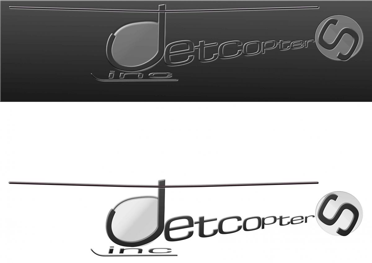
This mock design has been flying around my head, since 1984. It was my attempt at designing a logo, that contained letters that create shapes. This is the firm that supplied the helicopters for Airwolf. It still takes me ages, but I'm learning...I have used theses filters, glass and onyx. These give the desired effects. peter Ps is Hilary the only forum member to have a filter named after her? (Sunset) jetcopters inc.afdesign
-
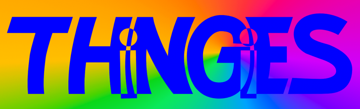
A very quick hand-trace of my original logo sketch for my upcoming comic Thingies: First I placed the hand-lettered concept sketch into its own layer. Then, I just made simple pen lines (with a stroke of 30 pt/px) and made each individual stroke the curve I wanted. Next, expanded strokes and added shapes together to form completed letters and then with the "i" letters I did an combine on each one and the letters they overlap. Finally I made the whole word a combined shaped. Added a conical gradient to a layer underneath it all to make sure the combine/compound shape was the way I wanted it. Pretty happy with it. BTW, Thingies is about sentient salamanders and I really kept their biology in mind when I made them into "funny animals". Depending on how Affinity Publisher works, I may want to use it to letter my comic rather than ComicLife (which is a fine app, but somewhat limiting in how it can fill shapes with bitmaps and such.
-
affinity designer Renewable Energy logo (please critique)
VectorWhiz replied to Mr Lucky's topic in Share your work
The problem with logos that target a specific subject, that is diverse in nature, it is difficult to select one that is covers them all. There are all sorts of angles from which peers imagine it and review it. The same goes for visitors on which the logo is used. Simple assignments can appear to be more difficult to draw than things may seem at first glance. -
I like to chime in on this, but be aware that my feedback is only valuable if you enjoyed this logo redesign process so far and interested to do it more often for others. 1. I would get rid of the circle. A logo, like anything else that resembles a symbol, has symbolicism, and many people will by default read a logo like that. The main symbol I 'see' in your logo, is the peace symbol, due to the circle and the three-legged stand. I'm sure you hope that some day there is world peace, but also sure this is not your intention for this logo. Furthermore, a circle which is an enclosed shape feels closed, while music is one of the things that is strong when open and free, inviting and bringing people together, not keeping them in/out. Not having the circle will instantly 'open' up your logo, and perhaps the feel people have about your band. 2. The triangle is overpowering, it's stronger than any other element, and this can be perceived as most important... is it? To me it looks like a Roman roof/facade aside from anything else. It my be the top of the 'T', but a logotype (a logo where text/letters are the base of the logo) that needs to be explained, is pretty weak. Again, if you enjoy the process so far, I strongly suggest sketching more ideas, something like 20 or even 30, go crazy, try different shapes, experiment with current shapes but repositioned, etc. It might be frustrating, but the last 5 will either be way better than this one, or confirm that this one is the strongest you can come up with. ... but lose the circle, and let the logo breath ;)
-
First project for my graphic design class
-
Sometimes a job takes so long; especially with no tablet. That it takes weeks and weeks: resulting in a sloppy rushed finish. This is not my best, but definitely the toughest. :unsure: I felt had to be done now, as it was getting to the point of never being finished and no longer fun. Hats off to those you who can knock something like this in an hour or so...no wonder I love my camera. Hilary this did faze me!
-
affinity designer Renewable Energy logo (please critique)
BarKeegan replied to Mr Lucky's topic in Share your work
Oh, and just to add, some of the most bulletproof logo designs work in black&white to start with -

affinity designer Renewable Energy logo (please critique)
Alfred replied to Mr Lucky's topic in Share your work
A laudably inclusive idea, William, but it would probably make the logo too ‘busy’ (especially at smaller sizes). -
My first try at this new program. I'm loving it! :D
-

affinity designer [Designer] Seamless Looping 2D Wing Plane Animation
jmwellborn replied to MmmMaarten's topic in Share your work
@MmmMaarten Apologies to the logo-guy. I thought it was a really charming duck, and so funny that it was flying a plane instead of flying itself. Oh, well.