Lovemonkey
-
Posts
22 -
Joined
-
Last visited
-
 Smee Again reacted to a post in a topic:
Photo restoration
Smee Again reacted to a post in a topic:
Photo restoration
-
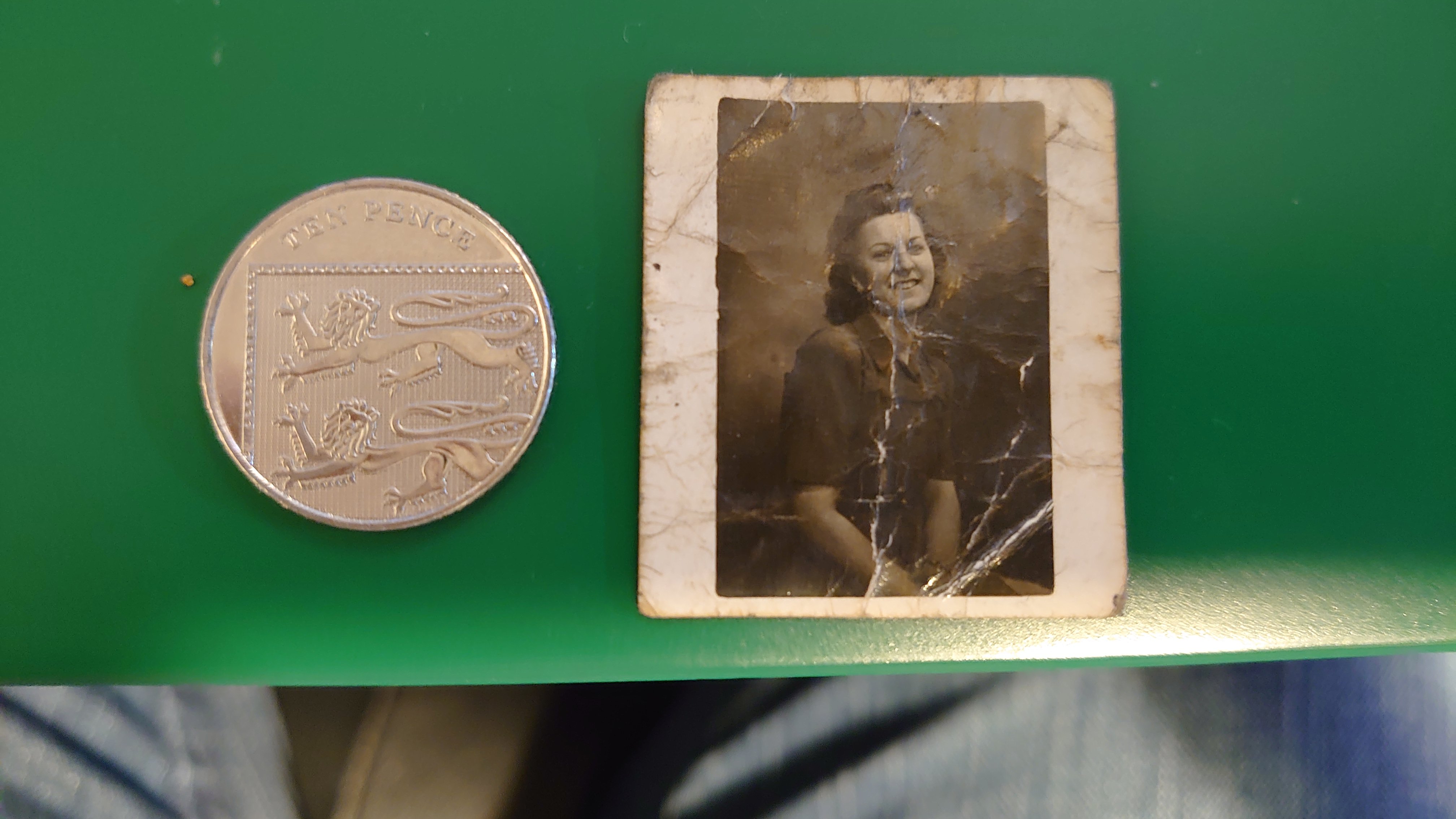
I used 1200 DPI to scan it.
-
George Gibson reacted to a post in a topic:
Photo restoration
-
John Rostron reacted to a post in a topic:
Photo restoration
-
John Rostron reacted to a post in a topic:
Photo restoration
-
Smee Again reacted to a post in a topic:
Photo restoration
-
Alfred reacted to a post in a topic:
Photo restoration
-
Thank you, converting to B&W helped a lot more, the photo prints out really nice at 6x4.

-
Lovemonkey reacted to a post in a topic:
Photo restoration
-
I actually watch his videos and live stuff, never thought to see if had done a video on photo restoration :/
-
Smee Again reacted to a post in a topic:
Photo restoration
-
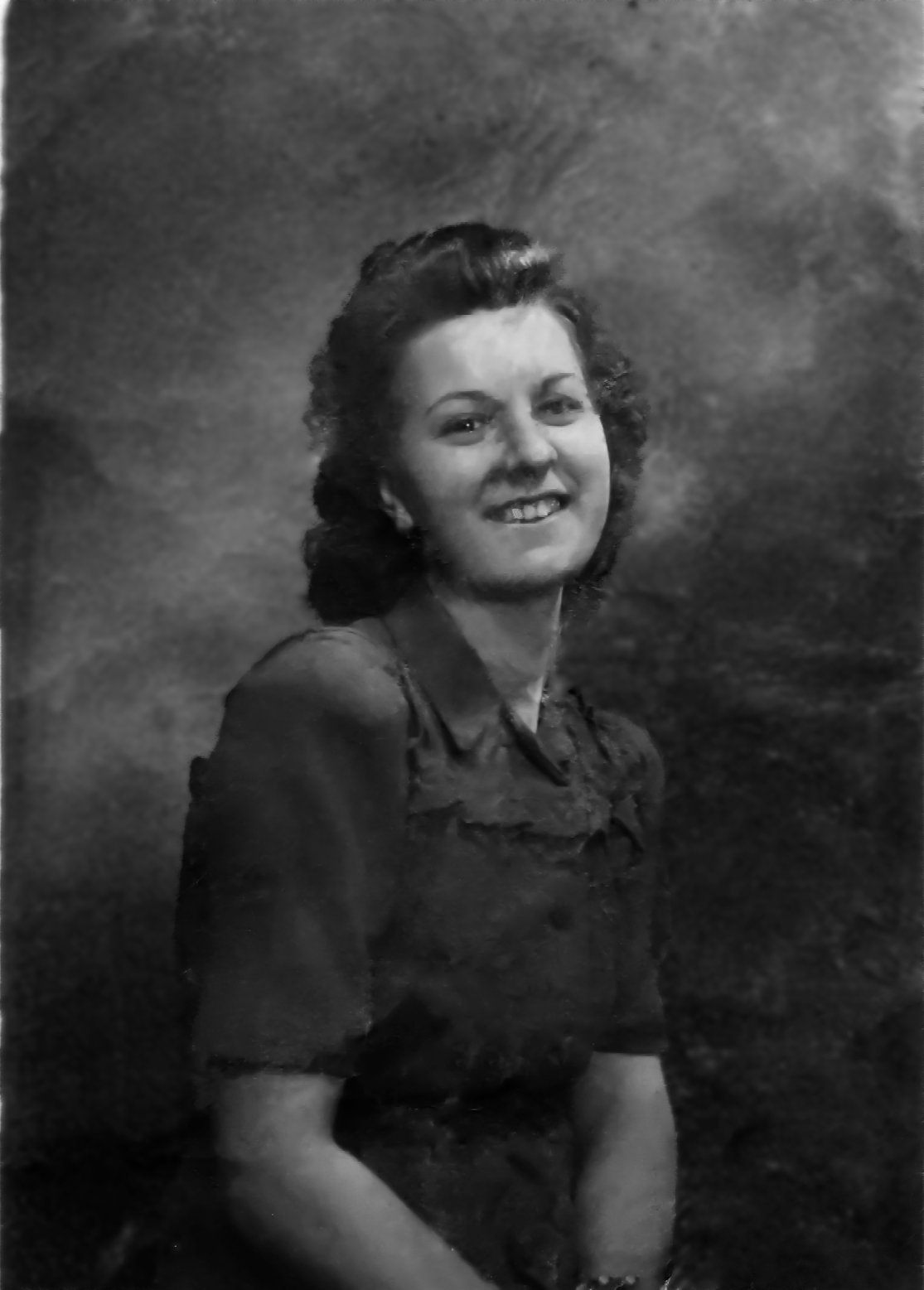
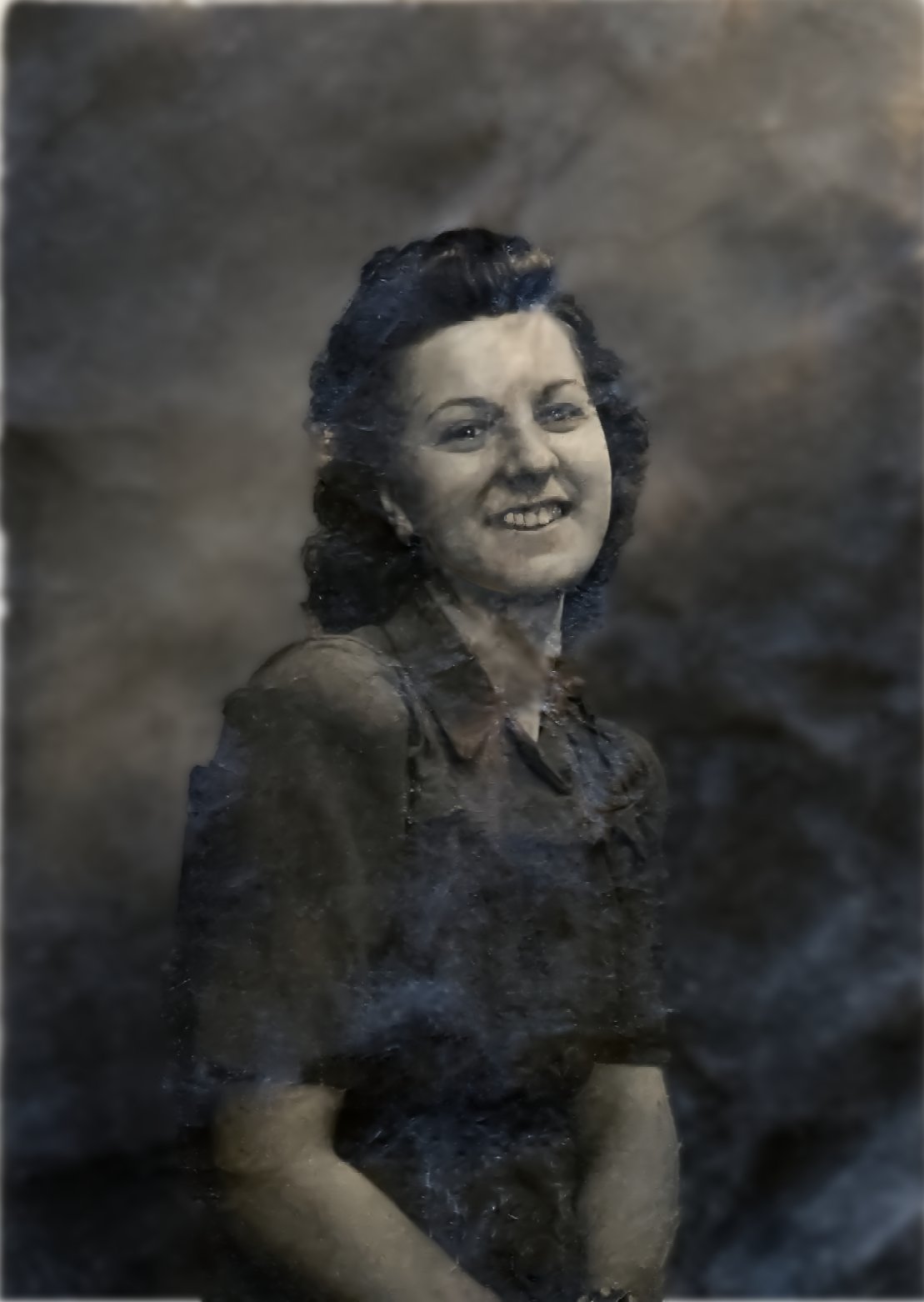
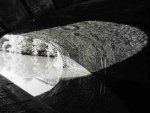
I've been working on restoring a photo of wife's late Nan. I think I haven't done to bad a job with the photo, considering its size and how bad it's damage plus I'm an absolute noob at this. I think I've reached the point where I can't really do anymore. Wish I could make her face a bit clearer. The photo is from round the mid to late 40's.
-
Thank you for those icons.
-
 Lovemonkey reacted to a post in a topic:
Some pictures made by affinity designer.
Lovemonkey reacted to a post in a topic:
Some pictures made by affinity designer.
-
Lovemonkey reacted to a post in a topic:
Bike Ride
-
Lovemonkey reacted to a post in a topic:
Cartoony monster face
-
Lovemonkey reacted to a post in a topic:
String Schooner
-
Lovemonkey reacted to a post in a topic:
Jason's Building Design - Branding and marketing.
-
Lovemonkey reacted to a post in a topic:
vector landscape
-
Lovemonkey reacted to a post in a topic:
Painting in Designer - Series of illustrations for Hunting in Canada web Field Guide
-
Lovemonkey reacted to a post in a topic:
Orton effect, masking , add shadow
-
Lovemonkey reacted to a post in a topic:
New to Affinity but liking it alot!
-
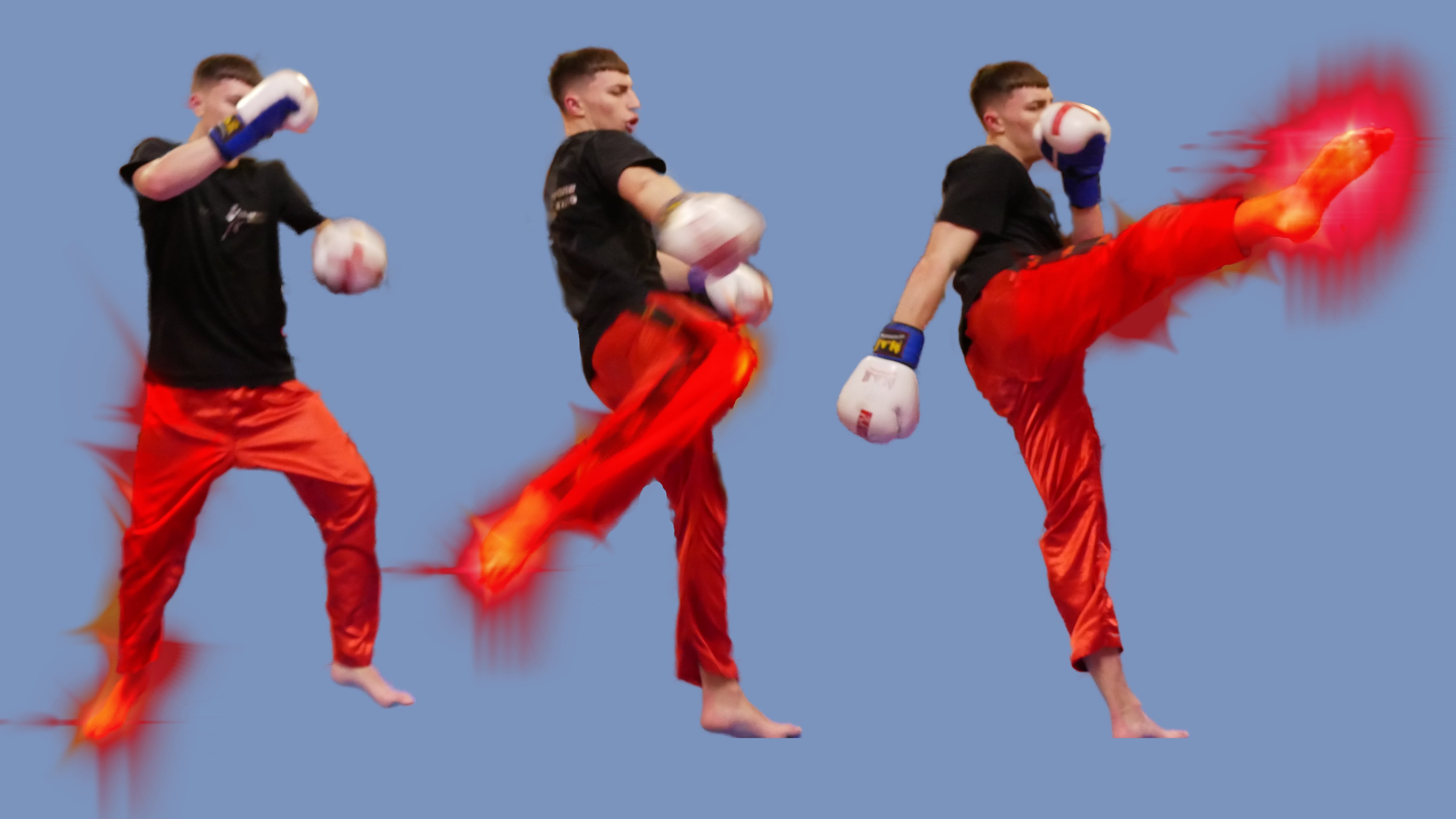
Thanks everyone for the feed back, the camera used was Lumix GX800 (micro 3/4) with my prime lens, I was playing about with my manual settings trying to get the feel of it. What I did was pretty quick edit on my IPad while sitting at my desk at work, Ive been watching one of the AP courses on Udmey and decided to give it a quick try, to see how quick it was to change things to get it looking more to my liking.
-
SrPx reacted to a post in a topic:
Posing daughter
-
VectorWhiz reacted to a post in a topic:
Posing daughter
-
John Rostron reacted to a post in a topic:
Posing daughter
-
I asked my daughter if she would pose for me while testing out the various settings on my camera. Thanks to affinity photo I went from this To this
-
Ok I have my IPad at work, "8. Could the glove nearest to the viewer somehow overlap part of the roundel?" Yes it can and its looks so much better, also allows me increase the size of the figure so I can rid of that belt. Thank you so much @GarryP
-
Thank you for the input, I do like your ideas. Might give it a whirl when I get some time to sit down and go over it more. I agree with the typeface and distressing, I was looking at something with the carved in rock look and I keep messing up the text to path for some reason hence why the letters are not in line (so to speak) also having different sized spears is not something I would off thought about. Looking at your knock up design, it does look better with different sizes and the broken letters really does make it stand out. I wasn't sure about the belt being in there, I just wanted something to break up the bottom of the circle. I will play a round more with figure to see if making him bigger will look better. The overall look I'm after is battle worn or something knocked about a bit. The logo will be used on FB and possibly on t-shirts.
-
Still getting used to the whole photo editing and designing thingamajig. First one is logo Ive designed for friends Kickboxing club, its still WIP as I feel its not just there yet. Second is me messing about in Photo using the Xenon brush pack. I did wan't to try and use the smoke brush pack. But I just couldn't get it right and watching the creators Youtube video in slow motion still didn't help.
-
Is that the Orion Nebular (M42)?
-
affinity designer WWII Warbirds Series - Spitfire
Lovemonkey replied to AlunR's topic in Share your work
wowsa -
That is great, I like how you made the city scape using electronic parts. Very clever!
-
Dredd looks fantastic.
-
Look almost like something from Warhammer Fantasy (as it was known as then) Great stuff.