-
Posts
1,904 -
Joined
Contact Methods
-
Website URL
https://www.behance.net/kevincreative
Profile Information
-
Gender
Male
-
Location
Canada - West Coast
-
Interests
illustration 2d and 3d
Recent Profile Visitors
9,812 profile views
-
 retrograde reacted to a post in a topic:
Layer behaviour like Illustrator
-
 retrograde reacted to a post in a topic:
Discussion on Affinity development (split from 2.6.3 announcement)
-
 retrograde reacted to a post in a topic:
Discussion on Affinity development (split from 2.6.3 announcement)
-
 retrograde reacted to a post in a topic:
Discussion on Affinity development (split from 2.6.3 announcement)
-
 nitro912gr reacted to a post in a topic:
Affinity Designer - How To Copy A Design Element into Multiple Artboards?
-
Thanks Leigh!
-
 retrograde reacted to a post in a topic:
Grid disappearing on zoom
-
 retrograde reacted to a post in a topic:
Affinity does not provide quality, it is time to part with Serif.
-
retrograde started following The Select tool , Grid disappearing on zoom , Mesh gradient (again) and 6 others
-
Hey team, how are we doing on this? Still present on my ipad using Designer 2.6.1
-
 Alfred reacted to a post in a topic:
Mesh gradient (again)
-
 retrograde reacted to a post in a topic:
Mesh gradient (again)
-
 ThatMikeGuy reacted to a post in a topic:
Mesh gradient (again)
-
 StuartRc reacted to a post in a topic:
Mesh gradient (again)
-
 StuartRc reacted to a post in a topic:
Mesh gradient (again)
-

Mesh gradient (again)
retrograde replied to JariH's topic in Feedback for the Affinity V2 Suite of Products
Thanks! Yes I was an early adopter of Designer back in 2014 and was included in their Designer workbook when it was being planned. I did the tutorial chapter on the Escher-esque multi perspective wine cellar. I also wrote a book for Packt Publishing on Designer version 1 during the pandemic. You can find that on Amazon. It's called Up and Running with Affinity Designer. Thanks for your comments on my post, as I said I don't really have anything against gradient meshes I just think nowadays with all of the tools in Designer there really isn't as much of a need for them. You can certainly get the same (or I would argue) much better results, faster. As ThatMikeGuy earlier in the thread commented, the "vector-ness" of the mesh workflow eventually gets rasterized when output or exported out. I wouldn't argue against having the feature if it gets added as I'm sure some people would prefer that workflow, I just don't think I would ever go that route again unless Serif's implementation of it adds something new to it. 🙂 -
 retrograde reacted to a post in a topic:
Mesh gradient (again)
-
 retrograde reacted to a post in a topic:
Mesh gradient (again)
-
 retrograde reacted to a post in a topic:
Mesh gradient (again)
-
 Alfred reacted to a post in a topic:
How and where to buy the Affinity Designer Work Book
-
 ThatMikeGuy reacted to a post in a topic:
Mesh gradient (again)
-
 loukash reacted to a post in a topic:
Mesh gradient (again)
-
 Alfred reacted to a post in a topic:
Mesh gradient (again)
-
 NotMyFault reacted to a post in a topic:
Mesh gradient (again)
-

Mesh gradient (again)
retrograde replied to JariH's topic in Feedback for the Affinity V2 Suite of Products
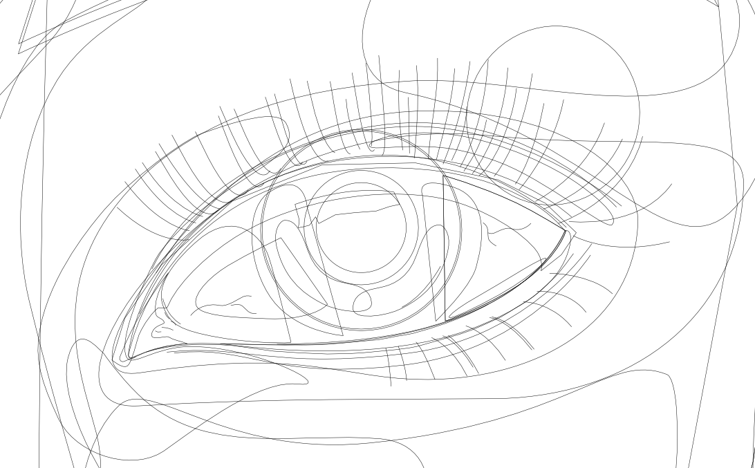
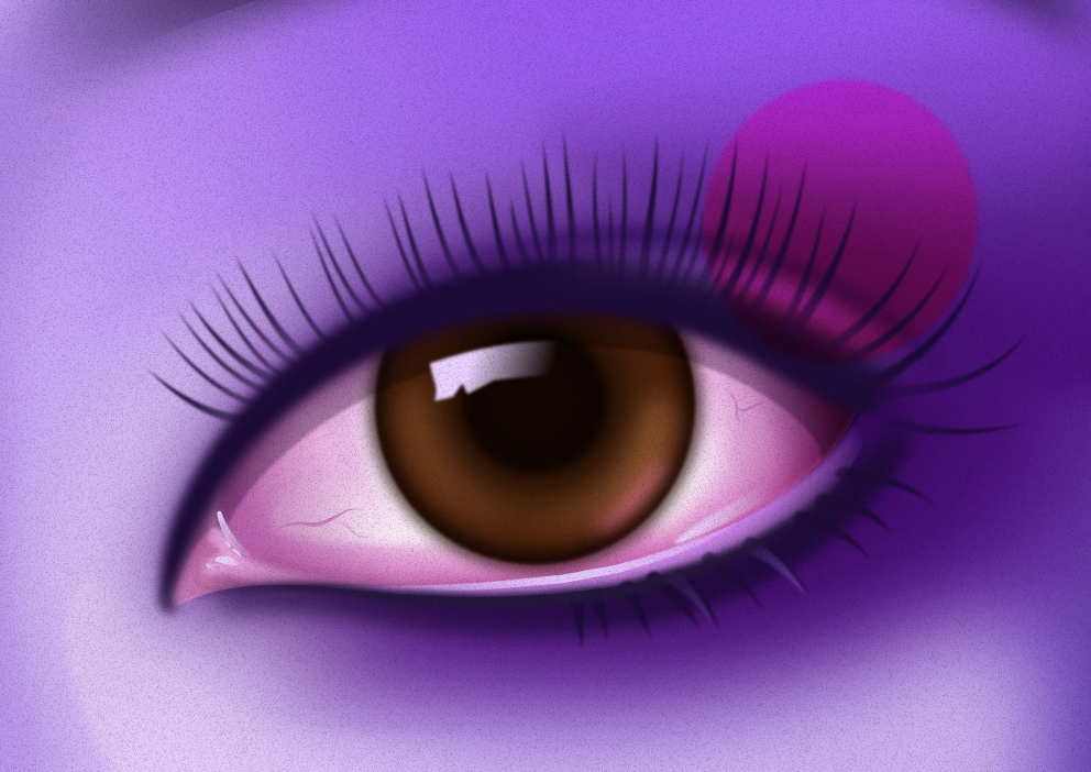
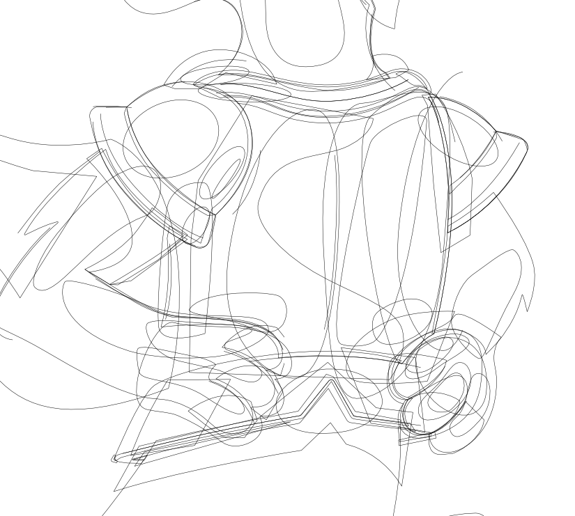
Just found this thread. I was a heavy gradient mesh user back in the day with illustrator but oh man there is no way I would want to work like that again. With Designer right now I can get faster, much better results without dealing with all of those unruly crisscrossing and parallel vector gradient paths. Using shapes and paths with vector effects, blurs, inner/outer shadows and glows - basically using the Quick Effects panel with occasional but minimal use if at all of the pixel persona I can achieve whatever I need quicker and more efficiently allowing for better control to experiment with a much more spontaneous workflow. With gradient meshes you really need to think ahead and nail down that path flow. Changing course far along in the process could be tricky and sometimes not even really possible without a ton of work. I see the attraction gradient meshes can hold, I used them a lot and with great results, but these days with all of the tools already in Designer, I frankly don't see the need. Some examples attached. A full tutorial for the eye example can be found here if you're curious how it was done. https://affinityspotlight.com/article/the-eyes-of-a-butterfly-with-kevin-house/ -

Quickshape like feature
retrograde replied to KelliConan's topic in Feedback for the Affinity V2 Suite of Products
I agree. I do a lot of sketching for my design and illustration work and recently I have switched from Procreate to Designer in the pixel persona on the ipad for that sketching. I actually prefer working in it to Procreate but those darn quickshape features of Procreate would be a nice addition to add to Designer for all of the reasons stated above. Pretty please Serif/Canva developers!! 🙂 -

Flip only layer or selection
retrograde replied to Kickilepuf's topic in Pre-V2 Archive of iPad Questions
Serif you have my permission to add a quick 'flip selection' button to the Designers ipad pixel persona quick menu. -

Flip only layer or selection
retrograde replied to Kickilepuf's topic in Pre-V2 Archive of iPad Questions
Almost 5 years later and still no simple flip selection in the photo persona of designer on ipad? Are people not using the photo persona in designer for sketching or painting? Currently I am sketching in designers photo persona on ipad, I have a selection made with the lasso tool and now to flip just this selection I have to cut and paste it to another layer, flip it (the new layer) then merge it back down onto the original layer?? Seriously, this is the how to flip a selection workflow? Or am I missing something? There should be a way to just flip the selection using the context tool bar or transform panel once a selection is made. When nothing is selected the expected behaviour should be what it currently is, that the whole layer transforms. Frustrating! -
You are welcome @Nikhail glad you enjoyed it. It's always great to see how others interpret it! - Kevin
- 3 replies
-
- affinity suite
- illustration
- (and 6 more)
-

The Select tool
retrograde replied to shellie's topic in Feedback for the Affinity V2 Suite of Products
Yes, attached is more of what I was talking about. Using the option drag with the node tool active to select some nodes of an already selected object. It would be awesome to get this ability with the move tool on the object selection level. See short screen capture video. Node tool lasso select.m4v -

The Select tool
retrograde replied to shellie's topic in Feedback for the Affinity V2 Suite of Products
In Designer persona, with a vector element selected using the node tool you can option > drag or alt > drag a lasso selection around the nodes you want to select.


