Mr Lucky
-
Posts
312 -
Joined
-
Last visited
Recent Profile Visitors
2,202 profile views


.thumb.jpg.2ac1b0424a6896c349d3d16eea40c7f3.jpg)


-
 Xzenor reacted to a post in a topic:
How do I convert a selection into a vector shape?
Xzenor reacted to a post in a topic:
How do I convert a selection into a vector shape?
-
See the quote above
-
Thanks Garry. I think my question is answered with a "no such tool in Affinity, but there are workarounds" I'm just very surprised there isn't a straightforward solution.
-
This will not work as I need the two (or more ovals) I can see how that would give me what I want initially, but I may need to resize as the design develops, text sizes etc. On of the tings I'm doing is making text track along the top of one oval (outside) and along the bottom of the other inside. If I change font or size of font then small adjustments need to be made to the ovals. But this is not the only reason as the design is going to need other ovals of different size, but all need to be the same shape. If I expand the stroke, I don't easily have an oval the same size as the inside of the expanded stroke. (Yes I can subtract, copy, undo and paste. However I assumed there would just be a simp0le easy way to revise an oval and keep the basic shape just a different size.
-
Thanks but I don't have windows. Surely there is an easy way to do this in Affinity.
-
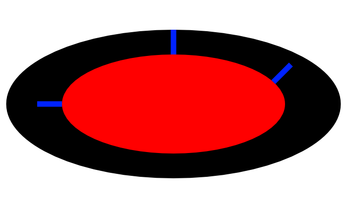
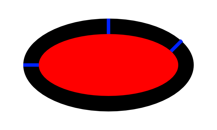
Please excuse me if I have the wrong terminology , but I need to get two or more concentric oval shape , one smaller and one larger. This is what I tried Create an ellipse Duplicate the shape Enlarge by shift, hold and drag. It makes it larger with same aspect ratio but this is not what I want as the distance between the two is obviously wider at the left and right than at top and bottom. So what I want is that distance to be equal all round. To do this I then tried the transform box, remove the aspect ratio link and add the same number of pixels to with and height. However this looks wrong because the distance between top and sides are now equal, the diagonal distance are not: Is anyone please able to tell me how to get the distance between the two the same all round, as in concentric circles?

-
 I wonder why they are called Vector brushes then? Is there a vector brush somewhere that really is a vector brush?
 -
How to draw insulation easily
Mr Lucky replied to Mr Lucky's topic in Desktop Questions (macOS and Windows)
Thanks, done the wiggly line as a brush. One annoying thing it doesn't seems to work using a vector as the image. Just working on the bitmap fills. -
I have created a vector design and it exports to SVG fine until I add a vector brush (light stippling). This causes the message "some areas will be rasterised." It should not be restoring vectors.
-
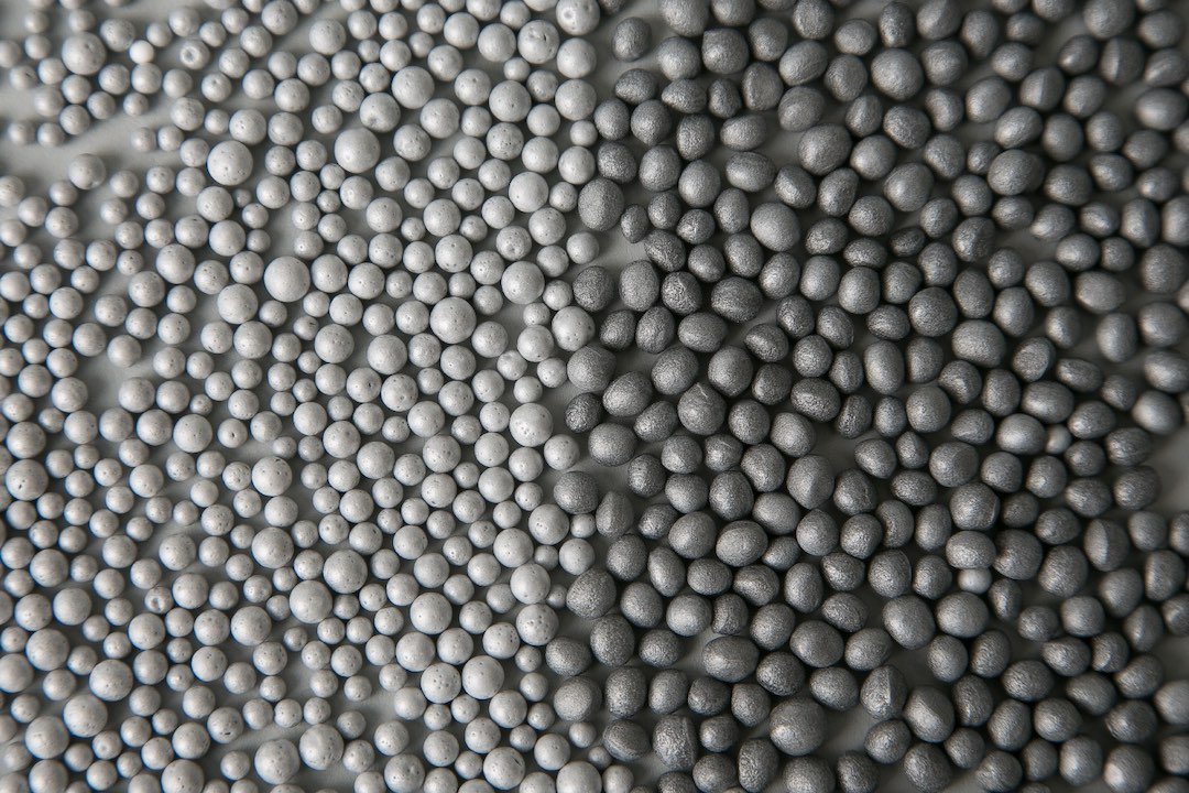
Typically architects represent insulation with a continuous squiggly line: Does anyone know of a quick way to do this with Vector? e.g. a vector brush plugin. I also want to represent polystyrene bead insulation, which is basically small beads within a cavity. The beads need to be shown in a random patter as they are random sizes, something like this: Again with vectors. Maybe there is a vector brush plugin that could do these?
-
loukash reacted to a post in a topic:
Exporting for web with with best quality
-
Exporting for web with with best quality
Mr Lucky replied to Mr Lucky's topic in Desktop Questions (macOS and Windows)
I've realised I am going to have to compromise somewhere along the line or the image file size will be too large (want to keep <100kB) and so going for perfection is a bit pointless as at the display size nobody would read the words or see the stave lines.. In the end I have made the image 3600 and exported to webp lossy 30% and showing it on the site at 75% as a half way compromise to retina So here is the result so far. Might still be work in progress . Maybe I can do better but managed to keep the file size <100kB https://logic-users-group.com -
debraspicher reacted to a post in a topic:
Exporting for web with with best quality
-
Exporting for web with with best quality
Mr Lucky replied to Mr Lucky's topic in Desktop Questions (macOS and Windows)
Yes it's 4000px. I tried loads of things, nothing (neither jpg100%, png nor tiff) showed anything near as good as the original (using the lines of the music stave as the easiest thing to check) It will be a website header background. Why 4000px you may ask? I had assumed (possibly wrongly) that it would display sharper for retina screens if I uploaded a 4000px file and gave it a 50% actual display size. Perhaps I'd just be better off redoing it at 2000px and export to 2000px to upload and display 100% (but responsive of course) The four images are all from screenshots of Logic software Yes I'd forgotten CMYK was just an experiment so if it improved anything . It didn't make any difference. No, that was from a screenshot so the EZ drums image was just all part of the screenshot. Aha, no they aren't whole pixels. Back to the drawing board.... I had only aligned them roughly by eye without thinking about whole pixels or even symmetry yet The Affinity zoom was 200% and export zoom 100% in order to show as the same size. Yes, that happens by default with screenshots on my computer (iMac Pro 2017 27" Retina display). Not sure I can change that. I might do that, thanks. I will need to check with the people whose website it is if that's OK. -
Exporting for web with with best quality
Mr Lucky replied to Mr Lucky's topic in Desktop Questions (macOS and Windows)
OK, understood, but the PNG export doesn't look any better. I suppose a question to be asked is that having paid for Affinity, which is I suppose is a pro software, is it necessary to use another app for reducing file size for web use. Or is it understood Affinity is only useful for print purposes and not up to the job of exporting for web? That's a bit disappointing. -
Exporting for web with with best quality
Mr Lucky replied to Mr Lucky's topic in Desktop Questions (macOS and Windows)
What is a preview for then if it isn't to show you what the export will look like? I though that was the point. The actually expert seems to be the same as the preview, ie not great given that the webp is supposedly lossless. And actually it's no better with other formats anyway which is why I'm asking what might I be doing wrong? Granted I normally work with audio and if I bounce (= export) in Logic to a lossless format, then it is lossless. ie no significant loss in quality. Not Affinity then? I reduced the screenshot size in Affinity photo and don't have a problem, it's just the export that is an issue. -
I'm trying to export an image without loosing (too much) quality. I've tried various formats jpg png webp but cannot find anything that doesn't lose what I consider too much for this purpose. For example here is screenshot of a lossless webp export, but it seems far from lossless. I must be doing something very wrong. Can anyone please help? As you can see the lines of the music stave and text are quite sharp in the .afphoto file (which is from a Screenshot of Apple Logic), but export preview is not so good.
-
OK that's good to know thanks. I am rebuilding it all anyway so it's all fine for me. converted the b symbols to curves it is easier to deal with