jmwellborn
-
Posts
2,361 -
Joined
-
Last visited
7 Followers


-
 RocketRoll reacted to a post in a topic:
Affinity publisher styles not working
RocketRoll reacted to a post in a topic:
Affinity publisher styles not working
-
 nolobs reacted to a post in a topic:
Asset packs
nolobs reacted to a post in a topic:
Asset packs
-
jmwellborn reacted to a post in a topic:
Open Recent not working for Affinity apps in Sequoia
-
jmwellborn reacted to a post in a topic:
Affinity Photo - Lights and Shadows function
-
jmwellborn reacted to a post in a topic:
Beta Features - What am I testing for?
-
Ldina reacted to a post in a topic:
Kudzu & Pine (InfraRed Photo)
-
jmwellborn reacted to a post in a topic:
Kudzu & Pine (InfraRed Photo)
-
They are both remarkable, but I give the black and white the slight edge, because there is more definition between the individual leaves. At least for me. Having once seen Kudzu in full power on either side of a highway in Mississippi, I can attest to its fearsome reputation. It was like driving through an 80 foot valley of green. To me, the color version is slightly less scary.
- 7 replies
-
- 1
-
-
- affinity photo
- infrared
- (and 1 more)
-
 jmwellborn reacted to a post in a topic:
Macro panel Disapeared in V2.6.3
jmwellborn reacted to a post in a topic:
Macro panel Disapeared in V2.6.3
-
j3rry reacted to a post in a topic:
Floral magic
-
@j3rry what an ethereal image!
-
jmwellborn reacted to a post in a topic:
Floral magic
-
jmwellborn reacted to a post in a topic:
My latest, black/white photo from my hometown Nyköping the year 1945 now in colour
-
jmwellborn reacted to a post in a topic:
March of the Robots and Comic Book Template
-
MmmMaarten reacted to a post in a topic:
Textures etc. for Car Models: Unique Classy Car and Cabriolet for Animation Short Film 🚗
-
jmwellborn reacted to a post in a topic:
Kerning is either "Auto" or '0%" - Why?
-
jmwellborn reacted to a post in a topic:
Kerning is either "Auto" or '0%" - Why?
-
StuartRc reacted to a post in a topic:
March of the Robots and Comic Book Template
-
 We had a Riley 3-seater sports many years ago that was a muted shade close to that yellow. Most fun of all the vehicles in a lengthy career.
 -
affinity designer March of the Robots and Comic Book Template
jmwellborn replied to StuartRc's topic in Share your work
@StuartRc Wonderful colours, as yours always are. That palette is spectacular!!! Your robots are inspired! -
MmmMaarten reacted to a post in a topic:
Textures etc. for Car Models: Unique Classy Car and Cabriolet for Animation Short Film 🚗
-
@MmmMaarten Inspired! Wish I could buy a real one.
-
desirae98 reacted to a post in a topic:
How to make an IMG into a Vector Shape?
-
How to make an IMG into a Vector Shape?
jmwellborn replied to desirae98's topic in Desktop Questions (macOS and Windows)
@desirae98 I note that your topic has been moved to Desktop Questions. Hopefully you will get an answer soon! -
Ldina reacted to a post in a topic:
Butterfly Illustrations
-
@Ldina These are all beautiful. Mourning Cloak looks like softest velvet!! Lovely!
- 21 replies
-
- 1
-
-
- affinity designer
- butterflies
- (and 2 more)
-
AffinityJules reacted to a post in a topic:
The Outer Gimmicks
-
Back in the 50’s we had only black and white with massive rabbit ears antennas lurking on top. Colour (plus rabbit ears) in the 60’s. They were dinosaurs!!
- 7 replies
-
- 1
-
-
- affinity photo
- composite
- (and 3 more)
-
PNG export transparent background not working
jmwellborn replied to Cally's topic in Desktop Questions (macOS and Windows)
In Ventura I started out with solid grey which I could change to checkerboard. Apples and oranges, but odd, just the same. @R C-R I note that you are confused with my post above. I was trying to show that the image was transparent by placing it on a coloured rectangle and also that it is fully adjustable size-wise so that it could be placed anywhere on a page at any size, and be transparent. Less would have been more, methinks. -
PNG export transparent background not working
jmwellborn replied to Cally's topic in Desktop Questions (macOS and Windows)
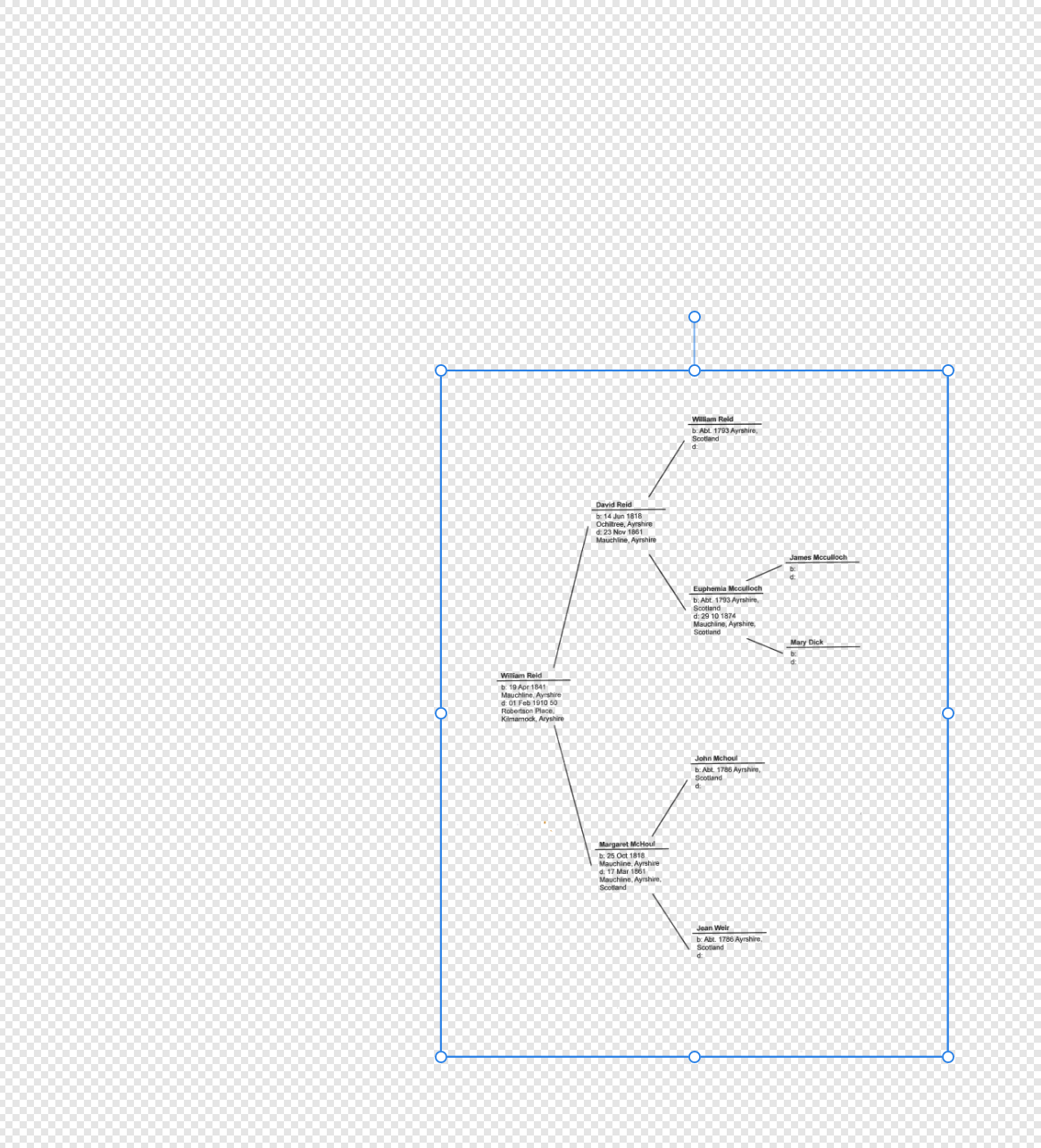
Yes, I expressed myself badly. My point was that if @Cally would unlock that layer in his original file, then export as a PNG with Selection Area, a new file would be created that would be useable, without any background at all. (Added the coloured rectangle to demonstrate.)
-
PNG export transparent background not working
jmwellborn replied to Cally's topic in Desktop Questions (macOS and Windows)
I fiddled around with Apple Preview, and also got the solid grey background, etc., or the checkerboard, and exported as a PNG from Preview. The file was not transparent when opened in Photo 2. I don't use Mixbooks, so haven't a clue there. My workaround does work, in case @Cally wants to try it. (Although there are hundreds of images with this issue, there could be a big problem . 😬 -
PNG export transparent background not working
jmwellborn replied to Cally's topic in Desktop Questions (macOS and Windows)
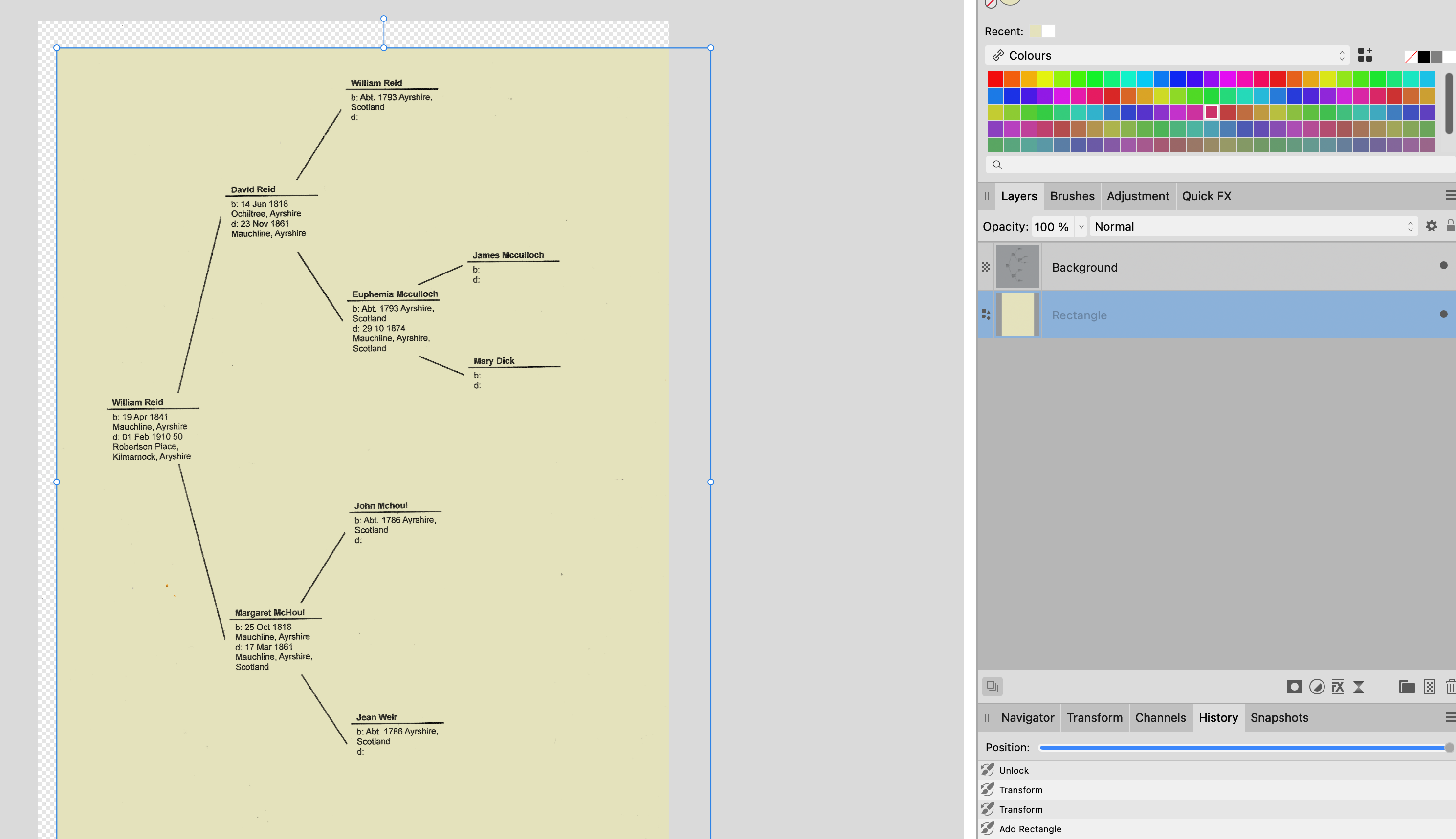
The one thing I found when I placed your file in Photo was that your Canvas has the checkerboard, not the drawing. In the Layers Panel, you will see that your layer with William Reid.afphoto is locked. Click the little padlock icon to unlock the layer, then click on your canvas and you will see that you can move your drawing around on the checkerboard canvas. With your drawing highlighted, go to FILE>EXPORT>PNG and choose the option Selection Area. You will now have a PNG that is completely transparent and can be either Opened or Placed in Photo, Publisher, or Designer. Does this help? -
@huebi Here is a very easy way to do this. Check this link. It is just a little fiddly, but here is another easy (amateurish) way to do this. 1. With crop tool, select Straighten. 2. Before you click APPLY, move the crop handles to touch the corners of your image (where possible, there will be blank spaces). 3. Click APPLY. 4. On the Layers Panel, right click on the image layer and select RASTERIZE. 5. Then go up to SELECT > Selection from Layer. 6. Then SELECT > Invert Selection. 7. Then EDIT > Inpainting. 8. Then SELECT > Deselect. I am not sure how much of these steps could be put into a Macro (haven't tried), but I am sure steps 5-8 could be added. 9. NOTE: If you have made a rather rigorous straightening effort, with rather large white spaces, you may see some streaks at the margins of your crop. You can add a new pixel layer, choose the Inpainting Brush Tool, use a brush size large enough to cover the streaked area, and paint. Screen Recording 2025-05-15 at 14.49.50.mov
-
OSX Ventura update to 13.7.5 - Blank "Open" menus
jmwellborn replied to SKO's topic in V2 Bugs found on macOS
@SKO and @Art51 If you will check the link in my comment above, and when you reach it, scroll down to the last post from @MikeTony713, you will find that he has provided the solution which has worked for me. You might consider it. Hope it helps you too! -
Genius!! Worked like a charm. On all three apps. One loses the list of all the recent documents prior to removing the mru.dat file, but every new document opened and saved is there and opens, in Open Recent and in New>Recent>click on file thumbnail and Open. Thank you ever so much. I had contacted Apple and removed all of my Desktop and Document files from the Cloud, in case that was the problem (Photo, etc. not knowing where to look) and it made no difference. So the mru.dat file is the villain. Do you think the developers would like a heads up?