Xenol
-
Posts
36 -
Joined
-
Last visited
Recent Profile Visitors
740 profile views
-
 Patrick Connor reacted to a post in a topic:
Jet Fighters - AD
Patrick Connor reacted to a post in a topic:
Jet Fighters - AD
-
jcolome reacted to a post in a topic:
Local Studio Logo
-
Aammppaa reacted to a post in a topic:
Local Studio Logo
-
Thanks for the input Jer, I'm a big fan of honest criticism, you often get suggestions you would never have thought of on your own! I'll have an attempt adding some dots as you suggest and see the result!
-
Xenol reacted to a post in a topic:
Local Studio Logo
-
I work for a few clients designing military-style patches, which often necessitates curved text. I find the current system of having to juggle with a bunch of little red flags until I manage to get the text in the right place on a shape and all on the same line a very cumbersome in experience. What I think would be a much smoother system: -On closed shapes (eg, a circle or custom shapes) have a button in the top tool-bar to swap the text from inside to outside the shape rather than trying to manhandle flags. Perhaps another button to give your the old view if you want that extra control? -Some form of flag which allowed you to set a 'centre' point on the shape, which you can justify the text to, allowing things to be easily kept symmetrical. When designing patches, I often get client requests to make the text bigger/smaller or have the copy changed slightly, which then requires effort realigning everything. This 'can' be done with the current system, but it doesn't make it easy. I understand this isn't a priority at all, and my needs are fairly niche, but I thought I'd mention it anyway since it's one of the VERY few gripes I have with AD!
-
jer reacted to a post in a topic:
Local Studio Logo
-
Adam reacted to a post in a topic:
Local Studio Logo
-
Xenol reacted to a post in a topic:
Local Studio Logo
-
stokerg reacted to a post in a topic:
Local Studio Logo
-
Madame reacted to a post in a topic:
Local Studio Logo
-
MEB reacted to a post in a topic:
Local Studio Logo
-
StuartRc reacted to a post in a topic:
Local Studio Logo
-
Leigh reacted to a post in a topic:
Local Studio Logo
-
Hi guys, something I'm doing for a friend's recording studio. Below are the logo design and a facebook cover (Which I'm particularly proud of) Thoughts?

- 4 replies
-
- 10
-
-
This is really cool! I might try and do something like this someday!
-
Thanks for the feedback, proper naming practices are something I should start exercising. How do you go about separating the lines and the colour? do you draw out the outlines first then colour in behind it?
-
Xenol reacted to a post in a topic:
AD Soldier - Help streamlining work?
-
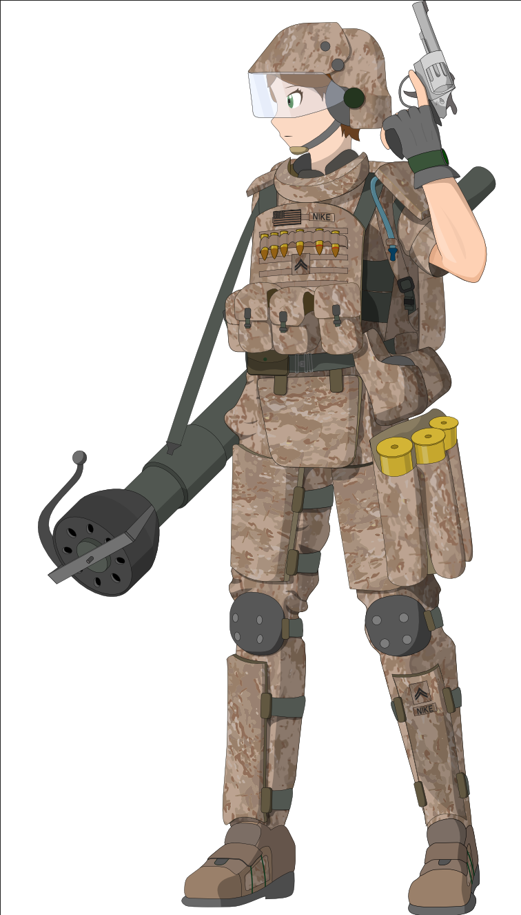
Hi, I recently completed this design for a friend of mine, and am overall very pleased with the results. I have learnt a lot about how to use AD, but I cannot help feeling that I am still being very inefficient. Big ask, but if someone could have a look at the AD file and offer any suggestions I'd be very grateful. Solider.afdesign
-

affinity designer Spotter's guide to stereotypes #9
Xenol replied to giantlobsterprd's topic in Share your work
Looks like DIN Condensed to me- 15 replies
-
- 2
-
-
- illustration
- digital
- (and 4 more)
-
Nice, reminds me of a clean version of Amatic.
-
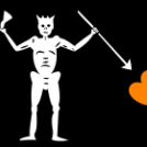
Hi folks. I started doing these as little project after some friends made some design requests. Here are a selection of the best. FN FAL Lee Enfield: SKS: A lot of it might not be to your taste (unless you're fond of the occasional Japanese cartoon), but if you could check out my deviantart it'd be appreciated: http://xenolsvectors.deviantart.com/gallery/
-
- 1
-
-
Xenol reacted to a post in a topic:
Jet Fighters - AD
-
Xenol reacted to a post in a topic:
Jet Fighters - AD
-
bang on, and I have a feeling thats the actual image I used as a template haha.
-
thanks Matt
-
Vector aircraft illustrations, I plan on making an entire series out of the concept.
- 15 replies
-
- 12
-
-
Second is my favourite design, needs a different font, perhaps Aller Display?
-
Thanks!
-
Xenol reacted to a post in a topic:
AD: Hide objects outside of workspace?
-
I don't know what setting I've accidentally clicked, but in AD I'm currently seeing all the shapes outside of the defined workspace. How do I hide them again, they're really distracting.