Search the Community
Showing results for 'logo' in content posted in Share your work.
-
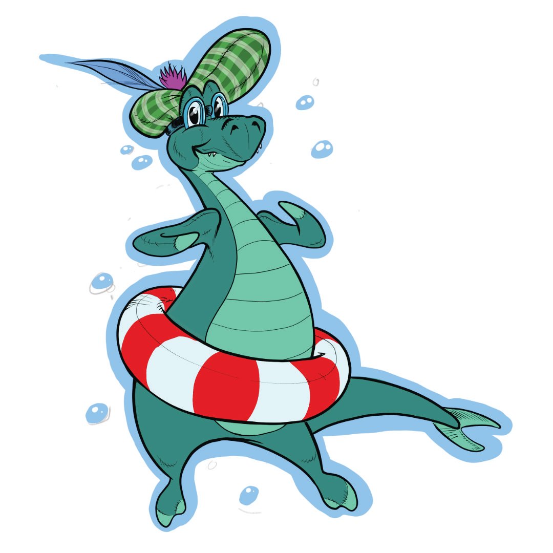
I was recently asked to design a Loch Ness Monster illustration to be used as part of a logo. I came up with several ideas that were narrowed down to one, which I produced a full colour sketch from, and then onto final vector graphics, with an option for the head looking the other way. I can't wait to share the final logo as soon as my collaborator on this, Amber, shares her design. I know it looks awesome, which includes some tweaks to the illustration for the better. I'll admit, I drew the sketches on Artflow on my Android tablet..... DESIGNER FOR ANDROID!!!!!

-
Halftone splash effect Affinity Windows 10 Hero wallpaper style
-
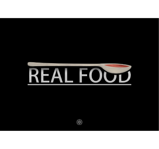
A logo created for a local Real Food chef,
-
 I wanted to share a project I completed using Affinity Designer. I worked with a client to redesign her interior design business logo. You can view the work in my portfolio by visiting this link. Aundra Skinner Interiors I know my client is happy with her new logo. I would love to hear what others think as well.
 -
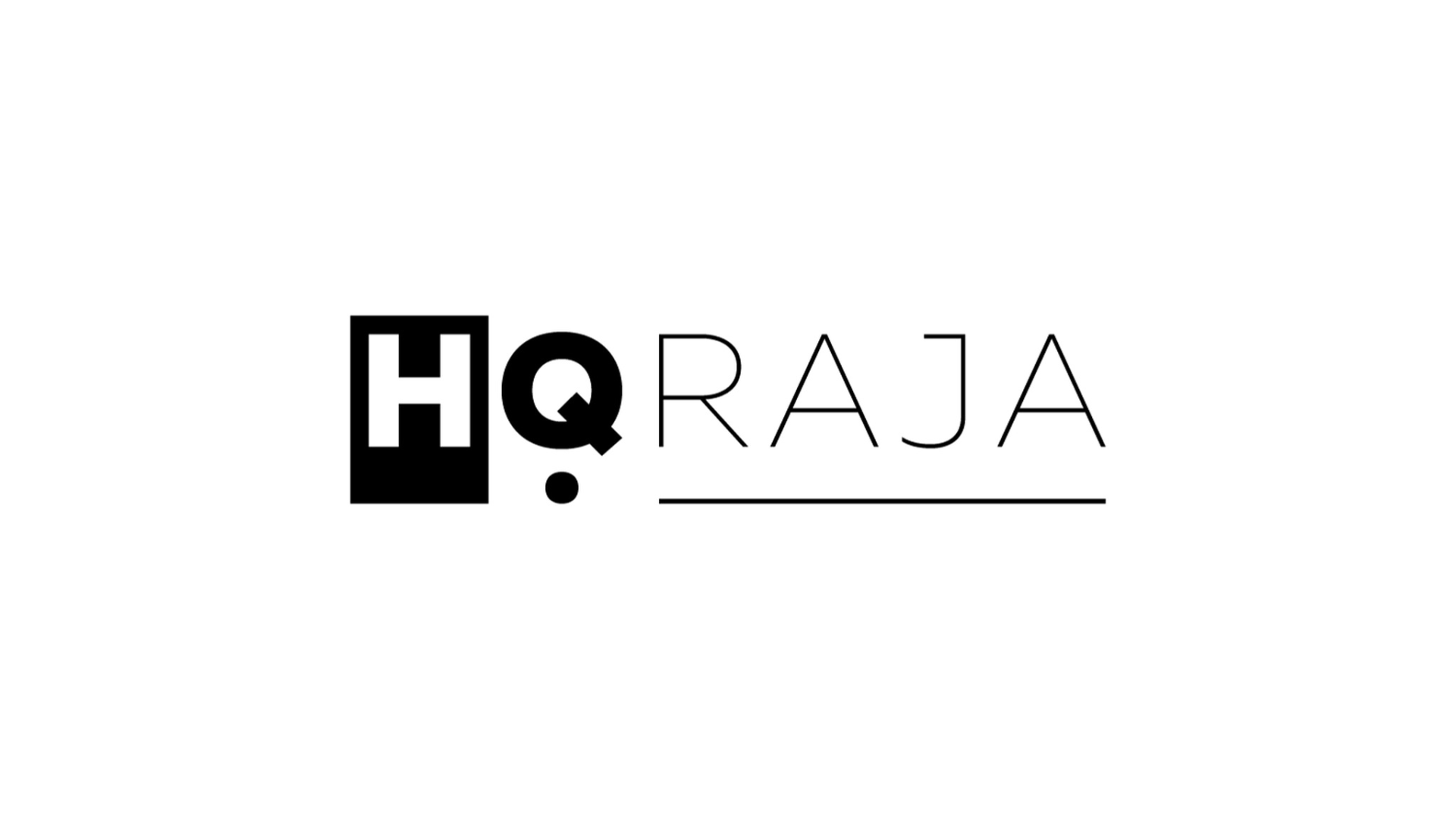
Hello everyone! This is my first post here. I wanted to share the logo to represent my professional identity/brand, that I designed using Affinity Designer. Any feedback would be appreciated. Regards, Haroon Q. Raja
-
Hi Folks. For a long time now, the logo of the brass band I play in has irked me. Although it is quite clever (the name BTM formed from a flat symbol, the shape of a cymbal and three quavers for the musically illiterate), it's unbalanced feel and amateurish execution has (to me) screamed out for a revamp. Below (right) is my take on the design. I'm going to pitch an entire rebrand at the next AGM. What do you folks think?
-
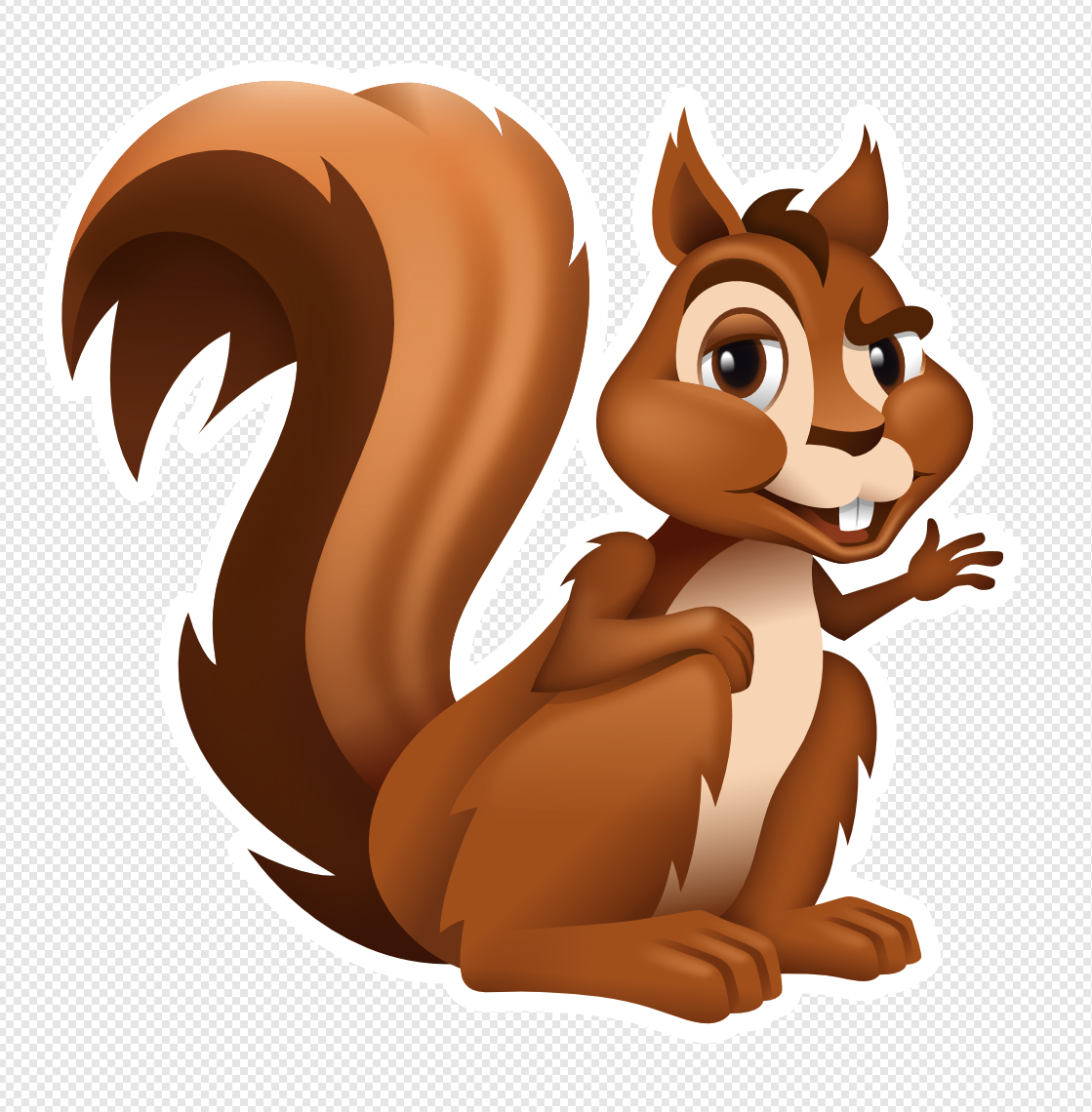
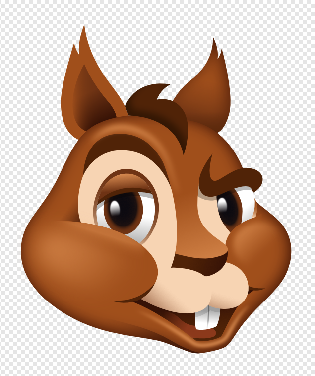
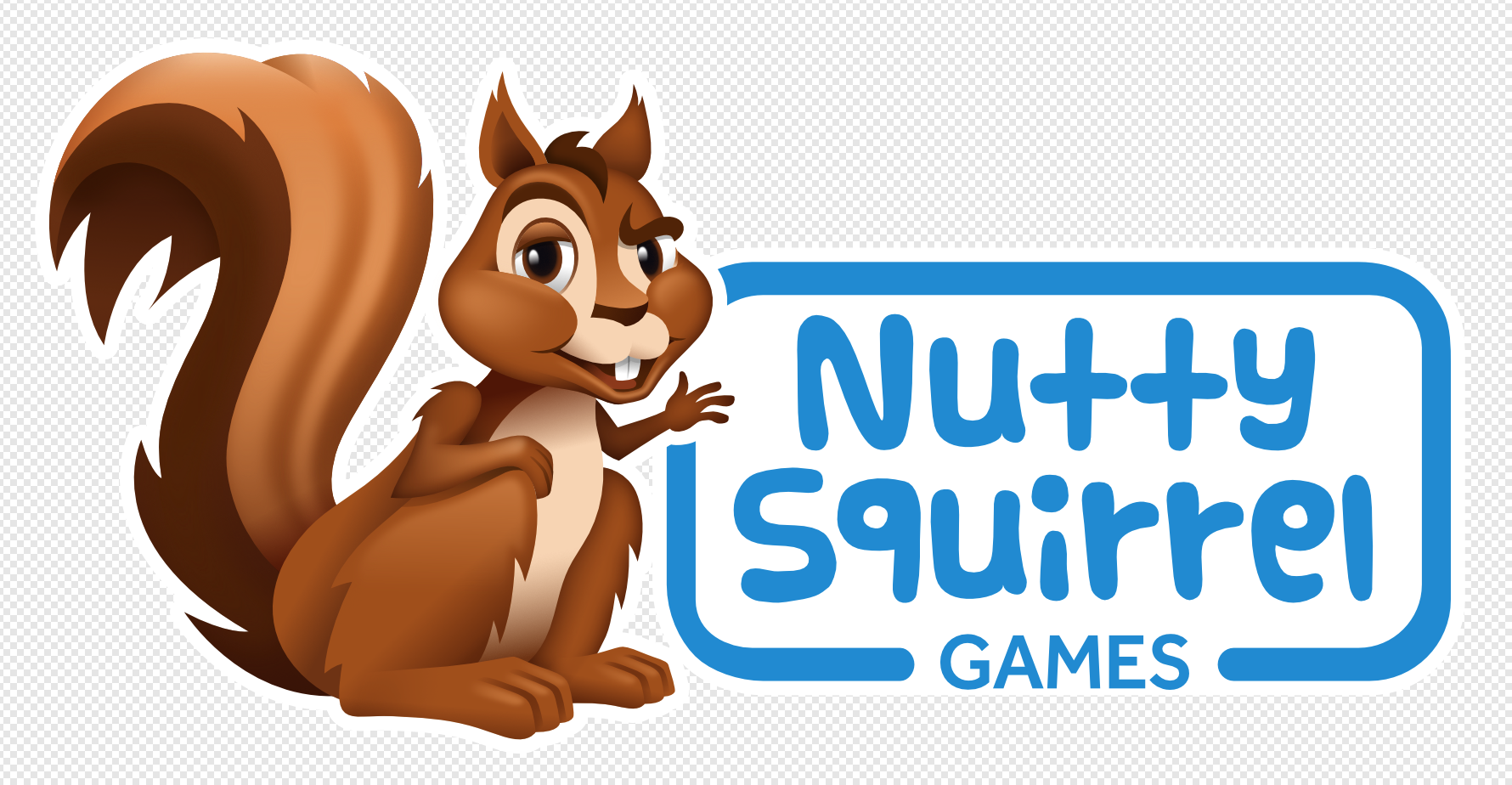
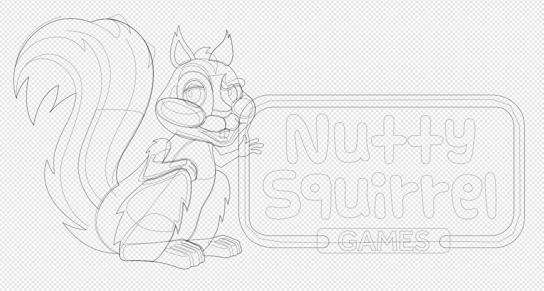
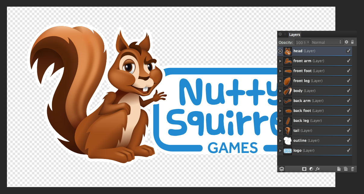
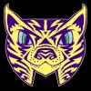
Hey all, here's my latest all vector Designer character. A fun, cheeky and a little "nutty" cartoon squirrel character created for Nutty Squirrel Games, a client in San Francisco. Also, I decided it was time for a refresh on my Forum avatar. Love working on these types of illos in Designer!!
- 15 replies
-
- 12
-

-
You've got strong elements: the title, the logo, and the picture. You don't need any pertubation like a pattern in the background. It doesn't have any meaning, it make us thing of wire mesh (not really positive), bees (out of subject) and isn't representative of "Sentry", or what we can imagine of American Legion. You've got important informations that could be put forward: the 2 titles and the image, since that's usually what we read on a cover, and what decide us to read or not. For example, if on each issue you've got a "portrait" or interview of someone important (or less, but that's got important things to say), it can be brought forward, perhaps with a picture of this person. You can decide, on each issue, to put forward one of those main articles, and have a picture to illustrate it. The logo either doesn't look in its proper place, it shouldn't be positionned where you've got place because you don't know what to do with it, but if it's representative and important, it should be in the important place, at the top with the title. Or you can test it at the bottom as a signature. You can play with it also, and have it at a big size (in few year, using it at another size will give a real "new version of the newsletter" feeling). Why put the image in small when you've got room, and since the mesh go to each side, I suppose you're not constrained by printing margins. You can have, as usually on covers, the image full page, or full half page. You don't need the caption on it either, they usually are inside the book/magazine, to give more importance to the other text. Same for the blue with the featered edge. It's not as strong as the title suggest. You can have a strong shape at the top with this word, in a different and noticiable font that you'll use as signature for the header only, like a logo. And why not a white rectangle with the informations "Newsletter • date" going on this blue shape? It can structure the page, to not have objects put in different parts. Don't forget to use a grid to positionning elements. They seems to be aligned on the left, but they've got different widths, (or positions for the right part of the elements), so it lacks some structure. Try to look at your design in big, in small size, upside down... It can help finding strong points and weak ones, and finding oddities.
-
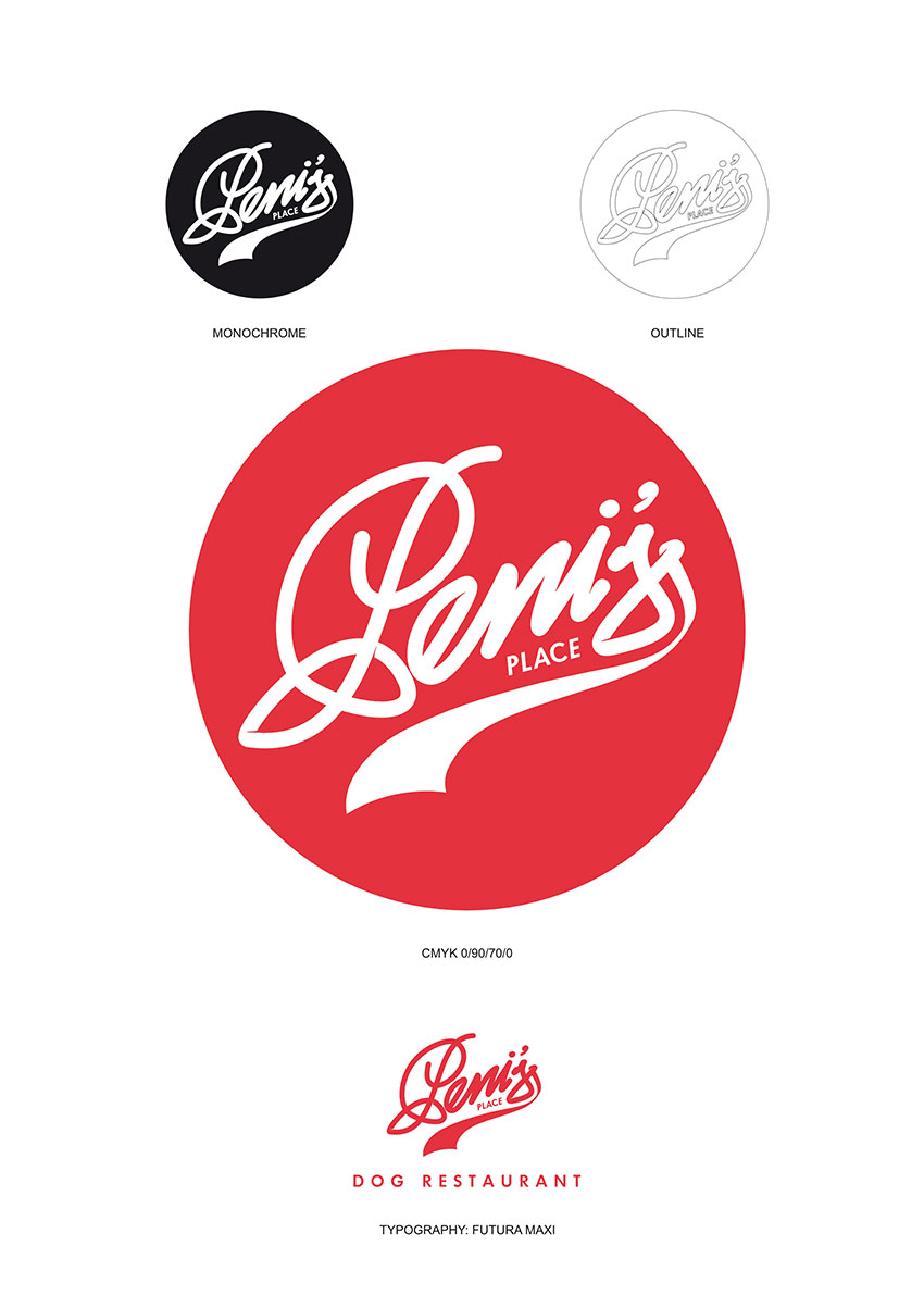
Hi there folks!! I need your urgent help with this work Im in. I have designed this logo (please see pic attached) but I have a problem with the roots holes. You see the client wants it without background, in a PNG file. But I had to put the roots holes in white, if I remove the white roots holes, the logo looks awfully horrible!!! Can you help me please? I would like to know if there is a way to put holes with transparency?
-
Logo I just finished for a pop up pie vendor who attends festivals and the like. Done with Affinity Designer.
-
Created this Mascot logo with Affinity Designer, I recently started using AD and i am new to Vector Designing. Any good sites where i can sell this type of logos ? Thanks. https://www.youtube.com/watch?v=G32g1Ywo9vg
-
First logo done for client with AD & Wacom Intuos pen tablet (M).
-
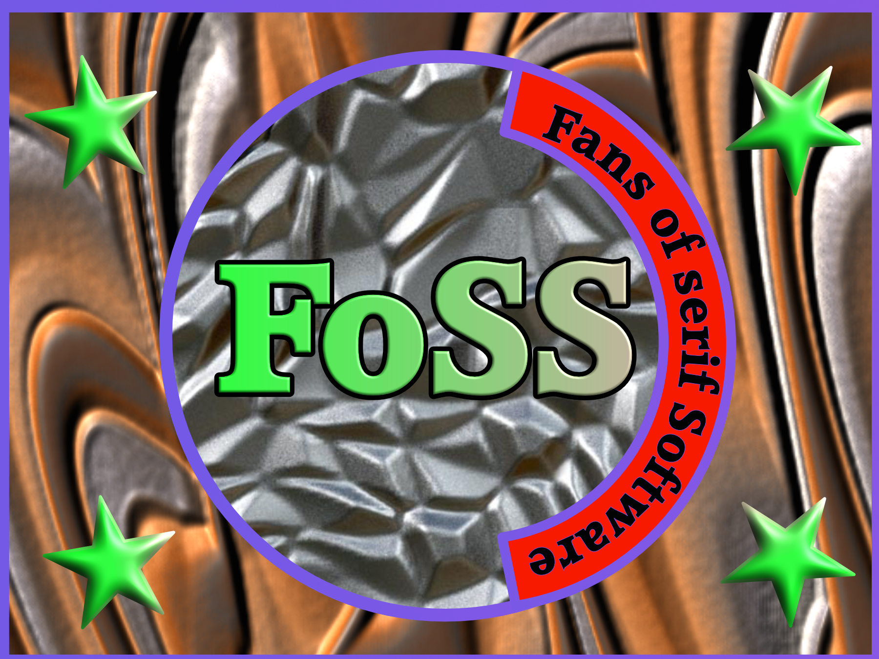
I was very reluctant to post this image after seeing so many other peoples brilliant submissions, but I have decided to give it a go and do so. Just a bitmapped filled rectangle and circle with some 3D text and text on a path (donut), stars made with a quick shape and given a 3D effect. There is so much in the brilliant program I have to learn and still get to grips with. Apologies to Serif for only having a lower case "s" in Serif. John
-
 Bought both apps yesterday in hopes of replacing the very expensive Adobe offerings. So far, I'm happy for the most part. Bought Designer first, and broke it in by re-drawing my bands logo. From this logo, I made a tri-color t-shirt logo as well. I'll post that too, if anyone would like to see how that came out. This logo was done entirely in Affinity Designer. No other apps or freehand drawing was done.
-
Between work this week, I've been playing with a new logo...partly because my bird doesn't work in printed applications but mainly because I'm a fussy idiot who cant stop tinkering. Anyway, Ive whittled my designs down to three feather designs, but cant pick which one is best. Earlier designs were way over complicated and way over engineered, so I have cut some fat and tried to keep an element of readability....the first rounded one although looks great also looks like a 'D' so the middle and last have a more feather look. (The logo will be used landscape and tower as it is now)
-
Salute! I have made this 3 logos in Affinity Designer for me, but I don't know which one to choose. Can you help me? EDIT: What is your favorite logo? Thanks! DAGGA - Graphic Designer & ART'stronaut
-
Un personaje hecho en Affinity Designer http://fav.me/da8og9u Logo hecho para mi grupo en Facebook de MOHO (Animestudio) http://fav.me/dac9z9q Espero les guste. PD: Si lo desean unanse al grupo de Affinity Designer en Devian Art
-
Hey folks, Here's a wee logo I designed for our local museum. They wanted a text based logo in their corporate colours (orange & grey) as well as a Valkyrie (based on a pendant found in Denmark). I'm happy to say they are delighted with this version (I sent them a few iterations). One thing that bugged me was that they asked if I could change the font to Arial! I obviously said no! George
-
I just did this LOGO to see how it went. It is not to hard to use and seems to work well.
- 1 reply
-
- 1
-
-
I'm not a graphic designer but I am using Affinity to create holiday ornaments (metal medallions, ribbons, etc) and this is my first draft of my company logo. Clearly I have not thought of a company name yet. :) I would like some honest feedback and suggestions. Thanks Bill Logo 2.afdesign
-
Hey guys, I recently made a logo design for myself in affinity designer. I will mostly use it for my ident on behance, twitter and youtube. Any thoughts on this one? For a closer look and different versions check out my behance: www.behance.net/yannikw
-
Hi there guys! Below are 3 samples of a logo I´m doing to my self (I am a psycholinguist, like a psychologist of the emotions) but I think that something is still missing. Can you guys give me any advise? or any suggestion? I´ll be open to all your answers. Thanks a lot
-
I created this logo in Affinity Designer for a local client.
-
 AI is coming strong for all of us (longer time for coders, but it will happen)... Designers will survive longer in their jobs (some of you will handle AI tools) than us illustrators (specially raster illustrators and digital painters, we're dead in the water). But the counter (imo for every creative job...even painters) of it is going the strong personal route (that or doing traditional, hand made art, imo). Some will find their way by streaming what they do (Twitch Art section is growing, and Youtube Live, would be clever to promote those with by tiktok/insta reels/yt shorts! (<-- big and fast organic growth, but pointing to the real content, not by themselves only) And Pinterest). This means, build a personality, a style that is recognizable as 'you', and almost as important build a community or following, people that gets to become familiar with you, your style, your written posts, too. Interact the more you can with them (there are limits; the graphic work is the priority). Humans want to know about humans, otherwise they lose interest on the (machine made) product itself (I believe this social and psychological component is what these AI companies have not considered too much). So, going the route of producing large scale, anonymous, unsigned cheapo stuff for stock art sites, or race to the bottom on fiverr or upwork... Besides that was never good (can be fine for now to get some bucks tho), I think that's what has zero future for most people, indeed. Making logos will yet be strong for a while (meaning if being able/skilled/trained to do brand stuff, really), IMO, because, at least doing that job right requires, besides a lot of knowledge and studies, a ton of human perception, soft skills, interaction with people, and stuff that AI cannot yet do, and for some time. I am not talking about small businesses that have their niece or the neighbor's kid doing the logo for the company, of course (those are already downloading the AI apps). You do your own stuff focusing on big traffic, but mostly that such people come to appreciate you and interact with you, too, imo, although at first that generates zero, so will need some more 'boring' (nothing is boring...) solid income. That's my take after reading/absorbing tons of stuff about the new situation and mostly what is coming... at least, in the very not so nice scenario that comes now, and which imo has no precedent, in centuries. The silver lining is that now will really win the most creative ones, at least the long run (but yeah, in the meantime, one's gotta eat, and for that, anything is good enough, IMO. Also, I love working in whatever, so, that's a plus that a lot of us do have). I don't think it is super dramatic, but a big change is clearly needed (people comparing it with the swap from traditional to digital painting have absolutely no clue. This is another entire ball game, it's huge. And it will also affect most graphic professionals). I might be wrong, though, as the legal aspects and the society's reaction about all this are a big part of the equation, and those are yet to happen. Your work has a lot of soul and it is very good. I wouldn't be worried. But we need to build the right thing, IMO.
 -
Howdy all! Getting geared up for a series that is my "homage" to the great cosmic epics by Kirby and Starlin. Here's my logo design for the series. I need so input from you good peeps here. I have design A and design B and don't know which one to use. In the upper right is a infinity symbol with arrows, that's what I need help with. I like that icon-logo a lot, as it sums up the gist of the story (infinite rebirths of reality, each reality has infinite universes within). I kinda like the 3D effect on A, but the simplicity of B matches the rest of the design well and uses the only color to pop. So if you'd be so kind as to indicate a choice, I'd be ever so thankful. And everyone who participates in this here poll and topic will get a mention in the print edition of this series. Any critiques are welcome, too, btw. Some background, This will be a prelude to the main series "Cape and Cowl Opera." I wanted to make this series, "A Prior Reality" different from the main series. So I thought that since comics (as we know 'em today) began life as compilations of the comic strips of the '30s and '40s and began to have new non-reprint stuff when newspaper comic strips ran out of new material. So this series will have 6 "daily" comics and 1 "sunday" comics each week. It'll be released on the web as such. It's early on, I won't start putting it on the web until I have at least ⅓ or ½ of the darn thing done. I'm jazzed about this, as the comic will be drawn, lettered and colored entirely by hand on paper. Except for the Title page and chapter headings. I couldn't have done that icon-logo without the Doughnut property! mmmm doughnuts.... It allowed me to eyeball the width of the circular shapes to match up the 4 objects and the Pie property (why am I getting hungry?) made it oh-so-simple to get the part of the outer circle just the way I want it. And topped it off with a cherry... no I mean triangle. The black background used the rounded rectangle and some hand editing to get the curves and sharp angles the way I wanted them. And thanks for any votes and comments!