Search the Community
Showing results for 'ROMM RGB'.
-
 I do not see any other way than what I showed in my post, but that, too, may require some preparation (like switching between K100 <-> Gray/RGB black), and handling of placed PDFs (= need to use Interpret mode to have their color space changed to RGB and Grayscale). and also post-processing, like manually changing page boxes from trim to media/bleed page by page, and handling non-symmetric bleeds (which Affinity apps cannot deal with automatically). The video clip below shows the procedure of creating a mixed mode publication, after you have created your all CMYK and and all Grayscale versions. The building blocks are attached, including an RGB version that has black text as RGB 0, 0, 0. mixed_colors.mp4 But basically the method shown could be used pretty effectively to get fully professional output. Hopefully Affinity apps at some point will have InDesign [Black] intelligence which keeps K values in grayscale exports, and auto-converts K100 to RGB 0, 0, 0 in RGB exports -- and that Publisher has its page box bugs and usability issues related to the page box and K-Only button fixed -- these fixes would make creating mixed-mode print jobs very smooth. color_and_gray2_allcmyk.pdf color_and_gray2_allrgb.pdf color_and_gray2_allgray.pdf color_and_gray2_mixed.pdf
 -
Start with a CMYK document—US sheetfeed uncoated, but maybe other profiles yield the same issue. 1. Place an RGB image—make sure it has some colors that are out of gamut for CMYK 2. Rasterize it 3. Use Color Picker tool (set to Point 1x1) to pick a color. Choose a color that originally would have been out of gamut. 4. If you have selected a color that was originally out of the CMYK’s gamut, notice the swatch next to the color picker's icon on the Color panel. It displays an out of gamut RGB color, while the Fill or Stroke swatch will display a CMYK color. See attached image. If you use the color picker that is found in the Color panel, this does not happen. It chooses a CMYK color and displays it next to the color picker icon in the Color panel. Edit: If this color is painted with, color picking the painted color yields the same out of gamut preview color—no matter which version of the color picker you use to originally pick the color, so even though the Color panel’s picker displays a CMYK color, it paints a color which the Color Picker Tool in the toolbar will display an out of gamut RGB preview of). End Edit This behavior is identical to when you color pick from an RGB image that has not been rasterized. Initially I’d thought the reason for the RGB preview of the picked color was due to the photo not being rasterized, however, it still does the same thing even after the photo has been rasterized. Same thing happens in Photo v2 on iPad. Expectation: In the case of picking from a rasterized photo, I’d expect the “picked color swatch” to show a CMYK color. Preference: In the case of picking from a non-rasterized RGB photo, I’d still prefer the “picked color swatch” to show a CMYK color, but perhaps there is reason for it to show the actual underlying RGB color as the color that was picked.

-
I wish it was shrinking... that would mean we've reached that ideal moment when I don't need to care anymore about color accuracy... even more, that all got so universally perfect that I need not to worry either about CMYK (yes, I know RIP are today very good in the conversion from RGB (but if the different RGB sources are too different for lack of calibration and etc...), but it's not enough in too many cases), color aberrations, levels of ink, etc. But each device/monitor/etc supporting a color profile or color space, like sRGB, Adobe RGB or Display P3 does not mean they display those colors accurately. Too often they introduce important deviations, etc, often not noticed (due to visual compensation, our perception...) until the work ends up on certain consumers screens. Even Mac screens do need calibration for serious work. Not only for print (and I have suffered the consequences when someone "skipped" some step in the chain, usually not the folks at the print company, and because... "hey, it's 2024, it's not needed anymore". Ouch, those cases ended with expensive print runs ruined) , but also for screen. I have some anecdotes with concept art for the press, for big sites that would publish an article or review about the game(/s), for which color accuracy was critical, despite being screen-only outputs. I would agree that social media centered work IF color accuracy is not so important, can live without that (except the moment when some color mistake is too big even for the average consumer, and somehow escapes the radar of capable people at the company). I wouldn't say it is shrinking. I'd say the vast amount of stuff dumped on social media today gives such sensation, but it's just how massive is that output. But any professional (not hobbyist) photographer I know, and even more, photo labs for bigger publications, do their hardware color calibration once per week, two weeks or monthly at the very least, depending on how critical is accuracy in their work, to counter inaccuracy due to monitors' degradation/change. And there are not fewer professionals now (more, if anything). This happens also in graphic design for anything beyond solely social media. Admittedly, for corporate image stuff (branding at certain levels, etc) you end up needing to use Pantones and other methods (which also involve calibration of all the chain), but if anything that's another proof for the need of accuracy. I have needed (as in, required) this accuracy with even the digital-only book cover illustrations and graphic design for ebooks. So... I think it's as needed as always, if not more. The difference is, IMO, that there is a huge chunk of work to be done which does not need it badly, for which the speed of output is more important. I recon though that tablets (at least Samsung, iPad Pro and the latest Surface Pro versions, indeed, at least this last one gets a desktop OS on it) can be considered now a "professional" companion; they make part of the professional workflow, or serve to review it, etc, but desktop keeps being the main thing for too many workflows.
-
 Hi Pyanepsion, I don't think the coloured spaces are causing the text spans at all. It is the multiple highlights on the spaces that are causing it. As I understand it SVG doesn't allow for highlighted text, so to make it work we have to draw a rectangle for every space using a highlighted colour. This is why you have that massive block of rectangles. So to ensure that wasn't causing the increased text spans I did an export with all of them set to no fill. SVG export with coloured spaces (attached Highlight Spaces.svg): <g transform="matrix(1,0,0,2.14286,0,0)"> <text x="14px" y="39.665px" style="font-family:'ArialMT', 'Arial', sans-serif;font-size:8px;fill:rgb(16,24,32);">Nullam hendrerit viverra dolor<tspan x="118.488px 120.711px 122.934px 127.828px 132.277px " y="39.665px 39.665px 39.665px 39.665px 39.665px ">. Ves</tspan>tibulum fringilla, lectus id viverra malesuada, enim</text> <g transform="matrix(8,0,0,8,201.648,50.0652)"> </g> <text x="14px" y="50.065px" style="font-family:'ArialMT', 'Arial', sans-serif;font-size:8px;fill:rgb(16,24,32);">mi adipiscing ligula, et bibendum lacus lectus id sem.</text> </g> SVG export without coloured spaces (attached Non highlight spaces.svg) <g> <text x="14px" y="39.665px" style="font-family:'ArialMT', 'Arial', sans-serif;font-size:8px;fill:rgb(16,24,32);">Nullam hendrerit viverra dolor<tspan x="118.488px 120.711px 122.934px 127.828px 132.277px " y="39.665px 39.665px 39.665px 39.665px 39.665px ">. Ves</tspan>tibulum fringilla, lectus id viverra malesuada, enim</text> <g transform="matrix(8,0,0,8,201.648,50.0652)"> </g> <text x="14px" y="50.065px" style="font-family:'ArialMT', 'Arial', sans-serif;font-size:8px;fill:rgb(16,24,32);">mi adipiscing ligula, et bibendum lacus lectus id sem.</text> </g> Notice how the spans are in exactly the same place? The spans are used to try to ensure objects are placed to match what you see in Affinity as closely as possible. Obviously this isn't always what people want, which is why we added the 'Longer Text Spans' option inside the Export Settings. This should do exactly what you want and remove those two text spans. I took the above two examples and exported them with 'Longer Text Spans' enabled and get this: SVG export with coloured spaces using longer text spans (Highlight Longer Text Spans.svg) <g transform="matrix(1,0,0,2.14286,0,0)"> <text x="14px" y="39.665px" style="font-family:'ArialMT', 'Arial', sans-serif;font-size:8px;fill:rgb(16,24,32);">Nullam hendrerit viverra <g transform="matrix(8,0,0,8,201.648,50.0652)"> </g> <text x="14px" y="50.065px" style="font-family:'ArialMT', 'Arial', sans-serif;font-size:8px;fill:rgb(16,24,32);">mi adipiscing ligula, et </g> SVG export without coloured spaces using longer text spans (Non Highlight spaces Longer Text Spans.svg) <g> <text x="14px" y="39.665px" style="font-family:'ArialMT', 'Arial', sans-serif;font-size:8px;fill:rgb(16,24,32);">Nullam hendrerit viverra <g transform="matrix(8,0,0,8,201.648,50.0652)"> </g> <text x="14px" y="50.065px" style="font-family:'ArialMT', 'Arial', sans-serif;font-size:8px;fill:rgb(16,24,32);">mi adipiscing ligula, et </g> So to summarize, I don't think there is an issue here, but it does sound like 'Longer Text Spans' will be what you need. You can also look at further minimizing the file size by using 'Use Hex Colours', 'Flatten Transforms' and also disabling 'Use Line Breaks'. Highlight Spaces.svgNon Highlight spaces Longer Text Spans.svgHighlight Longer Text Spans.svgNon highlight spaces.svg
 -
 Hi all! I can't tell you how lucky I am to have found this forum! You folks are really so kind and helpful! I am fairly new to design and wanted to have something printed today (making stickers) and learned that print is done in CMYK color format...well, whoopdidoo - haha - ya learn something new every day! I converted my project to CMYK and immediately a great deal of color vibrance was lost. My question is: 1. Does anyone have a good method or strategy to convert a design already done in RGB8 to CMYK and get the look of the original design back?
 -
 Are you using the same colour space (e.g. CMYK versus RGB) and colour profile in both applications? Can you share two documents, each made with a different application, in which you have placed the same image, in the same way, so we can see the difference?
 -
 Where is the setting to export CMYK-black (0/0/0/100) as pure RGB black (#00000000)?
 -
 As a famous bloke once said, "If Photo were the only raw processor available I'd go back to shooting rgb files from the camera" Oh wait a minute, that was me Here's an alternative approach not using "Canons secret IP of its own lenses." All defaults, no effort from me Can't upload jpgs today so it's zipped 069A2634.zip
 -
 Depends on many factors like colour format and profile of document bitmap or vector layers in document Export format vector or bitmap, PDF, jpeg, png etc? what should happen with other colors, e.g rich black? Can you elaborate more what you try to achieve? Why can’t you use RGB black directly?
 -
 Understanding RGB channels is an importing part of working with color in digital photography. Today we’ll look at how channels work in the Affinity programs from the ground up.
 -
 I think I must have misreported the file size of my whole document that I first referenced to Walt (I said the whole file was 32GB), but now when I convert from the RGB-8 and the 32 HDR setting, the file size for the whole drawing goes from 8MB (RGB-8) to 17MB (32 HDR) - still that's a sizable difference and I will check all of my docs to make sure they are on RGB-8 - good education!
 -
 Following the release of Affinity 2.1, which updated the PDF export library that Affinity uses, our team have discovered an issue in all Affinity apps on all platforms. When exporting an RGB document to PDF, if the export setting is set to 'Use Document Profile', the PDF will be assigned the sRGB2014 profile incorrectly. For users on Windows, Manually specifying the correct profile in the export dialog (instead of the 'Use Document Profile' option) should export the PDF with the specified profile as expected. Unfortunately this workaround does not work for macOS. If your document contains 'Placed' (ie Embedded or Linked) images, when exporting to PDF using the RGB Colour Space, the images will always use the 'sRGB2014' Colour Profile, within the PDF. From our testing, this issue can occur with any Affinity document using the RGB Colour Space, and still continues when converting the image colour space during export. To workaround this issue for 'Placed' images, you can convert the 'Placed' Image layer to a Pixel layer will correctly export/convert the images colour profile in the PDF. To do this, please select the 'Placed' Image layer, right-click and select Rasterise... This issue has been logged with our development team as a high priority issue and we're working to resolve this ASAP. Our apologies for any inconveniences caused due to this in the meantime.
 -
This is to be expected. adjustments do not get converted to give visual identical results when the color space or color profile is converted. most adjustment work „simplistically“ on color values, e.g. curves, levels etc. when you convert to a wide color profile, the color values in pixel layers change, so the relation between input / output will change. if you change color profile from rgb to cmyk or lab, some adjustments simply stop working e.g. invert gives useless results in cmyk.
-
 Unfortunately the Picker Tool can show only one colour mode, as @lacerto mentioned it is the colour space of the document. If you place a grayscale image in a CMYK document then the button "K Only" gets automatically activated which results in only K values for the Picker Tool. If you deselect 'K Only' in the Context Toolbar for this image then the Colour Picker shows the gray in 4 ink channels. – Additionally, if you have 'K Only' for a grayscale image deactivated in a CMYK document then it will be exported in 4-channel gray even if the image resource was saved with a grayscale profile. This is related to the fact that Affinity handles grayscale colours internally as RGB/HSL, even in a CMYK or grayscale document. The Colour Picker limitation to the current document colour mode also means that it shows colours of an RGB resource in a CMYK document as CMYK values. Affinity's 'K Only' workflow (or workaround) also means you can activate 'K Only' for an RGB resource to get it exported as K values only. If you apply a fill colour to an RGB image with 'K Only' activated it gets applied accordingly to its K only equivalent and thus appears monochromatic and brighter, different to the fill colour applied to an RGB resource without 'K Only' pressed.
 -
I think that the repeated questions are typically related to separation preview, while images (and possibly also native elements) are still in RGB color mode. If that kind of tool can also show problems in placed CMYK content (already when it is placed on the canvas and not just in the exported PDF), then all the better. That is, users would like to have a kind of an interactive in-app preflight tool that exists e.g. in InDesign (note that this tool also takes into account effective TAC assisted by things like overprinting and blend modes): properinkcontrol.mp4 In lack of something like that, post-export tools like Adobe Acrobat Pro and callas pdfToolbox, and PackzView (the only one that is free, but with limited availability), are pretty much the only tools that can handle TAC and other preflight related tasks effortlessly and professionally. Everything else that I have seen (including postprocessing of separated inks e.g. with Ghostscript) are rather convoluted workarounds, but of course better than not having anything at all (= dismissals from the printer).
-
 I am preparing some info for a client as I am recommending the Affinity suite to them as they don't have professional designers and thus do not want to pay the monthly subscription fee for Adobe. Right now all they would need is Photos as they are using Canva *shudder* for their design work. They have recently rebranded and are very particular on their colour for print but keep sending RGB print files which is a problem as it obviously converts different then the CMYK makeup they have chosen with the rebranding. To make a long story short I think part of the problem is the pictures they are using in Canva being RGB and want a simple solution for them to convert to CMYK. In Photoshop this is a simple thing, I open the RGB image in Photoshop and simply go to Image>Mode and select CMYK. Other adjustments can be done after this. What is the equivalent in Affinity Photo? I am hunting around the software (v1) and cannot find this. Can someone point me in the right direction for a simple conversion to CMYK?
 -
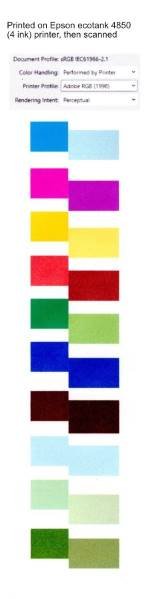
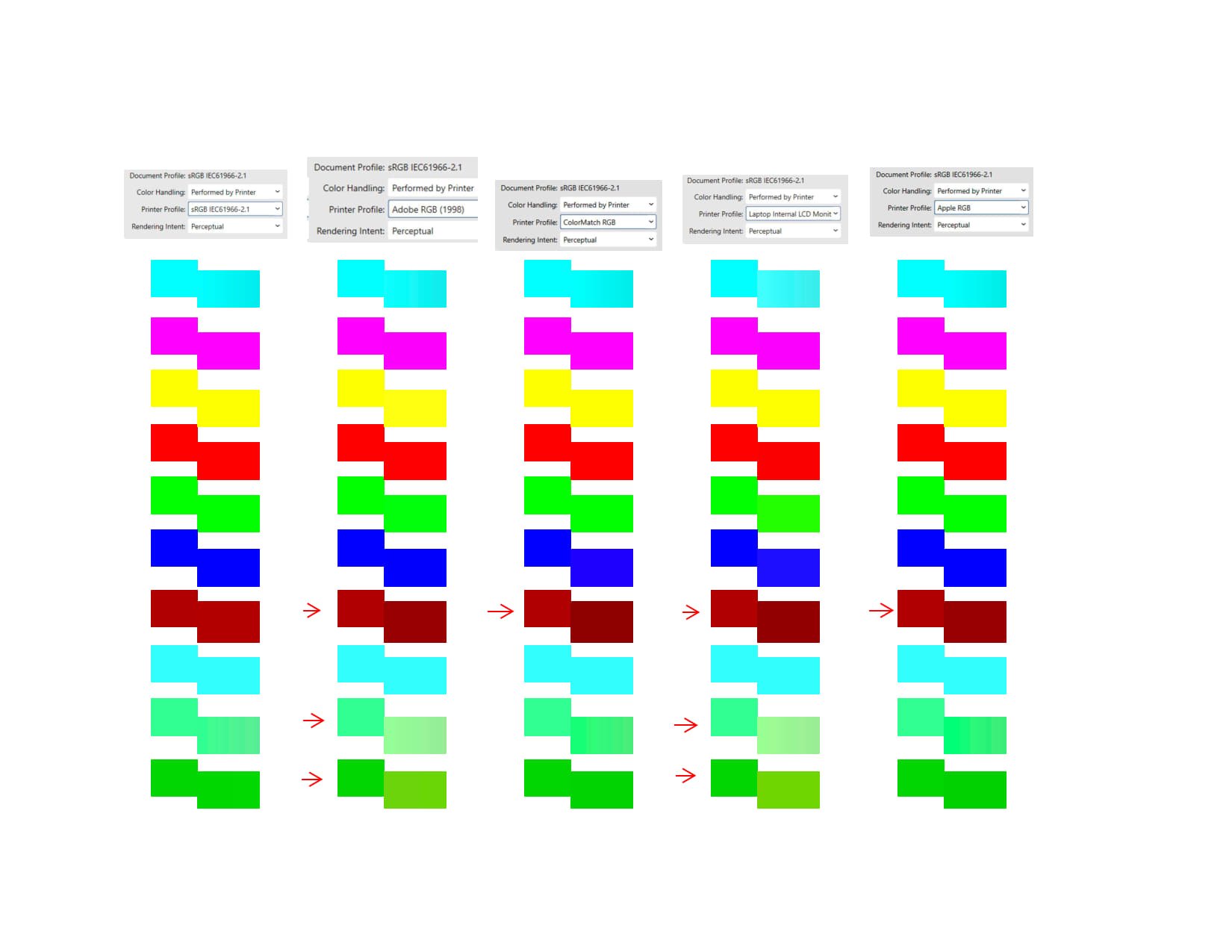
 Added note: This reports on a discrepancy between the printing of rectangles filled with gradient vs plain fill when color handling is set to "performed by printer" At the end of my second post below, I point out that the problem might lie with the color of the plain filled rectangles rather than with the color of the rectangles filled with a gradient. The remainder of this post is the original post. In trying to figure out how to get my printer to print the colors I want, I tried all sorts of arbitrary combinations of settings in the Affinity Publisher 2 print dialog (to get a sense of what effect they have). I stumbled across an odd behavior. After various experiments, I created the following test case: Create a rectangle pair by putting 2 rectangles next to each other, setting the fill of one of them to some rgb parameters. The fill of the other is then set to a linear gradient, both ends of which are exactly the same rgb values, so that both rectangles appear to have exactly the same fill. Then print them with color handing set to "Performed by Printer" but with the printer color profile set to something different from the document profile. I got strange results printing to an Epson EcoTank 4-ink printer (with its properties set to "no color adjustment") and also strange results printing to PDF with "Microsoft Print to PDF". In some cases the colors of the rectangles that are specified with gradient fills differ in the printout or PDF from the colors of the rectangles that look exactly the same, but whose fill is specified without a gradient. To me, this suggests a problem in Affinity's color handling that might also be causing other problems. I am including: a sample afpub file a jpg created by scanning a printout created by my Epson Ecotank ET-4850 printer (labeled with a caption) a sample pdf printout from the sample afpub file (modified only to add a caption)' a jpg file exported from a combination of pdf files created with several printer profiles gradient test d.afpub gradient test d adobe.pdf
-
Black ink fill rate control in CMYK?
lacerto replied to mykee's topic in Affinity on Desktop Questions (macOS and Windows)
Have you tried the save, close and reopening trick, as advised by @thomaso. This should result in RGB images being properly assigned with the "new" (currently active) target CMYK profile so that you get correct reading already when using TAC picker or CMYK picker, but most importantly, when you actually export to CMYK PDF. -
If you can demonstrate that the Photo correction is different for the same lens used on a full frame body and a crop body then carry on trying to modify the profiles to cope with both. I think that it would be a pain to select the right profile during development but then I'm not doing it. If you are serious about lens correction I recommend a trial of PhotoLab. I use it with Viewpoint, it's easy and produces superb results. If I only had Affinity Photo for raw development I would go back to shooting rgb files from the camera Hopefully a Serif expert will be along soon I have nothing further to add, good luck
-

Black ink fill rate control in CMYK?
mykee replied to mykee's topic in Affinity on Desktop Questions (macOS and Windows)
@lacerto your video is very useful, and this is exactly the little tool I miss in Affinity (Total Area Coverage), which I could really use to easily check if I am exporting good color coverage or not. Here I use FOGRA39 for my prints, so by default I use the FOGRA39L_VIGC_300 profile and put the RGB images on that, but for some reason it still crosses the 300% limit and exports 325%. If I put a Soft Proof layer with ISO ECI 300 on it, it has already taken back the tints, which may be a temporary solution, but it can distort the colours a bit. -
Hi, I wonder if it is possible in AP to change colors controlling the value of RGB. Thanks
-
When using a specific method for channel packing (see link below), export is wrong for TGA format if mask is fully or almost black. The test file has a mask with only 2 white pixels upper left / lower right. Problem 1: When exporting to TGA, the mask gets ignored and the TGA is fully opaque, despite the preview rendering. When changing export from TGA to PNG, export is representing the rendering. Image 1: Preview rendering for TGA wrong, check with navigator Panel Image 2: Image rendering correct for PNG (same file) Image 3: Solo / Isolation Mode of Mask Problem 2: If you re-import the TGA or PNG back gain into Photo, the RGB channels are not recoverable, but zeroed out. If you fill the mask with a white to black diagonal gradient, all TGB pixels are recoverable by filling the alpha channel after opening. almost empty mask export bug.afphoto
-
@itsRachel There are a few factors to consider when scanning. Size, Resolution, bit depth and color space. If you scan a 2 X 3 inch image at 300 dpi, the pixel dimensions will be 600 X 900 pixels (i.e., 2 X 300 and 3 X 300, respectively). That's fine if you want to print your final image to a dimension of 2X3 inches. But, if you plan to print it to a dimension of 8 X 12 inches, you will have to spread those pixels out over a larger area. In that case you would have a resolution of only 75 pixels per inch, (same number of pixels, 600 X 900, but blown up larger and very noticeable to the eye). So when scanning, think of your final print size. If you know you will print 8X12, multiply each dimension by 300 dpi to get a desired resolution of 2400 x 3600 pixels. It's simple math. 16 bit is best for high quality and smooth transitions. After editing the file, you can reduce it to 8 bits if desired, to reduce the final file size. Color Space...I almost always scan as RGB. This gives me the most flexibility and control. If I wish, I can always convert to grayscale later. Some inkjet printers have a B&W printing mode. If your printer does better printing B&W using that mode and prefers grayscale images, you can always convert your RGB file to grayscale and save it as a copy (keep your RGB original in case you need it again.) Your printer and image file need to "speak the same language". If your printer expects to receive sRGB data, then it is best to save your image as sRGB. Printing can get fairly involved if you want the best possible results.
-
Default black, not black
lacerto replied to KarinC's topic in Affinity on Desktop Questions (macOS and Windows)
No color, no light (L = 0). #231F20 (RGB conversion for K100) -- I do not have macOS version 1.x installed currently but the Windows 1.x version gives the same. I see no point in this kind of a categorical warning. It is the strong point of Affinity apps (similarly as that of InDesign) that mixed color definitions can be given (e.g. certain values given in RGB to get them in full color spectrum when exporting to RGB, and conversely, making a CMYK definition in an RGB document when there is point in keeping colors consistent in visual appearance in both targets). But it of course easily confuses people because it is pretty easy in Affinity apps to perform inadvertent color conversions simply by forgetting the lock off and switching the color model in the Colors panel. UPDATE: Actually there seems to be more fundamental difference in color conversions between macOS and Windows, which can at least potentially have some bearing when taking a design from one platform to another. E.g., in a CMYK document, K50 will be converted to H0 S0 L50 on Windows, while on macOS the HLS conversion will be done after first converting CMYK to RGB. On Windows, this will only happen if the document is in RGB color mode. I see the Windows behavior more appropriate, and it actually matches the Illustrator handles gray values in CMYK and RGB color mode (Illustrator is not a dual color mode app, but basically converts input colors to target color mode based on color profiles, but handles gray values differently in either color mode). -
 I don't know if this has been brought up yet, but I am working on a photo manipulation that has 6 layers, with each layer being a separate image. When I was trying to initiate the Shadows/Highlights adjustment from the Filters dropdown menu to make adjustments on one layer the program would quit and I would get the error notification to send to Apple. This has now happened 10 times, which is why I am posting it in the forum to see if this particular error has been encountered before. I am running AP2.4 on a 2021 MacBook Pro Ventura. The problem seems to be affecting only this one file because I tried the same adjustments with a Nikon D810 raw photo and had no problems. The image I am working on is 7000 pixels square, 32bit HDR in ROMM RGB color. As I mentioned, it is composed of 6 layers that have been rasterized. The file is rather large at over 700 megabytes saved as an Affinity Photo Document. I have worked on files much larger than this without a problem, so I am wondering if this has something to do with the number of active layers. The problem started when I added a 6th layer. If this is a bug that is currently being addressed please let me know so that I can await the next update.