thomaso
-
Posts
13,487 -
Joined
-
Last visited
6 Followers


Recent Profile Visitors


-
 Oufti reacted to a post in a topic:
Using "traditional" layers in AD
Oufti reacted to a post in a topic:
Using "traditional" layers in AD
-

Using "traditional" layers in AD
thomaso replied to MickM's topic in Desktop Questions (macOS and Windows)
Apart from MEB's hint regarding layer hierarchy, a change of attributes works also with Affinity Groups: If a "Group" layer is selected then a change of stroke or fill colour (et al.) will be assigned to layers inside the "Group" – but it's limited for multiple nested layers, e.g. a child object clipped by a parent object inside the group is not affected of a such a change done to the parent group. -
thomaso reacted to a post in a topic:
Objects more outside of artboard than inside are rendering as transparent when exporting.
-
Using "traditional" layers in AD
thomaso replied to MickM's topic in Desktop Questions (macOS and Windows)
Sorry, I don't understand your use of "traditional" and your colour example described for layers (... or layout objects?). Possibly you have "Global Layers" in mind? This layer type gets created for an entire document, used as container for future layout objects. They just structure the layer hierarchy across an entire document (i.e. on all pages) and can be used, for example, to organize different object types (e.g., text vs. image vs. background) within the layers panel or different text versions (e.g., English vs. French). If the property of a global layer is changed on one page (e.g., its vertical position in the layer hierarchy or its interface colour), the change is displayed synchronously on all other pages, so every page shows the same set of "Global Layers" but gets filled individually on individual pages. Unfortunately, "Global Layers" are not available in Affinity, although a discussion was nudged and kind of announced for APub by Serif staff members several years ago. -
PDF Export struggeling with layer curves
thomaso replied to DarkClown's topic in Desktop Questions (macOS and Windows)
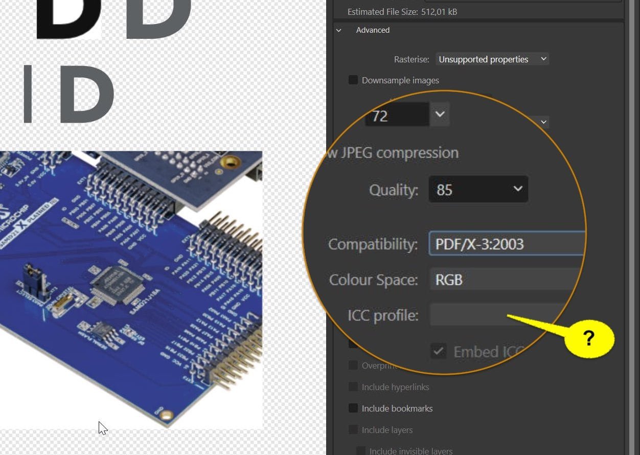
I don't think so, unless you accept the CMYK output in the exported PDF which you had set to RGB before export. Apparently the same oddity as shown above (for iPad) occurs and Affinity can't set and export a PDF/X in combination with an RGB profile. What menu entries (profiles) do you get when you try to set the colour profile in your settings? Can you choose sRGB? If you open your exported PDF/X-3 in Affinity and let it estimate the colour space, in what space gets the document created?
-
PDF Export struggeling with layer curves
thomaso replied to DarkClown's topic in Desktop Questions (macOS and Windows)
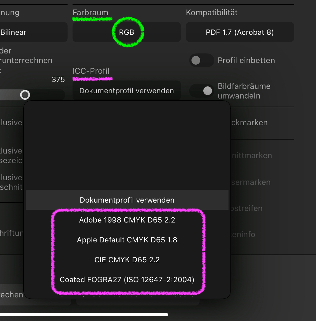
The colour shift seems to be caused by known Affinity issues with mixing colour spaces: CMYK document -> CMYK adjustment -> RGB output. If you switch the document from its current CMYK to RGB the issue gets displayed in the layout window already. If you then define the adjustment curve in its RGB space the issue doesn't occur. Note, in the attached example PDFs the adjustment curves were just roughly set and thus aren't corresponding. RGB-doc_RGB-adjustm-v1.7.pdf - CMYK-doc_RGB-adjustm_RGB-export.pdf If I export (v2, iPad) the original CMYK document to RGB (e.g. 'digital' preset) then the profile menu still offers CMYK profiles only instead of RGB profiles. A vaguely remember this was reported and logged as BUG years ago for the V1 desktop version.
-
PDF Export struggeling with layer curves
thomaso replied to DarkClown's topic in Desktop Questions (macOS and Windows)
You attached a PDF (v 1.7) with the image in the light blue version. I assume you meant to upload an Affinity document (with the image embedded), right? -
You could resize in two steps: Resize by 100 px with the anchor set to the right canvas edge + resize by 500 px with the anchor at the left edge.
-
Yes, I agree, of course workarounds can be annoying and not very welcome. I was rather confused be the OP's response… ...unless they specifically requested an answer without workarounds. In that case, the answer would have been "It's not possible in Affinity," and the thread would have ended. However, I can think of another workaround that accommodates the desire/requirement of printing two double-page spreads on one sheet and cutting them later. Its efficiency depends heavily on the layout and the variety of object types used. Increase the page height of the document by duplicating it and setting the anchor at the top. Duplicate all objects on all pages and, with the copies still selected,… …move them down by the original page height (half the new height). The result is a layout that includes a copy of each double-page spread, as shown in the screenshot of the OP's first post: This can be printed as a “normal” brochure without fiddling around with N-Up options, and with the sheets being halved as desired after printing.
-
Oufti reacted to a post in a topic:
Mini Booklet printing
-
PaulEC reacted to a post in a topic:
Mini Booklet printing
-
 R C-R reacted to a post in a topic:
Mini Booklet printing
R C-R reacted to a post in a topic:
Mini Booklet printing
-
I can't follow. To me printing single spreads on single sheets appears to be fully related to the topic. Though it suggests another than the requested workflow, it still achieves the desired result ... ... but with less complexity: The only difference seems to be the reversed order of printing & cutting and the resulting reduced requirement for certain printing options.
-
Hangman reacted to a post in a topic:
deactivate option in "Textstile"
-
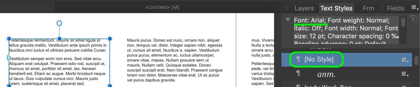
deactivate option in "Textstile"
thomaso replied to Anemar's topic in Desktop Questions (macOS and Windows)
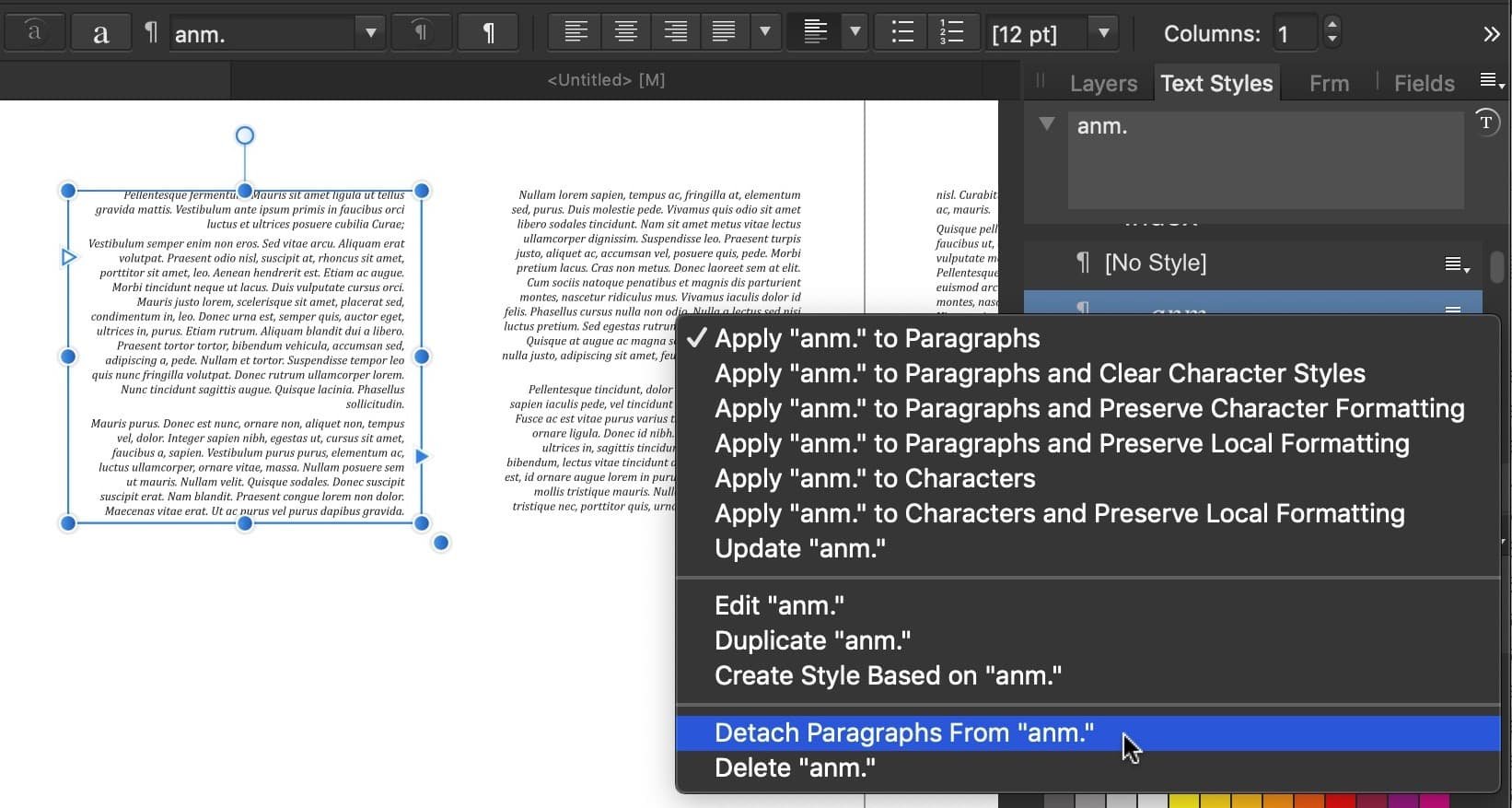
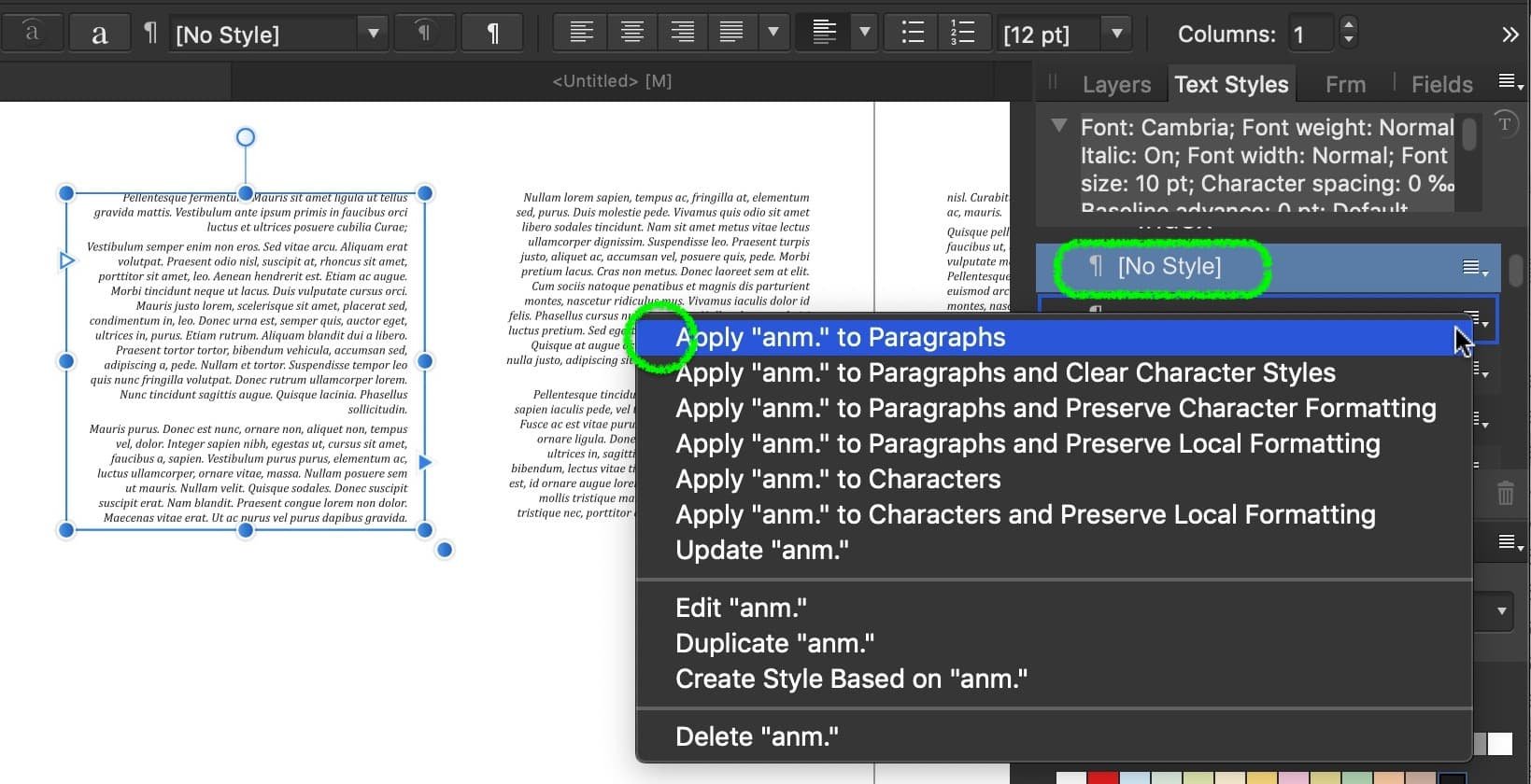
If you want to get the currently assigned text style replaced by the default text style attributes you can press "No Style" as @Hangman mentioned. Alternatively there is the menu option "Detach Paragraphs From <stylename>" (dt.: abtrennen) which will deactivate the first menu option but maintain the style attributes with none of your saved text styles assigned to the text with the consequence that also "No Style" is highlighted but not with the default attributes (see above: Arial normal vs. below: Cambria italic). Result:
-
PaulEC reacted to a post in a topic:
Mini Booklet printing
-
Westerwälder reacted to a post in a topic:
Mini Booklet printing
-
Hmm? Doesn't a single misprint on a sheet for 4 layout instances (= 4 final cards) actually cause 4 times as much ink + paper waste as a misprint with only 1 single layout on 1 printing sheet/card? Your thought may be correct as example for an offset printing machine and large sheets of 100 x 70 cm and with high print speed while every machine hour costs. But for a fully manually procedure I can't see an advantage to print multiple pages on larger sheets and cut them after printing.
-
Color Profile and Metadata
thomaso replied to boelens218's topic in Desktop Questions (macOS and Windows)
For file size reasons for instance. If an image is sRGB than a missing profile quite likely doesn't harm since it is the standard. Note, if you upload an image to this forum its software strips the profile, quite likely for disk space reasons. And if not sRGB standard: If users upload a screenshot this file usually had the user's monitor profile embedded which got stripped during the upload. If the metadata haven't been removed before upload, then other forum members still have the profile info available (e.g. in case of colour questions). -
PDF Export struggeling with layer curves
thomaso replied to DarkClown's topic in Desktop Questions (macOS and Windows)
Does it not work in every document and with every image/curves adjustment, or just in this in particular document? Have you tried to activate for PDF v1.x the export option "Allow advanced features"? The preview seems to show a masked adjustment (~ blue only). If yes, does it make a difference if you export without the mask? Is the document's colour space/profile sRGB (... as used for the v1.x export)? Can you show the Layers panel? In addition to the colour issue: In your screenshots the estimated file size for PDF/X is about six times larger than the v1.x version (512 vs. 77 kB). Is this difference still existing after export? FWIW, I can't reproduce the issue with Affinity V2, iPad. -
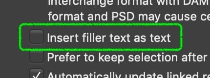
Linking Text Frames to Newly Added Pages
thomaso replied to snackdaddygaming's topic in Desktop Questions (macOS and Windows)
I used this workaround a few weeks ago. Of course, with this filler text option disabled to get a kind of unlimited amount of text (-> ... and pages): But right now I get only one spread added per Shift-click. – Any idea why?
-
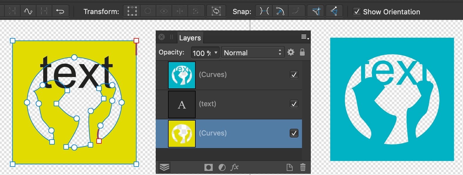
adding / merging layers fills entire artboard
thomaso replied to JeanetteF's topic in Desktop Questions (macOS and Windows)
@JeanetteF, Yes, that's the correct screenshot. I wonder if the curve/node chaos is causing your problem. For example, the right part shows 9 end nodes, but they only form one shape. With this poor vectorization, I'd rather redraw the four dancers manually. That seems faster than correcting the current state and searching for the culprit. -
adding / merging layers fills entire artboard
thomaso replied to JeanetteF's topic in Desktop Questions (macOS and Windows)
@JeanetteF, Can you upload a screenshot like below where the nodes of "left dancer" are visible?