thomaso
-
Posts
13,563 -
Joined
-
Last visited
Everything posted by thomaso
-
 This still doesn't clarify where your disk space went. If this … … is the/a reason I wonder how intense the temp / autosave folders are used on the relevant mac. If you open(d) the same documents the folder content may be quite the same.
 -
Problems printing processed photos
thomaso replied to Jhjennings's topic in Desktop Questions (macOS and Windows)
No doubt, just as an information can be both subjective and objective. But here it was simply about "more" and "less." Objective information is more informative than subjective information; in this sense, more informative content is less subjective. However, subjective info or news can be true or false, while objective content hardly ever can. Well, now you can debate “information” vs. “opinion,” not to mention “truth” and "reality". “My printer is the best ever developed!” “No, it’s never been a good printer!”- 67 replies
-
- 1
-

-
- affinity photo 2
- printing
- (and 2 more)
-
Problems printing processed photos
thomaso replied to Jhjennings's topic in Desktop Questions (macOS and Windows)
This (the successful print) appears to tell that a following print of faulty colours is not a matter of the monitor and/or its calibration. Just in case, it may be useful before cleaning printer heads (to reduce ink waste) and after the procedure (to see its success) to do a print of the printer's test pattern. This is informative regarding printer heads and is less ink demanding. A search on the Internet will lead you to numerous reviews / tests / opinions from various sources. Those may be more informative (less subjective) than the recommendations of individual forum members. https://duckduckgo.com/?q=best+printer+review+test- 67 replies
-
- 1
-

-
- affinity photo 2
- printing
- (and 2 more)
-
I don't know what "set under iCloud" means exactly – a cloud storage is always "an external disk", right? – but by the way, it is recommended to only work with Affinity documents if they are stored locally. (to avoid issues with interruptions in the communication between the app, its temp/autosave files and the opened or linked documents)
-
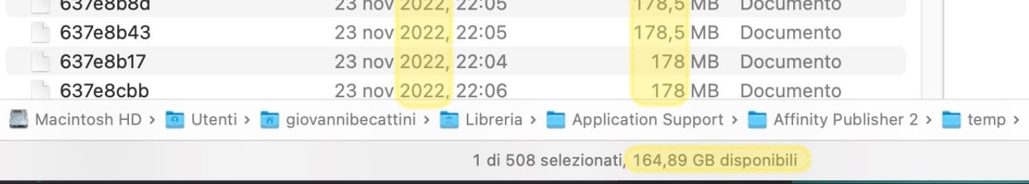
Do these info relate directly to this thread? Do you mean that the Affinity temp folder is filled again with a huge number of files and total file size? If yes, what numbers/sizes? Before you emptied the temp folder your screenshots reports 164,89 GB of free space. • What happened to this space since yesterday? • What was the total size of the temp folder before you emptied it = how much disc space did you gain? • If the temp folder size is large again, how is the related Affinity document setup, what number of pages, what types of layers, text/image, vector/pixel? • What is the file size of the related Affinity document on disk? It appears that – at least until yesterday – APub's temp folder contained… • a large number of files (508), • various old files (22 nov 2022) and • many files of similar size (~20x 178-190 MB) Did you ever save the document via "Save as…"with a different file name? This helps to get rid of unnecessary data. Unfortunately Affinity doesn't reliably remove unnecessary data of the layout sessions. Or does this document the option "File" -> "Save History With Document" enabled? If yes, disable it before using "Save As…". If you haven't used "Save As…" for this document for a while, do a "Save As…" with new name, … -> then close the document + the app, -> open the app again without opening a document and -> close the app again, -> then open the related (saved-as) document and -> check the temp folder sizes + free disk space. Note, macOS doesn't report all free disk space immediately. It may take some hours, a reboot may push it (without the option to open apps automatically).

-
Affinity uses temporary files for open documents, such as page/image previews. If all documents are closed, Affinity may retain them in case you reopen the same document, especially if you have enabled the option to automatically reopen recently used documents. If all documents are closed and Affinity quit, you can easily empty this "temp" folder. The files will be recreated as needed. For closed documents and apps, you can also delete all files in the "autosave" folder, especially older .autosave files that Affinity hasn't automatically removed for some reason. As with "temp," Affinity can retain "autosave" files for possible future use. When you open Affinity without opening a document (manually or automatically), Affinity should empty the "autosave" folder. Sometimes files get stuck in this folder, probably after app crashes.
-
How to do an Embroidery Photo Effect?
thomaso replied to albertkinng's topic in Desktop Questions (macOS and Windows)
You said the same about the video above, posted by @PaulEC. Here is just one of various replies in the existing threads with a link that leads to this video, too: The problem with your specific limitation while searching, mentioned before by @GarryP. -
How to do an Embroidery Photo Effect?
thomaso replied to albertkinng's topic in Desktop Questions (macOS and Windows)
@albertkinng, if the search had been performed before posting this thread, the problem would not have occurred in the first place. 😉 -
How to do an Embroidery Photo Effect?
thomaso replied to albertkinng's topic in Desktop Questions (macOS and Windows)
Are you serious? – Just use your logo (without background) instead of the text layers in the video. Select the shapes/curve layers by colour, one at a time, then apply -> Geometry -> "Add" to create curves (!) layers, one for each colour. Select the 6 resulting curves layers -> Duplicate them + apply again Geometry -> "Add". The result contains all shapes of your logo and can be used to paste the texture image as child layer while the other 6 will be used to colourize as wanted. If you want different stitch directions for the elements in each color, use the texture image six times as a sublayer. This allows you to edit the image individually for each color, such as rotating it. In this case the steps 3 + 4 aren't necessary. -
Problems printing processed photos
thomaso replied to Jhjennings's topic in Desktop Questions (macOS and Windows)
I wouldn't expect a soft proof profile for every paper, in particular for home/office printer hardware. Considering that a soft proof profile is intended to provide a rough preview of the printed colours, a paper that doesn't have any remarkable colour deviation doesn't necessarily need a soft proof and profile. I think that neutral white glossy paper, which was created in particular for one or more specific printer models of a manufacturer, does not noticeably affect the colours. However, a soft proof can hardly or never preview the difference between subtractive and additive colour generation, since a monitor produces light, but a print only reflects light. (therefore, to reduce this difference, it is useful to limit the brightness of a monitor (~80-100cd, max.120) and, in addition, judge a print in a bright, neutral, daylight-like situation.) -
Problems printing processed photos
thomaso replied to Jhjennings's topic in Desktop Questions (macOS and Windows)
You are not soft proofing with the printer profile – just as you would not soft proof with my monitor profile to see how I would see an image you send me. Simply* put, a printer profile corrects relative colour casts caused by the hardware (printer + inks), while a paper profile simulates the software's treatment of absolute paper properties or limitations, such as a yellowish paper colour (<- no neutral white result) or a greyish black (<- reduced contrast) due to the particular ink absorption of a particular paper. For instance, a 'fine art paper' (e.g. cotton) has a different ink absorption than a glossy photo paper (‘plastic’). Also, as @Oufti mentioned, when a printer manufacturer publishes a paper profile for their specific device(s) this paper profile includes corrections required for this specific hardware. (because a paper profile is created from a print result on this hardware and thus the printed result includes/shows the printer's colour handling or issues) *we may use a printer profile for instance for RISOGRAPH, a print process that prints with custom inks ('spot colours') and ink combinations, similar to screenprinting and in contrast to CMYK which has the goal to result in a 'natural' range of 'all' colours. Compare: https://risolvestudio.com/collections/riso-color-profiles https://risottostudio.com/pages/what-is-risograph-printing- 67 replies
-
- 2
-
-
- affinity photo 2
- printing
- (and 2 more)
-
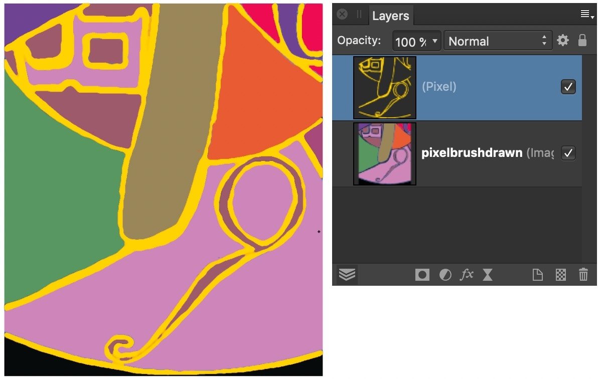
Neaten up hand-drawn lines
thomaso replied to Ros17's topic in Desktop Questions (macOS and Windows)
Just lock the reference layer? -
Neaten up hand-drawn lines
thomaso replied to Ros17's topic in Desktop Questions (macOS and Windows)
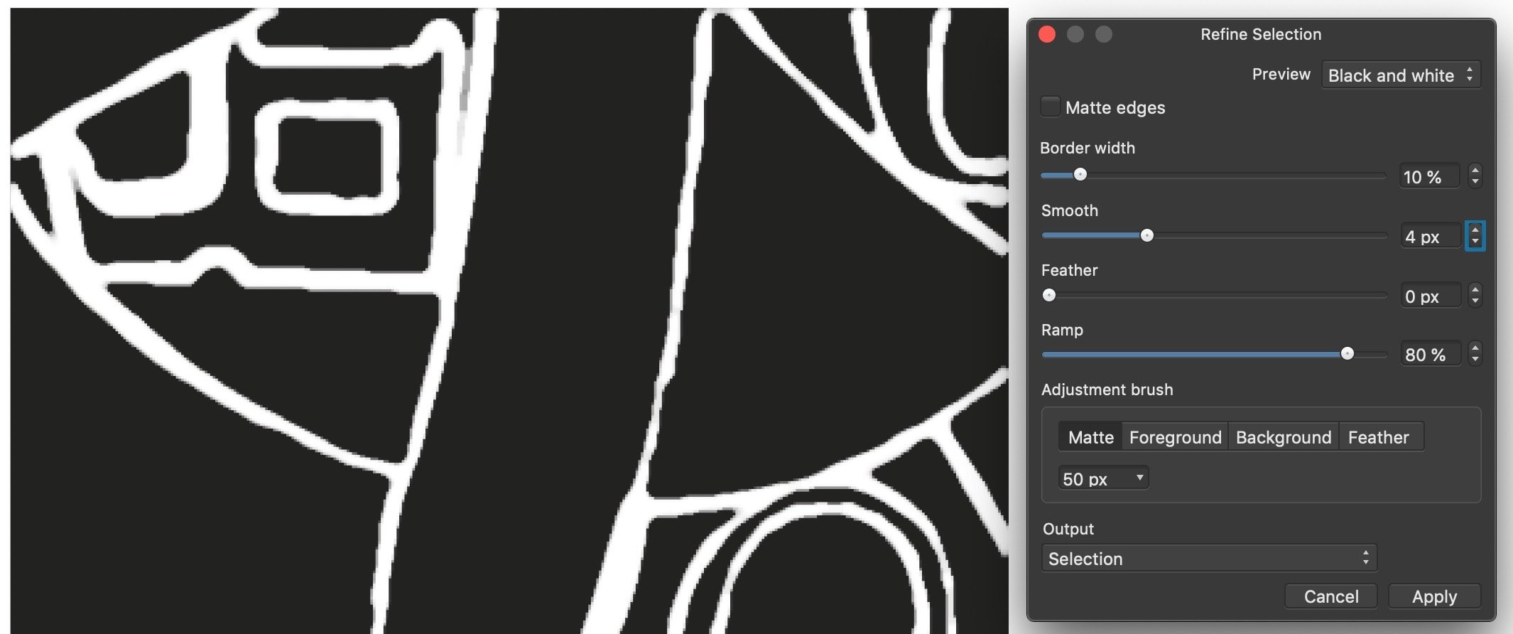
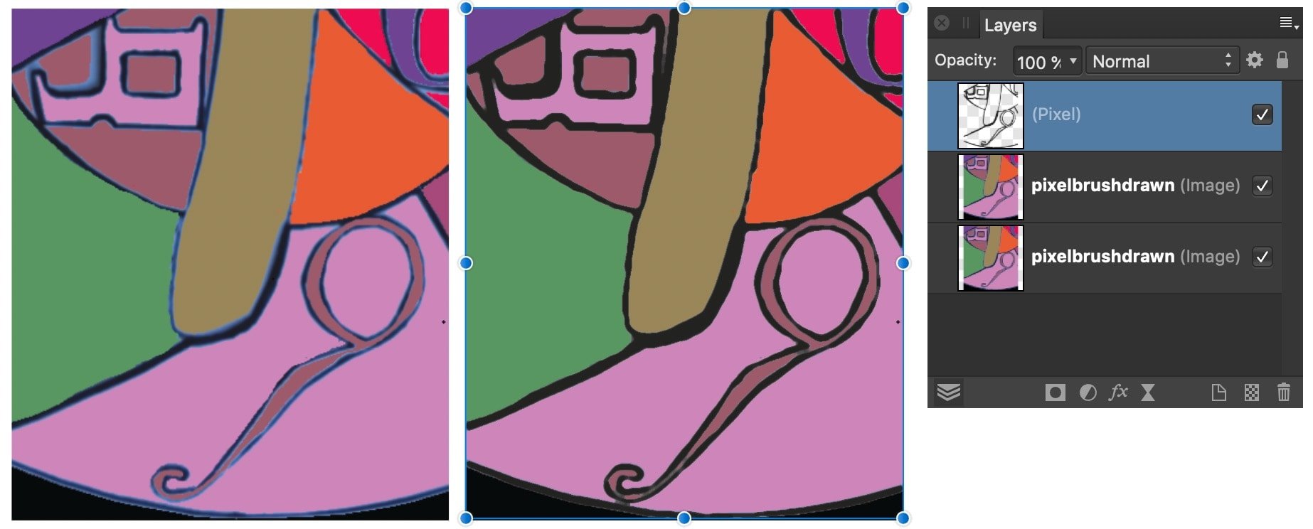
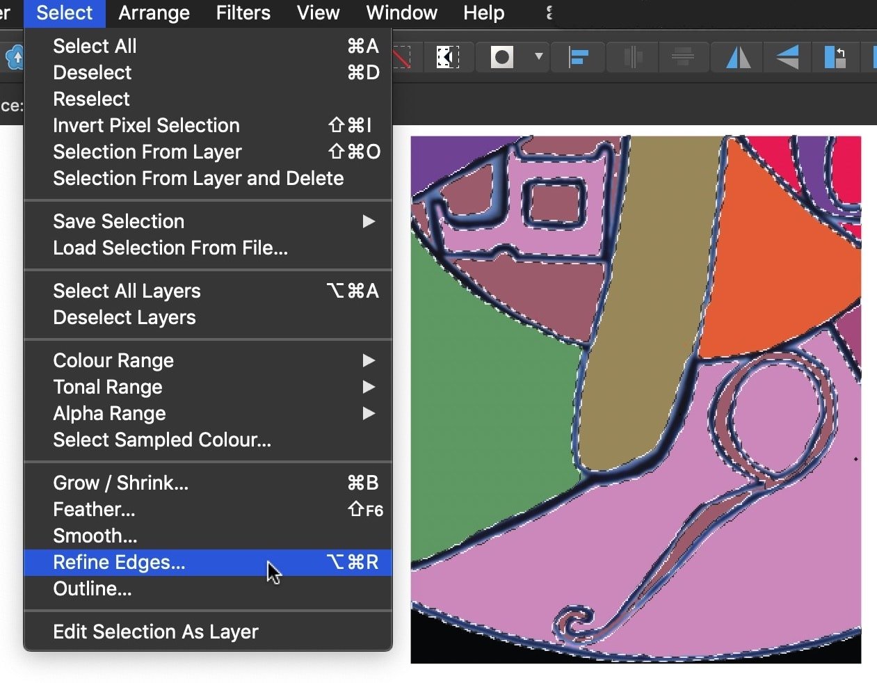
It's unclear how you understand "untidy" and "professional". Personally I am most confused by the two colours in the contour with a black line surrounded by a blue edge which additionally seems to fade here or there. So, in my understanding, a pure black (or another colour) stroke without a feathered edge would clarify the appearance, while I do like the flexible width of the stroke (because it represents analog, natural, manual work). You could achieve this with a pixel selection of the current stroke, including both its colours (p.s.: it may be easier to select all first and subtract the coloured areas between the contour), then refine the selection with the goal to smooth it, then fill the refined selection with one colour only. Once you created the selection and separate layer you have various options to apply another colour if wanted.
-
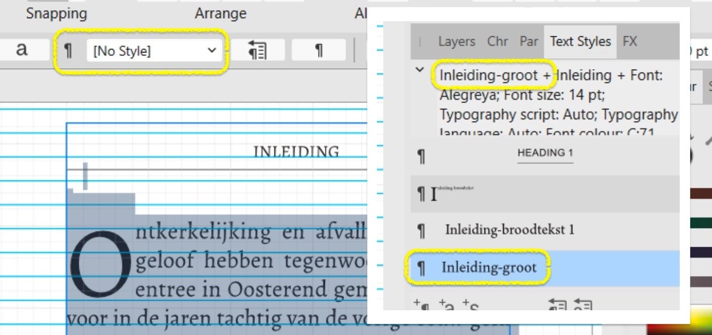
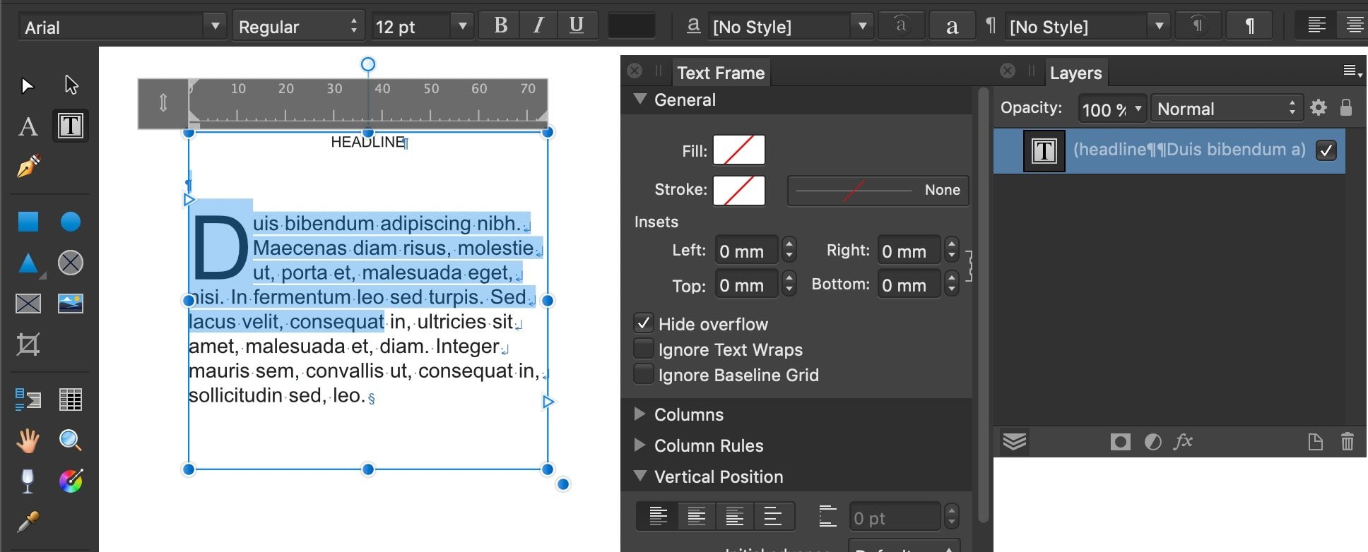
Also note that the Text Styles panel currently shows "Inleiding-groot" as assigned, while the context toolbar reports "No Style," which may refer to a different object or selection.
-
It appears in your screenshot the focus is currently neither on the selected text (it's highlight colour is grayish blue, not bright blue) nor on the text frame (it's bounding box does not show its handles). Do you have any other panel or dialog or window activated, maybe in the left, cropped area of your screenshot or on a second monitor? What if you open the Layers panel, deselect all objects and select this text frame only to get an interface appearance for the text frame like this: EDIT: It might also shed a bit more light on this of you activate additional interface indicators, e.g. "Show Special Characters" or "Show Text Ruler".
-
This PDF works in iOS.
-
Letter spacing in the Publisher
thomaso replied to Gnobelix's topic in Desktop Questions (macOS and Windows)
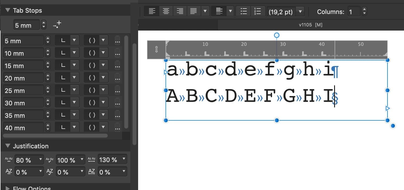
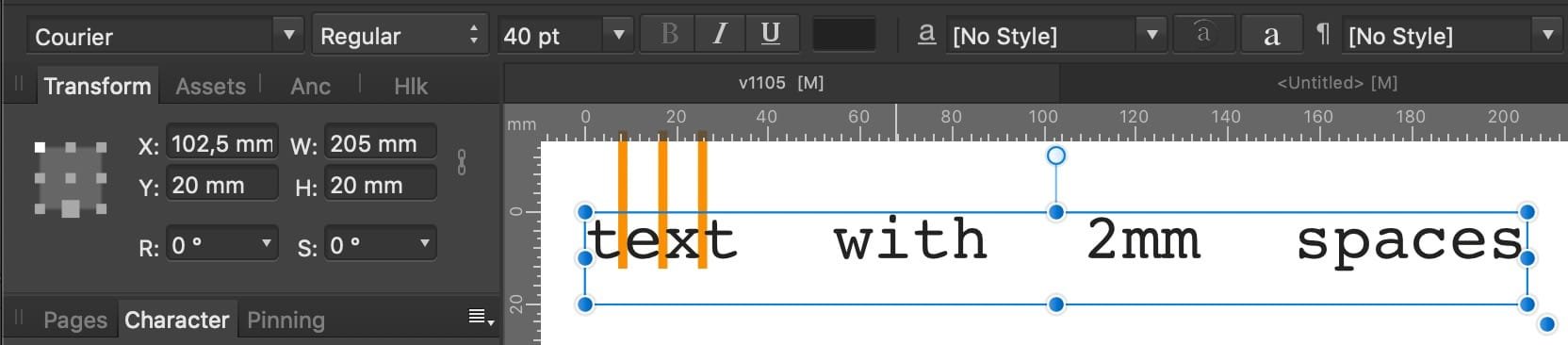
@lacerto's ruler idea leads me to another workflow, with monospace fonts, for multiple lines of text and without a need for "Justified All": Multiple tabs in the distance of the character width + space width, for instance: char 3 mm + space 2 mm = tab 5 mm. The tabs may easily inserted into the text via Find & Replace.
-
Newbie: Cannot seem to fill a basic shape.
thomaso replied to Scozone's topic in Desktop Questions (macOS and Windows)
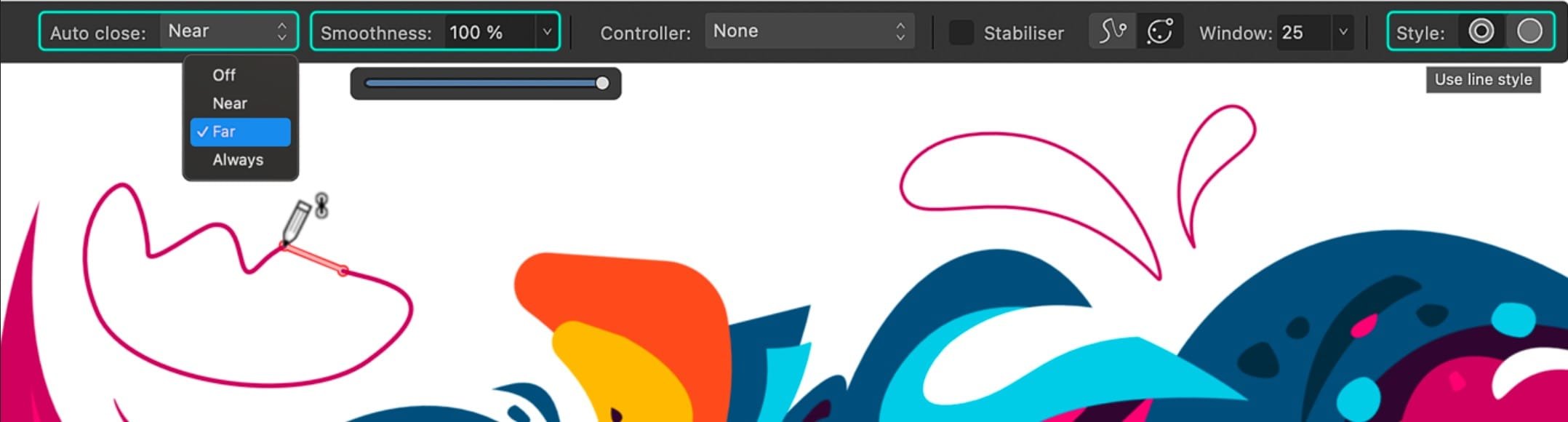
Just in case: Although Pen | Pencil Tool work differently and Pen doesn't enable straight lines (actually odd. why not with Shift as usual?), this might be a compromise/workaround: AD v2.6 offers • an "Auto-close: Always" feature for the Pencil Tool • plus a "Smoothness" slider,% option (before or directly after drawing) https://affinity.serif.com/whats-new/#2-6-pencil-pen-node-tool
-
You may get an email if you keep following this thread and with the according notification settings. For many (all?) fixed bugs the @Affinity Info Bot will post a reply in (all?) related (logged, tagged) threads. For instance: https://forum.affinity.serif.com/index.php?/topic/228865-frame-bigger-than-object/#findComment-1350437 I haven't tried but possibly you can follow the forum member "Affinity Info Bot" to get informed about all of its posts.
-
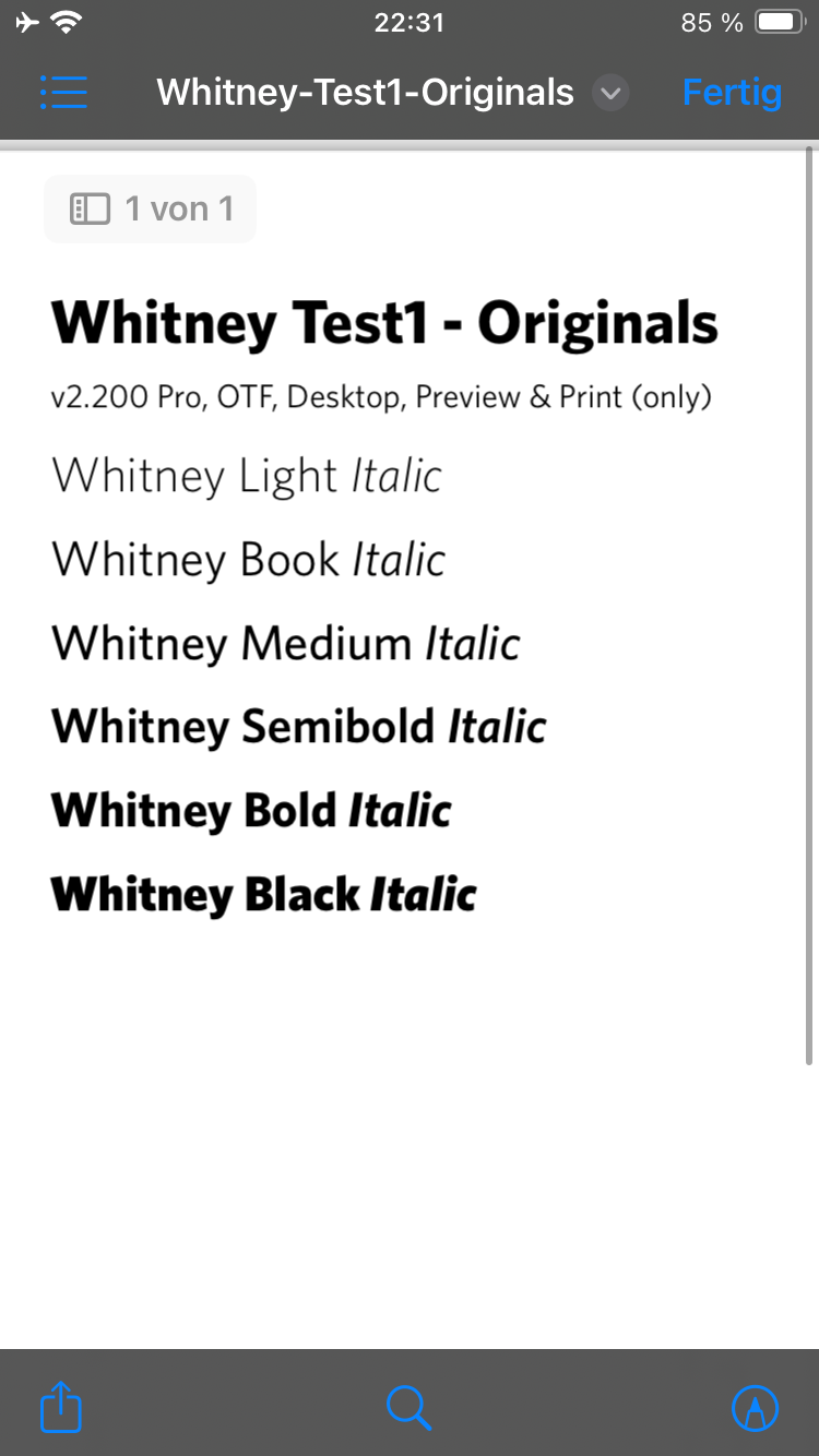
There seem to exist several fonts with the name "Whitney Book", both free and commercial. Can you tell us which source (manufacturer, font version) you are using? Are the fonts indeed embedded after export? If you open the exported PDF in Affinity, does the text appear as expected, is it displayed with the right font and, if you select some text with an Affinity Text Tool, does the Affinity font menu show its name without a ? or ! at the font name? If you disable the font on your computer so it doesn't appear in your font menus (e.g. in Affinity), does the PDF still show the font as expected? What result do you get in the PDF if you select an affected text frame and convert it into curves in Affinity before PDF export? Which one is used on your iPhone? Can you try another app on the iPhone to display the PDF? Can you upload a sample PDF to the forum with this font as text (i.e. not curved)?
-
Affinity Photo - Centering inside selection
thomaso replied to RedShirt's topic in Desktop Questions (macOS and Windows)
If you simply use another tool its not awful anymore: Just draw the outer reference area with the rectangle tool instead of the marquee tool. -
Letter spacing in the Publisher
thomaso replied to Gnobelix's topic in Desktop Questions (macOS and Windows)
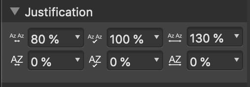
I hope you are talking about single lines, not multi-line paragraphs. In this case there is a workaround: Use a Artistic Text Frame and set its alignment to "Justified all". Count the number of characters and spaces and measure one character width to get the the complete text width = required width of the frame. As usual with characters there may occur a visual difference between straight vs. round/open shapes like between 'mk' vs. 'ca'. Also the word spacing may matter for you and possibly require adjustments in the default "Justification" settings.
-
Reopening an exported PDF in Affinity to change its colour space and profile doesn't appear to be a good idea if you want to avoid colour shift. Why not changing the document's profile before export? I think the easiest for you would be to check and possibly adjust the colour spaces and the colour profiles of all files/documents that are involved (pasted, placed, linked etc) in this layout so that all profiles in all involved documents match the one which is required by Amazon. In particular I mean the full page background (It's still unclear what layer type this is. It could be vector created in AD or a placed pixel image resource for instance. I don't see a "huge difference" in your video. It rather seems that only the red/orange is getting brighter a little bit (!) while the dark background (black) doesn't change from the beginning to the end of the clip. If you do see a huge difference in the video, can you tell us the timecode (min.) in the clip where it happens, and possible take two screenshots of before/after the huge change? Just curious: When you click on the "Document Setup…" (at 0:06 min.) button, no dialog window appears to open. Do you use more than the screen shown in this video?
-
The colour change maybe the consequence of your change of colour space and/or colour profile. You might need to adjust the colours before export. Therefore it appears to matter how the layout is setup for the visual background (not the layer named 'background'). What layer type is the object showing title image (black+red background)? What if you adjust the colour space + profile of this source to make it match with your layout document? Can you explain "foggy" to me in more precise, technical terms (my native language isn't English, and online translations don't seem less ambiguous). For instance, does it look blurry/unsharp or rather brighter, less saturated? And do you see this unexpected look only in the PDF after export or also in the Affinity layout document?
-
Why not? What profile does Amazon want and what profile do you think you are forced (by whom?) to use instead? What "affect" do you mean in particular? Any blend mode except "Normal" is supposed to affect the layer to which it's applied. Your screenshot doesn't show whether the dark area around the white drawing is part of the illustration layer or of the background.