DanH
-
Posts
56 -
Joined
-
Last visited
-
 Rivvie reacted to a post in a topic:
Automatically match fill and stroke color when needed
Rivvie reacted to a post in a topic:
Automatically match fill and stroke color when needed
-
Thank you, Walt! That did it. Side note: If “known issues” have notes that Staff refers to when answering questions, this would be a great addtion to those notes.
-
DanH reacted to a post in a topic:
Color picker picks wrong colors V2.1 1799
-
K Only can not differ between copies of an image
DanH replied to DanH's topic in V2 Bugs found on iPad
Thanks! The problem with placing again is it increases file size. Whereas duplicating a placed image, even multiple times, does not increase file size. -
Photo 2, iPad — Have not tested on other apps. Replication: 1. Place image, duplicate it. 2. Set the topmost copy to “K Only” 3. Exit to “Home screen” 4. Re-open the file, and see that the topmost copy of the image has reset to “K Only” being off. What appears to be happening is the lowest of the two image copies determines what the “K Only” will reset to. So an alternate replication process would be: 1. Place and duplicate an image 2. Set the lowest copy to have “K Only” on, and leave the top copy with “K Only” set off. 3. Exit to home screen 4. Re-open file, and now the top image has “K Only” set to on.
-
Just learned: the Quick Menu, which is in your second image, does nearly what you ask. But maybe you’re asking for more than the nine user selectable commands, and an expansion to the list of command options which currently is limited? On first impression, I think the grid design of the Quick Menu might make it hard to quickly find what I want except for any commands that I use a lot. Ideas to consider that may improve the Quick Menu: Color coded buttons, color being selectable by the user Option to add more columns and rows of buttons. One benefit would be more chances for empty spaces to better “design” the button spacing to allow a faster read and/or to arrange into categories. Command options expanded to all possible commands. Option for smaller buttons as currently found in the Edit menu. Option to layout the Quick Menu in the same layout style as currently found in the Document, Edit, and Selection menus (at the top left of the UI). So, option to be a list, or arrangeable into categories (i.e. Clipboard, Operations, etc.) with “buttons” in a column underneath each category just like Edit menu. Not sure if this next one, in practice, would actually be better, but worth an explore: Option to have the quick menu be identical to the Document, Edit, and Selection menus (in the upper left of the UI)—identical in layout and options, so, exactly identical. Basically just providing a slightly faster way to access these menus while also having them appear in the middle of the screen where it is a bit quicker to reach. Option to have one two, or all three of these menus to appear simultaneously. Afterthought: I wonder how much physiological benefit, if any, there is to “reaching” around the screen to access menus and tools, as compared to limiting “reaching” by having menus pop up at center screen which, perhaps, might be a bit ergonomically detrimental by keeping range of motion narrower. Sometimes a little change in how we move makes big a impact with actions done over and over.
-
True, and so what I mean to suggest is, when selecting a vector layer, make the color panel “smart enough” to know that I want to change the vector color, even if the brush is selected. Maybe make the brush’s connection to the color panel be “dormant” when a vector is selected, if that’s necessary. However, currently, when a vector’s color is changed, then when the paint brush is selected again the paint color has now changed to what the vector color was changed to. So, the color panel may as well let me change the vector color while the paint brush is selected because it changes the color of both anyway. (Sometimes I prefer to have the paint color switch along with the vector color. Other times I would not.) Maybe there is a better design, in line with your overhaul suggestions, but as it is currently designed, a small tweak is all I am requesting. Anything that will make it better and smoother. They need to ask us what we want before they do it. We have good ideas.
-
Photo 2, Designer 2, iPad or Mac. If using the Paint Brush on a pixel layer, then in the Layers panel a vector layer is selected in order to change its color, a different tool must be selected before the vector’s color can be changed. Some tools, when selected, allow the vector color to be changed, and some don’t. Clearly this is intended behavior, but I can’t reason out why. The app “knows” the vector can’t be painted on, so this may be why it stops the slider from changing—because there is a conflict of “which thing do you want to change color, the brush or the vector?”—but it could just as easily “realize” that I changed to a vector layer, so I must want to change its color, not the brush color. Then there’s the fact that having the Eraser or Clone Brush selected, which do not have a color panel connection, also prevents the vector color from changing. So, my workflow often looks like this: Change tool, select vector, change vector color, select pixel layer, select Paint Brush, paint It could look like this: Select vector, change vector color, select pixel layer, paint Is there sense to how it currently works that I don’t see?
-
Love it. Edit: wait, we have an almost exactly as requested function in the Quick Menu, which is shown but not mentioned in the second image above. Would also like something to help with this, but I’d probably prefer just swiping, with no tap. This would replace the current function where “scrolling” of the color swatch/circle causes the color to turn lighter or darker. Does anyone use it that way? For me, it’s so slow as to be not useful, and swipe to switch between color 1 and color 2 would be much more useful. Also, I’d like the X keyboard shortcut added for switching between color 1 and color 2. (Unification of all desktop and iPad keyboard shortcuts would make sense, too, for users who switch between both devices).
-
If you’re on desktop, press X on the keyboard. Is that what you’re asking? On iPad? Yes, please add a shortcut for iPad to switch between foreground/background color (color 1 and color 2).
-
I’ve searched help and online, with various search terms, and can not find any information on applying a fill color to a placed image in this manner, so your confirmation of it being a documented feature is assuring. Where can we find information about it? Seems strange to me, though, since that is not how it works when using the CMYK sliders when using the paint brush.
-
Gripsholm Lion reacted to a post in a topic:
Thanks to Serif for v 2.1
-
Oh thank you. Will test these different approaches further and see which I like to use. Following is a another approach that is promising, but concerned that it doesn’t seem to be a documented feature, so wonder if it will disappear and thus ruin what I have created with it: After placing an image, with it selected, the color panel sliders, as well as swatch selections, will recolor the selected image. I love this. So much. Any knowledge of documentation about this functionality? Also, does it make sense that when doing this, if all CMYK sliders are at O%, then moving Cyan (or Y or M) to 1% makes it just as saturated as if it were at 100%? (Works this way if the document is CMYK, but not when the document is RGB.)
-
Thanks to Serif for v 2.1
DanH replied to Gregory-CJ's topic in Feedback for the Affinity V2 Suite of Products
Regarding Brushes Panel: Love it, but do wish greatly that when relaunching Affinity that the selected brush was shown. After relaunching Affinity you have to reselect a brush before it then visually keeps track of it for you. Regarding unnacceptable comments: Not defending the comment that was removed, but I see the instigating comment just as out of line. -
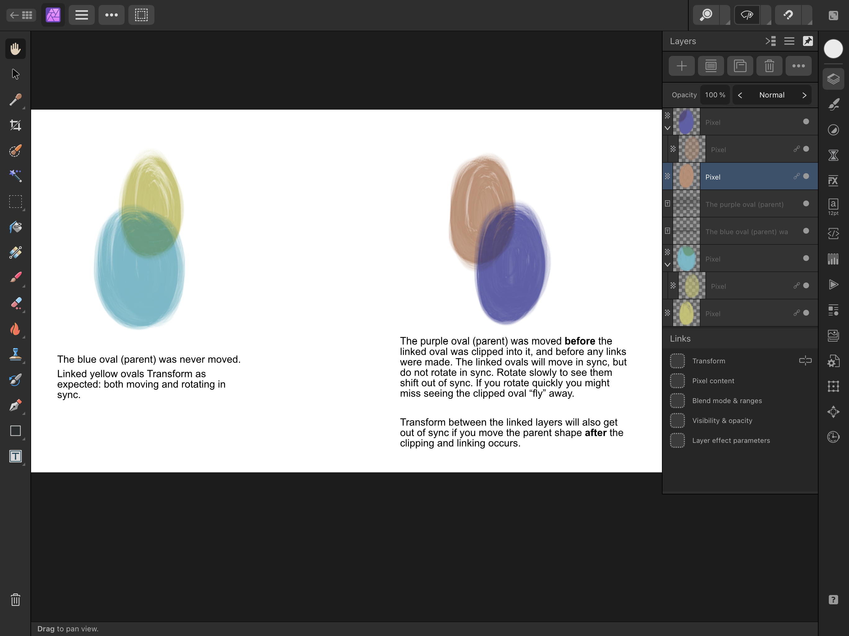
How’s that for a catchy title? Photo 2 — 2.1.0 , happens on iPad or Mac Transforming of linked layers is out of sync if one of the linked layers is clipped inside a layer that has moved. Attached is an .afphoto file. In case it helps, the process: 1. Paint a shape. Select and move it somewhere else onscreen. 2. On a separate layer, paint another shape. Place it behind the shape in step one, and so they partly overlap. Duplicate this second shape. 3. Clip one of the duplicates into the shape from step one. Set its blend mode to multiply, to visually distinguish it from the unclipped copy. 4. Link the shapes from step two, but only link the Transform. 5. Select and move either linked layer. They move in sync. Now rotate, and see they rotate out of sync. Linked layers out of sync if Parent of Child has ever moved.afphoto

-
Double tapping the opacity “window” at the top of the layers panel, to reset opacity to 100%, causes the selection bounding box to disappear temporarily. Selecting and moving is possible, only no bounding box, until you pinch and zoom, then the bounding box appears again. Using: Photo 2.1.0 iOS 15.4
-
On iPad, if layers are deleted and then the file is Saved, there is no reduction in file size to reflect the deleted layers. If instead we use “Save As” it does reduce in file size. One example: a 90 MB file, that with “Save As” reduces to about 11 MB, but with “Save”, it remains at 90 MB. In contrast: On Mac, if the layer deletions are done on the same file as in the above example, I find I can just Save the file—not Save As a new file—and the file size shrinks to reflect the deleted layers. Suggestion: match the iPad to the Mac in this regard
-
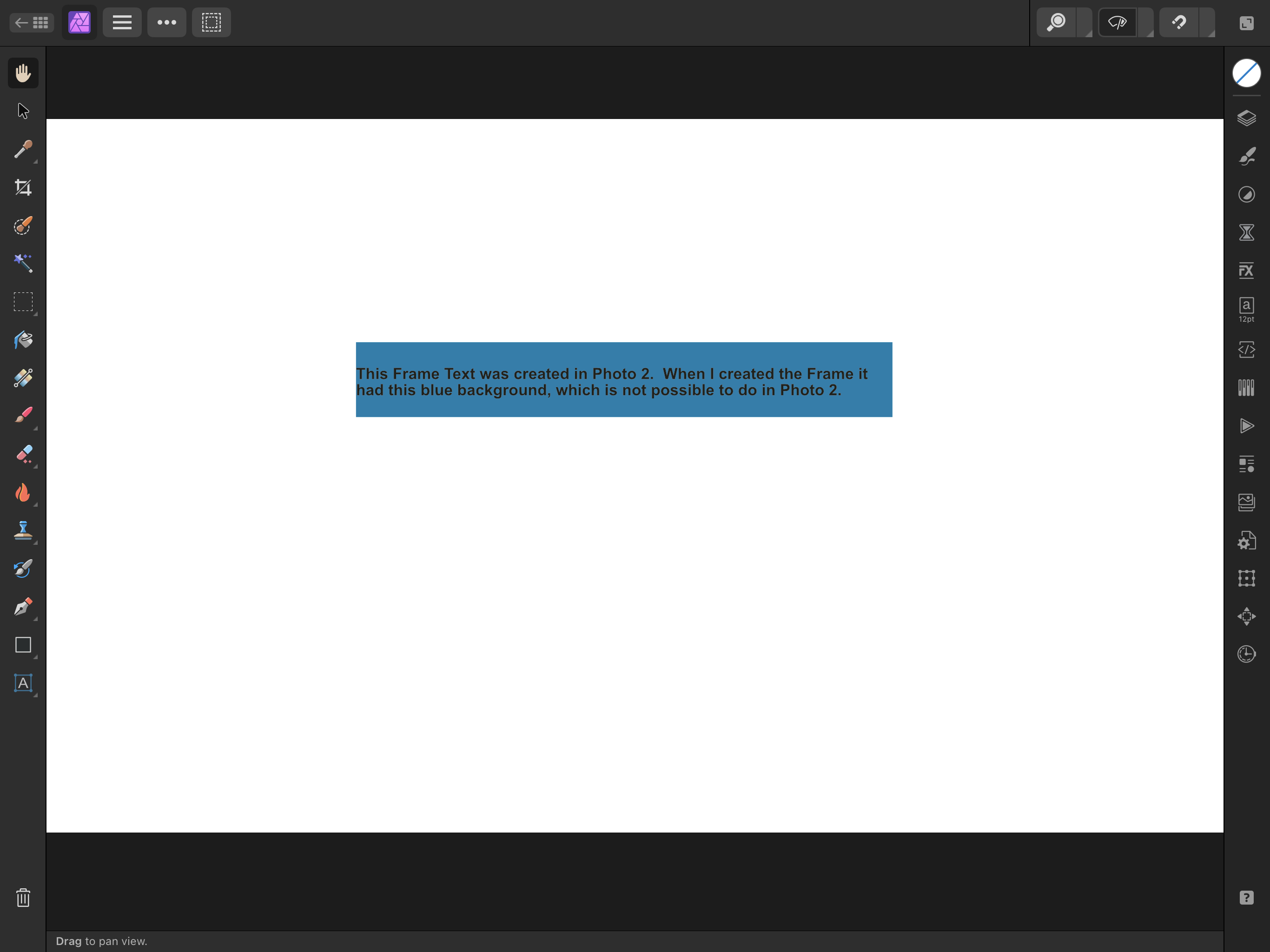
Three times now a Text Frame created in Photo 2 has had a background color. Two examples shown, along with the original files they appear in. I don’t know how to reproduce it. Using: iOS 15.4, Photo 2 version 2.1.0 This recently happened another time, but the background was green. I used Publisher to clear it, since that is where there are UI controls for altering the background color. … Now may be a good time to request further unification of the UI between apps: Background color in the Text Panel in all the apps. I’ll stop there, to keep on topic. You may argue Frame Text background color is a feature set difference between apps. Maybe (maybe) the background color of Frame Text is a legitimate separate Publisher-only feature—but not when a bug makes it appear in Photo and I have to use Publisher to clear it. Frame Text — Blue.afphoto Frame Text — Gray.afphoto