nick l
-
Posts
6 -
Joined
-
Last visited
-
Thanks very much for responding. I understand that this may not be a priority. It sounds like people have had a variety of problems with printing. I would love to have a clearer picture of the process involved in going from my RGB document to the inks of my CMYK printer. But there are so many issues.... My hope with this report is that it at least gives an illustration of what appears to be a concrete problem (or two....) Meanwhile, until further notice, I'm just setting color handling to "performed by app".
-
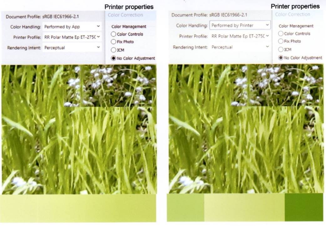
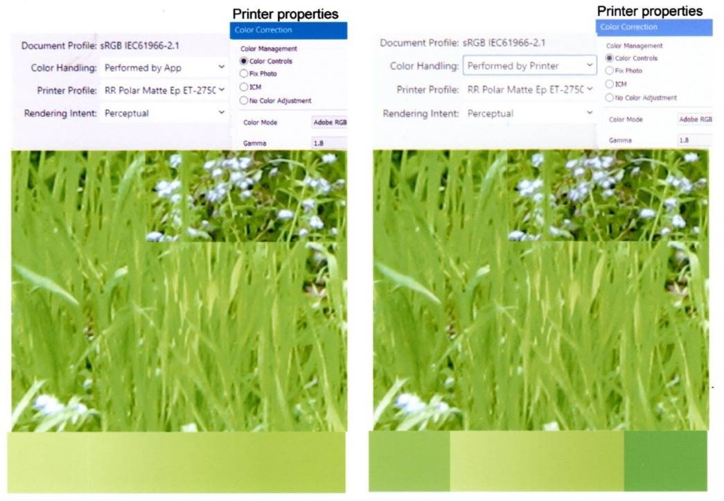
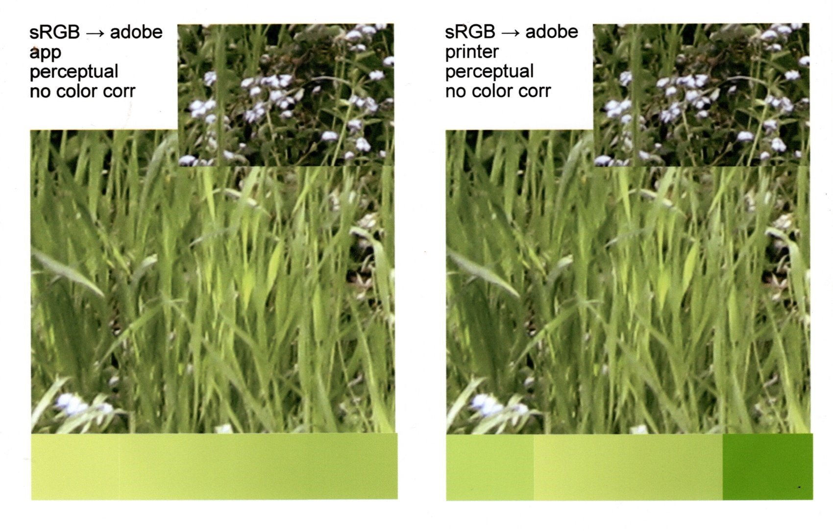
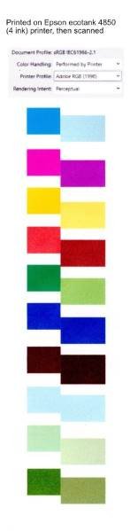
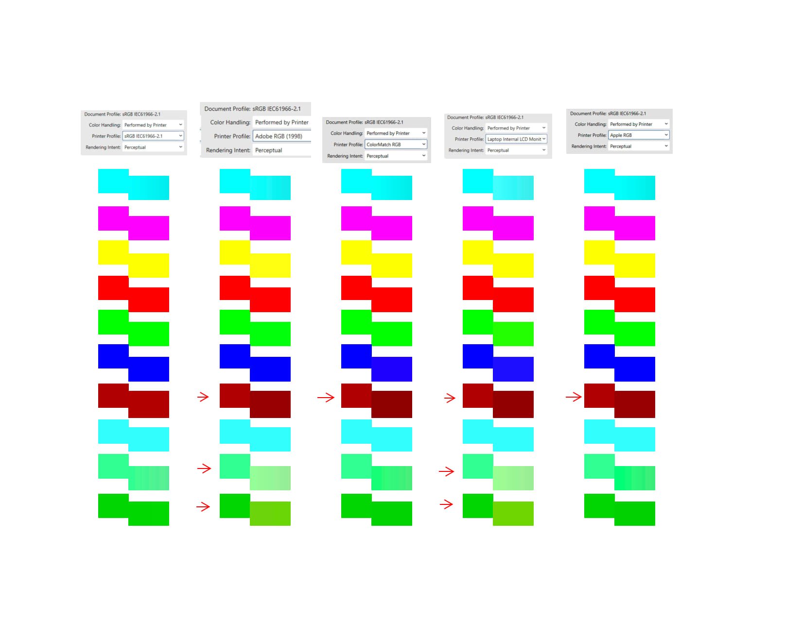
What *is* the difference between color handling "performed by app" and "performed by printer"? I just got some Red River Polar Matte paper, and have made some test printouts on that paper, using their color profile for that paper and my printer. I've tried the 4 combinations: color handling performed by app, and the printer properties color correction set to no color adjustment color handling performed by printer, and the printer properties color correction set to no color adjustment color handling performed by app, and the printer properties color correction set to color mode: adobe RGB gamma 1.8 color handling performed by printer, and the printer properties color correction set to color mode: adobe RGB gamma 1.8 I'm uploading scans of the printouts made by my Epson EcoTank printer. The color correction settings in the printer properties dialog have a big effect, and the choice of app or printer makes a clear difference to the rectangles. The effect on the images seems very subtle. The text at the top is copied and pasted from screen captures, and might look slightly different between the app and printer settings. I'm not able to discern any clear difference between app and printer settings in the printouts of the jpeg photo images.

-
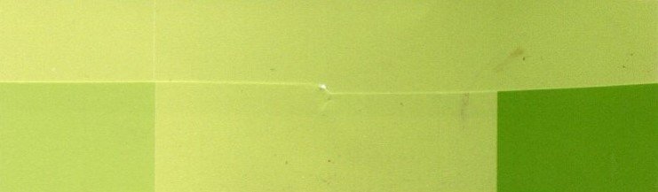
A bit more context: I've been trying to make a mental model of what's going on in mapping colors from their representation in the affinity files to the amount of the different inks used for each pixel by the printer. I've been having trouble finding relevant info at the level of detail I'm hoping for. I've tried various experiments. I've been conjecturing that the mapping is strictly pixel based, that is, that the mapping for a given pixel depends only on that pixel's color and not on the colors of neighboring pixels (or any other pixels). I would expect that in the two cases that differ surprisingly in the above report, the pixel values for the gradient-filled rectangles and the non-gradient filled rectangles would be identical (they are specified to be identical and appear identical when displayed in affinity publisher). Thus I would expect that there would be no possibility that they could print differently. This is clearly wrong. What is really going on? In trying various combinations of parameters to see what effects they might have, I've tried the "color handling performed by printer" and "color handling performed by app" settings in combination with setting the EcoTank printer's color correction setting to either "no color adjustment' or "color controls" with color mode set to Adobe RGB gamma 1.8 (with no further tweaks). For a given EcoTank color correction setting, in the limited tests I've done, it makes at most the slightest difference whether the color handling setting is set to "performed by app" or "performed by printer" - except for the case described above involving rectangle fills. The uploaded pictures with this post include a band with a gradient. There are 3 rectangles: a plain one on the left, another plain one on the right, and a gradient filled one in the middle going from the left color to the right color. When changing from app to printer color handling, the changes occur in the plain rectangles on the left and right, not the gradient filled rectangle in the middle (see the picture where I cut and pasted the two together). (Both the uploaded images in this post are scanned from EcoTank prints.)
-
Added note: This reports on a discrepancy between the printing of rectangles filled with gradient vs plain fill when color handling is set to "performed by printer" At the end of my second post below, I point out that the problem might lie with the color of the plain filled rectangles rather than with the color of the rectangles filled with a gradient. The remainder of this post is the original post. In trying to figure out how to get my printer to print the colors I want, I tried all sorts of arbitrary combinations of settings in the Affinity Publisher 2 print dialog (to get a sense of what effect they have). I stumbled across an odd behavior. After various experiments, I created the following test case: Create a rectangle pair by putting 2 rectangles next to each other, setting the fill of one of them to some rgb parameters. The fill of the other is then set to a linear gradient, both ends of which are exactly the same rgb values, so that both rectangles appear to have exactly the same fill. Then print them with color handing set to "Performed by Printer" but with the printer color profile set to something different from the document profile. I got strange results printing to an Epson EcoTank 4-ink printer (with its properties set to "no color adjustment") and also strange results printing to PDF with "Microsoft Print to PDF". In some cases the colors of the rectangles that are specified with gradient fills differ in the printout or PDF from the colors of the rectangles that look exactly the same, but whose fill is specified without a gradient. To me, this suggests a problem in Affinity's color handling that might also be causing other problems. I am including: a sample afpub file a jpg created by scanning a printout created by my Epson Ecotank ET-4850 printer (labeled with a caption) a sample pdf printout from the sample afpub file (modified only to add a caption)' a jpg file exported from a combination of pdf files created with several printer profiles gradient test d.afpub gradient test d adobe.pdf
-
Thank you for pointing out an issue I hadn't thought of. I rarely do this kind of work with colors. I'm not a professional in any related field. When I *am* paying attention to colors, I'm most often caring about the color of printouts that I make myself in very low volume settings, rather than with colors as they appear on the screen. I'm willing to look at how the print came out. (I have various struggles with color related to the printouts, and am being overwhelmed with trying to deal with ICC profiles - but that's another topic...)
-
 bures reacted to a post in a topic:
title bar color
bures reacted to a post in a topic:
title bar color
-
nick l joined the community
-
This seems like such an obvious desire, I feel I must simply be missing something. The issue is the lack of distinctive coloring of the window title bar, and the resulting extra work required to identify the top of a window - for example, to drag it somewhere, or to bring it to the front. Consider the following screenshot from Windows 10. How many windows are visible? There are 3 - A thunderbird email window is in the background, with an Affinity photo 2 window in front, and a settings window for affinity photo in front of that. It takes considerably more work than I'd like to find the title bars of the Affinity photo windows. The Affinity dark interface helps in some ways and makes things worse in others (the settings window title bar more or less disappears). Compare a mock up of title bars with my chosen Windows 10 accent colors (I've left all of the colors as the background accent colors). Surely, there must be a way to request this, but what is it????