

almeida_tercero
-
Posts
22 -
Joined
-
Last visited
Posts posted by almeida_tercero
-
-

- Ash Eldritch, Wosven, Andyneu and 5 others
-
 8
8
-
hello, i have a problem on designer icant use the mouse or wacom i have to turn one off which i've never have to do it before im on win10 and my affinity is version 1.7.1 i need help
-
On 6/6/2019 at 6:12 AM, William Overington said:
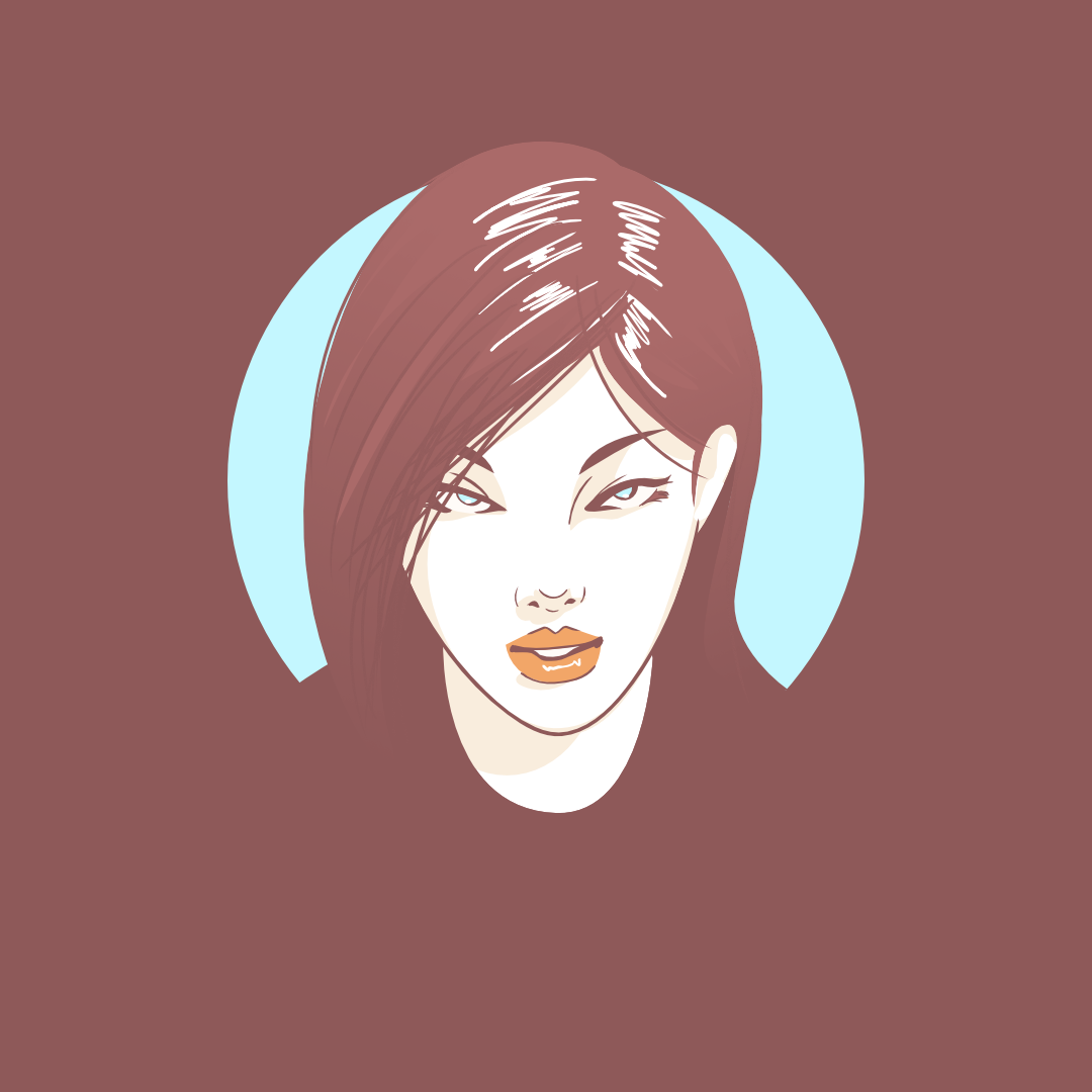
I find it interesting that the handle is at the left of the image. Many pictures of a cup of tea or coffee have the handle at the right.
Also that the cup handle is a little away from centre rotationally, as if it is for someone behind the picture.
Is it a cup with coffee in it, or, as taking the thread title precisely literally, an empty coffee cup made with two colours of ceramic fused into the cup during manufacture, as a stylish design?
So is the black shape of the image representing the horizontal surface of some black coffee, or is the black shape of the image representing the curved surface of the inside of an empty cup?
Yes, it is as if the cup is lit with a spotlight from the left and the right of the cup has only ambient light on it, with the spotlight just enough to cast a slight shadow.
The image is beautifully done. Could you say which program you used please and if possible could you say something about how you produced the image please?
William
thank you so much for your insights, i used affinity designer since i like to do minimalism and vectors are perfect for that because of its nature and how clean they're. The original image is a cup of coffee that i did for myself but what i really want is to make it blend with the background so you can stare at it and wonder, kinda silly haha
-
9 hours ago, doodler222 said:
I really liked how you decided to go with a unique angle here.
When I clicked it > I half expected it to be the normal every day view of a coffee cup.
Really like the soft hues to the lower right of the cup also.
thank you so much!
-
4 hours ago, Jowday said:
Well done. How about another background color or about giving it a lower level of brightness? Just an idea.
nice idea, what i tried to do here was blending the cup so it'll look super minimalist not so well executed haha
-
-
this looks really cool!
-
-
-
On 3/24/2019 at 10:43 AM, LoveSquid said:
Nice! I love the color palette you chose.
thank you so much!
-
-
-
4 hours ago, GarryP said:
Nice work.
Thank you!
-
-
I really love of affinity designer's workflow and the way gradients have no banding
-
thankyou somuch for sharing this
-
The thing that i'd do probably is to trace all the image and then after all use af photo to make a mask or something among those lines for the texture it can be with af designer or both
-
Hello, i'm new here but i'll try my best to help in this comunity so i've been making little gifs of differences between af designer and illustrator that would help some, i don't know if the format is good to be share here they're tweets and imcollecting them in a twitter moment for easy access
hope y'all like it and any feedback is well received.
The twitter moment is here and i will keep updating it so you can save the link for later! link : HERE
-
21 hours ago, wigglepixel said:
I can tell you're working on Windows
lol
-
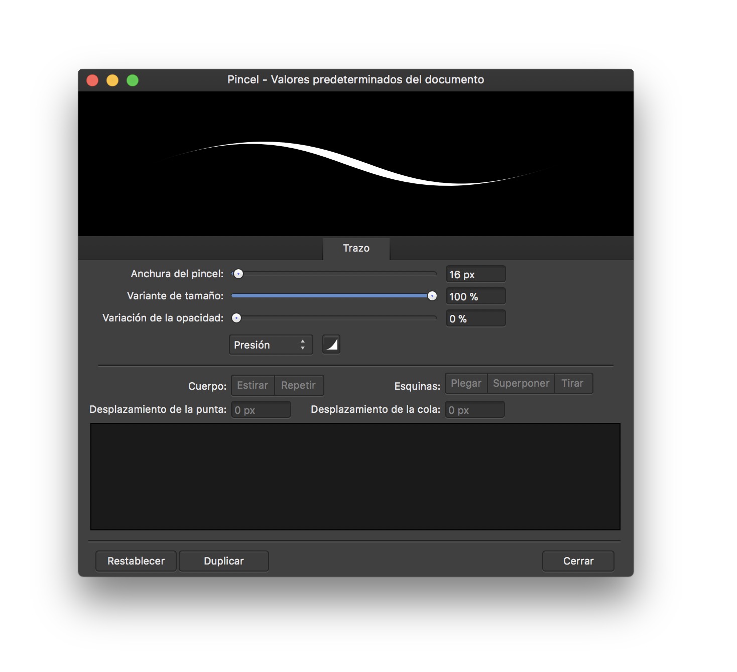
On 12/26/2017 at 5:54 AM, Pablo Cuesta said:
Hi! I found a solution for this problem. The problem is not that the pressure sensitivity is not working, but that it's very little. You have to select the pressure option in the controller as you all said and then, change the size variation in your stroke panel properties. I attach an image. It's not in english, but I hope you could understand.
this one worked for me
-
im new here, i always love vectors i have a lot made with illustrator but now im loving affinity programs everything seems easier and im trying to spread the word! :)
- dutchshader, Kasper-V, stokerg and 3 others
-
6


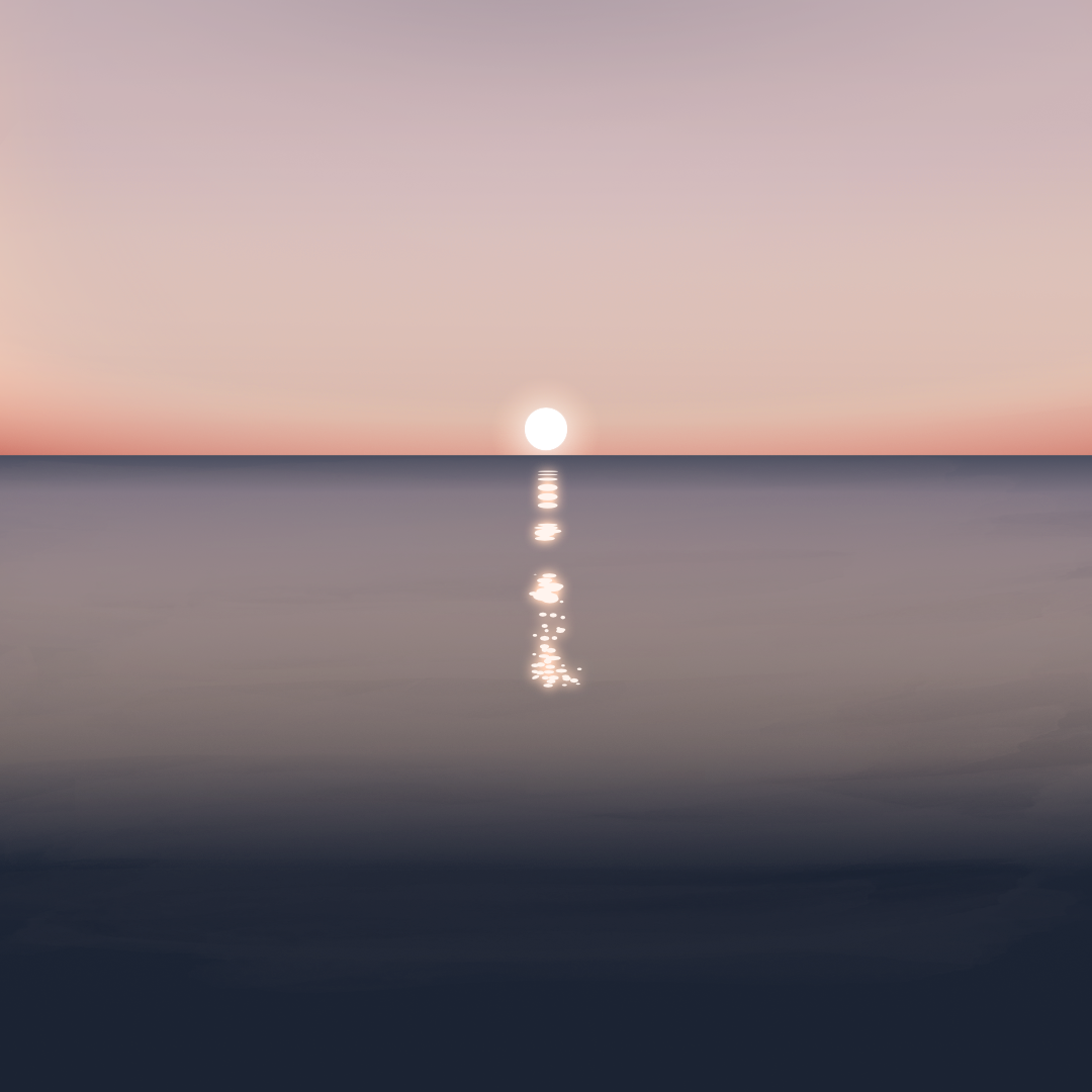


landscape made with affinity designer
in Share your work
Posted