Search the Community
Showing results for 'Separation preview'.
-
 Hi @fernteix, Welcome to the forums. We do support the latest iPads, but we have some issues: Frequency Separation Can add a tone and will cause redraw with transparency if cancelled Haze Removal - Applies a tone to the image. Cancelling causes redraw issue with transparent background Gaussian Blur - Blur is removed when applied High Pass - Image goes entirely grey Maximum Blur- Image vanishes and leaves a transparent background Minimum Blur - Image vanishes and leaves a transparent background Twirl - wrong context toolbar and missing preview in the Filters Studio Unsharp Mask - Effect is removed once you confirm the filter Thanks, Gabe.
 -
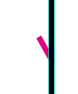
 When I make a pdf for print production in AD 1.6.0, objects with a different (spot)color next to a (thicker) line are not cut to the edge of the line but cut off the center of that line. See screen shot below. Is this a bug? Cause as far as I now there is no trapping feature / settings in AD? Thanks ! (Oh, and the pixels you see on the screenshot is from a Indesign CS 6 preview ;-). But the separation preview there is very handy :-) )
-
Affinity Photo with new ipad pro 2018 11"
Gabe replied to ryan.lio's topic in Pre-V2 Archive of Affinity on iPad Questions
I'm afraid no. We do not do any performance timed testing. Just bear in mind that we still have a few issues that we're currently working to fix: Frequency Separation Can add a tone and will cause redraw with transparency if cancelled Haze Removal - Applies a tone to the image. Cancelling causes redraw issue with transparent background Gaussian Blur - Blur is removed when applied High Pass - Image goes entirely grey Maximum Blur- Image vanishes and leaves a transparent background Minimum Blur - Image vanishes and leaves a transparent background Twirl - wrong context toolbar and missing preview in the Filters Studio Unsharp Mask - Effect is removed once you confirm the filter -

Color management
Jose A replied to Jose A's topic in Pre-V2 Archive of Affinity on Desktop Questions (macOS and Windows)
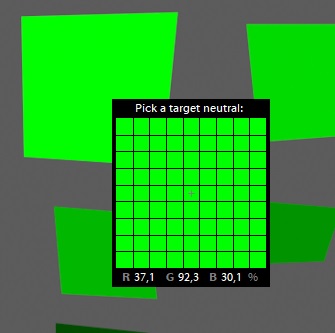
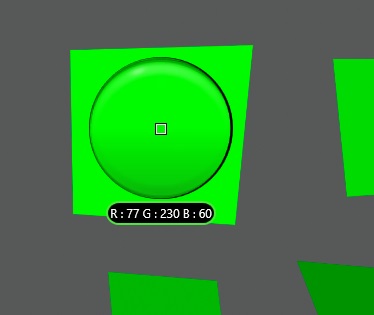
(EDIT: I did not know that the pictures would not keep the filenames. The first picture is called "experiment-1.jpg" and the second is called "experiment-1-2.jpg". If you open them with a widegamut monitor and with a computer which manages colors/browser, you can see that -1.jpg renders as sRGB, even if the preview in the bottom is (to me in chrome) adobeRGB and the second renders just like the preview, in adobeRGB. The bottom 3 pictures are self explanatory when reading the text) Ok, I did a lot of tests, lot of tries with different things, I guess this will be a long answer, but even so I dont think I will cover everything I saw. First off, talk about my monitor. (Monitor talk I) So, I am still not entirely sure whether my OS is in adobeRGB or not. It is not easy to say if it is, but, I would assume it is, because of one of the tests. Although, most of it is in sRGB, but it does not comunicate that to anything else (by anything else, I mean graphics card and monitor), it seems that they do not transfer this kind of data. My monitor always assumes that whatever comes to it is in adobeRGB. So, when I see an sRGB file which is just displayed as is, whithout taking into account that I had set up the OS to adobeRGB and needed the conversion, I just see it super saturated. So, it seems that everything is hyper saturated in my OS. I noticed it right when I first turned it on when I bought it, but back then I knew I would have to do some color management and since then I got convinced that everything is ok. But it seems that things are much harder than what I thought. So, the first thing I did was to create the "experiment-1.jpg" file in AP. There the greens are just from 255 down to 36 in steps of 36. The cyans are 0 255 255, 0 255 230 and 0 230 255. The document was done in adobeRGB. I proceeded to export it with embedded .icc profiles. the "experiment-1.jpg" with sRGB and "experiment-1-2.jpg" with adobeRGB. Checking them in "windows fotos" seems that the app ignores .icc profiles, however, I found out that "windows photo viewer" does not. With windows photo viewer I was able to correctly display the images. I was also not thinking it was real, because I was now used to the hyper saturated greens and it seemed that the green was too flat/yellowish. But after using my phone with an image of 0 255 0 as a reference I noticed it was correct. So, this allowed me to conclude that somewhere, Windows is indeed knowing it should be in adobeRGB, and this application knew about this and did the conversion. Monitor talk II - My monitor has a fast switch to change between 3 custom profiles. As default they come as adobeRGB, sRGB and B&W. this is not important, but I switched the B&W for a night mode, low brightness, less blues mode. Either way, I found out, by this images, that the monitor always assumes an adobeRGB input and when I switch to sRGB it does the conversion internally to display sRGB. This is how it seems to me, because when I view the same images but with the sRGB mode on, the pic with the sRGB profile gets even less saturated, and the one with the adobeRGB is correctly displayed. Continuing with the tests I made. Then I did a lot of testing with real images and some test images from another thread ( ) What I saw is that LR also manages color. As I import the "experiment-1..." jpegs I see that they are different. But unfortunately, as with the rest of most things with the OS, AP shows the same image, be it the sRGB one, or the adobeRGB one. Then I tried to export the same photo (now a real photo, which I had done some editing in LR and from which I created a tif file and did not temper with) both with LR and AP. Here I got some weird results. So first I did some adobeRGB export and loaded it into AP. It showed correctly that the color space was adobeRGB but immediately the colors were different from LR. I then proceeded to export the image as .jpg with embedded adobeRGB and did the same in LR to compare exports in an external viewer. Weirdly, I had mixed results in the sense that the exported versions were exactly the same, but the colors did not seem to match neither AP or LR in "windows fotos". But it seemed much much closer to AP than to LR. It can also be that then, as I did not have neutral colors everywhere and my color perception was slightly different when looking to one photo on the left side and the other on the right side. It seemed that switching the viewers around was switching the color difference (i. e. the "warmer" picture always was the one on the left side, regardless if it was AP-left, windows fotos-right or vice-versa). So I would prefer to assume that although they seemed different, my color perception was being altered by the inhomogenous and strong color separation within the photo (was looking at some red mountains and blue sky). However, in the color managed windows photos, the colors now also did not seem to match, but were much closer to LR (i. e. they were quite different from AP). The tests with ProPhoto just showed what I had already seen above which was that the pixel values are changed, as they should be (not meaning that its being done to the correct ones). So, if I then used "experiment-1-2.jpg" and converted it to ProPhoto, both LR and AP do change the pixel values, albeit to different ones, as seen above. So, the before 0 255 0 from adobeRGB was now 138 237 78 (edit, read ahead) in AP and in LR 37.1% 92.3% 30.1%, which in 8 bit is 95 235 77, which is a huge difference in the red channel specially. Also strange is that if I instead export the LR file with the embedded ProPhoto and load it in AP, now AP reads 77 230 60... (you can see the 3 cases in the attached pics) (EDIT: I realized now that I made a mistake and loaded "experiment-1.jpg" into AP and then did the conversion, so from sRGB to ProPhoto and not from adobeRGB to ProPhoto. By loading the correct file "experiment-1-2.jpg", I get 76 230 60, which complies with the exported version from LR and loaded into AP). What this is telling me is that somehow AP renders everything as sRGB (as proof of the experiment-1.jpg which has an sRGB as embedded profile, but renders the same as a pure adobeRGB), but of course, as I said above, my monitor takes that whatever is being given to it is adobeRGB and hence the color discrepancies. Then, as it does not take into account the differences between sRGB and adobeRGB the conversion to ProPhoto goes a bit off, as well as then the rendering. I did some other tests in between, but the ones that really got me thinking were some with gradients. I wanted to see the effects of render intents. First I did a conical gradient where I went like 255 255 0 - 0 255 0 - 0 255 255 - 0 0 255 - 255 0 255 - 255 0 0 - 255 255 0. Somehow this whole gradient is out of gamut for both sRGB and adobeRGB according to the soft proof. However I was still seeing the colors even if I chose relative colorimetric (which is ok, I would just be seeing all the saturated colors) and then if I chose perceptual there was just a tiny small change in the render (now I cannot really remember if it was changing the intents or changing the target space). Either way, I was expecting that if I switched to perceptual I might have a bigger difference in display of the colors as all the colors would be compressed into the gamut. But even more impressive and here I definitely expected to see a difference was with a linear gradient only in the green, while having the soft proof showing when I would be starting to clip adobeRGB, and it seems that at a value of 0 14 0, AP tells me that I am clipping adobeRGB (it might be true, I do not know, but this tells a lot about how huge ProPhoto is). Then I did a linear gradient across my whole document from 0 10 0 to 0 16 0 and changing intents did nothing. I was expecting to see saturated greens in a relative colorimetric intent (as from what I understand out of gamut colors are just represented as saturated colours, instead of compressing the color space into the target space as in perceptual). Maybe the color transformation is done instead in LAB and it preserves part of the L in a LAB space and this is why the whole thing stayed so dark (I was naively thinking I would see bright greens). Oh well, Its super late now, I took many hours today on this matter, I need to go to bed. All the best -JA
- 31 replies
-
- 1
-

-
- color management
- color
- (and 1 more)
-
A print sample of a news tabloid, the two pages are created in publisher. For test purposes, I replicated all paragraph styles from InDesign (some are not possible in Publisher), and found that there are still weird stuff going on with the tables, and strange rasterizing of text if the text layer is waaay below the layers of photos when I export it on 'pdf (for print).' ( I use Black and White layer adjustment to change the RGB photos, I like it!). I guess, by arranging the texts on top of the photos, and export again in pdf...voila, the text are crispy clear. My other concern are there's no color separation preview, and pdfs created from other applications--placed in publisher...still rusty--should be as is.
-

Colour Separations
stmartin replied to Nazario's topic in Feedback for Affinity Publisher V1 on Desktop
+1 for color separation preview. -
Colour Separations
osang replied to Nazario's topic in Feedback for Affinity Publisher V1 on Desktop
+1 for Color Separation preview. I'm also using computer-to-plate printing. -
 +1 – I'd like to have a clear and concise way of checking the colors in the document as well as quickly change them from spot to process. Also a separation preview would be helpful with checking overprint and spot color plates.
 -
So Eugene, I am assuming you are referring to separation preview. Right? Btw, nice to see you here and providing feedback. Mike
-
 Hello, I'm impressed with the development so far, but I have a request regarding the document bleed settings. I would really like to see a guideline pop up within the document showing where your bleeds are. It would definitely help me in planning my layouts. and maybe an option to convert lines to guides for if I needed to set up a dieline on a shape that is not rectangular. More print production tools in general would be nice - separation preview to determine percentages of ink coverage, and so on. Thanks
- 1 reply
-
- 1
-
-
 Separation preview will be a feature, but I don't think it will happen before the initial release - although I could be wrong?
 -
 You can use Word to make layouts? Are you kidding? Trapping nowadays is a RIP feature. Separation preview is nice, but not really necessary for a skilled designer. And a „once in year“ designer won‘t need it at all, because he probably doen‘t know anything about it. As I said: „Nice to have“ features, but definitely not indispensable.
 -
 I have a few question for those Designer artists who have to deal with prepress and printshops. How do you prepare your artfiles in order to minimize problems with the printshop? I ask because with Affinity Designer I don't see any possibility to preview color separations and I especially miss spot color separations? What workflow do you use or recommend assuming that we don't use any Adobe or other expensive third party software for this purpose?
 -

Separating colors
v_kyr replied to cmoore's topic in Pre-V2 Archive of Affinity on Desktop Questions (macOS and Windows)
Hmm, for AD can't tell here. - But AFAIK tools like Acrobat Pro, InDesign and QXP etc. allow to preview, print and partly also to save sepated color PDFs, so take a look here: Create Color-Separated PDFs Well if you find a way in AD to automatically select just all vector objects and layers which are involved here to be of a certain color, than you can force to do the desired separation process that way. But I'm not aware of any such color dependent multi selection possibility on the vector side, just on the pixel side aka when working with bitmaps. On the other hand here what probably would be possible to do is, to export into some text editable vector format (SVG, EPS/PS), make a file working copy and then remove in a text editor all objects of just one specific color there (as far as those color objects are clearly matchable via some well defined regular expression search/remove). Save the modified file and then reimport it into AD, then check in AD that everything is as you expect it to be, namely that only all those objects of one color are inside etc. Plain simple and stupid SVG example here ... Good luck! -
 Status: Beta Release Purpose: New features, fixes Requirements: Purchased Affinity Photo Mac App Store: Not Submitted Download: Here This is the sixth beta of a substantial change to our codebase and as much as we have tried to ensure the quality of the code, it should be considered to be not suitable for production use. This means that you should not attempt to use it for commercial purposes or for any other activity that may be adversely affected by the application failing. In addition it is definitely worth noting that files created in Affinity 1.6 may not open in 1.5 so always make a copy of your important documents before opening them in 1.6 to ensure you do not accidentally overwrite them and are unable to open them in your 1.5 version. To use this beta, simply download the file from the link given above and double-click on the file to open the installer. Follow the instructions to install the beta version. The beta sits alongside the Mac App Store version and will not interfere with it. Thanks, Affinity Photo Team Changes this release The Develop histogram updates fast again. Fixed issues when loading old document snapshots. Fix for uncomitted nudge transforms getting reverted when the user hits Escape. Improved inpainting stability. Can now drop photos from the Photos app into the application. Light UI tweaks and improvements, Numerous vector import / export improvements. Implement OpenType MarkToLigature rule. Font handling improvements. Localised macro and tone mapping presets. Retain EXIF information when creating an image stack. Fixed rotation / tilt input when using brushes. Added new GPUs to Metal compute acceleration (Iris Pro devices). More controls now automatically hide the tool when in use. “Find in Layers” will now automatically make the layers panel visible. Macro library now remembers expanded / collapsed state. CMYK improvements when using Metal compute acceleration. Fixed “Magic Mouse” issues. Don’t prompt to save unmodified documents on exit. Pressing tab will now show / hide the left / right studios correctly. Fixed numerous adjustment in LAB mode when using Metal compute. Circular maximum / minimum filters obey the channels tab properly. Fixed 32bit ICC profile serialisation. Fixed brush scatter not being random enough. Upgraded EXIF parser database. Pen Tool tweaked so that clicking on the start/end node forces it to become a cusp. Develop fixes for rotated photos. Fixed colour picket reticule lingering on the screen. Background grey preference now applies when there are no documents loaded. Fixed camera response function estimation. All spline editors (including Curves) can now be nudged using arrow keys. Improved handling of vertical panoramas. Don’t crash when loading corrupt JPEG files. Fixed crash when using a brush tool after frequency separation. Scrubby zoom shortcut now works in freehand selection tool. “Add” to selection can now move the selection in freehand selection tool. HDR merge improvements. Improved hint line for patch tool. Warn when leaving tone mapping without committing / cancelling. Attempting to refine an existing mask after a crop leads to brush offset issues. Default language should honour the currently set decimal separator. Don’t create Live Perspective filter layers with degenerate transforms. Ability to parse colour profile from EXIF InteroperabilityIndex. Fixed Multiply blend in 32bit RGB. Always use minimum fitting in the crop tool. Enable “Edit in” from Photos app in High Sierra. Updated LensFun correction database and engine. Fixed retouch tool issues in 32bit mode. Localisation improvements. Help improvements. Many other small improvements. Changes since last App Store release Build with macOS High Sierra SDK, Xcode 9. Fixed panorama stitching when using Core Image RAW. Further Light UI improvements. Fixed problems with full colour brushes. PDF import improvements. Text Styles improvements. Documents which have no changes don’t require saving. Fixed floating windows in full screen mode. The visibility of the left / right studio is now saved per persona. Fixed some DNG loading regressions. Fixed drag behaviour in the Curves tool. Develop now has button to rotate the image. Fix issue where documents could get stuck when loading. Node tool now allows rotation of nodes. Fixed many localisation truncations. Fixed Shadows & Highlights filter artefacts. Live Halftone filter UI improvements. Selection brush was not remembering size between uses. HSL adjustment now contributes per-channel adjustments to exported LUT. Mitigated Live Perspective crashes. Liquify now behaves correctly on rotated images. Fixed occasional layer corruption under extreme load. Stopped Liquify slightly blurring images (with Metal Compute enabled). Numerous adjustment now do not pollute the K channel in CMYK (with Metal Compute enabled). Fixed halftone filter in CMYK (with Metal Compute enabled). Localisation improvements. Numerous other small fixes and improvements. Help improvements. New “Live Halftone” filter. Added noise reduction slider to “New HDR Merge” panel. Added menu to layers panel with an “Auto-scroll” item (to quickly enable / disable). Importing ASE files now supports spot colours. Increased performance of Metal compute mode. Increased the maximum size of the liquify brush tools. Fixed some grid drag / drop issues. Improved Metal compute acceleration of HDR merge. Small SVG import improvements. Further TIFF import improvements / fixes. Better quality equirectangular projection previews if Metal compute enabled. Fixed Diffuse Glow opacity slider. “Always show brush crosshair” is more completely obeyed. Fixed vignette artefacts. Colour correction fixes for Metal view on AMD cards. Fixed issues with the quick mask toolbar dropdown. Fixed crashing on export / save. Numerous other small fixes. Improved localisation. Selection refinement performance improvements. Show progress when committing a refined selection. Handle layers with 0 width / height more correctly. Improved PDF / vector export. Remember Align To settings between sessions. Opening and saving document will now support macOS filesystem tags correctly. Export panel also support tags correctly. Improved RAW support - more cameras etc. Further efforts to reduce the size of the application binary. Improved TIFF loading correctness. Fixed some “Effects” brushes looking wrong on masks / adjustments. Prevent Tone Map being macro recorded (proper support for it will be reintroduced later). The “Undo” brush should do nothing on masks / adjustments. Fixed crash when using File -> New Batch Job in light UI mode. Fixed crash when loading a document with an OCIO space which is no longer available. Support malformed 8bit grayscale TIFFs (which were loading as sRGB). Fixed some scroll bar panel issues in light UI. Fixed Ctrl-reset startup crash in light UI. Fixed some flickering issues with sliders. Removed “Set as Default” for Pantone palettes. Improved drag & drop in the Library page. Numerous other small fixes. Localisation improvements (especially Russian). Metal compute acceleration. Significant improvements to light UI. Metal display acceleration. Custom brush wet edges. Outlier stacking mode. Fixed Export LUT Red/Blue swapping bug. Fixed inability to hold shift and click in brush tools to create a straight line. Improved Photoshop Plugin support. Fixed bad / crashing macros cause by recording a 32bit preview mode change. Fixed B&C macro arguments issues. Fixed info panel samplers not being drawn. Fixed artefacts with Live Filters. Improved Live Filters performance Pasting pixel data should always past pixel-aligned. Fixed inability to load Procreate PSD files. Localisation improvements. Numerous bug fixes and stability improvements First and foremost, the 1.6 version is mainly about: Light UI! (go to Preferences->User Interface) Improved view pan/zoom performance and new pixel-differencing pixel shader Improved performance with large documents New font chooser dropdown with recents, used fonts and favourites New Glyph browser Stroke stabiliser for all pencil and brush tools Align to key items (first/last selected) Text frame vertical alignment options Fit frame to text (double-click on bottom centre handle). Transform panel uses the rotation centre Scale/shear can now be performed about rotation centre Double-click now resets shape handles and rotate/shear handles Many PDF export improvements including vector export of multi-stop gradients Numerous bug fixes and stability improvements
 -
 It's Designer and it says Global 3 (Pantone 1595) and spot - it's a solid red with a 100% black crown on top, bit in Indesign I'm showing 100% 1595 and bk in the separation preview
 -
 any update on overprint preview? and is there a separation preview? I use these features daily in illustrator and am looking to make the switch.
 -
 Claude, je vous propose de suivre le tuto suivant. Cela vient d'un forum Adobe à propos d'un scanner Nikon. Le participant explique que la teinte est une contrainte chimique variable de film en film et qu'il faut donc tâtonner. Il explique en outre que la technique parait compliquée mais est en fait assez rapide. Ce devrait être adaptable à Affinity sans problème (je n'ai pas essayé): François The [orange] mask is not constant across the whole negative. It is formed, during development, in inverse proportion to the amount of dye formed in the Cyan and Magenta layers. No mask is created in the yellow dye layer. In the cyan dye layer, a red mask is created at about 40% in the areas of no Cyan dye, down to zero where the cyan reaches D-Max. In the Magenta dye layer it is about a 20% yellow mask. Removing the cast as though it were constant over the whole area degrades the colours where the mask wasn't originally formed. The following Photoshop procedure removes the 20% yellow 40% red mask from a color negative image. It is not actually as lengthy as this description might seem. After you have obtained a bit of experience with it, it goes fairly rapidly. Make sure the Layers dialog and the Channels dialog are separately visible, because this method needs both. (1) Open a color negative scan as an 8-bit RGB image. Convert it to CMYK with no K, in order to have the same structure as the color negative film. In order to suppress the K, File > Color Settings > CMYK Setup... to open the CMYK Setup dialog. For CMYK Model select Built-in, for Ink Colors select SWOP (Coated), for Dot Gain select Standard and enter -10%, for Separation Type select UCR and enter a Black Ink Limit of 0% and a Total Ink Limit of 400%. Convert the Parent image to CMYK and it will lighten noticeably, but it will contain no black ink (the K channel is white.) (2) We will create an image containing the 20% yellow mask of the Magenta film layer. On the Toolbar, make the Foreground Color white and the Background Color black. In order to make this image exactly the same size as the Parent image, on the Parent image Select All, Edit Copy, and File New. On the New dialog, name the new image "Yellow Mask", set the Mode to Grayscale, and the Contents to Background (Black). Click on the Magenta channel of the Parent image and Edit > Copy it. Click on the titlebar of the Yellow Mask image and Edit > Paste. A Layer 1 appears containing only a single Grayscale channel. This channel ranges from white to black and we want it range from 80% white (20% yellow dye strength) down to zero percent yellow dye (Grayscale black in the Magenta channel.) Merely set the Layer 1 Opacity to 20% and Flatten. The Black Background reduces the whitest value down to 20%. There is no need to save the Yellow Mask image -- just keep it open for use in later steps. (3) Create another image containing the 40% red mask of the Cyan film layer. File, New and name the image "Red Mask", make sure the Mode is Grayscale and the Contents are Background (Black). Make the Parent image active again, Select All, click on the Cyan channel, Edit Copy, and click on the Red Mask image title bar, and Edit Paste. Layer 1 will appear. Change its Opacity to 40% and Flatten. Also no need to save Red Mask -- just keep it open for use in the following steps. (4) We are now ready to remove the orange mask components from the Parent image. The Red Mask image will be removed as superimposed magenta and yellow layers, so it will be used twice. The Yellow Mask can be removed in a single step. Let's remove it first. On the Parent image, click on the Yellow channel. We can Deselect the selection now, because we don't need it in the following. Image > Calculations to open the Calculations dialog. Both Source 1 and Source 2 are currently defaulted to the Yellow channel of the Background layer of the Parent image. We are going to use the "Subtract" Blending mode of the Calculations dialog to remove the yellow mask, and the convention is to subtract Source 1 from Source 2, so we will leave Source 2 filled out just as it is and change Source 1 to Yellow Mask, Layer Background, Channel Black. Change the Blending field to Subtract. Since we are dealing with subtractive color we have to carry out our positive integer arithmetic in the inverted domain. Check the Invert box for Source 2, but do not check the Invert box on Source 1 because it is already inverted. It is all right to have Preview checked although sometimes you may be vexed by the preview because we are still working with inverted components of a color negative image. Opacity should be 100%, Offset 0, Scale 1 (the defaults). Mask should be unchecked and the Result should be "New Channel." OK to place the Subtract Calculation in a new channel. (5) The new channel may be named "Alpha 1." Double-click it (in the Channel dialog) to open the Channel Options dialog and in the "Color Indicates:" area click on "Spot Color." The new channel name now defaults to "Spot Color 1". We are still in "inverse space", so Image > Adjust > Invert to return to the normal "black=dye" subtractive color space. The Spot Color 1 channel now represents a revised version of the yellow channel, from which we have removed the yellow mask of the Magenta film layer. You can click on the Yellow channel and then the Spot Color 1 channel and as you alternate between them you can see that the Spot Color 1 channel contains less yellow (which is depicted as black in this Grayscale representation) than the Yellow channel. The difference may be subtle. We could copy the Spot Color 1 channel to the Yellow channel at this point, but for comparison lets leave it in place for the present, while keeping in mind that it is now our "real" Yellow channel. (6) Next, continuing to work in the Channels dialog, lets remove the yellow component of our Red Mask from the Spot Color 1 channel (our "real" yellow channel.) Click on the Spot Color 1 channel to make it active and open the Calculations dialog from the Image menu. As before, our selected channel appears as both Source 1 and Source 2 but we want to use the Red Mask image as Source 1. Once again, we don't need to invert our Source 1 (Red Mask), but we do need to check Invert for Source 2. Blending is still Subtract, Opacity 100%, Offset 0, Scale 1, Mask blank, and Result "New Channel." OK to put the result of the subtraction in a new channel, which will probably have the name "Spot Color 2" (Photoshop may have temporarily "learned" that we don't want Alpha channels.) The new "Spot Color 2" channel now represents our new unmasked Yellow channel and it is still Inverted, so Invert it to return it to the subtractive black dye mode (Image > Adjust > Invert (or Ctrl+i) with only the Spot Color 2 channel highlighted.) You can now compare the original Yellow channel with Spot Color 1 and Spot Color 2 to see the effects of "peeling off" two layers of yellow mask. Pure black still represents pure yellow in the Grayscale representation of the yellow channel, so Spot Color 2 should be less black than Spot Color 1 which should be less black than the Yellow channel. We can now replace the contents of the Yellow channel with the Spot Color 2 contents. Click on the Spot Color 2 channel, Select All (Ctrl+a) and Edit Copy (Ctrl+c) to put it on the ClipBoard. Click on the Yellow channel and Paste in (Ctrl+v) the new contents. We have no further use for the Spot Color 1 and Spot Color 2 channels, so we can simply drag them to the Trashcan icon at the bottom of the Channels dialog box. (7) We now want to strip the magenta layer of the Red Mask from the Magenta channel of the Parent image. On the Channels dialog, click on the Magenta channel so that it is the only highlighted channel of the Parent image. Open the Calculations dialog and change Source 1 to the Red Mask image. As before, Source 1 does not need Invert checked, but Source 2 does. OK to create a new channel containing the result of the subtraction. The new channel is probably named "Alpha 1" (Photoshop forgets) so double-click it to open the Channel Options dialog box and check Spot Color. (Don't worry that the Spot Color color square appears as yellow -- we are just going to use the Grayscale information.) The name of the channel changes to Spot Color 1. While it is still the only active channel, Invert it. (8) The Spot Color 1 channel now represents our revised Magenta channel which has had the red mask of the filmbase's Cyan layer removed from it. Compare Spot Color 1 with the Magenta channel to see that Spot Color 1 has less magenta dye (black) than the original Magenta channel. We ill now copy the contents of the Spot Color 1 channel to the Magenta channel. If Select All is still not in effect, do a Select All and click on the Spot Color 1 channel to select it and Copy it. Click on the Magenta channel and Paste. The Magenta channel has now had its part of the orange mask removed. We no longer need the Spot Color 1 channel, so we can drag it to the Channels TrashCan. (9) This completes the removal of the filmbase orange mask from the color negative image. We are now nearly ready to invert the Parent image color negative to a color positive. But first, remember that we converted the color negative from an RGB to a CMYK image with no black channel, because the color negative film itself does not have a black channel. The current Black channel is filled with pure white, indicating no black dye at all, and if we were to invert this CMYK image the Black channel would go from pure white to pure black, making the entire image solid black. To avoid this problem, and because we will be making extensive image adjustments after the conversion to a color positive, it is appropriate to convert the image mode from CMYK to RGB at this point. We can also Deselect because we no longer need the selection in effect. The conversion to RGB should cause no visible appearance change. (10) Now, in this next step, don't panic. Convert the image from a color negative to a color positive with an Image > Adjust > Invert. The result will not look like a good final result for several reasons (the reason for the "no panic" warning.) First and foremost, the color negative film representation has a very limited dynamic range (no deep blacks or pure whites) and the color print process compensates for this by automated (and sometimes manual) adjustments in the color printing equpment. Therefore it is perfectly normal to need to make large adjustments in Photoshop in order to put this color positive image in an acceptable final form. Another factor contributing to needed correction is that the actual filmbase orange mask may differ significantly from the 20%-yellow, 40%-red mask that we removed. (An improved version of this method will account for this by using and analyzing a measured sample of the filmbase mask.) A third factor is that the scanned image may contain image elements (sprocket holes, film border, etc.) that are not actually part of the image but contribute spurious components to the image histogram. To remedy this last problem, crop the image to include only relevant material. Since the following series of Photoshop image adjustments will be extensive, convert to the 16-bit RGB mode to help avoid fragmentation of the image's histogram. It may be advisable to upsample the 16-bit image to get a significantly higher pixel count (and filesize) before the image adjustment phase. (11) The quickest way to significantly improve the image is to use Image > Adjust > Levels. Don't use Auto Levels -- the image needs your personal attention. You can use whatever image adjustment techniques you like from this point on. I like to adjust the R, G, and B channels individually because they usually have significantly different histograms. Select the R channel and move the Black point to the right to enter the histogram slightly. Move the White point to the left enough to enter the edge of the Red histogram. Repeat for the Green and Blue histograms. Then start experimenting with the Mid-Gray (gamma) points. For more precise control, you can highlight the entry field and "nudge" the values with the Up-arrow and Down-arrow keys. Once the Levels adjustments have been made, the image should have a much wider dynamic range, ranging from near-black darks to near-white lights. You are then free to use whatever additional image adjustments you deem necessary. After making all of the image adjustments, change the Image Mode to 8-bit RGB for any needed filters work. A tiny bit of Gaussian blur can fill in some of the gaps in the histograms. Downsample if the pixel count is inappropriately high. This method was developed using Photoshop 5.0.2, but should work with Photoshop 4.0.1 and higher. This method rigorously removes the 20%-yellow 40%-red masks, but it is not the final answer because real world masks vary significantly from those specifications. I am developing an improved method to accommodate varying mask characteristics.
 -
We still don't know what the OP really means... The prepress departments I have worked in did fix some issues without notifying the client(s) involved. But what we wouldn't do is second guess the designer's intention. So even for rich blacks on smaller text, we would send an email or call the appropriate rep, who would in turn contact the client and inquire. If the fix was approved by the client, and only if approved by the client, would we run the fix. In no way would we fix something that was not approved. Else if the job went south we were left paying for the job. Most often the client would resubmit new PDFs. Production jobs, we did those too (a different department). And those jobs went through the same scrutiny and once in a blue moon, those too were rejected for some reason and the designer--though an in-house designer--redid what was wrong and resubmitted them just like everyone else. I can understand the need for certain prepress things. Dunno if AD, APub or APh will ever get them, though. One would be a truly color managed separation preview. The ability to map inks and spots, control screen angles, traps for non-PDF work-flows, maybe even imposition, etc., etc. (Imposition will always be best left to a dedicated imposition solution, though I can see why people may want it.) But some vague notion as expressed by the OP of "decent Pantone implementation" isn't "prepress." Of the 4 items listed, only one even is vaguely a prepress thing (the whole direct printing using a tiled format), but even it isn't really a prepress thing--produce a PDF and tile it from Acrobat. Pantone works in AD, but I think the notion of swatches needs rethought and implemented better. Locking, hiding, etc., and selection by attributes are simply production issues and those things have been requested and should be added to AD et al. So yeah, pre-press and production are separate things and attention definitely needs paid to the production/work-flow features in Serif software. Whether it is beyond the purview of the software as regards pre-press is up to Serif though it never hurts to ask for these things. Imposition will always be best left to a dedicated imposition solution, though I can see why people may want it.
- 6 replies
-
- 1
-
-
- prepress
- pantone names
- (and 4 more)
-
Hello all, I would like to write a list of features that make Affinity Designer can be called application for professionals. I know that probably some forum users get angry with my words but please read my explanation. Currently this Adobe Illustrator is the standard application for professionals. With its help you can design a poster, large format advertising or packaging. You can also prepare a project READY FOR PRINTING. Sorry but AD currently does not have many features that allow you to easily design the packaging or a poster and prepare the project for printing. Below I will try to list all the functions which according to me is missing: Missing designing functions: - Selectable units (pixels, millimeters, inches) - Possibility of dimensioning graphic elements (elements in the project, visible after saving) - Tracing raster graphic - "Offset path" function - "Gradient mesh" function - "Aling to selected object" function - AI-style transformation/scale tool - AI-style zooming tool (by selecting area and zooming, not photoshop-style zooming) - Selecting by attributes function - Locking/unlocking selected objects - Creating a pattern function - Creating a package of files (linked photos, used fonts + creating report one specified folder) - Barcode generator Missing "preparing for print" functions: - Fist and MOST IMPORTAINT - Separation preview - object "Overprint" atributes Without most of these functions AD has no chance to become a serious application that can be an alternative to the market leader. No matter whether someone likes it or not but it's B2B determines what is standard in the market and what is not. Currently, the standard is Adobe Illustrator. There are several reasons. According to me, except that it offers a lot of interesting features, it is open to the external plug-in developers. We have a great design supporting plug-ins from astute graphics, we have a great plug for preparation for printing and 3D visualization (from ESKO). They are extremely expensive but for the leaders of the market price is not such a problem. The opening up to third-party plugins creators seems to me to be one of the keys to existence as an alternative to Adobe Illustrator. Create your plug-in market oper to the third-part creators. Make money from a percentage of the profits (like Android Market, Apple Store). Serif - please! Be a real alternative to Adobe. I am writing this as the holder of APh and AD (even though I do not need it - but I bought them to support you)
-
MrFlexo, I completely agree with you about wanting a separation preview, it would be a welcomed addition. I think most people are eagerly waiting for a more powerful way to select multiple objects and hopefully it will be added soon! I do have a few questions about your list. There are already 2 different kinds of zooming in Designer, the regular kind that shows the box (maybe it is called "marquee" zooming) and scrubby zooming. Does Illustrator have a 3rd kind of zooming that I don't know about? Have you tried both kinds of zooming? I'm not sure why you added "locking-unlocking selected objects? You can lock and unlock items now in Designer. You can even lock things easily with a shortcut, the problem comes with unlocking. There currently isn't an easy way to unlock items without digging through the layers palette (which wastes time). An "unlock all" is what is needed. I'm not sure why but there is already an "unlock" shortcut in Designer but you have to have the object selected in order to use it (and you can't have it selected if it is locked). The only way to use it is if you have an item selected and you lock it, then you change your mind you can unlock it but once you click something else you have to travel to the Layers Palette. It doesn't make sense, unless there is something I'm missing? I am always requesting a "Hide/Show All" as well because it is a much needed time saver and it is hard to talk about a "lock/unlock all" without talking about "hide/show all". Hokusai
-

Better integration of the proof function
dkaiser replied to dkaiser's topic in Older Feedback & Suggestion Posts
The layer is the problem: https://youtu.be/G9ECfI2Div0 A integrated option like this (InDesign) works global over all layers: ...and where is the separation preview like this? -
 Click here to download the latest beta Status: Customer Beta Purpose: Performance and stability Requirements: A valid product key, issued when Windows Affinity Photo version 1.5 was purchased. As this is a beta release, it is considered to be not suitable for production use. This means that you should not attempt to use it for commercial purposes or for any other activity that you may be adversely affected by the application failing. We hope you enjoy the latest build, and as always, if you've got any problems, please don't hesitate to post here and we'll get back to you as soon as we can. Thanks once again for your continued feedback. If you have a general question about the software, please head over to the Questions Forum, or if you have any suggestions, please head over to the Feature Requests forum. Fixes Added several performance improvements Improved application start time Fixed crash when using cursor keys to feather a selection Fixed Selection Brush resize shortcuts not updating the context toolbar values Fixed mouse wheel on opacity edit not applying Fixed Retina Rendering Performance Preference (it was always doing a two-pass render for the high quality only option) Fixed Layers panel not updating when switching documents with a live filter open Fixed Unlinked / Separate Grid line and Subdivision line colours are not remembered Fixed being unable to re-apply the last applied snapshot Changed "Save With History" to prevent silent save back to JPEG, etc Fixed crash when clicking the swatch in Edit > Matte Fixed crashes when opening SVGs with no bounding boxes Fixed Help search results not displaying if temp path contains non-ASCII characters Distinguish between beta and normal builds in Explorer's "Open With" menu Fixed failing to select a word when right-clicking on the text caret Fixed being unable to interact with Transform panel when you draw out a marquee Fixed Colour Chooser not retaining the last type you were on Fixed Grid and Axis Manager not reflecting the currently selected artboard Improved support for badly formed PSD files Fixed Remove button on New Stack Document dialog not working Pixel width and height not updating in the Resize Document dialog, when changing the resolution with 'Resample' unticked Fixed Macro panel can appear off bottom of the screen Fixed Move Up/Down for Library categories are in the wrong order Fixed crash when changing the order of categories in the Library panel Fixed lens correction failing to work due to wrong lens look up Fixed crash when attempting to use undo brush when there is no history Fixed frequency separation crashing 32-bit documents when the bilateral is used Fixed cancelling macros import displaying an error message Fixed macro parameters appearing with empty tooltips Added scroll to macro parameters flyout Fixed changing dimensions before DPI in Resize Document dialog resizing out of aspect Fixed deleting a develop snapshot applies the first snapshot Fixed being unable to use keyboard shortcuts in FFT Denoise dialog Fixed Sources panel sources only showing with Clone brush active Fixed Sources panel toggle source preview icon doesn't change Improved performance of previewing a clone source
 -
 A response guessing about what is needed. Illustrations: My understanding of the problem. Every standard vector shap is made from a fill and a stroke. In this case, each fill may be different, but all strokes must be white, and the white separation between each fill should be the same width. In addition, all of the stroked shapes should be surrounded by a different color stroke or shape. A simple approach. Flat color background. A blue sky and a green ground. That is, 2 rectangles on above the other on the page, not strokes. Switch to outline view. Select a drawing tool and set it to no stroke or fill. This example, a tree trunk made of a verticle rectangle. Converted to curves (vector lines), a nodes added nodes to stretch out for limbs. Draw an ellipse for the leaves. Here's where it gets to be "fun." Select the trunk and leaves and divide. Look at the layer panel, and find the shape portion that was formed by the difference between the trunck and leaves. Delete that. Select the curve that is the upper part of the trunk. Add to the selection the lower part of the trunk. In node tool mode, join the curves. Select seperated nodes if necessary, and/or just click on join curves. There should now be a leaf shape w. a continuous ouline. Its nodes will be in the same place as the nodes for the continuous trunck shape. Select either, and set a fill and a stroke width that is appropriate, in white color. Copy and past style to the trunk. Change the trunck fill to something different. Repeat the process for other new items. You may need to add more nodes depending on the shapes yopu draw, and snap those nodes to other shape nodes to get an exact fit. I haven't yet figured out how to outline the combined stroked shapes with a consistent width outline. Hope this helpsI'm not sure the images will display correctly. Not showing right in the post preview view
-
Hi All, I tested Affinity and find some bugs in colour managment in road from AD to pdf. I noticed that rgb bitmaps which was placed in AD after export to pdf are still in rgb mode, even my choose cmyk in pdf export window. It is problem with preset for print or pdf/x4. It works (conversion into cmyk) only for preset pdf-x1a. But I don't konw why in pdf export window for preset pdf x1a is set V near embeded icc profile. Specification for pdf x1a does not allow for taged icc profile or embed icc in pdf. And I have question If in AD I find any document info about document - bitmaps, icc profiles in bitmap, resolution for all bitmaps in document, separation preview for check colors in document etc. I attach file testrgb.afdesign