

kurdyumov
-
Posts
20 -
Joined
-
Last visited
Posts posted by kurdyumov
-
-
Wow! Cool!
-
On 5/29/2020 at 11:27 AM, shustovcreates said:
норм!
Спасиб
-
-
31 minutes ago, Matthias said:
Affinity Designer vector output to Apple Motion: I am all for it as well. Even if was an unofficial hack for the time being, an experimental export feature (and labeled as such) it would still be tremendously helpful.
If Affinity Designer had scripting, the problem would have been solved long ago, but I don’t think it will be. Therefore, it remains only to rely on the mercy of the developers: (
-
4 hours ago, Dudemeister said:
Not exactly, in fact far from it, but, yeah.
No program can do this without third-party scripts. Ai and Draw can only with the help of Motionize, but it does not count
")
-
I, too, will be extremely happy with the appearance of export to Apple Motion. Let Affinity Designer be the first and only application in the world to do this
-
On 2/21/2019 at 1:50 PM, VectorVonDoom said:
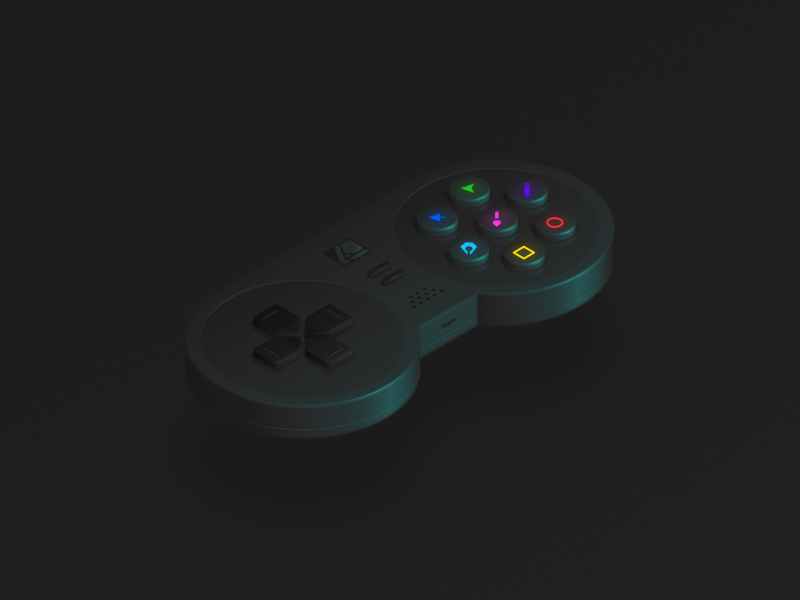
If you look at those teasers, search for something like gamepad teaser, then the highlights are still quite bright. I think if you did similar it would improve it especially on the left.
Hi, thanks for the comment. But I do not quite understand what you mean. If you are about the buttons on the right, then I deliberately made them bright, focusing on the tools.
-
On 3/4/2019 at 10:09 PM, evtonic3 said:
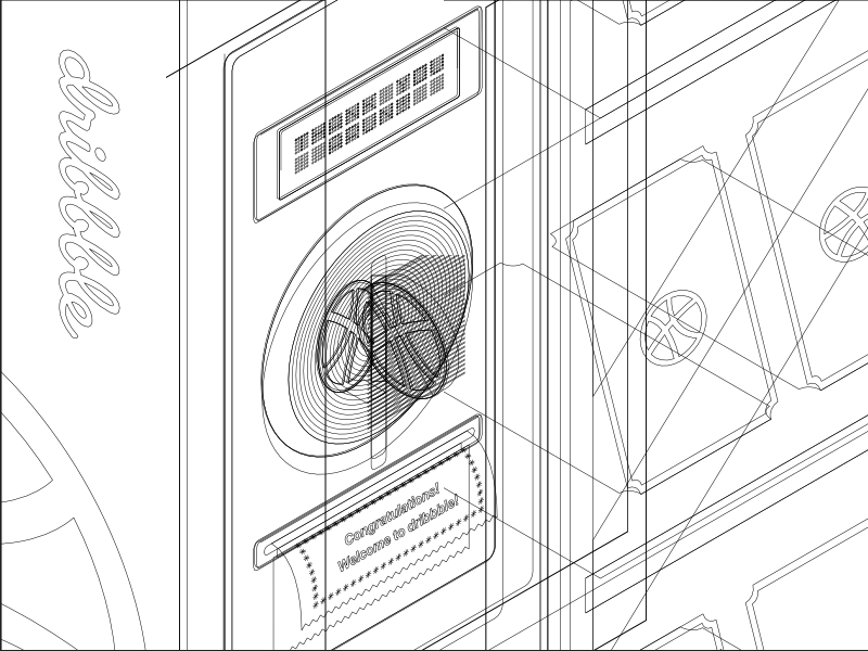
I'm trying to do everything you're doing here to do the exact same thing and something a little off for me. I can't seem to grab the star by the corner point and make it snap to the hex. When I grab the corner of the star it wants to scale from that point.
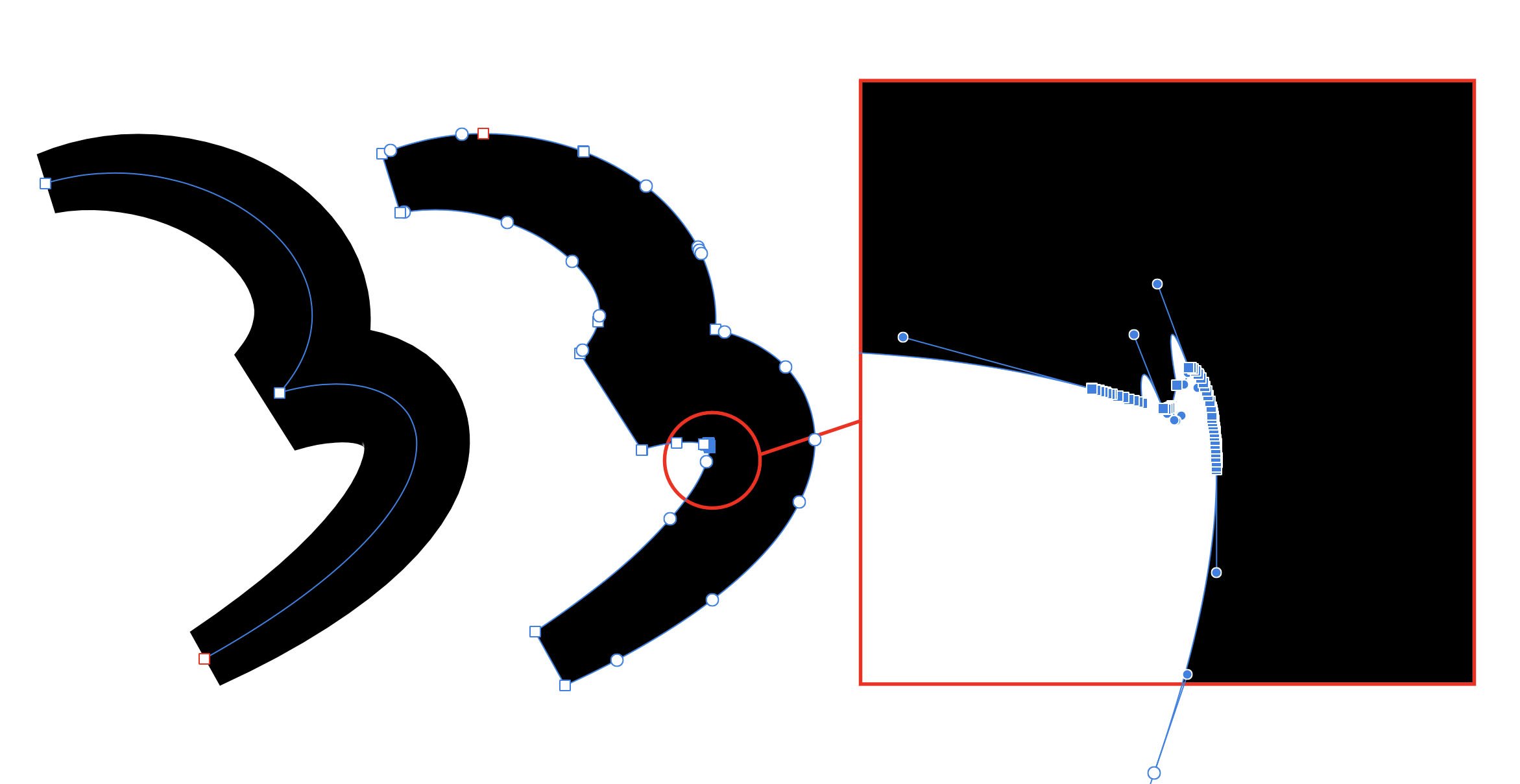
I was tormented for a long time trying to repeat this tricky move with the help of the Node tool. And yet I did it) It turns out a new tool "Point Transform Tool" appeared.
-
-
-
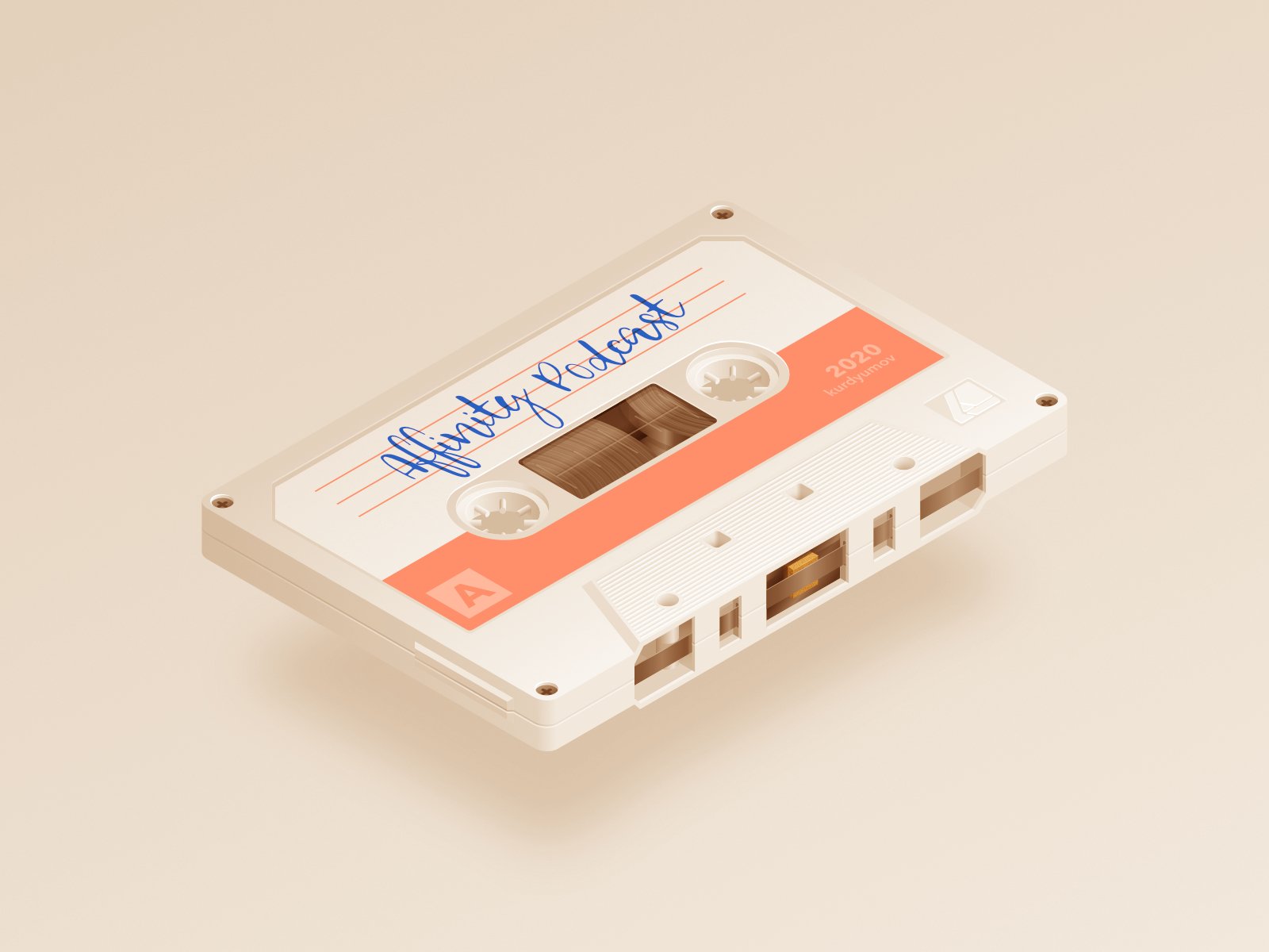
Hello, friends. Tonight I could not sleep and I decided to draw something for the soul. This is what I did, Affinity DesignPad.
I would be grateful for the support on Dribbble -
-
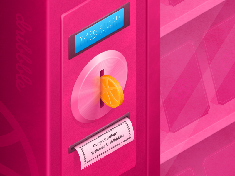
Hello everyone! This is my first shot for dribbble. Work done in 1.7 beta. The isometric tools in the new version of Affinity Designer 1.7 is a bomb!!!
https://dribbble.com/shots/5691827-Hello-Dribbble
- Sullyman, CienciasMagicas, nodeus and 10 others
-
 13
13
-
1 hour ago, TonyO said:
I use expand stroke a lot in my illustration with apple pencil pressure curves (i have to expand all of my outlines for microstock).
Expand stroke is an issue i run into constantly. This is the problem i usually have, curved lines will create areas that have huge amounts of superfluous nodes upon expansion. My fix is to just select them all, delete them and reshape the points to redo the shape, but it gets annoying having to reshape 1 out of every 3 objects you draw after expansion because they look like the attached, it definitely muddles the fluid experience of drawing with the pencil in vector.
This is a problem that Serif, apparently, is not going to solve
For these purposes, I personally use Ai, copying the curve from AD to Ai, then back.
-
On 11/21/2018 at 6:11 AM, Coffee said:
I personally love it. You did an awesome job!
Thank you!
-
-
10 hours ago, Uncle Mez said:
It's really beautiful but look like something already known ... have you looked at Gravit Designer or SketchApp loaded in Dark mode?
They Look closer to what you did but i like the refined aspect of your work but as of version 2.0 of Affinity Suite, i believe the genius behind the thing will come up with something unseen, just look at the recent icons of the APPS and even the nex Persona icons ... it's quickly picking up so i would advice you rework it and make really crazy looking and maybe an animated prototype would help understand and raise some attention and open real dialogue.
BTW the sliders you used should be what serif start to be inspired by and implement in the current beta cycle, the old slider are just ... maybe @Andy Somerfield will tell us to wait and see what is coming with sliders (i believe they doing great things considering the new HSL stuffs that i really enjoy).Hi,
Thank you very much. Before your comment, I did not know that Sketch and GravitDesigner have a dark theme))) I could not make friends with both editors and I don’t like their UI: (Yes, they became similar, but I wouldn’t say my concept is similar on them ... maybe a little ... Rather, I was inspired by the design of InVision Studio and Pixelmator Pro. In my opinion, these are the best editors to date, in terms of UI design.
I did not quite understand what kind of sliders we are talking about ?! I did not see anything new in the new beta version of Affinity Designer.
-
11 hours ago, JokeRat said:
Hi Vitaly,
Thanks for sharing your work with us. It's a pleasure to view and it has a lot of improvments I want for Affinity Designer. (like the better highlighting of selected tools, etc..)
From an aesthetical point of view it's fantastic and very pleasing to the eye. Although if you consider accessiblity and readability it's a tough one. The contrast is way too low and if people have a little eyesight issues, it's not viable, in my opinion. (I know, us UI/UX-designers have a hard time finding the balance between aesthetics and accessibility as it often compete with each other
.)
But as I said: Great work Vitaly! And I love your icon set, they are super crisp and look great! Hope to see more of your work.
Hi,
Thank you for your comment. I like moderately low contrast, it does not distract and allows focusing only on important elements, for example, active or previously modified ones. But maybe I'm used to it and you are really right In addition, in the settings of Affinity you can always adjust the level of gray. I appreciate your feedback.
-
Hello. My name is Vitaly, I am UX/UI designer from Russia. In my free time I decided to redesign my beloved Affinity Designer. What I did can be viewed at the link below. What do you say, colleagues?
View on Behance


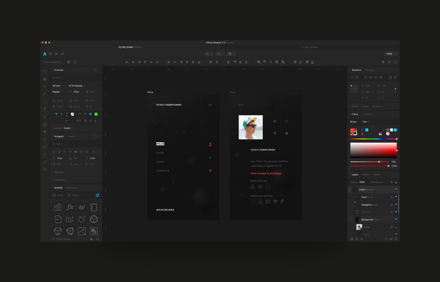
Affinity Apps icons for macOS Big Sur
in Share your work
Posted
Affinity Apps icons update for macOS Big Sur.