.png.e7630a08ee6e1c84d06141c3a5feb319.png)
Frozen Death Knight
-
Posts
1,361 -
Joined
-
Last visited
3 Followers


Recent Profile Visitors
21,988 profile views


-
 FdelS reacted to a post in a topic:
Please consider Linux as a viable platform - Microsoft is bleeding users to Linux because of their choices.
FdelS reacted to a post in a topic:
Please consider Linux as a viable platform - Microsoft is bleeding users to Linux because of their choices.
-
Frozen Death Knight reacted to a post in a topic:
Linux user base keep growing !
-
Frozen Death Knight reacted to a post in a topic:
end of affinity
-
Frozen Death Knight reacted to a post in a topic:
end of affinity
-
Frozen Death Knight reacted to a post in a topic:
end of affinity
-
bobdobbs reacted to a post in a topic:
Affinity for Game VFX - Step Animation w/ Live Procedural Texture
-
pupk reacted to a post in a topic:
Please consider Linux as a viable platform - Microsoft is bleeding users to Linux because of their choices.
-
David V reacted to a post in a topic:
Please consider Linux as a viable platform - Microsoft is bleeding users to Linux because of their choices.
-
David V reacted to a post in a topic:
Please consider Linux as a viable platform - Microsoft is bleeding users to Linux because of their choices.
-
 We'll just have to see what will happen with Affinity in the coming years under Canva mangement. I do know that a couple of months ago that they did a survey to get information about what Affinity customers are expecting out of the software. I sent a quite extensive list and I know a friend of mine who did the same since he uses Affinity as well for work. The devs have been fairly quiet on the forums besides the smaller patch updates for 2.6. To me it looks like Canva and Serif are still trying to assess their long term plans for the coming years and how to make Affinity more integrated into the Canva ecosystem. It has been about a year since the acquisition and we won't likely have a full grasp of what to expect out of it until we get more major patches out. 2.6 felt more like what we would typically expect out of a major patch from the dev team, so any changes done behind the scenes we still have yet to see. The changes might be good or they might be bad. Hard to say at this stage. So far nothing significant has changed, which can be a good or a bad thing depending on how you look at it.
 -
Frozen Death Knight reacted to a post in a topic:
Discussion on Affinity development (split from 2.6.3 announcement)
-
Snapseed reacted to a post in a topic:
Linux user base keep growing !
-
Here is an anecdotal experience I've had. I recently had one guy I work with on the regular install Linux because I showed that it is possible to run Affinity on the platform through Wine. If that wasn't possible he still would be using Windows. There are likely a lot more people in the same boat for various different software. If an opportunity comes to switch to Linux because of a specific software, there will be those willing to jump through all the hoops to get there. Tech enthusiasts are among the first to try out new stuff before the masses start doing the same thing. Microsoft have stepped on tech people's toes for so long that we are getting absolutely sick of it, so it is not surprising that you are starting to see more and more prominent people beginning to advocate for trying Linux out to their audiences. Just because Windows will remain the market dominant OS for the foreseeable future it does not mean that it would be futile to support other platforms. Heck, the fact that someone like PewdiePie is using Linux now and has to use Gimp because there are so few alternatives goes to show that there is a creative market on the platform that would be more than willing to try a Linux Adobe alternative if such a thing existed. There is already a big enough audience for Affinity on Linux that active work is being done in the community to run and maintain a Wine version that supports it. Now imagine all the good will Serif and Canva would get for supporting all these people who are willing fork out cash just to run a somewhat buggy but still functional Windows version of your creative software. I am one of those people.
-
Frozen Death Knight reacted to a post in a topic:
Linux user base keep growing !
-
Pewdiepie made his own video about moving over to Linux and what benefits and downsides there are for doing so. One such downside being Photoshop, since he actually has a background in graphics design before he became a prominent YouTuber. More and more people are going to start trying Linux out in the coming years and having big content creators starting to promote the OS is showing signs of growth.
-
@leshido Very cool! As a game artist I definitely agree about Affinity being very useful for game UI. Very easy to create pixel perfect designs and mass export everything from a single document. Once you have set up your assets it is very easy to iterate on the designs. That VFX through code is a really solid idea for building 2D animations. This makes me even more hungry for an animation timeline to be able to do this kind of work as well, since I think Affinity could be perfect for filling the niche that Photoshop fills in editing pixel/2D animations, storyboarding, UI, etc. Being able to key animate various settings like that filter slider you made would open up so many possibilities. Thanks for sharing!
-
Frozen Death Knight reacted to a post in a topic:
Affinity for Game VFX - Step Animation w/ Live Procedural Texture
-
Frozen Death Knight reacted to a post in a topic:
Feature regression - 2.6 no longer allows me to liquify multiple layers at once
-
Thanks for such a detailed answer! I understand the logic. I can just say from my Photoshop background how I use these merging features to help you see my point of view. While doing paintings I need to cut, copy, group, and merge various layer types to get specific results. A very common practice I did in Photoshop was merging layers and groups together after making backup copies of those layers in case I needed the layer hierarchy again. This was to simplify the painting process after having done multiple edits with Mask Layers, Vector Layers, Adjustment Layers, Group Layers, etc. In Photoshop this process is very straight forward. I just select any layer type I want and use commands like Merge Selected or Merge Down and it would automatically rasterize all layers to do the final merge. Yes, it is destructive editing, but it kept the flow going and it is years of getting used to stuff I took for granted and that I started to miss once I switched software. In Affinity I have had to build muscle memory to rasterize everything before any merge happens because otherwise I do not get the desired end result. It is those added extra steps that make the programs more annoying to use than the competition. I have gotten used to some of it, but in all honesty I really shouldn't have to. Personally I would be fine with the current method as long as there was a pop-up to ask if you want to destructively rasterize all affected layers the first time before merging like it is done for rasterizing when it asks if you want to keep FX or not. Most of the time I just want it to do destructive editing due to how I work, but I can see the logic in wanting to put up some safeguards as to avoid scenarios where people. I just am too used to a certain workflow and the less steps I have to do to achieve that workflow the better.
-
Hey again! I tried the latest Beta builds and unfortunately the issue still exists with certain brushes. As for my hardware, I use a Wacom Cintiq 13" HD that I bought back in 2013. I have used the latest Wacom drivers provided by the manufacturer. I use High Precision instead of Windows Ink.
-
Just wanted to check if my comment about it not being fixed in 2.6.2 has been seen by the devs. Merging anything that isn't a Pixel Layer does not work due to the other layer types not being properly rasterized ahead of a merge, so the issue persists.
-
I've been trying 3.0 yesterday. It is a massive step up for sure, but it is no Affinity still. Even with some of the bugs I get better performance from running Affinity through Wine on Linux. Also, Krita is miles ahead of GIMP in terms of features and general quality of life like a much stronger brush engine and a very flexible hotkeys system. It even has non-destructive filters long before GIMP achieved the same thing. Here's my current list of improvements I would like to see in GIMP: - A better hotkeys system. Again I point to Krita (can change how modifiers work) and also Affinity (switching tools on the same hotkey and using shift as an option). - GPU acceleration. - A more extensive brush engine like Krita. - More vector capabilities. - A brush selection menu like the one from Photoshop including some features from Krita. - UI panel placement presets that can be saved and loaded. - Smudge Tool is not as good as in Krita and Affinity after 2.6. - The Tool Options panel needs to be completely reworked so it becomes a top bar like how it is done in Photoshop and Affinity. The current version takes up a ton of unnecessary screen space when it needs to be shown at all times to be able to adjust settings on the fly. This issue has long since been solved with having the settings of each tool as a top bar and even other open source software does this like Blender and Inkscape. Also, GIMP 3.0 is crashing on me a ton when making new canvases. It is incredibly unstable in its current form. There is also some weirdness with the window management itself where I cannot use the fullscreen shortcut or adjust the height of the window. If there is one thing I think GIMP 3.0 really succeeds at it is the new interface. It looks great. It is miles ahead of Affinity V2 by being a lot more customisable with custom icons, colours, scalable UI, etc. The layer locking feature is just as good as in Photoshop and works exactly like how I want it to. If GIMP just fixed those other core issues I listed I would be a lot more willing to switch over. Hopefully 3.0 will make GIMP more popular and thus lead it to a golden age the way Blender and Krita have been developed over recent years. Non-destructive layers is a massive dealbreaker for a lot of people, so I can see some people jump onboard because of this release.
-
@Affinity Info Bot It is still not fixed. The expected behaviour I have for this operator in every scenario is that it will automatically rasterize all selected layers before merging anything. When I select a Group Layer, Vector Layer, Image Layer, etc. I expect it to rasterize and then merge. It should never be greyed out under any circumstances. This is how Photoshop works since the Creative Suite days and I used it all the time to collapse certain layer stacks in the painting process. I do not want to manually rasterize and then merge since it is a waste of time when it can be done in one single button press.

-
Works like before. Thanks! Would be nice if it could be expanded in the future where you can transform child layers and parent layers simultaneously. I know it was possible in some very old V1 builds until it was no longer possible to select both parent layers and child layers. Would be convenient to make liquify possible to affect child layers with a toggle while working on the main parent layer. Just an idea.
-
I can confirm this issue exists on Windows as well.
-
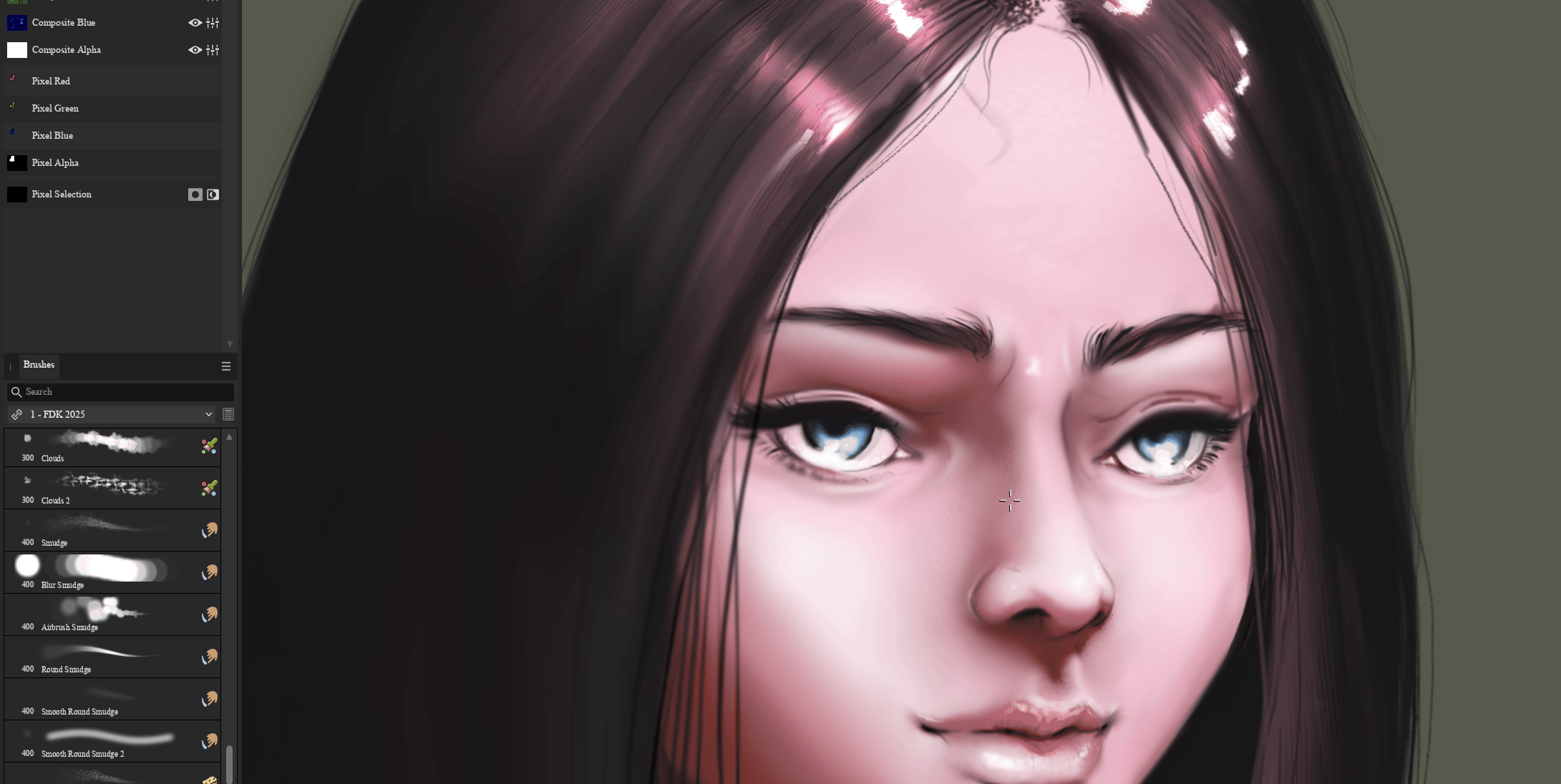
Yes, I resize it by tilting my tablet pen when brushing. Seems like a pretty normal thing you would want to do for certain brush effects.
-
As an artist, the new method is a lot better for blending and it has reduced a lot of the artefacts that came with the tool like how it broke the alpha with transparency artefacts on completely opaque layers. Still some issues as I have reported on previously, but a lot better compared to previously. Smudging now behaves more like Krita smudging, which has a really good smudging algorithm. All that being said, I can understand if someone would like to have the old behaviour back in some way, because the results can be very different. Personally I vastly prefer the results of the new smudging over the old one. The forced spacing is indeed weird however.
-
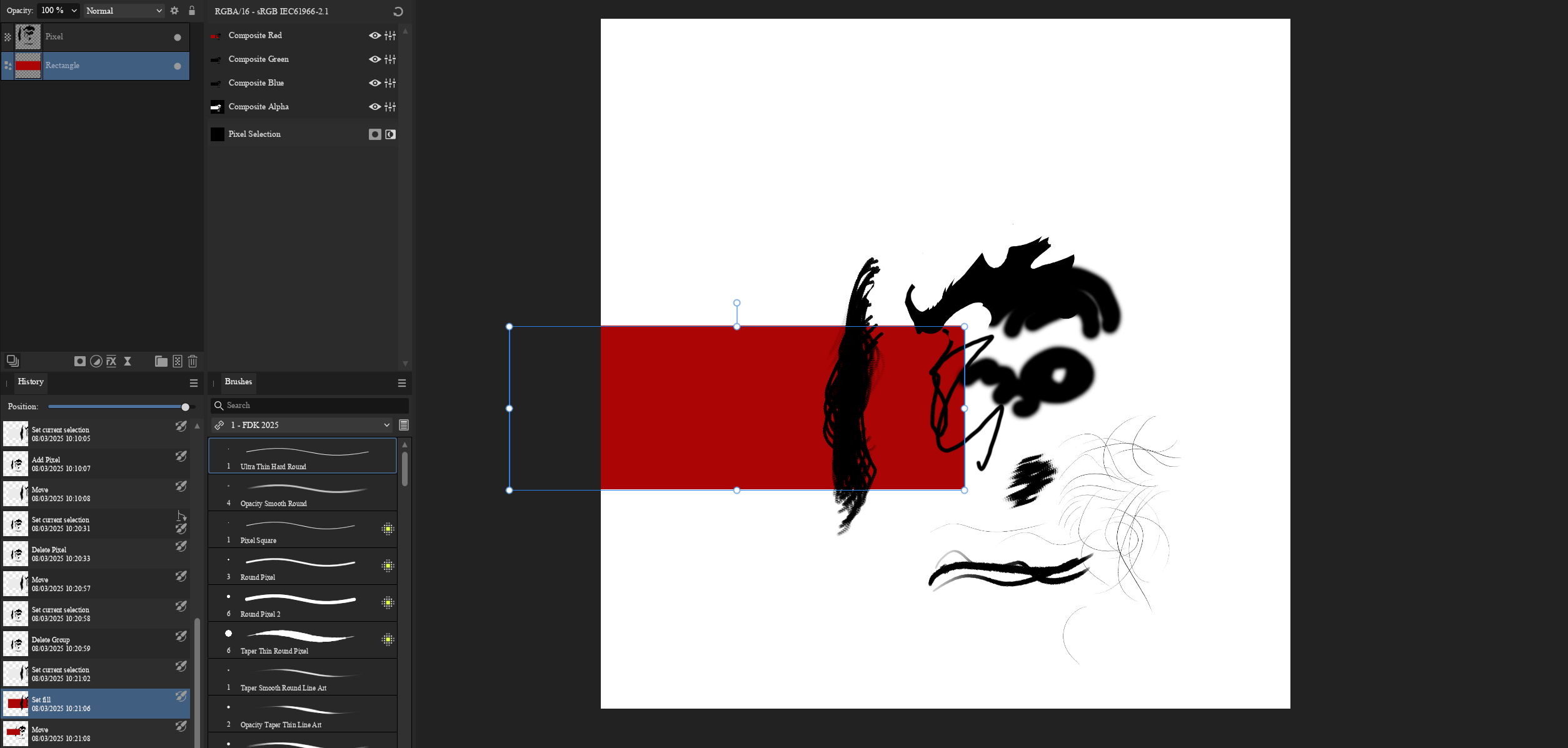
Here you go! Square Artefact Brushes.afbrushes
-
No worries! Anyway, I found a custom brush of mine called Round Smudge that produces squares in the smudge when I tilt my tablet pen to adjust the brush size.