bbrother
-
Posts
935 -
Joined
-
Last visited
1 Follower

-
 lacerto reacted to a post in a topic:
Affinity PHOTO export to .bmp *HELP*
lacerto reacted to a post in a topic:
Affinity PHOTO export to .bmp *HELP*
-
Max Mitty reacted to a post in a topic:
Affinity PHOTO export to .bmp *HELP*
-
matisso reacted to a post in a topic:
Affinity PHOTO export to .bmp *HELP*
-
matisso reacted to a post in a topic:
Affinity PHOTO export to .bmp *HELP*
-
Affinity PHOTO export to .bmp *HELP*
bbrother replied to Max Mitty's topic in Desktop Questions (macOS and Windows)
🤔 But why not? After all, it's users who shape the direction of tool development. Workarounds can be helpful — temporarily. But not everyone wants to install new apps, configure folders, or oversee automation processes. A native function means one click and you're done — no stress, no complications. No dependency on another process where something might fail. ➡ Affinity should strive for a simplified, reliable workflow that reflects real user expectations. Not every need should end with downloading yet another application — sometimes it’s enough for the developer to simply do what’s obvious. -
 bbrother reacted to a post in a topic:
Affinity PHOTO export to .bmp *HELP*
bbrother reacted to a post in a topic:
Affinity PHOTO export to .bmp *HELP*
-
Yep, it’s a limitation — and one that’s already been acknowledged and explained by staff. If I recall correctly, Patrick Connor (QA head) mentioned that the Export Persona uses pixels as its only unit and doesn’t support floating-point values, which is why slices can’t snap to guides. Guides in the document can use other units and allow sub-pixel precision, so there’s a mismatch between how guides behave and how slices are handled in Export Persona. Not ideal, but at least it’s a known constraint — and you can still use the Transform panel to set slice position and size precisely. Anyway, I think the more pressing gaps are elsewhere, where real workflows are affected
-
Max Mitty reacted to a post in a topic:
Affinity PHOTO export to .bmp *HELP*
-
 bbrother reacted to a post in a topic:
Affinity PHOTO export to .bmp *HELP*
bbrother reacted to a post in a topic:
Affinity PHOTO export to .bmp *HELP*
-
bbrother reacted to a post in a topic:
Affinity PHOTO export to .bmp *HELP*
-
bbrother reacted to a post in a topic:
Affinity PHOTO export to .bmp *HELP*
-
bbrother reacted to a post in a topic:
Affinity PHOTO export to .bmp *HELP*
-
bbrother reacted to a post in a topic:
Affinity PHOTO export to .bmp *HELP*
-
bbrother reacted to a post in a topic:
Affinity PHOTO export to .bmp *HELP*
-
bbrother reacted to a post in a topic:
Affinity PHOTO export to .bmp *HELP*
-
Affinity PHOTO export to .bmp *HELP*
bbrother replied to Max Mitty's topic in Desktop Questions (macOS and Windows)
Can’t argue that BMP isn’t glamorous and lacks modern features like compression or transparency. But some, who serve half-truths dressed as conclusions, should understand that it was never designed to be a champion — but to be simple, device-independent, and lossless. And in those areas, it still performs exceptionally well. BMP is still alive and used in specific workflows like embedded systems, bootloaders, medical imaging, and industrial interfaces. And despite more advanced formats replacing it in many areas, it still holds its place in industry-leading apps like Photoshop, Illustrator, CorelDRAW, and InDesign. Not every format needs mass adoption or use to be valid. Some exist because specific workflows demand them. When a user like @Max Mitty presents a clear, real-world need, the response shouldn’t be deflection. Suggesting that other apps should support more formats, while excusing Affinity for supporting fewer — now that’s one heck of an irony. The argument about “cost and effort” also falls flat. BMP is one of the simplest formats to implement, and with Canva’s resources now behind Serif, it’s hardly a technical challenge. Why BMP is low-cost and easy to implement: No compression — BMP stores raw pixel data, so there’s no need for complex encoding. Simple structure — just a header and pixel array, easy to read and write. No transparency or ICC profiles — fewer edge cases to test and maintain. Well-documented — decades of tooling and libraries available. Partial support already exists — Affinity handles BMP via clipboard and WMF. As already pointed out by @lacerto No need to support all variants — a basic 24-bit RGB BMP covers most use cases. Tools should adapt to workflows and demand — not the other way around. And when a format is still actively used and expected, omitting it is simply a functional blind spot. -
 bbrother reacted to a post in a topic:
Existing Slices Not Able to Export From an Imported Layer
bbrother reacted to a post in a topic:
Existing Slices Not Able to Export From an Imported Layer
-
Why Your Slice Template Exports Blank – And How to Fix It It looks like the slices in your template were created using the Layers panel in Export Persona. That method creates layer-linked slices, which only export content from the specific layer they were created from—even if other content is visible in the document. So when you paste in your new set of 24 sketches into the template, the existing slices don't recognize this new content, and your exports come out blank. This behavior matches exactly how slices from the Layers panel are designed to work, as stated in Affinity's documentation: ✅ My recommended solution To make this work as intended, you should recreate your slices using the Slice Tool instead. Slices made with the Slice Tool behave differently: Here’s a workflow you can use: Record your slice layout. From your existing template, jot down each slice’s position and size: X, Y, W, and H. Give each one a name and an index (e.g. “Sketch_01”, “Sketch_02”…), starting top-left and moving row-by-row. Recreate slices using the Slice Tool. Delete your old layer-based slices. Use the Slice Tool to manually recreate each slice. Input the exact coordinates and dimensions via the Transform panel in Export Persona (which allows precise control). ⚠️ Note: Unfortunately, the Slice Tool doesn't support snapping to guides or objects, which is why recording the position and size of your existing slices is crucial for accurate recreation. Once you’ve rebuilt the slices this way, any content you drop onto your template—regardless of layer—will be properly exported within those slice boundaries. Hope this helps you streamline your workflow!
-
matisso reacted to a post in a topic:
Corrupted .afpub file — urgent client project (Mac, Affinity Publisher)
-
A thoughtful alternative to a single proprietary binary blob could be a ZIP container housing modular JSON/XML files. Layers, objects, styles, and metadata can be stored as isolated files, with the container offering compression and checksums for data integrity. I think this approach is used by InDesign (.idml), Sketch (.sketch), and Word (.docx)—making recovery, validation, and fault isolation far easier. You know, binary formats are undeniably fast and compact, but also notoriously unforgiving. A tiny corruption, a write delay, a sync misfire—and suddenly, you're sweating bullets 😰, hunting backups and hoping you didn't lose all your hard work. I don't claim deep file-format expertise, but Serif had a real chance to modernize with Affinity. For software positioned as forward-thinking, adopting a more resilient structure might've spared users a few headaches.
-
Snapseed reacted to a post in a topic:
extremelly beginner-unfriendly software
-
Snapseed reacted to a post in a topic:
extremelly beginner-unfriendly software
-
kat reacted to a post in a topic:
selection tool closing unexpectedly
-
bbrother reacted to a post in a topic:
2.6.4 (3439) is available to beta test
-
That's a really valid point, and I'd like to hear the answer as well — not necessarily expecting a hard date, but some clarity would be appreciated. The Canva acquisition (and its added resources) raised expectations for faster development, but it seems existing complexities and the effort to refine core features may have slowed things down more than they thought. Some insight into what's causing the delay — ideally with a convincing explanation — would be welcome. If that leads to a more stable and polished 2.7, it's understandable. But keeping users in the dark isn’t the best way to sustain engagement.
-
matisso reacted to a post in a topic:
Corrupted .afpub file — urgent client project (Mac, Affinity Publisher)
-
Yup! I always try the “Document > Add Pages from File…” method first — it's pretty much my last lifeline when dealing with a corrupted .afpub file. It occasionally saves the day, but if the corruption is deep, even that won't help much. And while Affinity support might be able to recover it, it's never guaranteed. That said, it's worth noting that the .afpub format used by Affinity Publisher is binary, which inherently makes it more vulnerable to corruption. This is particularly true when working with external drives or syncing files through cloud services — just one corrupted byte is sometimes all it takes to put you in serious trouble. So seriously @GGA08, it's best to play it safe: Avoid when possible editing files directly from external drives or folders synced with cloud services — this is where most corruption risks hide. Make backups non-negotiable. Keep backups in multiple locations (especially local). Never fully trust Affinity’s file recovery — it might give you false hope and waste precious time. That bit of caution can save you from a whole lot of frustration.
-
selection tool closing unexpectedly
bbrother replied to kat's topic in Desktop Questions (macOS and Windows)
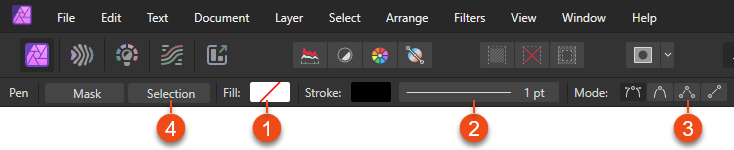
Hey! @kat Here's a clearer breakdown of how to use the Freehand Selection Tool, especially with Type: Polygonal: How to use: Select the Freehand Selection Tool from the Tools panel. In the context toolbar, set Type: Polygonal to create straight edge selections. Click to place each point, double-click or press Enter to close shape. Make sure Mode is set to New or Add — these are meant for starting fresh selections or add to existing one. Avoid starting new selection with Intersect or Subtract mode unless you're modifying an existing selection — in these modes, if no initial selection exist, the new one will simply not appear after confirming. If the selection is closing prematurely: You might be double-clicking or hitting Enter to early, which closes the path even if you're mid-way. Using Intersect or Subtract mode without any existing selection may result in no visible output after finishing — this can look like the selection disappears or "closes to soon". On large canvases or with heavy files, system lag might cause input errors. You can try save your changes, restarting the app or simplifying the document. Alternative Approach: If you're having problems with the Freehand Selection Tool set to Type: Polygonal, a solid alternative is the Pen Tool. It gives you precise control and can be used to create accurate polygonal selections. Here's how: Select the Pen Tool form the Tools panel. In the context toolbar: Disable fill (set to none). (1) Enable Stroke (any color, just for visibility). (2) Click to make the points and build your selection shape with straight lines. You can use the default Pen Mode to create straight lines — just click without dragging. Alternatively, you can switch the Pen Tool to Polygon Mode, which is streamlined for straight edges. (3) Once the shape is complete click the Selection button in the context toolbar to convert the path into an selection. (4) Hope this clears things up and brings a bit more clarity — sometimes straight-to-the-point answer goes further than a terminology checklist. Best of luck with your work! Visual guide: Pen Tool Settings in Context Toolbar↓
-
Style picker doesn’t apply text styles
bbrother replied to Catshill's topic in Desktop Questions (macOS and Windows)
Mine samples and applies styles like a charm — unless yours is just shy. → Check out the demo. Not at all, Mike. Just use quadruple click and the paragraph will be selected along with the paragraph break mark. DEMO: Style Picker: Sampling AND Applying? 🤯 Yup — just in case someone’s still unsure.↓ Style Picker.mp4 -
Style picker doesn’t apply text styles
bbrother replied to Catshill's topic in Desktop Questions (macOS and Windows)
R C-R, your confidence is unmatched — but unfortunately, so is your misunderstanding of how Style Picker works. It does sample paragraph and character styles — the documentation says that verbatim: Also, in the Settings section: Character Settings—when selected, the currently loaded character styles and local formatting will be applied to text ranges you interact with. Paragraph Settings—when selected, the currently loaded paragraph styles will be applied to text ranges you interact with. So, Yes Style Picker does apply named paragraph and character styles — provided the corresponding settings are enabled and full paragraph (including the break) is selected. Key facts about this tool: It’s not a clone-paste tool, but a sampler and applier. It loads paragraph style, character style (also named) and any local formatting applied at the precise character that is clicked. It applies paragraph style, character style (also named) and any local formatting to selected text To apply named paragraph style you need not only be sure about two things: Appropriate setting is checked in context toolbar The full paragraph (including the break) is selected. You're misinterpreted both terminology and tool behavior, which could mislead others. @MikeTO, great reply — the “trick” you mentioned is the key, but allow me a nerdy tweak: Style Picker doesn’t “copy” styles per se — it “samples” them. Just semantics, but could save someone from assuming they’ll get duplicate styles. @Catshill You might want to update your thread title to: “Style Picker doesn’t apply text styles” That’s closer to the issue, and more useful to others scanning the forum for style quirks. -
Calling it 'indoctrination' when people have spent decades working with the only real industry standard sounds weak. For years, there were no viable alternatives, so people built skills within the ecosystem that dominated the industry. Exploring other tools now is not a sign of past blindness, but present-day openness.
-
Just to let you know, if you’re not happy with your purchase and you bought directly from Serif, you can request a full refund within 14 days of receiving the product. Simply email affinityreturns@serif.com. Otherwise, check the refund policy of the store you bought from.
-
Can’t argue with that — when shortcut labels get patched and Contour Tool remains broken, ROI starts feeling more like Return on Inconvenience. If v3 lands before those tools are fixed, it’ll just be legacy bugs in a new UI suit. @Patrick Connor I appreciate the effort put into patch 2.6.4 — and I genuinely mean that. Still, when trivial fixes land into the patch while core features remain broken for an extended period, it feels misaligned. Hopefully things can get back on track. Perhaps with the help of new blood in the dev team.
-
Publisher 2.6.3 - Book PDF Export won't add blank pages
bbrother replied to YMot's topic in V2 Bugs found on Windows
Hi and welcome to the forum! @YMot. Just letting you know I ran some tests to verify what you described: 🧪 My test setup Created a Book file with 4 chapters: Chapters 1, 2, and 4 each have 6 pages (even) Chapter 3 has 5 pages (odd), to trigger a padding case All chapters use Facing Pages and Start on Right System: Windows 11 Pro 24H2 App: Affinity Publisher 2.6.3 (MSI EXE build, not MSIX) 🔍 What I observed Export as All Chapters as Pages ❌ No blank pages were generated. Even with “Merge Where Possible” and “Pad” turned on under the book’s Stray Pages options Export as All Chapters (Spreads) ✅ Blank pages were added correctly ➤ For example, two empty pages were inserted after Chapter 2 so that Chapter 3 could start on a right-hand page 🧩 Is this a bug? I'd agree with your take — since Pad and Merge are Book-level behaviors, as for me they should apply regardless of whether the export is set to Pages or Spreads. And again, great catch! 👍 -
The Quick FX panel in Affinity Designer is basically used to apply effects using a simplified set of the most commonly used settings for specific effects, rather than the full range available in the main Layer Effects panel. ⚠️Note: I might be wrong but in Affinity Photo and Publisher Quick FX panel is hidden by default—you can enable it via: Window > Quick FX For a basic overview of the Quick FX panel, see: Quick FX panel↓ https://affinity.help/designer2/English.lproj/index.html?page=pages/Panels/layerFxPanel.html&title=Quick%20FX%20panel For more in-depth guidance on how to use and customize effects, including explanations of each setting, check: Using layer effects↓ https://affinity.help/designer2/English.lproj/index.html?page=pages/LayerFX/create_layerFX.html&title=Using%20layer%20effects Below are direct links to individual effect pages: 3D Effect → https://affinity.help/designer2/English.lproj/index.html?page=pages/LayerFX/layerFX_3D.html&title=3D%20Effect Bevel / Emboss → https://affinity.help/designer2/English.lproj/index.html?page=pages/LayerFX/layerFX_bevelEmboss.html&title=Bevel/Emboss Colour Overlay → https://affinity.help/designer2/English.lproj/index.html?page=pages/LayerFX/layerFX_clrOverlay.html&title=Colour%20Overlay Gaussian Blur → https://affinity.help/designer2/English.lproj/index.html?page=pages/LayerFX/layerFX_gaussianBlur.html&title=Gaussian%20Blur Gradient Overlay → https://affinity.help/designer2/English.lproj/index.html?page=pages/LayerFX/layerFX_gradientOverlay.html&title=Gradient%20Overlay Inner Glow → https://affinity.help/designer2/English.lproj/index.html?page=pages/LayerFX/layerFX_innerGlow.html&title=Inner%20Glow Inner Shadow → https://affinity.help/designer2/English.lproj/index.html?page=pages/LayerFX/layerFX_innerShadow.html&title=Inner%20Shadow Outer Glow → https://affinity.help/designer2/English.lproj/index.html?page=pages/LayerFX/layerFX_outerGlow.html&title=Outer%20Glow Outer Shadow → https://affinity.help/designer2/English.lproj/index.html?page=pages/LayerFX/layerFX_outerShadow.html&title=Outer%20Shadow Outline → https://affinity.help/designer2/English.lproj/index.html?page=pages/LayerFX/layerFX_outline.html&title=Outline Hopefully this gives you a useful starting point — and leads to a few more insights along the way. Good luck.
- 1 reply
-
- 1
-