bbrother
-
Posts
529 -
Joined
-
Last visited
Everything posted by bbrother
-
App version: APub 2.4.2 OS: Windows 10 PRO 22H2 Create Drop Caps. Assign a character style to them using the Style drop-down list. Make some visible changes in the assigned character style. The Drop Caps won't change. The only way to update them to reflect the changes made is to deselect the character style and select it again. Whats's expected: While you make changes in the character style they should be reflected live in Drop Caps, as with paragraph styles, or at least after committing them. This bug is very similar to AF-1012 which affects bulleted and numbered lists.
-
Complex construction with initial words
bbrother replied to anto's topic in Affinity on Desktop Questions (macOS and Windows)
@anto Your construction uses two character styles, so I'm sorry but this is not possible. The "Initial Words feature" allows you to use only one character style to style a specific number of initial words. Additionally, it allows you to specify which characters can be used to automatically end the initial word formatting. And if the formatting ends at these characters, it cannot be resumed again. I wrote as clearly as I could. What you want to achieve requires GREP styles. -
Hi @Dezzallier welcome to the forum, great that you joined. As for your question. Publishers often ask to convert fonts to curves if they request files in graphics program formats such as Illustrator (.ai files) or Indesign (.indd files). Why are they doing this? Because the fonts used are not saved in these files, which may result in missing fonts and replacing them with other, basic ones. When sending a file in PDF format, there is no need to convert fonts to curves because all fonts can be embedded in this format, but many publishers ask you to convert them anyway. For this reason, it would be best if you asked the publisher you want to print from what their requirements are when it comes to preparing the file for printing to avoid misunderstandings and frustration on both sides. Personally, I send files for printing with fonts converted to curves because that's what my publisher wants. I hope this cleared up your doubts a bit. Regards.
-
I've been using APub (Affinity Publisher) for a few years now and haven't gotten around to this concept where paragraph and character styles are throwed into one bag. And I really tried not to be prejudiced against this solution and to give it a chance. This simply doesn't work and is not very convenient. And I really tried not to be prejudiced against this solution and to give it a chance. This simply doesn't work and is not very convenient. In addition to all this, there is forced sorting by name alphabetically. It's not good to work like this, especially in bigger projects.
-
Align and Geometry Dialog as Panel
bbrother replied to jaxfh's topic in Feedback for the Affinity V2 Suite of Products
@jaxfh, As for the floating panel for alignment operations, such a request has already been made. So you can share your opinion on this subject in the post linked below. -
Paragraph/Character panel issues
bbrother replied to MikeTO's topic in Other New Bugs and Issues in the Betas
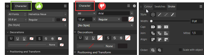
I agree @mikeTO. The changes in version 2.5, as you can see in the attached screenshot you attached, are a step back in terms of usability and appearance versus 2.4. This must be changed. It cannot be that some of the control elements are too wide and some are too narrow, causing the names to be truncated. -
I'm not sure, and I don't think this is exclusive to beta 2.5, but if you've started making UI changes and dealing with inconsistencies, I'd like to draw your attention to the fact that the shape of the active tab in panel groups is different between macOS and Windows. In macOS (first from the left in the screenshot) it has a rectangular shape, while in Windows (second from the left) it is a rectangle with the left and right edges tilted inward. In my opinion, it looks better in the macOS version (first from left). The human eye prefers simple geometric shapes because they produce less visual noise. Also it's better for the user when clicking areas are simple shaped. In this respect, it would be worth adapting the Windows version to the macOS version. In the Windows version, the inconsistencies go a little further, as can be seen (third from left on screenshot above) when comparing the shape of the selected tab with the shape of inactive tabs in the hover state. Selected and active have tilted edges, and unselected ones on hover are straight edges rects. What's also bad is that the active/selected state and the hover state, share the same background color. These are two different states and should have slightly different colors. Someone must have slept through the UI basics lesson. I hope that there will be room for corrections in the above-mentioned issues in this beta cycle.😉

-
Unfortunately, nothing has changed and this functionality (split/span columns) is still not available
-
@Callum, can I ask you a favor? Could you please add an bug tag containing a reference number to this post. This will help us track when the issue is fixed. Thank you for logging this issue.
-
APub 2.4.2 Windows PRO 22H2 Something strange happens when the first page has guides from master page and you add more pages in the document Create a new document. Add guides to the Master A page. Make sure the Master A page is aplied to the first page of the document. Add more pages. The problem: After pages being added horizontal guides coming from the master are rendered on the pasteboard on the left next to the first document page, despite there is no page in this place (see attached video↓) Please fix these quirks as they degrade the user experience⚠️ APub_master_pages_guides_quirk.mp4
-
Ahh, you're right @MikeTo, at first glance I didn't notice that the close panel icon was on the left, so it's a macOS screenshot. However, the "Update Paragraph Style" button should still not be placed above the dropdown button, but next to it on the right😉 Placing it above, is an example how not to do the UI/UX.
-
First thing @MikeTO The "Paragraph Style" drop-down list, you're refering to is simply a list of options that appears when you click a button, not a combo box. You can talk about a combo box, when you're dealing with a combination of a standard list box or drop-down list and an editable text box that allows users to enter a value that is not in the list, which is not the case in the example you're refering to. Second thing: The "Update Paragraph Style" button should not be placed above the button used to reveal the drop-down list, but next to it, as in the contextual toolbar. The clickable area of a drop-down button should be protected and accessible only to that button. Otherwise, you'll run into the problems you mentioned above, such as a situation where the user accidentally updates a paragraph style even though his intention was to reveal the drop-down list, all because of a click on the right corner, what is usualy reflexively done in case of drop-down buttons. @Patrick Connor Could you please bring this issue to the attention of the person(s) responsible for the UI design? BTW, nice to see you're finally trying to improve the UI. I missed it. On the contrary, UI has a huge impact on the user experience and therefore helps companies achieve their financial goals by simply focusing on user needs. The interface should be designed with particular care, even down to the smallest details. The app should look good and be user-friendly. Without the right balance between UI and UX, you can say goodbye to potential users and wave them away as they retreat and try to find something else. Rule #1 - “Focus on the user and everything else will follow.”
-
Your view coincides with mine, so there are at least two of us now.😉 Whether and when this will be implemented depends on how much this feature is desired. You are the first to notice this, so answer this question yourself. Generally, regular expressions in the Find and Replace panel are an underestimated function, so it is hard to expect that improving it for tables will be a priority. I know it will be much less pleasant without the ^ token, but you can still fix those unwanted spaces, you just need to use a different strategy, e.g. you can try to target BAD|Bad| BAI| BAE preceded by \s using a pattern like [\s([A-E]{3})] with [Match case] option unchecked. Do not give up @jamakasi The time you spend on finding the right pattern will not be wasted, you will learn more about regular expressions, which will bear fruit in the future💪. Good luck dealing with those unwanted spaces in text, @jamakaschi.
-
Certainly, many of the issues described here are already known to management and development teams. However, testing for known issues, even obvious ones, is also important because it helps them analyze the impact of these issues on the overall customer experience. So keep testing and share your feedback, even the obvious ones. They certainly don't take them lightly😉
-
@stokerg For me it also doesn't refresh automatically after I drop the file. It is necessary to interact with the panel to force a refresh. I checked using PNGs and SVGs. This happens with every file. So @stokerg it's possible that this is a problem for a larger group of users, but you don't see it in the reports, because perhaps not everyone will report that it also applies to them.
-
This is so disappointing
bbrother replied to RNKLN's topic in Feedback for the Affinity V2 Suite of Products
I don't always agree with you, but that's probably the case. There is no reason to be disappointed. This is a bit of an exaggeration. On the contrary, the reorganization of the beta forum is a sign that a new beta version 2.5 should soon see the daylight. -
Apub indent TOC?
bbrother replied to kat's topic in Affinity on Desktop Questions (macOS and Windows)
@kat This is not a top menu but context toolbar for text frame. The context toolbar always updates to show the options available for the currently selected tool. This button (marked in red rect in above screenshot) is used to update paragraph style. When you make some changes (overrides) in paragraph it is used to update the paragraph style to include those changes. The mere fact that it is not dimmed, i.e. disabled, means that there are some overrides in the paragraph. Am I right @MikeTO, or maybe I mixed something up? That's right, you nailed it in the first reply post👍.
-
Hi @jakamaschi, welcome to the forum. Nice of you to join.🙂. Indeed, it does not work as it should and I will clarify a bit, it is caused by an incorrect decision regarding the way of comparing the content of the table (text) with the regular expression pattern, namely treating it as a whole as if we were dealing with one text frame. Hence in case of ^ token we have unexpected results and begining of text in cells is not always recognized as beginning of a line. Why does it work this way with tables? I don't know, you'd have to ask the developer(s) who implemented it. @DWright Can you ask someone who has implemented this why regular expressions are processed this way for a table? @jamakaschi The solution to the problem you briefly described would be to treat each cell separately as an independent text frame, and compare those frames text one by one against regex pattern and show the results in Find and Replace results list. Screenshot of results for [^\s([A-Z])]↓(click to enlarge)
-
Affinity breaks lines before tabs instead of after
bbrother replied to MikeTO's topic in V2 Bugs found on macOS
I agree, it doesn't look very nice whether the text or "Tab stop leader character" almost touches the page numbers. -
Apub indent TOC?
bbrother replied to kat's topic in Affinity on Desktop Questions (macOS and Windows)
@kat Paragraph → Decorations as the name suggests, this is used to create decorations (left, top, right, bottom borders and fill), usualy to differentiate text blocks. It is great for, when you want the apperance of a "pull qoute', or for coloured heading fill or underline. But it is not used, nor it can't to outdent punctuation characters like *. Making punctuation marks like * outdented, what you're asking for, i think it's is called by pro typesetters a "Hanging punctuation" or "Exdentation". It's a microtypographic technique of typesetting punctuation marks and bullet points, most commonly quotation marks and hyphens, further towards the edge so that they do not disrupt the ‘flow’ of a body of text or ‘break’ the margin of alignment. It is so called because the punctuation appears to hang in the margin of the text and is not incorporated into the block or column of text. That will be all when it comes to the theory. In my opinion, "Hanging Punctuation" is best used when the text frame is fully with text, when there is no room to breathe between words (example bellow↓) But I'm curious why you would want to use it for TOC? like you suggested earlier in this thread. In APub it's quite a simple matter to make hanging punctuation. This is typically done at the text style level (without manually selecting the character itself) in the Character → Optical Alignment section. You can also do this at the character level (apply alignment to selected characters rather than to text style) by using the Character panel instead. The whole procedure is simple: In the Character → Optical Alignment section, change Type to 'Manual'. This invokes all the listed alignment rule presets, plus any added custom optical alignment rules. Click "Add" to add a new rule. Edit the rule. Left — is used for the percentage of the character to be outdented at paragraph's Left Indent or tab stop. Right — is used for the percentage of the character to be outdented at paragraph's right Indent or tab stop. 100% means the whole character's width will be outdented Characters — The character to be optically aligned. The character you type in your paragraph that matches this character will be automatically aligned. I hope this helps you a bit with the topic of outdenting *. BTW @kat, I'm not a professional typesetter, I am a ful stack web-dev that likes to learn new things.😄 -
Apub indent TOC?
bbrother replied to kat's topic in Affinity on Desktop Questions (macOS and Windows)
@kat If you're asking whether it's possible to have a negative value in the [First Line Indent] field in the spacing section of the "Paragraph" panel, then no. APub does not allow negative values in this field. If you enter a negative value, it will be automatically corrected to 0p if you use picas or 0mm if you use milimeters as document units. The equivalent for what you have on your screenshot (InDesign) in APub will be↓ -
It's placed with white background because the only thing you currently can't do is placing the JPG file directly on canvas in Affinity apps either using the: File → Place command, dragging it to the canvas from Finder (Mac) or Explorer (Win), or using the Place Tool and keep the clipping paths. No, you didn't miss anything, because there is no such option. If you open the jpg directly via File → Open in APub the path(s) will be there as vector masks. What you need to do is just select the main layer with nested vector masks included and copy to another document if you want/need. Check out he video below↓ APub_place_jpg_with_path.mp4 I hope I have shed some light on this matter for you @Martin511 BTW, I agree with your reasoning. If it is possible to open and save JPG files with clipping paths, it should also be possible to select such a path when placing a photo via the Place tool.
-
If you would like each newly created text frame to remain [No style] for character and paragraph, despite changes made to the previous one. If that's what you're thinking, there is no such setting or possibility. I'ts a nightmare for me to. That's not how it should work by default. Yes. I think the same. The user shouldn't be forced to drag text frames from the "Resources" panel just to ensure that the default text style in a newly created frame wouldn't change and stay's how he wants. This is crazy In APub we have a confusion of the role they have to play, the text frame, the text styles, and object styles.
- 8 replies
-
- 3
-

-

-

-
- affinity publisher
- windows11
- (and 1 more)
-
Good point @Frozen Death Knight, but I would still prefer to manage symbols from the "Symbols" panel, which has the advantage over the "Assets" panel of having options like create, detach, and sync. Adding the ability to create libraries in this panel and making it global would make it a complete one place to manage and create symbols. I edited that point in the list to be more precise. Thx to bringing it up to my attention @Frozen Death knight👍
-
Affinity Pub TOC page hyperlinks
bbrother replied to kat's topic in Affinity on Desktop Questions (macOS and Windows)
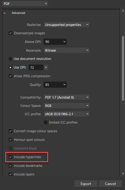
@kat I will add from my side that you can find the "Include hyperlinks" checkbox in the "Advanced" section in the PDF export options. ----------------- P.S @walt.farrell @MikeTO thx for the explanation why the TOC hyperlinks are not listed in the "Hyperlinks" panel.
- 10 replies
-
- 2
-
-
- affinity publisher 2
- page hyperlinks
- (and 1 more)