ronnyb
-
Posts
2,680 -
Joined


-
 matisso reacted to a post in a topic:
Please NO MORE NEW FEATURES!
matisso reacted to a post in a topic:
Please NO MORE NEW FEATURES!
-
ronnyb reacted to a post in a topic:
2.6.4 (3439) is available to beta test
-
Ian R reacted to a post in a topic:
mm rulers in Affinity are not designed for humans
-
ronnyb reacted to a post in a topic:
Too quiet …
-
ronnyb reacted to a post in a topic:
Too quiet …
-
ronnyb reacted to a post in a topic:
Too quiet …
-
ronnyb reacted to a post in a topic:
Too quiet …
-
ronnyb reacted to a post in a topic:
Too quiet …
-
ronnyb reacted to a post in a topic:
Too quiet …
-
 ONEBYSTUDIO reacted to a post in a topic:
mm rulers in Affinity are not designed for humans
ONEBYSTUDIO reacted to a post in a topic:
mm rulers in Affinity are not designed for humans
-
Westerwälder reacted to a post in a topic:
mm rulers in Affinity are not designed for humans
-

mm rulers in Affinity are not designed for humans
ronnyb replied to Blake_S's topic in V2 Bugs found on Windows
Unfortunately this seems to be the Affinity way… just get half baked features out, and move on to the next set of half baked features. The basic rendering engine is still broken, so don’t hold your breath… unfortunately Affinity does not deliver on their stated promises after YEARS of bug reports. i was hoping the Canva acquisition would help but it hasn’t… sigh………… -
ronnyb reacted to a post in a topic:
mm rulers in Affinity are not designed for humans
-
ronnyb reacted to a post in a topic:
Liquid Glass style icons
-
ronnyb reacted to a post in a topic:
[V2 Affinity Suite] Request: New Dynamic Color Palette Generation Feature
-
PaoloT reacted to a post in a topic:
The 2 “iceberg” issues surrounding Affinity 3
-
1. Bugs, bugs, bugs… the low-level bugs related to the rendering engine still exist. This is a major problem, for an allegedly “professional” visual design suite… 2. The User Interface. It’s soooooo dated it feels like one is running a windoze app from 2001. Look at any OS-native app’s UI and it’s clear; and compared to the Liquid Glass UI Apple announced yesterday, Affinity UI feels like an ancient relic…. Seriously Affinity, leave the UI to the operating system developers, and instead focus on resolving bugs and adding features, areas where your expertise is desperately needed. Quit trying to make a custom UI. Apple and Microsoft have much more brainpower dedicated to this specific area.….
-
matisso reacted to a post in a topic:
Bugs across Affinity Suite
-
You can make a “Book” which compiles all your separate catalogues (each being a separate Publisher file) into a master document “Book”. I believe you can set up Master pages in any document and drag and drop them to any other document. You can use the Assets panel to store, organize and use design elements across documents You can use global colors in the “Book” Publisher document to standardize palette across your other documents. Set up your Character and Paragraph styles for consistent fonts and typography. Hope that helps!
-
copy and paste - IpadOS -> macOS
ronnyb replied to HugoIII's topic in Feedback for the Affinity V2 Suite of Products
macOS and iPadOS support this using iCloud…. Affinity needs to support it…. -
David Soeiro reacted to a post in a topic:
Please NO MORE NEW FEATURES!
-
matisso reacted to a post in a topic:
Please NO MORE NEW FEATURES!
-
Iltirtar reacted to a post in a topic:
Please NO MORE NEW FEATURES!
-
Make high contrast consistent
ronnyb replied to paleolith's topic in Feedback for the Affinity V2 Suite of Products
The entire UI is a flashback to 2001.... -
Bound by Beans reacted to a post in a topic:
Make high contrast consistent
-
macOS Photo — Copy Merged command broken
ronnyb replied to ronnyb's topic in Other New Bugs and Issues in the Betas
No need to send file, I figured it out. So it's bc it's a 32/bit file. I realized when I saved the original RAW file (24MB) as an APhoto file it ballooned to 567MB! I figured Messages couldn't handle the size and/or 32bit data, so I tried converting the file to 8 bit before Copy Merged and then I was able to Paste in Messages... -
macOS Photo — Copy Merged command broken
ronnyb replied to ronnyb's topic in Other New Bugs and Issues in the Betas
Well, for me Pasting doesn't work in Safari nor Messages, but Preview is able to make a New File from Clipboard... it's a not a terribly large file...
-
macOS Photo — Copy Merged command broken
ronnyb replied to ronnyb's topic in Other New Bugs and Issues in the Betas
Sorry if my post was unclear; I DIDN'T use the File → Share → Messages command, I used Edit → Copy Merged followed by Edit → Paste in Messages app -
Latest beta RC3 of Photo doesn't share send the "Copy and Merged" clipboard to Messages.... The Paste command does work within Photo, but nothing happens when Pasting the clipboard in Messages app
-
macOS - Photo - Develop Persona issues
ronnyb replied to ronnyb's topic in Other New Bugs and Issues in the Betas
@Chris B This is still broken in the last beta; now the window pops up on the lower left of the screen, totally in the wrong location.... -
Verified fixed. Awesome great job!
-
There are reasons NOT to use the following method, but you could apply a gradient to the Stroke of your object and using overlapping color stops along the gradient, create the effect your original post’s title asks… Nailing the angle of the (linear?) gradient in the right direction seems the only critical part of the process…
-
When using the Cmd + shortcut to zoom in on an object, AD doesn't center the view on the selected object, which would be useful for obvious reasons.
-
macOS - Photo - Develop Persona issues
ronnyb replied to ronnyb's topic in Other New Bugs and Issues in the Betas
Yes using an external display, it does not bleed into the adjacent display I don't think so @Chris B The controls belong underneath the appropriate category title, not under the Presets title/category, which inherently does not have controls. This is BASIC UI logic.... Lens Profile category belongs beneath the manual controls. Thanks for your time and efforts, @Chris B -
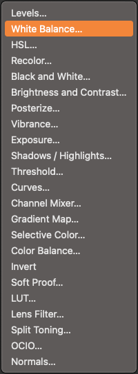
How about adding some kind of logical order to these, perhaps simple alphabetical order? Right now it's just random, non-sensical order... this sucks for workflow/productivity, i've reported it years ago... you have to hunt through a long list of items. Really alphabetical order is not that hard to implement... I REALLY hope you guys get a real UI/UX person in there... there are so many bad decisions being made all over the place, it's pathetic.