Search the Community
Showing results for tags 'affinity designer'.
-
 Since updating to 2.1, whenever I create a new artboard in a linked (non-embedded) file, all linked items in my working file are broken with Designer: Instead of showing the linked artboard, I have the linked file preview for each linked item in my artboard file. (the linked file has multiple artboards). Appears each time I reopen the working file, not during the edit process. So the "working" solution for me is to open the document in Photo, manually update the linked file with the resource manager, save it and open it with Designer in order to get the correct rendering of each linked element. Looks like a bug with the Designer Resource Manager as it should update automatically if there are any changes.
 -
Hi Im new here but i wish to share my latest artwork and also I have a question about data entry, how to keep letters and numer horizontally around circle? Many thank

- 1 reply
-
- 9
-

-

-
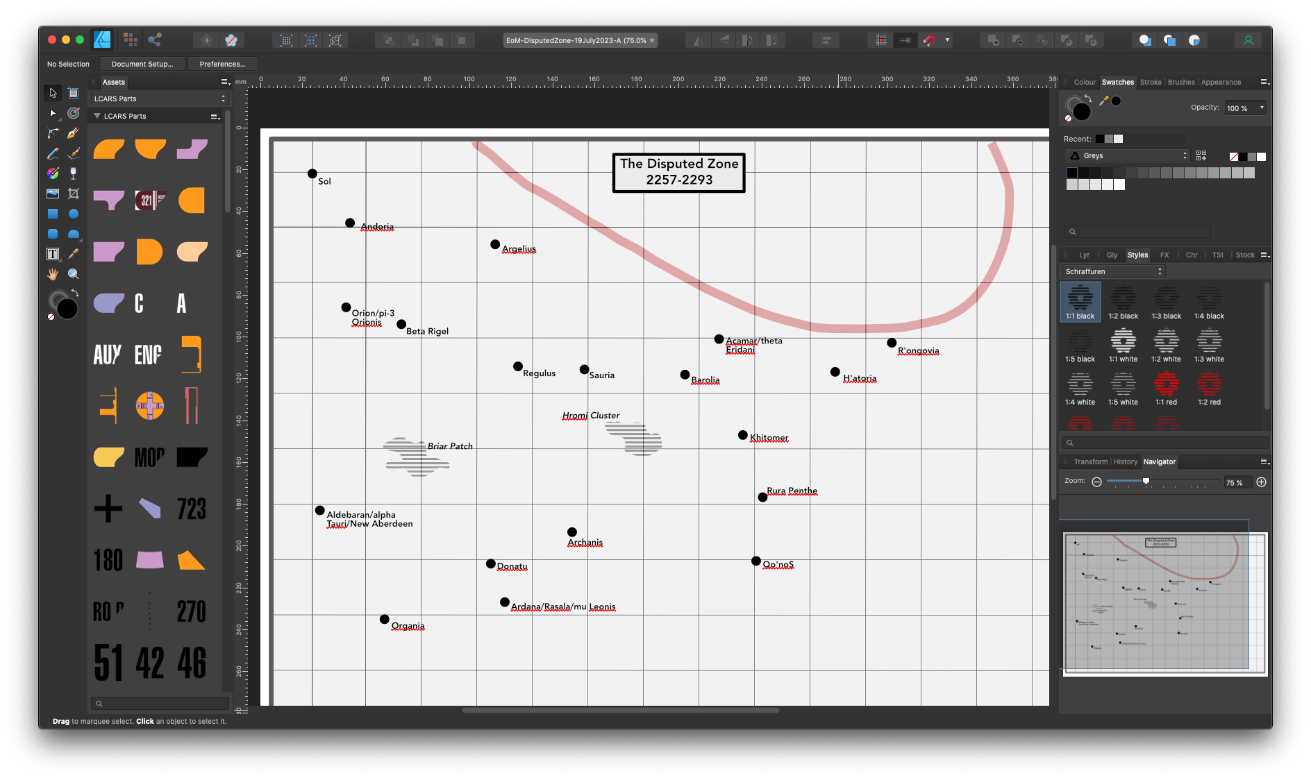
I'm working up a historical starmap for a fan fiction project, with data adapted from Star Trek, and stylistic cues from the old Dent's Canadian/School Atlas' front half material, which was usually produced in black and white with usage of tones and/or spot colours. This is intended to be ink-usage-friendly for other fans' purposes. I expect to creative derivative works devoted to marking systems particularly notable for "key" resources specific to that mythology, and possibly other spin-offs as well. I'm working in Affinity Designer 1.10.6 because that's as far as my hardware and budget will currently allow. I guess I'm looking for additional "tone"/"Style" resources that may be particularly useful for this project. If you have any recommendations...?
-
A few days ago I made a rather silly picture I titled The perils of poorly-maintained Gents' lavatories (that's men's public restrooms in American). And then I thought I could animate this! There's nothing on view that actually requires censoring, I should point out. The moving parts are all on separate layers, so each one transfers to a layer in MoviePlus X6. (MoviePlus: still doing the business, and more intuitive to use than a lot of other video editors 🙂) I recorded the sound effects in the kitchen on my iPhone; the little bit of speech will be recognisable to Goon Show fans.
- 2 replies
-
- 4
-
-

-
- designer
- serif movieplus x6
- (and 1 more)
-
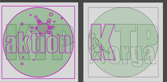
 Hi, I'm not exactly new to the software but I'm delving into some more complex topics as I keep using it for random stuff. For a simple illustration project, I'm trying to merge the shapes of a character's body while avoiding using destructive operations. What I'd love to achieve is to use a compound shape (made using Alt + boolean Add operation) as a clipping mask for some inner shapes. See the attached example for what I'm trying to achieve (with a very simplified character) and the tests I have made so far. From what I gather I have three options: Use a compound path. This will unfortunately break clipping functionality, and the clipped shapes will get lost inside the original containing shape (Body in teh example). If I move them to the root of the compound the simply become part of the compound itself. Make a compound path, group the inner shapes, then use a copy of the compound path as a compound mask for the grouped inner shapes. This works(ish) but messes with rendering and the inner shape with the gaussian blur FX will exhibit some color banding. Not sure it's noticeable in the example picture, but it definitely is there. This option is kind of a chore to maintain as well, as I'd have to make changes to both the compound path and the mask. It also makes a mess in the level hierarchy. (Note: the color banding seems to be caused by the pass-through rendering mode of the group. I could bypass this by not using a group, and just duplicate the compound yet again to make a mask for each inner shape, but that makes it even harder to maintain) Simply boolean add the shapes. This is visually what I'd like to achieve, but it's a destructive operation. I would need to keep a non-merged copy in case I need to move or redo the ears, for example. Maintaining both copies synced would be a major pain and simply not a good workflow. I'd like to just use the first option, since it's simple and non-destructive, to achieve the visual result of the third option, but I can't get it to work that way. Is it not possible for compound paths to act as clipping masks as well? What other options are there that I'm missing?
-
 Hi, I exchange documents from Designer via PDF. There are two cases: a) Export for going directly to the printer. In this case there is no doubt: I choose the Export (for print) option. b) Export for reuse in InDesign, and be sure to have a copy that someone else can read in Illustrator. In this latter case I'm in doubt: would Export (for exchange) be the better choice? I would suspect this would work perfectly fine with InDesign (so it seems), and at the same time preserve most of the original situation when opening into another program for editing. How is it? Paolo
 -
 I'm not doing something right, it's maybe a bug or a preference I need to activate, but when I make a background on Affinity Designer with Bleed, it does export fine to a Print Format showing the bleed area, but when directly imported the Designer File to Affinity Publisher, it imports it trimmed to the page format and disregards the bleed area. Anything else I can do differently to fix this? I'm on V2. Thank you so much in advance.
 -
About The Box Set is hundreds of vector and raster brushes made for Affinity Photo & Designer. Each brush was handmade using real materials scanned at high resolutions and crafted to simulate real media. I wanted the origin of the brushes to have a heritage of the materials they are simulating. Scanning pools of watercolor, swatches of paint, and stipples of charcoal contributed to creating brushes with the same idiosyncratic material magic. My only request is that you take these brushes, with their clever names, as suggestions. They work superbly out of the box, but I strongly encourage you to adjust the sliders, rearrange or remove the textures, and discover how they can suit your hand(s). Make. Discover. Repeat. Cheers and happy art making, -Jef (WREN) RASTER BRUSHES For use in Affinity Photo and Designer. The blending brush in the Oil Set is the only one exclusive to Affinity Photo. DRAFTING INK OIL Oil Brush Dynamics Most oil brushes have blending built into pen pressure. With a single brush and hue you can adjust the luminosity of the stroke- giving it an oily blend. The Brush's color in the example above is the color of the background. A normal pressure gives you the hue without any lightening or darkening. WATERCOLOR ACRYLIC VECTOR BRUSHES For use with Affinity Designer Only. Pen & Ink Charcoal & Graphite Sumi-E Painterly Drips Handlettering LINKS The Box Set
- 209 replies
-
- 21
-
-
-
- affinity designer
- resources
- (and 4 more)
-
 Hi, I need to create a document with multiple 32x32px artboards in designer. I can't for the life of my find that setting where you can specify how many artboards. I don't wanna create 100 artboards, one at a time 🤨. Does anyone know where it is?
 -
 Something like Expression had decades ago or Xara . A brush constructed from selected group of objects with option to deform them along the brush vector and alternate , or just scatter with random offset. That text along a path option is so much of a pain.
 -
 What I'm thinking of is an alternative to the classic layers: a node editor, where each layer would now be a node, with a mask and before input, so that you can reuse layer groups. What I'm thinking of: Each node has inputs and outputs depending on the type (example blur: input=image, radius form=type, radius, output=image) Creating groups and naming them storing created groups as global templates (like macros, but as components that can be stored) adding custom inputs to groups with custom labels maybe sharing groups online? (like as a marketplace for quick templates) As an orientation for how it would work, I would like something like Blender 3Ds node editor. As for how it's integrated into the UI, either it's a separate editor that you need to toggle on/off on a per-project basis, or it's a layer (like a node layer or something) that then opens a UI
- 1 reply
-
- 1
-
-
- affinity photo
- affinity designer
- (and 7 more)
-
 In Affinity Persona, on my Mac, I can hold Control while using the vector brush to force a straight line. In Pixel Persona (or in Photo), I can't do that. I can only hold the Shift key to force the line vertical or horizontal. It'd be a quality of life improvement if there were a similar straight-line-only modifier for Pixel persona. While I'm asking, it'd be nice to have that same option available in the Eraser Tool (as it is for the Shift modifier). I see that a similar operation can be done by clicking, then shift-clicking on the 2nd point to connect the two points with a straight line, but I'm really asking for similar functionality as the vector brush where I can drag the final point around and see where the line (or eraser mark) will go so I can fine tune the location.
 -
 Is there a way to automatically assign matching colors of imported SVGs to the color in the document palette? Maybe by editing the SVG file? thx
 -
Is there a way to handpick a certain artboard that is used as a thumbnail for the templates? I work with artboards... a lot. And the previews in the File=>New dialogue are really small.. -thx, Dave
-
As stated here, there should be a way to handpick a certain artboard that is used as a thumbnail for the template section (and file system) I work with artboards... a lot. And the previews in the File=>New dialogue are really small.. -thx, Dave
-
 In AD V1 hovering over elements highlighted their outlines. This makes sense, since you want to know what to select, even when it's hidden. But when you removed the cursor - the image cleared. In AD V2 they stay and partly cannot be deselected at all, they randomly disappear or shine up when I touch other elements, in both preview and wireframe mode. It is annoying when I want to visually check a little icon and keep on seeing outlines. this is how it is supposed to look when my cursor is out of the way. This is when I touched the elements. Sometimes random artefacts stay visible. in preview and wireframe mode. Cannot deselect them. The only solution is to either export it or to save, close and restart the file. This doesn't make sense when I just want to see the effect and maybe revert it. I cannot find a hint, how to turn off highlighting at all. Is there a setting? I consider this a bug. iMac retina 2017, macOS 13.6.1
-
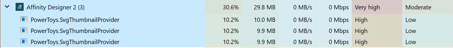
 Since yesterday, Affinity Designer is broken for me on version 2.2.1. The UI freezes and is stuck on a full-core load (single core) even after terminating the task in Task manager. Uninstalling and reinstalling the app (MSIX) did not resolve the issue. I also tried repairing. It seems to have to do with Windows PowerToys from the look of taskmanager, so I updated PowerToys to 0.75.1. It's weird because I haven't updated PowerToys yesterday... E1: Time to uninstall PowerToys... E2: That fixed the issue, but it's not a long term solution for me. E3: The SVG thumbnails in the recent file window appear to be the culprit with SVG icon preview enabled in the File Explorer Add-ons section of PowerToys. I had several SVG thumbnails in recent files that failed to render. Disabling this specific module was enough to get it to work again.
-
 I have done some thinking about what direction Affinity is heading relative to the competition. Adobe has been making a lot of strides, specifically with AI powered features. Even if Affinity 2.0 is a very good update, and 2.1 added some good improvements, I still feel that the general perception is that Affinity is stalling a bit. Serif took up a huge task for a small company putting out a very nice integrated suite of programs at a very good price. They took the fight to competition with 3 programs that could replace mre well known industry standard programs, at least to a high degree. By being so affordable, they provided a good entry point for small businesses, freelancers and enthousiasts. I truly appreciate what Serif created in this respect. Providing these apps also on iPad was quite visionary as well. Then the v.2 offered a universal language for all apps at a very good price, making an offer very hard to ignore. However it is a very big task to keep 3 apps on 3 platforms up to date, provide regular updates and not lose the users to the competition. The competetion in this field has become much more severe than it was even 10 years ago and I think this is why Serif really needs to ask the question where to go next. In my vision there is only one way that makes sense: fully integrate the 3 apps in one program! Affinity has been about the integration of the various parts from the start, and this has been its unique selling point. Publisher was the cherry on the pie in this regard. With the Universal License, Affinity made it clear that you get the best result when all apps are installed. Let's not kid ourselves into believe any one of these 3 apps is the best in class in terms of features (best bang for a buck though). It's strength lies in how well the different parts work together. There are 3 apps now, and though I understand they are meant for different use cases, but in real life as a designer, these do not always make sense. Having to jump over from designer to photo to use a filter on an illustration, or from photo to designer to round the corner of a shape is annoying, and it seems arbitrary. Publisher led the way in providing all elements of the suite in 1 program (albeit in reduced form) and I feel this is the only logical way to develop the suite. Making 1 app instead of 3 saves resources and makes it less prone to comparisons to similar programs. The persona approach which was in designer from the start provides a good base, but I would argue that the user should be provided with more options to customize they layout to its preferences. This is an area where Affinity is lacking a lot. I see this as the biggest chance for Affinity to keep their own unique place in the market, but I look forward to other ideas.
 -

is possiblity drag from assets directily to use image as fill in vector shape/bitmap brush drawn shape? applies Affinity Photo and Affinity Designer in computer.is possiblity drag from assets directily vector shape fill etc?
MxHeppa posted a topic in Affinity on Desktop Questions (macOS and Windows)
is possiblity drag from assets directily to use image as fill in vector shape/bitmap brush drawn shape? applies Affinity Photo and Affinity Designer in computer. i bet i get it working earlier. i tested with 2.2.1. -
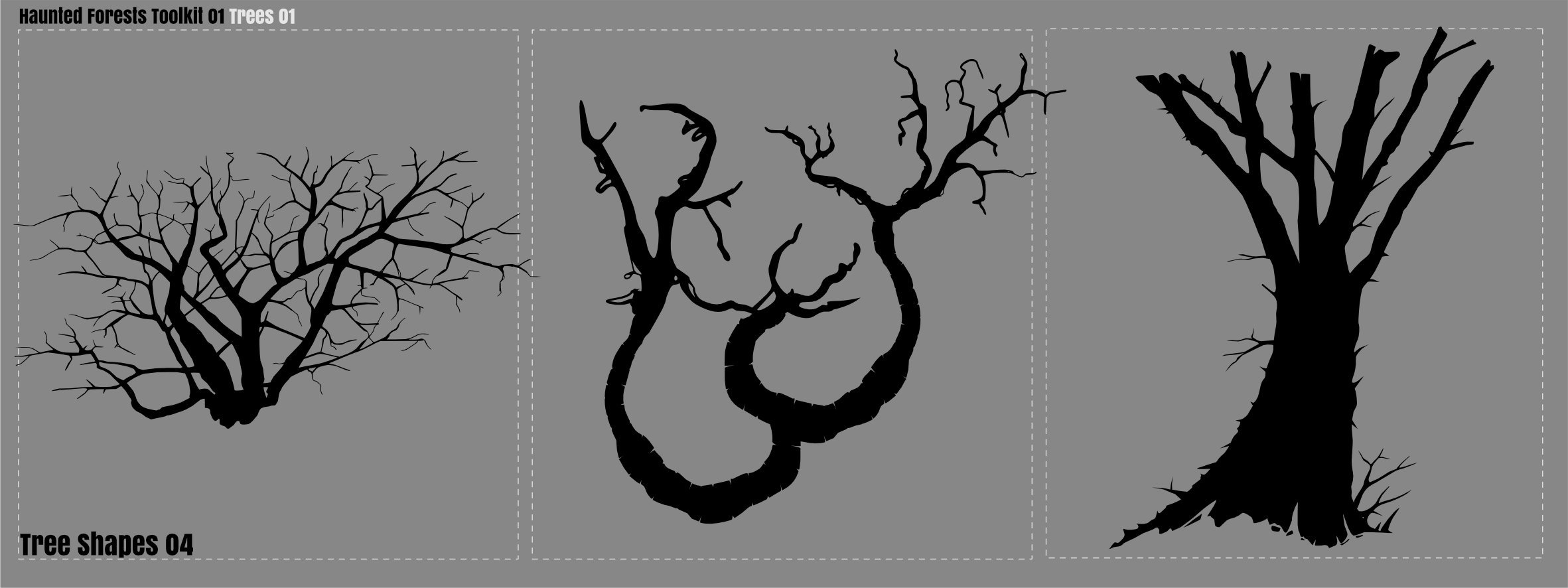
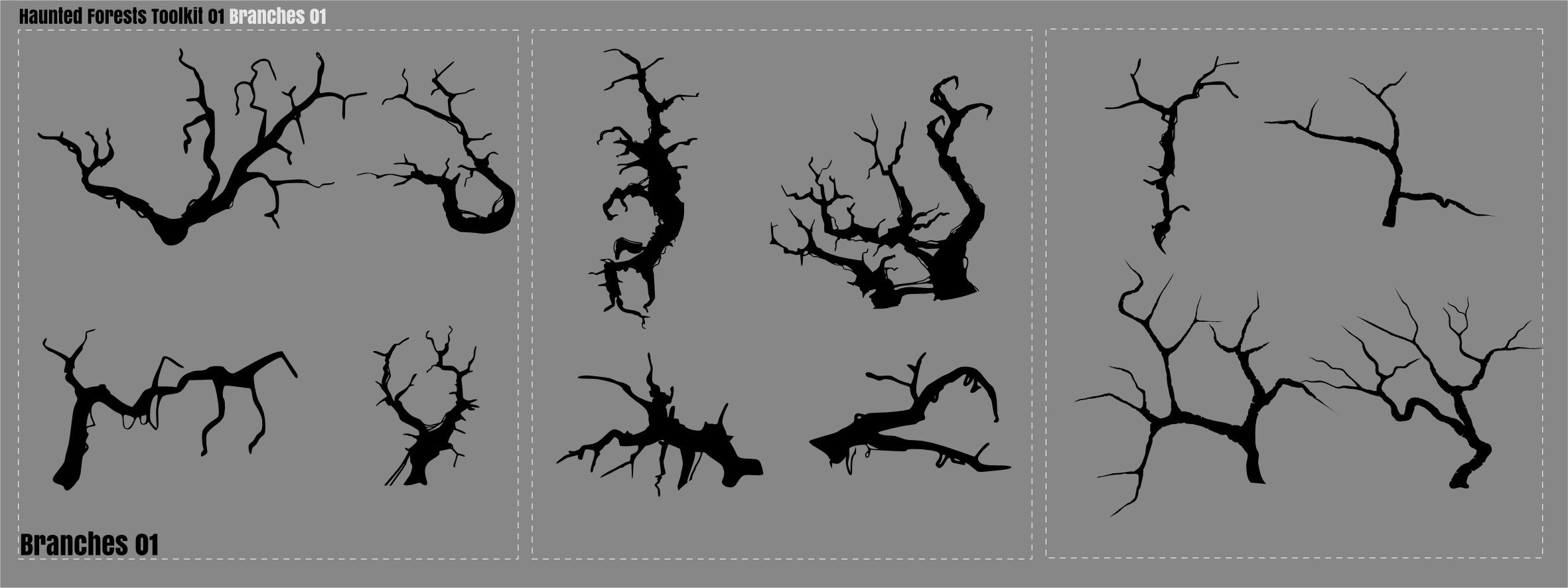
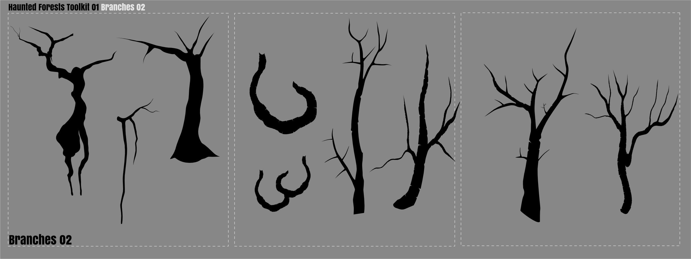
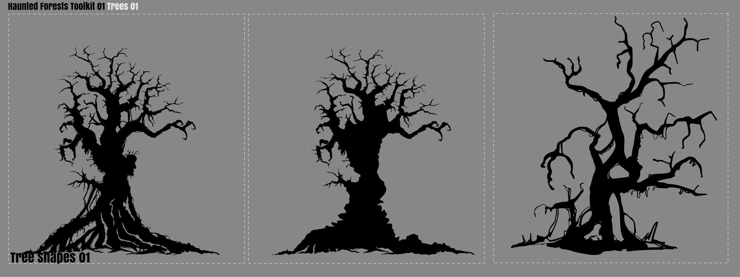
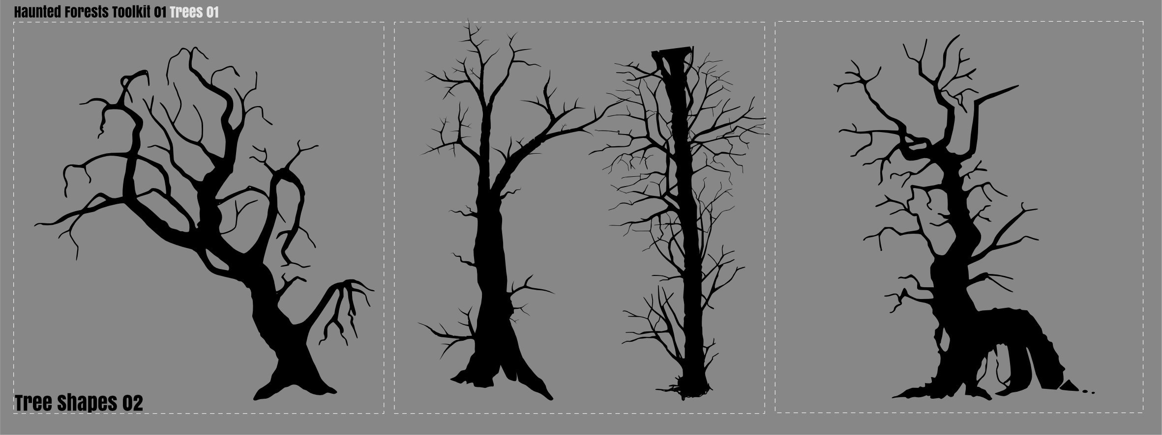
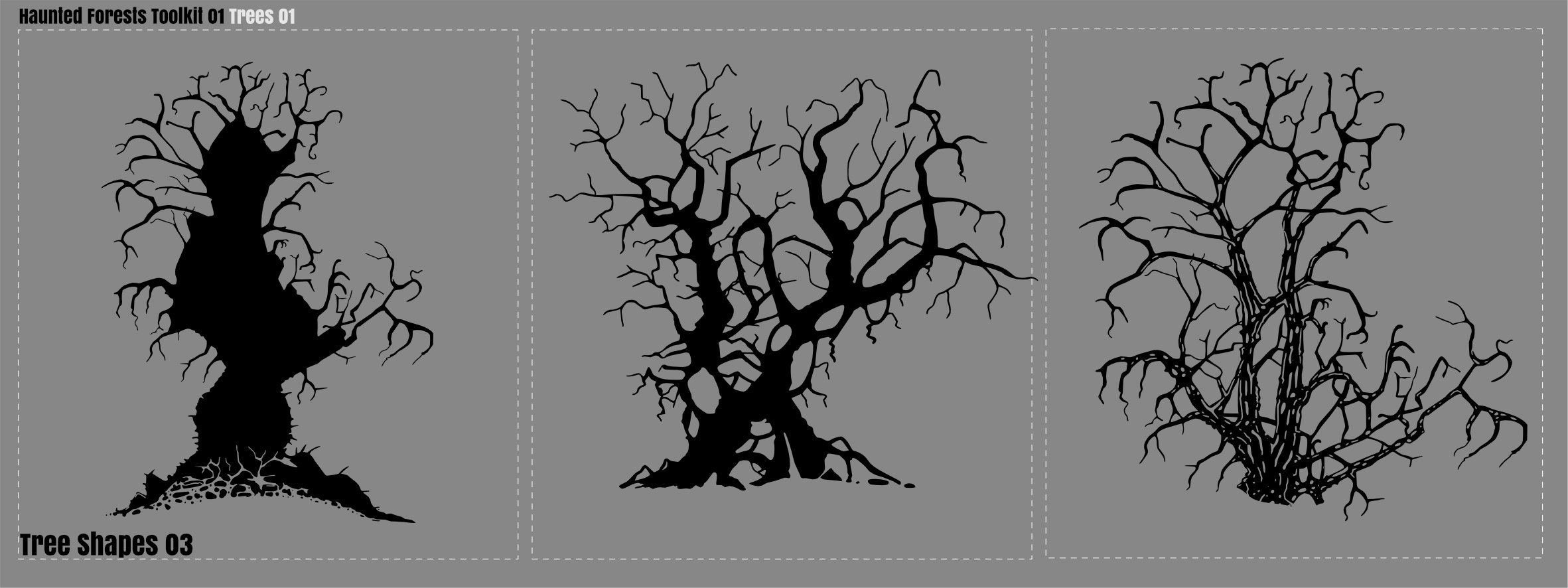
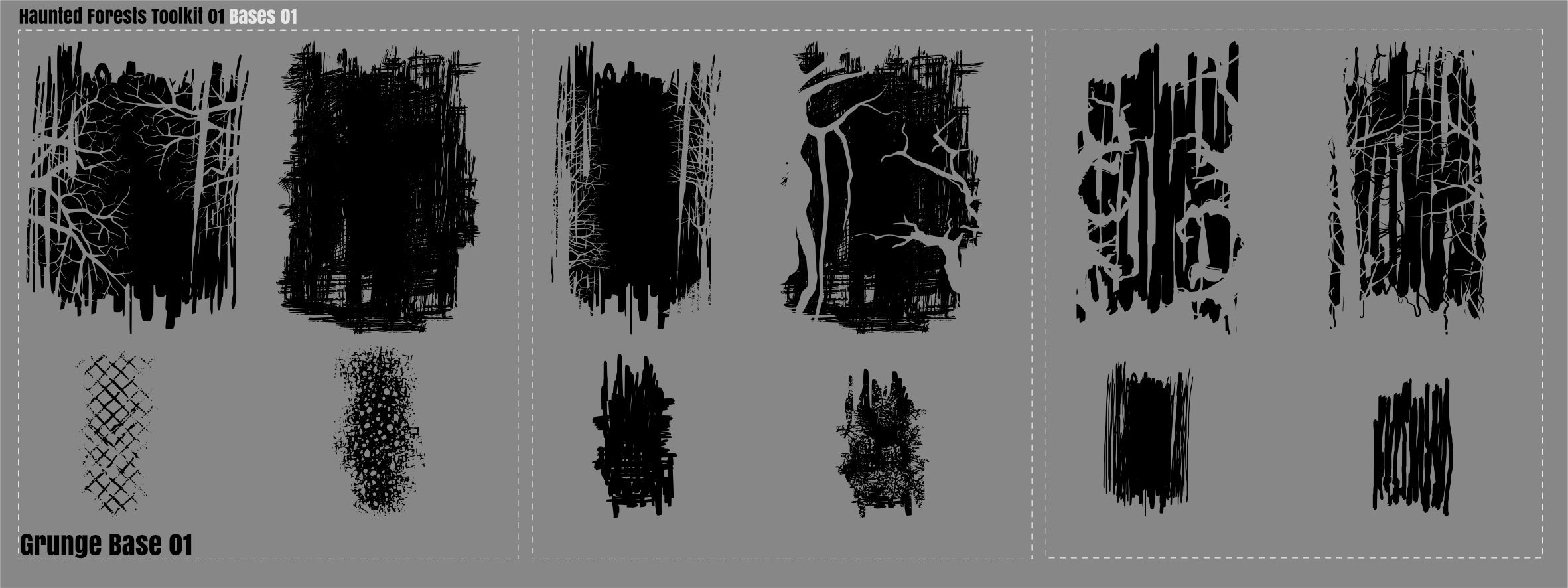
Haunted Forest Toolkit Added a Set of Vector Trees to supplement the Zombies! 13 large Vector base trees 21 Branches 12 Grunge Bases .zip contains a single AD 2.2 file with 7 artboards You can chop them up! and use them with Zombies! Trees Branches Grunge Base Affinity Designer 2.2 File: Haunted Forest Toolkit.zip
-
 Feel free to merge or remove this thread if such a suggestion has already been made. Currently, you can smooth paths in two ways (Correct me if I'm wrong): 'Smooth curve' tool which works globally on the curve and has no settings. Or 'Convert to Smooth/Smart' which works on selected vertices. It would be nice if Designer V2 had a brush like tool for smoothing curves, with tolerance settings for better control over smoothing. There is a similar tool in Adobe Illustrator.
- 2 replies
-
- 4
-
-
- affinity designer
- feature request
- (and 1 more)
-
 Affinity Designer is a good tool to work with, but like Adobe Illustrator, Apple Pages and some other applications, I'd like to have a text frame that can flow to another frame. I know that I can import text frames from Publisher, but I need the native feature so I can add more text frames if I need to. Thank you
-
I made a picture of an old-fashioned barometer because . . . well, because I can! Who needs an excuse? I discovered quite a while ago that I enjoy making things with scales and pointers, for some reason; and the Version 2 Duplicate dialogue makes it so much easier to make circular scales. The woodwork is created from a stock photo of a piece of wood, which I sawed into quarters and turned a profile edge (digitally, that is ). All the rest is made from vectors, using three photos for reference and picking out the best features. (There were some curlicues on the thermometer scales, but I forgot to do them! ) The red letters are from a freebie font called Great Victorian, which has plain and swashed cap forms.
-
Hi, this thing has been driving me crazy, but I couldn't find anything helpful via search. When using Designer 2, all colors from the "Grays" swatches or selected via other methods have a reddish hue on screen that I cannot get rid of. It's most obvious with grays. Exporting to e.g. PDF they go back to being neutral gray when viewing the PDF in a third-party viewer. It's most clearly illustrated by this screenshot: In my opinion, these colors on screen should look the same. It also shows that it's not a mis-calibrated monitor or other Windows color management problem, since internally for Windows, the GPU and the monitor, the color of these two boxes should be identical, but they are not: The PowerToys color picker identifies the left as (192, 192, 192) and the right as (188, 178, 175). Changing a different Document Color Format (RGB, Gray, CMYK) has not effect. Neither does changing the Document Color Profile. My monitors are being calibrated using a Calibrite colorchecker. I do not notice similar behavior in other non-Affinity applications. As far as I can tell, this did not happen in Designer 1. Does anyone have any helpful hints? Yaisog hue.afdesign
-