Search the Community
Showing results for tags 'affinity photo'.
-
Just bought Affinity Photo and one of the first tool I checked was, if I can move the zero point of the ruler to any point within the canvas. Unfortunately it is not able to use!!! I would need this tool urgently! Please help!
-
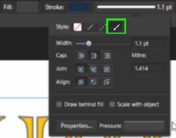
 Hi, I want to use an artistic Brush to outline my text. Lines work Dashed lines work The next option - "Texture" - doesn't do anything. If I click on "Properties", it opens up the Brush editing panel, but with no brush shown. If I select a Brush then open the panel, still nothing. What am I doing wrong? Regards, Steve
-
Normally I could do this with Photoshop. But really struggling with Affinity. If anyone knows an easier way to remove reflection I'd be ever so grateful. Anyway, my first attempt using a cross between my Lightroom and Affinity Photo.
-
I know that layer effects come out of the land of Photoshop compatibility, but I'd like to propose a new one which would create unlimited-size "long shadows'--solid, not offset dropshadows extending in whatever direction from a type or shape layer. There are workarounds for this, but most involve rasterizing the type (so if you change the kerning, you have to go back through again.) How about it?
-
- 1
-

-
- affinity designer
- affinity photo
- (and 1 more)
-
I made some channel mixer adjustments for AD and AP which I'd like to share with you. You can add them to your AP though opening the document, selecting each group, selecting the "channel mixer" adj, so that it's panel opens up, click "add preset". (I've made a feature request to make that easier) You can then access them by the "view > studio > adjustments" panel which is active by default (only available in AP) These are a bit "Instagram like" so please don't overdo it, blend modes, opacity and blend ranges can, and should be adjusted upon your needs for more information about such techniques you can have a look over here https://forum.affinity.serif.com/index.php?/topic/37125-ap-ad-beginner-amateur-pro/ cheers channel mix.afdesign PS: similar presets vor curves are available here PS: similar presets for "LUT" adj. are available here
-
 Hi, I bought affinity photo on July 8th, and everytime I open it up it shows affinity photo 1.5 I was wondering if I already have this? And if not how do I download it? Thanks in advance
 -
 I've created a quick video showing how to create a basic Long Shadow Effect using the Power Duplicate feature in Affinity Photo. If you have a better way of creating a Long Shadow Effect, feel free to add your tips and tricks here :) Affinity Photo - Long Shadow Effect
 -
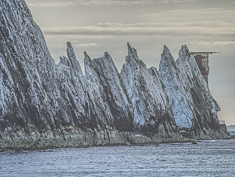
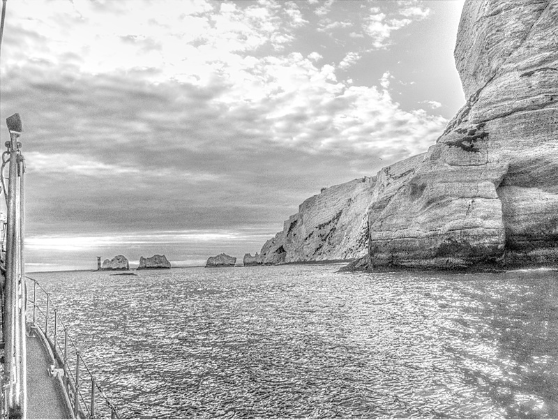
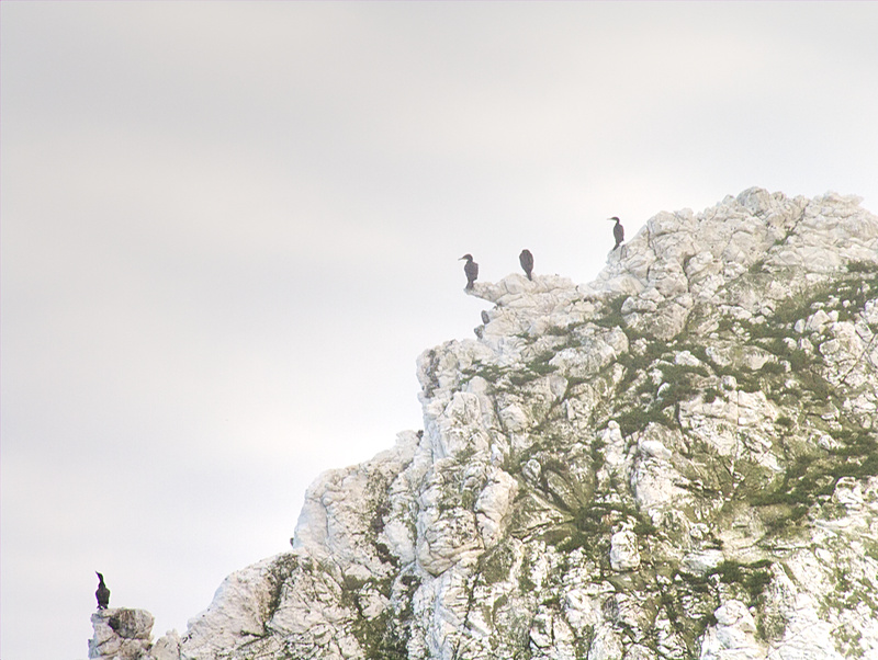
I had the privilege of being given a ride on the Yarmouth Lifeboat last week, and took my camera -- naturally! These photos are small ones I posted on Facebook; if/when I come to print them, I'll re-edit them at full size (and maybe develop them a little differently). The Needles chalk stacks, and the lighthouse: Scratchell's Bay and the cliffs Cormorants. They very considerately arranged themselves according to the Rule of Odds: a group of three and a group of one. (I wonder what he did to upset the others?)
- 9 replies
-
- 4
-
-
- needles
- isle of wight
- (and 5 more)
-
January 5, 2017Practice works affinity Early betahttps://www.youtube.com/watch?v=YDD8mF--v6Q
-
 Hello, a few months use Affinity Photo, it is possible to create contact sheets directly or via a plug in ? Thanks
 -
The picture that I captured had a lot of haze and dullness in it. So, I tried to retrieve some of those natural colours back inside AP Sharing the original image and the retouched version. Critics and feedback welcome!!
-
Hello, I have been waiting with excitement for the Affinity BETA to come out on windows. After opening Affinity, i was not convinced. I really got this "not bad" feeling.. This is because of 1 main issue; i don't like the user interface. Functionally speaking, its great. It beats photoshop in my opinion. But its not even close to what i had hoped for.. I am a big fan of "minimalism" and "flat" design, not just for its looks, but for the overall experience. I came accross a photoshop redisign made by Aurélien Salomon on Behance: https://www.behance.net/gallery/19600227/Photoshop-redesign This is how a modern and new photo editor app/program, in my opinion, should look like. Design is contantly evolving, so the tools that are used to create design should be designed with this in mind. My suggestion: create an user interface that works with templates. Give the user control of how Affinity looks like. What would be better then an editor that by itself gives inspiration to create more beautifull & smart designs?
-
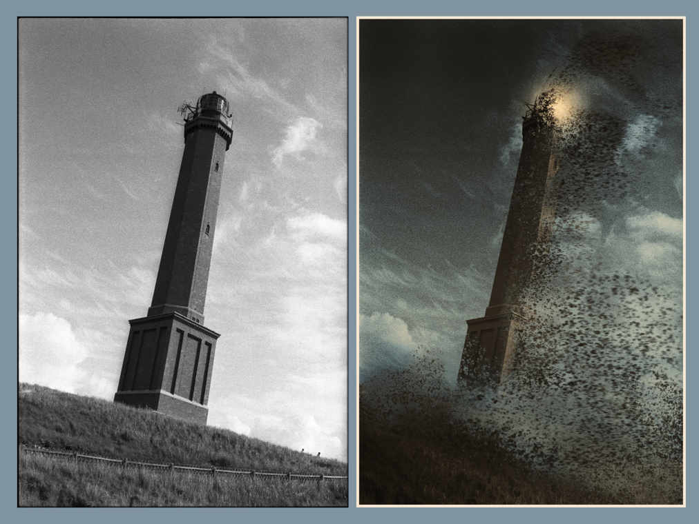
I am a 59 year old guy from Germany and new to this forum but not new to Affinity Photo. I also use AD … sometimes – I’m more into photo. I started working with AP in July 2015 after nearly 23 years working with A***e-Software. It was a good choice to change, wasn’t it. I want to show you an Artwork I have made with AP just for fun from a picture I took in 1986 (!) on Kodak Tri-X. It’s the lighthouse of Norderney, an island off the coast of Germany. As you see it’s a »Before« and »After« Comments and critics welcome! Puck
-
 Hello and thank you in advance for your help. I've included a screen shot of my issue: a single Affinity Photo processed portrait JPEG as exported from AP in medium quality (1.7 MB). All three are of exactly the same photograph, displayed through (from L to R) Affinity Photo, Adobe Bridge CS5 and Windows (7 Premium home Edition 64 bit) Explorer Picture Directory. The image originated as a NEF RAW file (Nikon D7200) via DNG converter into AP Develop persona, then processed in photo persona at 8 bit RGB. The same JPEG image opened in Photoshop CS5.1 (64 bit) opens in ACR and is as dark as the illustrated image in Adobe Bridge. However, when attached to an email, the over saturated 'orange' version occurs. Oddly reassuring is that the printed version matches the AP one beautifully. My monitor is Dell UP2516D Will you be producing an asset management programme to work with AP any time soon? Thanks again, Lubiloo
-
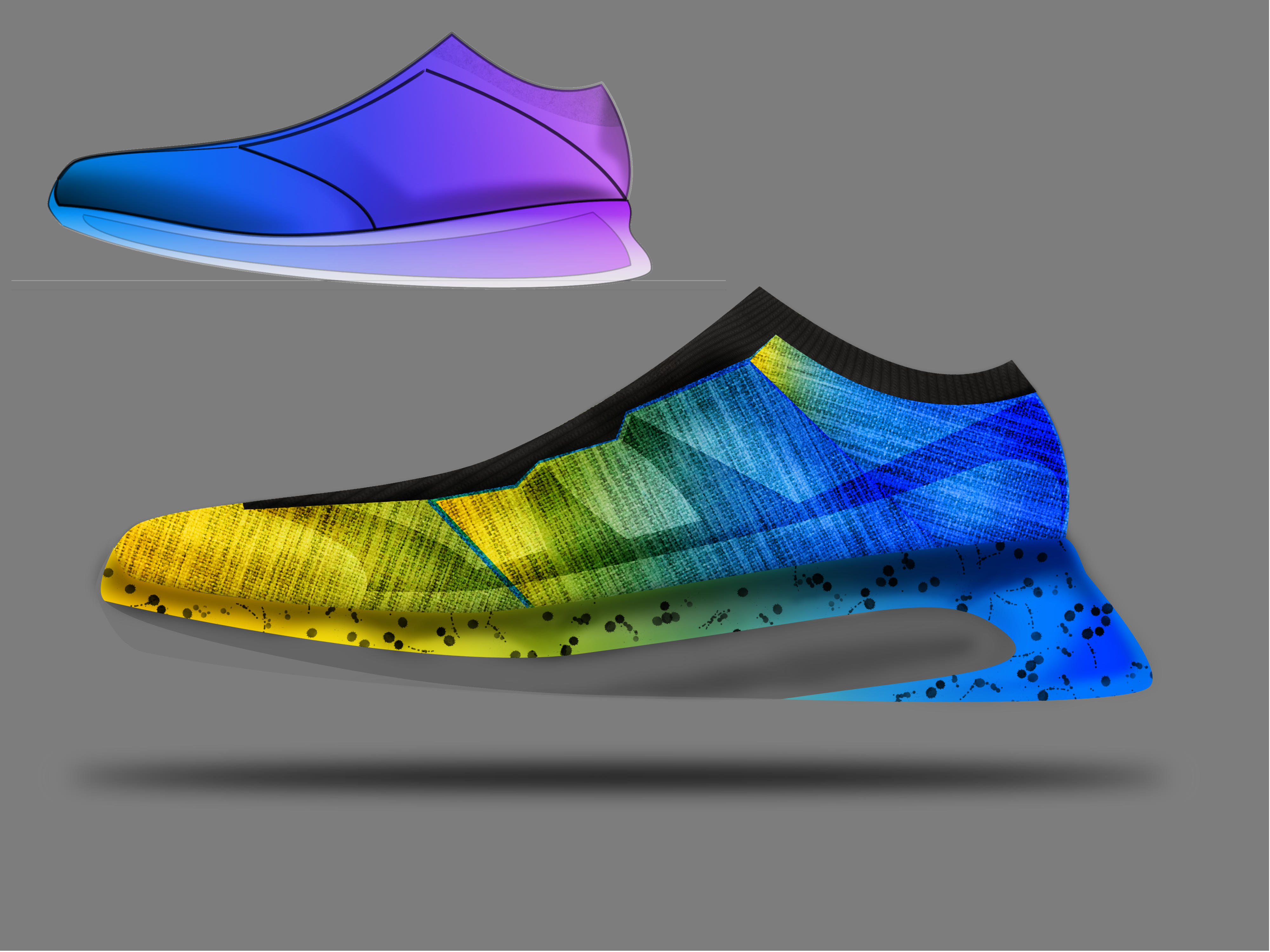
Hello, I present my first shoes. Project AD, and finalization with AP
- 5 replies
-
- 1
-
-
- affinity photo
- multi
- (and 1 more)
-
Hello, here is a link to my website, where I show some book cover designs (Print, ebook). All are created with aPhoto and aDesigner. For me, there are no better apps for this job. http://dein-buchcover.de/portfolio.html Looking forward to any feedback, thank you ;-)
- 1 reply
-
- 2
-
-
- book cover design
- buchcovergestaltung
- (and 5 more)
-
 I would love to see something like what Tandent Lightbrush supposedly does (see this article) implemented inside of Affinity Photo. It is basically like frequency separation, except that it separates illumination and surface detail instead. It could be implemented in conjunction with a blend mode that would re-combine these two passes, just like Linear Light re-combines the high-pass layer with the low-pass one for frequency separation. I don't know if the algorithm is described in a Siggraph paper or something like that, but I believe there have been several published approaches to estimating illumination and so on. I was fully expecting for something to show up in Photoshop soon after because it would be spectacularly useful for photo editing, but so far Adobe hasn't done anything in that direction yet. I'm not even sure if the original product is still around.
 -
Hi All, So I just got affinity photo today and for one primary reason, I need to be able to remove the background from photos with images of people in it. I used to use WebPlus for this and they had a tool called 'Photo Editor' which would allow you to click on the background and it would remove blocks of colours up a different shade. For example a white background would be removed up to the outline of a persons arm/ body. How do I do this on affinity photo? Going round the outline of a person is fiddly and takes time so I am looking for a quick solution. Thanks for taking the time. George
-
 I discovered a trick to export an .Affinity file into .PSD while maintaining the possibility of editing text. Lets go. It's quite simple: 1. Save your file in PDF (for export) 2. Open in Illustrator and export to PSD (while retaining text editing) Ready! Simple right? Here's a video showing you step by step. It is worth remembering that some things can get lost but if you simplify the Affinity file it will get easier to turn it into PDF and then PSD and keep all fonts editable. In my tests I had a group of texts inside a layer with opacity and this was lost, but if I take this text from the layers it is possible to keep editing (the video shows some tests) https://www.youtube.com/watch?v=f-p3J1umYIg
 -
Hit there, guys! I took these pictures of a grackle with my smartphone and tried to improve them with Photo. I'm just a hobbyst with no training in photography but I hope I managed to get some decent pictures. Tell me what you think! Any advice will be appreciated. Best regards!
-
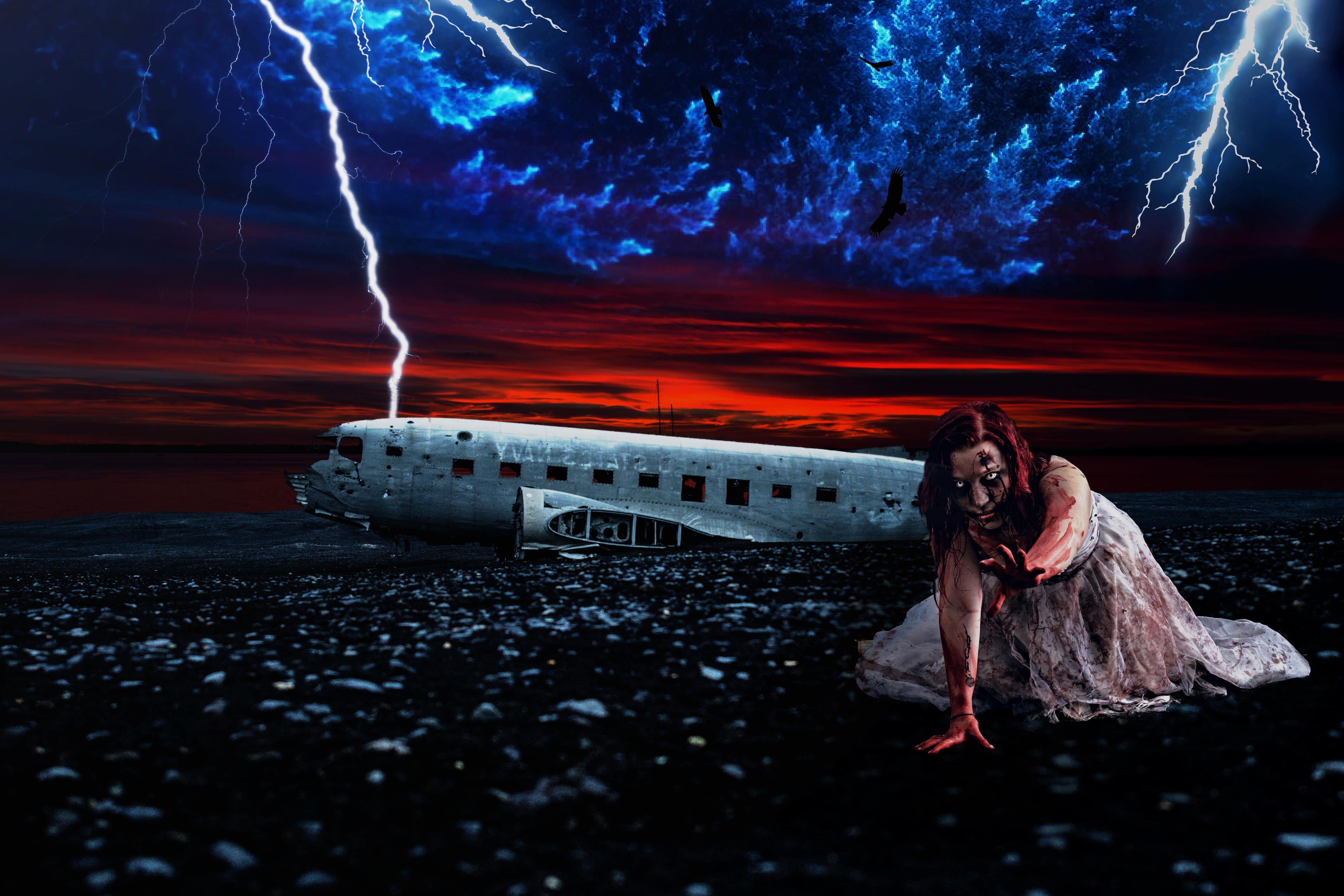
-Survivor Another composite created in Affinity Photo for iPad, made up of about 7 images, went really dark on this one for some reason! *Edit: I've updated the image, this is version 3, I've made a few edits to the original Allan
- 5 replies
-
- 2
-
-
- photo manipulation
- manipulation
- (and 4 more)
-
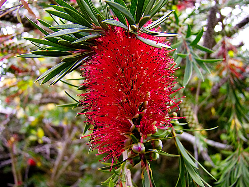
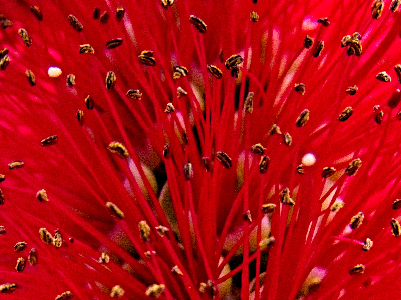
As some of you folks are asking for more photos, here are a couple from my garden this week. Although the originals are biggish (22Mb) RAW files from my camera, I've bolied them down to 800 x 600 pixels to share on Facebook. I must get round to having some full-size printing done! OK, this is my bottle-brush tree (Callistemon), which is flowering for the first time in a few years. First is the finished photo as I developed it ... Next, I went back and developed the RAW file three times, setting the exposure to -2, 0, and 1.5, and processed them as HDR. I applied some tone mapping and a little local contrast (but didn't make a note of the values -- sorry!), applied a vignette with exposure +2, and painted a little extra white around the edges and corners to improve the vignette. Finally, this is an 800 x 600 px selection from the first file before I resized it, to show the detail of the flowers. There's quite a bit of noise, as you can see, even though I shot it at 100 ISO. Time to get a decent camera!
- 9 replies
-
- 1
-
-
- bottle-brush tree
- callistemon
- (and 1 more)
-
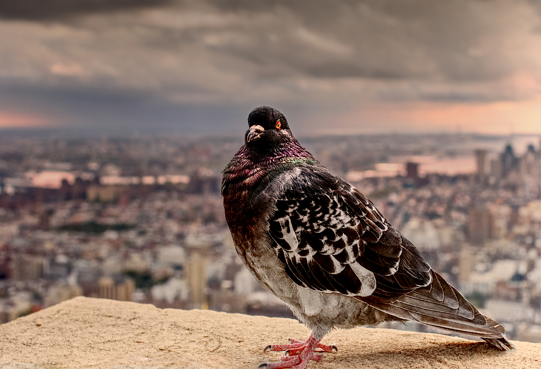
Hi, I decided that maybe it was time to share some of my AP work. I recently discovered some files I thought I had lost of photos I took in New York when on holiday a few years ago (shot on an EOS 400d, about 10mp). Surprised at how the pigeon came out, I was originally going for something quite subtle but out of curiosity put its through tone mapping. Can a pigeon be heroic? Any suggestions? whenever I tried to make them less extreme they lost all impact. Steve Edit: I've now made them smaller....
-
 Dear all, I am very exciting with Affinity photo on iPad. Therefore, I will make video clip of everything i learn from it, and they are for sharing always. Mask Layer on Affinity Photo on iPad https://youtu.be/c-pfrXDBwvU Perspective Projection in Affinity Photo on iPad https://youtu.be/PAtHcKEyh-w How to use crop tool in Affinity Photo on iPad https://youtu.be/UQaPDo9tfTs Equirectangular Projection in Affinity Photo on iPad https://youtu.be/bS34wOmoLzw Convert any photo to pencil sketch https://youtu.be/3OYKRBJpPqA
- 1 reply
-
- 3
-
-
- Affinity photo
- iPad
- (and 1 more)
-
The current Gradient Map feature is quite basic like the one in Photoshop, but in many ways, it could be a much more useful tool with the following additions: HSL Mode: Instead of going based only on Luminance, this would use the input hue or saturation as the lookup index. In combination with HSL blend modes, this would allow for some fantastic workflows like basically warping the color wheel to taste, similar to the "HSL Wheels" feature in Magic Bullet Colorista (Note: don't be fooled by the name of the feature, this is NOT referring to the three-way color corrector). Just use a gradient of the HSL spectrum and drag or re-define stops, set the result to "Hue" blend mode, and you have an extremely powerful color correction tool that gives you results that would be difficult to achieve in any other way. Circular Editor Option: Like the Colorama filter built-into in After Effects, this makes it easy to work on maps that are supposed to start and end with the same color. In combination with an input for a number of revolutions (cycles) to use, this would also make it easy to create gradient effects where a few stops are repeated multiple times across the spectrum (like, say, alternating black-white-black-white). This would also massively improve usability in conjunction with the HSL mode option suggested above. Access to swatches: This would make it easy to re-use gradients by defining them or recalling them from swatches as an alternative to using Adjustment Presets. Interpolation control: Sometimes the transition from one color to the next needs fine-tuning – this is something that Affinity's gradient editor already supports, but not in the Gradient Map dialog. A Constant Interpolation setting where the color would just be constant up until the next stop would also be useful since it would eliminate the need for duplicate stops in the same position, which are really hard to select. Possibly, the curve editor could also be re-used to define falloff using a Bézier or Catmull-Rom-Spline. Duplicate Stop option: Often, it is necessary to use the same color multiple times in a gradient. Adding a button for this and/or enabling Option+Drag to duplicate would be useful. Photoshop aggravatingly always inserts new stops with the same color instead of the color that is already there at that position in the gradient, but the (better) implementation of this in Affinity had the side effect that duplicating stops became harder. On-image sampling: While the dialog box is open, it would be useful to highlight the value under the mouse pointer in the gradient display to be able to place a stop exactly at the desired position. Clicking in the image would insert a stop. On-image highlighting: Conversely, when editing/dragging a stop in the gradient editor, an option to highlight the affected pixels in the image would be helpful. The options could be:off (nothing) all pixels that have exactly the value represented by the position of the stop (similar to focus peaking) the zone that will be affected in the image. The overlay would start at 100% intensity at the value represented by the stop and fall off to 0% on each side until the position of the next stop respectively, taking the falloff into account (see "Interpolation Control" above). Optionally, two different colors could be used to represent each side of the stop. Resizable dialog box for more precision: When editing 16-bit images or editing falloff from one stop to the next or when placing stops very close to each other, it would be useful to have more room to work with. Making gradient editor dialog boxes in the application resizable would alleviate this problem. Snap to Luminosity button: Sometimes, it is useful to place stops exactly at the point in the gradient that corresponds to their luminosity, especially when they are defined by selecting swatches from a color palette. Adding a button that moves all selected stops to that position would make this really quick. For instance, tinting an image with two tones while keeping black and white intact could be achieved very quickly by selecting a black-to-white preset, then adding two stop, selecting a color from the document color palette for each, and clicking that "Snap Selected Stops to Luminosity" button. Ability to move start and end stops. The values before the first stop and after the last one would simply use constant extrapolation. This would eliminate the need for duplicate stops, which take longer to create and are harder to edit since all operations need to be performed twice.
- 3 replies
-
- 7
-
-
- Gradient Map
- Adjustments
- (and 2 more)