Search the Community
Showing results for '"text wrap"' in content posted in Affinity on Desktop Questions (macOS and Windows) .
-
 Hi, I have an interesting problem. I needed a shape in Publisher that wasn't available in the available shape collection available in Publisher, but does exist in OmniGraffle, so I created an OmniGraffle document, dragged in the shape from OmniGraffle's stencil collection, copied it, and then pasted it into my Publisher document. Surprisingly, it worked, but it was imported as a group of three objects ("Curves", "Curve", and "Object"). By experimentation, I found that only one of the objects allowed me to insert an image inside it in Publisher, so I deleted the other two unneeded objects. This is working fine, with the exception that when the shape is "right side up" in Publisher, its rotation property shows a 180 degree rotation. Visually, this doesn't pose a problem, but a side-effect of this is that when I set the shape's text wrap setting to "Jump", the effects of the "Distance from Text" values visually work the opposite from what one would expect (increasing "Top" would push text away from the visual "bottom" of the shape. As a workaround, I solved this problem by inverting the shape in OmniGraffle before pasting it into Publisher, but I'm curious as to whether there's a way to "reset" the rotation of a shape from within Publisher, so intuitive behavior of the "Distance from Text" would occur for a shape that's being used inverted from its typical orientation. Thanks, Ken RightSideUpShapeWith180DegreeRotation.afpub
 -

Best way to add captions?
anto replied to benged123's topic in Affinity on Desktop Questions (macOS and Windows)
Yes. But you have to group Picture frame with text and add text wrap to group.
-
 I am trying to wrap text around a cropped image, but it is wrapping the text around the original image size/outline. I want it to wrap around only the visible cropped area. When I check the text wrap outline, it shows the outline of the original image. I know I can edit the outline by hand, but there has to be a faster way. I tried resetting the wrap outline, and it changes to the cropped area, but it doesn't stick. I have attached a file with the problematic elements. I should note that I'm setting the text wrap at a group level, while the image that is cropped is part of that group. Extra Credit: What does reset wrap outline do? In this situation it doesn't seem to do anything permanent. Thx! Example.afpub
 -
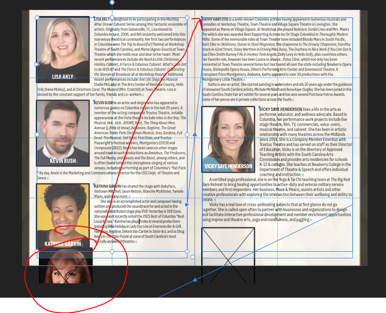
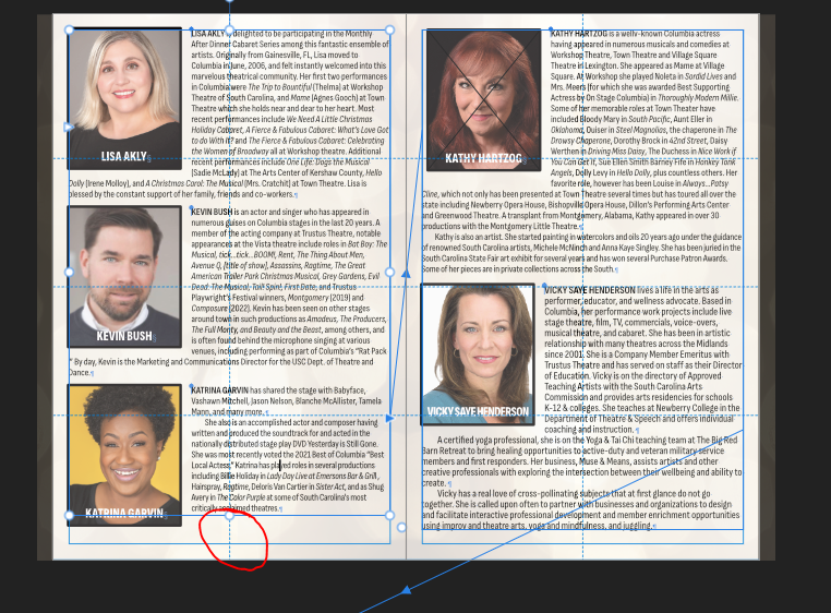
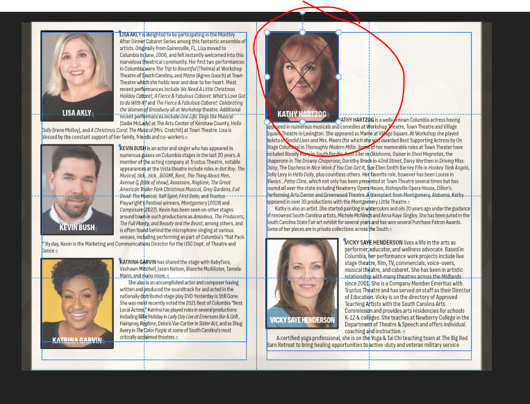
 I have a producing program. Each performer has a headshot and a bio. I want the headshot to appear next to the top line of the corresponding bio. My text style has widows/orphans turned on to prevent single lines at the top or bottom of a frame. The circled photo is placed as a floating image to line up with the paragraph (see arrow). The only way I have found to make this image move is to physically shorten the text frame on the left (picture 2). I very much dislike this because if the text changes length, the frame has to be manually adjusted again to allow for it. If I make the image inline, I'm unable to add a wrap to the image (see picture 3). I would have thought that float with text did exactly that. If the text to which the image is "pinned" moves, shouldn't the image move with it and not require manual resizing of text frames?
-
 Dear Forum, I am relatively new to Affinity Publisher and am working on newsletters and a compilation of equipment collections with data merged from an EXCEL sheet. I am so glad I found MikeTO's user guide - and thanks for such a responsive forum! In the following I describe features/observations which I could not find or apply correctly, maybe you could give me some pointers: Artistic Text: define a fixed size text frame and allow the font size to adjust filling the given text frame Running Header: I get unpredictable results with the running header field on a document page if the specific text style occurs in an artistic text frame (sometimes works, mostly not: field remains empty). No problem with regular text field. Running header field adds a new line after filling the field and before next entry in the text frame, unless a termination character is added in the running header text - by design? That took me a while to figure out. Master pages: Can I find out which Master page was applied to a specific page and if it was modified? Will 'Clear Master' clear all masters applied to the document page? How can I re-apply a master to a document page which had previously been changed (detached) but want to go back to the master page? Apply-Master will not change the changed properties Parameters for Text wrap around newly inserted frames/images, currently always defaults to 'none'. I use a 'square' with .04" margins most of the time, would be helpful to set a default for that. (In case of the newsletter picture frames are not in the master page, as they vary in number, size and location from issue to issue) 'Unprintable text' in a Master page text box, which only serves as an instruction for the content but does not print or show in preview mode on the document page. If no text is entered, the field stays empty. I use a custom field as a workaround (by emptying the field value before publishing). Legend under or above an image frame. I use a text box and group it with the image, but resizing will change the font and size of the text box in vertical direction, even if I select 'lock' in the transform panel. A means to clearly indicate that one edits the Master page instead of the document pages (green bar?) or is this just a beginners mistake? Enter discrete zoom level when manipulating images in an image frame, rather than the slider. Enable page-up/down keys in editing. Remember zoom setting when opening an existing project - it defaults to 'fit on screen' which is not suited for the newsletter - Thank you and a happy Holiday Season!
 -
 I am guessing you have a Text Frame with Ignore Text Wrap checked underneath the image.
 -
 Ach so, das wär die "Torte": https://affinity.help/designer2/de.lproj/pages/Tools/tools_pie.html Du kannst auch die roten Punkte bewegen, um den Ausschnitt zu rotieren. Brilliant! Daran hab ich nicht gedacht. Mit Publisher gäbe es dann weitere nicht-destruktive Möglichkeiten via Text Wrap ("Umbrechen/Umfließen von Text"). https://affinity.help/publisher2/de.lproj/pages/Text/wrapText.html
 -
 Have you tried Pinning the tables, either "inline" or "floating" (+ text wrap)? This works to make the table flow with the text, though it may require manual adjustments in case of column / frame / page brakes. (Below a screenshot of V1) If the mentioned post feels relevant it appears useful to edit your post + add a link to this.
-
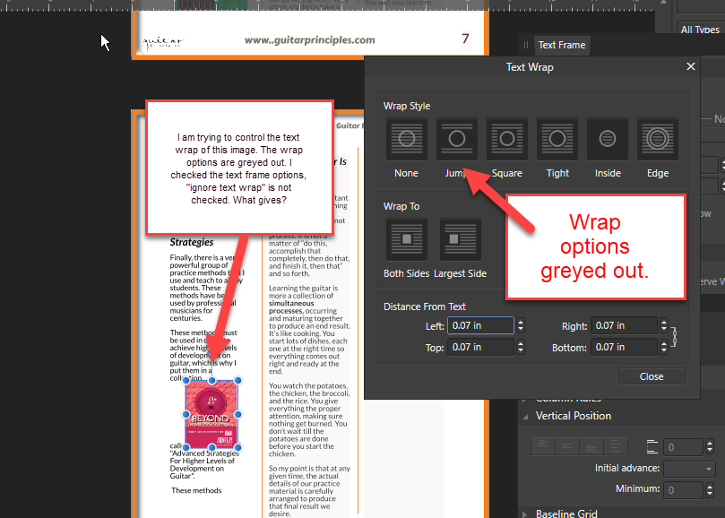
 Hi Folks, I love affinity publisher, but i keep having this problem. I place an image in a text box, and I go to wrap the text, and all the options are greyed out. The image does not move easily either, it keeps getting "stuck". "ignore text wrap" is unchecked. Please see image........thanks very much!
-
 Hi All, I don't have exactly the same issue as above (or don't think so anyway) but there's plenty of experts here, so I figured this is a good spot to post. So, in Publisher 1 I was able to utilize text wrapping and I don't remember having any difficulty to figure it out. I just imported a file from Publisher 1 into Publisher 2.3, in addition to whacking-out the text, the text wrap disappeared and I can't apply it again. I replaced the image but that didn't do it. Text frame setting Ignore Text Wraps is not set. What puzzles me is there doesn't seem to be a button like "Set Wrapping Now" or something that clearly activates it, only a wrap configuration setting. Really, I'm not using Publisher much, I use Designer more often but I don't see that text wrapping is a feature in Designer -- is that correct? I see in the help file Text on a path but nothing specifically about wrapping a text frame around an object. Thanks for any suggestions! Kevin
 -
 One thing I really miss in Publisher V1 is the inability to show the extent of the text wrap around a graphic. It will sound bad if I say that InDesign does this ... but it does - and it is so useful. In Publisher V1 (which I am using for paid projects, mostly happily), all I can do is change wrap values and see which way the text jumps. Tedious. Please say this has been addressed in v2!
 -

Text wrap not working in Publisher?
Hangman replied to Godzilla's topic in Affinity on Desktop Questions (macOS and Windows)
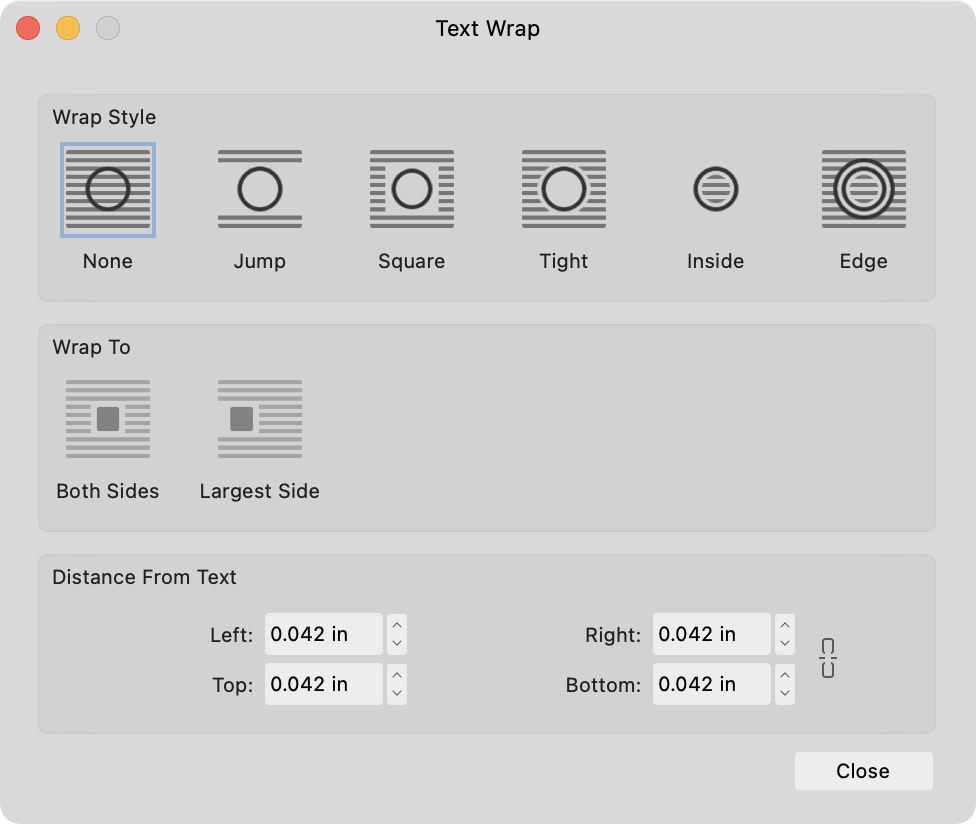
Hi @Godzilla and welcome to the forums, With your image selected could you upload a screengrab of your Text Wrap Settings... -

Text doesn't wrap around PNG image
GarryP replied to Hussard64's topic in Affinity on Desktop Questions (macOS and Windows)
Try this: Add the image to the document as an Image Layer (use Place); Set the Text Wrap to the required settings to the image layer; Use menu “Layer → Convert to Picture Frame”. That seems to work. -
This sounds like you have applied a Text Wrap to the Picture Frame and or the image it contains. On the Toolbar
- 4 replies
-
- 1
-

-
- caption
- text frame
- (and 2 more)
-
Try setting the Pictures and their captions in Groups (as you have done for two of the three on the problem spread) then set the Text Wrap to Square instead of Jump. This is going to help because you have two column Text Frames. Use the paragraph style you have made (or imported(?)) for the notes for the notes. Change the spacing on the Notes Panel to be much less than what you now have. A few other tips. Base your various text styles on other text styles. As it stands now each of the Paragraph styles are unique. While there is nothing wrong with that it makes life difficult. I think most of the text has overrides applied. If they were based on Base and Base had Widows and Orphans turned on then they would just need to inherit/No Change instead of the current method where you have set that on explicitly for all the many styles and or you have overridden it. Group your pictures and captions and set the text flow for that group. Currently one (at least) of the captions is in the body text. Start over with just a couple of pages of text. Just have a Heading, and a Body text Paragarph Styles. Then add some footnotes, make a footnote paragraph style and choose that with the Notes panel.
-
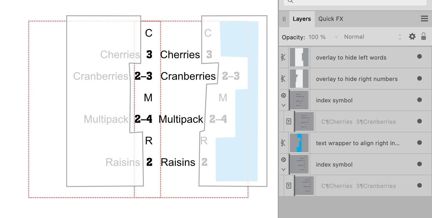
 Here's a rough and utterly ridiculous technique… Index as a symbol, placed twice (red dotted outline), blue shape has Text Wrap to force right side index to align left, white shapes (with transparency to show what's happening) cover up the respective words and numbers of the 2 symbols. Cons: insane to try and build and maintain Pros: um…technically does what the OP wants? maybe?
-
 After inserting photo and wrap text I get this: Which is how I want it to look. But I want to pin the photo to the text so that if I add or subtract text, the photo will stay with the text. However, when I pin the photo, the text unwraps: If I try to re-wrap the text, nothing changes. What am I missing?
-
 Hello. I've just started using Publisher, and noticed that when I use text wrapping around images the text immediately next to the image is rasterised when exported to PDF. Is this usual or am I doing something wrong? This is a screenshot of a blown-up example. It does look ok at normal size, but it's bothering me that it does this at all - is it to do with the wrap settings? I've used 'tight' and shunted the text over to the left for a space between the text and image. I format books, so do want the end product to be as good as possible. Many thanks!
-
Pinning Offset Issue
thomaso replied to DieterW's topic in Affinity on Desktop Questions (macOS and Windows)
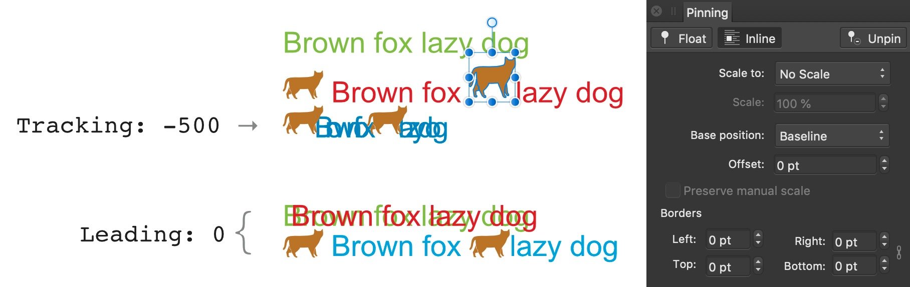
For inline pinning there are various options that even may conflict with each other or be influenced by other settings. For instance you may manually adjust a pinned image size (e.g. by dragging its handles) without altering the scale setting in the Pinning Panel. In the screenshot below all are set to 'No scale' but don't have identical size. Or the various possible spots for vertical adjustments: base position + borders for pinned objects and leading + leading override + baseline shift for the surrounding text. Also values can be relative or absolute and also be related to options in other panels (e.g. leading). To me it makes sense to use relative values for instance if a the font or size gets changed – while Affinity tries to avoid overlapping of pinned objects with the surrounding text (it feels like the 'Text Wrap' option but appears to work not identically). Honestly I can't tell the principle in all details and often I need several trails to achieve what want. Possibly it is not coded with an obvious or consequent logic, similar to the detail for Floating objects that get their anchor auto-created at an unexpected text position, often in a line above the expected one. So for questions it would help to see screenshots with current settings or a file for inspection + your description of the wanted result.
-
 You have demonstrated a bug. The problem isn't particular to a Group containing a 'vector-cropped' (actually vector-masked) Image. It affects a Group containing a raster-masked or vector-masked object of any kind. If a masked object has text wrap, the wrap outline is based on the revealed extent of the object - good. If a masked object is in a Group, and the Group has text wrap, the wrap outline is based on the entire extent of the object as if it has no mask - bug.
 -
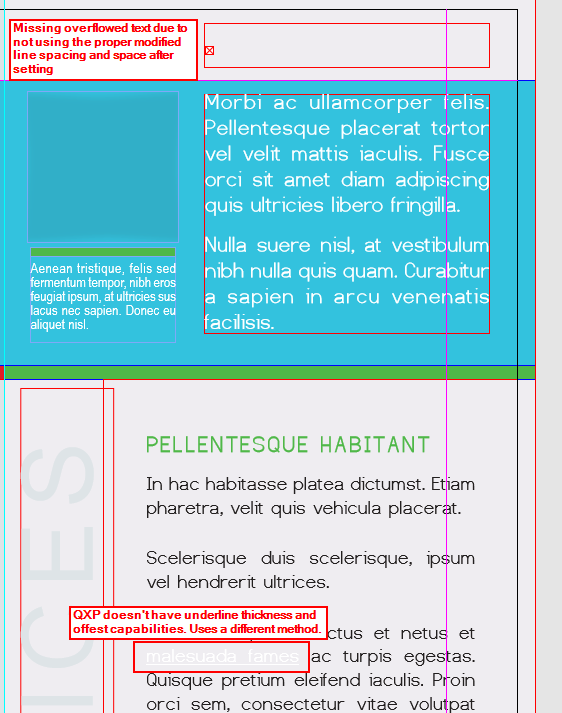
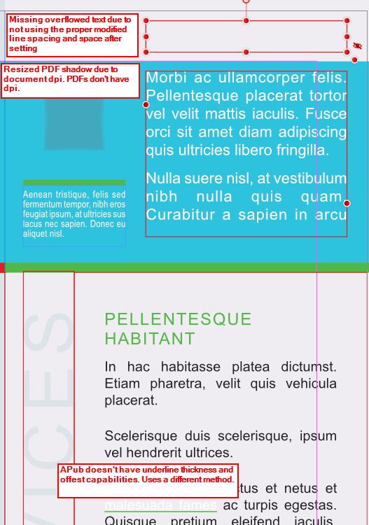
 Because I got work done that was due this afternoon last night and I'm somewhat bored, I made this little comparison. I grabbed an InDesign sample brochure and packaged it along with an .idml file. The sample filed used a certain free font. For ID, the font doesn't actually need to be installed if these fonts reside in a folder named Document Fonts. The Viva Designer sample opened the InDesign file (versus the .idml, but the results are the same as opening the .indd version in this case). The main font used was reported as missing. VD handles these missing, uninstalled fonts different than ID or QXP (more on QXP's handling later). With VD, one can just drag and drop such fonts onto the open file and they become available for that publication. Neat feature, but I would prefer the folder method of ID and QXP. VD handled this publication better than either APub and QXP. Mainly for one reason: VD can/does include ID's method of using the custom underline property as a text highlight method. With APub or QXP, the white text that should be highlighted shows with a normal underline whereas VD has the colored background with the white text. In order to display this properly in QXP or APub, one would need to know, firstly that this text is suppose to a background of a certain color and size--what this highlighted text is suppose to look like--and secondly, replicate it using their respective methods for this effect. This highlighted text is used three places in the brochure using different color each time. But all QXP and APub display is white text with a white underline versus the brochure using yellow, red and green highlight via the underline property. As with QXP, VD properly displays the shadow PDF used. I've hidden the image that sits on top of this PDF shadow to demonstrate that VD and QXP, neither having a document DPI (as ID also) the shadow is full size whereas APub shrinks it due to the use of having a document DPI. VD also handled the overridden space after and the line spacing for the headline at the top of the column versus APub and QXP requiring adjusting the height of the text box for the heading to display. As regards the font issue, APub would need for the fonts to be installed. QXP requires a slightly font folder naming, so I copied the Documents folder and renamed the copy Fonts. However, both ID and QXP can use a master fonts folder place where these document specific fonts are available for the application to use for any publication without the need to install them. While not shown, the first page of this brochure has a map as a graphic. APub properly used the map image box's run-around property, pushing a column's text over to its right side. VD and QXP requires wrap-around image boxes to be higher in the layer order it is suppose to affect. This map in VD/QXP needed moved to the Tex layer and above the text in the layer order for the text wrap to work. In addition, I had to play with the run-around properties in VD. Once moved, the values were reset to zero so those values needed re-entered. In short, there were differing issues in all three applications. However, I believe with this particular publication, VD handled it best. If I was more bored, I would have hunted down some of my other test publications that showed where APub was near perfect and QXP/VD fell short, or specific publications where QXP was the best versus APub/VD. Viva Designer: QuarkXPress: Affinity Publisher:
-
Your mentioned aspects of workflow don't have a "better" or "ideal" way but are rather up to your habits, individual preferences and skills (with the various tools, objects and panels). They mainly concern the order of various layout steps while different order causes different layout steps. Both technics, text importing (as long story) and image pinning require more discipline but may be more efficient (faster, flexible) once they got setup properly. Importing all text (for 20 pages) into one text frame enables you to use the text of the various articles as one long story across the entire document – independent of the layout, its object sizes and positions. In this workflow all text frames are linked to a long story text flow – unless you cut/paste parts of the imported text to use it in separate text frames. – This way will require extra special characters added too the text, as column, frame or page break characters for instance, to avoid confusion caused by the influence of text changes in one article on the text flow in other articles (assuming an "article" is in a separate layout element, visually only or technically, too). Pinning images is related to text flow, too, but is independent of the aspect above (of a long linked story versus separate text snippets) but concerns the workflow details of images with their related, specific part of text. A pinned object is anchored ("float") to a certain text position or it is pasted like a character ("inside"). In both ways the pinned object becomes a nested child layer of a certain text frame in the Layers panel. Thus it will move / flow with the text (but not vice versa). The different pinning options (e.g. float/inside) depend on the layout: while "inside" is useful for images visually inside text frame borders, "float" allows positions outside their parent text frame on a completely different position on the page. – This means on the other hand, pinned object get useful especially in layout where the text flow changes during the layout process (e.g. by added or deleted text passages as in a book for instance) but possibly not for a newsletter. – An alternative option is Text Wrap applied to selected images that get placed visually on a text. For a periodical medium (newsletter) both technics are rather irrelevant. But in case the number of articles and their lengths and the number of images per article would be the same in every single newsletter issue then it may appear easier to replace content of one issue to create a new one. Generally the method of replacing old content by the newer can become quite confusing and leading to content and layout errors, especially on 20 pages, because "old" and "new" are not clearly to distinguish as layout items. – Instead it is useful to create an "empty" template that contains margins/grids, styles, certain objects (e.g. those with fixed size or position) and repeated content (e.g. title, logo etc.). The optional use of Master Pages depends much on the amount of repeated content & layout objects within one newsletter issue (e.g. page numbers) and also between several issues (e.g. title page, editorial, contents overview, etc.). They are definitely helpful for guides (margins, 1-/2-…column grids). Empty text / image frames as master page objects can be quite helpful if the layouts of the different newsletter pages and newsletter issues do not need to get changed a lot for certain content. They have the disadvantage that their objects need to get "detached" for certain edits on the document pages, for instance to modify their position or object size in the layout individually. – A variant of master page objects would be to create them as (empty) templates but fully detach them durable once they get filled with content (this way they are rather like objects placed via copy/paste).
-
Images across multiple columns
Old Bruce replied to Tex4aviation's topic in Affinity on Desktop Questions (macOS and Windows)
With all due respect to @MikeTO I have to disagree with his suggestion of using "pin the image as floated". I would not Pin the image at all, just turn on the Text Wrap. With Pinning an image of this size you'll most likely run into problems later on as you edit the document. Pinning is great for small/tiny images, less useful for images which are the width of the page. A question I have is; Do you want the picture frame to be the width of the margins or just the width of the Picture? -
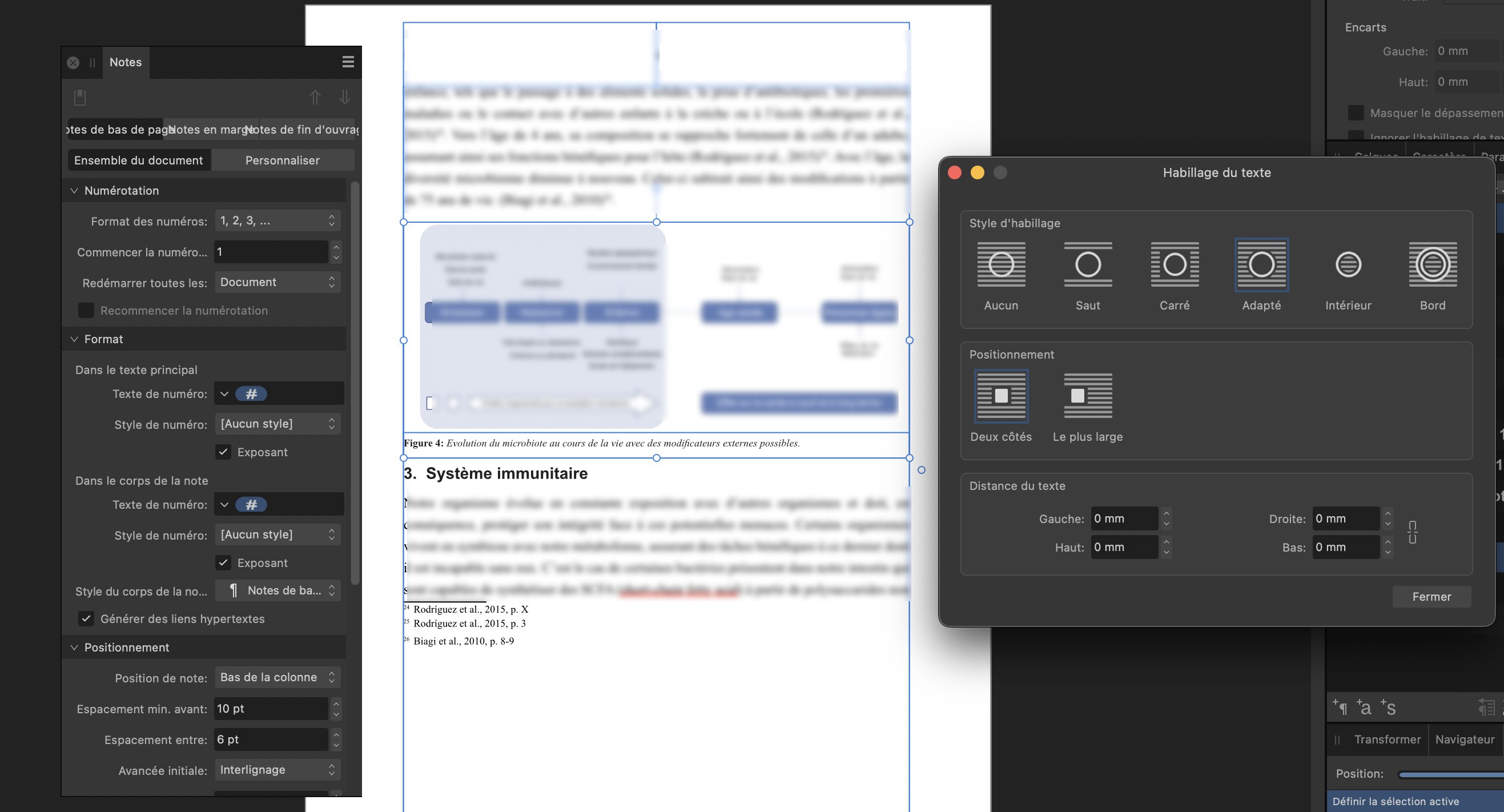
 Hello, I'm writing on the forum in order to get more information about footnotes. I'm currently struggling with the formatting of the footnotes. As you can see from the images, as soon as I apply a text wrap to my image, the footnotes don't stay at the bottom of the text box. Even when I change the footnote options from bottom of frame to bottom of column, the problem persists. I've managed to place it in the text without it moving everything around, but by moving it slightly the problem returns. Changing the wrapping parameters doesn't help. I hope my explanations are understandable (English isn't my mother tongue) and I thank you for your help. PS: I've blurred the text for copyright reasons, I apologize.
-
What is the point of leading override?
thomaso replied to mogsie's topic in Affinity on Desktop Questions (macOS and Windows)
It gets applied to characters, not lines ... similar to text wrap, drop shadow, bleed size etc. which get applied to other objects than they affect.