Godzilla
-
Posts
27 -
Joined
-
Last visited
-
 Chills reacted to a post in a topic:
Templates for book design?
Chills reacted to a post in a topic:
Templates for book design?
-
Godzilla reacted to a post in a topic:
Unofficial PDF Manual - Expert Guide to Affinity Publisher
-
Alan Ralph reacted to a post in a topic:
Type catalogues and books
-
Alan Ralph reacted to a post in a topic:
Type catalogues and books
-
A few more books from my shelves: clockwise from top left: Sophie Beier's Reading Letters (an excellent book on readability and legibility in text); Ina Saltz's Typography Essentials; Sarah Hyndman's Why Fonts Matter, and Beier's Type Tricks.

-
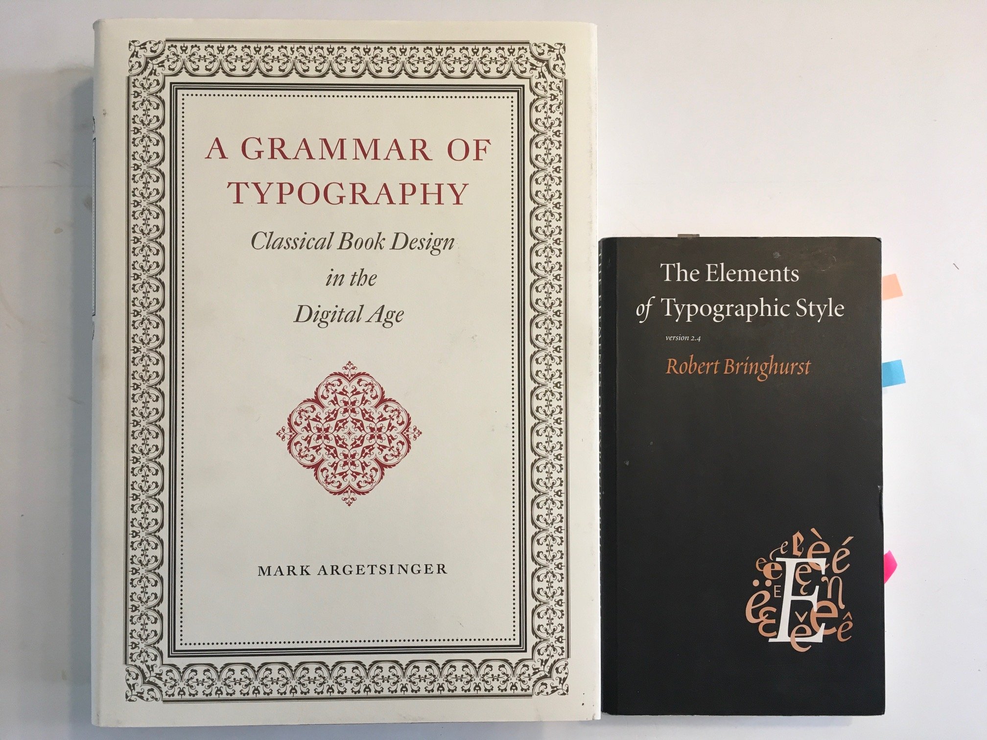
And then there's Mark Argetsinger's magnificent book, A Grammar of Typography: Classical Book Design in the Digital Age. Shown here with Bringhurst's excellent work for comparison in size.
-
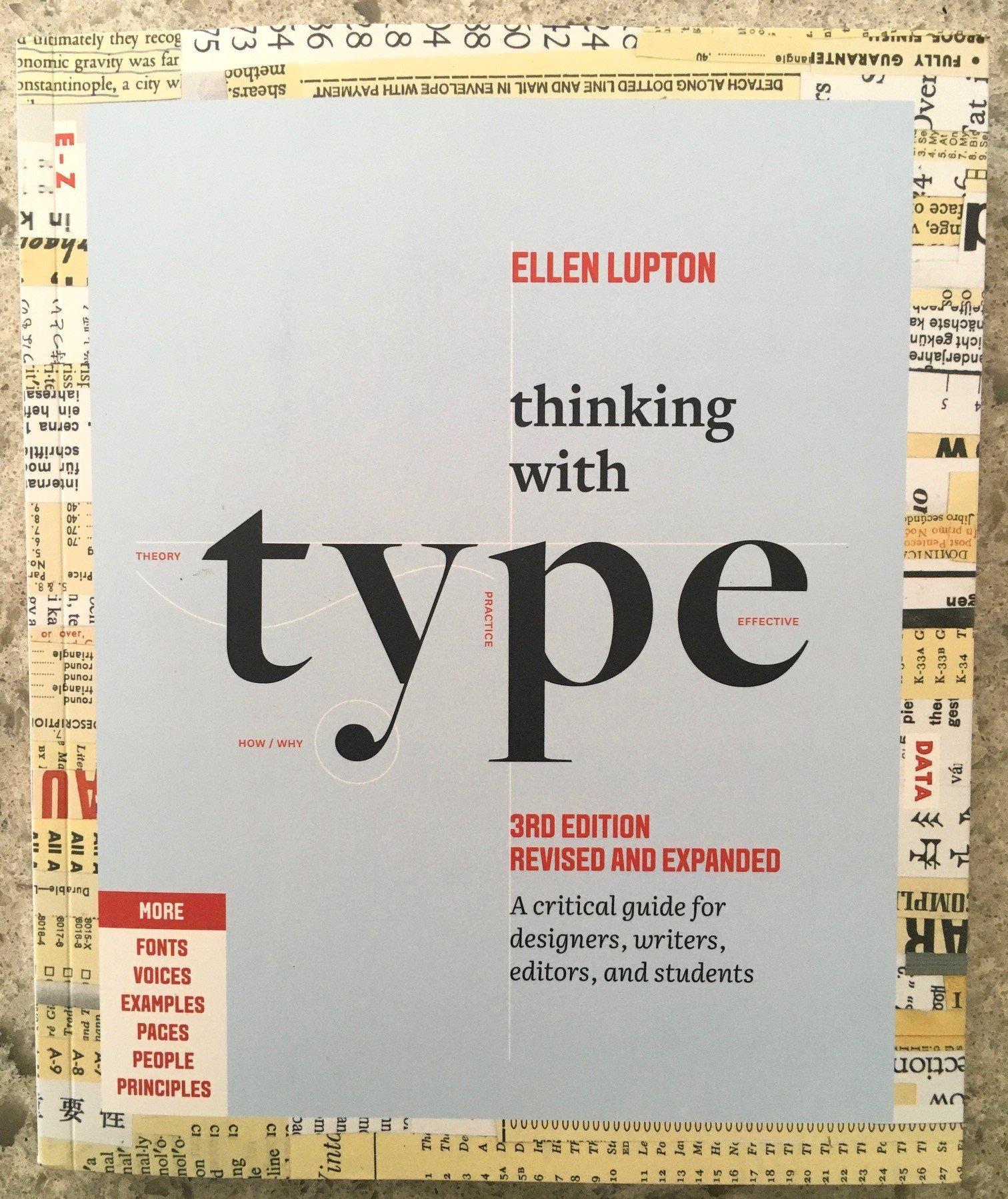
Third edition of Lupton's excellent book. I have the 2nd edition as well.
-
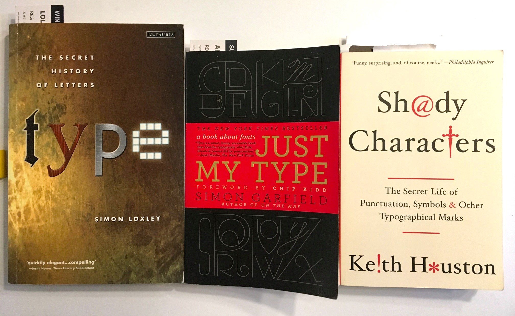
Three books on the history of type and type design. I got Loxley's book yesterday. I read Garfield and Houston previously but and rereading both. Both are entertaining to read. Modern readers may not know that punctuation is a fairly new invention in the history of writing, and that the non-alphabetic/non-numeral characters on your keyboard have an interesting, often contentious history.
-
Godzilla reacted to a post in a topic:
Unofficial PDF Manual - Expert Guide to Affinity Publisher
-
Font Explorer X
Godzilla replied to chrisk's topic in Feedback for the V1 Affinity Suite of Products
https://www.high-logic.com/font-manager/maintype I'm debating whether to use Fontbase or Maintype as a font manager. The latter can hold up to 2,500 fonts in its free version. Any further thoughts on them? -
Godzilla reacted to a post in a topic:
Curated list of Free for Commercial Use Fonts
-
Godzilla reacted to a post in a topic:
Curated list of Free for Commercial Use Fonts
-
loukash reacted to a post in a topic:
Type catalogues and books
-
iconoclast reacted to a post in a topic:
Type catalogues and books
-
iconoclast reacted to a post in a topic:
Type catalogues and books
-
iconoclast reacted to a post in a topic:
Type catalogues and books
-
Oufti reacted to a post in a topic:
Type catalogues and books
-
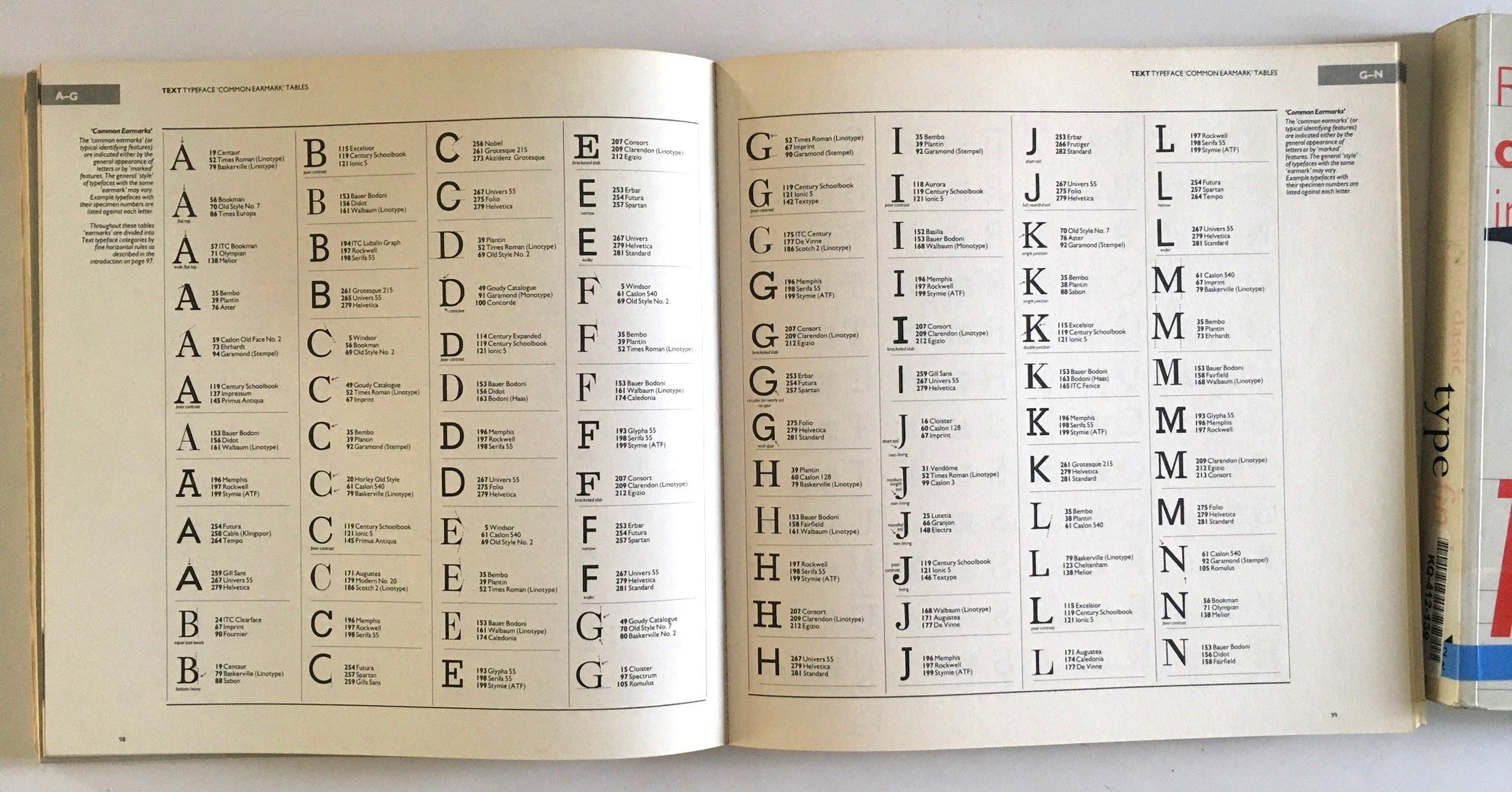
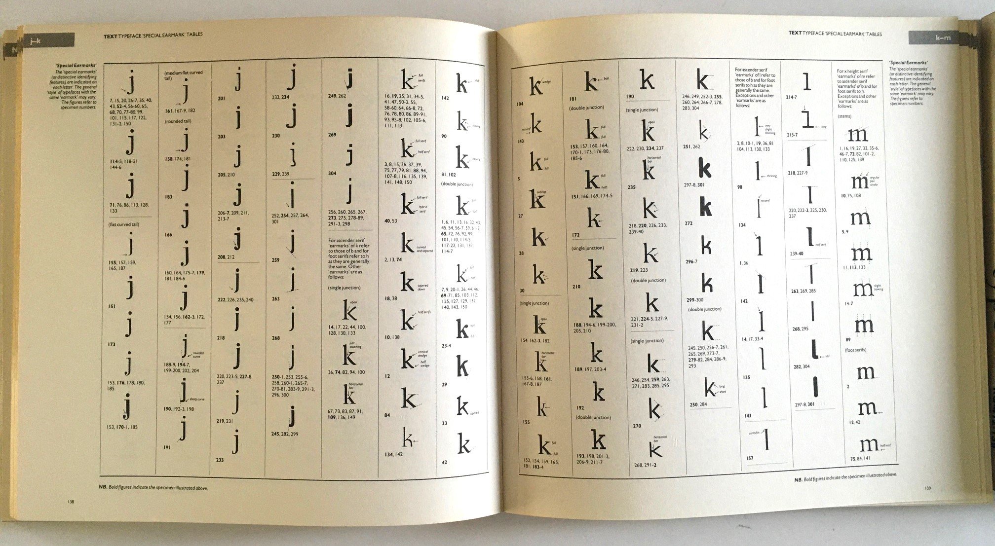
These books are what I used to identify typefaces for many years, before there ever was any online service like What The Font. The edition on the right is the last one, from 2004. The one on the left is much older: 1983.
-
Godzilla reacted to a post in a topic:
Type catalogues and books
-
loukash reacted to a post in a topic:
Type catalogues and books
-
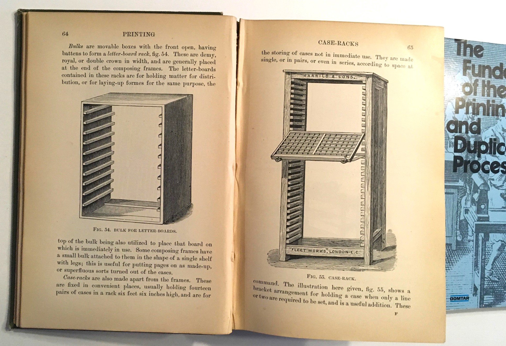
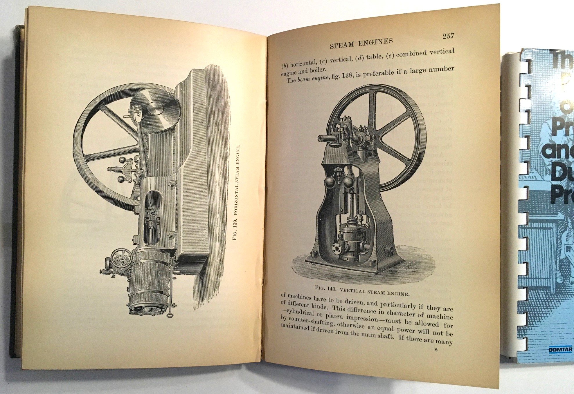
Three more books from my collection. The leftmost one is a printing textbook from 1904 by Charles Thomas Jacobi. It has the original owner's name and date on the frontspiece as Nov. 1906. The middle is an undated, Cerlox-bound handout from Domtar, and the rightmost is a small 1968 book from Howard & Smith Monotype. It has a subtitle inside: A Guide to Better Typographic Communication. I get great joy holding a book that is 120 years old, knowing that before me others opened it, read it, examined the images, and learned from it. I much prefer actual books to a website, although I have used them to help identify fonts and found many to be very informative. My last two versions of CorelDraw came with What The Font access built in. It was very handy when I had to replicate a face for a client's new work and they had no idea what had been used. In large part I prefer the printed version because I like to read and own books, and to refer to them at my leisure, not merely when I am online. I read a lot these days (two-four hours most days). At night I read in bed for at least an hour and will often choose books from my library like this to reread or look for content related to come project or study. That's how I found these three: looking for something else I recalled from my library I hoped might help with a project I am working on. I also sometimes pick up old books from yard sales or library discards and examine them for their type and layout. I have several shelves of books from the mid-1800s to the 1930s (as well as a few thousand song sheets from about 1880 to 1940). Mostly I keep them because I like to examine the typography, rather than to actually read them (well, most of the songsheets are for playing music on my ukuleles...). To my wife's annoyance, I once rescued an entire set of encyclopedias from the 1940s just because they were so beautifully set and laid out (you can see some pages here).
-
Godzilla reacted to a post in a topic:
Type catalogues and books
-
Godzilla reacted to a post in a topic:
Type catalogues and books
-
loukash reacted to a post in a topic:
Type catalogues and books
-
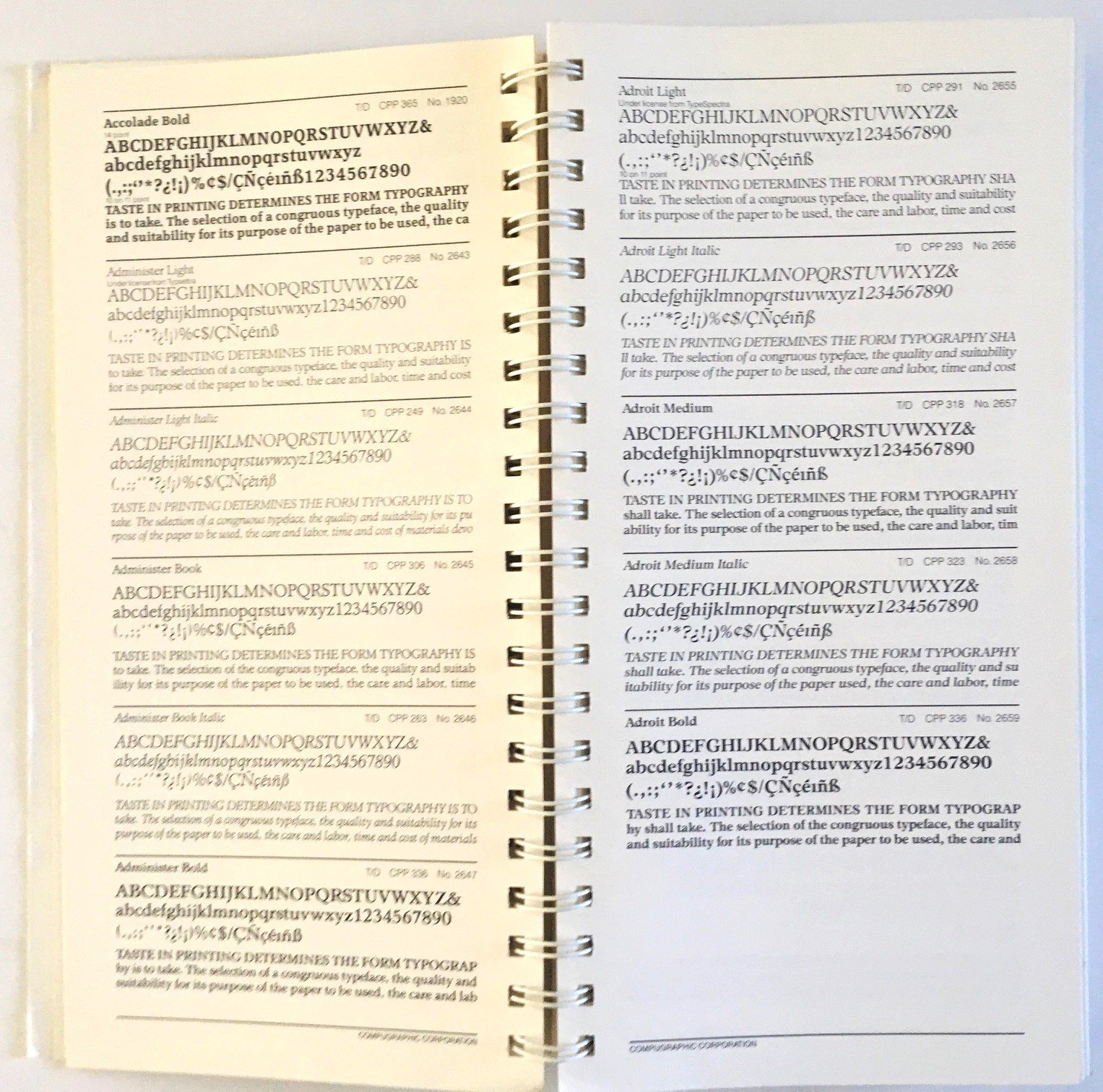
I have several books of type and typefaces in my library, including a couple on how to identify a typeface. Some are catalogues from typesetters, others just show glyph sets from various faces, and others offer comparisons of similar faces. I use these all the time when I'm hunting for a suitable face, but I also just like browsing the pages. Does anyone else here have similar books? I'd like to see more. I will make a list of those I have and post it in the comments (with some images) if anyone else is interested in this sort of book. (I also have some books on designing with type). I've attached some images of one such book. I recently came across this particular typeface catalogue buried in my library and somewhat forgotten. It was printed for the 25th anniversary of CompuGraphic in 1985, but reprinted in '87. Has some interesting and innovative typefaces in it. I picked it up in the late 1980s, likely when I was doing freelance editing and writing for tech companies.
-
Thanks again. I am not in agreement with you on the alignment of the baseline, however. I can't see why it would be better to align with the page than the margins if there will be no text outside the margins. What purpose does the grid serve outside them? And doesn't that require the user to reset the default margins to fit the baseline rather than the other way around? I look forward to reading your explanation. My reasoning: I want an exact 1" margin at the top and bottom of my page to handle running heads (1" is pretty standard in book publishing — I'm working with imperial because book and paper sizes in North America are still in inches and most publishers/printers are not going to switch to metric any time soon). My body text is 11pt with a 13pt leading. Aligning the grid (13pt) with the top (0-0) of the page means the first baseline in the text area begins 5.54pts below the top margin. The first line of text will then begin 18.54pt below the margin. If I align the margin with the baseline, it is either too high or too low (admittedly only by 5.54 or 18.54 pts). I have also calculated chapter headlines at 24pt with a narrow 26pt leading to accommodate the baseline (still looking for a suitable typeface for that tightness however) to start at a fixed location approx 3.4in or 19 baselines below the top of each opening page for a 6x9 book (or 3 in/17 baselines for 5x8 book). I am tinkering with golden ratio proportions; if I set the baseline at the top of the page, it alters those measurements slightly. My experience doing newspaper layout in the early '90s was using flats and pasting printed/waxed columns on them, aligned with the pre-printed (in non-repo blue) grid of the flat. To the best of my recollection, the grid was not printed in the margins, only in the columns (i.e. within the margins). Yes, I know, that was back during the Ice Ages (paste-up is a lost art...). But it makes sense to me that way. Anyway, thanks again for the manual. I have found it an excellent source of information. I hope Affinty/Canva recognize your effort and recompense you for it. It should be included with the program (and someone should be found to do the same for Designer and Photo, but I digress...) Cheers Ian
-
Thank you. If I might suggest a small addition to a future release... On P. 35 explaining the start position of the baseline grid: for most uses it's more practical to have the grid align relative to the top margin. That way it aligns with the area(s) where the text will be placed. Having it align to the top of the page can lead to the baseline in the text area starting awkwardly (only a partial grid space).
-
Much appreciate. This manual is a godsend. I've printed many pages to read offline and I've shared the link to this thread several times on social media. Your efforts are very much appreciated by the community. Will you need to do any updates for 2.4.1?
-
Text skew shows on screen but not in PDF
Godzilla replied to Godzilla's topic in V2 Bugs found on Windows
Because I use other apps as well, and want a reliable PDF printer for them. -
Text skew shows on screen but not in PDF
Godzilla replied to Godzilla's topic in V2 Bugs found on Windows
I suggest what she means is she and her council. Common for mayors here to say "we" to refer to the collective activities of a municipal council. And as the leader of a provincial political party, she might use it to refer to party decisions and actions. I'm not the author of the content, merely using it in a newsletter. -
Text skew shows on screen but not in PDF
Godzilla replied to Godzilla's topic in V2 Bugs found on Windows
Seems that the fault lies in the Microsoft (the version that comes with Win 11) print-to-PDF driver. The text skew shows properly if I export it. I will have to get other PDF drivers to test to see if they work better. -
An excellent resource. Thank you.


.JPG.80986e4c586194cc37f2f93a0d96635c.JPG)
.JPG.d18d2ad71485bdadfe10afcc872a162a.JPG)