Search the Community
Showing results for tags 'Affinity photo'.
-
 I have a .psd created in photoshop elements. It opens ok in Affinity photo. I am having trouble getting the exported pdf to show text as a vector (with zero pixelation when zoomed in). Can you please tell me what settings I should use during export to make sure text has zero pixelation when zoomed in? When I export the same .psd using photoshop elements, the resulting .pdf renders the text as a vector so I know its not a problem with my design setup. Also my print company recommends pdf/x-4 as the output profile but that preset in affinity photo produces a text with pixelated edges. The only change I made to the psd file in affinity photo was a conversion to cmyk color profile. I would like to start using affinity photo by default but need to be able to confidently render psd files to pdf with the text output as vector with no pixelation. Also I notice when I change the setting to "no rasterization" when outputting to pdf from .psd, it ignores any clipping masks applied so the image is not as intended. Can you please advise settings to try in this situation. Thanks so much.
 -

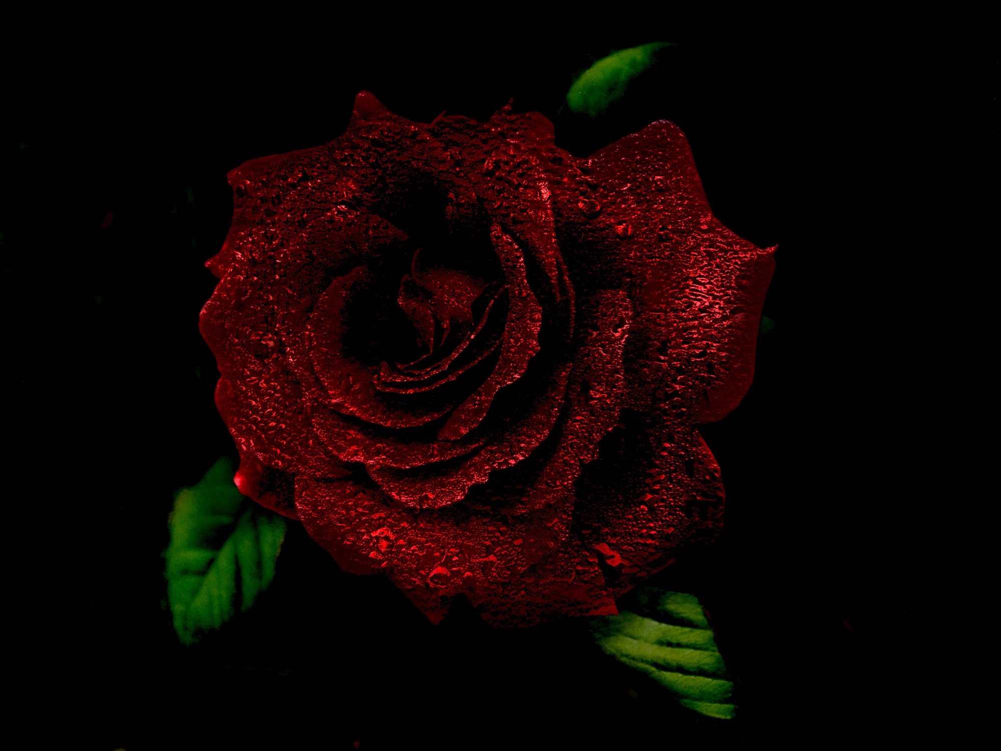
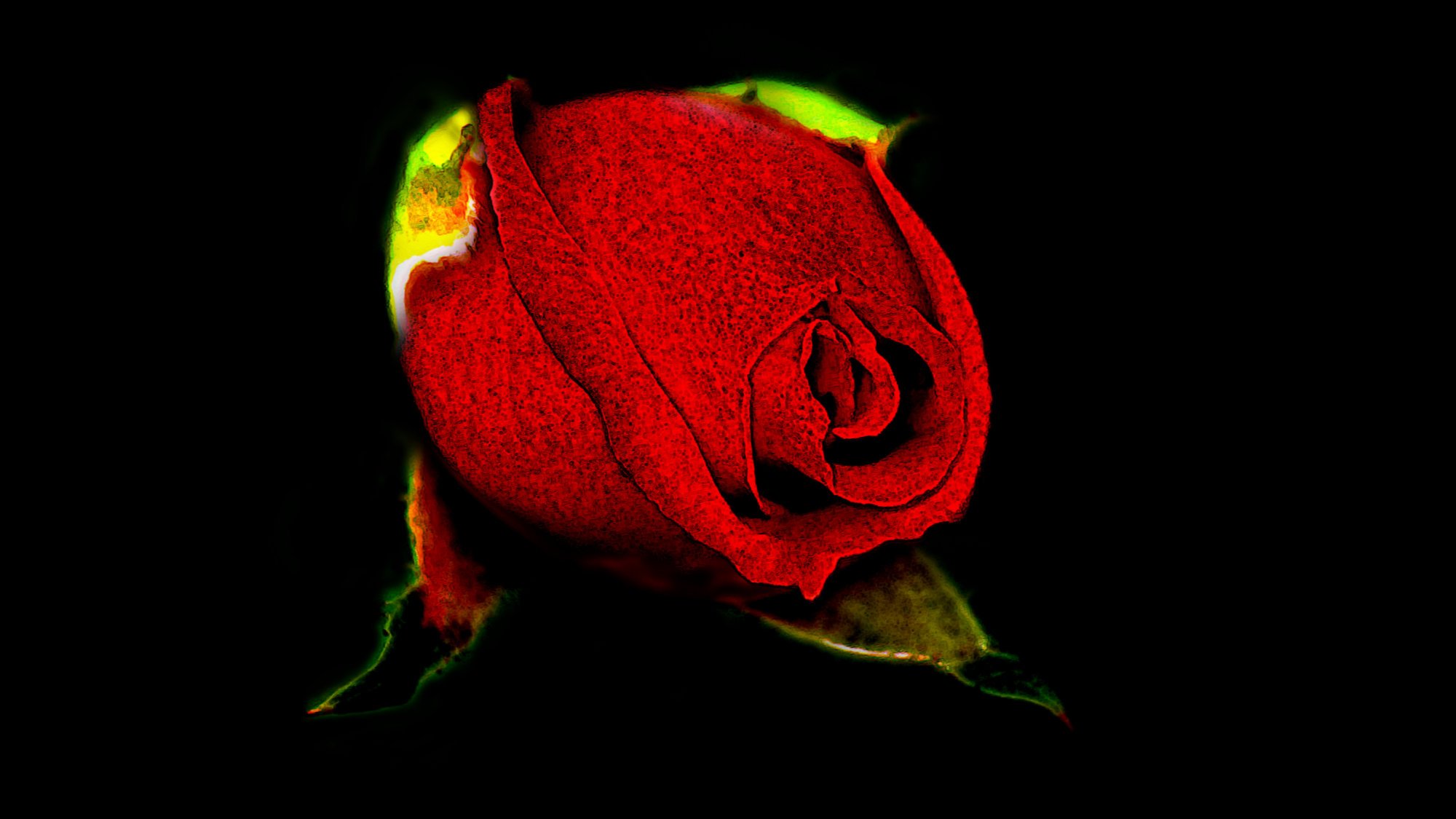
multi First raster digi painting done in Designer & Photo
Dazmondo77 posted a topic in Share your work
I usually use Clip Studio Paint for raster painting as it's super responsive and the blend and mix tools are brilliant, but I thought I'd work on this piece in Designer and Photo using some of the Daub and Frankentoon brushes I've purchased over the past couple of years - seems to have worked out OK although I still prefer mixing and blending in CSP
-

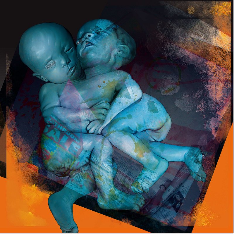
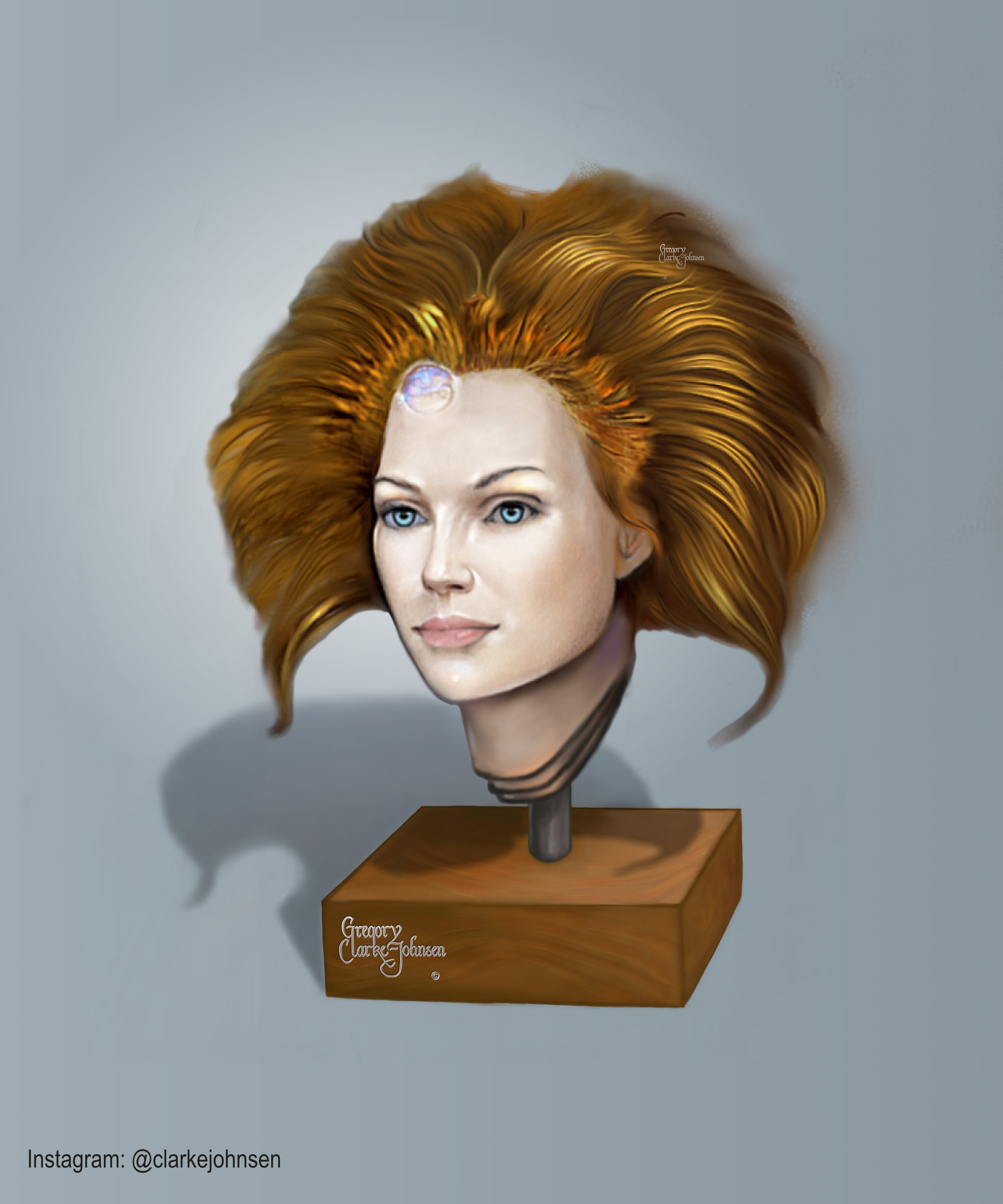
affinity photo GODDESS SERIES- HAND PAINTED PORTRAITS IN A P
Gregory-CJ posted a topic in Share your work
HI everyone. Here are a few images from my digital design goddess theme . These images were hand painted in Affinity Photo. Let me know what you think. Gregory CJ
- 5 replies
-
- 7
-

-
- digital painting
- goddess painting
- (and 2 more)
-
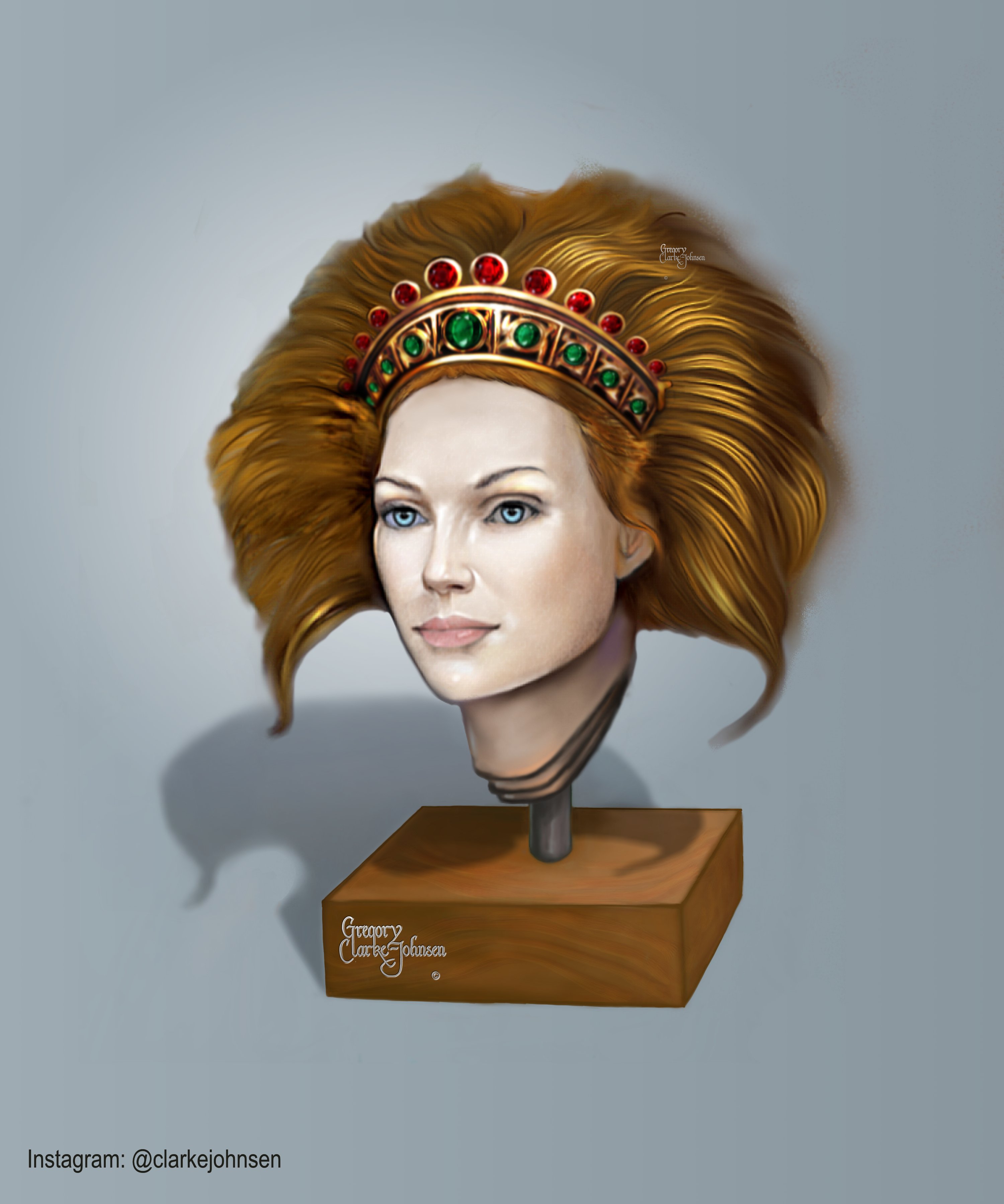
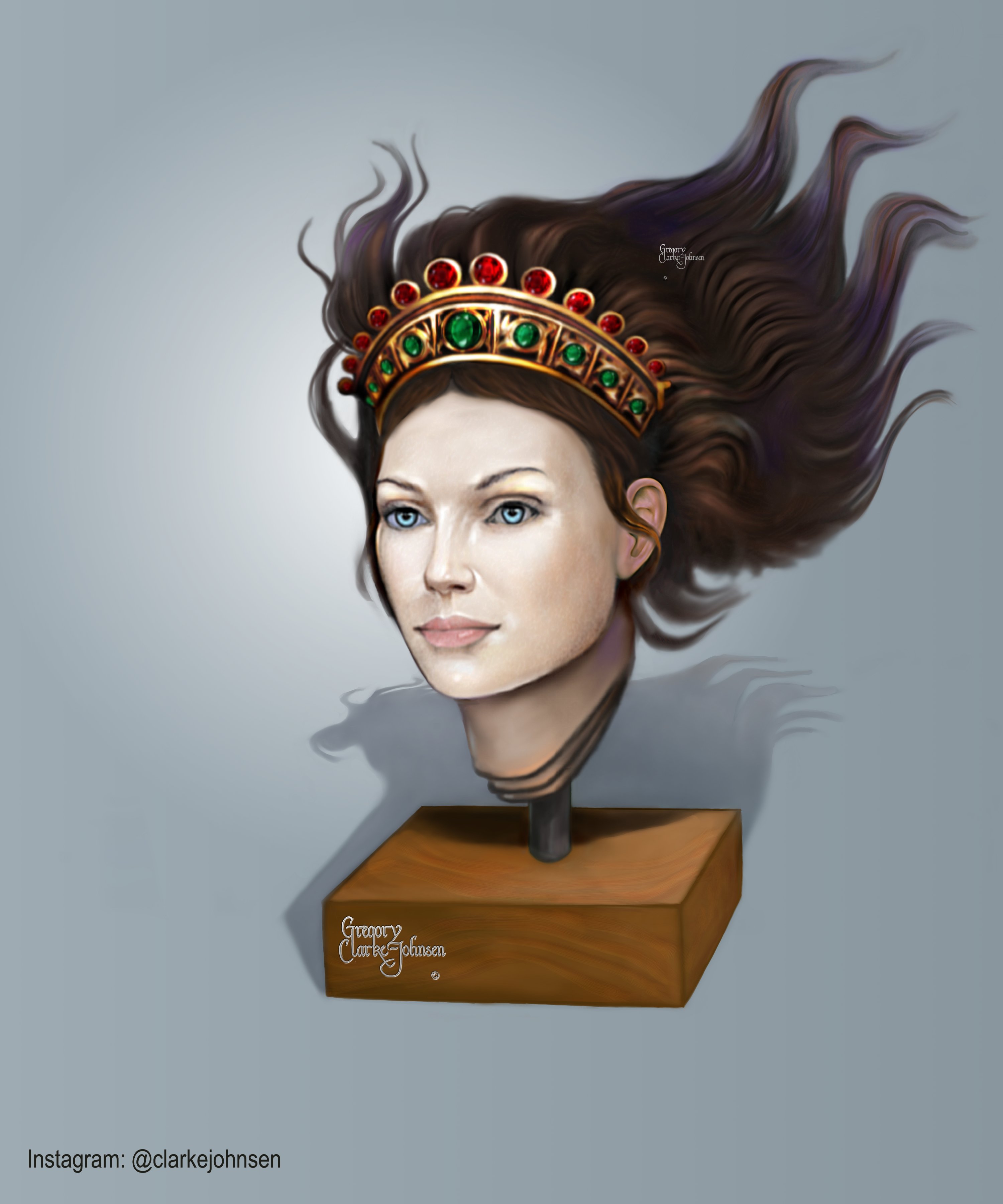
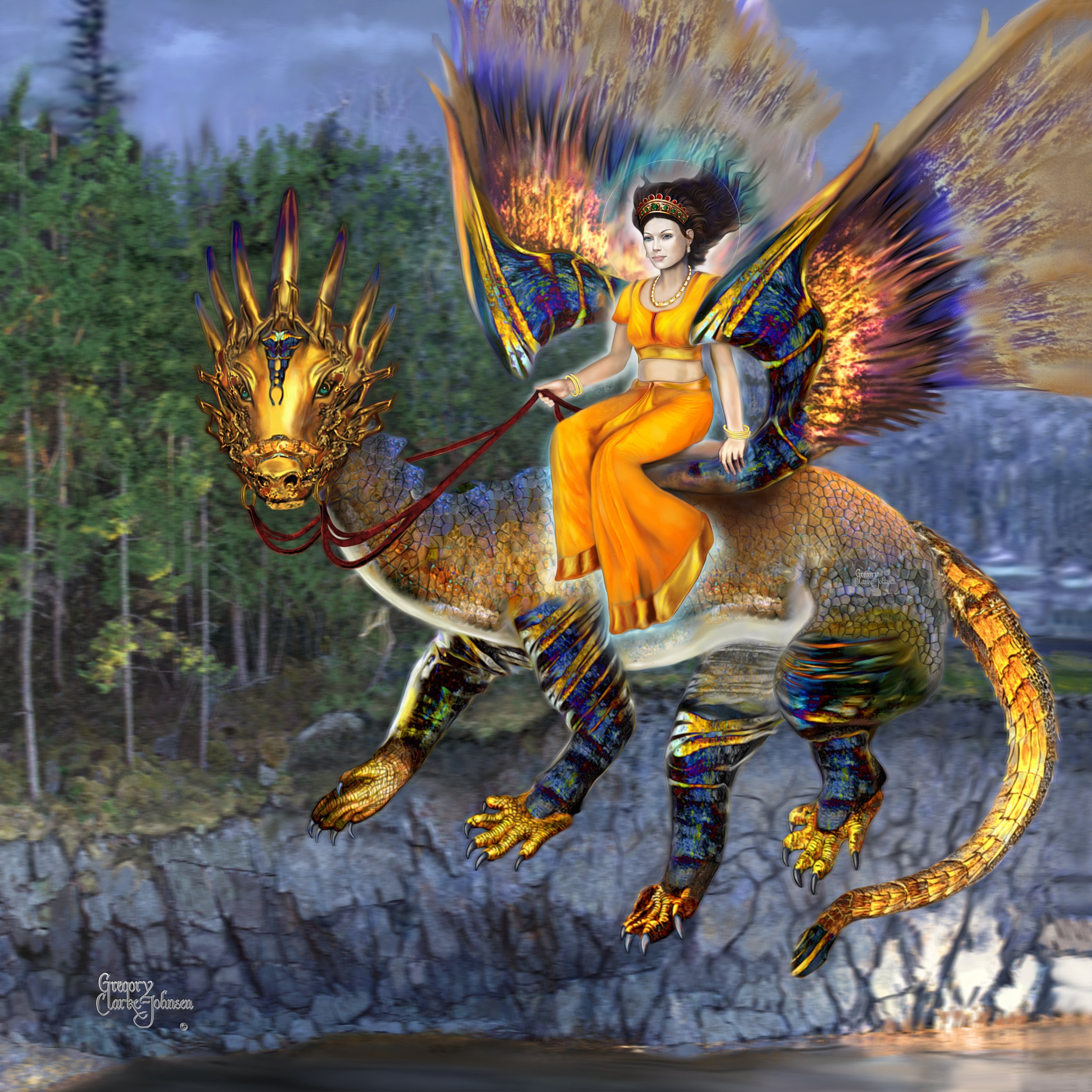
affinity photo GODDESS SERIES -FINAL PAINTING & DRAGON -AP
Gregory-CJ posted a topic in Share your work
Here is the final painting that I have been working on for some time. It's entitled " Goddess of Light" The entire piece was painted using Affinity Photo. Comments are welcomed. Enjoy!
-
- 2
-
-
- dragon
- digital painting
- (and 2 more)
-
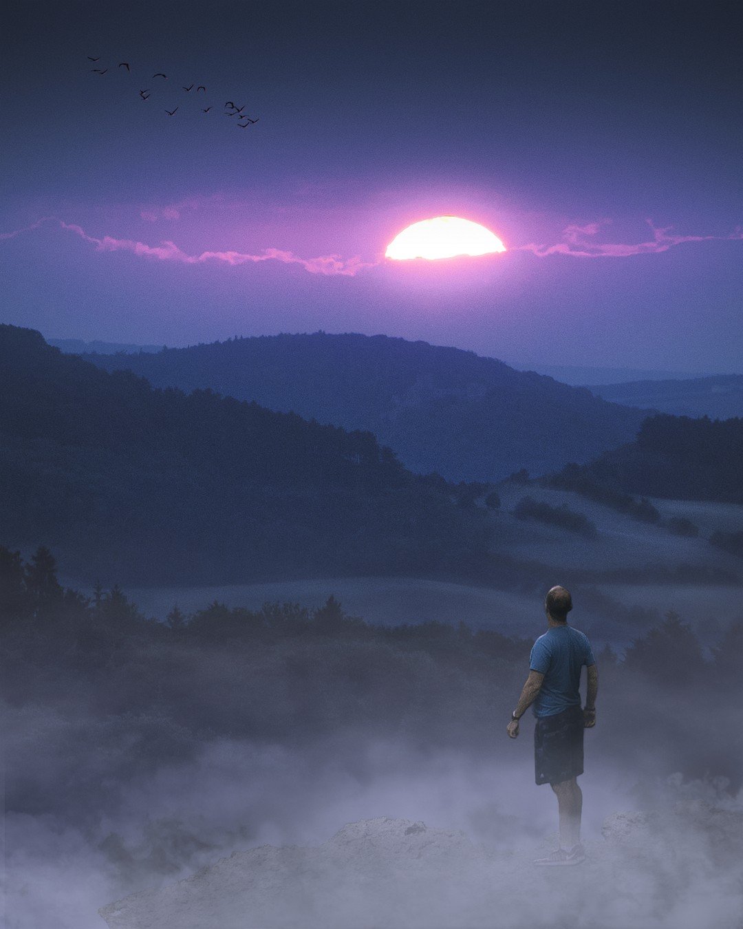
This time I was experimenting with some layer options (3D for the birds and on me), dodge and burn and blendmodes for painting in some radiation around the lightsource. Hope you like it - cheers, Marc
-
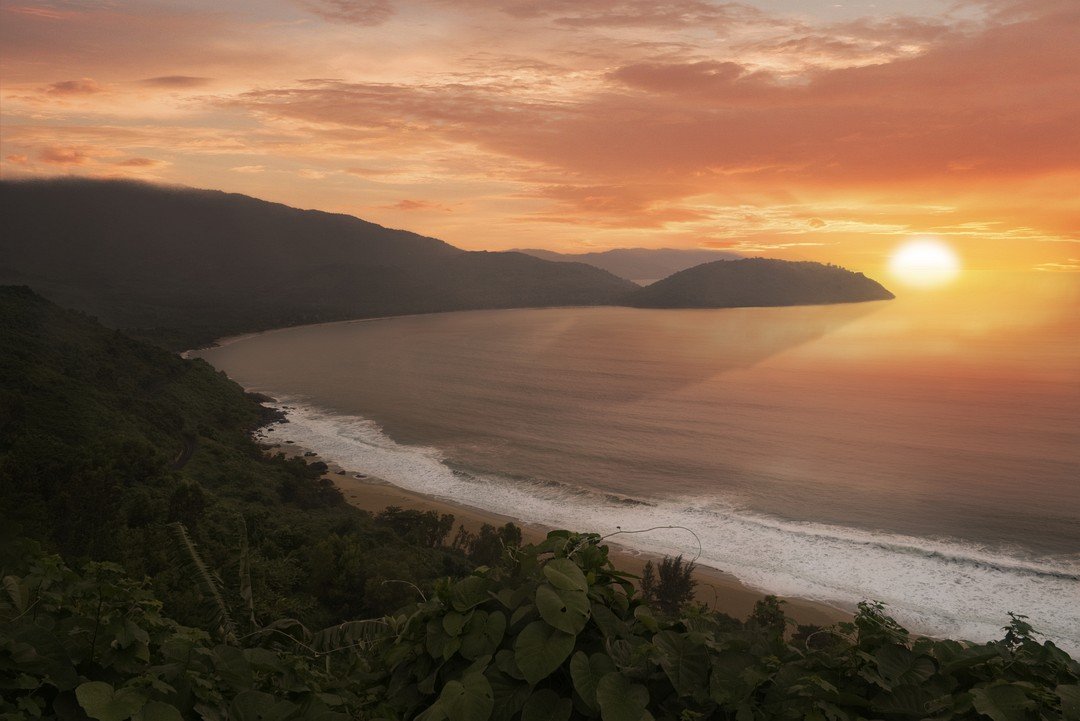
Hey folks, another photo manipulation because of a monsun like weather on the Hai-Van-Pass in Vietnam. The sun looks a bit fake, it is just a white half ellipse with gaussian blur - do you have any recommendations for a better processing? Processed in AP: Original: Cheers, Marc
-
Hi Team, I am a VFX artist from INDIA where for some creative shots we paint manually using photoshop (clone tool). Where we will be opening the Sequence inside photoshop and clone the area. Here we can choose the source whichever frame we needed and clone it in the current frame which is too good. Is it possible to enroll this feature in Affinity photo? It will make a major difference.
-
I did this following a Photoshop tutorial using Affinity Photo. I used the brushes that were offered in the tutorial but created my own denim texture in another program and then imported that into photo where I added a few adjustments.
-
 Here is the second volume of my Ten Top Tips for Affinity Photo. Hope you guys find it useful
 -
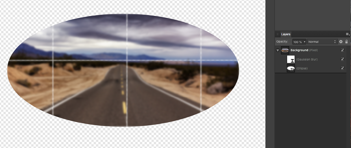
 Hi all, as part of working on helping someone else I did this (see image below) If I move the gaussian blur below the ellipse the grid disappears, a bug or is there a valid reason for this affect? odd effect.afphoto
-
Is it possible to have Text On Path in Affinity Photo? I know it's possible in Affinity Designer but I can't seem to do it in Affinity Photo. I tried creating a Path with the Pen Tool and then using the Artistic Text Tool and typing but can't get it to follow the path.
-
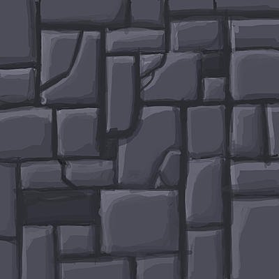
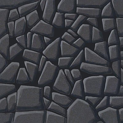
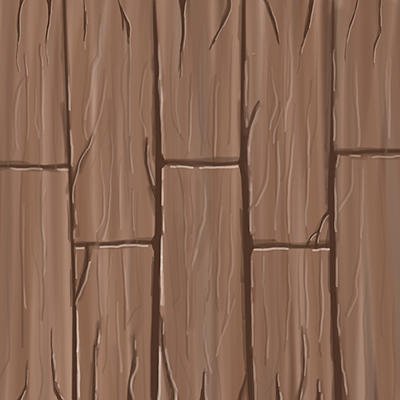
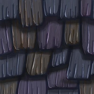
Learning how to do hand painted textures is something I've been wanting to do for a long, long while now. I like the style, I like the look, I think it's quite neat. Thing is, I've always put off trying it out for myself because I know next to nothing about digital painting. I know quite about about manipulating photos to make textures, and a goodly bit about modeling them in a 3D editor, but painted textures are something I figured would always be just out of my reach. Then I realized that the only reason why I don't know how to do it is because I've never tried it. That the only thing between me and success is a good bit of practice. So here I am. Last Thursday, I decided to do one texture a day for the next month to see how I take to it. I've crammed a few hours of tutorials on Youtube, inspected other people's works, and just studied the hell out of it. Minus some stumbles here and there, I can already see a slight improvement just after a week with it. It started out with my admitted janky first texture, and has come to today, with a grass texture that's actually surprisingly good. This thread will act as my diary, detailing my journey from totes noobis, to maybe hopefully pretty decent. If anyone wants to add or critique what I've done, feel more than free. I'm always up for some tips, tricks, and a bit of harsh, but honest criticism. (FYI, these images are scaled down from their original size) Day 1. My first attempt. It is, like I said, kinda janky. To my credit, at least you can tell what it is. Day 2. Another stone floor. Probably the one texture I spent the longest time with. Trying to get the shading just right. Day 3. A wood floor. This one was, eh...okay. It's a little flat and plain, kinda rough, but hey. Just my third day. Day 4. Wooden roof shingles. This is where I felt like I was starting to get a slight feel for things. It's still pretty sloppy, and you can see a few areas where I guffed up, but it's not bad. Day 5. Stone tiles. My least favorite of the bunch, and the one I spent the least amount of effort on, truth be told. I tried to do something in a celshaded style. Ended up just looking bland. Day 6. My 2nd attempt at a wood floor. It's certainly better than my first, with some actual texture and depth to it. Day 7. Grass. Dunno if I'm improving, or if the stars happened to align just right on this one. It's the first texture I've done that I'd consider actually decent. Though if you look at it closely, you can see how I cheated things a bit. And there you have it. My work so far. From here on out, I'll be posting one a day. Like I said, if anyone here wants to throw in their 2 cents, you're more than welcome.
- 28 replies
-
- 12
-
-

-
 So, down the rabbit hole of color management for us! I'm on a Windows 10, 64-bit operating system with a run-of-the-mill Dell P2414H. I purchased a ColorMunki Display to calibrate my monitor. In the preferences of the program delivered with it, you have the choice of ICC profile version 2 or version 4. It defaults to version 4, but my Googling appears to suggest that version 4 may be problematic in numerous situations. However, I'm also having a hard time finding recent AND reliable info (ironically X-rite's own information is very dated). Of course, I'm most concerned about all this in Affinity Photo, so, first question: Do you advise ICC version 2 or 4? Can AP handle both of them (if that even comes into question), or is it better to use the older ICC version 2? And more largely (second question), is there anything specific that I need to do to make sure that AP is... correctly calling upon the monitor calibration information in the icm file? I'm asking because I also use RawTherapee for more "in-depth" raw development, and in that program, you have to indicate the monitor's color profile (point the program to the current monitor calibration icm file, so to speak). I don't see any such thing in Affinity Photo, although I do think Affinity Photo is completely "color managed"(?). So, I suppose there i a third implicite question: How does AP insert itself into the color management pipeline on any given computer? De excuse me if my terminology is off; I hope everything is understandable and thank you all in advance for your feedback!
 -
really capable software
-
Original black and white photo and source: https://www.theatlantic.com/photo/2014/04/world-war-i-in-photos-soldiers-and-civilians/507329/
- 16 replies
-
- 12
-
-
Hey folks, this is my 2nd attempt in Affinity Photo. What do you think about it? Expect more edits soon Best regards, Marc
-
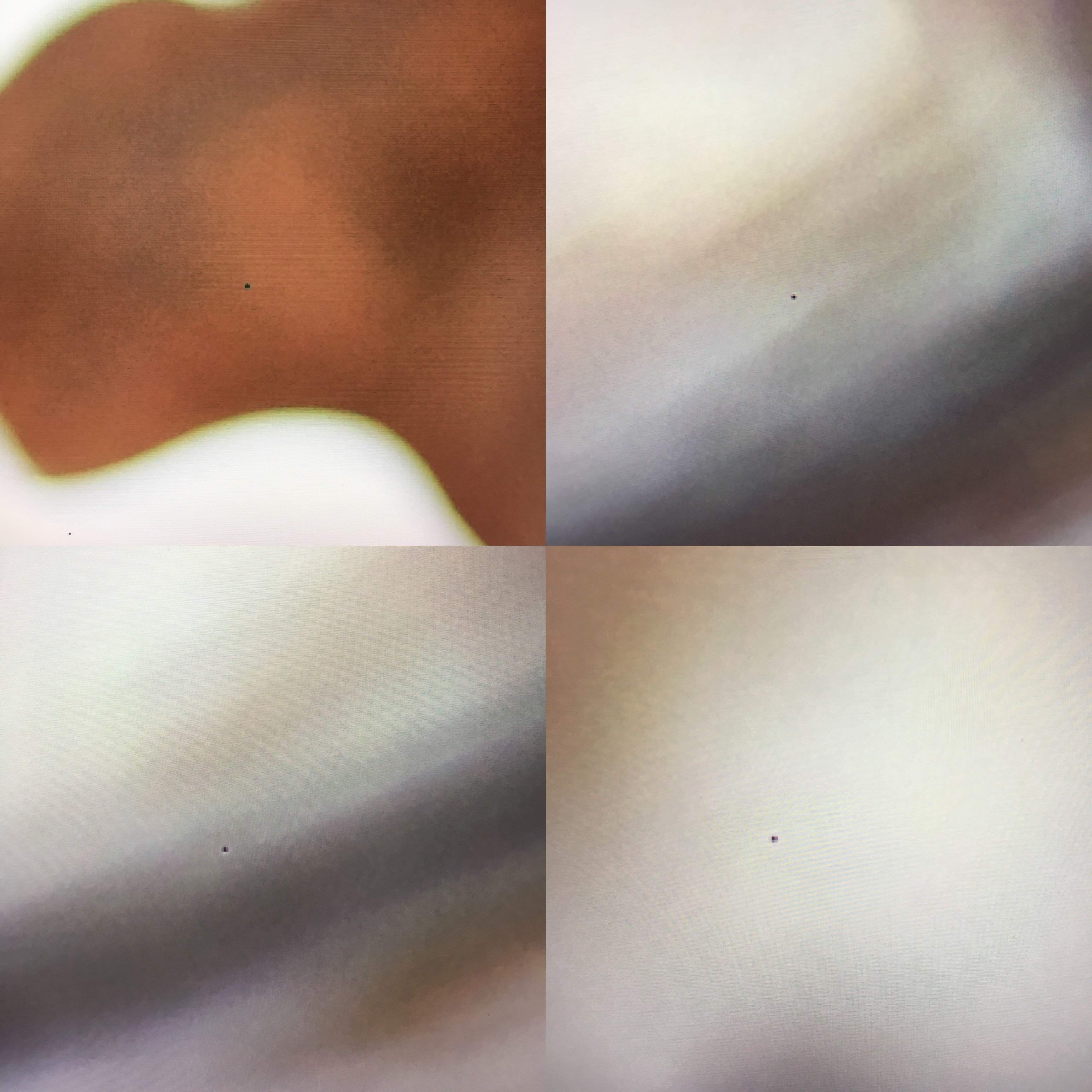
 Hello fellow Affinity iPad users! i just bought the Affinity Photo App for my iPad Pro 9.7“. I already love it! However I encountered one weird problem: There are random tiny dots visible on my imported RAW files (RW2, Panasonic Lumix G7). You can see what I mean in the photo I have uploaded below. Does anyone know where that could come from? As for now it isn‘t that much of a problem as I can remove the dots with the clone tool, however it is quite annoying if you have to edit multiple photos and have to go searching for the little dots first and remove them all first. if you need more information to help me with my problem, just tell me, I‘ll try to be as precise as possible. EDIT: The dots appear only in Affinity, when I import and export the RAWs with another software, there are no dots visible at all. EDIT 2: I have now found out that the dots are so called „Stuck Pixels“. I tried the Pixel Refresh option my camera provides that actually claims to solve stuck Pixel Problems but that didn‘t work - it actually made it worse I believe. I‘m a bit concerned - I have spent my money onAffinity and really want to use it but this makes it pretty much unusable for me... Thank you for every answer! Greets, Sarah (infinabey)
-
Hi all! I've recently started work on a new project using Affinity Photo on iPad Pro called Coup de tête. This is the second in the series so far, I always like to get people thinking about my work and create that emotional connection. What do you see?
- 7 replies
-
- 4
-
-
- art
- contemporary art
- (and 1 more)
-
 I hesitate to post in this august place, but I think one of my selection techniques has not been explicitly described before.. This video is aimed at real world outdoor photography which is often taken under less than ideal conditions; and where we need to cheat because there was not a camera there when we wanted one.. This image is a composite. It was constructed in Affinity Photo. The video is a workflow demonstration - it is not good enough to be called a tutorial. Outdoor activities can often be difficult to photograph. My pastime is sailing, and I now have a motorboat. It is surprisingly difficult to get images of your own boat at sea. So you have to use what you can beg, borrow, or steal. The video is about using a photo taken by a friend, taken from a moving platform(another boat) under less than ideal weather conditions. We take the image and transform it so it can be used in an entirely different context. I have used three techniques described in official Serif Affinity videos by James Ritson. They are "Bringing Out Water Detail" <a href="https://vimeo.com/202899215" rel="noreferrer nofollow">vimeo.com/202899215</a> "HDR from one exposure" <a href="https://www.youtube.com/watch?v=Ar6CZvfyFvk&feature=youtu.be" rel="noreferrer nofollow">www.youtube.com/watch?v=Ar6CZvfyFvk&feature=youtu.be</a> "Making Images Pop" <a href="https://vimeo.com/178575803" rel="noreferrer nofollow">vimeo.com/178575803</a> The first part of the video deals with enhancing the basic image, including two different applications of tone mapping. The second part deals with four different approaches to selection, to deal with different aspects of the image and how to combine them. I have not seen the use of the pen tool to create fine detail precise selections before, but maybe I did not look far enough. So far as I know, it is a first. The same problems apply to a lot of outdoor activities including windsurfing, climbing, motocross, horse riding. Wherever there is equipment, wild background, fine details (such as reins or ropes) then complex selection may be needed so you can blag an exciting picture. Please view
 -
 Hello.When I make Photos with my 2000d in Raw and put These in Affinity Photo it always get pink. In Canon Digital Photo Professional 4 it dont. Can you please help me?
 -
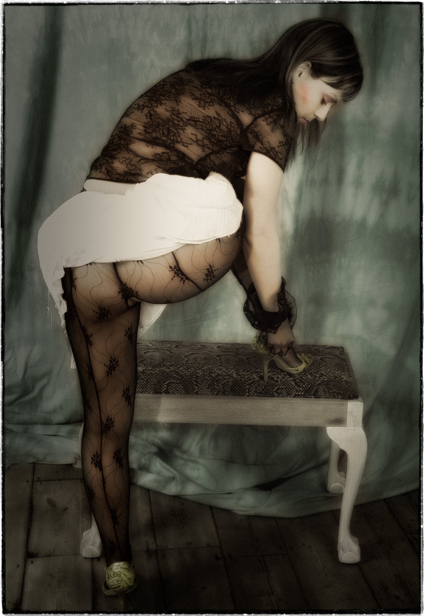
 I have swapped from Adobe to here. I've been a Photoshop user since 1997 but always felt Adobe were extortionately overpricing their products. I tried and loved Affinity...yes, there are a few glitches, but it's quicker, more accessible and even more powerful in places. I used Serif products way back in the early 2000's on a PC and always liked them. Now that Adobe are using a subscription system, I want no more from them. One area of silver photography where I have had to find my own way to reproduce an equivalent effect is that of diffusing the image by using a lady's stocking under the enlarger lens, diffusing the highlights, which as it was in negative, would be the shadow areas on the print, giving a beautiful skin tone and a broody darkness to the image. I would then hand-colour the image using dyes. I was sponsored by Photo Technology who made them back in the 80's. Affinity is a real delight to find and my first image is offered here; a digital stocking-diffused, hand-coloured black-and-white image.
-
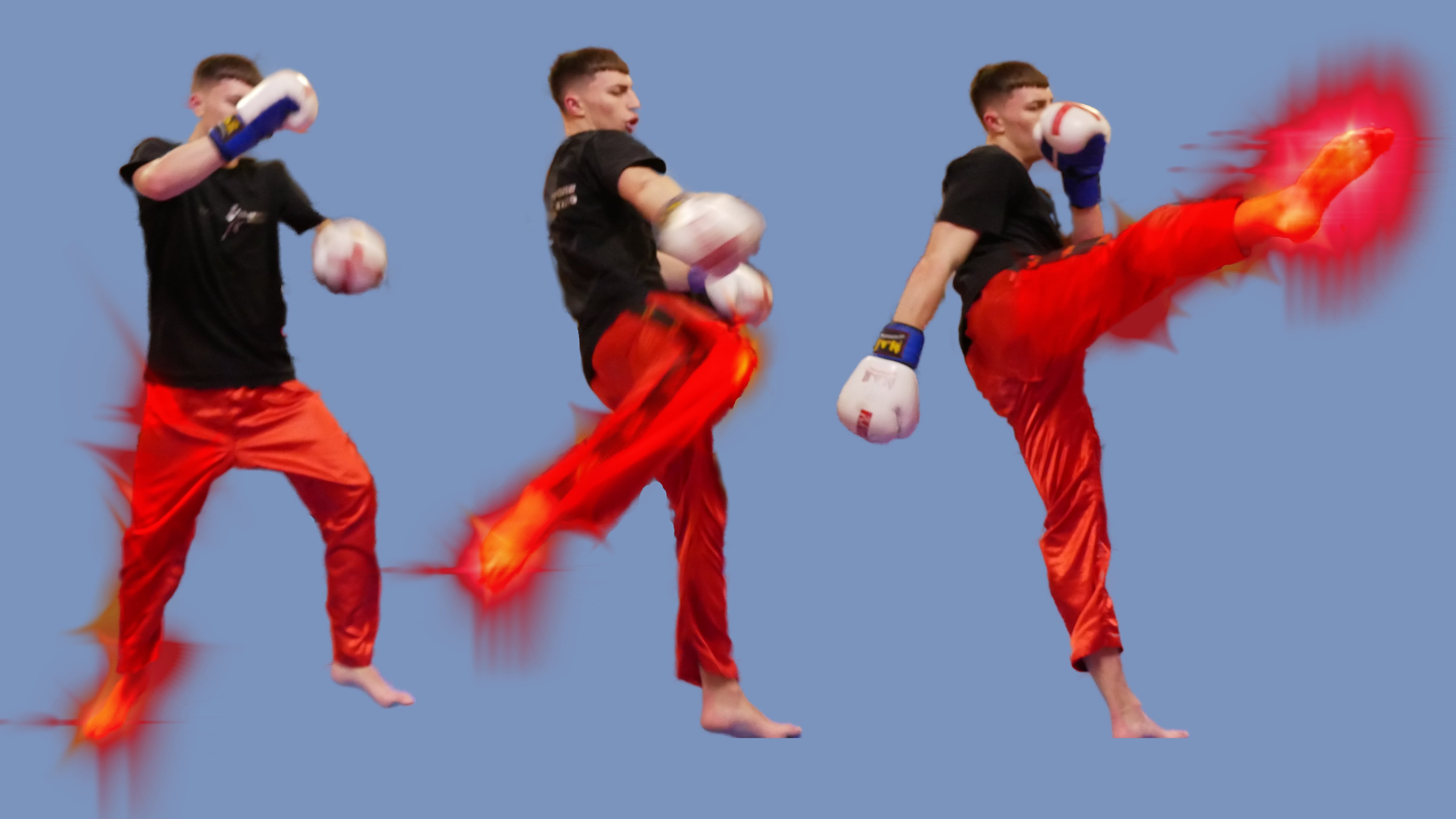
Still getting used to the whole photo editing and designing thingamajig. First one is logo Ive designed for friends Kickboxing club, its still WIP as I feel its not just there yet. Second is me messing about in Photo using the Xenon brush pack. I did wan't to try and use the smoke brush pack. But I just couldn't get it right and watching the creators Youtube video in slow motion still didn't help.
-
I believe this is the 4th issue that I've created cover-to-cover with QuarkXpress and, just as important, Affinity Photo and Affinity Designer. My workflow has COMPLETELY changed, from the world of Adobe, to a mix that serves me better. I've read through many threads in the forums, mostly positive, but some rantings how Affinity products are not "pro," whatever that means. Granted, these are my opinions, but Photo and Designer feel so much better than their Adobe counterparts. There was a bit of the "changing the brain" learning curve, but I'm far more comfortable now than I ever was with Adobe, especially since they went to a subscription model. Just with the magazine in mind, I've created photo collages, done a massive amount of photo manipulation, color correction, logo creation. . . .everything but the layout (I've been using Publisher Beta but it's not at the point where I can rely on it to see the magazine through to print). The magazine Editor and Publisher are happy, the print files are hitting all the right notes with the Printer and the public are enjoying the product, both physically and electronically.
-
 Some photoshop brushes work just fine but others seem to lose their propeties. I don't know if it is because they are not fully compatible.