Search the Community
Showing results for 'variable fonts'.
-

Variable font support, please!
M1chael replied to Rooobert's topic in Feedback for Affinity Publisher V1 on Desktop
I would really like to have support for variable fonts in the Affinity tools, too. please -

Variable font support
MikeW replied to George Thomas's topic in Feedback for Affinity Publisher V1 on Desktop
Yes, ID supports variable fonts. But I don't know whether Adobe has added support yet for other than the predefined weights in the variable fonts yet. Pdf generation takes more time, especially when an application can make use of user defined axis controls. Variable font support hasn't been added to the pdf spec as released. So variable fonts cannot be edited in a pdf, for instance. -
Hello @rhavin and welcome to the forums. This is a variable font. Variable fonts are not yet supported by Affinity programs.
-
Glyphs with internal overlaps render incorrectly
MikeW replied to Vozka's topic in V1 Bugs found on Windows
No, the font is technically correct. Various rendering engines, especially those that do not support variable fonts, can render each component with artifacts, including the artifacts shown in this thread. Many Google fonts on the GF website do have various issues in many applications. -

Is AFFINITY dead?
Fritz_H replied to J.T's topic in Pre-V2 Archive of Affinity on Desktop Questions (macOS and Windows)
..but there are still those 90% who had to wait very long for e.g. HW-acceleration.. which still often causes issues ... or are still waiting for support of variable fonts.. etc. -

All text not loaded from pdf or illustrator
Sean P replied to AndreasFurster's topic in V1 Bugs found on Windows
Hi AndreasFurster, The attached AI file is using a Variable font which is not currently supported in Affinity which I believe is why its failing to import/show up. I will get it passed over to development to see if it can be improved on import when using Variable Fonts. The Ghostscript converted PDF is also using a Variable Font, so is likely why that is not displaying correctly when switching fonts. I did switch the font to a non variable in AI and the file was then able to be imported ok! -
 Welcome to the Serif Affinity forums, @Its_Jack. That probably indicates you're using a variable font. The Affinity applications do not support variable fonts yet. You probably need to uninstall it, and pick the standard version of the font from the "static" folder instead.
 -
You’ve actually been tricked by Google. In order to better sell your personal data, this search engine first shows you what matches your interests, then those of other searchers on the data server you depend on. This is the same principle that makes social network users believe that their very marginal opinion is in the majority. Everyone has understood that you do not use variable fonts or Opentype collections. Their main advantage is, of course, to reduce the total weight of a font family and this makes them adopted since their creation in 2016 by the Internet world. In DTP, it’s been slower, because we often only use a few different fonts in a document, and DTP software has been a little slow to implement them unlike Internet software. In the last couple of years, there has been a growing interest in DTP in this new technique, because many agencies are doing both print and screen, and also because with these fonts, most of the restrictions of DTP are minimized. In addition, many forges often offer only these formats, which further speeds up the process…
-
 The default master in Mulish is ExtraLight. And when variable fonts are not supported the fallback font is the default master. So he definitely installed the variable font.
 -

Exporting to PDF: wrong font style (font type is OK)
RobLonely replied to RobLonely's topic in V1 Bugs found on macOS
Thank you very much for pointing to PDF format and for the link. So to avoid using variable fonts with APub or InDesign or whatever, it would be helpful to KNOW which fonts are variable and which ones are not. To be quite honest I haven't thought about this separation of fonts up to now. As Dov Isaacs writes it could take years until the PDF specification takes care of variable fonts. So there is no other way than avoiding these fonts, isn't there? -
Since you had a previous version of Office installed, with fonts included, and now you have M365 in which Calibri is probably now a cloud font, I wonder if you have some sort of font cache issue. On Windows if you have a font actually installed it will not download the cloud font. For example to get it to download the static cloud versions of Bahnscrift, I had to delete the Bahnschrift variable font (which is protected). I would check to see if Calibri is in the CloudFonts cache folder. And I would check to see if Calibri is still installed in your normal fonts folder. APub can see the font like it is a normally installed font, so I assume it is there. If it was only a Cloud font, only Office apps could see it (like Word). I cannot check all this - we need some other Mac users with Office and Calibri. Ugh, cloud fonts, wadda nightmare.
-
@walt.farrell It turns out GF does have the current axis registry listed in a user friendly way. It is at the bottom of their variable fonts list - there is an Axis definitions tab. https://fonts.google.com/variablefonts#axis-definitions Those are just brief descriptions. The GF Knowledge info in-progress will expand on that with demo images, etc.
-
Tuffy Bold (Google fonts) is close for the same characters. Bahnschrift (Regular), which ships with current Windows versions. It is a variable font and likely isn't super useful in Serif applications. DIN Medium
-

Variable font support, please!
DamienG replied to Rooobert's topic in Feedback for Affinity Publisher V1 on Desktop
At this point I'm starting to think they're holding back important features like variable fonts and webp support to put into a 2.0 release we have to pay to upgrade to. -
@walt.farrell Because nothing has happened regarding this in the "official" repo, Google Fonts established their own Axis Registry for their own use (and their web font API) and to provide some clarity to the entire variable font ecosystem. https://github.com/googlefonts/axisregistry It currently has 23 axes accepted into this registry. https://github.com/googlefonts/axisregistry/tree/main/Lib/axisregistry/data And there are many more axes proposed in the issues tracker: https://github.com/googlefonts/axisregistry/issues And there a few other proposals scattered around the GF repo. They do not treat this as "this is our way" but more of a place to get ideas, and feed back, and then to propose clear definitions of each axis to help everyone going forward. For example every one needs to be on the same page in defining the Italic axis vs. the Slant axis. So users will know what to expect when they encounter a font with these. There is also guidance on the "best" scale(s) to use the various axes, and why. I know this registry is not very helpful regarding clarity for the end user right now. But GF is currently working on an update to their GF Knowledge pages which will provide good descriptions of every axis - which will be very helpful for all end users. I see their updates and discussions almost every day as they work on this. You can see some examples of that here (they call it GFK): https://github.com/google/fonts/search?q=GFK&type=issues I am not sure of the timeline for publishing that, but they are diligently working on it. Since it is CC licensed we will be able to share it in different forms.
-
I want to use fonts downloaded from google fonts, and they download as a variable font ttf. So, without this feature, I'm restricted in design options. They do correctly load in kind of, in so far as the list of weights is the same length as the weights in the family, but one weight takes place for every single one. I'd consider this a bug. I see the topic goes back two years. In absence of the feature, can anybody recommend solutions to extract the individual weights from the ttf as a workaround?
-
@walt.farrell don't forget that they are still very useful for folks exporting to bitmap and vector (via curve outlines) formats, providing them with additional flexibility to customize and tweak their text elements using the various axis provided. This is especially useful as doing significant vector manipulation of outlined fonts in Designer is not exactly a pleasant experience currently, and having to redo that work should the text change makes me weep. The importance of being able to retain those text elements as editable text shouldn't be overlooked just because the output is rendered static (without variable fonts).
-
I was reading the Microsoft docs page on that font and that seems to be the case. Even from a font managing standpoint, I am absolutely for abolishing separate, dedicated weight files. It could be interesting to have a “snap to weight” flag/checkbox, too. And the same goes to “snap to width” (on that subject why wouldn't you care for variable width? It would also simplify things on that department). Then again, that should become an OpenType and UX standard of sorts. IMHO, the only styles that could still be separated into their own files are the italics. Then again, it's not like there couldn't be a convention of sorts, a more restricted, glorified stylistic set of sorts, which could still allow for parametric changes to angle. That way, you could indeed have an instant upright italic, an oblique version, etc., all in the same file. Yeah, I got a bit lost there. I think as a type designer and font editor teacher, so this is just me creatively rambling at this point. In any case, Serif could and should be at the forefront of typographic innovation, instead of just focusing on illustration and classical DTP. I know it will take years for them to match Adobe's Single- and Multiline composers, RTL support, yadda yadda, but variable fonts are really just easy pickings, even if they're just based on a bunch of custom parameter sliders at this point. It's the standardization further down the road that really matters, and the only way for them to partake on that is to enter that market ASAP. Also, thank you for pointing me to that Microsoft font. I had absolutely no idea they were toying with variable fonts already. That makes me extremely hopeful for an eventual appearance of variable font support in Microsoft Office, and not just at the OS level. That would solve so many headaches, really…
-
 You're welcome. I am not sure what you mean by "picture in picture", but here is a clip showing what I mean by duplicating placed pages and cropping them so that parts that need to be updated are clipped out. In this case the year 2021 is updated to 2022 by using an existing "2" from a copy of the page, but basically fixes would need to be made by using installed fonts (or their close "relatives"). The idea, however, is to show that by using "Passthrough" you can reproduce (re-export) a production PDF without touching the original, which in this case was created in QuarkXPress 2018, using legacy Type 1 font [not basically "supported" anymore by the high and mighty] and having itself placed PDFs created in InDesign (Arabic text) and VectorStyler (variable font and warped text, which were vectorized already when initially creating the exported PDF by VectorStyler). The production PDF that was used in Publisher was created in PDF/X-1a:2001 (not reproducible by PDFLib that Affinity apps are depending on when producing PDFs), which needs to be exported using "PDF (press-ready)" to avoid rasterizations. The clip shows that nothing is rasterized, and parts that were initially fonts, are fonts still when exported from Publisher, and that all colors, including spot colors, are passed through. Attached are the source PDF, Publisher document, and fixed PDF. As mentioned, an easy alternative would be using a professional PDF editor like Adobe Acrobat Pro [still purchasable based on "perpetual" license model whatever that means especially on macOS platform] or PDF/X-Change, and directly change the year "2021" to "2022", and just save. PDF Expert (the macOS editor I purchased) could not do it, because it would not keep the spot color (and would not keep even a CMYK color). It would still be a useful tool when replacing, inserting or deleting single pages, arranging pages, or merging PDF files, disregarding the color space, and doing annotations and text editing RGB files.
 -
There are essentially 5 kinds of fonts in print. Windows offers 934 of them for free. A lot of them are not recognized by the Affinity suite. Opentype Collection: correct screen display | correct printing | buggy PDF export OpenType CCF: correct screen display | correct printing | correct PDF export Opentype TTF standard: correct screen display | correct printing | correct PDF export Opentype TTF variable: buggy screen display | buggy printing | buggy PDF export Opentype Truetype: correct screen display | correct printing | correct PDF export Here is an Affinity Publisher file showing an example in each case. To get all the free fonts for Windows, just go to the menu Customize/Fonts/Download fonts of all languages. You can also add the free fonts from Microsoft Store from the menu Get more fonts in Microsoft Store. fontes.afpub
-
 Be warned though that Affinity applications cannot use Variable Fonts nor can they use Colour Fonts. You can use any font that is on your computer. There is no import/open of fonts in any of the Affinity applications. They all use the fonts which are on the computer. If you do not have the Lucida font on your computer you will have to find it and purchase it in order to use it in any application.
 -
 In the light of the upcoming changes to the Apple platforms, the request for variable font support seems to get more importance than it may have had in the past. I guess there will be a day when Apple decides to remove the current non-variable styles of their San Francisco UI fonts from the developers page and leave only the single variable font file for download. And when that happens, design applications that do not support variable fonts will be difficult to use for developing apps intended for the Apple ecosystem. So, in a way, I have the impression it would make sense to start looking into this. Big Sur isn’t so far away anymore. 😀
 -
Been sitting here looking at all these tools and thinking about this. There are another 4-5 online tools which also support variable fonts. Most of these tools really need a User Guide to get the most out of them. To do that properly would take quite awhile. A good idea, but time consuming. Think I will just do an Online Font Tools post - a kind of summary of all the tools. That would get people the web links and a good tool summary fairly quickly. Gawd I hate doing half-a$$ed docs; it is painful. Really needs lots of pics. But I guess it is good to get the info out there in some form sooner, rather than later.
-
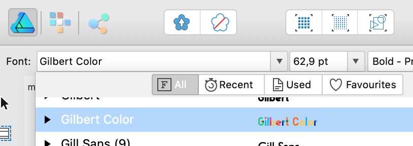
 Variable fonts are not supported i.e you can use the font under it's style such as bold condensed but you cannot change the weight of that style. Affinity also does not support Colour fonts, they will display as a single colour which can be a bit of a mess when the colours define the shape of the font.
 -
If / when you can count on the support for colour svg fonts and variable var variable fonts? MAC and WIN systems recognize them, even AD shows them on the menu but then they are black

- 1 reply
-
- 2
-