

A_B_C
-
Posts
4,420 -
Joined
Recent Profile Visitors
11,244 profile views


.thumb.png.f5afae2a9250e809b941098a0ecead9a.png)


-
 AnoobisAnkh reacted to a post in a topic:
Still problems with Corners Expanding Stroke AD 1.6 B11
AnoobisAnkh reacted to a post in a topic:
Still problems with Corners Expanding Stroke AD 1.6 B11
-
 MiloW reacted to a post in a topic:
Is there any way to lock guides?
MiloW reacted to a post in a topic:
Is there any way to lock guides?
-
apostolate reacted to a post in a topic:
How to or tips on creating concentric circles of shapes?
-
apostolate reacted to a post in a topic:
Text on a Path anomaly
-
 A_B_C reacted to a post in a topic:
Inktober 2024
A_B_C reacted to a post in a topic:
Inktober 2024
-
A_B_C reacted to a post in a topic:
Inktober 2024
-
A_B_C reacted to a post in a topic:
Inktober 2024
-
A_B_C reacted to a post in a topic:
Inktober 2024
-
StuartRc reacted to a post in a topic:
Inktober 2024
-
I’m sorry, I had to like all of them! So wonderful. 😀
-
A_B_C reacted to a post in a topic:
Inktober 2024
-
A_B_C reacted to a post in a topic:
Inktober 2024
-
A_B_C reacted to a post in a topic:
Inktober 2024
-
A_B_C reacted to a post in a topic:
Inktober 2024
-
A_B_C reacted to a post in a topic:
Inktober 2024
-
DelN reacted to a post in a topic:
Assets: Monster Club II Vector Colouring Artboards
-
StuartRc reacted to a post in a topic:
Monster Club II
-
StuartRc reacted to a post in a topic:
Assets: Monster Club II Vector Colouring Artboards
-
Sorry, I had to like them all. 😁
-
My goodness … these are fantastic! 😲
-
Thank you, everyone! — I had searched the forum before posting, but didn’t find the issue mentioned by Walt. That makes sense. So I agree with what Mike said: hope this is fixed soon. 🙂
-
Please try the following: Create a new text frame. Insert some text, and place the caret cursor somewhere in the text. Use the Glyph Browser Panel to insert an additional glyph at the caret cursor position by double-clicking the respective glyph in the Panel list. Without clicking anywhere else, use the Backspace key. Expected behavior: The inserted glyph is deleted. Actual behavior: The entire text frame is deleted, even if the caret cursor is still shown inside the text frame. In the following screencast, you cannot see that I pressed the Backspace key, after inserting /abreve/ and moving the cursor to the left, above the text frame. But you can see that the entire text frame is deleted, even if the (non-blinking) caret is still indicating the insertion point in the text frame. Backspace.mov This behavior is, if not a bug, highly inconvenient. When you intend to select glyph alternates, you will often want to try out things in context, that is, you will want to insert glyphs and have the option to simply undo the insertion by pressing Backspace, then insert a different alternate. So double-clicking a glyph in the Glyph Browser Panel should never remove focus from the current insertion point in a text frame. Compare how the macOS glyph panel works. After double-clicking a glyph to insert it in a text area (like /abreve/ in the example below), you can simply press Backspace to undo your insertion: macOS-Glyph-Panel.mov Thank you for your attention.
-
amerta reacted to a post in a topic:
Line without smoothing
-
Thank you so much. 😀
-
(Just posted because it wasn’t clear from Leigh’s post whether Publisher is included in the 2.5.1 fix.)
-
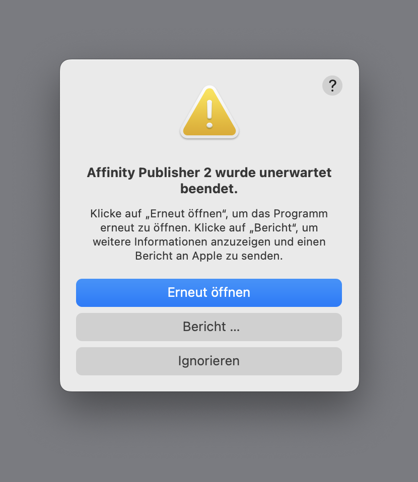
First off, thank you for fixing Designer and Photo 2.5 by releasing 2.5.1. 😀 However, the same problem persists with the Mac App Store version of Publisher 2.5 on my system (MBP Intel 2029, 16'', macOS Sonoma). It crashes on launch. I sent the crash report through Apple’s reporting system, but if you need it, I can send it to you directly as well. Please fix. 😀

-

Variable Font Support
A_B_C replied to Ash's topic in [ARCHIVE] 2.5, 2.4, 2.3, 2.2 & 2.1 Features and Improvements
FWIW — Last time I tested (by the end of last year), FontCreator does not work in CrossOver. -
(And there should be a way to minimize these panels to a list of buttons. Even on a 16'' MBP, it is very difficult to work efficiently in Publisher with the Panels taking so much space.)
-
Variable Font Support Discussion (split)
A_B_C replied to fde101's topic in Beta Software Program Members Area
You can always store predefined instances (locations in a variation space) to a variable font. Not sure what additional value a “snap to discrete values” function would provide. -
While you’re at it, would it be difficult to add the following feature for collapsing and expanding panel sections to all panels? https://forum.affinity.serif.com/index.php?/topic/202656-please-improve-panel-visual-depth-management/#comment-1205284 A better explanation of the feature is provided by fde101: https://forum.affinity.serif.com/index.php?/topic/202656-please-improve-panel-visual-depth-management/#comment-1205349
-
Please improve panel visual depth management
A_B_C replied to A_B_C's topic in Feedback for the Affinity V2 Suite of Products
It’s interesting that there already is a Blender-like solution (confer my screenshot above) for the new Typography Panel, as shown in Ash’s announcement. So the UI framework basically seems to allow transferring a rendering logic for sections from dialogs to panels. Remember that the above rendering of panel sections in the new Typography Panel is essentially the same as it is in the current dialog (and also the same as it is in the current Preferences Dialog), so I wonder whether this new approach could be transferred to all other panels.
-
Please improve panel visual depth management
A_B_C replied to A_B_C's topic in Feedback for the Affinity V2 Suite of Products
@fde101, I couldn’t have explained my suggestion any better … 😀 -
Please improve panel visual depth management
A_B_C replied to A_B_C's topic in Feedback for the Affinity V2 Suite of Products
A modest suggestion that would improve UX in the present framework: please add Collapse-all and Expand-all by Alt-clicking the section headers inside a panel. This would at least provide a workaround for many orientation problems in crowded panels and reduce search time.