A_B_C
-
Posts
4,409 -
Joined
Everything posted by A_B_C
-

Typography Dialog turned into a Panel
A_B_C replied to Ash's topic in 2.5 Beta New Features and Improvements
While you’re at it, would it be difficult to add the following feature for collapsing and expanding panel sections to all panels? https://forum.affinity.serif.com/index.php?/topic/202656-please-improve-panel-visual-depth-management/#comment-1205284 A better explanation of the feature is provided by fde101: https://forum.affinity.serif.com/index.php?/topic/202656-please-improve-panel-visual-depth-management/#comment-1205349 -
Please improve panel visual depth management
A_B_C replied to A_B_C's topic in Feedback for the Affinity V2 Suite of Products
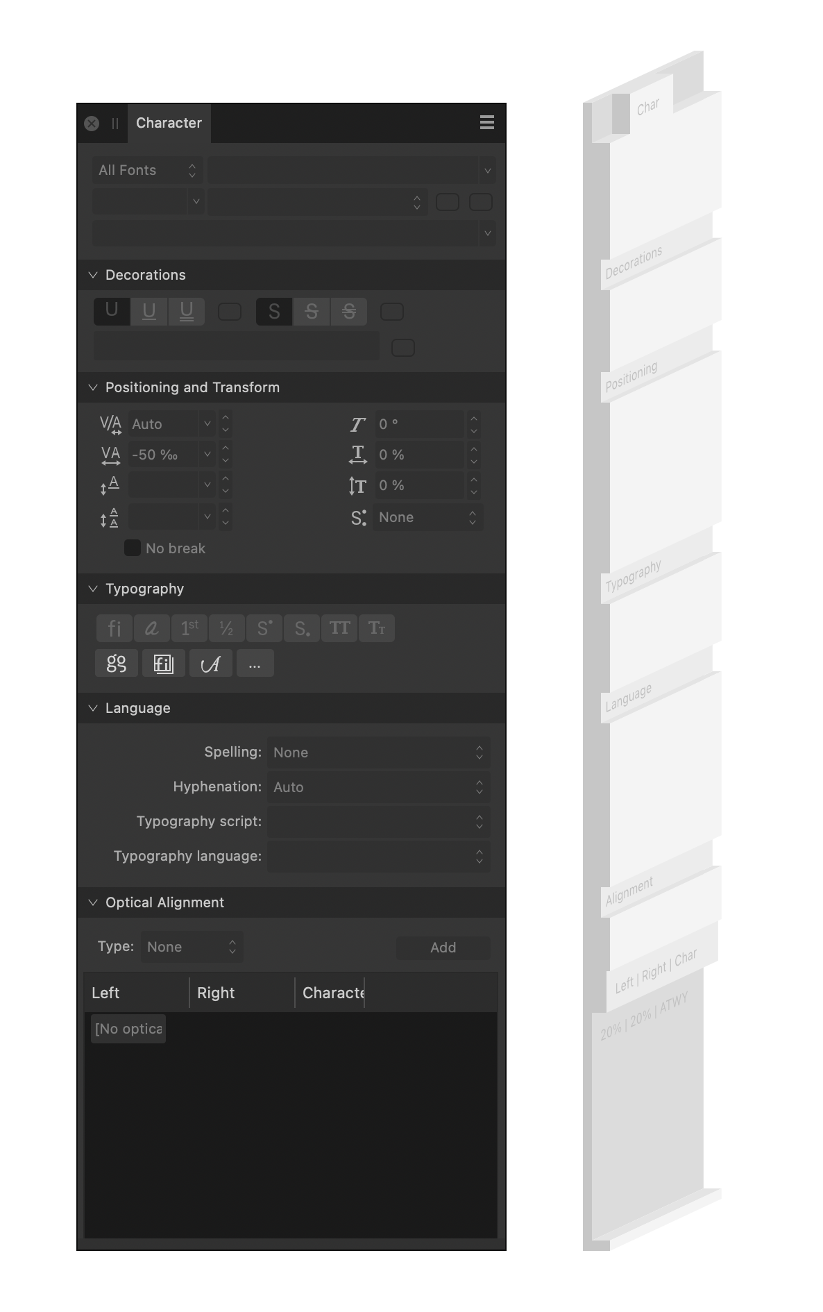
It’s interesting that there already is a Blender-like solution (confer my screenshot above) for the new Typography Panel, as shown in Ash’s announcement. So the UI framework basically seems to allow transferring a rendering logic for sections from dialogs to panels. Remember that the above rendering of panel sections in the new Typography Panel is essentially the same as it is in the current dialog (and also the same as it is in the current Preferences Dialog), so I wonder whether this new approach could be transferred to all other panels.
-
Please improve panel visual depth management
A_B_C replied to A_B_C's topic in Feedback for the Affinity V2 Suite of Products
@fde101, I couldn’t have explained my suggestion any better … 😀 -
Please improve panel visual depth management
A_B_C replied to A_B_C's topic in Feedback for the Affinity V2 Suite of Products
A modest suggestion that would improve UX in the present framework: please add Collapse-all and Expand-all by Alt-clicking the section headers inside a panel. This would at least provide a workaround for many orientation problems in crowded panels and reduce search time. -
While you are at improving the UX by turning the Typography dialog into a panel (thank you very much for that, it is highly appreciated), would you mind reconsidering the overall panels layout too? I still find that the current approach to draw panel sections is not very apt to visually keep things together that belong together, especially in the typography-related panels that have a lot of sections. The z-dimension (depth) management is not really compelling. Visually, the section headers are one level deeper than the panel surface, which creates a hierarchy problem that has been present from version 1.0. A section heading should never sit inside a groove, for when you do it this way, you cannot create the impression that the heading starts a section whose contents will be subsumed under the heading. If you need a section inside a panel, there are much better, time-proven ways to do this. To take a (really just random) example, here is a panel stack from Blender. I hope you can see that the visual depth management that is much clearer than Affinity’s. While it may not be perfect in any respect, it is clear at first glance what contents belong to the sections “Restrictions”, “Instancing”, “Line Art”, and “Custom Properties” respectively: Now confer this example to your visual depth management in the following example. Can you tell at first glance that “Justification” opens a new section? Or doesn’t it rather seem that the bar in which the section heading lives is the footer of the dark area for tabulator settings above? Especially when the scroll bar is present on the right? I hope you can see that there is room for improvement in this area. I know it’s not likely that you will overhaul your entire panel layout on occasion of reorganising the Typography panel, but maybe this change is a good occasion to take a step back and make notes for further improvements in future versions. So I just wanted to mention the problem here (again).
-
Variable Font Support (coming soon to 2.5 beta)
A_B_C replied to Ash's topic in 2.5 Beta New Features and Improvements
Out of sincere interest, what specific aspects of color fonts make this technology interesting for you as graphic designers and typographers? -
Find and Replace is your friend here. Make a Character Style with only the No-break Attribute set, and replace any sequence of three periods by a sequence of three periods formatted with this Character Style.
-
[Publisher 2.3 macOS] Problem with OT Features and Tracking
A_B_C replied to A_B_C's topic in V2 Bugs found on macOS
Cool. Thanks for looking this up. 😀 -
[Publisher 2.3 macOS] Problem with OT Features and Tracking
A_B_C replied to A_B_C's topic in V2 Bugs found on macOS
Many thanks! 😀 -
[Publisher 2.3 macOS] Problem with OT Features and Tracking
A_B_C replied to A_B_C's topic in V2 Bugs found on macOS
Of course, there is no issue in this case, because Publisher simply does not replace the uppercase glyphs by the small cap alternates when you enable Petites capitales (Small Caps). Both the uppercase glyphs and the small caps have the same metrics in my example font: The reported issue is specifically about tracking in the context of applied OpenType GSUB features. And this is where Publisher goes wrong. 🙂
-
[Publisher 2.3 macOS] Problem with OT Features and Tracking
A_B_C replied to A_B_C's topic in V2 Bugs found on macOS
Publisher 2.3.1, latest MAS version, macOS Sonoma 14.3.1 (23D60), MacBook Pro 16'', 2019, 2.6 GHz 6-Core Intel Core i7 -
Please take a look at the attached files. The .zip archive contains a Publisher file and a test font. The test font contains six glyphs /A/B/C/A.sc/B.sc/C.sc/, all of which are just rectangles of the same width (but different heights). There is something strange with the computation of tracking. In the screenshot below, there are two text frames, one containing the text string /ABC/ with the OpenType Feature c2sc applied to the text (blue text), the other one containing the string /A.sc/B.sc/C.sc/ where the small caps glyphs were entered through the Glyph Panel without using the OpenType Feature (red text). Additionally, a tracking value of -50 per mille is applied to both frames. Now, one would expect that the glyphs should perfectly line up. It shouldn’t matter whether the uppercase letters are replaced by the small caps letters through an OpenType feature or whether the small caps letters are directly inserted by the user through the Glyph Panel. The text should look identical. Yet, the two text frames look different. So there seems to be something wrong with your text shaper when tracking is applied. The glyph positions are not computed consistently. Please take a look. Thank you. 🙂 Test files: Tracking-Issue.zip
-
2.3.0 to be released this morning!
A_B_C replied to Ash's topic in [ARCHIVE] 2.4, 2.3, 2.2 & 2.1 Features and Improvements
Thumbs up! Thank you for the great work. 😊 -
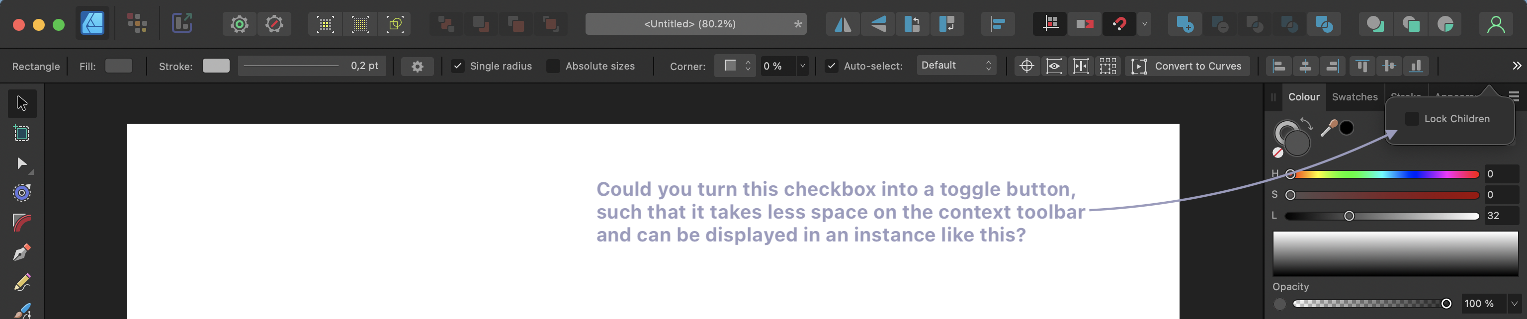
This is a super-tiny request, but it would help in recurring instances. Could you turn the Lock Children checkbox on the context toolbar into a toggle button with an icon, such that you can get rid of the label text? This way, the toggle would not require so much space on the context toolbar and could be shown in a situation like the one below. This is the full-width of a 16" MBP screen with these settings: It happens so often that I use a rectangle with child content, and Lock Children is always hidden in that instance. Please consider. 🙂
-
So it’s probably a slightly different problem than the one of the OP. Please split this thread if useful.
-
Ahh … I see what the problem is. Publisher 2.2 seems to open at the external screen’s resolution and does not understand that it plays now on a smaller field. When I grab the corner of the window frame and resize it, everything gets back to normal. Thank goodness there is a workaround, but the bug is still mildly annoying.
-
Similar problem here. Whenever I plug out my external 4k monitor (BenQ Design Vue PD Series, Thunderbolt to MacBook Pro 16'', 2019, macOS Ventura 13.6 build 22G120) and relaunch Publisher 2.2 on my internal MBP screen, my workspace looks like this. This is really a problem. Please fix.
-
We are live, and thank you!!!
A_B_C replied to Ash's topic in [ARCHIVE] 2.4, 2.3, 2.2 & 2.1 Features and Improvements
Congratulations to the new versions! The new features are awesome! It feels like everything is coming together. Keep up the great work, and grant yourself a little break now! You deserve it. 😀 -
Panel height not restored after double click on tab header
A_B_C replied to A_B_C's topic in V2 Bugs found on macOS
Thank you, Nathan. :) -
Hi there, please take a look at this. When I double click a panel to reduce it to the tab header, and double click it again to restore it, it always opens at minimal height: Panel-Height.mov This is very inconvenient, and I have the impression it hadn’t been that way in earlier versions. The panel should remember its previous height and be restored to this height when it is restored. Thanks for correcting.
-
Is there a point in my reply where I spoke about glyph widths? Or where I said that the glyph substitution would be responsible for the problem we see? Neither the first nor the second. 🙂 Rather, the only detail I meant to address was the following: Since you are aware of the distinction between characters (codepoints) and glyphs, you will understand that this way of speaking can be misleading. In OpenType Layout, we do not substitute characters for characters, but glyphs for glyphs. Hence, it does not make much sense to speak of “substituted characters” and properties such “characters” would “inherit.” This is likely to lead to a confusion between characters and glyphs and to paint a wrong picture of OpenType Layout processing. But as I said, the way of expression in the quote above does not invalidate your diagnosis (and there’s certainly no need to put every word under close scrutiny, if the underlying distinctions are clear – so no offense). As you noted, the application seems to lose track of which glyph corresponds to which character (with its particular line breaking property) when glyph substitution occurs. It does not retrace the text shaping process correctly before entering the stage where the output of the text shaper is distributed to paragraph lines.
-
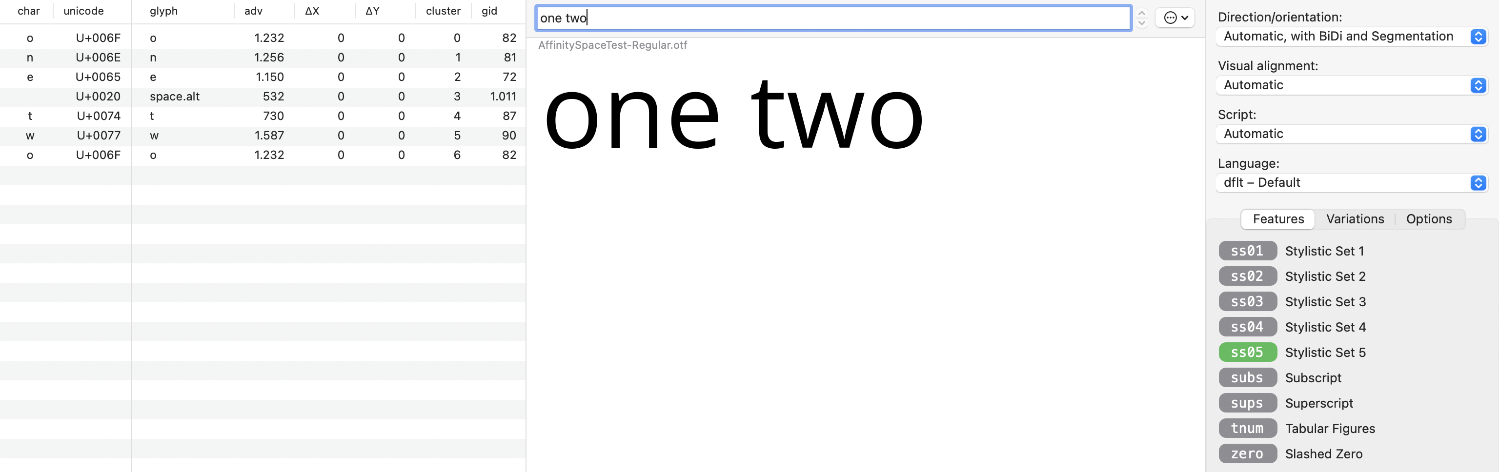
I think this is basically the correct explanation, although there are some details I would rephrase somewhat differently. The problem is that we are talking about two different levels in text processing here. Being assigned to a Line Breaking Class is a property of a Unicode character, while the kind of substitutions we are talking about in this thread is a substitution that happens on the glyph level. A character is an abstract entity (a location in an encoding space), while a glyph is, basically, a set of drawing rules that, when applied, result in a visual object, such as a letter or symbol. In order to turn a sequence of Unicode characters into something visible, the codepoints belonging to this sequence must be mapped to the corresponding glyphs of the font that is selected for text rendering, and these glyphs must be positioned correctly in relation to each other. This mapping and positioning process is performed by a text shaping engine. If the selected font is an OpenType font, it may also include OpenType Layout (GSUB, GPOS) lookups that must be applied by the text shaping engine, either by default (e.g. depending on script and language settings for the Unicode input sequence) or based on user choices. Such a user choice would be enabling the GSUB feature ss05 in Dave’s font that replaces the /space/ glyph by the /space.alt/ glyph. Now, a text shaping engine is typically not concerned with problems of line-breaking, hyphenation or justification. The output of a text shaper is usually a data stream that can be visualised as a glyph sequence laid out on a single, indefinitely long line. To find out where potential word, sentence or line break points are in this line, you will have to apply another process that iterates over the output of the text shaper and remembers the shaping process, starting from the Unicode input sequence. In Dave’s example, this process will have to retrace the character-to-glyph mapping from the codepoint U+0020 to the glyph /space/ (GID 3), and then the glyph-to-glyph substitution from /space/ (GID 3) to /space.alt/ (GID 1011). And by retracing, the process might be able to identify the position in the glyph sequence where an instance of the /space.alt/ glyph occurs as a potential break point for line breaking. So since we are not substituting characters by characters (that is, codepoints by codepoints) when applying an OpenType Layout rule (the /space.alt/ glyph is not encoded anyway), but glyphs by glyphs, there is a slight conceptual problem in saying that “the solution is for the substituted character to inherit the Line Breaking Class characteristics of the character it is replacing”, but apart from that, I think you are right.
-
Please fix this oversight. It creates really awkward situations to resolve when you work with a lot of cropped objects that are overlaid. ☹️
-
To expand on what @Oufti said, the zero-width space (U+200B) can be used in scripts like Thai where words are not visually separated within a phrase. You can insert a zero-width space there to fine-tune word-boundary detection.
-
Hi Dave, it will be interesting to see how this is sorted out in the Affinity apps. Some background information can be gathered from this thread on the FontLab forum. Adam Twardoch and John Hudson suggested different ways to put alternative spaces into the font or adjust the width of the space glyph depending on the selected script and language parameters, but as I said, especially in web browsers, none of these methods worked really well. I can see whether I can find my test fonts in the archive to give you some more information. Regarding interpolation, you are right: one has to distinguish between the capabilities of font editors and the OpenType specification. When you have a variable font setup in a font editor like FontLab or Glyphs, any glyph substitution or positioning rule that you define in the FEA syntax will apply to all masters in your font. Hence, you cannot do any useful positioning using the FEA syntax in a variable font setup. On the other hand, the OpenType specification clearly provides the means for varying positioning data along design axes. For GPOS data the variation deltas are stored in an Item Variation Store table in the GDEF table (see here and here). The problem is that there is no easy way to set up these variation deltas, given the current way in which font editors operate. So what is technically possible, according to the specification, is not really feasible at the moment, from the font developers perspective. (Hence, there are probably not many, if any, variable fonts out there that use GPOS other than for kerning and mark attachment.)