shadowphiar
-
Posts
11 -
Joined
-
Last visited
-
Microsoft Word is version 16.57 (installed with a Microsoft 365 license). Library/Group Containers/UBF8T346G9.Office/FontCache/4/CloudFonts/ does exist and contains some font files, but Calibri isn't among them (presumably the most common fonts are included in the app installer, so it never needed to be downloaded separately). The old font file, examined in Get Info, says it is version 0.90 with a Modified date of 25 January 2005 - I can't vouch for how accurate that is, but the file has certainly been copied from one computer to the next to the next, and plausibly originated from the font's first public release.
-
 Wosven reacted to a post in a topic:
Unexpected circumflex accent appears on j in small caps Calibri
Wosven reacted to a post in a topic:
Unexpected circumflex accent appears on j in small caps Calibri
-
It seems Microsoft Word probably wasn't using the same underlying file after all, as it doesn't install its fonts into the Library directories and instead keeps separate copies of all its fonts in /Applications/Microsoft Word/Contents/Resources/DFonts/ I've copied the Calibri files out of there into ~/Library/Fonts, rebooted for good measure, and then tried Affinity again. It has worked, small caps look normal in my document now. So it looks like the problem was just me trying to use a font file that is about old enough to get a drivers' license.
-
Word is version 16.57 (on Microsoft 365). The font itself (in home/Library/Fonts) says it is version 0.90 with a Modified date of 25 January 2005 - I've had it longer than this Office installation from a while ago when Microsoft supplied the Fonts installers as a standalone download. I'll move it away and see if reinstalling Office helps.
-
 kenmcd reacted to a post in a topic:
Unexpected circumflex accent appears on j in small caps Calibri
kenmcd reacted to a post in a topic:
Unexpected circumflex accent appears on j in small caps Calibri
-
Yes, please see attached. Thanks. smallcaps.pdf
-
Hi, I'm seeing some odd behaviour: if I add a text box and write some words including a lower case letter j, set the font to Calibri, and turn on Small Caps in the typography panel, then the letter j is unexpectedly displayed with a circumflex accent, like Ĵ. I've only seen this happen with Calibri font, and only with the letter j. This does appear in print and in exports. I am using Publisher 1.10.4 (also tested in Designer 1.10.4) on macOS Monterey 12.2. It is displayed the same both with and without hardware acceleration (I usually have this setting switched on). Microsoft Word on the same computer (and presumably using the same underlying font file) displays normally. Is there an odd setting that I might have triggered? smallcaps.afpub

-
I don't disagree, but (a) I thought I already had, and (b) nothing visible in Affinity Designer told me that I had not. At a minimum, I think this is a feature request for a preflight check for Object colours in the wrong space.
-
Ah - that's possible. I probably had drawn some of the objects and then used the colour picker tool to choose the same colour in its adjacent box. (It's a shame the colour picker hasn't specified into the same colour space, but I can understand how it might not.) In Designer how can I tell which colour space a particular object is defined in? If I select one object and look in the Colour palette, I can choose to see the CMYK values or the RGB values, but I can't see anything telling me which are definitive for that object. Is there a quick way to find all a document's objects that are defined in RGB? I'll probably never want there to be any. I thought there might be a warning somewhere in the Preflight checks, but if I enable all the "Image Colour" options, it still doesn't flag anything in this test document. Should I have expected it to? Primarily for people to view on screens. I've prepared a CMYK file for the printers, and that is the primary output of what I'm doing, but secondarily there will also be a version downloadable on the web and I had assumed it would be better to use RGB for that (as it's roughly 25% smaller even before downsampling any of the images).
-
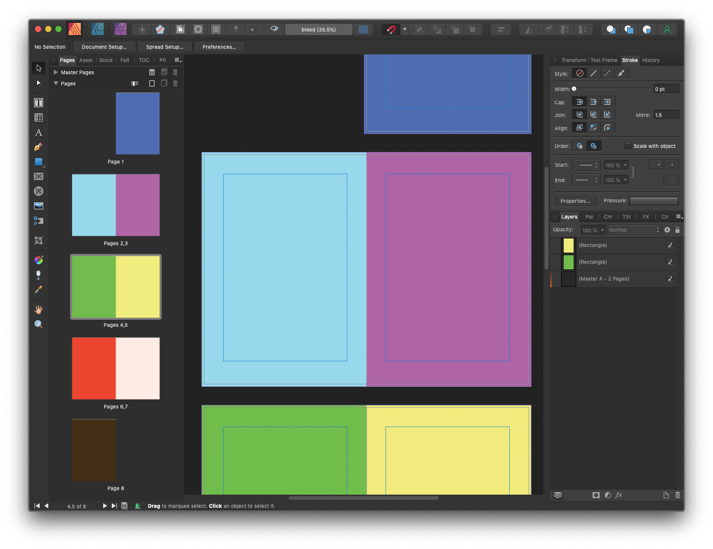
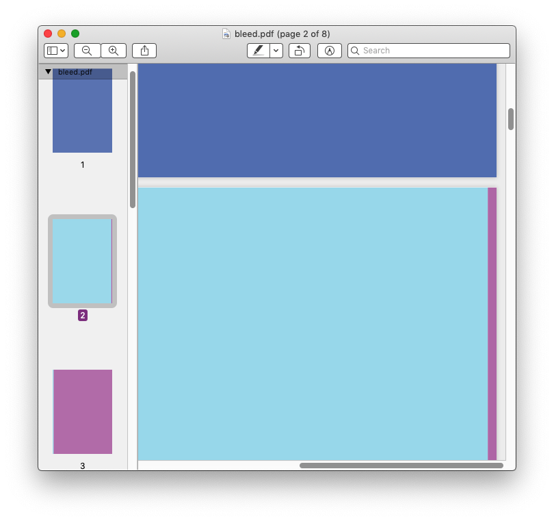
I'm doing a magazine-type layout in Affinity Publisher 1.9.2. I understand the requirement for bleed areas around the edge of the printed page, and I can control these in Affinity Designer and place content to the edge of the bleed area, that's fine. What I'm slightly confused about is the bleed area between two pages of a spread. The printer asks for a pdf file of all pages (not spreads) - which I am generating with Export PDF (Press Ready), include bleed, All Pages. What I see for example is that on the right hand side of page 2, the PDF includes 3mm of the content from page 3. These pages are going to be printed double-sided as though on A3 and then stapled together - so page 3 isn't going to be printed adjacent to page 2. If anything, I'd have expected content from page 7 to be included (if it is an 8-page document). Is there a setting somewhere which controls which pages are considered "adjacent" for the purposes of generating content in the bleed area? Will this not matter? Does content in the bleed area on the inside edge of a spread end up getting removed in software before it ever reaches the page? bleed.afpub bleed.pdf
-
Hi, I'm getting some inconsistent results when using the PDF export presets such as "Digital (High Quality)" rendering a CMYK source document into RGB colour space. (Exporting to "Press Ready" does not show this issue). In the attached example, the line and the attached box are the same colour but are displayed quite visibly different in the PDF by either Adobe Reader 21.1.20145, or MacOS Preview 10.1 (944.6.16.1). Similarly the other line and its attached circle are the same colour in the original document. I'm using Affinity Publisher 1.9.2 on Mac OS 10.14.6. test (digital - high quality).pdf test (press ready).pdf test.afpub
-
Hello all, A design I'm trying to reproduce in Affinity Publisher has filled areas around header text which extend to the edge of the page. I've been doing this using a Decoration in the paragraph text style, which seems to work fairly well but has two drawbacks: The left edge of the rectangle is placed relative to the text column, so if I change the margins or move the text box I would have to adjust the size in order to reach the edge of the page. To reach the edge of the bleed area on the left pages, I make the column extend 3mm beyond the page. But for pages on the right, I would only want this to extend to the centre of the spread (i.e. not onto the left page, which will generally be on a different piece of paper). This means the size I need is generally different for left and right sides. I've done this by having separate styles for headings on the left and right sides, but if I ever need to add a page to a section, all the subsequent headings need to have their style changed. Is there a better way I should be doing this?
.png.1773674f69718ad0444c0dcf3c0dc7e4.png)