Search the Community
Showing results for 'variable fonts'.
-
I can't use variable fonts
-
Hi @AnnieBro, Thanks for your report! As you've mentioned, our team are aware of issues with fonts within Affinity on iPadOS 17 and due to these known issues our development team currently recommend installing fonts outside of the Affinity app - either directly into the iPadOS Settings using Font 'profiles', or using a free third party Font Manager, such as iFont. I'd recommend removing the font from the Affinity app settings you have installed already, then once you have installed the font as a profile/through a font manager, you should then find this correctly appears within the Affinity app. I hope this helps
-
 Hi. Affinity v 1 didn't have this problem. I'm really happy with v2 over all. V2 is showing one problem on both mac and ipad. Brushes that should be expressive and have variable widths tied to pressure all have uniform in width. This is with two different styluses including the apple pencil. Everything is normally expressive in Procreate. How do I fix this?
 -
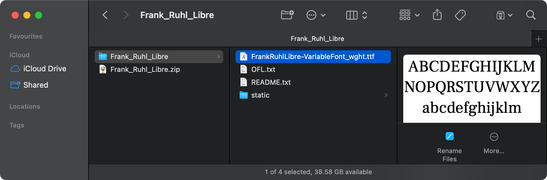
Hi @BarbaraSki, Thanks for the link... When you download the font from Google Fonts and Unzip the file you 'should' see the following, i.e., both the single 'Variable Font'... along with a folder labelled 'static'... If you've installed the variable font, i.e., just the single .ttf file then you have the variable version installed. If this is the case, if you remove this in your font manager and then install all the static versions of Frank Ruhl Libre and reopen your Publisher file, it should automatically substitute the static versions for the variable version but if it doesn't because of the variable font settings used in your Publisher file you will need to re-apply the static versions accordingly... Once you've done this you should find that exporting your Publisher file to a PDF will display the fonts correctly...

-
 2.4 Features and Improvements This post is the list of all new features and improvements included in the 2.4.0 release, and the next post is a list of the main bug fixes. Features and improvements affecting all platforms (Designer) DWG and DXF export Outlines created in Affinity can now be exported for use in various CAD applications and utilities for vinyl cutters, plotters and CNC tools Supports drawing scale Tutorial on DWG/DXF Import & Export Set selection box can be explicitly set for your selections. Double-click / tap to switch from Node to Move Tool so you can now toggle between them (Designer & Photo) Filename available as variable in Export Persona offering Document Name Document Filename Ability to lock insertion target for all new objects you can choose to: lock "Behind" lock "Inside" lock "On Top" Spacebar modifier for ‘Lock Children’ hold the spacebar to temporarily toggle Lock Children on or off for the opposite of the context toolbar setting Tutorial for Lock Children Layers (in Photo) Space Horizontal / Vertical now considers key object If you specify a key object in your selection, the behaviour changes to mean the furthest left (or right) object and the key object will not change position, and the other items are spaced evenly. Tutorial on Aligning, Distributing and Unifying Layers (in Designer) Tutorial on Aligning, Distributing and Unifying Layers (in Photo) Size / Rotate objects to same Make all items in your current selection adopt the same width or height or rotation 32-bit HDR PNG support added Import and export of 32-bit HDR PNG files, as described in the PNG specification (3rd edition) Tutorial for HDR PNG Import & Export (Photo & Publisher) Improved RAW processing and support for 58 new camera models including: Apple iPhone (14 & 15 [inc Pro/Pro Max/Pro Max Plus]) Canon EOS R8 Nikon Z8 Panasonic DC-GH6 Leica Q3 and M11 Monochrom Fujifilm GFX 100 II DJI Mavic 3 Pro (drone) and many more… In addition to those features on all platforms above, these are the Windows and macOS features and improvements (Publisher & Designer) Layer States added Already a feature in Photo, the States Panel is an exciting addition to Designer and Publisher, and adds this new functionality to all applications Capture the current layer visibility across your document Create queries based on various criteria to make a selection or toggle visibility of layers Button to select all layers that fulfil the criteria specified in the query Tutorial on Layer States (using Designer): Localised versions of the changes in 2.4 (and those in earlier releases) can be found here Affinity Designer Feature List Affinity Photo Feature List Affinity Publisher Feature List As well as all those improvements above, listed below is a list of the fixed bugs in this release
 -
As a longtime user of InDesign (I used it back in the day when it was called PageMaker and wasn't an Adobe product) and someone who uses it 'in the trenches' I thought it might be interesting to make a couple constructive of points. Well done Affinity you have just about created an InDesign 'killer'. But at the moment there are a couple of things you might want to change: SHOW SPECIAL CHARACTER - from someone who went through the typesetting craze (and had to use Quarks XPress package) I have learnt to rely (totally) on using and seeing 'Special Characters' on screen. In the 'real world' of design etc., this is a must; it's not a deal breaker but, it would be incredibly helpful for the size and colour of the 'special characters' to be seen. If you don't like them, you can always turn them off! SHOW TYPOGRAPHY - Why in gods name is this not able to be docked as a side panel? As again, being a typography nut, this would be really useful for me... GLYPH BROWSER - this panel would be excellent if it allowed you to use a 'slider' to make fonts bigger or smaller. Hope someone takes notice of the above points! We really need Affinity as a real opponent to Adobe. Cheers!
-
These are my biggest fears. Because I expect and would like development to move in such a direction that Affinity programs become truly professional tools equipped with mature and high-quality functions, which means, for example: top-notch rendering library (no redraw issues, smooth zoom-in-out without flashing render tiles, no delays in rendering / updating thumbnails) professional object styles (dedicated dialog, ability to either clear and replace all object settings or replace only specific ones or save defaults) Split/ span columns professional spread and page management (multi-page spreads, moving and page reorder) foolproof color managment and pdf export workflow comparable to a professional tool (without reinventing the wheel, where everything has been working optimally for many years) true vector brushes and patterns vector symmetry tools symbols libraries variable font support creating cutom glyph sets drag-n-drop to rearrange columns and rows in table tables across multiple page or inside text frames envelope distort (using selected object as a shape for the envelope) and more and more... Otherwise, I can't imagine how Affinity would compete with Adobe, which is what the owners of Canva declare. And for God's sake, stop this type of marketing↓ With all my sympathy and respect for your programs, it has nothing to do with reality. What's more, such arrogant marketing, unsupported by quality, slowly becomes distasteful and discourages rather than encourages people to buy your products. You can advertise your product in a more balanced way without treating your current and potential customers like mindless idiots.
-
 This font family was changed to variable with Windows 11. If you have access to a Windows 10 system, these fonts are static versions. Included with the Windows 10 Pan-European Supplemental Fonts Pack. But it only has 6 styles vs. the 16 style instances in the variable fonts. https://learn.microsoft.com/en-us/typography/fonts/windows_10_font_list#-pan-european-supplemental-fonts
 -
 Well, in OSX its possibly to categorize/Prefer... your fonts in special folders.... And AFFINITY will just search/select/suggest... this fonts in this folder (By osx)... That works really well... BUT it needs some long ways... - You have to open the FONT-Panel - You have to find/click/Activate... the font-panel TAB - You have to open the Font-Panel, than you have 2 TIMES to choose from the category and finally from the FONT... if this FONT has VARIATIONS you must mouseway back to the AFF_Font/Vari... THAT is a better worklflow than AFF:Favaorites... but i could be thousend betterm, smartehr, smoother,,, if AFF itself allows Favorite FONts in diverse categorizes... Wahts the problem to imlpement such easy thing???? Just tell OSX Font-Manager / Widwos-TTF-INspector.... THIS; THIS AND THIS FONT with all Varioitiones i want in MY catergorie XY/Subcategorie "SERIF"... Whats so difficault... that could be done in 1-2 POINT; POINT udates...
 -
I'm using Publisher 2.3 on iPad (OS17.2). I have about 200 fonts installed. Opening the fonts menu takes some time to load (display the fonts correctly). The menu cannot be used in this time. But even after the menu is loaded fully, scrolling is almost impossible. I know that I should maybe not install so many fonts. However, at least with the 2.0 version (not used 2.1 and 2.2 much) the menu was much more usable. Scrolling was working after an acceptable loading time. So there is some kind of degradation. Andreas
-
Noto Sans Display static fonts are available here (in the old repo): https://github.com/notofonts/noto-fonts/tree/main/hinted/ttf/NotoSansDisplay and here: Noto_Sans_Display.(2022-06-30).zip Note: this repo/zip has all four static widths. Lora full release with static fonts (OTF+TTF) is available here: https://github.com/cyrealtype/Lora-Cyrillic/releases/tag/v3.005 and here: Lora-v3.005.(2023-01-16).release.zip Sure sign of a variable font (one that may not be configured properly).
-
 Just do a web search on "variable fonts" if you do not know what they are. For instance, one of the hits will be https://fonts.google.com/knowledge/introducing_type/introducing_variable_fonts, which explains how they differ from regular fonts.
 -
 Hi All, I have Affinity suite installed on 2 windows computers, a main one, and one I use when the more powerful one is tied up, or misbehaving. One irritant with this is that I can't see a way to keep the fonts I have marked as favourites aligned, or things like what LUT's are on which machine in line. I recently upgraded my hardware and I'm about to reinstall windows and all the software for a fresh start. And it would be really cool if there was a way to get things back the way they were quickly. Now I realise that Affinity is not going to shuffle the fonts and LUT files around for me, but is there a good way of doing this? Even exporting a checklist would make this task a lot less prone to errors. Thank you, Nick
 -

Pencil Tool Improvements
Bryan Rieger replied to Ash's topic in 2.5 Beta New Features and Improvements
Yeah, I miss that effect a lot, but I'd prefer it to be more of a non-destructive vector effect (sort of a mix between the contour tool and layer FX) so that you could always go back and edit the effect as and when needed. Also see 'pucker, bloat, splatter, block shadow, offset, etc'. Roughen also isn't an effect that should be limited to the pencil tool, as using it with paths/curves/shapes drawn with the pen tool, shapes and fonts would also be desirable. -

Variable Font Support Discussion (split)
fde101 replied to fde101's topic in Beta Software Program Members Area
Accordingly, shouldn't that be in the Feedback forum as it is not for this beta? In any case, since these fonts are constructed by center-line strokes, when this is done, please consider leveraging that fact by allowing brushes to be applied to them (for those not doing CNC work, anyway...). -

Variable Font Support Discussion (split)
ronnyb replied to fde101's topic in Beta Software Program Members Area
Thanks for replying @Ash Btw there is currently partial support for single stroke fonts, except some characters don’t render, so hopefully it wouldn’t be a huge deal for the devs to slip it into an upcoming beta… -
 There is a pretty good general description of the three most common color font technologies on Glyphs web site (all within the specs of OpenType). The CPAL/COLR based version is described here: https://glyphsapp.com/learn/creating-a-microsoft-color-font CPAL/COLR(v1) is not obsolete by no means, but in many ways the most advanced (and also rarest on field). As described in my first post within this thread, Affinity apps support at least to some extent sbix (bitmap based, common on macOS) and CPAL/COLR based (vector based, both Windows and macOS) fonts. What was surprising (at least to me) that they also support OpenType SVG-table based color fonts, for which I earlier believed that only the b/w fallback versions would be supported. But as shown within this thread, certain kinds of SVG-OTF color fonts will be exported as color fonts (or sometimes converted to outlines, but still in color) whenever exporting to SVG or PDF. In a way Affinity apps prove out to be supporting color fonts at least on a level that is work(around)able... Color can be worked in to fonts so well using other means that one could say that the whole color font technology is kind of obsolete, it never really fired, partly probably for reasons implied in this discussion: they are pretty complex, and still not widely supported (even within browsers).
 -

Affinity designer taking 5+ minutes to load configurations
Lee D replied to JulieR's topic in V2 Bugs found on iPad
@JulieR Once the app is open, can you see documents on the Live Docs screen? If you can I recommend tapping the icon for each document and saving them first. Once saved, swipe up to return to OS, then swipe up again and make sure the app is fully closed. Now tap the app icon, when you see the splash screen, double tap to open the Clear User Data options and tap Reset and when prompted tap OK. Does the app now open quicker? If not do you have a lot of fonts installed within the app at all? If you start a new document and try Placing an image, are you selecting from Files or Photos? Can you now see them to select? If not can you please do a screen recording showing this workflow. -
 Hi @Alexeir and welcome to the forums. This is a variable Font. Variable Fonts are not supported yet by Affinity programmes. If needed, install the static version of these font.
- 1 reply
-
- 1
-

-

Publisher 2.4 crashes when applying another master page
Pyanepsion replied to Andreas S's topic in V2 Bugs found on Windows
Hello @Andreas S, I replaced all the images with others (in fact always the same one), then I integrated them and then I drastically modified the dimensions of the mock-ups. I didn't reproduce any crashes. However, a resource image couldn't be integrated, one of the pages (4-5) doesn't seem to have a layout, and the fonts are missing exept vivaldi italic (I only use the 1000 fonts supplied with Windows unless requested by the customer). Check that the problem isn't caused by importing resource files from an older version of Affinity or by one or more fonts. Crash test Sample.afpub -

Hej jeg har et spørgsmål. Hvordan får jeg nye fonts ind i Affinity Design ?? Jeg har før arbejdet i Adope CC her var nemt at sætte nye fonte ind i programmet, men jeg kan ikke finde nogen metode og hvordan man gør, jeg har stadig en masse fonde fra Adob
Ilse B. posted a topic in Affinity on Desktop Questions (macOS and Windows)
Hej jeg har et spørgsmål. Hvordan får jeg nye fonts ind i Affinity Design ?? Jeg har før arbejdet i Adope CC her var nemt at sætte nye fonte ind i programmet, men jeg kan ikke finde nogen metode og hvordan man gør, jeg har stadig en masse fonde fra Adobe i True Type, så er det muligt at de kan de blive kopieret ind i affinity programmerne. med venlig hilsen Ilse -
All glyphs not showing as options
kenmcd replied to ShenaJ's topic in Affinity on Desktop Questions (macOS and Windows)
Some of the "features" are actually OpenType (OT) features and some are constructions by the application. For example there is no All Caps feature in OT. Character Variants (cvNN) is an actual OT feature which Affinity does support when it is actually present. To test take a look at the fonts Charis SIL and Junicode. They both have OT Character Variants. ID does not support cvNN at all (there is an add-on available which does). Affinity only shows the actual OT feature Access All Alternates (aalt) if it actually exists in the font. Adopey apps construct this (whether it actually exists or not in OT) and that is what is displayed in the alternates pop-up. Groovy Script actually has an aalt feature and the font developer actually created it manually (more advanced font editors can create it automatically). Pluses and minuses - Automatically may create duplicates and odd exceptions - Manually may miss alternates but could also be a well thought-out and better. It appears there is a newer version of the font with more features than the version I have (v1.000). Regarding the Stylistic Sets (ssNN) - it appears the newer font may have multiple alternates on the ssNN (like on cvNN). Junicode 2 has started doing this. Because they have more than ss01-ss20 (and do not want to exceed ss20). Some apps will work all the way up to ss99 (APub, ID, LibreOffice), and some fonts will use up to ss99. And some apps will only display up to ss20 (Word). And some do not work with the ssNN variants. Since ID does not support OT Character Variants at all, I assume it also may not support variants in Stylistic Sets. And on and on... Would have to see the newer font to determine exactly what is happening. Additional thoughts... - applying some OT features will block other OT features (depends on the order inside the font) - fonts may have errors/bugs in the OT features. The more complex the font, the more likely there are issues. -
 I see that 2.3.0 has added some filtering to the Account dialog. I don't recall which beta build added it, but it seems useful. Edit: This was not new in 2.3. The Search bar in the Account dialog has some useful filtering buttons, but in 2.3.0.2157 on Windows the Fonts button doesn't work properly. When enabled, nothing is shown, even though there are fonts listed if one uses the Search box. It works fine in the 2.3 beta on macOS, and in 2.2.1 on Windows. 20231124-1616-42.9563876.mp4 Edit: By the way, the Help doesn't yet show these filtering buttons, nor the Search box. It would be nice if they were shown and described.
 -
All glyphs not showing as options
lacerto replied to ShenaJ's topic in Affinity on Desktop Questions (macOS and Windows)
What a technologically interesting font! The way it works and makes its alternative glyphs available made me wonder whether there is some specific method (e.g., using a pen) to invoke different glyph versions, but based on the YouTube video created by the author of the font it seems that no, the text is basically supposed to be composed (or enhanced) letter by letter, and for this purpose Affinity Typography panel with dynamic Alternates controls suits acceptably well even if the size of the alternates remains pretty small. But as the Character panel has a button labelled as "Character Variants"... ...I wonder if this is something that is intended to show alternatives for single characters in a separate window (and in bigger size), but just has not been implemented yet? (I could not find a way to make this feature working with any of the fonts that I tested.) Another thing that seems to need some improvement is the Typography panel itself, which cannot currently be resized (especially in width, to make more wide character selections fully visible), and using white text samples for stylistic sets in the Stylistic Sets list (in context of the Character panel). This font made me also wonder whether certain typographic features like "Contextual Alternates" and "Stylistic Alternates" (and the combination of both), and even Stylistic Sets, are kinds of presets designed to be used with all the characters using the same font (instead of requiring character-wise selection of alternatives, which there can be over 20 for certain characters)? Based on my very superficial tests, in context of certain fonts it might be so, though the output might be a bit different when used with Adobe apps, and Affinity apps and CorelDRAW (which btw. could be an issue when opening IDML files that use advanced OpenType typographical settings). But with many fonts that I tested (including Adobe Pro designs), it was not so, so applying e.g. a specific stylistic set for entire text would produce absurd results (end forms used uncritically disregarding position of the character, etc.). Also, text might have multiple stylistic sets applied. But I began to wonder this because Adobe and Affinity apps show available stylistic sets quite differently, Adobe apps (including Photoshop 2024) and CorelDRAW showing all available stylistic variations only in context of glyph selection, while in context of e.g. Groovy Script only two stylistic sets made available in menu context, while Affinity apps show all stylistic sets available and appliable options in menu context. opentypealternatives.mp4
-
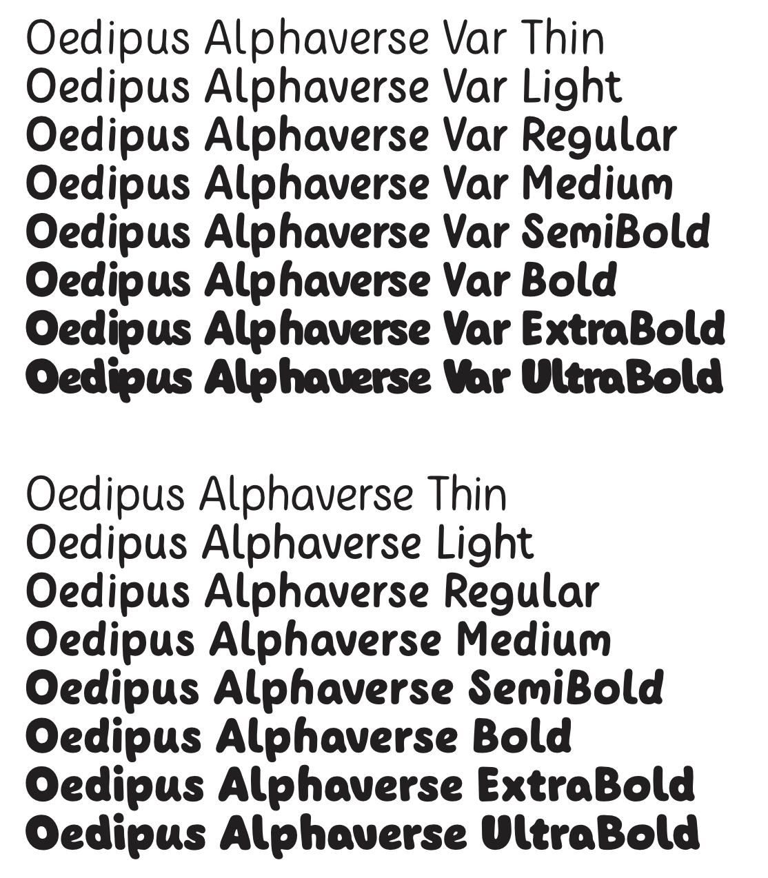
 Almost every software, including PowerPoint or TextEdit is able to support static instances of Variable Fonts by now. Unfortunately the metrics of Variable Font instances are completely off in Affinity products. It is about time to start supporting Variable Fonts. Screenshot showing static instances of a variable font above, single fonts below. They should act the same.