gdenby
-
Posts
1,887 -
Joined
Everything posted by gdenby
-

affinity designer Botticelli's, The Birth of Venus (AD, Progress)
gdenby replied to VectorVonDoom's topic in Share your work
I worked in a museum, and lighting was one of the tasks I did. Its not just UV. For many works, particularly those that might have any organic colors, any light is bad. Current museum standards are that a work must be kept w. less than a 5% degradation over a 500 year period. For some pieces, that means no higher than 3 candlepower for 8 hours a day for 4 - 6 weeks every 10 years. We had exhibits where the pieces were kept under curtains and only lifted when there was a viewer. We never had the kind of money to have proximity triggers for the lights, such as are needed for "primitive" works that are all organic materials. The only way those and other pieces would likely be seen was thru high quality digital images captured under strobes that fire for a few thousandths of a second. The photographer had 3 shots, and then the piece went back into storage for maybe another 5 - 10 years. Or they might be on view in a room where it was too dark to read any signage. We had a few exhibits that were literally once in a lifetime. Renaissance drawings that would not be shown to the public for at least 30 years. -
Hi, The Lightning Phoenix, Seems to me you might just be over extending the node control handles. See below. A pen line intentionally made with over extended controls. The same line with the handles reduced to a normal size. The nodes changed to "sharp." Then changed back to curved nodes. Note, there is good reason to have controls that can extremely stretch the line between the nodes. Examples of shapes w. just 2 nodes and controls w. large extensions. One can define large areas w. a minimum of info, resulting in tiny files.

-
affinity designer Botticelli's, The Birth of Venus (AD, Progress)
gdenby replied to VectorVonDoom's topic in Share your work
Welcome to the alliance of painstaking visual artists! While I had been exposed to various classical artists when quite young, my 1st big revelation was work by Albrecht Dürer. I eventually was able to view one of his portrait paintings. Tiny, not life size at all. Exquisite, but I had supposed it would have been bigger. Sometime later, I came across a reference that said it took 4 years to complete. And then there was the historical note that the way he painted single hairs was w. and ordinary brush, exquisitely handled. Really, good work. I think you must be realizing why Botticelli's images span ages. May your journey in the footsteps prove worthwhile. -
Hi, pnnylayne, I'm a complete slouch when it comes to photography. No camera w. RAW, the camera in my iPad is as good, probably better, than any I've had. But I agree w. carl123. AP is probably what you need. I use Designer hours a day, but for some things, such as clearing out noise, or correcting scans of badly faded old pics from the 1940s, I go to photo. Currently, I'm working on a vector portrait of my brother-in-law that was taken w. a cell phone. I spent a couple of hours in Photo to get it to where it was clear enough that I could use it as a backdrop for what I'm doing in Designer, mostly using the pencil tool. If I didn't want to use that, but could get by w. the pen tool, which is available in both, Photo would have been adequate.
-
If you want to paste a bitmap, use the fill tool, and choose bitmap. Then save the object as a style, and it can be applied top any number of other objects
-
Hi, Renzatic, Seems like most people are better w. pen and paper, than a tablet. My guess is that the paper's "tooth" gives better feedback to the fingers as the pencil is drawn across. I got a sheet of "paperlike" plastic for my iPad screen, and it helps a little. But anything that takes hand & eye co-ordination just takes lots of practice. The younger started the better. Unfortunately, many people don't even write w. pens or pencils anymore.
-
Hi, KDJ, I did come across a stencil making tutorial for Cricut here. To do something similar in Affinity, you will need to use the boolean operators, specifically, subtract and add. These can be found in the menu "Layer/Geometry." There are also usually buttons for the operations in the upper right of the toolbar, assuming you have a basic layout for the bar. After choosing whatever font you want, type the words/letters. Then convert them to curves. A simple way to brake them up is to select the pen tool, and in line mode, draw a thick stroke. Position that as needed where you want to brake the glyph shape. Use the command "Layer/Expand Stroke" on the pen line. The line, now named "curve," should be above the letter shape in the layer hierarchy. With both selected, use the subtract command. The pen line shape will disappear, but the letter "curves" object will remain, but with a new clean break. After working w. many letters, you may want to group the mass of curves to make them easy to move around. Because all of the parts are distinct, they can be all "added" into a single curves object, also for easy moving and scaling. Then daw a rectangle to represent the vinyl to be cut, position the stencil above it, and subtract.
-
Among the Ps brushes I've tried, a few make scattered horizontal lines. As far as I can tell, they were made for early versions of CS. Most work fine.
-
Using the node tool, click one on node. Hold one finger down on the screen, and click on the next. Both will then move together. Gestures can be used for approximations, or grid snapping for integers. If you need numbers, open the transform studio. Probably best to select the center position in the little bounding box icon. That way, the number input will be transferred to each node based on the center of the axis between them. Alter the numbers as needed. Press the x/y position buttons, and a little keypad icon will pop up, allowing whatever precise number you like.
-
Argh, my acronymia circuit isn't working. AI is AI, But AP is Ps.
-
Hi, dE.niz, Dunno. Haven't used AP for at least 7 years, and not much then. But, here, dis-assemble this: Assembly.afdesign
-
Hi, NightlyVagabond, I was unfamiliar w. Clip Studio, and so looked it up. I see that it has been in development for about 18 years now, and obviously has lots of feature focus on creating manga style art. In contrast, Affinity has only been in production for a bit more that 4 years, and is not specifically intended for comic product. There are users that have shown manga style artwork in the "Share your work" section of the forum. You might want to look them over. There are many things still in development. As you noticed, there is no vector eraser. One can break up vectors, and trim them using subtraction, but many people have asked for a dedicated vector eraser. I was unable to see which features were included in the different versions. I suppose some things, like the posable 3D models are for the Pro version. I doubt Affinity has any plans at this point for anything like that. Likewise, there doesn't seem to be any intent to expand into animation. If one is using a pressure sensitive tablet and stylus, or an iPad, Designers pencil tool will make lines with dynamic thickness and opacity. If one only has a mouse, both the pen and pencil tool can have the thickness adjusted by a pressure graph, similar to what I've seen in Clip Studio. My daughter does use Photoshop extensively for art, much of which is manga influenced (She spent her childhood making Dragonball-Z cartoons.) She's tried out Designer, and noted right away that there were more blend layer options, and she was very impressed w. how quickly the software responded. She mentioned she was happy to know that there was something she could use for her work if she decides to stop the Adobe subscription.
-
Hi, Hjortenfeldt, Designer already has the ability to do the many of the fx thru vectors. AFAIK, Gaussian blur is not feasible w/o rasterizing the output. "Fx" elements that can be made by color gradients and opacity settings should be. I suspect that transforming the underlying geometry to sets of parametric variable could be quite difficult. Attached, a sample of a a drop shadow, a bevelled object w. an outer glow, and then, well, a bunch of fun. I have batches of these sort of objects based on simple geometric primitives. Its not hard to change them as I like to tweak the fx. Shifting them to objects w. more complex geometries is something with which I've had less success. Myself, I can't imagine what it would be like to program a routine to deal w. that, and then tack a simple interface with sliders and buttons onto it.
-
Gosh, Xakiru, You make me feel eternal, as I recall the wonder and amazement when I 1st used perspective/mesh warp. For the moment, the Affinity Photo handles such distortions, and free or very inexpensive vectorizers work quite well. And yes, just about eveyrbody wants to see it built into Designer.
-
Vector Hatch Fill
gdenby replied to S E Scott's topic in Pre-V2 Archive of Affinity on Desktop Questions (macOS and Windows)
Hi, DoctorX, I just group the vectors, and drag them into the asset studio. Then rename. You can also save symbols as assets -
Question: Making Waves with Circles
gdenby replied to HDoowop's topic in Pre-V2 Archive of Affinity on iPad Questions
Hi, HDoowop, Part of the problem, I'm sure, is due to the fact Illustrator has a different interface, and different terminology, etc. etc. So, you have to do a translation, and then figure out how Designer does it. IMO, best to ignore Illustrator tutes. It like having to learn a different language to use tools one may or may have not, and that work a bit different anyway. My attempt started by using the ellipse tool to make circles that had thick strokes. I duplicated them horizontally, making sure they were all aligned to bottom. Selected all and did the "add." Changed to the node tool, and selected all the upper nodes, and the 2 sides nodes. Did a "break" operation. Selected all the broken parts, and deleted. Selected the remains, and set the fill to "none." Really, not much to it. I don't use the iPad version much, and I spent most of my time trying to remember where the options were. On the desktop, w. I use mostly, its about a 30 second operation, if that. -
Hi, Stace, I'll try and explain what is most likely going on. A software tradition is that applications that make graphics by using geometric figures are called "draw" programs. Those that make images by storing blocks of numbers representing colors and shades in different locations were called "paint." Designers "draw" persona uses pre-made parametric shapes and lines called bezier curves to make forms. If you switch the View/View Mode to Outline, you will see the math defined lines that in Vector view can have stokes and fills applied. Many people coming from traditional media, or "paint" programs, consider the strokes and fill to be objects in themselves. But they are only attributes assigned to curves in space. For instance, use the rectangle tool while in vector view. Select the rectangle, and set both the fill and the stroke to none. It will disappear from the screen, tho' it will still show in the layer list with just a listing of (rectangle). If one switched to outline, one can see the rectangle as a wireframe, so called. All of the curves enclose an area in 2D space. The "boolean" operations such as add, subtract, etc, will manipulate those areas. When those operations are used on open curves, such as may be made w. a pressure sensitive tablet and stylus, Designer, like other similar applications, will "close" the curves, by extending a stroke to the endpoints of various open curves. The stroke and fill attributes of the curve at the bottom of the layer hierarchy are assigned to the curve(s) made by the boolean operation. My guess from what you illustrate is that various pencil strokes that overlap are being made into a single area, surrounded by the variable stroke that showed in the lower area, stretched to surround the combined areas. What Designer allows, is for the strokes to be "expanded" into 2D forms, which then can be added to others.
-
show nodes
gdenby replied to vanessagae's topic in Pre-V2 Archive of Affinity on Desktop Questions (macOS and Windows)
Hi, vanessagae, Probably a simple thing. The nodes only show up if you are using the node tool AND have curve(s) selected. Press "V" on the keyboard. Click on a curve, or shift click on multiple curves. Then press "A", which turns on the node tool. You should see the node of any selected curve(s). You should be able to click-select on any number of nodes, and alter them as you like. Hope this helps. -
cutting out
gdenby replied to lettergothic's topic in Pre-V2 Archive of Affinity on Desktop Questions (macOS and Windows)
My try. Started w. pen tool. Switched to node tool to bring the vectors in tighter to the slight curves of the edges, roundings at corner. Back to pen tool, and change to selection. Copy and paste into new document. Use perspective tool 3 times, on for each slanted side. Adjusted one edge to flatten w. mesh warp.
-
Grid-questions
gdenby replied to Polygonius's topic in Pre-V2 Archive of Affinity on Desktop Questions (macOS and Windows)
AFAIK, there is only 1 grid present at a time, and it can not be saved. You could make various grids w. a main division of 64, 128, 256... and you can then set the number of subdivisions to integers of the base divided by 4. You might need to reduce the snapping tolerance, considering the base is 8. I s'pose you could make an asset set of grid lines at the different proportions, and bring those into the document as needed for snapping points.- 1 reply
-
- 1
-

-
This is a common misunderstanding. Vector brushes stretch or repeat a bitmap along a vector, changing the size and/or the opacity along the vector depending on the pressure curve associated w. the vector. At some point, there should be a vector mesh warp that will bend a complex vector outline, such as one that appears like a brush stroke. For now, on must export such images, and run them thru a bitmap vectorizer.
-
Hi, Alan Reterink, W/o knowing what shapes you are working w., its a little hard to say, but I suspect subtracting the object from the underlying objects may give what you want. Erase makes the appearance of a subtraction, whereas subtraction alters the vector boundary.
-
Drawing to scale
gdenby replied to jackamus's topic in Pre-V2 Archive of Affinity on Desktop Questions (macOS and Windows)
"How do you chnange the dimensions in the Transform tab without it changing the size of the object or shape?" Do you mean something like changing dimension in cm to inches? Or do you just want a proportional change? 10 ca to 1/2, i.e 5 cm? -
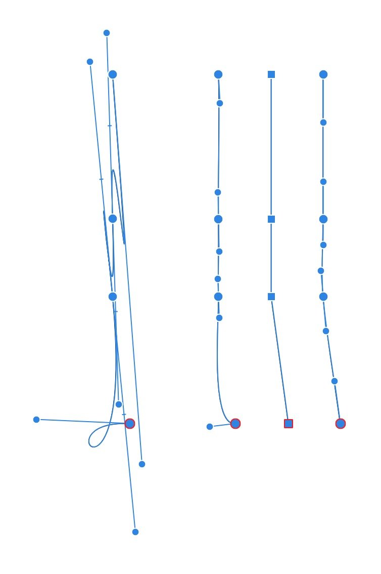
Hello, again, Thanks for posting the afdesign file. The lines you are working on seem to be on the "base" layer, which is locked. The elements can't be selected for joining with themselves unless one works in the outline mode. Of you want to add a vertical line, thats not hard if snapping is on. There will be a yellow dot that indicates when the pen is over the line segment. If you want add that line, or modify the existing shape, there are other more complex issues. The existing lines would need to be broken at the junction points, and then rejoined into new shapes. The problem is that the v. 1.6 release does not lock into the break point(s) when adding the node point for making the break. It is only done manually/visually, and is always slightly inaccurate. (Mind, like about 1000th of a point.) The 1.7 beta give a signal marker that indicates when the new node is being placed at the intersection of the various lines. Also, in this particular instance, its more complex, because all the lines are unjoined. There is existing curve line, A & B, and one would need to break both, and join sections A1 + "new" + B1, and A2 + "new copy" + B2. Hope this clarifies things.
-
Hi, Morten_Hjort, Did you mean you are starting from a .png? I can't find a reference for an .ong file type. And, which image are you trying to dupe? The first at the top, which has dimension marks, or, the next one. w. most of the lines in a reddish tone.? They seem to have different curved shapes. The pen tool can't snap to a pixel representation. Recreating the curved shapes might work better if you started w. approximate shapes, such as ellipses or rounded rectangles, and adjusted those w. the node tool when converted to curves. There are some small asymmetrical curves that will probably need to be made w. rough approximations w. the pen tool, and carefully adjusted. What I could do for a portion. Approximation.afdesign