firstdefence
-
Posts
11,711 -
Joined
-
Last visited
Everything posted by firstdefence
-
Lovely composites Markus, the girl on the building is cool and has a comedic aspect to it too. A cool addition to that image would be someone normal size on the ground looking up at the girl.
- 1 reply
-
- 1
-

-

affinity photo getting my head around Affinity
firstdefence replied to ianrb's topic in Share your work
That's a beast of a truck Ian. I personally think the trees draw the eye away from the truck, I go as far as to say lose the right side land as well, if you are going for a stylised image these things don't really add much to the overall effect. I'd love you to take a very low level shot, like on the floor and a fairly wide angle lense if you have one, you could have the truck bursting through the paper, would look fab -
I think the title should be the Laying Lion, unless yo know for a fact its been fibbing lol!
-
affinity designer Loneliness — stylized vector illustration
firstdefence replied to Metin Seven's topic in Share your work
You have a really cool style and it conveys the emotion well 10/10 -
This has got a nice moody nighttime feel to it, I can here the sax playing in the background
-
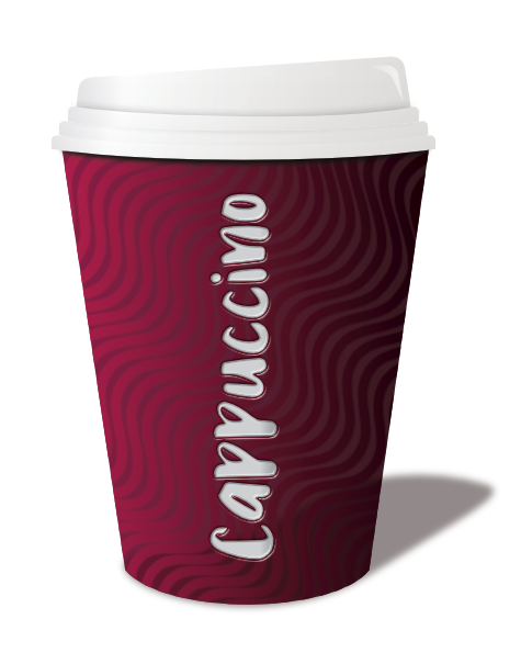
Ok my 2 pence worth lol! The base, edge of the lid and the top and bottom edge of the label could be curved to show a rounded 3D object, if the effect was to create a stylised 2D then ignore the last comment. I think the shading is a bit too dark and the base would probably look better squared off i.e no curve. I think the style lends itself to a more stylised vector with punchy contrasting colours. I'm not sure the brown label works, I get the coffee colour reference and its kind of in tonal contrast with the blue. I think this is a half wants to be 3D and half wants to be a stylised vector. You inspired me to have a go at this, I cheated a bit by using a costa cup image as a reference but the rest is all me hahaha! I have saved the file with History to show you what I did, I tell you it took some tweaking deleting and trying different ways to get it looking as it does, I got round the label by putting the text vertically like Costa do (Sneaky Eh!) The little upside-down L shape on the lid I added as a last flash and filled white and then added transparency. I had to look up how to spell Cappuccino lol! I got close with cappachino lol! Cappuccino Cup.afdesign

-
I think a lot of the pleasure comes from creating something you like, I personally like abstract images you can see so much in them. I see a little green alien man with his saucer floating above him lol!. Don't just use symmetry though, use asymmetry off set and repeat multiple times with different levels of opacity, just let your creativity loose. Nice image though.
-
Plugins
firstdefence replied to debbru's topic in Pre-V2 Archive of Desktop Questions (macOS and Windows)
This is how I have mine set.
-
Fixing Clothes
firstdefence replied to Tabi's topic in Pre-V2 Archive of Desktop Questions (macOS and Windows)
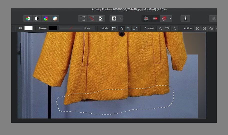
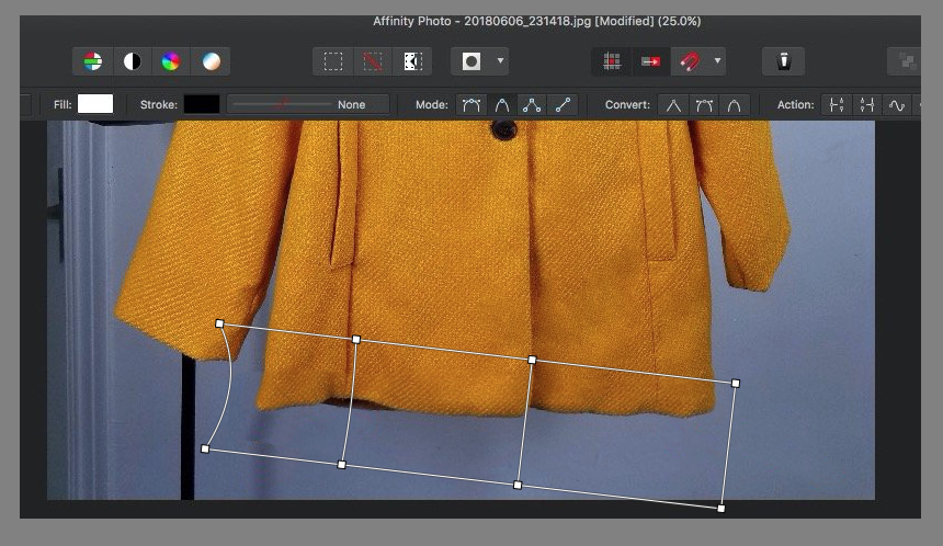
An alternative method that would retain the aesthetics of the cloth and the shadowing on the edge of the coat would be to... Select the base of the coat using the Freehand selection tool then Copy and Paste to a new Layer Rotate the selection you have made. Then Adjust using the Mesh Warp Tool You can then spend a bit of time sharpening the selection because it will blur slightly and then tidy the background up with some cloning maybe a bit of erasing or replacement. You can save yourself a hell of a lot of trouble by just being observant prior to taking a photo and checking how the image looks after, it's much easier to take another image than it is to edit one.
-
Fixing Clothes
firstdefence replied to Tabi's topic in Pre-V2 Archive of Desktop Questions (macOS and Windows)
Just tried the mesh warp tool and it warps the weave too, might be able to do it in repeated stages, so use the mesh warp several times in small steps. -
Does this issue actually have any consequence or is it just a visual flaw?
-
Plugins
firstdefence replied to debbru's topic in Pre-V2 Archive of Desktop Questions (macOS and Windows)
Windows or Mac? What Plugin? Screenshot of the Plugin tab in Affinity's Preferences Panel -
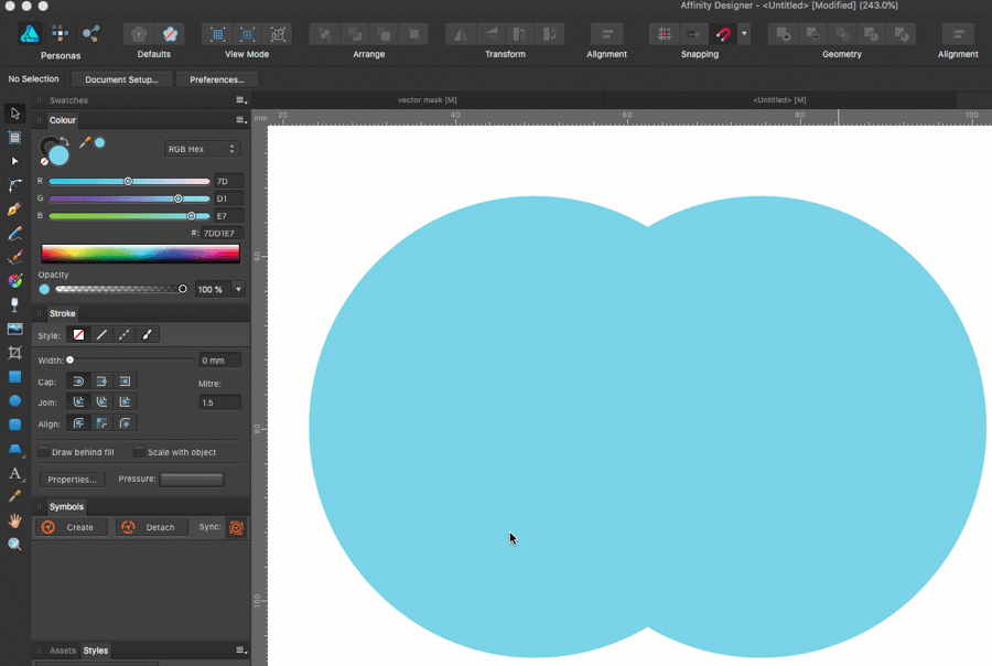
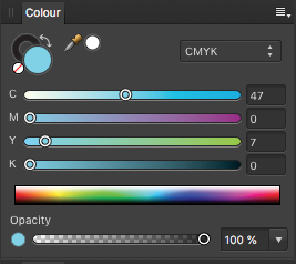
Although the colour values are different in RGB Hex, the colour is the same as shown in CMYK
-
Why are you using RGB HEX Values in a CMYK document? If you change the Colour Panel to CMYK the Panel will show: Using the Colour Picker to select from the original circle will maintain the 47,0,7,0 colour.
-
Batch Editing Question
firstdefence replied to duncang's topic in Pre-V2 Archive of Desktop Questions (macOS and Windows)
I'm not 100% up on macro's but unless there is a cog to the side of the action performed within the macro I think you would have to record the macro again because there is no way to edit the flood Fill Tools Tolerance. -
Opacity masks ?
firstdefence replied to ThomasAn.'s topic in Pre-V2 Archive of Desktop Questions (macOS and Windows)
Just read this post and the reply by A_B_C -
Would love to see the girl in the stripe dress in colour (third image down) unless she was wearing a black and white striped dress lol! Nice images love the selective colours too, works well on the little carts image.
-
multi Beyond Horizon - Game made with Affinity + Unity
firstdefence replied to SalfingerAndrew's topic in Share your work
Well I need new socks because you've just blown mine off, what an awesome effort. -
Opacity masks ?
firstdefence replied to ThomasAn.'s topic in Pre-V2 Archive of Desktop Questions (macOS and Windows)
@ThomasAn. What is the purpose of wanting an opacity mask? The black background shows the opacity variation from the blue colour of the tear to the black of the background via the gradient of the globules that are used as a mask. -
Repeat Patterns
firstdefence replied to Galvertron's topic in Pre-V2 Archive of Desktop Questions (macOS and Windows)
Great minds dutch and they are all vector. -
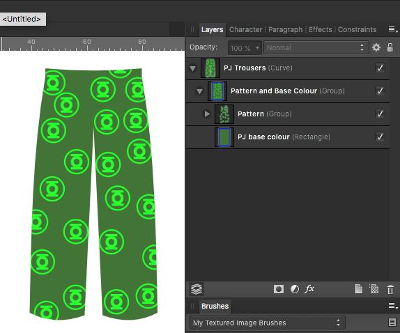
Repeat Patterns
firstdefence replied to Galvertron's topic in Pre-V2 Archive of Desktop Questions (macOS and Windows)
You could create a vector shapes and then create symbols for each colourway, use Power Duplicate to get a repeated pattern, group that pattern and make the group a child of the PJ's shape. To get the background colour of the PJs just add a rectangle to the group that is a child of the PJ shape.
-
I wonder if its the only layer but its just not selected, but SRZ is making the assumption it is because its the only layer. I've done dafter things.
-
Ive tried every PDF export including Advanced features checked and all interpret an inner and outer stroke as a fill, so it effectively expands the stroke.
-
So centre lined it see's it as a stroke, inner or outer it interprets it as a fill.