peter
-
Posts
1,744 -
Joined
-
Last visited
Everything posted by peter
-
 Hi dreyko, Welcome to the forums. One person to ask would be Dan aka giantlobsterprd, as he knows his stuff. https://forum.affinity.serif.com/index.php?/topic/15754-the-dead-of-london/?p=72082 HTH peter
 -
We all copy, that's how we learnt to write. Then as time marches on, our handwriting evolves into something that is unique. Typically this is how our signature take shape. As for art in general: yes finished work is copyrightable, but a soup label redone as a piece of wall art...well judge for yourselves. Context, intent and honesty are big factors here. There are two famous Flemish renaissance painters Jheronimous Bosch and Pieter Breugel. Their work looks hard to distinguish to the untrained eye, as the artwork does look like it comes from the same vein. The key difference here is Bosch leans towards the religious and diabolical, where as Breugel aims for the mundane and secular, most of the time. Both these artists have one thing in common with the likes of Lowry, Handford and even the Radio Times Christmas picture puzzle...that is they depict chaotic scenes, with multiple characters doing their own thing. I really like this sort of art, as there is always something new to look at. As for Grayson Perry he painted Breugel's Hunter's in the snow, onto one of his own vases, albeit a homage. So the key thing here is this...if you're going to a party, then bring a bottle: as those who have something to offer will always be more welcome. In a nutshell if you are going to copy/emulate then try to add something of your own creation to the mix.
-
Danke!
-
And transparency!
-
Nice font: what is it called?
-
Nice! I'm tempted to shout, It's behind you!
- 7 replies
-
- 1
-

-
- ufo
- illustration
- (and 3 more)
-
Perfect for all mums who like playing Cut the rope. :P
-
Wow! That'd look great on any bedroom wall or shed for that matter.
-
Just saw the wee bairn, Mam and his uncut umbilical cord...If it doesn't get cut soon, will the others start to call him James Cord-on? :P Do it, it'd make a great alternative to the usual fodder in the shops.
-
Seeing how it's Mother's Day this Sunday: I think a meal out instead, might be the better option...

-
This reminds me of Font print magic from way back...it was Windows only. http://font-print-magic.software.informer.com
-
Be brave...just do it: a good inspirational poster.
-
Golden Ratio in logo design?
peter replied to johnd's topic in Tutorials (Staff and Customer Created Tutorials)
I have to admit that maths (with an s on the end) is not my strong point. However, I do hope that johnd finds things easier to grasp now. Yup...it was late. -
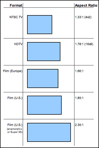
Golden Ratio in logo design?
peter replied to johnd's topic in Tutorials (Staff and Customer Created Tutorials)
This is how the A0 paper system is laid out...One large piece of paper, in portrait mode, cut in two half way down along its waistline as it were. The cut page is now rotated 90 degrees left or right and cut again in the same way. Repeat this and all the little pieces will have the same proportions. A0 uses a ratio of 50:50 nice balanced and very symmetrical. Old TV sets had almost square shaped screens (4:3). The golden ratio uses Fibonacci numbers instead, giving us a ratio of 1:168. New TV sets use rectangular shaped screens (16:9). Which do you think is nicer...? So the effect is more pleasing to the eye. Why? Because that is replicated in the natural and design world. So think of the rectangles and circles produce with the this template as pastry cutters. Each one is the same shape as the rest. Only the size differs and if you lined them up, with the biggest on the left...then you would end up with a curved but jagged ramp. HTH peter
-
I don't think she knows anything about them. I do know that she likes Picasso and knows of Bosch and Breugel.
-
It's been a long, long time since I posted anything. :huh: I saw a program on the two eccentric artists on the box, so armed with two photographs that I've take on my Fuji bridge camera, I decided to give it a bash... The girl in question was my ex-stepdaughter; who strangely didn't like this shot of her by the beach. :huh: All comments welcome... SaveSave a little bit of G&G.afdesign
-
Nice blues, good tones too.
-
I Like it! I think Cartoonmike will too. Useless fact of the day: Brewster is my ex's surname.
-
If the first pic was a tattoo, it would be.... :o
-
affinity photo Underwater baby photography in a Fish tank
peter replied to carl123's topic in Share your work
Problem solved! Ask these chaps :P :D :lol: -
affinity photo Underwater baby photography in a Fish tank
peter replied to carl123's topic in Share your work
That's what Bob (the baby said) :blink: :wacko: :unsure: -
I had a Micra too, only mine was more like the photo, red and wearing a bit of chrome. I also passed my test in one. So let's add this one to the AD garage! B)
-
affinity photo Alien Desert. First Try At Painting With Affinity Photo.
peter replied to TonyJ's topic in Share your work
Amazing depth of field. -
Hi Carl123, Great pic. Giant capt vs giant cat. There's one or two cat lovers round here (not me ;)) Star Treking across the universe: blasting giant moggies, will only make things worse! :angry:
-
Even with a monochrome background, it's a great pic!