peter
-
Posts
1,744 -
Joined
-
Last visited
Everything posted by peter
-
affinity photo Panorama of a wine cellar in a monastery (dark)
peter replied to Frank Jonen's topic in Share your work
Hi frankjonen That's an amazing balance of tonal balance, depth and warmth. Not all dark cellars are foreboding; this one looks very tempting! Hic! :P -
Facebook now has a nag screen/pop up bar for non members, that sits at the middle then bottom of the page. :(
-
Nice letter warping!
-
Good enough to grace TIME magazine!
-
Truly stunning! The translucent effect is really electric. B)
-
affinity photo Luminare Saga JRPG - Garden Area
peter replied to Brett Stebbins's topic in Share your work
Nice! :) -
affinity photo Weapon and Armor Shops Interior
peter replied to Brett Stebbins's topic in Share your work
Beautiful colours. -
Hi Ash, No apologies needed: Circles-within-circles and all that. Hope you get the team you need. As for me, designer? No. Web stuff? No. Professional? No. Passionate about enthusiastic copy writing? You bet! Ask Eejits about turning his great work into Public information film style posters and Ronnie McBride about my rewriting skills. I Would love to help if possible. Please do not apologise for your call to arms as it were, as networking is not a crime. However, not offering the talent in-these-here-forums a chance to shine, should be :P Peter PS Good luck once again.
-
Hi Gary and welcome to the forums. What you could do is contact the video creators and ask them directly...they don't bite: honest! Pinterest is excellent, as a search engine for images, seems that Bing is now jumping on to that same band wagon too. HTH peter
-
Nice touch! Putting some people in front of your artwork, making it look like an exhibition.
-
Very elegant.
-
affinity photo Weapons and Armor Shops for JRPG
peter replied to Brett Stebbins's topic in Share your work
Sniff...sniff...sniff! Where's that tutorial? I know there's one there somewhere! -
I see what you mean Bodo. He will always live on through his music. Just like Prince. RIP
-
I like it! The blue and red chevrons have a high recognition factor (that is if I saw it again, I would recognise it). B)
-
affinity photo Weapons and Armor Shops for JRPG
peter replied to Brett Stebbins's topic in Share your work
Truly magical!- 6 replies
-
- 1
-

-
- concept design
- concept art
- (and 2 more)
-
Works in AD too!
-
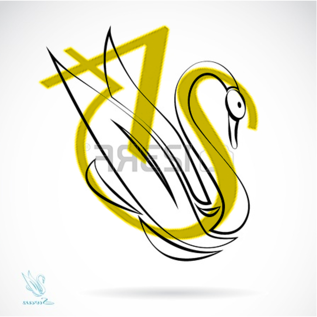
affinity designer Logo & Branding Project with Affinity Designer
peter replied to KyleChicoine's topic in Share your work
Hi Kyle Welcome to the forums. My opinion...? Perfect! The font just oozes elegance, as it has a slight art deco feel to it, whilst still looking fresh. The monogram is distinct and it passes the usual originality and zoomability tests, with flying colours. Well done that man! :D :P PS Am I the only one who can see a swan in the letters A and S?
-
Still no paste board. :( Any ideas when it will be implemented? I would also like to see paste inside available when I right click. Oops, wrong place too post this...
-
Well done Ronnie!
-
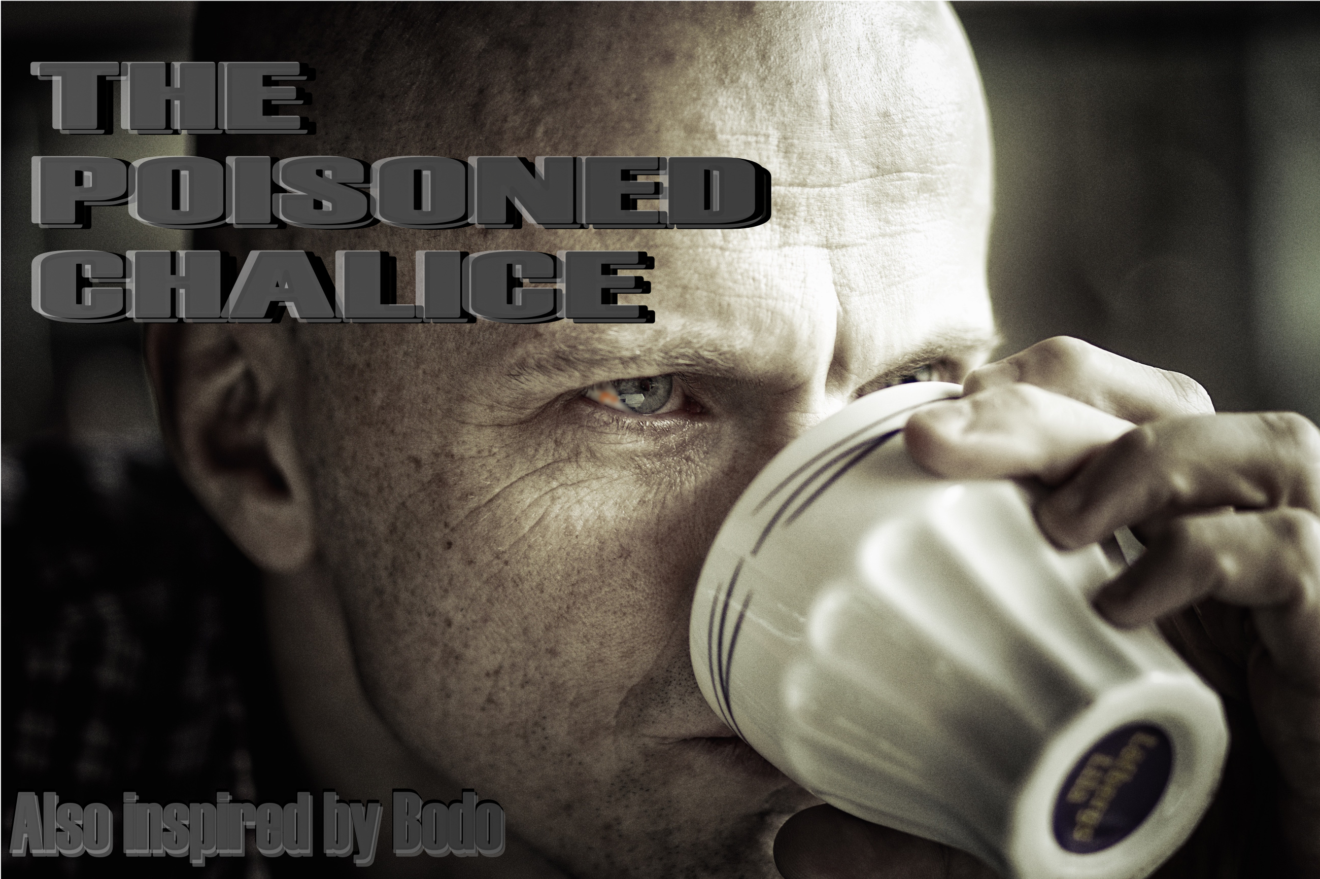
Hey Bodo! Dankes. It's perfect. :D :D :D I really like the way that you placed the text is behind the girl's head. The image, background space and text is balanced beautifully: pure poster material. However, in my humble opinion your original image is more suited to film and television, when the title sequence fades the text in and out in the middle area of the screen. This is very Scandi(navian) drama-esque and draws you into the writer's world. peter PS eyes have definitely become your trademark, here in the forums. :ph34r:
- 6 replies
-
- 1
-
-
- book cover
- buchcover
- (and 1 more)
-
Hi justwilliam You've give me an idea! The second photo has got my brain ticking over...I can never resist trying to read a photo; this is what came into my head Something that might go done well in Germany (Hello Bodo). A mockup and a very rough draft for a fictitious book cover. So don't under estimate your photographic skills, you took this picture for a reason...I hope this rought draft does it justice!
-
Hi Bodo, great atmosphere, here in the forest, green, moody and forbidding. It's as if the forest was trying to bury the evidence, before the girl can recover and escape from her fate. My only critique is this: you have covered her face and her eyes with the text and have left a lot of free space in the top portion of the picture (place the text there). We've lost a snapshot, of what is going through her mind. When it comes to painting eyes, you've got it down to a fine art. B) (Grammar cop at work again) :P
- 6 replies
-
- 3
-
-
- book cover
- buchcover
- (and 1 more)
-
The silhouette effect works wonders.
-
Where did she go?
-
Hi there, Good effort these images are more suited to book covers, where they can be appreciated more. Both image 2 and 3 remind me of astrology: whereas image one, explains how the mind is probably the most complicated object in the universe... :o As for your icon/logo, remember that less-is-more. Here's an example from Pinterest https://s-media-cache-ak0.pinimg.com/564x/fb/6d/c1/fb6dc1e9a31cb43b46d554e1edf1cac2.jpg So what you need to do is match your perception of your chosen career and your publics' perception. Let me explain this classic example of Theatre and Drama. Two faces or masks, one representing tragedy, the other comedy. Even Emojis can do it! :( :) So iconic and recognisable. Keep it simple!