
Milos Micatek
-
Posts
96 -
Joined
-
Last visited
Reputation Activity
-

 Milos Micatek got a reaction from VectorWhiz in Typeface design (WIP)
Yesterday I started to design new typeface in Affinity Designer. I really love split view to get quick overview of shapes and to control outlines. ;)
-
 Milos Micatek got a reaction from Fantail in Typeface design (WIP)
Hello.
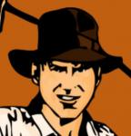
I used AD to draw and slice single glyphs for my new comic book font... regular is done, others (italic, bold, bold ilalic) are still in progress.
... and here is the sampler:
-
Milos Micatek got a reaction from Fantail in Typeface design (WIP)
I am using Font Creator 8.0, it is PC only, but thinking about Glyphs (or Glyphs Mini) for my Macbook.
-
 Milos Micatek got a reaction from Burny in Typeface design (WIP)
Hello.
I used AD to draw and slice single glyphs for my new comic book font... regular is done, others (italic, bold, bold ilalic) are still in progress.
... and here is the sampler:
-
-
 Milos Micatek got a reaction from MEB in Typeface design (WIP)
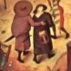
The typeface for new webpage has been created in 2 versions - with and without scratches - waiting for client's feedback. Meanwhile I started with handwritten medieval looking typeface, alphabet and special glyphs done, starting to slice.
Thanks, AD guys, Export Persona and Slice tool are excellent!
-
Milos Micatek got a reaction from VectorWhiz in Typeface design (WIP)
Work on the new font continues - 2nd weight, diacritics added.
Btw, is there any possible way to get the split view by horizontal line (not vertical)?
-
 Milos Micatek got a reaction from Wiredframe in Save Text Style
+1 for Text styles in AD. It will be more than required feature for my comic book lettering... the same as "editable text layers" exported to PSD. ;)
-
Milos Micatek got a reaction from peter in Typeface design (WIP)
The typeface for new webpage has been created in 2 versions - with and without scratches - waiting for client's feedback. Meanwhile I started with handwritten medieval looking typeface, alphabet and special glyphs done, starting to slice.
Thanks, AD guys, Export Persona and Slice tool are excellent!
-
 Milos Micatek reacted to evtonic3 in 1.4.2 Mac updates out now
By end of June has already been said.
-
Milos Micatek reacted to KateM in 1.4.2 Mac updates out now
Hi all,
The team have released the latest updates (1.4.2) for Affinity Photo and Affinity Designer, which focus on bug-fix updates, stability improvements and performance.
Visit your Mac App Store and click on the Updates page to get the latest releases now.
Key improvements
Fix for converting between widegamut RGB and sRGB profiles causing incorrect colours Fix for converting colour profile/colour model not undoing correctly for inner glow effects Fix for occasional crash with arrow shape Fix for Rasterise causing layer effects to appear the wrong size if they were present on a scaled object Fix for A1 (Press Ready) preset having the wrong dimensions for an A1 sheet Fix for tool shortcut keys on international keyboards Fix for scaling issues during copy/paste of text items Improved RTF clipboard support Slightly thinner text tool caret No longer output file paths to PDF export, only use file names (for improved privacy) Fix for line weight incorrectly scaling based on object size when applying Styles even when 'Scale with object' was deselected in the Stroke panel Many PSD compatibility improvements, particularly when using 16 bit documents Singleclick in the Art text tool no longer creates a new Art text object if you are already in caret mode on an Art text object Improved SVG font export compatibility Fix for SVG export generating invalid IDs Fix for vector export of cropped bitmaps Fix for PDF import of large images and soft masks Though the focus is mainly on fixes this time we’ll be adding more exciting new features very soon in the upcoming 1.5 updates... In the meantime you can check out the Affinity Designer 1.5 sneak peek video here. All the best! Kate -
 Milos Micatek got a reaction from Patrick Connor in Typeface design (WIP)
#artvsartist Ouki douk... how does this hashy-tagy-wishy-washi thing work in Affinity Photo :) ?
-
 Milos Micatek got a reaction from SrPx in Typeface design (WIP)
Yesterday I started to design new typeface in Affinity Designer. I really love split view to get quick overview of shapes and to control outlines. ;)
-
 Milos Micatek got a reaction from vitaprimo in Typeface design (WIP)
It is always nice to see my font used in real application :) http://planetadinosauru.cz/
-
Milos Micatek got a reaction from peter in Typeface design (WIP)
It is always nice to see my font used in real application :) http://planetadinosauru.cz/
-
 Milos Micatek got a reaction from Amorph in Typeface design (WIP)
Yesterday I started to design new typeface in Affinity Designer. I really love split view to get quick overview of shapes and to control outlines. ;)
-
Milos Micatek reacted to CartoonMike in Logo Design for Web Comicl
Been a busy, busy boy of late. Here's the title to the first "issue" of the webcomic. All done in AD. I wanted to emulate the old Marvel titles/dislplay lettering of the '60s and '70s a bit (big fan of the "banner-ribbon" element). I really like the noise attribute that can be added to fills/strokes. Like with most seasonings, it's best if done sparingly. Yeah, right. :P
I had fun doing the flat iconic representations of an arrow and scythe here. Thanks to Insecto Design (whatta name! love it!) and his work, not to mention tutorials, helped me to just do the shapes. The fonts are all from ComiCraft, btw. These titles are going to be on a med-dark green background, so it should pop pretty good.
Had an absolute blast working on this. Did a lot of option-dragging to copy elements and the credit lines were done using the Art Text tool on a path. So smooth to do that. While I would love to have some features (warping in freehand and perspective, for example), the current version of AD was great to work in. This is a screen cap on a file with 9 Artboards. While I haven't read the online help about them, I was able to just grok how to use them by, y'know, using them.
While I'm certainly not alone in the throng of users waiting for 1.5 beta, the current version certainly gets the job done very well and with style! I just sealed the deal to letter a graphic novel and I'll be using AD for it. Thanks, Affinity!
-
Milos Micatek reacted to CartoonMike in Logo Design for Web Comicl
And here is the logo within a cover design. :)
About the colors: This is a process posting, btw. The colors as shown aren't final. They are Flats. In the original file using Clip Studio Paint (formerly known as Manga Studio), the layer containing these flats has an attribute called "Reference Layer" so no matter what layer I'm working on, even if the flats layer isn't visible over what's on the current layer -- I have a magic wand tool adjusted specifically only to select from the Reference layer. This way I can paint, for example, the tree leaves after selecting the area of the leaves that's colored with this flat color. It's pretty cool, and makes coloring comics magnitudes easier.
The Logo and cover art was copied and placed, respectively, in a Affinity Designer document. The green rectangle is the "safe zone" all important stuff needs to be within this area (like word balloons, captions, important art, yadda yadda yadda). The Red rectangle indicates that what's outside of it will be cut off; the area between the red and green rectangle may be trimmed slightly as the printing and cutting process is still analog, which is fancy-speak for "sometimes the paper slips and things don't get printed/cut the way we want them to -- so cut us some slack, 'kay?"
Eventually I'd like to do the colors/painting in Affinity Photo. For some reason I just can't quite get my mind around Photo. Which means I'll be practicing in it in my "off" time. But CSP does have a great Perspective tool and a pretty great brush engine, so I'll be using that for the bulk of work. Photo will come in handy for some image adjustments and such.
In case anybody's wondering, the story of Afterwards is a simple one, world ends, some people survive and the story begins when our lead character loses a pair of arrows and eventually gains a very important task to unify the scattered remnants of humanity. Y'know, same old apocalyptic stuff. :P Naw, this is a reaction of all the end-of-the-world stories that are usually dismal and dark (yeah, looking at you Walking Dead!) or a conflict every hour (c'mon, the 100, lighten why doncha) or just plain will not die or just gets weirder and weirder (the Terminator and my guilty pleasure Z Nation). I still think the best story of this genre is Afred Bester's "Adam with no Eve" short story -- and if you want to read what my wife calls "antique Sci-Fi" read his stuff. In Afterwards... a few troupes get subverted and totally inverted while we watch our hero grow into that role.
So lemme know what y'all think of this little trifle of a cover. Thanks!
-
 Milos Micatek got a reaction from 000 in Typeface design (WIP)
It is always nice to see my font used in real application :) http://planetadinosauru.cz/
-
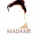 Milos Micatek got a reaction from Madame in Typeface design (WIP)
It is always nice to see my font used in real application :) http://planetadinosauru.cz/
-
 Milos Micatek got a reaction from MattP in Typeface design (WIP)
It is always nice to see my font used in real application :) http://planetadinosauru.cz/
-
Milos Micatek got a reaction from MEB in Typeface design (WIP)
It is always nice to see my font used in real application :) http://planetadinosauru.cz/
-
 Milos Micatek got a reaction from A_B_C in Typeface design (WIP)
Yesterday I started to design new typeface in Affinity Designer. I really love split view to get quick overview of shapes and to control outlines. ;)
-
 Milos Micatek got a reaction from sersou in Typeface design (WIP)
Hello.
I used AD to draw and slice single glyphs for my new comic book font... regular is done, others (italic, bold, bold ilalic) are still in progress.
... and here is the sampler:
-
Milos Micatek got a reaction from MEB in Typeface design (WIP)
Work on the new font continues - 2nd weight, diacritics added.
Btw, is there any possible way to get the split view by horizontal line (not vertical)?