Our response time is longer than usual currently. We're working to answer users as quickly as possible and thank you for your continued patience.
Search the Community
Showing results for tags 'swatches'.
-
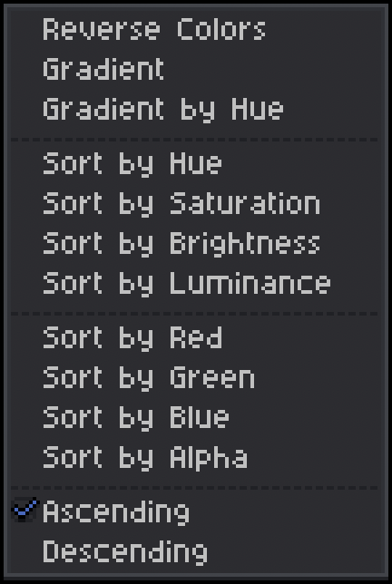
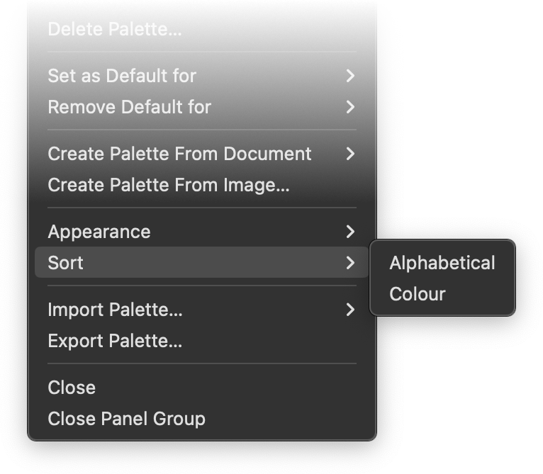
 Hey everyone, I've been wondering for a few years now why there are so few sorting options for the Swatches palette: Alphabetical and Hue – that's very limited when compared to the options offered in other software, especially one of my favourites, Aseprite. The options in Affinity are somehow very sparse, even though colours play such an important role in our line of work. Aseprite: Affinity: More questions: Can anyone confirm that Document Palettes/Swatches cannot be sorted at all? I’ve tried in all three apps (Mac), the expanded menu as above does not appear in any of the apps. I also think the option to generate gradients between to swatches would be a great addition, just like seen in the Aseprite menu. I also know there are tons of websites that offer these options, but if I had one wish, I'd like to see some of these features in one place without distractions – preferably directly integrated into the apps. Cheers Dennis
-
 When you select multiple objects with different colors and then "Add to swatches", right now it only adds one color to the swatches. I would like to be able to add all colors that are in the selection. Also, this may be a different feature request, but I'd like to be able to select multiple swatches in the Swatches Panel, and then be able to mass delete them or mass 'Make Global'. Right now you can only select one swatch at a time.
- 3 replies
-
- 1
-

-
- feature request
- swatches
- (and 2 more)
-
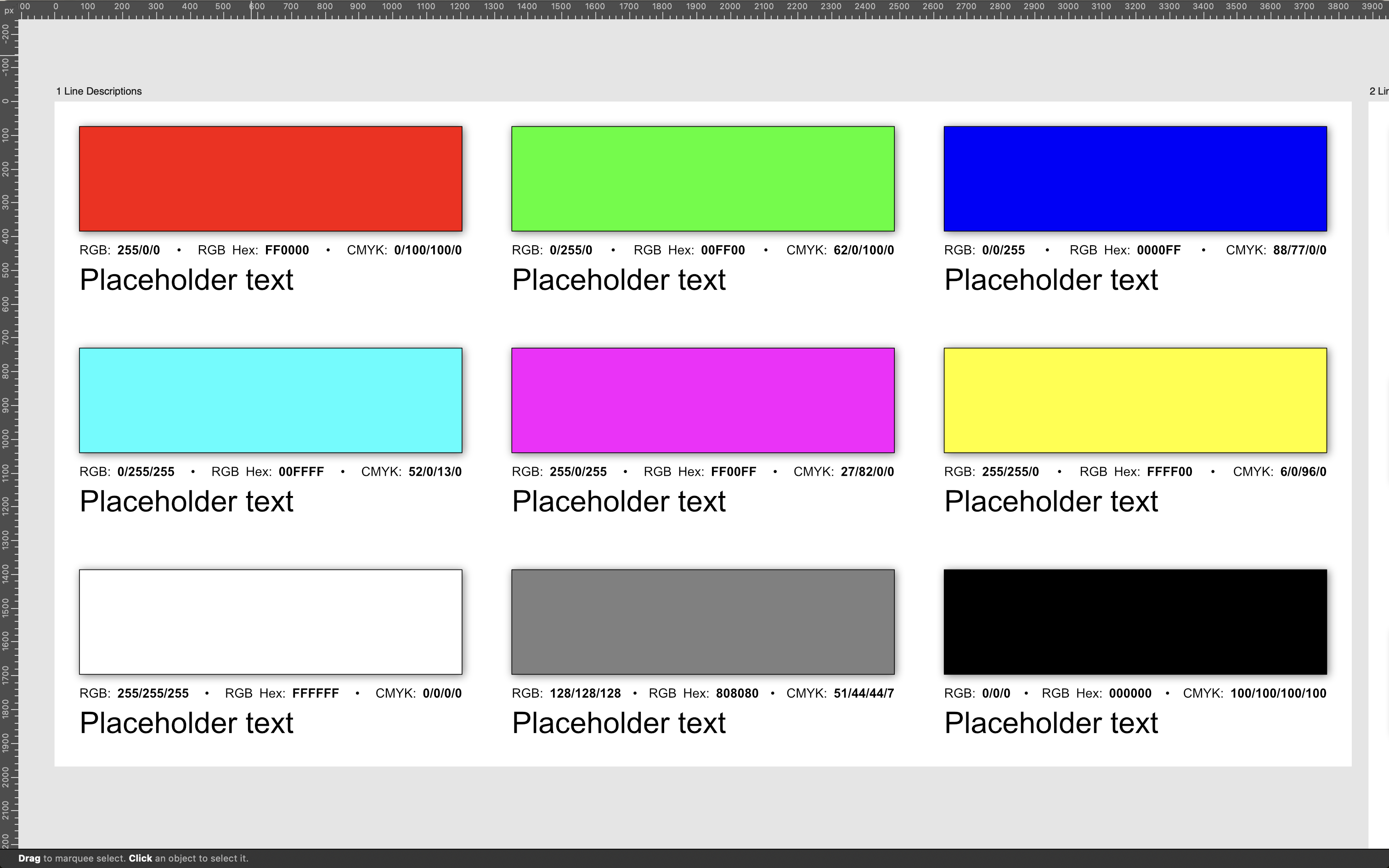
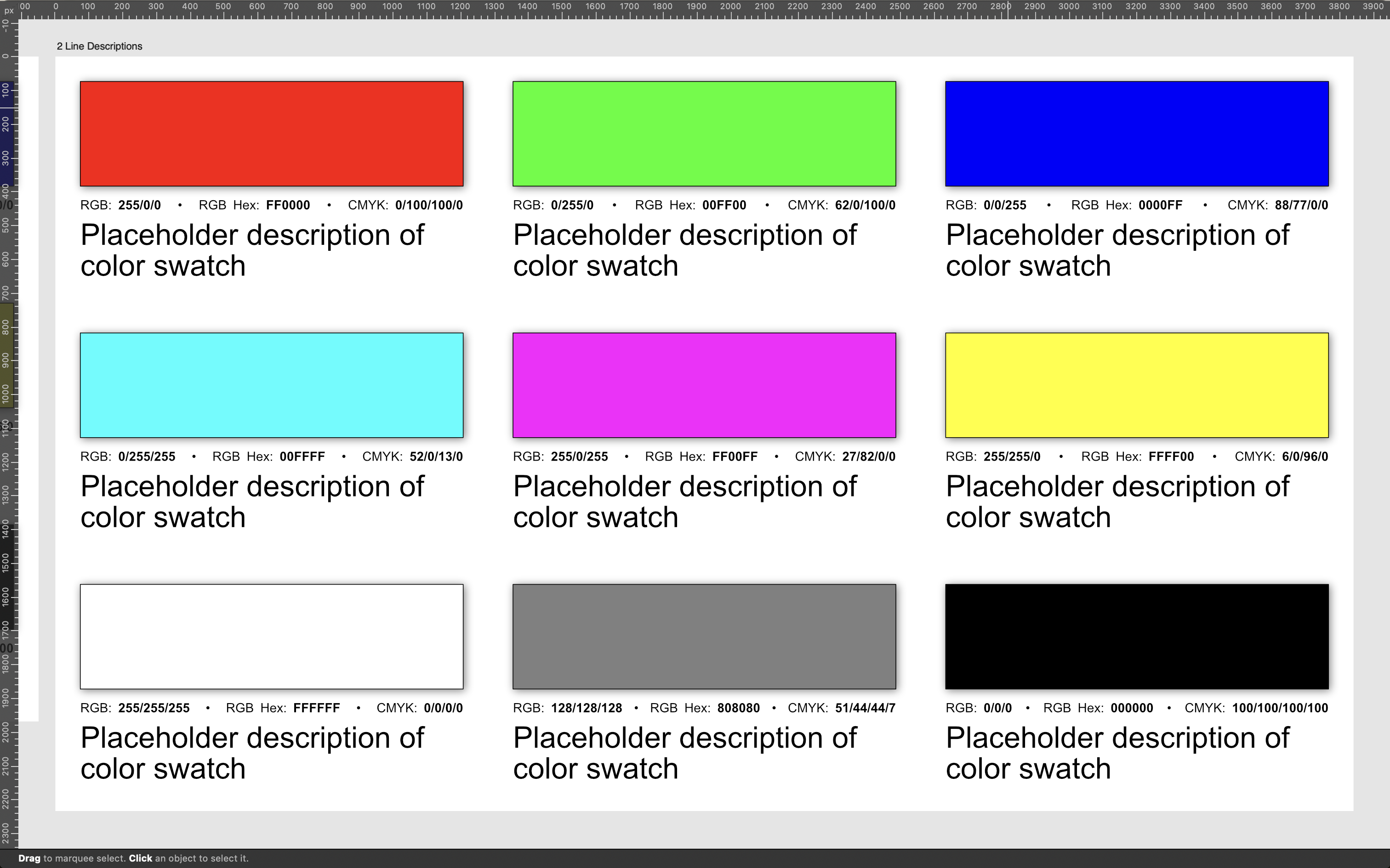
Here is a color swatch template I made that may be helpful to some. I understand there is a swatches panel already in Affinity, but sometimes a designer needs to see a more detailed visualization of their color swatches. In this template is two artboards; one artboard is designed for a single line of text in the swatch description, the other is designed for 2 lines of text in the swatch description. Feel free to use whichever suits your needs. Color Swatches Template.afdesign
-
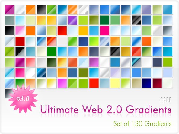
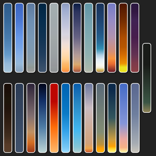
 Here is the set of gradients "WEB 2.0 v.3" converted from the free .grd Photoshop file. I downloaded the PS gradient file from this site and converted it into .afpalette. It's a pity that creating .afpalette files from .grd files is so time-consuming, I hope that in the upcoming versions of Affinity programs, the ability to import the .grd file will be added, just like it is with files .abr WEB 2.0 v.3 gradients.afpalette
-
 In Publisher, these are my swatches: When I switch over to Designer, or Photo, I get this: How can these be inconsistent? When I add a new swatch in one persona, they are not added in the other either. P.S. there is no reference in the docs for what the icons in front of the swatches mean in the dropdown, so it gets hard to tell which is which.
-
 Hey guys, One thing that keeps bugging me when I open a project that I'm working on is that the first thing I have to do is switch to the respective Document Palette from the Default Palette. Wouldn't it make more sense for a document to remember this and just select the last Document Palette you used (in case you have more than one) when opening a .afdesign file? Or at least give us an option in the Palette menu to set that Document Palette as default for that specific document. This would be nice as well. What do you think? Thanks in advance, Cristian
- 2 replies
-
- 5
-
-
- request
- suggestion
- (and 2 more)
-
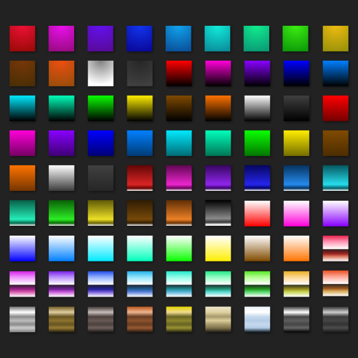
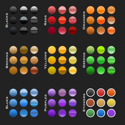
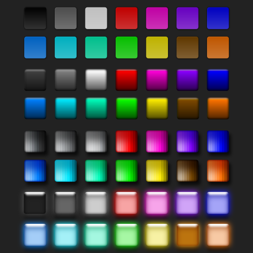
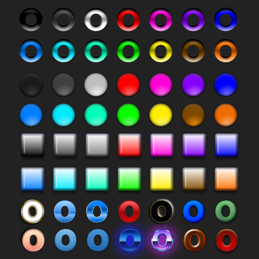
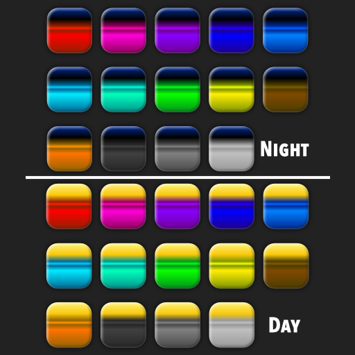
A massive selection of vintage and retro color swatches for Affinity, inspired by the fashions and culture of the 20th century! Get 20% off until 11.59pm, 8th May (UK time). Simply use the discount code 'century' at checkout to redeem. >>GET IT NOW!<< Finding the right vintage or retro color palette for a project can be time-consuming so, we created these Affinity color swatches to help make choosing classic color schemes quick and easy. Drawing from the art, fashions and culture of the 20th century, we’ve created three color swatch sets representing each decade. There are also 15 bonus vintage and retro color swatch palettes included (not shown in the preview). Use them for your vintage and retro designs and illustrations! The retro color swatches are compatible with Affinity Designer, Affinity Photo and Affinity Publisher. To use the vintage swatches load them into the swatches panel and you’re good to go. Add it to your design arsenal today and get the classic look just right! The download features the following files: 30 vintage Swatches – for use with Affinity Designer, Affinity Photo & Affinity Publisher. 15 Bonus Vintage and Retro Swatch Sets. A Quick Reference Guide – Navigate the color swatches quickly and easily. Instructions for Affinity Desktop and iPad. >>GET IT NOW!<<
-
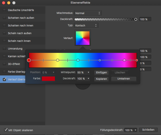
Right now, I can't easily select my gradients from the swatches panel when I am using a gradient overlay as an effect. There's only the option to pick colours, but not predefined gradients. Please add this option.
-
Thanks to this tool: https://github.com/philippbosch/tailwind-swatches I put together a tailwind palette have fun! tailwind.afpalette tailwind-swatches.clr
-
 Hi I am trying to import the color palette into AD from ase file which isa standard for illustrator. Is there a way I can do this. Right now the AD doesn't recognize this file type. Thanks Pranav
 -
 Right clicking a swatch created on any document palette created after the first one will no longer have the Edit, Rename and Delete menu entries active. See the image below: Steps to reproduce: Create a new document Create a new document palette, name it 1 for easy reference Create a new global swatch, make it spot to enable the Rename Spot menu too Right click the newly created swatch See that you can edit, rename and delete this swatch Create a new document palette, name it 2 for easy reference Create a new spot global swatch Right click this new swatch, notice the disabled menu items Creating further palettes and swatches Notice the problem continues Video guide below: Swtaches menu.mp4 Thanks!
-
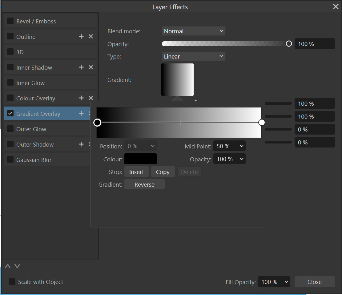
 Hi guys, I have created a color gradient in a layer fx (see image) - now I want to copy that gradient somehow or ideally make it a swatch/global gradient. But I don't see how. Thanks in advance, Stefan.
-
 In the attached file are shapes that use global colours. The objects were originally made in ADesigner v1.x, later edited in the Designer Persona in APub and then dragged copy-and-pasted from existing files to new files. Now I see the names like "Globale Farbe 18" in the "Colour" tab, but I don't see them anywhere under the "swatches" tab. Is there a way to have the existing global colours show up in a swatch palette? globalcolour_nopalette.afpub
 -
It would be nice to delete multiple swatches at once by shift-clicking them and pressing delete. Right now I have to do it one by one and then be asked if I want to really delete the swatch. This is way too tedious.
-
 You see, I REALLY like the Color Chord feature. However it feels a bit inaccessible or that it has potential to be much more. What if we took the feature all together and made it its own panel? It could show a preview of the many color harmonies available from the currently selected color, as well as a live-preview that responds to us changing the color's hue. Could even take it a step further and maybe have a section that shows different light/saturated tones (like a Monochromatic or something of the likes option that would show it's respective tones to whatever color we want, selected or from a harmony). This would make designing a bit more dynamic if global colors generated from this feature could responded accordingly to the changes made to the original selected color (and not create a duplicate of the original color in the color palette which does become annoying).
 -
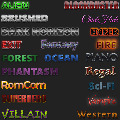
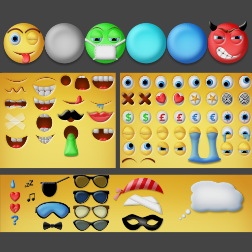
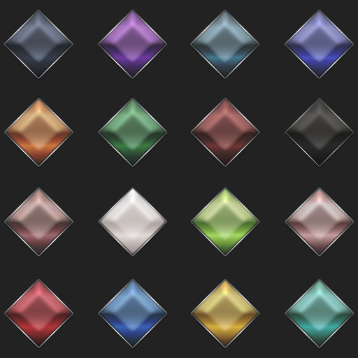
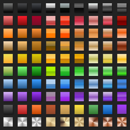
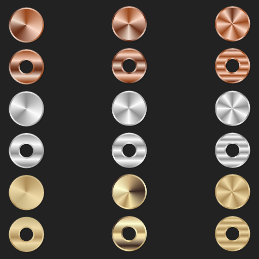
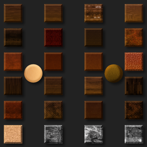
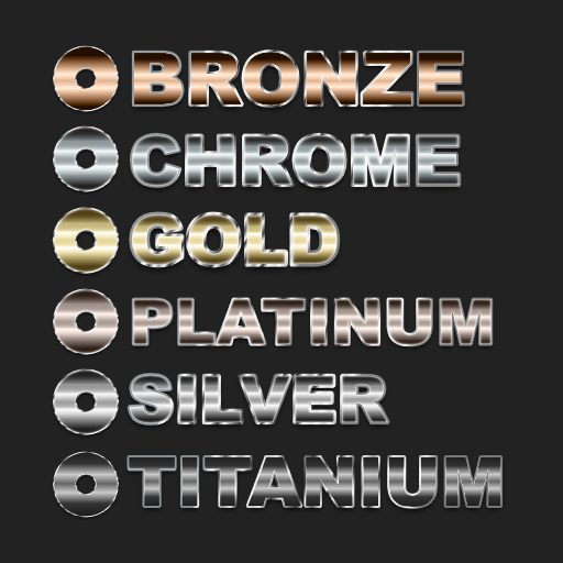
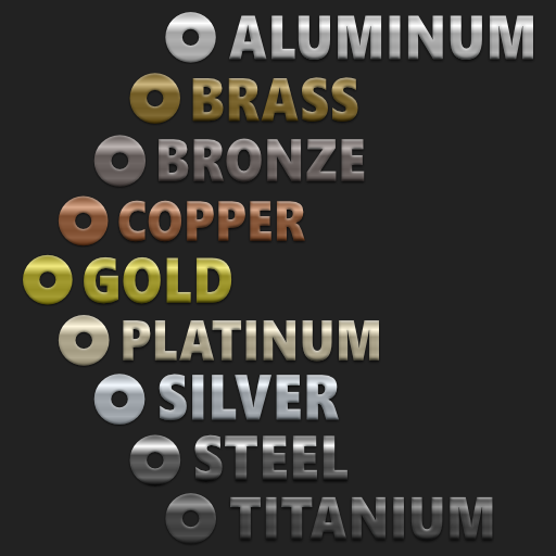
It was recently suggested that I create s single post showing all of the free resources we have made available via https://affinity.graphics as some were never announced here and some folks still don't know about Affinity.Graphics for finding resources. We just updated the site a bit and released 2 more free resources there, so stop by and check things out. You can find DSV's offerings directly at our Affinity.Graphics User Page. Attached are promo images of everything we've released to date. Enjoy! Dream Atmospheres Dream Brushed Metals Dream Buttons Styles Dream Cinematic Bold Styles Dream Cinematic Styles Dream EmotiKit Dream Gem Styles Dream Gradients 1 Dream Gradients 2 Dream Holiday Styles Dream Latex Styles Dream Liquid Vials Styles Dream Meeple Toolkit Dream Metals Styles Dream Organics Styles Dream Polished Metals Styles Dream Raw Metals Styles Dream Resume Templates Dream Rubber Styles Dream Skies Gradients Dream Styles 1 Dream Styles 2 Dream Styles 3 Dream Styles 4 Dream Xanadu Styles
- 33 replies
-
- 11
-

-
-
- free resources
- styles
- (and 4 more)
-
 i had a pretty intensive course in indesign for the last few months. but since i wasn't a big fan of adobe even before the course, i wanted to transfer the knowledge i gained to affinity publisher. Unfortunately, I quickly discovered that many important functions are not available, or are extremely cumbersome to use. 1. spot colors If you want to make a spot color, you MUST create a new global color. There is no option to convert an existing color to a spot color. 2. overprinting In InDesign you can select an object and mark it as "overprint". In Publisher, you have to set up a swatch and mark the color itself as overprint. 3. delete a global color When you delete a global color, you should be able to replace it with an existing global color. 4. add global colors automatically When adding a vector graphic, the colors it contains should be added directly to the document palette. 5. create palette from document since point 4 does not apply, this function is useful. however, even colors from images are added, so you have to disable it first, otherwise this function is useless again. 6. quality of life A big help would be that when you double click a color in the swatches, the "Global Colors" window (which opens when you create a new global color) opens. This small change would fix point 1. I would love to work 100% with affinity. But these points make my decision difficult.
 -
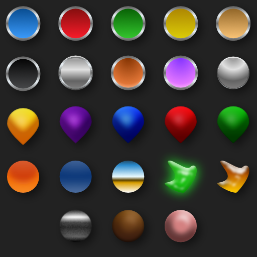
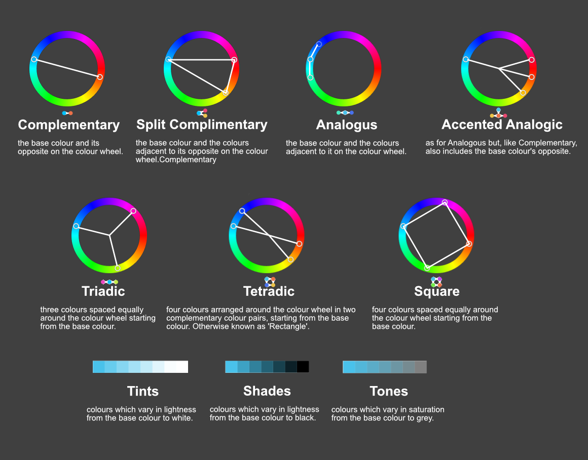
Here is a more visual representation of the colour chord options which are available within the Swatches menu after right clicking on a colour and choosing Add Chord to Swatch. The text as well as used colours are from the documentation.
-
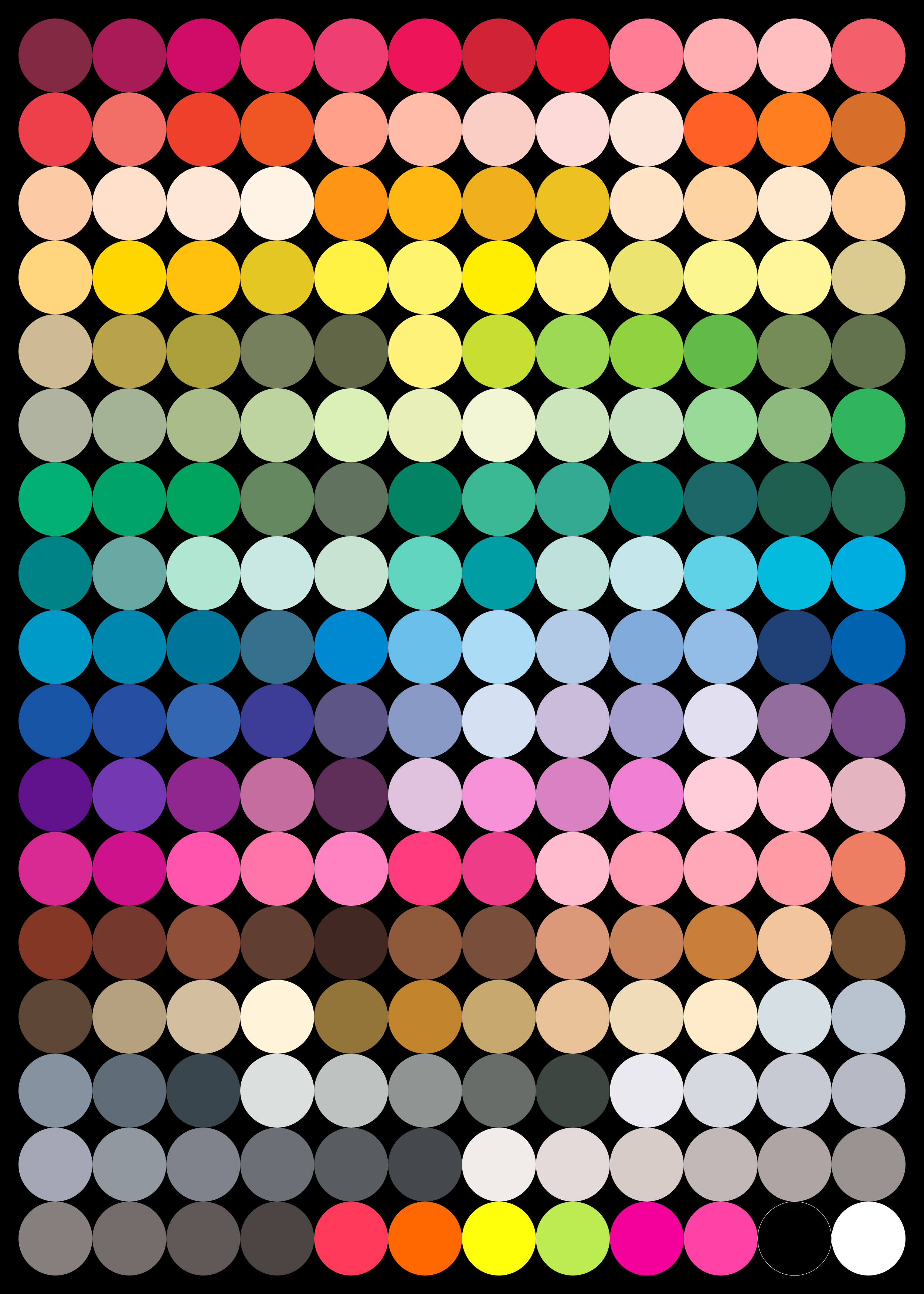
Hello everyone :) Since I just really love these colours, I made this palette and I'd like to share it with you. These are the colours of the Touch Twin Markers, from ShinHan Art. I numbered and named the 204 swatches, to keep them sorted as they appear in their Colour Chart, but of course you can sort them as you want. Hope you like them. :) Touch Twin Markers.zip
- 11 replies
-
- 22
-
-
-
I want to use Select > Select Same to filter my objects from a PDF. In Illustrator, I can use Select Same to get all the objects that have a particular stroke & fill colour without selecting objects. I can use this to sort items along a gradient/ palette. The workflow is as follows: create a document palette > select the first colour > Select Same > Group > Deselect, pick the second colour rinse and repeat. This is also helpful to retrieve objects that are nested deep within the PDF, as long as you know the colours of the object.
-
The ability to group global colors into schemes by saving the state of the entire group. Individual global color could be changed and save the new group state as a new scheme. This would allow having multiple color schemes for a group and change the look of the entire document merely by switching color schemes.
-
I've searched around and while I see people asking about this, doesn't seem like there's any kind of formal request for this feature so here's one. Essentially it's what the title says, please add the ability to create, edit and apply global colour swatches in illustrations and designs done on the iPad. Global colours are a fundamental part of vector design and illustration, the need for this is vital! Right now the only workaround is to create them on the desktop and then open the file on the iPad, but this has limitations besides not being able to edit the swatches on the device itself. For example if you apply a global to an object, the swatches panel will not indicate in any way that the colour is apply to the object, unlike in the desktop where you can see the swatch highlighted. Thanks!
- 8 replies
-
- 7
-
-
- global colors
- global colours
- (and 3 more)
-
Based on https://material.io/guidelines/style/color.htmlI created swatches for Affinity with all Material Design colors, properly named nad sorted. Enjoy Material.zip
-
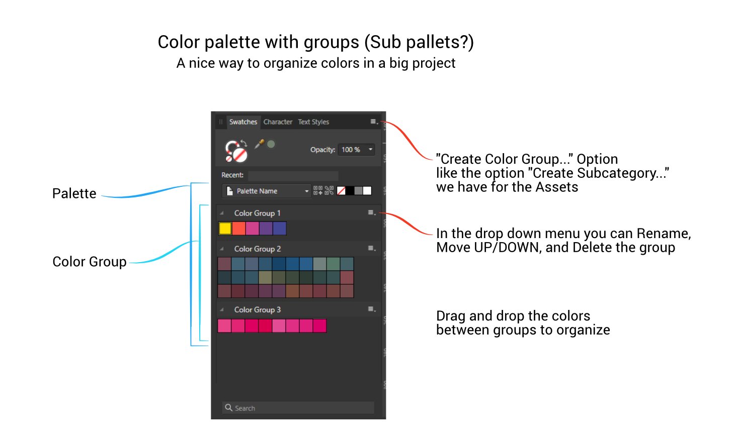
 This suggestion is basically a copy of what we have with Assets (subcategory) but working for the color palette. Imagine a big project, illustration with several characters, scenes with various elements and so on. The color group option makes it easy to organize colors by characters, elements, accessories or whatever you're doing, without having to create a new palette for each one. You can have the CHARACTERS palette, and within this palette have the characters colors separated into groups. CHARACTERS Palette Character 01 Character 02 .... ________ PLANTS Palette Grass Bush Trees ______ PROJECT X Palette Header elements Body elements Artistic elements Text I think the idea and utility is easy to understand but here is an image to help
-
- 2
-
-
- suggestion
- swatches
- (and 1 more)
-
For me it would be very useful, if Affinity Publishers Preflight would be able to find colours, that are not in the used swatches panel. That could prevent the accidental use of Colours, that are not wanted. I don't know, if I can make my point clear – I'm from Germany and my English is a bit clumsy.
- 1 reply
-
- 1
-
-
- feature request
- preflight
- (and 3 more)