Search the Community
Showing results for tags 'Affinity photo'.
-
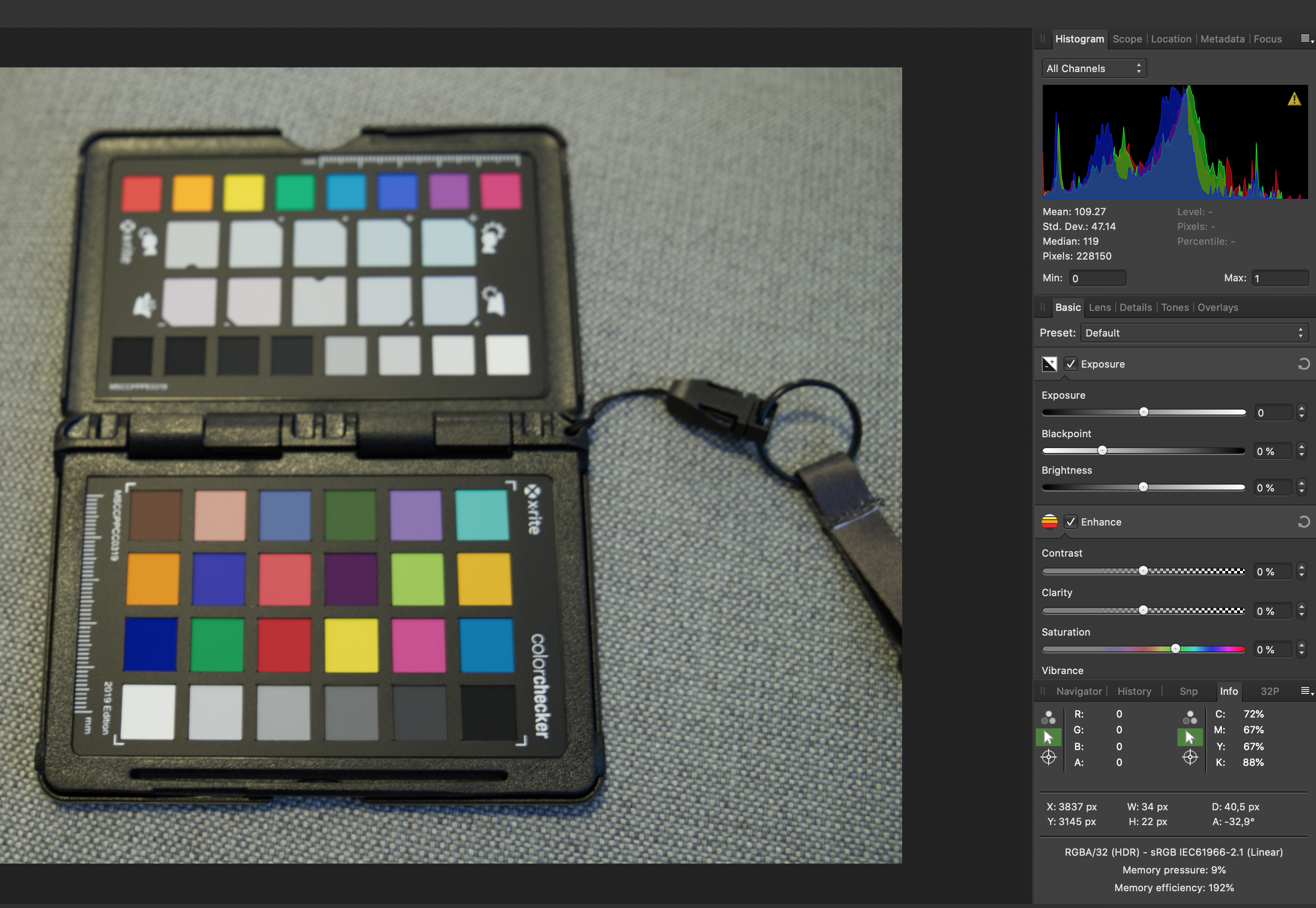
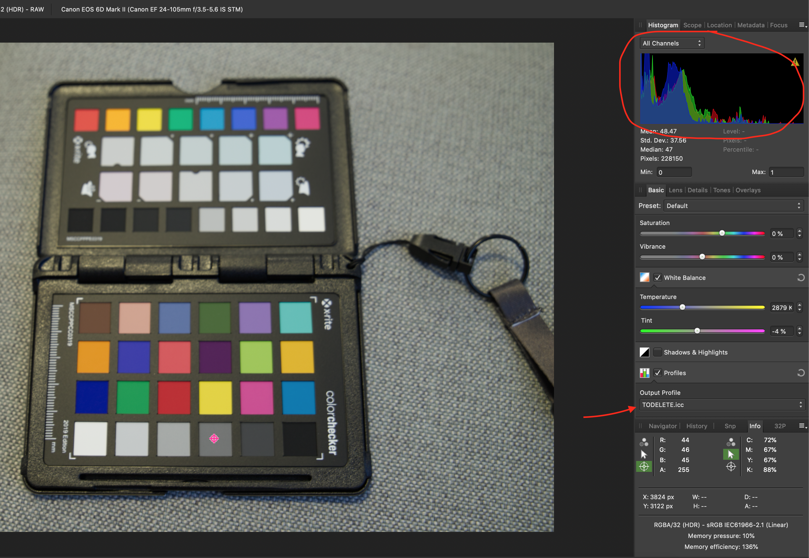
 Hi, I've been trying to use the XRITE Color Checker Passport and I'd like to ask for help. I'm not sure if I'm doing this correctly. I saw in another message in this forum the steps to generate the ICC file. So, to verify if the ICC was correct, in my understanding, I can use it in the original picture and I would expect NO changes in the color or anything. It actually squeezed the colors towards the black and the image became darker. The original image, only with WB corrected is the Pic 1 Then, after the ICC was succesfully generated and loaded in Affinity from that image, when I apply the profile, see the Histogram: Pic 2 If I develop the picture, it will be darker. BUT... if I load the image, after the WB correction, and develop the picture, from Document -> Assign ICC profile, the picture is corrected, but the contrast decreases and it looks washed (picture Pic 3). So, is it a bug with Affinity? How could I verify the colors are truly corrected? Can I use the RGB values in Info panel to double check the color palete values? The ICC profile I generated I called it TODELETE. Thanks! Sergio PIC 1: PIC 2: PIC 3:
-
This began life (or was resurrected -- see below) when I was fourteen, at school in 1965 when Games was rained off and I started doodling in a notebook whatever came into my head. I've still got the notebook somewhere, but I can't lay my hands on it just now to show you the original scribble.But here's the weird creepy thing ... ten years or so later I was idly flipping through a book, A Century of Creepy Stories, at a friend's house, when I came to an illustration ... that was my teenage doodle! It was different, obviously, but had all the elements: the old man, the long-case clock, the water ...And then I remembered ... when I was seven, we had a caravan holiday in Cornwall. Under my bed, I found someone had left a book ... A Century of Creepy Stories! The room is by Vidar Nordli Mathisen from unsplash; the bath from a photo by Max Murauer from unsplash; the clock and the wooden posts are my own photos; the other elements I borrowed from the internet.
-
 Am I missing a step while dragging an image into Photos and if I drag another, rather than opening it, it places it on top of the already opened image.
-
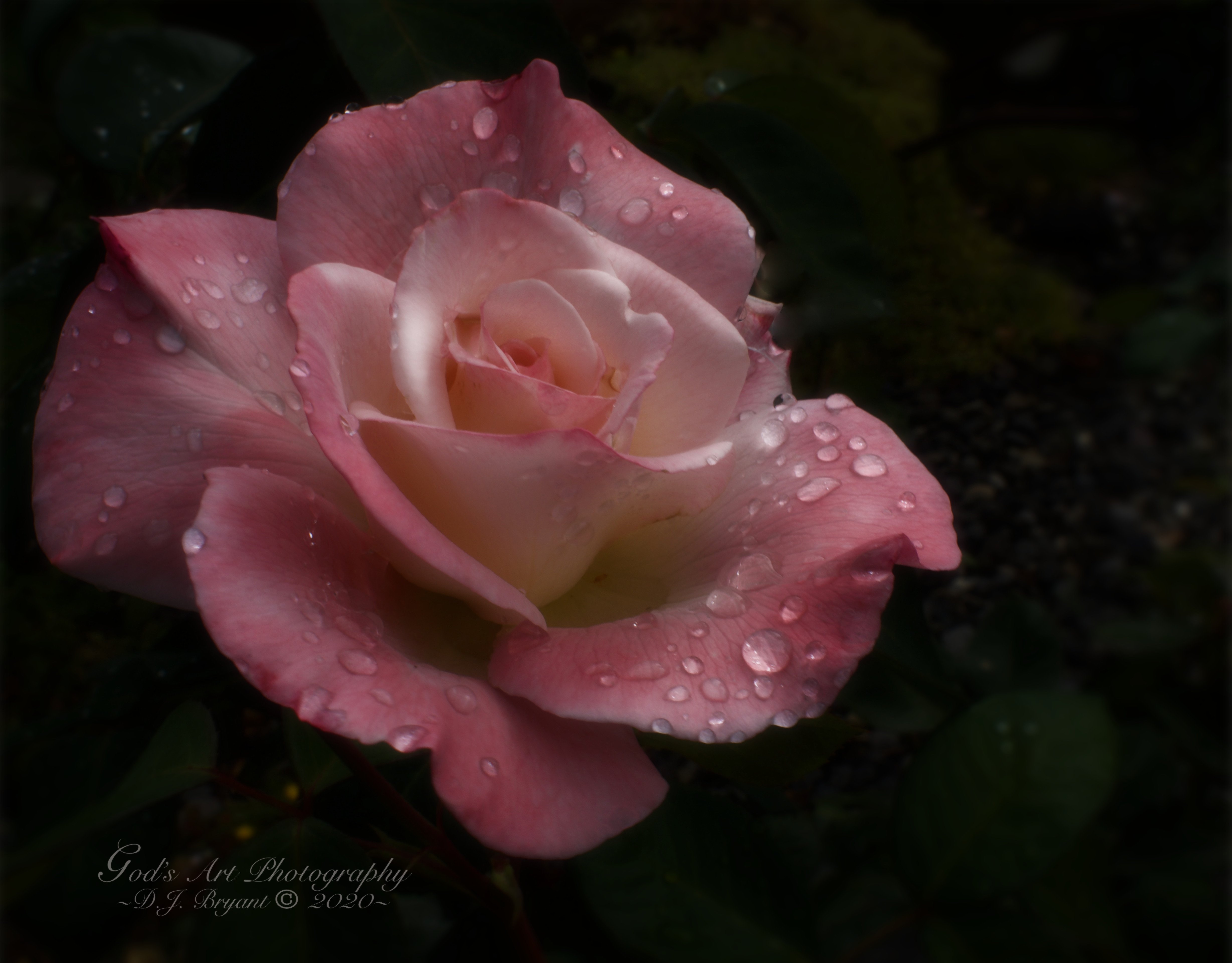
Just a sweet little rose from our garden after the rain. She is called Pristine.
-
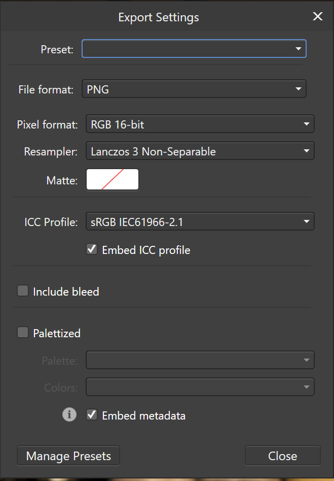
 Hi everyone, I am new to Affinity Photo and photo editing in general and I have a crucial problem. The preview of my edits that AP shows does not fit the exported files. Just for reference my screen is colour calibrated using a SpyderX and is able to achieve 100% sRGB. Looking in Windows -> Settings -> System -> Display -> Advanced Display Settings -> Bit depth I see the value 8 bit. Now when I look at the edited photo in AP (before exporting) I can clearly see shades of gray on the top left lamp, but when I look at it through DigiKam's ShowPhoto (which I read it is colour managed) I am losing all the gray detail in the top left lamp. I have exported to PNG 16bit (as I was working in sRGB 16 bit in AP) with the attached settings. The even weirder problem is that if I open the exported PNG in AP I see the exact same image as the preview. As far I know, the only profile that should be anything but sRGB/Adobe RGB/ProPhoto is the display one (which is found under Windows -> Settings -> System -> Display -> Advanced Display Settings -> Display Adapter Properties -> Colour Management -> Colour Management) that should be generated by a colour calibration tool such as SpyderX/i1Display/etc. Please let me know what do I get wrong as it drives me nuts that the export does not match the edit! Thank you for your time and stay safe! DSCF2205.afphoto
-
Hey ho! My handsome cat shown in a new light - what do you think? Photo taken with my good old Nikon D90. Enjoy it 😃 Chris
-
 Hi, Unlike other applications Affinity does not have upgrades internal to application. It asks to download a 400MB + sized application and then upgrade. Why cannot the application run internal upgrades instead of making user explicitly download a heavy file and then manually upgrade?
 -
 I usually do still life photography but decided to play around with portraits and had a subject in front of a green screen, removed the background and I was looking for a good background to use and although there is plenty I've come across a problem of creating realistic depth so the person doesn't actually look like it's on a pasted background. Any tips on getting this looking more real or is it case of trying loads of backgrounds to see what fits?
 -
 Topaz offers instructions for attaching their app as a plugin to AF. https://help.topazlabs.com/hc/en-us/articles/360001129351-Serif-Affinity-Photo-Using-Your-Topaz-Labs-Plug-ins When working in AF, I invoke the Sharpen AI app with the image I have open and the app connects as a plugin and launches fine. The problem is, it is non-functional - does not process anything. I've sent this on to Topaz and am awaiting their reply, but I wonder if there is any knowledge about this with AP people. Thanks.
 -
 In the last weeks, my Affinity apps started to close by itself after opening. I couldn't find a pattern or any relationship with any other software on my PC (Windows 10, fully updated - nVidia driver update - Intel CPU and GTX 1050Ti GPU) and it seems to be totally random. I click on the icon to open the program... it opens and right in the moment after it opens, it closes (no crashing, no error, just disappears). After that... i can't open the software again, since it will keep behaving like that (open, close right after that). (Attached a vídeo of the problem happening). To use the software again, I need to reboot my computer and try again. Anyone have any idea of what is happening? There is any error log that I can use to check what is happening? 2020-09-01 09-34-04.mp4
 -
Hi guys, I just made this brushes 2 days ago. Here's the link if you want to download it: https://drive.google.com/file/d/19yzrVPnG8VIdnJzcJsHqzf8Hi6ALiIww/view?usp=sharing You can also check out the video below to see how I use these brushes. Hope you like it, thank you!
-
- 5
-

-
- affinity photo
- free brushes
- (and 2 more)
-
Hi guys, I just made this brushes 2 days ago. Here's the link if you want to download it: https://drive.google.com/file/d/19yzrVPnG8VIdnJzcJsHqzf8Hi6ALiIww/view?usp=sharing You can also check out the video below to see how I use these brushes. Hope you like it, thank you!
-
- 1
-
-
- affinity photo
- free brushes
- (and 3 more)
-
Post prosessing with Affinity Photo, added lighting, texture, LUT.
-
Hello everybode, I would like to suggest the feature to export animated gifs from Affinity Photo and/or Affinity Designer. THis feauture would be so cool and helpful, because with it we could create at least basic animations. Have a nice day
-

How to Make Your Own Brush
Krisna posted a topic in Tutorials (Staff and Customer Created Tutorials)
Hi guys, I just uploaded a tutorial video about how to make brush in Affinity Photo. I hope you enjoy this video. Thank you-
- 1
-
-
- affinity photo
- brush
- (and 4 more)
-
I've been playing around with song lyric artwork, and as it's the anniversary of the White Pony album I thought I'd do one for that. The lyrics are repeated (IIRC the text box is filled with the album lyrics 3 times) because to fill the logo would've required to blow up the lyrics a fair bit, which meant the logo didn't have very good definition. As a heads up, the lyrics do contain swear words. (I wouldn't have thought that counts as controversial, but happy to redo the post as just as link if it is). Logo and text and was done in Designer, background photo was edited in Photo. Obviously all kudos to the band for the pony logo and lyrics, I just did this a bit of fun fanboy art.
-
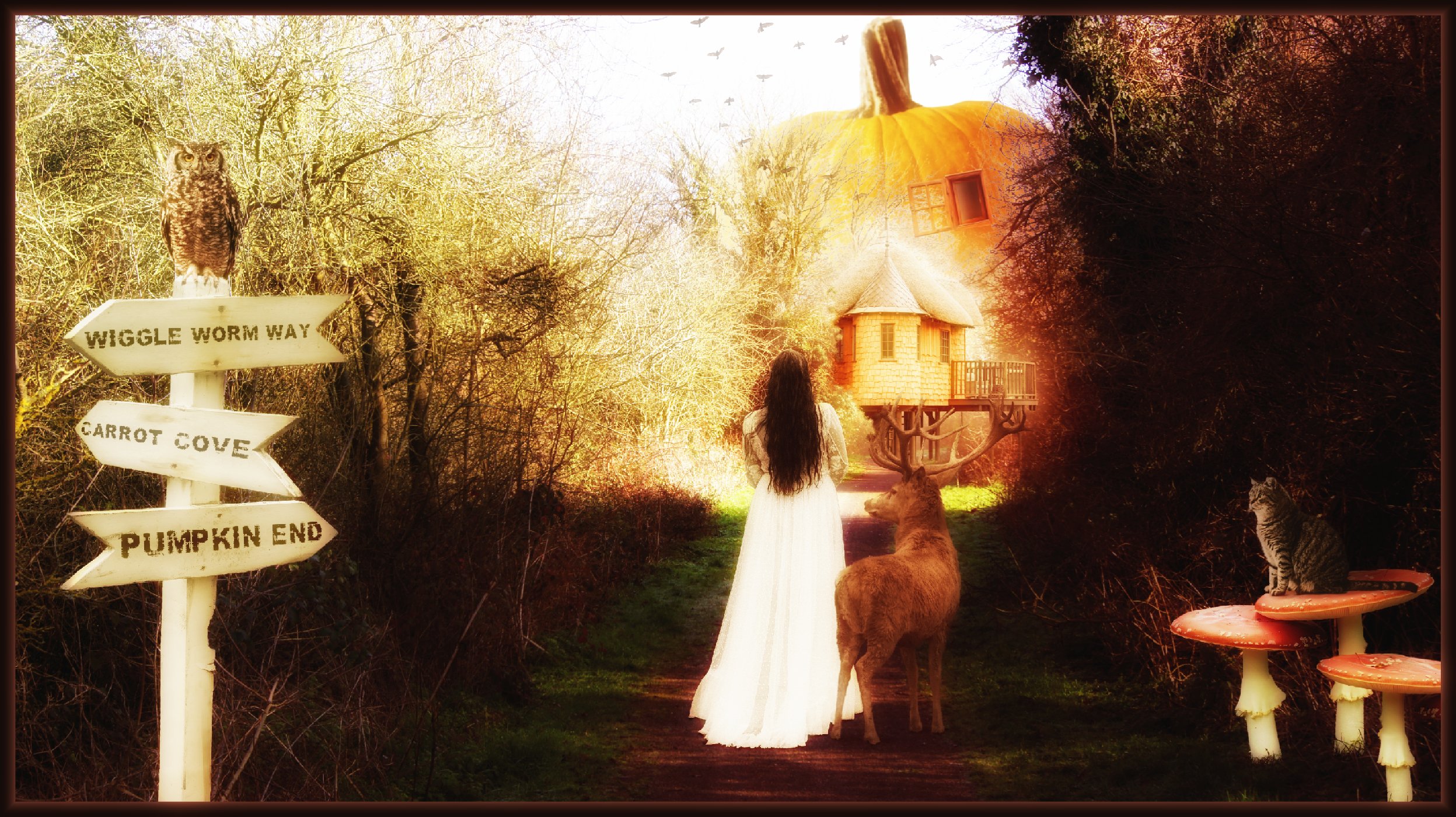
The base picture came from one of my many nature walks, and with a bit of imagination I tried to create a fairy tale type picture. Yes I know. . .I'm out there! 😀
-
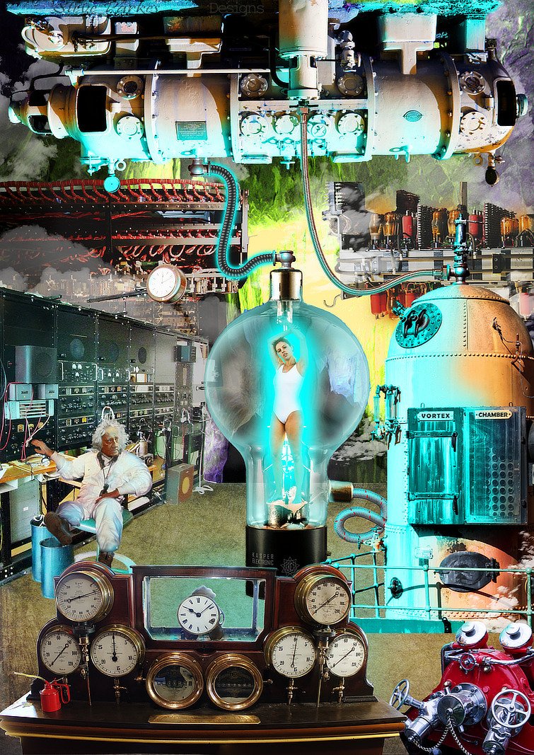
Way back in the good old 30s, 40s & 50s, before real science had begun to catch up with pulp fiction, there was a penchant among sci-fi magazines for mad scientists to experiment on scantily-clad ladies in glass vessels. I've seen quite a few on FaceBook pages lately, so I thought I'd have a go at making a realistic-looking one of my own, mostly in Affinity Photo.As far as possible I've used my own photos, but the unfortunate female is from Pixabay, the Mad Scientist is Doc Brown from Back to the Future with William Herschel's head (photo: Julia Margaret Cameron), the glass thingy is from off the internet; the tubing is some Affinity Designer image brushes I made for the purpose. The whole thing was largely inspired by Richard Hamilton's Pop Art collage Just what is it that makes today's homes so different, so appealing?. It grew organically, which means I had a half-formed plan in my head and mostly added stuff willy-nilly and moved it around till I was happy. Oh, and I had to paint everything electric-shock blue. I made this A2 size, which is a bit bigger than it needed to be really: the while thing is nearly 300MB, even after I'd flattened quite a few of the layers and groups. This is Hamilton's iconic work, which kicked off the Pop Art movement in 1956. In those days, cut and paste meant a pair of scissors and a bottle of Gloy!
- 1 reply
-
- 6
-
-
- science fiction
- mad scientist
- (and 5 more)
-
Affinity Photo Final Image Stock Photos arbinsidik.com
-
 Making found brush easier please give numbers in preview or names ? i tried found and finally founded smooth edge brush what is full colour what i selec5red in its "strongest areas". in previews is hard found and expect all brushes do finally (when they used amount x) this but looks is not. i mean in Affinity Photo. and why not Designer also if idea is suitable. and these brushes dont have name even help what shows when pointer stays top of them. and i feel these should be first choice not these very opague but not fully opague brushes.
 -
for example painting is not fully opague ? looks like this: i painted this black and when i pick color is 63,63,63. and in border areas there is darker values than middle. this happens other brushes as well. and used red does same. i feel this bug. i want for example airbrush stuff what is rounded edges but darkest area is black when i select black. in other program i can do what i want (and i feel there should be also happen same) but is so silly use program what is very old (is i think 1993 or 1996 or something like it) and change stuff to it and back and even more worse this other tool dont support modern wacom and multiply mixing mode for example,
-
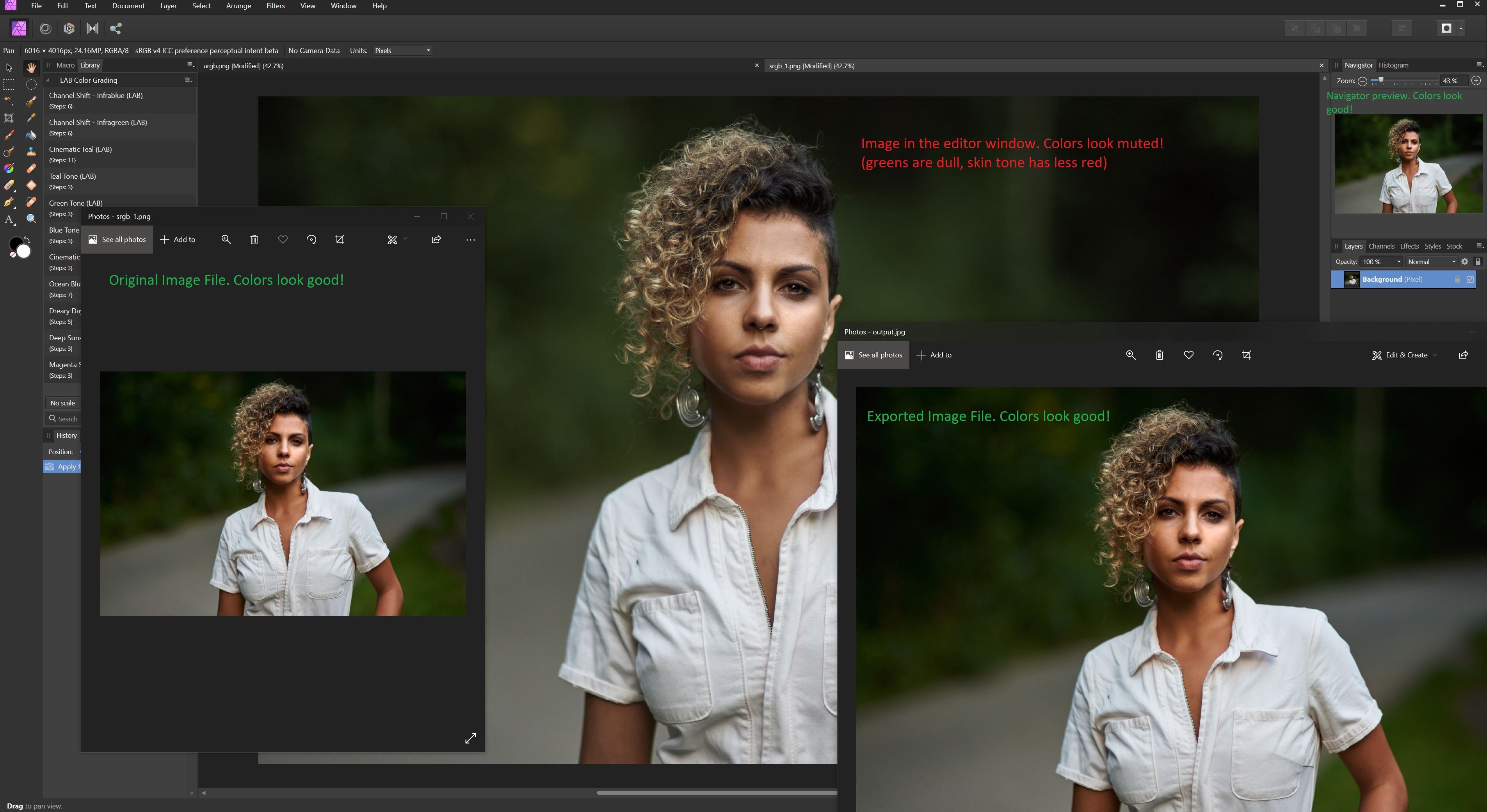
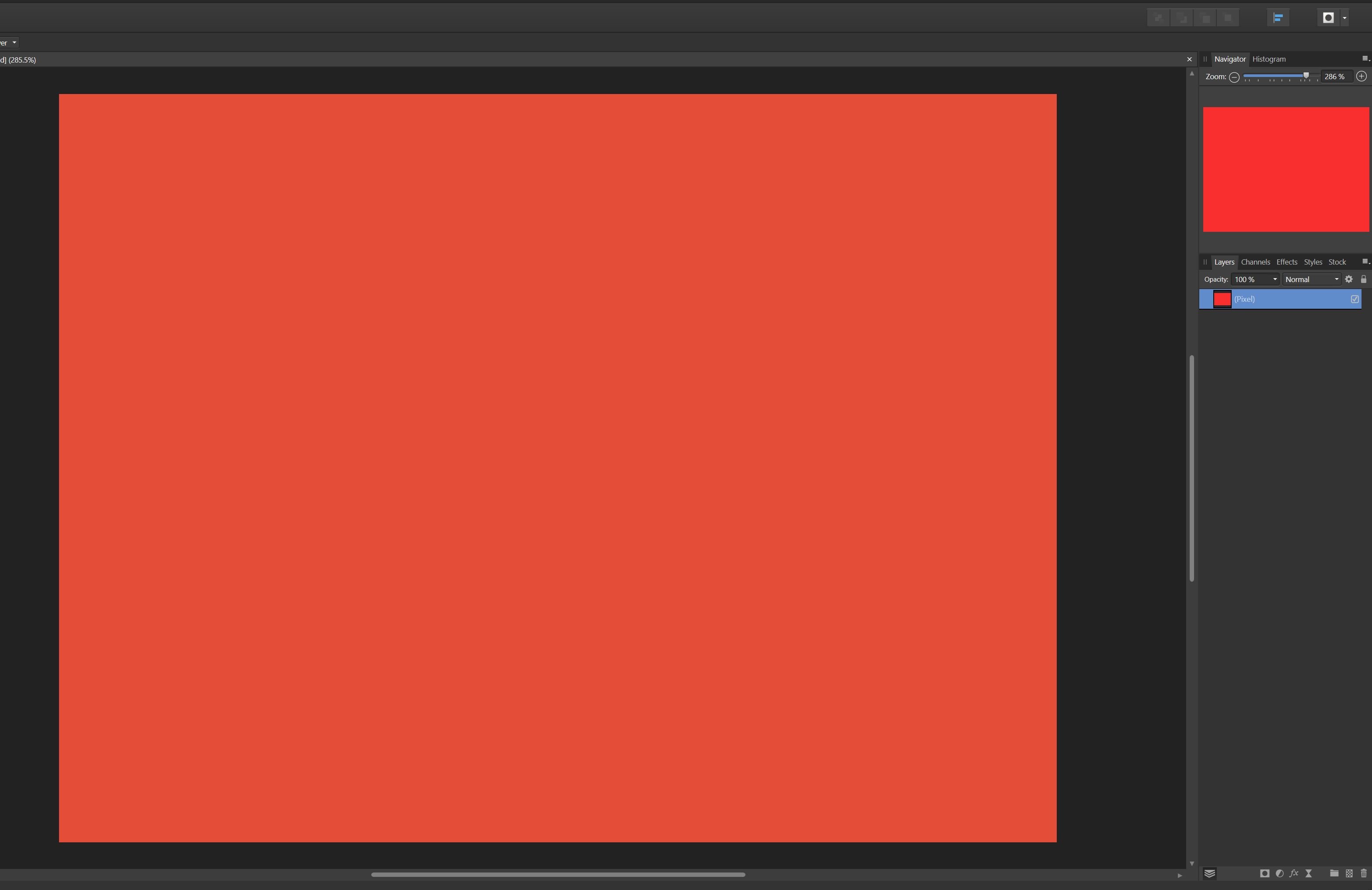
 Hey there, I am having an issue that is driving me insane and I was wondering if anyone had any ideas. The colors in the affinity editor window for an image I am working with are wrong. I know it isn't a display calibration issue because the colors are ONLY wrong in the main Affinity Photo editor window. (Also I am working using a calibrated monitor) - They are correct when I open the source image file in Windows Pictures - They are even correct in the tiny little navigator window in Affinity Photo - They are correct if I export the image file and then open it in Window Pictures again. The only area where they are incorrect is in the main editor window itself. Colors look dull. Its as if saturation has been lowered. I have tried all sorts of things to fix it from working with different color profiles to different bit depths or even different file formats. Nothing has any impact. Whenever I open an image in affinity, it just looks "dull" This obviously presents a huge problem when working with photos as I can't make accurate color grading decisions. I've included a screenshot below showing an image at various steps of the workflow. You can very clearly see that the main large image is duller than all the others and if I sample say the center of the green highlight in the top left hand blur what I am seeing is also affirmed: - Source File: 15,27,3 - Editor Window: 28, 36, 13 - Output: 16, 28, 4 - Navigator: 16, 30, 5 You expect a bit of variance because I can't sample the exact same spot but the Editor Window is clearly very difference than the others. I have also included a screenshot of a new document just filled with red to rule out it being an issue with the photo itself. In that screen you can clearly see that the red in the navigator preview is richer and more vibrant than the red in the editor window itself. (The navigator is accurate to the color I selected) Any help would be really appreciated. I am running AP 1.8.5.703 on Windows 10. I am hoping maybe there is some setting that may be wrong in my preferences?
-

affinity photo MEIN BUCHCOVER-TUTORIAL IM AFFINITY WORKBOOK
bodobe posted a topic in Share your work
MY BOOKCOVER TUTORIAL IN THE AFFINITY WORKBOOK My work in book cover design caught the attention of Serif (Nottingham) and one day I got mail. Whether I wanted to do a tutorial on book cover design for the new Affinity Photo Workbook, and of course, I was happy to be there. As an example, I have contributed a tutorial for the design of the book cover of a fictional novel (Search The Woods): From setting up the document to the actual design and exporting the print edition, all work steps are carefully described. https://www.bodobe.de/mein-tutorial-zur-buchcovergestaltung/-
- 2
-
-
- buchcover
- book cover design
- (and 2 more)
-
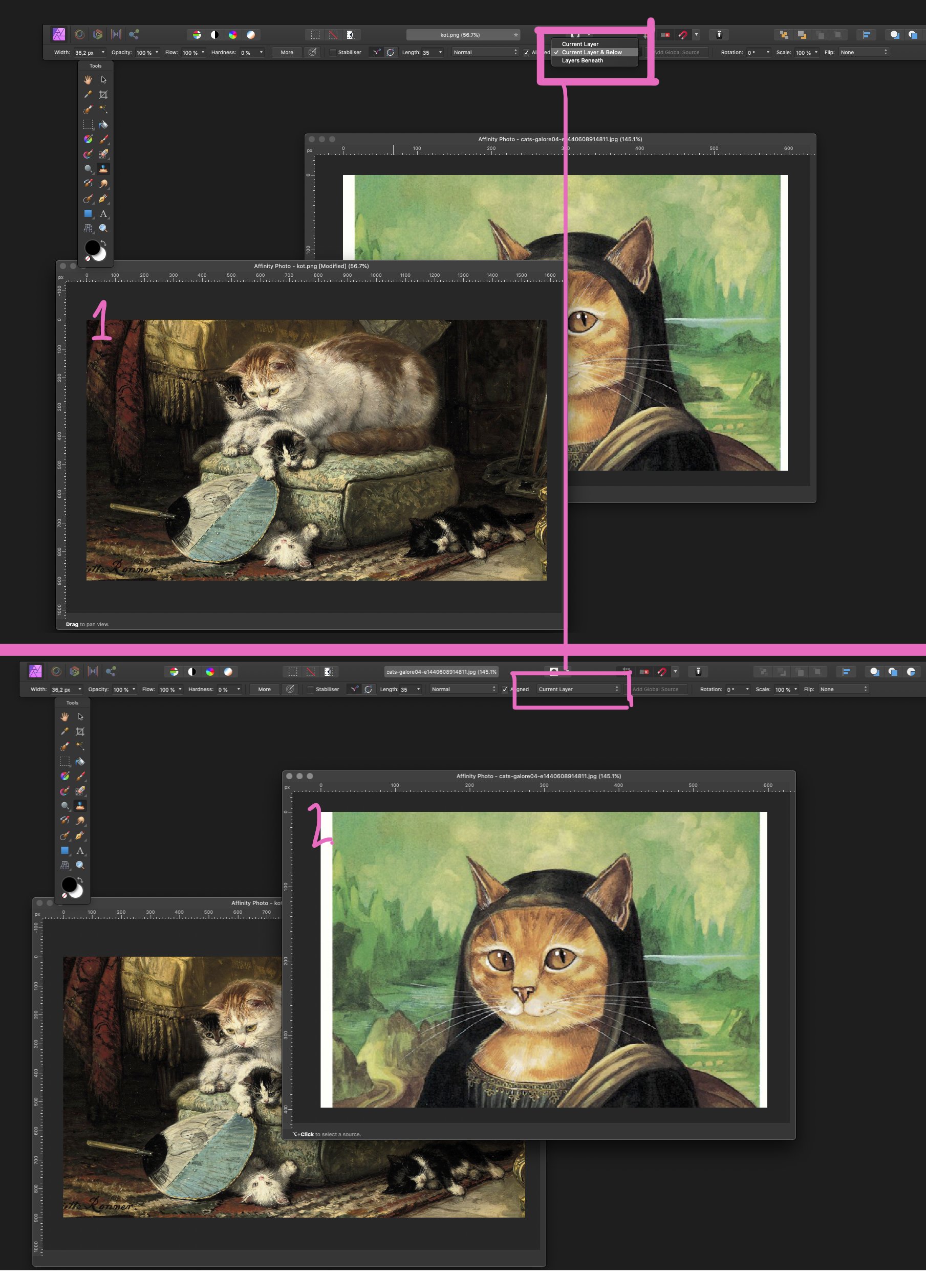
 Issue/situation: In Affinity Photo I would like the tools ( Cloning, Inpaint etc ) to remember the last settings such as Source: Current Layer & Below, but it only seems to 'remember' settings such as opacity etc. Question: How do I get the last settings to be the default for the tools? Screenshots: See attached screenshot. Operating system: OSX Catalina 10.15.6 Affinity Photo: Version 1.8.4 Unusual hardware: Wacom tablet Intuos pro Any help or input on this matter is much appreciated. Thank you in advance. PS: if this post is in the wrong forum, then please let me know, and I will submit it in another.