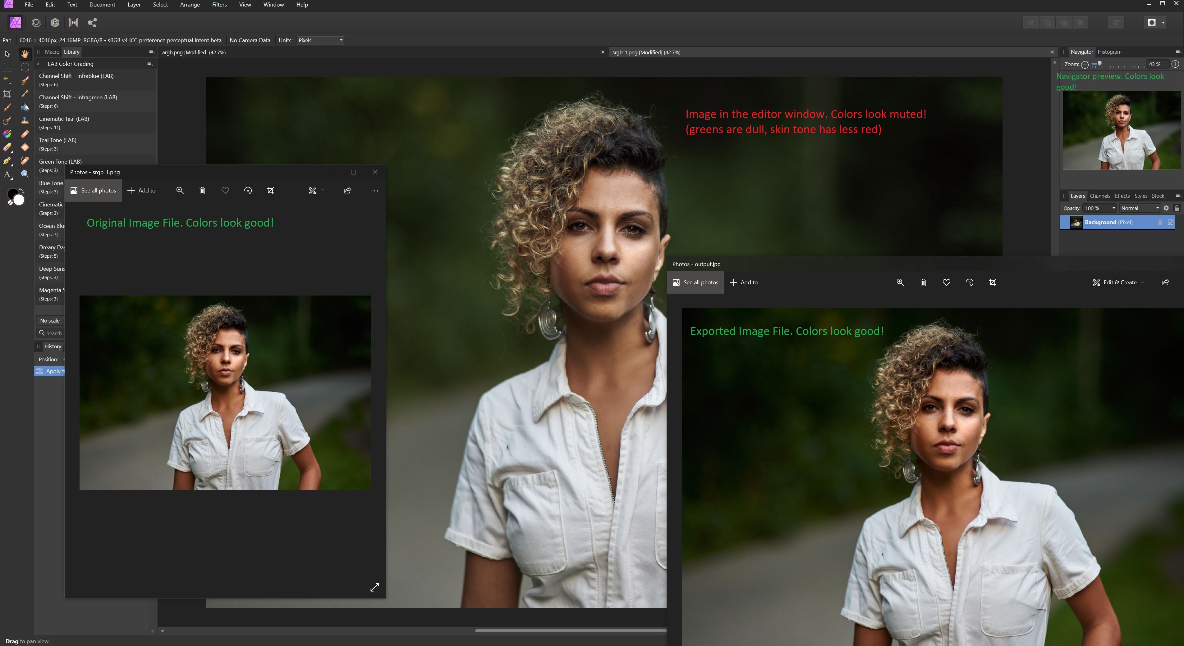
Hey there, I am having an issue that is driving me insane and I was wondering if anyone had any ideas. The colors in the affinity editor window for an image I am working with are wrong. I know it isn't a display calibration issue because the colors are ONLY wrong in the main Affinity Photo editor window. (Also I am working using a calibrated monitor)
- They are correct when I open the source image file in Windows Pictures
- They are even correct in the tiny little navigator window in Affinity Photo
- They are correct if I export the image file and then open it in Window Pictures again.
The only area where they are incorrect is in the main editor window itself. Colors look dull. Its as if saturation has been lowered. I have tried all sorts of things to fix it from working with different color profiles to different bit depths or even different file formats. Nothing has any impact. Whenever I open an image in affinity, it just looks "dull"
This obviously presents a huge problem when working with photos as I can't make accurate color grading decisions.
I've included a screenshot below showing an image at various steps of the workflow. You can very clearly see that the main large image is duller than all the others and if I sample say the center of the green highlight in the top left hand blur what I am seeing is also affirmed:
- Source File: 15,27,3
- Editor Window: 28, 36, 13
- Output: 16, 28, 4
- Navigator: 16, 30, 5
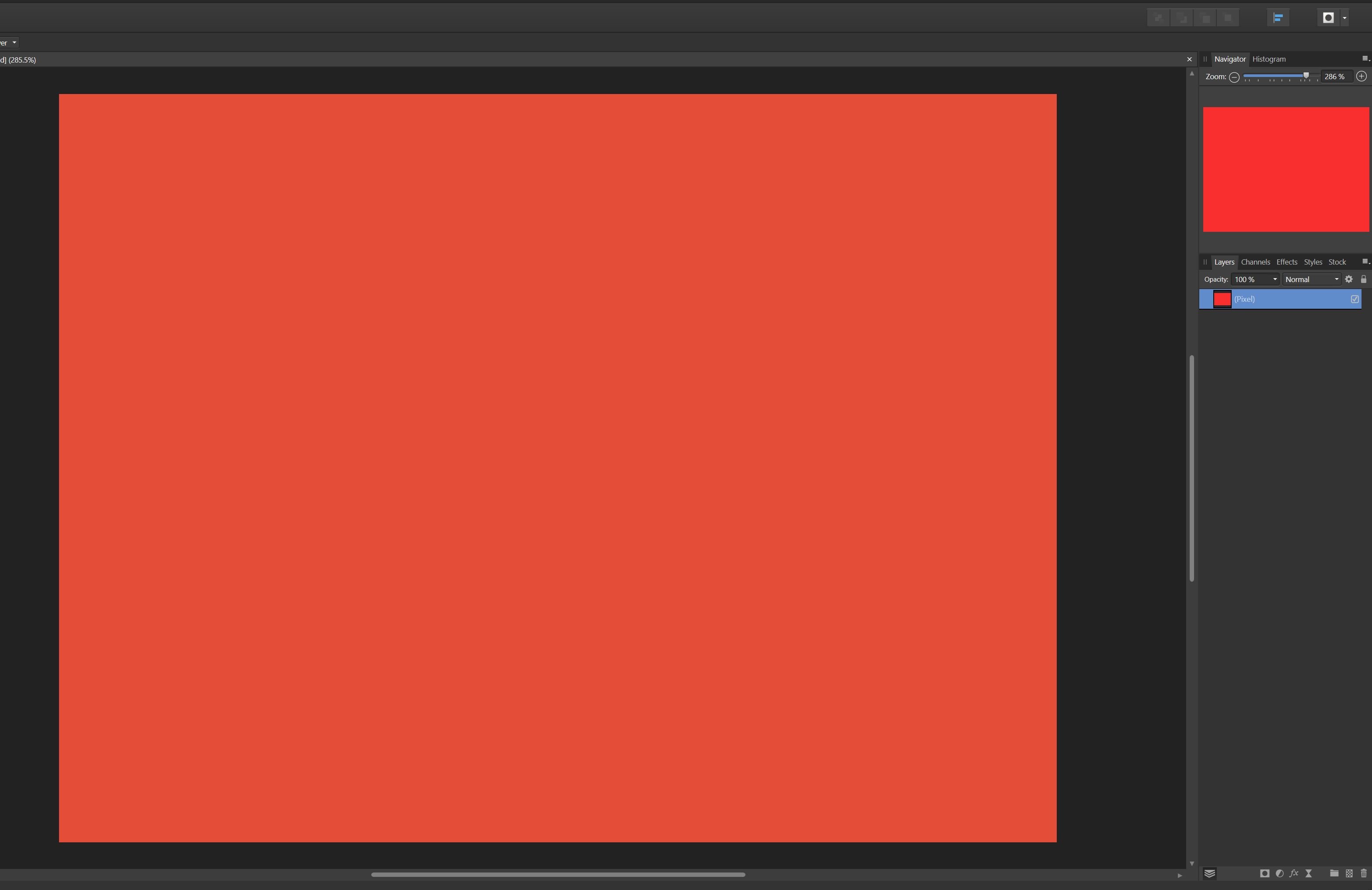
You expect a bit of variance because I can't sample the exact same spot but the Editor Window is clearly very difference than the others. I have also included a screenshot of a new document just filled with red to rule out it being an issue with the photo itself. In that screen you can clearly see that the red in the navigator preview is richer and more vibrant than the red in the editor window itself. (The navigator is accurate to the color I selected)
Any help would be really appreciated. I am running AP 1.8.5.703 on Windows 10. I am hoping maybe there is some setting that may be wrong in my preferences?


 Daniel Tudosiu reacted to a post in a topic:
Affinity Photo main editor window colors are incorrect. (and inconsistent with navigator)
Daniel Tudosiu reacted to a post in a topic:
Affinity Photo main editor window colors are incorrect. (and inconsistent with navigator)